

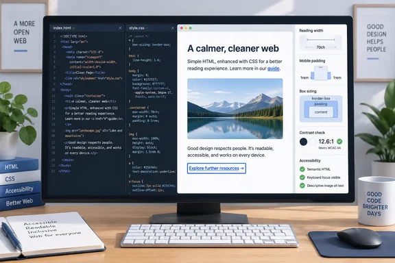
border-box sizing, a 70-character reading measure, centered content, a larger root font size, responsive images, and sans-serif headings—to improve the default rendering without a framework.There is also a date discrepancy worth noting. The submitted How-To Geek page is marked September 17, 2026, while a Yahoo syndication of the same Bobby Jack article identifies April 9, 2026 as its publication date. The advice itself is evergreen, but the “12 lines” framing is less a new CSS technique than a compact collection of long-established defaults.
For developers building documentation pages, internal tools, simple static sites, or lightweight project readmes, the useful takeaway is real: a small stylesheet can prevent several common presentation failures. But two parts of the example—its contrast claim and its approach to inline links—need correction before they become a copy-and-paste standard.
What the stylesheet fixes immediately
The proposed reset starts with box-sizing: border-box on the root element and inheritance for the remaining elements. That changes how declared widths and heights are calculated: padding and borders stay inside the declared dimensions instead of expanding a box beyond them. MDN documents this as a practical way to avoid the familiar problem where percentage-width columns no longer fit beside one another after padding is added.
That is especially useful in quick admin dashboards and utility pages, where a developer may set a card to width: 50% and later add 16 pixels of padding. Under the default content-box model, the final rendered width grows; under border-box, it does not. The source uses the older *:before and *:after spelling in its explanatory example, though its final code omits pseudo-elements altogether. Modern CSS examples generally use ::before and ::after, while browsers continue to support the legacy single-colon form.
The core reading-width decision is similarly sensible. max-width: 70ch limits a content column to roughly 70 zero-character widths in the active font, keeping prose from stretching across an ultrawide display. It is an approximation, not a literal character counter, because proportional fonts give letters different widths. Still, MDN’s responsive-design guidance supports constraining text columns to keep long-form content readable across device sizes.
Centering the constrained root with margin: auto completes that desktop presentation. On a large monitor, a narrow text column remains visually balanced rather than being pinned to the far left edge. On a smaller viewport, however, the stylesheet gives the document no horizontal padding. A 70ch maximum does not create breathing room when the viewport is narrower than that limit, so text can sit directly against the browser edge.
For a bare document, that may be acceptable. For a page intended for ordinary use, adding padding-inline: 1rem to the root—or using a dedicated main wrapper—would make the baseline more robust without turning it into a framework.
The accessibility claim needs a precise correction
The source says the Web Content Accessibility Guidelines require a 7:1 contrast ratio and presents #333 text on a white background as safely over that threshold. The color choice is strong: dark gray on white does provide high text contrast. But 7:1 is the enhanced AAA target for normal-size text, not the standard AA minimum most sites use for conformance.
W3C’s WCAG 2.2 defines the normal-text minimum at 4.5:1 for Level AA, with 3:1 permitted for large text. The stricter 7:1 ratio is Level AAA, and 4.5:1 applies to large text at that level. That distinction matters for teams translating an informal CSS tip into an accessibility requirement, a contract condition, or an automated test threshold.
The article’s more subtle problem is that it specifies only foreground color:
html {
  color: #333;
}
W3C guidance warns that authors who explicitly set a foreground color should also establish the corresponding background color. Without it, a browser extension, forced-colors mode, user stylesheet, inherited component style, or future page rule can create a combination the author never checked. A safer compact declaration is:
html {
  color: #333;
  background: #fff;
}
That does not eliminate the need to test components with custom backgrounds, disabled states, placeholders, icons, and error messages. It does ensure the body-text contrast being claimed is actually defined by the author’s CSS rather than assumed from the browser’s default canvas.
Link styling is where the tiny reset becomes risky
The source recommends removing the underline from links by default and returning it only on hover:
a:link {
  text-decoration: none;
}

a:hover {
  text-decoration: underline;
}
That is visually fashionable, but it is a poor default for prose-heavy content. Inline links can become recognizable only by color, and W3C accessibility guidance explicitly says color should not be the only visual cue used to distinguish information. A hover-only underline does not solve the issue for touch users, keyboard users, or readers who cannot reliably distinguish the chosen link color from nearby text.
There is a functional wrinkle in the exact selector, too. a:link targets unvisited links, not every anchor. A visited link can retain browser-default underlining while an unvisited link loses it, producing inconsistent styling depending on a visitor’s history. CSS restricts what pages can do with :visited specifically to protect browsing privacy, so link-state styling deserves more care than a two-rule snippet suggests.
For content links, the better small-CSS answer is to preserve an underline and refine it:
a {
  text-underline-offset: 0.15em;
  text-decoration-thickness: 0.08em;
}
This maintains a non-color signal while avoiding the heavy, crowded appearance that leads developers to remove underlines in the first place. Navigation links can use a more deliberately designed treatment, but they should retain a visible keyboard-focus state. The browser’s default focus indicator is a useful safeguard until a site supplies a tested replacement.
Images, fonts, and the limits of a page-wide rule
The image rule is one of the strongest parts of the starter set:
img {
  max-width: 100%;
  height: auto;
}
It prevents an image with large intrinsic dimensions or HTML width attributes from overflowing a narrow container. MDN identifies max-width: 100% as a standard fluid-image technique. The caveat is performance: responsive CSS stops layout breakage, but it does not stop a browser from downloading a 5 MB source image and then shrinking it to 300 pixels wide.
Production sites still need properly sized image files, modern formats where appropriate, srcset and sizes for responsive candidates, meaningful alt text, and explicit width and height attributes to reduce layout movement while the image loads. Those are not optional refinements if the page carries real content, but they are outside the scope of a visual reset.
The typography choices also work best for documents, not every application interface. Raising the root font size from the common 16-pixel default through font-size: 1.25em respects a user’s chosen browser default better than hard-coding 20 pixels. A line-height of 1.4 provides more separation than many browser defaults and is generally comfortable for reading.
Assigning generic sans-serif to headings while leaving body copy in the browser’s default serif face gives a plain document hierarchy with no font downloads. It is an appropriate zero-dependency choice. It is not, however, a complete typographic system: headings need margins, page sections need spacing, form controls need usable states, and dense data tables require their own treatment.
A safer small baseline for simple pages
The source’s strength is its refusal to make every simple page depend on a CSS library. That is a useful corrective for developers who reach for a multi-megabyte UI stack before writing a heading and two paragraphs. But a starter should avoid teaching an incorrect accessibility threshold or making embedded links less discoverable.
This version remains intentionally small while correcting those omissions:
html {
  box-sizing: border-box;
  max-width: 70ch;
  margin: auto;
  padding-inline: 1rem;
  font-size: 1.25em;
  line-height: 1.4;
  color: #333;
  background: #fff;
}

*, *::before, *::after { box-sizing: inherit; }
h1, h2, h3, h4, h5, h6 { font-family: sans-serif; }
img { max-width: 100%; height: auto; }
a { text-underline-offset: 0.15em; }
It is longer than the slogan, because it makes explicit the background color and narrow-screen gutter that the original assumes, while retaining a visible cue for links. That tradeoff is worthwhile. A minimal stylesheet should reduce the number of decisions a developer has to revisit later, not create subtle accessibility and consistency issues that only appear after content arrives.