

Microsoft is building a Copilot Design System in 2026 to make Copilot behave more consistently across Microsoft 365 apps, after backlash over intrusive AI entry points such as the floating Dynamic Action Button in Word, Excel, and PowerPoint. The company’s pitch is “intentional and humane” AI. The more practical reading is simpler: Microsoft has realized that Copilot cannot become infrastructure if it continues to feel like an ad unit pasted on top of work.
That distinction matters. The fight over Copilot is no longer about whether Microsoft will put AI in Windows and Office; that decision has been made. The fight is over whether Microsoft can make Copilot feel like part of the operating environment rather than a corporate growth target wearing a sparkle icon.
Jon Friedman’s new role as Microsoft’s first Chief Design Officer is not a decorative promotion. It is Microsoft admitting, in the careful language of design leadership, that its first phase of Copilot deployment produced fragmentation. Copilot showed up in too many places, under too many metaphors, with too little evidence that each placement respected the user’s task.
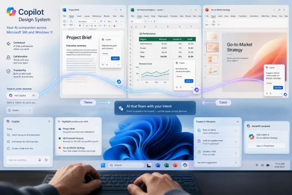
That is the problem the Copilot Design System is meant to solve. A design system, in Microsoft’s hands, is not merely a set of colors, buttons, and spacing rules. It is a control layer for product behavior: where Copilot appears, what it suggests, when it interrupts, how it hands off between surfaces, and how much agency the user appears to retain.
The phrase “AI-forward design system” sounds like the sort of thing that escapes a conference room before anyone can stop it. But the underlying issue is real. Traditional interface design assumes the product waits for a command. Copilot is supposed to infer intent, suggest next actions, summarize context, and move between apps. That makes its interface less like a toolbar and more like a behavioral policy.
This is where Microsoft’s ambition collides with user tolerance. A productivity app can survive a clumsy button. A work platform that constantly guesses wrong, appears uninvited, or blocks content trains users to distrust it. Microsoft is trying to design its way out of that distrust without retreating from the larger AI bet.
The button sits near the document canvas, offering a single entry point into Copilot and contextual actions. From Microsoft’s perspective, that is elegant consolidation. From the user’s perspective, especially in Excel, it can look like an overlay placed on top of the very work Microsoft claims to respect.
The backlash was predictable because Office users have spent decades building muscle memory around ribbons, panes, right-click menus, keyboard shortcuts, and document space. A floating AI button changes the geometry of work. It does not merely add a feature; it occupies attention.
Microsoft’s later move to let users dock the button or move it back toward the ribbon is therefore more than a concession. It is evidence that the company is still learning the difference between discoverability and persistence. Discoverability helps users find a feature when it is relevant. Persistence reminds them that the vendor has business objectives.
That sounds abstract, but it addresses a practical failure mode. If Copilot can appear as a floating button, a chat pane, an on-canvas suggestion, a highlighted-text action, or a contextual prompt, users need to know whether these are separate features or one system following them through the task. Without that coherence, Copilot feels less like an assistant and more like a swarm.
Microsoft’s challenge is to make Copilot ambient without making it creepy, proactive without making it presumptuous, and contextual without making the user wonder what has been scanned. That is not just an interface problem. It is a trust problem.
“Throw & Catch” also reveals how Microsoft thinks about the future of Office. The company does not want Copilot to live in a single chat sidebar. It wants Copilot to move through the document, the app, the file, and eventually the wider Microsoft Graph context. The design system is the choreography for that movement.
That may actually make the integration more consequential. A loud Copilot button is easy to dislike, disable, ignore, or mock. An invisible Copilot layer embedded into workflows, suggestions, search, shortcuts, and app behaviors is harder to evaluate because it becomes part of the furniture.
This is why the language around being “intentional” deserves scrutiny. For users, intentionality means restraint: do not interrupt me unless the value is obvious. For Microsoft, intentionality may mean orchestration: make every Copilot surface feel like it belongs to one coherent system.
Those goals can overlap, but they are not identical. Microsoft can reduce visual clutter while still expanding Copilot’s reach. It can remove a button from one place while deepening the dependency elsewhere. The Copilot Design System is best understood as a way to normalize AI integration, not abandon it.
Office UI changes are not cosmetic in large organizations. Training materials reference screenshots. Help desks build scripts around known menus. Regulated industries care about where content goes, what gets summarized, and which users can invoke AI on which files. A Copilot entry point that changes across apps and update channels can become an operational issue.
Microsoft’s design-system approach could help if it produces stability. A single interaction model across Word, Excel, PowerPoint, Teams, Outlook, and Windows would reduce confusion. Consistent keyboard shortcuts, predictable panes, and clear admin policy behavior would make Copilot easier to support.
But the same system could also accelerate change. If Microsoft creates a unified Copilot interaction layer, it can ship new behaviors across the suite more quickly. That is good for product velocity and risky for IT departments that already struggle to keep pace with Microsoft 365’s rolling updates.
That is the standard Microsoft now has to meet. If Copilot is to become a “thought partner,” it must first prove that it can be quiet. The best assistant is not the one that appears most often; it is the one that appears at the moment of need, with the right context, and disappears cleanly afterward.
This is especially true in creative and analytical work. A writer highlighting text may want a rewrite suggestion. A lawyer may not. An analyst selecting a range in Excel may want a formula explanation. A finance team preparing board numbers may want nothing inserted, inferred, or summarized unless explicitly requested.
The Copilot Design System will be judged by these edge cases, not by polished demos. Microsoft can show Copilot moving gracefully between surfaces, but real users will test whether it respects concentration, privacy expectations, and the sanctity of the document canvas.
That is why Microsoft’s decision to offer more ways to move or reduce the Dynamic Action Button matters. It acknowledges that AI adoption cannot be forced purely through placement. Engagement may rise when a feature is put directly in front of users, but resentment can rise with it.
There is also a strategic risk for Microsoft. If Copilot becomes associated with clutter, nagging, and unexplained UI churn, users will learn to treat it as another thing to disable. That would be disastrous for a product Microsoft wants to position as the new front end for work.
Design, then, is not secondary to Microsoft’s AI strategy. It is the strategy’s point of contact with reality. The model may be powerful, the graph integration may be deep, and the licensing may be lucrative, but the user still meets Copilot as a button, pane, suggestion, shortcut, or interruption.
That distinction matters. The fight over Copilot is no longer about whether Microsoft will put AI in Windows and Office; that decision has been made. The fight is over whether Microsoft can make Copilot feel like part of the operating environment rather than a corporate growth target wearing a sparkle icon.
 Microsoft’s New Design Job Is Damage Control With a Roadmap
Jon Friedman’s new role as Microsoft’s first Chief Design Officer is not a decorative promotion. It is Microsoft admitting, in the careful language of design leadership, that its first phase of Copilot deployment produced fragmentation. Copilot showed up in too many places, under too many metaphors, with too little evidence that each placement respected the user’s task.That is the problem the Copilot Design System is meant to solve. A design system, in Microsoft’s hands, is not merely a set of colors, buttons, and spacing rules. It is a control layer for product behavior: where Copilot appears, what it suggests, when it interrupts, how it hands off between surfaces, and how much agency the user appears to retain.
The phrase “AI-forward design system” sounds like the sort of thing that escapes a conference room before anyone can stop it. But the underlying issue is real. Traditional interface design assumes the product waits for a command. Copilot is supposed to infer intent, suggest next actions, summarize context, and move between apps. That makes its interface less like a toolbar and more like a behavioral policy.
This is where Microsoft’s ambition collides with user tolerance. A productivity app can survive a clumsy button. A work platform that constantly guesses wrong, appears uninvited, or blocks content trains users to distrust it. Microsoft is trying to design its way out of that distrust without retreating from the larger AI bet.
The Floating Button Became the Symbol of a Bigger Miscalculation
The Dynamic Action Button was supposed to make Copilot more discoverable in Word, Excel, and PowerPoint. Instead, it became a small floating monument to Microsoft’s larger problem: the company wants Copilot to be ever-present, while many users want it to be available only when summoned.The button sits near the document canvas, offering a single entry point into Copilot and contextual actions. From Microsoft’s perspective, that is elegant consolidation. From the user’s perspective, especially in Excel, it can look like an overlay placed on top of the very work Microsoft claims to respect.
The backlash was predictable because Office users have spent decades building muscle memory around ribbons, panes, right-click menus, keyboard shortcuts, and document space. A floating AI button changes the geometry of work. It does not merely add a feature; it occupies attention.
Microsoft’s later move to let users dock the button or move it back toward the ribbon is therefore more than a concession. It is evidence that the company is still learning the difference between discoverability and persistence. Discoverability helps users find a feature when it is relevant. Persistence reminds them that the vendor has business objectives.
“Throw & Catch” Is Microsoft’s Attempt to Make AI Feel Ambient
One of the more revealing pieces of the design work is Microsoft’s “Throw & Catch” concept. The idea is that Copilot’s various entry points should coordinate with each other, passing focus between surfaces so the user understands where the AI is active and why.That sounds abstract, but it addresses a practical failure mode. If Copilot can appear as a floating button, a chat pane, an on-canvas suggestion, a highlighted-text action, or a contextual prompt, users need to know whether these are separate features or one system following them through the task. Without that coherence, Copilot feels less like an assistant and more like a swarm.
Microsoft’s challenge is to make Copilot ambient without making it creepy, proactive without making it presumptuous, and contextual without making the user wonder what has been scanned. That is not just an interface problem. It is a trust problem.
“Throw & Catch” also reveals how Microsoft thinks about the future of Office. The company does not want Copilot to live in a single chat sidebar. It wants Copilot to move through the document, the app, the file, and eventually the wider Microsoft Graph context. The design system is the choreography for that movement.
The Windows Lesson Is That Rebranding Is Not Retreat
Microsoft has recently signaled that it will be more intentional about where Copilot appears in Windows 11. That is a welcome change, but it should not be mistaken for a pullback from AI integration. Microsoft is not removing Copilot from the platform. It is trying to make Copilot less visibly bolted on.That may actually make the integration more consequential. A loud Copilot button is easy to dislike, disable, ignore, or mock. An invisible Copilot layer embedded into workflows, suggestions, search, shortcuts, and app behaviors is harder to evaluate because it becomes part of the furniture.
This is why the language around being “intentional” deserves scrutiny. For users, intentionality means restraint: do not interrupt me unless the value is obvious. For Microsoft, intentionality may mean orchestration: make every Copilot surface feel like it belongs to one coherent system.
Those goals can overlap, but they are not identical. Microsoft can reduce visual clutter while still expanding Copilot’s reach. It can remove a button from one place while deepening the dependency elsewhere. The Copilot Design System is best understood as a way to normalize AI integration, not abandon it.
Enterprise IT Will Care Less About the Button Than the Behavior
For administrators, the most important question is not whether Copilot’s icon floats, docks, or returns to the ribbon. It is whether Microsoft gives organizations predictable controls over Copilot availability, data boundaries, user education, and interface change management.Office UI changes are not cosmetic in large organizations. Training materials reference screenshots. Help desks build scripts around known menus. Regulated industries care about where content goes, what gets summarized, and which users can invoke AI on which files. A Copilot entry point that changes across apps and update channels can become an operational issue.
Microsoft’s design-system approach could help if it produces stability. A single interaction model across Word, Excel, PowerPoint, Teams, Outlook, and Windows would reduce confusion. Consistent keyboard shortcuts, predictable panes, and clear admin policy behavior would make Copilot easier to support.
But the same system could also accelerate change. If Microsoft creates a unified Copilot interaction layer, it can ship new behaviors across the suite more quickly. That is good for product velocity and risky for IT departments that already struggle to keep pace with Microsoft 365’s rolling updates.
Humane AI Starts With the Right to Ignore It
The word “humane” is doing a lot of work in Microsoft’s design framing. Humane software respects attention. It does not confuse availability with urgency. It does not treat every blank space as an opportunity for suggestion.That is the standard Microsoft now has to meet. If Copilot is to become a “thought partner,” it must first prove that it can be quiet. The best assistant is not the one that appears most often; it is the one that appears at the moment of need, with the right context, and disappears cleanly afterward.
This is especially true in creative and analytical work. A writer highlighting text may want a rewrite suggestion. A lawyer may not. An analyst selecting a range in Excel may want a formula explanation. A finance team preparing board numbers may want nothing inserted, inferred, or summarized unless explicitly requested.
The Copilot Design System will be judged by these edge cases, not by polished demos. Microsoft can show Copilot moving gracefully between surfaces, but real users will test whether it respects concentration, privacy expectations, and the sanctity of the document canvas.
The Copilot Button Fight Was Really About Control
The loudest complaints about Copilot are often framed as anti-AI sentiment, but that oversimplifies the issue. Many Windows and Office users are not opposed to AI features. They are opposed to losing control over when those features appear and how deeply they are woven into familiar tools.That is why Microsoft’s decision to offer more ways to move or reduce the Dynamic Action Button matters. It acknowledges that AI adoption cannot be forced purely through placement. Engagement may rise when a feature is put directly in front of users, but resentment can rise with it.
There is also a strategic risk for Microsoft. If Copilot becomes associated with clutter, nagging, and unexplained UI churn, users will learn to treat it as another thing to disable. That would be disastrous for a product Microsoft wants to position as the new front end for work.
Design, then, is not secondary to Microsoft’s AI strategy. It is the strategy’s point of contact with reality. The model may be powerful, the graph integration may be deep, and the licensing may be lucrative, but the user still meets Copilot as a button, pane, suggestion, shortcut, or interruption.
The Small Print Behind Microsoft’s Big AI Bet
The concrete lesson from this episode is that Microsoft is moving from Copilot as feature placement to Copilot as system behavior. That shift will shape how WindowsForum readers experience Microsoft 365 over the next year.- Microsoft is not backing away from Copilot; it is trying to make Copilot less visibly disruptive and more structurally embedded.
- The Dynamic Action Button backlash showed that users distinguish sharply between helpful access and unwanted persistence.
- The Copilot Design System is likely to standardize how Copilot appears across apps, devices, and contexts.
- Enterprise administrators should watch for policy controls, update-channel timing, and documentation changes as closely as they watch UI screenshots.
- The success of Copilot will depend less on whether users can find it and more on whether they trust it to stay out of the way.
References
- Primary source: Neowin
Published: 2026-05-26T08:50:06.585011
Microsoft is working on a "Copilot Design System"
Microsoft says its new Copilot Design System will make AI feel "humane", and it also reveals how deeply Copilot is embedding itself into Office workflows. www.neowin.net
- Official source: support.microsoft.com
Die Schaltfläche "Copilot Dynamic Action" in Word Excel und PowerPoint - Microsoft-Support
Erfahren Sie mehr über die copilot Dynamic Action Button (DAB) in Word, Excel und PowerPoint. Erfahren Sie, wie Sie Copilot öffnen, die Schaltfläche andocken und suchen, wenn sie fehlt. support.microsoft.com
- Related coverage: office-watch.com
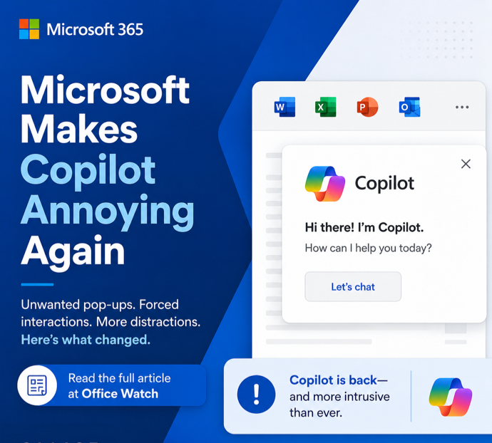
Microsoft buries the Copilot button and floats a nag in its place
Microsoft has quietly removed the Copilot button from the Home tab in Word, Excel and PowerPoint and replaced it with a permanent floating icon at the bottom rioffice-watch.com
- Related coverage: windowscentral.com
Microsoft admits its "infuriating" floating AI button was a mistake
Microsoft admits the floating Copilot button was a mistake and will allow you to hide it in Word, Excel, and PowerPoint soon. www.windowscentral.com
- Official source: learn.microsoft.com

Extend the capabilities of your agent - Microsoft Copilot Studio
Extend your agents with topics, knowledge, tools, and other agents.learn.microsoft.com - Related coverage: theregister.com

Microsoft lets users exile floating Copilot button after interface rage
Listening to your customers? Who are you, and what have you done with Microsoft?www.theregister.com
- Related coverage: digitaltrends.com

Microsoft will let users disable the floating Copilot button in the Office app
Microsoft is rolling out an Office update in the last week of May 2026 that lets users move the floating Copilot button out of their documents and back to the ribbon. www.digitaltrends.com
- Related coverage: windowsnews.ai
Microsoft Lets Users Move Copilot Button to Ribbon (Office AI UI Backlash)
Microsoft finally lets you move the Copilot button in Word, Excel, and PowerPoint to the ribbon, ending the floating orb’s reign of distraction. Here’s how...windowsnews.ai
- Official source: microsoft.design

Proof and possibility
Jon Friedman on becoming Microsoft's first Chief Design Officermicrosoft.design
- Official source: download.microsoft.com
- Related coverage: bcn.co.uk
- Related coverage: techxplore.com
- Official source: adoption.microsoft.com