Microsoft quietly rolled out a redesigned Windows Insider Program website this month, replacing the program’s long-serving landing pages with a modern, colorful interface that highlights registration flows, channel guidance, business and server streams, and — unsurprisingly — an AI-powered assistant baked into the page.
The Windows Insider Program has been Microsoft’s public-facing testing ground since late 2014, giving enthusiasts, developers, and IT pros early access to pre-release Windows builds and a formal channel to submit feedback. Over the past year the program has seen both new feature experimentation — particularly around on-device AI, Copilot integrations, and UI overhauls — and a growing, vocal community debate about the direction of Windows development and how Microsoft listens to Insider feedback.
The new website arrives against that backdrop: design refreshes and improved documentation are unobjectionable on their own, but the timing and the addition of an AI assistant come at a moment when many Insiders are scrutinizing how Microsoft prioritizes AI-first features, hardware gating (Copilot+ PCs), and user consent. This article breaks down what changed on the site, what’s new from a functional and technical standpoint, and what the redesign means for the future of the Windows Insider Program — including potential benefits and risks Insiders should weigh.
Important caveats about the assistant:
Two simultaneous realities therefore exist:
For Insiders who want to continue shaping Windows, the practical reality is unchanged: the program remains a valuable route to influence product direction, but influence depends less on polished portals and more on meaningful engagement and transparent follow-through from Microsoft. The website provides a better map for where to go — but the route itself still depends on how Microsoft listens, acts, and communicates with the community going forward.
Conclusion
Microsoft’s redesigned Windows Insider Program website modernizes the onboarding experience, elevates documentation, and signals the company’s intent to make AI a first-class presence in the program experience. That is a reasonable and sensible evolution of the program’s public face. Yet for many longtime Insiders the critical questions are not visual but procedural: will feedback be heard and acted upon, will AI be integrated with care and transparency, and will Microsoft avoid fragmenting the platform with hardware-only experiences? The site update is a positive step, but it should be the start of a renewed commitment to clarity, accountability, and community partnership — not the only one.
Source: Neowin Windows Insider Program gets a redesigned website
 Background
The Windows Insider Program has been Microsoft’s public-facing testing ground since late 2014, giving enthusiasts, developers, and IT pros early access to pre-release Windows builds and a formal channel to submit feedback. Over the past year the program has seen both new feature experimentation — particularly around on-device AI, Copilot integrations, and UI overhauls — and a growing, vocal community debate about the direction of Windows development and how Microsoft listens to Insider feedback.The new website arrives against that backdrop: design refreshes and improved documentation are unobjectionable on their own, but the timing and the addition of an AI assistant come at a moment when many Insiders are scrutinizing how Microsoft prioritizes AI-first features, hardware gating (Copilot+ PCs), and user consent. This article breaks down what changed on the site, what’s new from a functional and technical standpoint, and what the redesign means for the future of the Windows Insider Program — including potential benefits and risks Insiders should weigh.
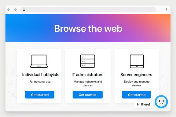
What’s different on the redesigned Windows Insider website
The redesigned site focuses on clarity and onboarding. It migrates the old, text-heavy pages into a visually modern framework that emphasizes action: signing up, choosing the right channel, downloading builds, and finding docs. Key surface-level changes include:- A contemporary visual language with colorful backgrounds, gradients, and refreshed icons that align with Microsoft’s recent UI updates.
- Prominent quick links to register for the program and to enroll specific device types, including Windows Insider for Business and Windows Server Insider.
- Clear, plain-language explanations of the Insider channels (Canary/Dev/Beta/Release Preview equivalents) and the expectations for each channel.
- Quick access to the latest release notes for each channel and a simple way to locate downloads and documentation.
- An AI-powered chatbot embedded on the site intended to answer program questions and guide users to relevant pages.
Who the new layout is aimed at
The site’s layout signals three primary audiences:- Individual enthusiasts and hobbyists who want a clear sign-up path and a simple explanation of what each Insider channel provides.
- IT administrators and enterprise testers via Windows Insider for Business pages that explain corporate registration and AAD enrollment.
- Server administrators and developers through a dedicated Windows Server Insider landing area with downloads and dev-focused guidance.
A closer look at the AI assistant and what it does (and doesn’t)
Adding an AI assistant to a program site dedicated to pre-release software is logical: common tasks like "Which channel should I pick?" or "Where do I download a server preview?" are repetitive and can be automated. The assistant appears oriented toward answering FAQ-style questions, pointing users to registration flows, and surfacing relevant docs.Important caveats about the assistant:
- The chatbot is a navigation and FAQ tool, not a substitute for official policy, legal agreements, or technical support channels.
- Given the breadth of Insider topics, the bot will inevitably lag when it comes to organizational changes, staffing updates, or rapidly evolving program details.
- The assistant’s responses may be server-driven and therefore subject to updates independent of the page, which means occasional inconsistencies — such as stale references to staff or leadership — are to be expected.
Why the site redesign matters (benefits)
The redesign delivers a number of clear, immediate advantages for the Windows Insider community:- Faster onboarding: the registration funnel is more visible and easier to navigate, lowering the barrier to entry for new Insiders.
- Improved discoverability: channel descriptions and release notes are easier to locate, reducing confusion about build expectations and risks.
- Segmentation for business and server users: enterprise registration and Windows Server Insider content are surfaced prominently, making it simpler for organizations to enroll devices and obtain the right images.
- Centralized downloads and docs: having a single place to find downloads, flight information, and documentation helps testers who juggle multiple devices or channels.
- Iterative telemetry for improvements: the site appears instrumented for analytics, enabling Microsoft to shape the resource based on actual usage patterns rather than guesswork.
Risks, blind spots, and community friction
Despite clear benefits, there are notable risks and community concerns tied to this redesign and its surrounding context.1. Trust and transparency issues
Many Insiders are sensitive to how Microsoft handles telemetry, opt-ins, and changes to product direction. Packaging an AI chat interface next to registration flows raises immediate questions:- What telemetry does the chatbot collect, and how is it used?
- Are conversation logs tied to user accounts or feedback profiles?
- Does the assistant present official policy or only illustrative answers?
2. Stale or incorrect content
Automated assistants are only as current as their knowledge base. Program leadership changes, channel policy updates, and flighting models can shift quickly. Relying too heavily on an AI helper without clear signals about freshness risks delivering outdated information to users — for example, when staff departures or role changes occur.3. Overemphasis on AI features
The revamped site prominently signals Microsoft’s commitment to AI-first experiences. For Insiders who have raised concerns about the pace and prominence of AI features, the site’s tone might feel like confirmation that AI is the central strategic priority — which can be alienating if those Insiders would prefer more emphasis on stability, accessibility, or performance.4. Hardware gating and fragmentation
The website clarifies channel expectations and highlights device-specific experiences (for instance, features gated to Copilot+ machines). While technically necessary at times, this emphasis further publicizes the fragmentation risk: users may expect similar features across devices and then discover a feature limited to local NPU-enabled hardware, which can breed confusion and frustration.5. Communication during leadership transitions
Recent departures and role changes among program veterans have sparked debate about the future direction of the Insider program. A polished website helps convey continuity, but it cannot substitute for visible, trust-building outreach from program leads. When the community has questions about priorities and feedback handling, a static site — even with chatbot assistance — is insufficient.What the redesign teaches us about Microsoft’s strategy
The site refresh signals several strategic priorities:- Professionalize the funnel: Microsoft wants smoother conversion from curiosity to registration, making it easier for both consumers and organizations to enroll.
- Normalize AI presence: showcasing an onsite assistant and calling out AI-integrated features indicates the company intends AI to be a first-class experience across Windows.
- Support business audiences more transparently: the clearer “for Business” and Server areas show Microsoft is actively courting enterprise testers and corporate deployment scenarios.
- Control the narrative: better docs and a single canonical site reduce fragmentation and the risk of outdated third-party guides circulating in the community.
Practical recommendations for Insiders and admins
For individual testers, IT pros, and program observers, here are concrete steps and considerations to get the most out of the redesigned site:- Use the new landing pages for enrollment and to confirm channel expectations.
- When in doubt, cross‑check release notes with Flight Hub and the Feedback Hub before deploying a build to a primary device.
- Treat the AI assistant as a convenience tool; verify policy or technical claims against official blog posts and release notes for critical actions.
- Enterprise admins should follow the Windows Insider for Business flow and use Azure AD enrollment for corporate devices rather than personal accounts.
- Keep a fallback plan: install Insider builds on secondary hardware or VMs, and maintain current backups before testing.
How Microsoft should improve the experience next
The redesign lays a useful foundation, but several enhancements would build trust and long-term value:- Transparent AI disclosures: a short, scannable explanation of what the chatbot knows, how often it’s updated, and what telemetry it collects would address privacy concerns.
- Versioned content and timestamps: showing when a page or FAQ was last updated helps Insiders assess whether information is current.
- Leader and contact channel clarity: a visible, maintained list of program leads, community managers, and channels for live engagement would reduce uncertainty during staff changes.
- Stronger documentation links to Flight Hub: while the site links release notes, clearer cross-references to Flight Hub and specific build numbers (with build histories) would help power users.
- Explicit feature gating notices: callouts for features limited to Copilot+ hardware or regional availability should be visible on relevant pages to set expectations.
The bigger picture: website changes versus program direction
A site redesign is a relatively low‑risk, high-visibility update. It improves first impressions and reduces friction for newcomers, but it cannot address deeper program issues that many Insiders have raised: perceived de-prioritization of community feedback, rapid AI-first feature pushes, and the introduction of hardware-gated experiences that split the user base.Two simultaneous realities therefore exist:
- On one hand, the redesigned website is a net positive: better onboarding, cleaner docs, and easier access to business and server resources.
- On the other hand, the community’s larger concerns — governance, feedback responsiveness, ethical AI deployment, and feature fragmentation — will not be resolved by visuals alone.
Final assessment: useful, timely, but insufficient on its own
The new Windows Insider website is a useful upgrade: it simplifies registration, clarifies channel differences, and centralizes documentation. The embedded AI assistant adds convenience but also introduces legitimate concerns about accuracy and data handling. In isolation, the redesign improves the program’s front door, yet it does not answer deeper questions about priorities, trust, and the feedback-to-action pipeline.For Insiders who want to continue shaping Windows, the practical reality is unchanged: the program remains a valuable route to influence product direction, but influence depends less on polished portals and more on meaningful engagement and transparent follow-through from Microsoft. The website provides a better map for where to go — but the route itself still depends on how Microsoft listens, acts, and communicates with the community going forward.
Conclusion
Microsoft’s redesigned Windows Insider Program website modernizes the onboarding experience, elevates documentation, and signals the company’s intent to make AI a first-class presence in the program experience. That is a reasonable and sensible evolution of the program’s public face. Yet for many longtime Insiders the critical questions are not visual but procedural: will feedback be heard and acted upon, will AI be integrated with care and transparency, and will Microsoft avoid fragmenting the platform with hardware-only experiences? The site update is a positive step, but it should be the start of a renewed commitment to clarity, accountability, and community partnership — not the only one.
Source: Neowin Windows Insider Program gets a redesigned website