

Everything below about design intent comes from Microsoft's own account. It is not independent testing, and it says nothing about how the icon behaves in any given build.
What Microsoft says it changed
Microsoft gives two reasons for the redesign.
- Consistency. Microsoft says Copilot was becoming a new experience, while the icon looked a little different depending on where you found it. That wording is my paraphrase of the design post, not a search result, so treat the citation tag as private transport only.
- Communication. The post says a static icon can't tell you whether Copilot has started, is working out a plan, or is digging through your files. A moving one can.
The post doesn't give a rollout date, build number or list of supported apps. It doesn't say whether every Copilot surface will show the animation. Don't read it as a simultaneous launch for all users.
The new mark
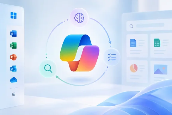
Microsoft says the mark had to stay readable in every frame while moving, so the team went back to the square. After many iterations they settled on two distinct forms that make one silhouette. The forms can move relative to each other without losing their connection. Microsoft describes this as separate pieces coming together into something more useful and more powerful. That is a symbolic reading, not a statement about how Copilot's AI works.
The wordmark pairs Segoe with Segoe Serif. Microsoft says the sans-serif keeps things open and readable, and the serif adds personality.
For colour, the team kept a link to Copilot's original gradient and let colours shift and blend between contexts. They tested colour on screen, in print and in physical materials. The post gives no colour values, contrast ratios, animation durations or accessibility measurements. It would be a mistake to infer accessibility outcomes from the description alone.
Three motion gestures
Microsoft built what it calls a shared motion language around three moments when Copilot is busy. In each, the same two forms move in relation to each other and come back together as one.
| Gesture | What Microsoft says it signals |
|---|---|
| Thinking | Copilot is working through your request |
| Planning | Copilot is organizing the next steps |
| Retrieval | Copilot is pulling in context from your files and work |
Microsoft says the gestures follow Copilot across its ecosystem. Its example is that a gesture seen in Windows should feel familiar in Word or PowerPoint. The post also mentions apps, devices, larger product moments, and global marketing and advertising.
The post leaves several questions unanswered:
- how the gestures are triggered
- whether they map to real backend processing states
- whether users can turn the motion off
"Retrieval" is a visual cue. It is not proof that a particular file was accessed, and it doesn't explain permissions or data handling. Admins who care about how Copilot reaches files should rely on Microsoft's actual data-access and permissions documentation.
Why Windows and Microsoft 365 users may care
The practical value here is small but real. AI assistants are often opaque during the wait, and an icon that distinguishes thinking, planning and fetching context could reduce that uncertainty. It would also help Copilot look like one product across Windows and the Microsoft 365 apps. Microsoft's own support documentation shows how fragmented the branding has been.
- Microsoft's support page says the Microsoft 365 (Office) app is now called the Microsoft Copilot app across web, mobile and Windows. The "Microsoft 365 Copilot" name and icon began rolling out on January 15, 2025, and web URLs are being consolidated under copilot.cloud.microsoft.
- That is a separate app-identity change. Nothing in the support page ties it to the October animated mark.
A leak and an earlier redesign
Two other items give context. Neither is confirmed as part of this release.
- Neowin reported in August 2026 that Copilot could soon be getting a new, more minimalistic icon, according to leaks. The leaked icon appeared in an Edge Canary build and in Microsoft 365. Neowin said Microsoft removed it from the Edge Canary build, so it looked like an accidental leak. Neowin described it as a flattened version of the existing icon. Whether the leaked design matches the one Microsoft now describes is something I can't confirm from the available material.
- Microsoft's May 28, 2026 blog post covered a redesign of the Copilot app and how Copilot appears in Microsoft 365 apps. It described a task-aware prompt area and a single entry point across apps. That post doesn't mention the icon motion, so treat the two announcements as separate unless Microsoft links them.
What to do now
Nothing, as far as this announcement goes. It contains no user steps, version requirements, admin controls or account restrictions. It isn't a security update or a new Copilot capability. I wouldn't update an app or change a setting because of it.
If you manage a fleet, the sensible move is to keep an eye on end-user training material and screenshots. They may start to show a different Copilot icon over the coming months. Help desk staff may also get questions about the moving mark.
Bottom line
Microsoft is turning Copilot's icon into a status indicator. It also wants the icon to work as a consistent brand mark across Windows and Microsoft 365. The case for it is plausible, and no independent evidence yet shows whether it helps users. The open questions are rollout timing, accessibility options such as reduced motion, and whether the animations reflect what Copilot is actually doing.
Update: Additional details (October 7, 2026)
Neowin reports that Microsoft’s redesign process took several designers and other staff months of work. Beyond testing the mark in digital and print settings, the team reportedly printed versions on paper, debated curve weights, and discarded ideas overnight when they did not fit the wider Copilot ecosystem.
Those details reinforce that the final icon, wordmark, colour system, and three motion states were developed as one identity system rather than as a simple animation added to the existing logo.
References
- Microsoft explains why it took "months" to redesign the Copilot icon Neowin · 2026-10-07T12:10:01+00:00
- Microsoft may have accidentally leaked a new Copilot icon - Neowin neowin.net
- Introducing a new design for Microsoft 365 Copilot | AI at Work Blog microsoft.com