

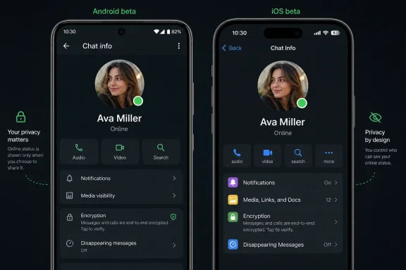
WhatsApp is testing a green online-status dot for selected Android and iPhone beta users in July 2026, with the indicator appearing on a contact’s profile photo inside the chat info screen when that person is actively using the app. The change was first tracked by WABetaInfo and has since been corroborated by outlets including Gadgets 360, Beebom, and The Express Tribune. It is a tiny interface tweak with a larger consequence: WhatsApp is slowly making presence feel native to an app that has historically treated availability as something users could infer, hide, or ignore. The question is not whether a green dot is useful; it is whether WhatsApp can add social immediacy without importing the pressure tactics of every other Meta inbox.
For years, WhatsApp has had an online status, but it has never behaved quite like the active indicators that define Messenger, Instagram, Slack, Teams, or Discord. You could open a chat and see the word “online” beneath a name, assuming the other person’s privacy settings allowed it. That was information, but it was not design language.
The green dot changes that. According to WABetaInfo’s Android reporting, WhatsApp beta for Android 2.26.24.5 began showing a small green indicator on a contact’s profile photo when that person is currently active. The iPhone test, reported this week for WhatsApp beta for iOS 26.26.10.72 through TestFlight, brings the same visual convention to Apple’s platform.
That matters because a dot is not just a shorter label. It is a piece of ambient UI, the sort of iconography users absorb before they consciously read it. Green means available; green means now; green means this person might answer.
For WhatsApp, that is a subtle but meaningful shift in tone. The app has long been the place where messages sit comfortably between SMS and social networking: personal, direct, encrypted, but not necessarily performative. A persistent visual language of online presence nudges it a little closer to the social graph.
That placement is important. If WhatsApp wanted to make active status impossible to miss, it would put the dot in the chat list, where users make the decision to message, mute, archive, or ignore. Instead, the company is testing the signal one layer deeper, where only users who already seek more context will see it.
Gadgets 360 described the Android version as a profile-photo indicator inside the chat info screen, while several reports on the iOS beta say the dot appears at the bottom-right of the contact’s profile picture. In practical terms, this is not yet the Messenger-style “everyone who is online right now” experience.
That gap explains why the feature feels both overdue and incomplete. If the goal is to help users decide whether someone is available, burying that signal in the info screen weakens its utility. If the goal is to test user reaction before putting presence into more visible surfaces, the cautious placement makes more sense.
That is why WhatsApp’s version deserves scrutiny even if the first implementation is modest. Meta has spent years refining presence indicators across its social products because they increase interaction. If users know someone is active, they are more likely to send a message, expect a quick reply, and stay inside the app to watch what happens next.
WhatsApp has been different partly because it has not needed the same engagement machinery. Its value comes from utility and trust: it is where family groups, local businesses, neighborhood chats, school announcements, and cross-border conversations already live. It does not need to make the inbox feel more alive in order to be indispensable.
But Meta’s incentives do not disappear because the app is encrypted. WhatsApp is now a platform for business messaging, channels, payments in some markets, AI experiments, and broader Meta account services. A more visible presence layer makes the app more interactive, and more interactive apps tend to create more opportunities for monetization, automation, and cross-product integration.
The Express Tribune reported that WhatsApp’s new indicator respects existing privacy preferences, and WABetaInfo’s coverage has made the same point. If you previously decided that nobody, or only certain people, could see when you are online, the green dot should not override that decision. In other words, the dot is not a new permission category; it is a new presentation of an existing signal.
That distinction is crucial. WhatsApp users already live with a complicated privacy bargain: read receipts, last seen, profile photos, status updates, group visibility, and online presence can all become social evidence. The green dot would be far more controversial if it changed who gets to see availability rather than merely changing how that availability is displayed.
Still, design can change behavior even when permissions stay constant. A text label that appears only when you open a chat is one thing. A bright visual badge on a profile photo is another. The privacy setting may be the same, but the psychological weight is not.
WhatsApp’s delay may have helped it avoid some of the backlash that earlier presence systems created. Users have already learned to look for privacy controls. They understand that “online” can be socially sensitive. They know that being active in an app does not mean being available for every conversation.
That cultural maturity gives WhatsApp room to introduce the feature more carefully. A green dot in 2016 might have felt like an intrusion. A green dot in 2026 feels like a standard interface convention — as long as it does not become too aggressive.
There is also a platform consistency argument. WhatsApp is used across Android, iOS, desktop, and web, often by people who switch between devices all day. A visual presence indicator can reduce ambiguity, especially for users who treat WhatsApp as a lightweight coordination tool rather than a place for long-form conversation.
If WhatsApp adds green dots to the chat list, the feature becomes materially different. Suddenly availability is not something users check; it is something the app broadcasts while they scan their conversations. That would make WhatsApp feel more alive, but also more demanding.
WABetaInfo has connected the current design direction to a broader Contacts hub that would make online status more visible. If that hub arrives, the green dot may become part of a larger presence layer rather than a one-off cosmetic tweak. A dedicated area showing active contacts would move WhatsApp closer to the social dashboards Meta already operates elsewhere.
That is where the tradeoff becomes sharp. A contacts hub could make WhatsApp more useful for quick calls, spontaneous chats, and real-time coordination. It could also transform availability into yet another metric users feel compelled to manage.
For some users, that cue will be welcome. If a colleague, friend, or relative is online, a quick message may feel less intrusive. If someone is not active, waiting may feel more polite. The dot can reduce the uncertainty that makes messaging oddly stressful.
For others, it will intensify the old problem of being seen without wanting to engage. The person who opens WhatsApp to check one group message may now appear visibly active to anyone allowed to see their online status. The resulting social expectation — “you were online, why didn’t you reply?” — is not a technical bug, but it is a real product consequence.
WhatsApp appears to understand this, which is why respecting online-status privacy is not merely a nice touch. It is the boundary between a convenience feature and a social surveillance feature. Users who value quiet should make sure their current settings still reflect how visible they want to be.
The company is not just adding isolated features. It is modernizing WhatsApp into something more account-based, presence-aware, and platform-like. Usernames reduce dependence on phone numbers. AI chats create new interaction modes. View-once text extends ephemeral communication beyond photos and videos. A contacts hub would make the address book feel more like a live network.
That evolution is not inherently bad. WhatsApp’s original simplicity was powerful, but the app now serves more than three billion monthly users, according to Meta’s own public positioning and repeated industry reporting. A product at that scale has to support more use cases than plain one-to-one messaging.
The risk is that WhatsApp loses the very restraint that made it trusted. Every small feature can be defended as helpful. Together, they can make the app feel busier, more watched, and more like the rest of Meta’s portfolio.
It is worth stressing that beta availability does not equal public launch. Some users may see the dot; many will not. WhatsApp often rolls out server-side changes gradually, meaning two people on the same app version can still have different feature access.
There is also no confirmed public release date. Reports from WABetaInfo and other outlets describe a limited rollout to beta testers, not a universal deployment. Anyone promising an exact launch window is guessing unless WhatsApp announces one.
For regular users, the practical advice is simple: do not uninstall, sideload, or chase random APKs just to get a green dot. Wait for the official app store update, and treat beta screenshots as a preview rather than a promise.
Presence indicators matter in that context. They can make teams faster, but they can also blur the line between availability and obligation. A green dot can become a manager’s shortcut for “why are you not responding?” even when the app was never sanctioned as a workplace tool.
For administrators and security-minded users, the lesson is less about this specific dot than about governance. If a business uses WhatsApp informally, it should not pretend UI changes have no operational impact. Seemingly minor consumer features can alter expectations around response times, privacy, and recordkeeping.
This is especially relevant where WhatsApp coexists with Microsoft Teams, Slack, email, and ticketing systems. Those enterprise tools have admin controls, retention policies, and presence semantics that organizations can define. WhatsApp’s consumer-first design gives users privacy settings, but it does not give companies the same level of centralized control.
That is the version WhatsApp appears to be testing today. The dot replaces or supplements the “online” word in a limited surface. It respects existing controls. It has no confirmed release date and no confirmed expansion to the chat list.
But product history teaches caution. Features that begin as restrained indicators often become engagement surfaces. A profile-photo dot can become a chat-list dot. A chat-list dot can become an active-contacts shelf. An active-contacts shelf can become a recommendation engine for who to message now.
WhatsApp’s challenge is to stop at useful. Meta’s challenge, culturally and commercially, is that stopping at useful is not always how its social products have evolved.
 WhatsApp Turns “Online” Into a Signal You Can See at a Glance
For years, WhatsApp has had an online status, but it has never behaved quite like the active indicators that define Messenger, Instagram, Slack, Teams, or Discord. You could open a chat and see the word “online” beneath a name, assuming the other person’s privacy settings allowed it. That was information, but it was not design language.The green dot changes that. According to WABetaInfo’s Android reporting, WhatsApp beta for Android 2.26.24.5 began showing a small green indicator on a contact’s profile photo when that person is currently active. The iPhone test, reported this week for WhatsApp beta for iOS 26.26.10.72 through TestFlight, brings the same visual convention to Apple’s platform.
That matters because a dot is not just a shorter label. It is a piece of ambient UI, the sort of iconography users absorb before they consciously read it. Green means available; green means now; green means this person might answer.
For WhatsApp, that is a subtle but meaningful shift in tone. The app has long been the place where messages sit comfortably between SMS and social networking: personal, direct, encrypted, but not necessarily performative. A persistent visual language of online presence nudges it a little closer to the social graph.
The Feature Is Smaller Than the Reaction Around It
The current test is narrower than some headlines make it sound. The indicator does not appear in the main chat list. It does not sit inside the conversation thread next to every message. It is visible, for now, on the contact or chat info screen — the page reached by tapping a person’s name or profile area at the top of a conversation.That placement is important. If WhatsApp wanted to make active status impossible to miss, it would put the dot in the chat list, where users make the decision to message, mute, archive, or ignore. Instead, the company is testing the signal one layer deeper, where only users who already seek more context will see it.
Gadgets 360 described the Android version as a profile-photo indicator inside the chat info screen, while several reports on the iOS beta say the dot appears at the bottom-right of the contact’s profile picture. In practical terms, this is not yet the Messenger-style “everyone who is online right now” experience.
That gap explains why the feature feels both overdue and incomplete. If the goal is to help users decide whether someone is available, burying that signal in the info screen weakens its utility. If the goal is to test user reaction before putting presence into more visible surfaces, the cautious placement makes more sense.
Meta Knows Exactly What a Green Dot Does
A green dot is one of the most loaded pixels in modern consumer software. On Instagram, Messenger, workplace chat apps, dating apps, and gaming platforms, it does more than report activity. It creates expectations.That is why WhatsApp’s version deserves scrutiny even if the first implementation is modest. Meta has spent years refining presence indicators across its social products because they increase interaction. If users know someone is active, they are more likely to send a message, expect a quick reply, and stay inside the app to watch what happens next.
WhatsApp has been different partly because it has not needed the same engagement machinery. Its value comes from utility and trust: it is where family groups, local businesses, neighborhood chats, school announcements, and cross-border conversations already live. It does not need to make the inbox feel more alive in order to be indispensable.
But Meta’s incentives do not disappear because the app is encrypted. WhatsApp is now a platform for business messaging, channels, payments in some markets, AI experiments, and broader Meta account services. A more visible presence layer makes the app more interactive, and more interactive apps tend to create more opportunities for monetization, automation, and cross-product integration.
Privacy Settings Are the Feature’s Make-or-Break Detail
The strongest point in WhatsApp’s favor is that the green dot reportedly follows the existing “Last seen and online” privacy controls. Users who hide their online status should not display the dot. That may sound obvious, but it is precisely the sort of detail companies get wrong when they redesign familiar privacy surfaces.The Express Tribune reported that WhatsApp’s new indicator respects existing privacy preferences, and WABetaInfo’s coverage has made the same point. If you previously decided that nobody, or only certain people, could see when you are online, the green dot should not override that decision. In other words, the dot is not a new permission category; it is a new presentation of an existing signal.
That distinction is crucial. WhatsApp users already live with a complicated privacy bargain: read receipts, last seen, profile photos, status updates, group visibility, and online presence can all become social evidence. The green dot would be far more controversial if it changed who gets to see availability rather than merely changing how that availability is displayed.
Still, design can change behavior even when permissions stay constant. A text label that appears only when you open a chat is one thing. A bright visual badge on a profile photo is another. The privacy setting may be the same, but the psychological weight is not.
WhatsApp Is Late to Presence, and That May Be an Advantage
The obvious comparison is Messenger or Instagram, where active indicators are part of the furniture. For younger users especially, a green dot is not novel; it is expected. Many social apps have conditioned people to interpret availability as a real-time invitation.WhatsApp’s delay may have helped it avoid some of the backlash that earlier presence systems created. Users have already learned to look for privacy controls. They understand that “online” can be socially sensitive. They know that being active in an app does not mean being available for every conversation.
That cultural maturity gives WhatsApp room to introduce the feature more carefully. A green dot in 2016 might have felt like an intrusion. A green dot in 2026 feels like a standard interface convention — as long as it does not become too aggressive.
There is also a platform consistency argument. WhatsApp is used across Android, iOS, desktop, and web, often by people who switch between devices all day. A visual presence indicator can reduce ambiguity, especially for users who treat WhatsApp as a lightweight coordination tool rather than a place for long-form conversation.
The Chat List Is the Real Battlefield
The biggest unanswered product question is whether the dot eventually moves to the main chat list. The current location is safe, but not especially powerful. Most users do not open contact info pages before sending routine messages.If WhatsApp adds green dots to the chat list, the feature becomes materially different. Suddenly availability is not something users check; it is something the app broadcasts while they scan their conversations. That would make WhatsApp feel more alive, but also more demanding.
WABetaInfo has connected the current design direction to a broader Contacts hub that would make online status more visible. If that hub arrives, the green dot may become part of a larger presence layer rather than a one-off cosmetic tweak. A dedicated area showing active contacts would move WhatsApp closer to the social dashboards Meta already operates elsewhere.
That is where the tradeoff becomes sharp. A contacts hub could make WhatsApp more useful for quick calls, spontaneous chats, and real-time coordination. It could also transform availability into yet another metric users feel compelled to manage.
The Dot Rewrites Etiquette Without Asking Permission
Messaging etiquette is never set by settings menus alone. It emerges from tiny frictions: whether typing indicators appear, whether read receipts are on, whether a message shows as delivered, whether an app makes silence visible. The green dot adds one more social cue.For some users, that cue will be welcome. If a colleague, friend, or relative is online, a quick message may feel less intrusive. If someone is not active, waiting may feel more polite. The dot can reduce the uncertainty that makes messaging oddly stressful.
For others, it will intensify the old problem of being seen without wanting to engage. The person who opens WhatsApp to check one group message may now appear visibly active to anyone allowed to see their online status. The resulting social expectation — “you were online, why didn’t you reply?” — is not a technical bug, but it is a real product consequence.
WhatsApp appears to understand this, which is why respecting online-status privacy is not merely a nice touch. It is the boundary between a convenience feature and a social surveillance feature. Users who value quiet should make sure their current settings still reflect how visible they want to be.
Beta Tests Are Product Strategy in Public
WhatsApp’s beta program has become a reliable early-warning system for where the app is headed. In recent months, reports have pointed to username reservations, view-once text messages, backup-management changes, AI-related privacy experiments, and new contact-management surfaces. The green dot fits that broader pattern.The company is not just adding isolated features. It is modernizing WhatsApp into something more account-based, presence-aware, and platform-like. Usernames reduce dependence on phone numbers. AI chats create new interaction modes. View-once text extends ephemeral communication beyond photos and videos. A contacts hub would make the address book feel more like a live network.
That evolution is not inherently bad. WhatsApp’s original simplicity was powerful, but the app now serves more than three billion monthly users, according to Meta’s own public positioning and repeated industry reporting. A product at that scale has to support more use cases than plain one-to-one messaging.
The risk is that WhatsApp loses the very restraint that made it trusted. Every small feature can be defended as helpful. Together, they can make the app feel busier, more watched, and more like the rest of Meta’s portfolio.
Android and iOS Are Moving in Step, but Not in Lockstep
The Android beta landed first, with WABetaInfo identifying version 2.26.24.5 as the compatible build. The iOS beta followed through TestFlight with version 26.26.10.72. That sequence is typical for WhatsApp: features appear in one beta channel, spread to selected testers, and may change before a wider rollout.It is worth stressing that beta availability does not equal public launch. Some users may see the dot; many will not. WhatsApp often rolls out server-side changes gradually, meaning two people on the same app version can still have different feature access.
There is also no confirmed public release date. Reports from WABetaInfo and other outlets describe a limited rollout to beta testers, not a universal deployment. Anyone promising an exact launch window is guessing unless WhatsApp announces one.
For regular users, the practical advice is simple: do not uninstall, sideload, or chase random APKs just to get a green dot. Wait for the official app store update, and treat beta screenshots as a preview rather than a promise.
Enterprise and Admins Should Not Ignore Consumer Presence
WindowsForum readers may be tempted to file this as a consumer-app footnote. That would be a mistake. WhatsApp is already part of the informal IT stack in many workplaces, especially outside the United States and in small businesses that rely on it for customer communication, shift coordination, logistics, and support.Presence indicators matter in that context. They can make teams faster, but they can also blur the line between availability and obligation. A green dot can become a manager’s shortcut for “why are you not responding?” even when the app was never sanctioned as a workplace tool.
For administrators and security-minded users, the lesson is less about this specific dot than about governance. If a business uses WhatsApp informally, it should not pretend UI changes have no operational impact. Seemingly minor consumer features can alter expectations around response times, privacy, and recordkeeping.
This is especially relevant where WhatsApp coexists with Microsoft Teams, Slack, email, and ticketing systems. Those enterprise tools have admin controls, retention policies, and presence semantics that organizations can define. WhatsApp’s consumer-first design gives users privacy settings, but it does not give companies the same level of centralized control.
The Best Version of This Feature Is Boring
The ideal green-dot rollout would be almost unremarkable. It would appear only where existing privacy settings allow it. It would not override hidden online status. It would not introduce new notification nags, active-contact carousels, or algorithmic prompts. It would remain a clear visual shortcut for people who already opted into being visible.That is the version WhatsApp appears to be testing today. The dot replaces or supplements the “online” word in a limited surface. It respects existing controls. It has no confirmed release date and no confirmed expansion to the chat list.
But product history teaches caution. Features that begin as restrained indicators often become engagement surfaces. A profile-photo dot can become a chat-list dot. A chat-list dot can become an active-contacts shelf. An active-contacts shelf can become a recommendation engine for who to message now.
WhatsApp’s challenge is to stop at useful. Meta’s challenge, culturally and commercially, is that stopping at useful is not always how its social products have evolved.
The Small Dot Carries a Large Warning Label
The concrete facts are still limited, but the product direction is visible enough to draw some practical conclusions. WhatsApp is not blowing up its privacy model with this test. It is, however, making online presence more visually prominent, and that will change how some people experience the app.- WhatsApp is testing the green online-status dot with selected Android beta users on version 2.26.24.5 and selected iOS beta users on version 26.26.10.72.
- The indicator currently appears on a contact’s profile photo inside the chat or contact info screen, not in the main chat list or directly inside conversation threads.
- The dot reportedly follows the same privacy rules as WhatsApp’s existing “Last seen and online” settings, so users who hide online status should not expose the new indicator.
- There is no confirmed public release date, and beta availability does not guarantee that every tester will see the feature immediately.
- The feature matters less as a standalone dot than as part of WhatsApp’s broader shift toward richer contact discovery, presence, usernames, ephemeral messaging, and Meta-linked services.
References
- Primary source: BestForAndroid
Published: 2026-07-05T22:01:00.169523
Loading…
bestforandroid.com - Related coverage: gadgets.beebom.com
Loading…
gadgets.beebom.com - Related coverage: gadgets360.com
Loading…
www.gadgets360.com - Related coverage: pkrevenue.com
Loading…
pkrevenue.com - Related coverage: gizchina.com
Loading…
www.gizchina.com - Related coverage: tribune.com.pk
Loading…
tribune.com.pk
- Related coverage: wabetainfo.com
Loading…
wabetainfo.com - Related coverage: techjuice.pk
Loading…
www.techjuice.pk - Related coverage: particle.news
Loading…
particle.news - Related coverage: softwarebay.de
Loading…
softwarebay.de - Related coverage: en.shiftdelete.net
Loading…
en.shiftdelete.net - Related coverage: smartworld.it
Loading…
www.smartworld.it - Related coverage: techrounder.com
Loading…
www.techrounder.com - Related coverage: mmjccm.org
Loading…
mmjccm.org