

Files 4.2 arrived in early July 2026 for Windows 10 and Windows 11 users, adding a Tree View sidebar, faster dual-pane workflows, toolbar-based “Open With” controls, metadata improvements, and a long list of navigation and reliability fixes. As reported by Neowin and detailed by the Files project’s own release notes, this is not the kind of update that changes what a file manager is. It is more important than that: it changes how often users have to stop thinking about their work and start thinking about the tool. For a third-party Windows file manager, that is the whole fight.
The most revealing thing about Files 4.2 is that its headline features are not flashy. There is no AI copilot, no cloud-storage rebrand, no attempt to turn the humble act of moving files into a subscription funnel. Instead, the update is about navigation, panes, context, restoration, and small bits of polish that make a file manager feel less like a window into storage and more like a working environment.
That matters because Windows File Explorer has spent years occupying an awkward position in Microsoft’s design priorities. It is essential enough that almost every Windows user touches it, but foundational enough that Microsoft is careful, sometimes painfully careful, about changing it. The result is a built-in app that has modernized in visible ways while still leaving power users hungry for the kind of spatial, repeatable, keyboard-friendly file management they remember from dedicated tools.
Files has leaned into that gap. Its appeal is not merely that it looks at home on Windows 11, though it does. Its appeal is that it treats the file manager as a place where people work — comparing folders, staging archives, renaming batches of media, jumping between project directories, and keeping several locations alive across a session.
Version 4.2 sharpens that identity. The update does not try to replace Windows itself. It tries to replace the sense that File Explorer is the only reasonable default.
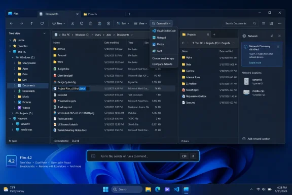
Tree View gives users an expandable hierarchy directly in the sidebar, letting them open and collapse branches without committing the main pane to each location. That sounds almost old-fashioned, because it is. But it is old-fashioned in the same way a physical keyboard is old-fashioned: the interaction model survived because it solves a real problem.
Modern Windows design often trims interfaces down until the first impression is clean and the tenth action is annoying. A hierarchy view is the opposite bet. It accepts visual density in exchange for fewer round trips, fewer back-button taps, and fewer moments where the user loses track of where they are.
For sysadmins and developers, that is not a cosmetic preference. Directory structure is part of the work. A file manager that makes structure visible is not cluttered; it is honest.
That interaction matters because it collapses a multi-step setup into a direct manipulation. Instead of deciding in advance that you want a second pane, creating it, and then navigating it to the right place, you can turn an existing tab into the second pane at the moment you realize you need one. The software gets out of the planning business and enters the flow of work.
The new “Open in other pane” action reinforces that direction. In dual-pane mode, a user can right-click a folder and open it in the opposite pane, with the same action also available through the Command Palette and assignable to a custom shortcut. That is exactly the kind of feature that sounds minor until it becomes muscle memory.
Files 4.2 also refines “Open in new pane” so it no longer immediately creates another pane without asking how it should be arranged. This is small-interface discipline: the app still moves quickly, but it stops assuming that every split-screen decision is identical.
That is not merely faster. It changes the hierarchy of the interface. Context menus are powerful, but they are also hidden drawers; users must remember what is inside them and where each command lives this month. A toolbar flyout makes the action explicit and lets users build a workspace around the things they actually do.
Files also adds a search box to toolbar customization, which is the sort of improvement that only becomes necessary once an app has accumulated enough commands to justify serious personalization. That can be read two ways. The charitable reading is that Files is maturing into a power-user tool. The warning is that power-user tools often bury themselves under their own configurability.
For now, Files seems to be on the right side of that line. Searchable customization is an admission that the app has depth. It is also an attempt to keep that depth from turning into archaeology.
That is a smart compromise between ordinary browsing and deliberate editing. Many users prefer not to see extensions all the time, either for visual cleanliness or because Windows has trained them not to care. But renaming is a different context. During rename, the extension can be the most important part of the filename.
Anyone who has worked with scripts, media files, archives, logs, or config files knows the risk. A hidden extension can turn a simple rename into a small act of guesswork. A visible extension during editing reduces that ambiguity without forcing the user to live with extensions in every normal view.
It is a classic example of context-aware design. Files is not asking users to choose between simplicity and control as a permanent philosophical commitment. It is giving them the right amount of control at the moment control matters.
That is more consequential than it sounds. A file manager that can correct incomplete metadata is not just browsing media; it is participating in library maintenance. For users with music collections, archived recordings, podcasts, local video libraries, or production assets, metadata is how content becomes searchable and understandable over time.
Album artwork management has also been expanded, with support for removing existing album covers from the Properties page. Again, this is not a headline feature in the mass-market sense. But it is a sign that Files is comfortable living in the territory between file browser and asset manager.
Microsoft’s built-in tools often separate these worlds. File Explorer browses. Media apps consume. Tag editors specialize. Files is betting that many users want just enough editing where the files already are.
That turns breadcrumbs from a passive location indicator into an active navigation surface. In many file managers, breadcrumbs are useful for moving upward, but not much else. Files is treating each segment of the path as a potential workspace seed.
This is particularly useful when working inside deeply nested directories. You might be several folders down in a project and suddenly need the parent directory in another pane, the sibling folder in a new tab, or a higher-level directory in a separate window. The new breadcrumb actions reduce the friction between recognizing that need and building the layout around it.
It also fits the larger design language of Files 4.2. Tabs, panes, breadcrumbs, and sidebars are no longer isolated interface elements. They are becoming different entry points into the same workflow: keep context, split context, restore context, and move without losing your place.
That state may include source folders, Downloads, a NAS share, an export directory, a scratch folder, and a project archive. Losing it is not catastrophic, but it is annoying in exactly the way modern software is too often annoying: it forces the user to reconstruct context the computer already had.
Reliable session restore is part of a broader expectation that apps should remember their working shape. Browsers do this. Code editors do this. Terminal apps increasingly do this. File managers should too, because file management is rarely a single-location activity anymore.
Files’ improvement here is therefore not just a bug fix. It is an argument that file browsing is persistent work, not disposable window dressing.
This is a good example of a third-party app smoothing over an operating-system behavior it does not control. Network browsing on Windows can feel opaque, especially when expected devices or shares simply fail to appear. Users are then left to wonder whether the issue is the app, the network, permissions, SMB configuration, firewall rules, or Windows discovery settings.
A banner does not solve all of that. But it narrows the mystery. It tells the user that the missing device may not be missing because Files failed; it may be missing because Windows is not advertising or discovering the environment in the way the user expects.
For administrators, clear state reporting is valuable because it saves time. For home users, it prevents the common spiral of reinstalling apps, rebooting routers, and blaming the wrong layer of the stack.
There are also fixes for pane focus, sidebar drag-and-hover behavior, oversized shortcut overlay icons, Columns View focus, shell flyouts, missing toolbar buttons, command-line launching, and shortcuts not appearing in search results. Individually, these are not dramatic. Collectively, they are the difference between “promising alternative” and “daily driver.”
This is where third-party Windows utilities often struggle. They win users with features Microsoft does not offer, then lose them through paper cuts. Files 4.2 is clearly aimed at reducing those paper cuts, especially around the areas where the app has become more ambitious: panes, tabs, context menus, search, and custom commands.
The more a file manager asks users to trust it with daily work, the less tolerance users have for weird focus bugs or inconsistent menu behavior. A mature file manager is not the one with the longest feature list. It is the one that behaves predictably when the user is moving quickly.
That gives Files room to move faster. It can assume its users want tabs, panes, command palettes, metadata tools, and dense navigation. It can ship a Tree View sidebar without worrying that a billion users will interpret hierarchy as clutter. It can make dual-pane splitting more tactile because its audience is already self-selecting for this kind of control.
Microsoft, meanwhile, has to make File Explorer safe for people who barely know where their Downloads folder is. That does not excuse every omission or rough edge, but it explains why File Explorer evolves in half-steps. Its job is not to delight the top 10 percent of Windows users. Its job is to avoid confusing the bottom 50 percent while not enraging the rest.
This is why Files’ success is healthy for the Windows ecosystem. It does not need to embarrass Microsoft to matter. It only needs to prove that Windows still has room for opinionated desktop software that improves the daily experience without asking permission from the OS vendor.
For users, the choice is straightforward. Those who want the app and want to financially support it can use the Store path. Those who prefer the free build can get it directly. The more interesting point is that Files can exist in both worlds at once.
That dual availability is a reminder that Windows’ software ecosystem has never been one thing. It is Store apps, Win32 holdovers, GitHub projects, commercial utilities, open-source passion projects, enterprise agents, and decades of muscle memory all layered together. Files succeeds precisely because it feels modern without pretending Windows became a locked-down appliance overnight.
It also benefits from Microsoft’s uneven Store history. For years, the Microsoft Store struggled to become the default destination for serious desktop software. Apps like Files show a more pragmatic future: the Store can be a support and distribution option, but it does not have to be the only door.
For that group, the new release lands in exactly the right place. Tree View helps with depth. Drag-to-split helps with comparison and movement. “Open in other pane” helps with speed. Metadata editing helps with collections. Session restore helps with continuity. The Network Discovery banner helps with diagnosis.
The common thread is not novelty. It is reduced interruption. Files 4.2 is an update about fewer detours.
That is a powerful pitch in 2026, when so much desktop software seems determined to interrupt users with accounts, panels, recommendations, AI prompts, redesigned surfaces, and cloud-first assumptions. A file manager that simply helps users move through their own storage more efficiently feels almost rebellious.
 Files Is Winning by Treating File Management as a Workflow Problem
The most revealing thing about Files 4.2 is that its headline features are not flashy. There is no AI copilot, no cloud-storage rebrand, no attempt to turn the humble act of moving files into a subscription funnel. Instead, the update is about navigation, panes, context, restoration, and small bits of polish that make a file manager feel less like a window into storage and more like a working environment.That matters because Windows File Explorer has spent years occupying an awkward position in Microsoft’s design priorities. It is essential enough that almost every Windows user touches it, but foundational enough that Microsoft is careful, sometimes painfully careful, about changing it. The result is a built-in app that has modernized in visible ways while still leaving power users hungry for the kind of spatial, repeatable, keyboard-friendly file management they remember from dedicated tools.
Files has leaned into that gap. Its appeal is not merely that it looks at home on Windows 11, though it does. Its appeal is that it treats the file manager as a place where people work — comparing folders, staging archives, renaming batches of media, jumping between project directories, and keeping several locations alive across a session.
Version 4.2 sharpens that identity. The update does not try to replace Windows itself. It tries to replace the sense that File Explorer is the only reasonable default.
The Sidebar Finally Starts Behaving Like a Map
The new Tree View in the sidebar is the most obvious example of Files moving toward a more serious navigation model. A flat list of pinned locations is useful when your storage life is simple. It becomes inadequate the moment your work lives several levels deep in project folders, source trees, photo libraries, VM directories, or network shares.Tree View gives users an expandable hierarchy directly in the sidebar, letting them open and collapse branches without committing the main pane to each location. That sounds almost old-fashioned, because it is. But it is old-fashioned in the same way a physical keyboard is old-fashioned: the interaction model survived because it solves a real problem.
Modern Windows design often trims interfaces down until the first impression is clean and the tenth action is annoying. A hierarchy view is the opposite bet. It accepts visual density in exchange for fewer round trips, fewer back-button taps, and fewer moments where the user loses track of where they are.
For sysadmins and developers, that is not a cosmetic preference. Directory structure is part of the work. A file manager that makes structure visible is not cluttered; it is honest.
Dual Pane Stops Feeling Like a Mode and Starts Feeling Like a Gesture
Files already had dual-pane functionality, but version 4.2 makes it feel more native to the act of browsing. Users can now drag an existing tab and drop it to the side, top, or bottom of the file area to create a split. A side drop creates a vertical layout; a top or bottom drop creates a horizontal one.That interaction matters because it collapses a multi-step setup into a direct manipulation. Instead of deciding in advance that you want a second pane, creating it, and then navigating it to the right place, you can turn an existing tab into the second pane at the moment you realize you need one. The software gets out of the planning business and enters the flow of work.
The new “Open in other pane” action reinforces that direction. In dual-pane mode, a user can right-click a folder and open it in the opposite pane, with the same action also available through the Command Palette and assignable to a custom shortcut. That is exactly the kind of feature that sounds minor until it becomes muscle memory.
Files 4.2 also refines “Open in new pane” so it no longer immediately creates another pane without asking how it should be arranged. This is small-interface discipline: the app still moves quickly, but it stops assuming that every split-screen decision is identical.
The Toolbar Becomes a Place for Intent, Not Decoration
The new “Open With” flyout on the toolbar is another feature that reveals Files’ priorities. Once users add it through toolbar customization, it provides quick access to apps capable of opening the selected file. It moves a common decision out of the context menu and into a visible, repeatable control.That is not merely faster. It changes the hierarchy of the interface. Context menus are powerful, but they are also hidden drawers; users must remember what is inside them and where each command lives this month. A toolbar flyout makes the action explicit and lets users build a workspace around the things they actually do.
Files also adds a search box to toolbar customization, which is the sort of improvement that only becomes necessary once an app has accumulated enough commands to justify serious personalization. That can be read two ways. The charitable reading is that Files is maturing into a power-user tool. The warning is that power-user tools often bury themselves under their own configurability.
For now, Files seems to be on the right side of that line. Searchable customization is an admission that the app has depth. It is also an attempt to keep that depth from turning into archaeology.
The Rename Fix Is a Tiny Change With Real Consequences
One of the more practical changes in Files 4.2 concerns file extensions during renaming. Previously, users who hid extensions throughout the app would not see them while renaming files. Starting with this release, the extension is always displayed during the rename process.That is a smart compromise between ordinary browsing and deliberate editing. Many users prefer not to see extensions all the time, either for visual cleanliness or because Windows has trained them not to care. But renaming is a different context. During rename, the extension can be the most important part of the filename.
Anyone who has worked with scripts, media files, archives, logs, or config files knows the risk. A hidden extension can turn a simple rename into a small act of guesswork. A visible extension during editing reduces that ambiguity without forcing the user to live with extensions in every normal view.
It is a classic example of context-aware design. Files is not asking users to choose between simplicity and control as a permanent philosophical commitment. It is giving them the right amount of control at the moment control matters.
Metadata Editing Moves Files Closer to a Working Library Tool
Files 4.2 also improves media metadata editing. The app already supported editing fields such as title, artist, album, year, and genre, but the new release removes a limitation that kept users from filling fields that were previously empty. Users can now populate missing metadata rather than merely changing existing entries.That is more consequential than it sounds. A file manager that can correct incomplete metadata is not just browsing media; it is participating in library maintenance. For users with music collections, archived recordings, podcasts, local video libraries, or production assets, metadata is how content becomes searchable and understandable over time.
Album artwork management has also been expanded, with support for removing existing album covers from the Properties page. Again, this is not a headline feature in the mass-market sense. But it is a sign that Files is comfortable living in the territory between file browser and asset manager.
Microsoft’s built-in tools often separate these worlds. File Explorer browses. Media apps consume. Tag editors specialize. Files is betting that many users want just enough editing where the files already are.
Breadcrumbs Become a Launchpad Instead of a Trail of Crumbs
The breadcrumb bar also gets smarter in version 4.2. A chevron now appears after the final breadcrumb for a more consistent visual appearance, but the larger improvement is behavioral: right-clicking any breadcrumb opens a context menu with options to open that location in a new tab, new window, or new pane.That turns breadcrumbs from a passive location indicator into an active navigation surface. In many file managers, breadcrumbs are useful for moving upward, but not much else. Files is treating each segment of the path as a potential workspace seed.
This is particularly useful when working inside deeply nested directories. You might be several folders down in a project and suddenly need the parent directory in another pane, the sibling folder in a new tab, or a higher-level directory in a separate window. The new breadcrumb actions reduce the friction between recognizing that need and building the layout around it.
It also fits the larger design language of Files 4.2. Tabs, panes, breadcrumbs, and sidebars are no longer isolated interface elements. They are becoming different entry points into the same workflow: keep context, split context, restore context, and move without losing your place.
Session Restore Is No Longer a Luxury Feature
The “Continue where you left off” option has been improved so previously opened tabs should restore more reliably and in the correct order between sessions. This is another feature whose importance depends heavily on how someone uses a PC. For a casual user, reopening a few folders may be trivial. For a power user, a file manager session can be a working state.That state may include source folders, Downloads, a NAS share, an export directory, a scratch folder, and a project archive. Losing it is not catastrophic, but it is annoying in exactly the way modern software is too often annoying: it forces the user to reconstruct context the computer already had.
Reliable session restore is part of a broader expectation that apps should remember their working shape. Browsers do this. Code editors do this. Terminal apps increasingly do this. File managers should too, because file management is rarely a single-location activity anymore.
Files’ improvement here is therefore not just a bug fix. It is an argument that file browsing is persistent work, not disposable window dressing.
Network Discovery Gets the Kind of Explanation Windows Often Withholds
Files 4.2 now displays a Network Discovery banner on the Network page whenever Windows has Network Discovery disabled. The banner explains that some network locations may not appear until the Windows setting is enabled.This is a good example of a third-party app smoothing over an operating-system behavior it does not control. Network browsing on Windows can feel opaque, especially when expected devices or shares simply fail to appear. Users are then left to wonder whether the issue is the app, the network, permissions, SMB configuration, firewall rules, or Windows discovery settings.
A banner does not solve all of that. But it narrows the mystery. It tells the user that the missing device may not be missing because Files failed; it may be missing because Windows is not advertising or discovering the environment in the way the user expects.
For administrators, clear state reporting is valuable because it saves time. For home users, it prevents the common spiral of reinstalling apps, rebooting routers, and blaming the wrong layer of the stack.
The Small Fixes Are the Product
The rest of the changelog reads like the kind of maintenance work that rarely gets applause but determines whether users stick around. Fonts in the Windows Fonts folder now show proper thumbnails. New archives are automatically selected after creation. The File In Use dialog adds a Skip button. The Command Palette no longer shows duplicate entries in some cases.There are also fixes for pane focus, sidebar drag-and-hover behavior, oversized shortcut overlay icons, Columns View focus, shell flyouts, missing toolbar buttons, command-line launching, and shortcuts not appearing in search results. Individually, these are not dramatic. Collectively, they are the difference between “promising alternative” and “daily driver.”
This is where third-party Windows utilities often struggle. They win users with features Microsoft does not offer, then lose them through paper cuts. Files 4.2 is clearly aimed at reducing those paper cuts, especially around the areas where the app has become more ambitious: panes, tabs, context menus, search, and custom commands.
The more a file manager asks users to trust it with daily work, the less tolerance users have for weird focus bugs or inconsistent menu behavior. A mature file manager is not the one with the longest feature list. It is the one that behaves predictably when the user is moving quickly.
Microsoft’s File Explorer Problem Is Not That It Lacks Features
The easy reading of Files 4.2 is that it gives Windows users features File Explorer lacks or handles less gracefully. That is true enough, but it undersells the real divide. Microsoft’s File Explorer is constrained by compatibility, habit, enterprise expectations, and the need to serve almost every Windows user on earth. Files is constrained by none of those things to the same degree.That gives Files room to move faster. It can assume its users want tabs, panes, command palettes, metadata tools, and dense navigation. It can ship a Tree View sidebar without worrying that a billion users will interpret hierarchy as clutter. It can make dual-pane splitting more tactile because its audience is already self-selecting for this kind of control.
Microsoft, meanwhile, has to make File Explorer safe for people who barely know where their Downloads folder is. That does not excuse every omission or rough edge, but it explains why File Explorer evolves in half-steps. Its job is not to delight the top 10 percent of Windows users. Its job is to avoid confusing the bottom 50 percent while not enraging the rest.
This is why Files’ success is healthy for the Windows ecosystem. It does not need to embarrass Microsoft to matter. It only needs to prove that Windows still has room for opinionated desktop software that improves the daily experience without asking permission from the OS vendor.
The Paid Store Version and Free Website Version Tell a Familiar Windows Story
Files remains available through the Microsoft Store as a paid version and through the official website as a free download. That split says something about the economics of modern Windows utilities. The Store version offers a way to support development while staying inside Microsoft’s app distribution channel; the website version preserves the open, familiar model of downloading software directly.For users, the choice is straightforward. Those who want the app and want to financially support it can use the Store path. Those who prefer the free build can get it directly. The more interesting point is that Files can exist in both worlds at once.
That dual availability is a reminder that Windows’ software ecosystem has never been one thing. It is Store apps, Win32 holdovers, GitHub projects, commercial utilities, open-source passion projects, enterprise agents, and decades of muscle memory all layered together. Files succeeds precisely because it feels modern without pretending Windows became a locked-down appliance overnight.
It also benefits from Microsoft’s uneven Store history. For years, the Microsoft Store struggled to become the default destination for serious desktop software. Apps like Files show a more pragmatic future: the Store can be a support and distribution option, but it does not have to be the only door.
The Real Competition Is User Patience
Files 4.2 will not make every Windows user abandon File Explorer, and it does not need to. Most users never replace default apps unless the default app repeatedly gets in their way. The audience for Files is narrower but more demanding: users who notice friction, remember better workflows, and are willing to install a tool that respects those instincts.For that group, the new release lands in exactly the right place. Tree View helps with depth. Drag-to-split helps with comparison and movement. “Open in other pane” helps with speed. Metadata editing helps with collections. Session restore helps with continuity. The Network Discovery banner helps with diagnosis.
The common thread is not novelty. It is reduced interruption. Files 4.2 is an update about fewer detours.
That is a powerful pitch in 2026, when so much desktop software seems determined to interrupt users with accounts, panels, recommendations, AI prompts, redesigned surfaces, and cloud-first assumptions. A file manager that simply helps users move through their own storage more efficiently feels almost rebellious.
Files 4.2 Makes Its Case in the Details
The practical read on this release is simple: Files is becoming more useful for people who treat file management as part of their daily workflow rather than an occasional chore. Neowin’s report captures the length of the changelog, but the importance of the update is in how tightly those changes cluster around navigation, multitasking, and continuity.- Files 4.2 adds a Tree View sidebar that makes deeply nested folders easier to browse without constantly changing the main view.
- The update makes dual-pane work faster by letting users drag tabs into split layouts and open folders directly in the opposite pane.
- The new toolbar “Open With” flyout gives users quicker access to alternate apps without relying on the traditional context menu.
- Rename behavior is safer because file extensions are now shown during renaming even when extensions are hidden during normal browsing.
- Media metadata editing is more capable because users can fill empty fields and remove album artwork from the Properties page.
- Reliability fixes around tabs, panes, toolbar buttons, search, command-line launching, and session restore make the app more credible as a daily replacement for File Explorer.
References
- Primary source: Neowin
Published: Sun, 05 Jul 2026 15:46:02 GMT
Popular Windows 11 file manager Files gets a long list of new features and improvements - Neowin
Files, a third-party file management app for Windows 11 and 10, has received its newest update. It brings a lot of changes and improvements. www.neowin.net
- Related coverage: files.community

Files • Announcing Files v4.2
We're excited to announce the general availability of Files v4.2.
files.community
- Related coverage: windowscentral.com
Here are the 6 biggest features and improvements coming to Windows 11 in the June 2026 update on Tuesday | Windows Central
Microsoft's June 2026 Windows 11 update boosts responsiveness, adds Shared Audio, expands NPU metrics, and improves OOBE.www.windowscentral.com - Related coverage: pcworld.com
Windows 11 26H2 is coming: Meet all the new features | PCWorld
Windows 11 26H2 is the next major free update for all Windows users. Among other things, it brings improvements to Explorer, camera control, and AI. Here's an overview.www.pcworld.com - Related coverage: alternativeto.net
Files 4.0.37 reduces package size, boosts home actions, adds 7z options, and improves tabs | AlternativeTo
Files 4.0.37 reduces installer size by over 180 MB, improving download/install times. New features include a right-click menu on the home page, path hints for tabs, sidebar toggle, middle-click scrolling, and new advanced 7z options.alternativeto.net
- Related coverage: dorianexplorer.com
Best File Manager for Windows 11 in 2026: 7 Options Compared
Need a better file manager for Windows 11? These 7 options stand out for speed, tabs, search, dual-pane workflows, and power-user features. dorianexplorer.com
- Related coverage: assets-global.website-files.com
- Related coverage: acmemask.com