

Paul Thurrott published a Windows 11 Field Guide attachment page titled “snap-guide” on Thurrott.com on July 08, 2026, putting Microsoft’s Snap system back in focus as one of Windows 11’s most consequential everyday productivity features. The page itself is slight, but the subject is not. Snap has become the quiet organizing layer beneath Windows 11: part mouse gesture, part keyboard workflow, part app-compatibility contract, and part evidence that Microsoft still sees window management as a competitive advantage. The catch is that the same system that makes multitasking discoverable for ordinary users can also become one more unsolicited overlay for power users who already know where they want their windows to go.
For decades, window management in Windows was mostly a behavior you learned by accident. Drag a window to an edge, it fills half the screen. Drag it to a corner, it occupies a quarter. Press Windows plus an arrow key and the active app moves predictably around the desktop. It was powerful, but it was also invisible until you had either been taught it or discovered it by muscle memory.
Windows 11 changed that by turning Snap from a hidden gesture into a visible interface. Microsoft introduced Snap Layouts, Snap Groups, and Desktops as part of the original Windows 11 pitch in 2021, explicitly framing them as tools for organizing windows and optimizing screen real estate. That positioning matters: Snap was no longer just a resizing trick; it was a first-class answer to the modern PC problem of too many apps, too many browser tabs, too many chats, and too many monitors.
Thurrott’s July 08, 2026 “snap-guide” page lands in that context. It is not a Patch Tuesday bulletin, a security advisory, or a breathless AI announcement. It is a guide artifact attached to the Windows 11 Field Guide’s multitasking coverage, and its importance comes from what that coverage implies: in 2026, understanding Windows 11 means understanding how Microsoft wants users to compose workspaces, not merely launch apps.
That may sound mundane until you watch how people actually work. A lawyer reviewing a PDF while drafting in Word is window managing. A help-desk technician keeping Teams, a ticketing system, Event Viewer, and a browser open is window managing. A student comparing notes, a video lecture, and a chat thread is window managing. Snap is the part of Windows 11 that tries to turn that chaos into a reusable arrangement.
The deeper story is that Microsoft has spent five years making Snap more obvious, more animated, more assistive, and more integrated. Some of those changes are objectively useful. Some are divisive. All of them show a company trying to solve one of the oldest problems in desktop computing without admitting that the desktop itself has become crowded with suggestions, flyouts, and behavioral nudges.
Microsoft’s official support material describes the modern Snap system as a combination of edge dragging, keyboard snapping, Snap Assist, Snap layouts, the Snap flyout, the top Snap bar, and Snap groups. The company’s language is relentlessly productivity-oriented: arrange open windows, use predetermined layouts, fill the rest with Snap Assist, resize adjacent snapped windows without wasting space, and return to a group from the taskbar.
That is the charitable reading, and it is not wrong. A two-window side-by-side layout is still one of the best productivity features ever shipped in a mass-market operating system. The more advanced layouts are genuinely useful on ultrawide displays, external monitors, and higher-resolution laptop screens. The fact that Windows can remember and surface groups also reduces the penalty for switching away from a carefully arranged workspace.
But Windows 11 also made Snap more assertive. As Microsoft documented during the Windows Insider cycle in 2022, dragging a window to the top of the screen could reveal Snap layouts, allowing the user to drop the window into a zone and then use Snap Assist to complete the layout. That change broadened Snap beyond the maximize button and keyboard shortcut. It also put a visible target directly in a place where many users already drag windows for other reasons.
This is where the feature becomes a microcosm of Windows 11 itself. Microsoft’s instinct is often correct: make useful things easier to find. Its execution, however, tends to assume that more visible assistance is always better. Snap shows both sides of that habit in a single gesture.
The table is the story in miniature. Microsoft has not built one Snap feature; it has built a family of overlapping entry points. The question for Windows users is not whether Snap is useful. It is which doorway into Snap respects the way they already work.
That critique is important because it separates Snap from the broader anti-Windows grumbling that surrounds almost every Windows 11 change. The complaint is not that Snap Layouts are useless. It is that the wrong invocation method can make a useful feature feel intrusive. Hovering over the maximize button is intentional. Pressing Windows key + Z is intentional. Accidentally summoning a large layout affordance while dragging a window near the top edge is something else.
Microsoft’s own documentation reinforces the distinction, even if it does not frame it as a controversy. The company says the Snap flyout appears when hovering over the maximize button or pressing Windows key + Z, while the Snap bar appears when dragging a window to the top of the screen. That terminology matters. One is a flyout attached to a control. The other is a screen-edge behavior, and screen edges are some of the most contested real estate in any desktop interface.
Think about what lives at the top of a Windows workspace in 2026. Browser tabs. File Explorer tabs. Custom title bars. Search boxes. App toolbars. Remote desktop session chrome. Virtual machine windows. Collaboration apps with their own sharing controls. The top edge is not empty; it is where applications increasingly put their own navigation and drag targets.
That makes the Snap bar more than a convenience feature. It is a system-level claim on a highly trafficked input zone. For a new user, that claim may be helpful. For an administrator, developer, or longtime Windows user, it can be just another overlay arriving at precisely the moment the user is trying to manipulate something else.
The better way to understand the dispute is not “Snap good” versus “Snap bad.” It is “discovery” versus “agency.” Microsoft wants users to discover layouts without reading a manual. Power users want the OS to stop interpreting every movement as an opportunity to assist. Both positions are defensible, which is why the settings matter.
That distinction is crucial. Users do not have to throw away Snap to quiet down one part of it. They can keep keyboard snapping, keep the maximize-button layout flyout, and disable the top-of-screen layout trigger if it gets in the way. For many people, that is the best Windows 11 compromise: preserve the core productivity benefit while reducing accidental UI interruptions.
This is also where admins and support teams should pay attention. Snap complaints are easy to misdiagnose as generic “Windows 11 annoyance” reports. In reality, users may be objecting to a specific subfeature: the top Snap bar, Snap Assist suggestions, taskbar Snap Group previews, or Edge tab integration in multitasking views. A good support response begins by isolating which behavior is causing friction.
Thurrott’s broader Windows 11 Field Guide coverage, as indexed around the same period, treats Snap features as part of the modern multitasking toolkit alongside Alt + Tab, Task View, Desktops, and Task Manager. That is the right taxonomy. Snap is not merely a visual flourish; it is one layer in a larger switching-and-arranging model. Changing it blindly can alter how users move between tasks.
Enterprise IT should therefore resist two bad instincts. The first is to disable everything because a few vocal users dislike a flyout. The second is to leave all defaults untouched because Snap is “just UI.” Window management defaults shape how people work all day, and small friction repeated hundreds of times becomes real productivity loss.
This is an underappreciated shift. In earlier Windows eras, an app could mostly treat window chrome as its own aesthetic problem. Windows 11 makes the title bar part of a system-level productivity surface. If an app breaks the maximize-button Snap flyout, it does not merely look nonstandard; it opts out of a major Windows 11 workflow.
The minimum-size issue is equally important. Microsoft says an app that can invoke Snap layouts but cannot snap properly may have a minimum window size that is too large for the selected zone. Its guidance calls for supporting a minimum width of at most 500 effective pixels across common screen sizes, with an even smaller minimum width recommended for broader compatibility. That is not a cosmetic recommendation. It is a usability requirement for any app expected to live alongside others on modern displays.
This is where IT departments and software vendors often talk past each other. Users complain that “Snap doesn’t work” with a business app. The vendor says the app launches and resizes within its supported range. Both statements can be true. A window can be technically resizable while still failing the lived reality of Windows 11 multitasking.
Electron apps deserve special mention because they have historically been heavy users of custom title bars. Microsoft’s guidance points Electron developers toward versions that support Snap layouts. The implication is simple: if an app replaces standard window chrome, it inherits responsibility for preserving standard window behaviors. Branding does not excuse breaking the desktop.
For organizations with internal apps, Snap testing should be part of Windows 11 readiness, not a post-rollout annoyance. Hover over the maximize button. Press Windows key + Z. Drag the window into common zones. Try side-by-side, thirds, quadrants, portrait orientation, laptop display, external monitor, and docking scenarios. If the app’s minimum width ruins common layouts, file it as a usability defect.
The reason is practical. Windows 11 users increasingly expect apps to behave like good citizens in a composed workspace. Apps that resist snapping, refuse useful minimum sizes, or hide caption behavior behind custom chrome feel old in a very specific way: not visually old, but operationally old.
That is subtly powerful because it acknowledges that multitasking is not just about arranging windows; it is about recovering context. The productivity loss is not only the time spent resizing windows. It is the mental tax of remembering which windows belonged together and reassembling them after checking email, joining a meeting, or opening a full-screen app.
A good Snap Group is closer to a temporary workspace than a layout. It says: these two or three apps were part of the same task. Bring them back together. That is the same problem virtual desktops try to solve at a larger scale, but Snap Groups operate with less ceremony. They are small, task-shaped, and disposable.
This is why the feature deserves more serious treatment in admin and user training. Many users know how to put two windows side by side. Fewer understand that the taskbar can preserve and expose that arrangement as a group. Even fewer know how Snap, Task View, Alt + Tab, and Desktops overlap. The result is that Windows 11 contains a fairly rich workspace model that many users experience only as isolated tricks.
There is also a strategic point here. Apple added more visible window-management features to macOS in recent years, and third-party tiling tools remain popular across desktop platforms. Microsoft’s advantage is that Snap is built into Windows, broadly available, and integrated into the shell. Its disadvantage is that Windows carries decades of compatibility baggage and user expectations. A feature that delights one user may disrupt another’s muscle memory.
Snap Groups show Microsoft at its best because they add value without demanding much attention. They do not ask the user to adopt a new app, sign into a service, or accept an AI prompt. They simply preserve a work arrangement and make it easier to return. In a Windows era often criticized for recommendations and upsells, that kind of quiet usefulness stands out.
That convergence is good for documentation and support. If Windows 11’s supported releases behave similarly, guides can focus less on version archaeology and more on how the system works now. For users, it means the Snap guidance they read in 2026 is less likely to be tied to one narrow release train. For admins, it reduces the nightmare of explaining that a feature exists on one Windows 11 machine but not another.
But the same period has also produced growing fatigue with Windows 11 overlays and suggestions. Windows Central’s February 2026 critique paired the top Snap Assist flyout with another drag-related suggestion surface and argued that Microsoft’s additions can make the operating system feel busier rather than better. That criticism resonates because it points to a pattern, not a single checkbox.
Microsoft is trying to make Windows helpful at the moment of action. Drag a window, it suggests a layout. Drag a file, it may suggest a sharing target. Open Start, it may suggest apps or content. Use search, it may blend local, web, and promotional experiences. Each individual idea can be defended. The cumulative effect can feel like an operating system constantly raising its hand.
Snap is fortunate because it has a strong underlying case. Unlike some Windows 11 additions, it solves a daily problem and has a long lineage in Windows behavior. The risk is that Microsoft’s most intrusive Snap entry points could taint the reputation of the whole system. If users associate Snap with surprise flyouts rather than deliberate layout control, Microsoft will have squandered one of Windows 11’s best productivity stories.
The solution is not to retreat to Windows 7 minimalism. Modern screens are larger, app workloads are more complex, and touch devices require more visible affordances than mouse-only desktops did. The solution is progressive disclosure with genuine respect for user intent: show the feature when asked, teach it clearly, and let users silence the parts that misfire.
February 16, 2022 — Microsoft announced an Insider Preview build that added a new way to invoke Snap layouts by dragging a window to the top of the screen, with mouse and touch in mind.
September 28, 2023 — Microsoft’s Windows Learning Center published consumer guidance explaining Snap layouts, Snap groups, Windows key + Z, maximize-button hover, and top-center dragging.
February 24, 2026 — Windows Central criticized the top-of-screen Snap Assist flyout as one of the Windows 11 additions that can interrupt established workflows.
June 14, 2026 — Thurrott.com’s Windows 11 Field Guide overview described Snap layouts, Snap suggestions, and Snap groups as part of Windows 11’s refined multitasking toolkit.
July 08, 2026 — Thurrott.com published the “snap-guide” attachment page by Paul Thurrott, tying the Snap topic to the Windows 11 Field Guide’s multitasking coverage.
On a 13- or 14-inch laptop, manual resizing is tedious. Two windows side by side can be useful, but only if the apps tolerate narrow widths. Three-window arrangements may be unrealistic unless the display scaling and app design cooperate. This is where Microsoft’s effective-pixel guidance for developers becomes visible to ordinary users. If an app refuses to shrink, it breaks the laptop multitasking model first.
Touch and convertible devices complicate the picture further. The top Snap bar makes more sense when viewed as a touch-friendly target. Hovering over a maximize button is a mouse behavior. Keyboard shortcuts are great for keyboard users. Dragging a window to a visible top target is easier to teach on a tablet-like PC. Microsoft’s 2022 language explicitly connected the improved Snap Layouts behavior to both touch and mouse.
That does not eliminate the annoyance for traditional users, but it explains why Microsoft made the choice. Windows is trying to serve laptop touchscreens, desktop workstations, tablets, remote sessions, and multi-monitor docking setups with one shell. Snap is one of the places where those constituencies collide.
Docking is the hidden stress test. A worker may use a laptop alone in the morning, dock into two monitors at the office, undock for a meeting, and reconnect later. In that life, window placement is not decorative. It is continuity. Snap, Snap Groups, and related multi-monitor behaviors can reduce the sense that every hardware transition requires rebuilding the workspace from scratch.
That is why admins should test Snap across real work patterns, not just default images. The executive with a single ultrawide monitor, the developer with three displays, the field worker on a touchscreen laptop, and the call-center employee in a locked-down app stack will not experience the same Snap system. A one-size-fits-all opinion about the feature is less useful than a baseline with documented exceptions.
That is the standard Microsoft should apply as it continues refining Windows 11. The best shell features are not the ones that demonstrate themselves constantly. They are the ones that become part of the user’s motion. Alt + Tab survived because it is fast, predictable, and user-initiated. Snap’s older edge and keyboard behaviors have the same virtue. The newer visual layers need to earn that trust.
There is a lesson here for the rest of Windows 11. Microsoft often seems anxious that users will miss features unless the OS surfaces them aggressively. Sometimes that anxiety is justified; hidden power is wasted power. But visibility is not the same as usefulness, and repeated interruption is not the same as teaching. Snap works best when it gives users a clean path from intention to arrangement.
Thurrott’s “snap-guide” artifact is therefore a useful reminder, even if the page itself is just one small piece of a larger field guide. The Windows 11 story in 2026 is not only about Copilot, Arm processors, annual feature releases, or security baselines. It is also about whether the operating system’s ordinary motions feel controlled. Moving a window is one of the most ordinary motions of all.
Then they should tune the noisy parts. If the top Snap bar appears when they do not want it, turn that trigger off. If Snap Assist suggestions are useful, keep them. If taskbar group previews help recover workspaces, keep them. If Edge tabs in switching views create clutter, adjust the multitasking settings accordingly. The point is to make Windows respect the user’s workflow, not force the user into Microsoft’s demo script.
For developers, the read is even simpler. A Windows 11 app that does not Snap well feels unfinished. Support standard caption behavior when possible. If using a custom title bar, preserve the maximize-button contract. Test real Snap zones. Reduce minimum widths where the app design allows. Treat window management as part of the app experience, not a shell feature outside your responsibility.
For admins, the lesson is to operationalize the preference. Include Snap in onboarding. Include it in app testing. Include it in help-desk scripts. Include it in the Windows 11 migration conversation. The cost is small, and the payoff is a desktop that feels less chaotic.
The danger is that Microsoft will continue confusing discoverability with insistence. Snap Layouts, Snap Assist, and Snap Groups are strong enough not to need constant ambushes. They need clarity, consistency, and settings that remain easy to find. Windows 11 users are not hostile to help; they are hostile to help that arrives uninvited.
A concise read of the current state looks like this:
If Windows 11’s next few years are defined by more AI surfaces, more cloud hooks, and more attempts to predict user intent, Snap should be the feature Microsoft studies before adding another overlay: make the useful thing visible, make the deliberate path fast, make the accidental path optional, and remember that the desktop is most powerful when the user—not the operating system—decides what belongs on the screen.
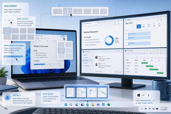 Snap Is No Longer a Shortcut; It Is Windows 11’s Work Surface
For decades, window management in Windows was mostly a behavior you learned by accident. Drag a window to an edge, it fills half the screen. Drag it to a corner, it occupies a quarter. Press Windows plus an arrow key and the active app moves predictably around the desktop. It was powerful, but it was also invisible until you had either been taught it or discovered it by muscle memory.Windows 11 changed that by turning Snap from a hidden gesture into a visible interface. Microsoft introduced Snap Layouts, Snap Groups, and Desktops as part of the original Windows 11 pitch in 2021, explicitly framing them as tools for organizing windows and optimizing screen real estate. That positioning matters: Snap was no longer just a resizing trick; it was a first-class answer to the modern PC problem of too many apps, too many browser tabs, too many chats, and too many monitors.
Thurrott’s July 08, 2026 “snap-guide” page lands in that context. It is not a Patch Tuesday bulletin, a security advisory, or a breathless AI announcement. It is a guide artifact attached to the Windows 11 Field Guide’s multitasking coverage, and its importance comes from what that coverage implies: in 2026, understanding Windows 11 means understanding how Microsoft wants users to compose workspaces, not merely launch apps.
That may sound mundane until you watch how people actually work. A lawyer reviewing a PDF while drafting in Word is window managing. A help-desk technician keeping Teams, a ticketing system, Event Viewer, and a browser open is window managing. A student comparing notes, a video lecture, and a chat thread is window managing. Snap is the part of Windows 11 that tries to turn that chaos into a reusable arrangement.
The deeper story is that Microsoft has spent five years making Snap more obvious, more animated, more assistive, and more integrated. Some of those changes are objectively useful. Some are divisive. All of them show a company trying to solve one of the oldest problems in desktop computing without admitting that the desktop itself has become crowded with suggestions, flyouts, and behavioral nudges.
Microsoft Turned Discovery Into a Product Feature
The original Windows 11 Snap Layouts design solved a real discoverability problem. Hover over the maximize button, and Windows exposes layout choices. Press Windows key + Z, and the same idea appears through the keyboard. Choose a zone, and Snap Assist offers other open windows to fill the remaining slots. The mechanism is simple enough for casual users and fast enough for those who learn the shortcut.Microsoft’s official support material describes the modern Snap system as a combination of edge dragging, keyboard snapping, Snap Assist, Snap layouts, the Snap flyout, the top Snap bar, and Snap groups. The company’s language is relentlessly productivity-oriented: arrange open windows, use predetermined layouts, fill the rest with Snap Assist, resize adjacent snapped windows without wasting space, and return to a group from the taskbar.
That is the charitable reading, and it is not wrong. A two-window side-by-side layout is still one of the best productivity features ever shipped in a mass-market operating system. The more advanced layouts are genuinely useful on ultrawide displays, external monitors, and higher-resolution laptop screens. The fact that Windows can remember and surface groups also reduces the penalty for switching away from a carefully arranged workspace.
But Windows 11 also made Snap more assertive. As Microsoft documented during the Windows Insider cycle in 2022, dragging a window to the top of the screen could reveal Snap layouts, allowing the user to drop the window into a zone and then use Snap Assist to complete the layout. That change broadened Snap beyond the maximize button and keyboard shortcut. It also put a visible target directly in a place where many users already drag windows for other reasons.
This is where the feature becomes a microcosm of Windows 11 itself. Microsoft’s instinct is often correct: make useful things easier to find. Its execution, however, tends to assume that more visible assistance is always better. Snap shows both sides of that habit in a single gesture.
| Snap entry point | How it works | Best fit | Practical tradeoff |
|---|---|---|---|
| Edge or corner drag | Drag a window to a screen edge or corner to resize it into a side or quarter position | Fast two-window or four-window arrangements | Discoverable only if the user already knows the gesture |
| Maximize-button flyout | Hover over the maximize button and choose a predefined layout | Deliberate layout selection with the mouse | Depends on app title-bar behavior and caption-button support |
| Windows key + Z | Press the keyboard shortcut to invoke Snap layouts | Power users and keyboard-first workflows | Efficient, but still requires knowing the shortcut |
| Top-of-screen Snap bar | Drag a window toward the top of the screen and choose a layout | Touch, pen, and users who benefit from visual targets | Can interrupt users who were merely moving or maximizing a window |
The Top Edge Became the New Battlefield
The most controversial part of modern Snap is not the layout grid itself. It is the top-of-screen behavior. Windows Central argued earlier in 2026 that the Snap Assist flyout that appears when dragging a window to the top of the screen can feel less like help and more like interference, especially for experienced users who already rely on older drag and keyboard habits.That critique is important because it separates Snap from the broader anti-Windows grumbling that surrounds almost every Windows 11 change. The complaint is not that Snap Layouts are useless. It is that the wrong invocation method can make a useful feature feel intrusive. Hovering over the maximize button is intentional. Pressing Windows key + Z is intentional. Accidentally summoning a large layout affordance while dragging a window near the top edge is something else.
Microsoft’s own documentation reinforces the distinction, even if it does not frame it as a controversy. The company says the Snap flyout appears when hovering over the maximize button or pressing Windows key + Z, while the Snap bar appears when dragging a window to the top of the screen. That terminology matters. One is a flyout attached to a control. The other is a screen-edge behavior, and screen edges are some of the most contested real estate in any desktop interface.
Think about what lives at the top of a Windows workspace in 2026. Browser tabs. File Explorer tabs. Custom title bars. Search boxes. App toolbars. Remote desktop session chrome. Virtual machine windows. Collaboration apps with their own sharing controls. The top edge is not empty; it is where applications increasingly put their own navigation and drag targets.
That makes the Snap bar more than a convenience feature. It is a system-level claim on a highly trafficked input zone. For a new user, that claim may be helpful. For an administrator, developer, or longtime Windows user, it can be just another overlay arriving at precisely the moment the user is trying to manipulate something else.
The better way to understand the dispute is not “Snap good” versus “Snap bad.” It is “discovery” versus “agency.” Microsoft wants users to discover layouts without reading a manual. Power users want the OS to stop interpreting every movement as an opportunity to assist. Both positions are defensible, which is why the settings matter.
The Settings Page Is the Real Power Feature
The most important practical fact about Snap in Windows 11 is that it is configurable. Microsoft’s support guidance points users to Settings > System > Multitasking, where Snap windows can be turned on or off and related checkboxes can be adjusted. Windows Central’s 2026 coverage highlighted the same path for disabling the top Snap tray while keeping more deliberate snapping paths intact.That distinction is crucial. Users do not have to throw away Snap to quiet down one part of it. They can keep keyboard snapping, keep the maximize-button layout flyout, and disable the top-of-screen layout trigger if it gets in the way. For many people, that is the best Windows 11 compromise: preserve the core productivity benefit while reducing accidental UI interruptions.
This is also where admins and support teams should pay attention. Snap complaints are easy to misdiagnose as generic “Windows 11 annoyance” reports. In reality, users may be objecting to a specific subfeature: the top Snap bar, Snap Assist suggestions, taskbar Snap Group previews, or Edge tab integration in multitasking views. A good support response begins by isolating which behavior is causing friction.
Thurrott’s broader Windows 11 Field Guide coverage, as indexed around the same period, treats Snap features as part of the modern multitasking toolkit alongside Alt + Tab, Task View, Desktops, and Task Manager. That is the right taxonomy. Snap is not merely a visual flourish; it is one layer in a larger switching-and-arranging model. Changing it blindly can alter how users move between tasks.
Enterprise IT should therefore resist two bad instincts. The first is to disable everything because a few vocal users dislike a flyout. The second is to leave all defaults untouched because Snap is “just UI.” Window management defaults shape how people work all day, and small friction repeated hundreds of times becomes real productivity loss.
Action checklist for admins
- Test the Windows 11 Snap defaults on representative laptop, desktop, ultrawide, docking, and multi-monitor setups before changing policy or guidance.
- Document the user-facing path for Snap controls: Settings > System > Multitasking > Snap windows.
- If users complain about the top-of-screen tray, disable only the option that shows Snap layouts when dragging a window to the top of the screen, rather than disabling Snap entirely.
- Validate internal Win32, WPF, WinUI, Electron, and line-of-business apps with the maximize-button Snap flyout.
- Ask developers of custom-title-bar apps to verify maximize-button hit testing and minimum window widths against Microsoft’s Snap guidance.
- Include Snap behavior in Windows 11 onboarding materials so users learn Windows key + Z, taskbar Snap Groups, and resizing snapped windows deliberately.
Developers Are Part of the Snap Contract Now
Snap is not only a user feature. It is also an application compatibility requirement. Microsoft’s developer documentation makes clear that most apps with a standard maximize caption button will automatically show Snap layouts, but some desktop apps with custom title bars or customized caption buttons may not. For Win32 apps, Microsoft points developers toward proper handling of non-client hit testing for the maximize button; for other app stacks, it recommends platform-supported windowing patterns.This is an underappreciated shift. In earlier Windows eras, an app could mostly treat window chrome as its own aesthetic problem. Windows 11 makes the title bar part of a system-level productivity surface. If an app breaks the maximize-button Snap flyout, it does not merely look nonstandard; it opts out of a major Windows 11 workflow.
The minimum-size issue is equally important. Microsoft says an app that can invoke Snap layouts but cannot snap properly may have a minimum window size that is too large for the selected zone. Its guidance calls for supporting a minimum width of at most 500 effective pixels across common screen sizes, with an even smaller minimum width recommended for broader compatibility. That is not a cosmetic recommendation. It is a usability requirement for any app expected to live alongside others on modern displays.
This is where IT departments and software vendors often talk past each other. Users complain that “Snap doesn’t work” with a business app. The vendor says the app launches and resizes within its supported range. Both statements can be true. A window can be technically resizable while still failing the lived reality of Windows 11 multitasking.
Electron apps deserve special mention because they have historically been heavy users of custom title bars. Microsoft’s guidance points Electron developers toward versions that support Snap layouts. The implication is simple: if an app replaces standard window chrome, it inherits responsibility for preserving standard window behaviors. Branding does not excuse breaking the desktop.
For organizations with internal apps, Snap testing should be part of Windows 11 readiness, not a post-rollout annoyance. Hover over the maximize button. Press Windows key + Z. Drag the window into common zones. Try side-by-side, thirds, quadrants, portrait orientation, laptop display, external monitor, and docking scenarios. If the app’s minimum width ruins common layouts, file it as a usability defect.
The reason is practical. Windows 11 users increasingly expect apps to behave like good citizens in a composed workspace. Apps that resist snapping, refuse useful minimum sizes, or hide caption behavior behind custom chrome feel old in a very specific way: not visually old, but operationally old.
Snap Groups Are the Feature Microsoft Still Undersells
Snap Layouts get the attention because they are visible. Snap Groups may be the more important long-term idea. A Snap Group lets users return to a set of arranged windows from the taskbar rather than rebuilding the arrangement after switching away. In Microsoft’s framing, a group forms when windows are arranged in a layout and can later be selected as a unit.That is subtly powerful because it acknowledges that multitasking is not just about arranging windows; it is about recovering context. The productivity loss is not only the time spent resizing windows. It is the mental tax of remembering which windows belonged together and reassembling them after checking email, joining a meeting, or opening a full-screen app.
A good Snap Group is closer to a temporary workspace than a layout. It says: these two or three apps were part of the same task. Bring them back together. That is the same problem virtual desktops try to solve at a larger scale, but Snap Groups operate with less ceremony. They are small, task-shaped, and disposable.
This is why the feature deserves more serious treatment in admin and user training. Many users know how to put two windows side by side. Fewer understand that the taskbar can preserve and expose that arrangement as a group. Even fewer know how Snap, Task View, Alt + Tab, and Desktops overlap. The result is that Windows 11 contains a fairly rich workspace model that many users experience only as isolated tricks.
There is also a strategic point here. Apple added more visible window-management features to macOS in recent years, and third-party tiling tools remain popular across desktop platforms. Microsoft’s advantage is that Snap is built into Windows, broadly available, and integrated into the shell. Its disadvantage is that Windows carries decades of compatibility baggage and user expectations. A feature that delights one user may disrupt another’s muscle memory.
Snap Groups show Microsoft at its best because they add value without demanding much attention. They do not ask the user to adopt a new app, sign into a service, or accept an AI prompt. They simply preserve a work arrangement and make it easier to return. In a Windows era often criticized for recommendations and upsells, that kind of quiet usefulness stands out.
The 2026 Context: Windows 11 Has More Multitasking, but Also More Noise
By 2026, Windows 11 is a mature operating system with a multitasking stack that is richer than the one it launched with. Thurrott’s broader Windows 11 Field Guide overview describes a platform whose supported versions are increasingly aligned in feature terms, with multitasking tools including Alt + Tab, Task View, Desktops, Snap layouts, Snap suggestions, Snap groups, and updated low-level tools such as Task Manager.That convergence is good for documentation and support. If Windows 11’s supported releases behave similarly, guides can focus less on version archaeology and more on how the system works now. For users, it means the Snap guidance they read in 2026 is less likely to be tied to one narrow release train. For admins, it reduces the nightmare of explaining that a feature exists on one Windows 11 machine but not another.
But the same period has also produced growing fatigue with Windows 11 overlays and suggestions. Windows Central’s February 2026 critique paired the top Snap Assist flyout with another drag-related suggestion surface and argued that Microsoft’s additions can make the operating system feel busier rather than better. That criticism resonates because it points to a pattern, not a single checkbox.
Microsoft is trying to make Windows helpful at the moment of action. Drag a window, it suggests a layout. Drag a file, it may suggest a sharing target. Open Start, it may suggest apps or content. Use search, it may blend local, web, and promotional experiences. Each individual idea can be defended. The cumulative effect can feel like an operating system constantly raising its hand.
Snap is fortunate because it has a strong underlying case. Unlike some Windows 11 additions, it solves a daily problem and has a long lineage in Windows behavior. The risk is that Microsoft’s most intrusive Snap entry points could taint the reputation of the whole system. If users associate Snap with surprise flyouts rather than deliberate layout control, Microsoft will have squandered one of Windows 11’s best productivity stories.
The solution is not to retreat to Windows 7 minimalism. Modern screens are larger, app workloads are more complex, and touch devices require more visible affordances than mouse-only desktops did. The solution is progressive disclosure with genuine respect for user intent: show the feature when asked, teach it clearly, and let users silence the parts that misfire.
Timeline
June 24, 2021 — Microsoft introduced Windows 11 and presented Snap Layouts, Snap Groups, and Desktops as core features for organizing windows and improving multitasking.February 16, 2022 — Microsoft announced an Insider Preview build that added a new way to invoke Snap layouts by dragging a window to the top of the screen, with mouse and touch in mind.
September 28, 2023 — Microsoft’s Windows Learning Center published consumer guidance explaining Snap layouts, Snap groups, Windows key + Z, maximize-button hover, and top-center dragging.
February 24, 2026 — Windows Central criticized the top-of-screen Snap Assist flyout as one of the Windows 11 additions that can interrupt established workflows.
June 14, 2026 — Thurrott.com’s Windows 11 Field Guide overview described Snap layouts, Snap suggestions, and Snap groups as part of Windows 11’s refined multitasking toolkit.
July 08, 2026 — Thurrott.com published the “snap-guide” attachment page by Paul Thurrott, tying the Snap topic to the Windows 11 Field Guide’s multitasking coverage.
Why This Matters More on Laptops Than Desktops
Snap is often demonstrated on large monitors because that is where the layouts look most impressive. Three columns, asymmetrical arrangements, and task-specific groupings all make sense on a 27-inch display or an ultrawide. But the feature may matter even more on laptops, where screen space is constrained and users constantly trade between focus and context.On a 13- or 14-inch laptop, manual resizing is tedious. Two windows side by side can be useful, but only if the apps tolerate narrow widths. Three-window arrangements may be unrealistic unless the display scaling and app design cooperate. This is where Microsoft’s effective-pixel guidance for developers becomes visible to ordinary users. If an app refuses to shrink, it breaks the laptop multitasking model first.
Touch and convertible devices complicate the picture further. The top Snap bar makes more sense when viewed as a touch-friendly target. Hovering over a maximize button is a mouse behavior. Keyboard shortcuts are great for keyboard users. Dragging a window to a visible top target is easier to teach on a tablet-like PC. Microsoft’s 2022 language explicitly connected the improved Snap Layouts behavior to both touch and mouse.
That does not eliminate the annoyance for traditional users, but it explains why Microsoft made the choice. Windows is trying to serve laptop touchscreens, desktop workstations, tablets, remote sessions, and multi-monitor docking setups with one shell. Snap is one of the places where those constituencies collide.
Docking is the hidden stress test. A worker may use a laptop alone in the morning, dock into two monitors at the office, undock for a meeting, and reconnect later. In that life, window placement is not decorative. It is continuity. Snap, Snap Groups, and related multi-monitor behaviors can reduce the sense that every hardware transition requires rebuilding the workspace from scratch.
That is why admins should test Snap across real work patterns, not just default images. The executive with a single ultrawide monitor, the developer with three displays, the field worker on a touchscreen laptop, and the call-center employee in a locked-down app stack will not experience the same Snap system. A one-size-fits-all opinion about the feature is less useful than a baseline with documented exceptions.
The Best Windows Features Eventually Disappear
The highest compliment for Snap would be that users stop noticing it. A good layout should feel like the screen did what the user meant. A good Snap Group should reappear before the user has time to resent switching contexts. A good app should expose the maximize-button flyout without requiring anyone to know what non-client hit testing is.That is the standard Microsoft should apply as it continues refining Windows 11. The best shell features are not the ones that demonstrate themselves constantly. They are the ones that become part of the user’s motion. Alt + Tab survived because it is fast, predictable, and user-initiated. Snap’s older edge and keyboard behaviors have the same virtue. The newer visual layers need to earn that trust.
There is a lesson here for the rest of Windows 11. Microsoft often seems anxious that users will miss features unless the OS surfaces them aggressively. Sometimes that anxiety is justified; hidden power is wasted power. But visibility is not the same as usefulness, and repeated interruption is not the same as teaching. Snap works best when it gives users a clean path from intention to arrangement.
Thurrott’s “snap-guide” artifact is therefore a useful reminder, even if the page itself is just one small piece of a larger field guide. The Windows 11 story in 2026 is not only about Copilot, Arm processors, annual feature releases, or security baselines. It is also about whether the operating system’s ordinary motions feel controlled. Moving a window is one of the most ordinary motions of all.
The Practical Read for Windows Users
The smart response to Snap in 2026 is selective adoption, not blanket praise or blanket rejection. Users should learn the deliberate controls first: Windows key + Z, maximize-button hover, side and corner snapping, Snap Assist selection, and taskbar Snap Groups. Those features deliver most of the benefit with the least surprise.Then they should tune the noisy parts. If the top Snap bar appears when they do not want it, turn that trigger off. If Snap Assist suggestions are useful, keep them. If taskbar group previews help recover workspaces, keep them. If Edge tabs in switching views create clutter, adjust the multitasking settings accordingly. The point is to make Windows respect the user’s workflow, not force the user into Microsoft’s demo script.
For developers, the read is even simpler. A Windows 11 app that does not Snap well feels unfinished. Support standard caption behavior when possible. If using a custom title bar, preserve the maximize-button contract. Test real Snap zones. Reduce minimum widths where the app design allows. Treat window management as part of the app experience, not a shell feature outside your responsibility.
For admins, the lesson is to operationalize the preference. Include Snap in onboarding. Include it in app testing. Include it in help-desk scripts. Include it in the Windows 11 migration conversation. The cost is small, and the payoff is a desktop that feels less chaotic.
The Part Microsoft Got Right Is Still Worth Defending
Snap deserves a defense because it represents something Windows still does better than almost any mainstream platform: flexible, mixed-mode multitasking for messy real work. It accommodates mouse users, keyboard users, touch users, laptop users, external-monitor users, and people who are juggling too many applications because their jobs require it. That breadth is hard to design for, and Microsoft has spent years iterating toward a system ordinary users can actually discover.The danger is that Microsoft will continue confusing discoverability with insistence. Snap Layouts, Snap Assist, and Snap Groups are strong enough not to need constant ambushes. They need clarity, consistency, and settings that remain easy to find. Windows 11 users are not hostile to help; they are hostile to help that arrives uninvited.
A concise read of the current state looks like this:
- Snap Layouts are one of Windows 11’s most useful daily productivity features, especially when invoked deliberately.
- The top-of-screen Snap bar is helpful for some users and disruptive for others, which makes its setting essential.
- Snap Groups are underused because Microsoft has not taught them as clearly as it has shown the layout grid.
- App developers can break or improve the Snap experience through title-bar choices and minimum window sizes.
- Admins should treat Snap configuration and education as part of Windows 11 deployment quality, not cosmetic polish.
- The best setup for many power users is not “Snap off,” but “Snap on, noisy triggers off.”
If Windows 11’s next few years are defined by more AI surfaces, more cloud hooks, and more attempts to predict user intent, Snap should be the feature Microsoft studies before adding another overlay: make the useful thing visible, make the deliberate path fast, make the accidental path optional, and remember that the desktop is most powerful when the user—not the operating system—decides what belongs on the screen.
References
- Primary source: thurrott.com
Published: 2026-07-08T22:10:18.008802
snap-guide - Thurrott.com
 www.thurrott.com
- Official source: support.microsoft.com
Snap Your Windows | Microsoft Support
Discover the power of the Snap feature in Windows, designed to enhance your multitasking and productivity. The Snap feature allows you to quickly resize and position windows on your screen by dragging them to the edges or corners. With Snap, you can easily organize multiple windows, making it...support.microsoft.com - Official source: learn.microsoft.com
Support snap layouts for desktop apps on Windows 11 - Windows apps | Microsoft Learn
Support the snap layouts menu in your desktop application.learn.microsoft.com - Official source: microsoft.com
How to Use Snap Layouts | Microsoft Windows
Organize your screen with Snap layouts in Windows 11. From multitasking on calls to optimizing research, Snap layouts help make screen time more productive.www.microsoft.com
- Official source: blogs.windows.com
Introducing Windows 11
At a time when the PC is playing a more central role in our lives, Windows 11 is designed to bring you closer to what you love.blogs.windows.com - Related coverage: ed.ac.uk
- Related coverage: ineasysteps.com
- Related coverage: squareplanit.com
- Related coverage: windowscentral.com
Two new Windows 11 features are frustrating users | Windows Central
Windows 11 keeps adding features, but not all of them improve productivity. Here's why the Snap Assist and Drag Tray flyouts miss the mark.www.windowscentral.com - Related coverage: techradar.com