

Microsoft on May 28, 2026 announced a redesign of Microsoft 365 Copilot across its standalone app and Office apps, replacing the static prompt line with a task-aware workspace and adding a more consistent Copilot entry point in Word, Excel, PowerPoint, and Outlook. The company is pitching the update as a quieter, faster, more context-sensitive way to make AI useful without turning every document into a billboard for AI. That framing matters because Copilot’s biggest problem has never been only intelligence; it has been interruption. Microsoft is now trying to make Copilot feel less like a pop-up and more like infrastructure.
The obvious reading of the redesign is that Microsoft has cleaned up Copilot’s interface. The more interesting reading is that Microsoft has accepted a complaint many users have been making for the last two years: AI that constantly announces itself can become another productivity tax.
Copilot’s first era was defined by presence. It appeared in Windows, Edge, Office, Teams, the taskbar, mobile apps, search boxes, sidebars, and branding exercises that sometimes seemed to rename the Microsoft 365 universe around a single word. That strategy made sense if the goal was awareness. It made less sense once people had to live with the thing all day.
The new Microsoft 365 Copilot design is a response to that tension. Microsoft is not backing away from Copilot; it is trying to make Copilot less visually needy. The assistant is being redesigned around progressive disclosure, the old interface idea that simple surfaces should reveal deeper controls only when the user’s intent requires them.
That sounds like design-school language, but in practice it is the difference between a tool that feels like a helpful editor and one that feels like Clippy with cloud compute. Microsoft is still betting heavily on AI in productivity software. It is just learning that the interface has to whisper before the model can speak.
That is more important than it sounds. The first generation of AI chat interfaces trained users to think in single-shot commands: ask a question, wait, revise, repeat. But office work is rarely that tidy. A useful Copilot prompt may include pasted notes, a half-written paragraph, a meeting summary, formatting constraints, and a desired output format.
By making the prompt area roomier and more document-like, Microsoft is implicitly admitting that prompting is itself a kind of work. If Copilot is supposed to help with messy tasks, the input surface cannot feel like a search box from 2008. It has to tolerate rough material before it can produce polished output.
The redesign also gives Copilot room to surface tools and controls underneath the prompt based on the task at hand. If the user is doing something simple, the interface can stay sparse. If the user is preparing a complex document, data analysis, or presentation, Copilot can expose more options without dumping the entire toolbox onto the screen.
That is the right direction. The risk is that “contextual” controls can become a new kind of clutter if Microsoft guesses wrong. A quiet assistant that appears at the right time is useful; a quiet assistant that repeatedly misreads intent is merely a slower nuisance.
That is a bigger move than a cosmetic refresh. Microsoft is trying to collapse the distance between asking for help and applying the result. In the old model, the user asked Copilot for a draft, copied or accepted part of the output, then manually repaired what did not fit. In the newer model, Copilot is supposed to operate closer to the canvas itself: the paragraph, slide, spreadsheet cell, or email thread where the work is already happening.
This is where the “agentic” language enters. Microsoft is increasingly dividing Copilot into capability-focused agents such as Designer, Researcher, and app-specific assistants for Word, Excel, and PowerPoint. The pitch is that these agents are not generic chat personalities; they are role-based helpers that can take action within the app.
For WindowsForum readers, the distinction matters because it changes how administrators and users should evaluate Copilot. The question is no longer simply whether the chatbot gives a good answer. The question is whether an AI layer that can read context, propose edits, and potentially act inside business documents is governed well enough to trust.
That makes the interface part of the security model. Clear signals about what Copilot is seeing, what it is using, and what it is changing are not decorative niceties. They are the difference between assisted work and opaque automation.
That hybrid model is telling. Microsoft has tried several forms for Copilot: Windows sidebar, web app, Office ribbon button, floating button, taskbar-adjacent assistant, Edge pane, and app-native panel. The company has not always seemed sure whether Copilot should be an app, a service, a sidebar, a search box, or an operating-system feature.
The new direction appears to be less about one fixed location and more about one consistent behavior. Copilot should be reachable from a predictable place, but it should not require users to leave the thing they are working on. That is sensible, especially for Office documents where switching contexts can destroy the very momentum Copilot is supposed to preserve.
Still, there is a fine line between “available everywhere” and “inescapable everywhere.” Microsoft has already faced user irritation over Copilot buttons and AI affordances that feel imposed rather than invited. A collapsible pane and more restrained interface are useful only if users and administrators retain meaningful control over when Copilot appears.
The most successful version of this design would feel boring in the best possible way. It would be there when summoned, relevant when opened, and invisible when not needed. For a company as eager as Microsoft has been to brand every surface with Copilot, that restraint may be the hardest feature to ship.
Those numbers should be read carefully. Microsoft’s own notes make clear that some measurements come from controlled testing windows and short-term usage comparisons. Early lifts after a redesigned experience do not necessarily prove long-term adoption, especially when the product is being placed more prominently inside daily productivity apps.
Even so, performance matters disproportionately for AI tools. A traditional feature can be slightly slow and still be predictable. An AI assistant that pauses, streams, revises, and sometimes produces unusable output has a much narrower tolerance window. If the user waits and then has to rewrite the answer anyway, the tool has not saved time; it has merely moved the labor.
This is why Microsoft’s emphasis on speed, structure, and output quality is not just marketing varnish. Copilot has to feel fast enough that users try it casually, but reliable enough that they return for consequential work. That second part is harder.
A prettier Copilot that produces the same uncertain output will not change much. A faster Copilot that more clearly structures responses, preserves context, and suggests sensible next steps could become part of the muscle memory of Office work. The redesign is Microsoft’s attempt to make the interface stop getting in the way of that possibility.
This is where Copilot becomes potentially valuable in a way a generic chatbot cannot. If it can understand the project folder, the last meeting, the email thread, the spreadsheet, and the deck, then it can do more than generate plausible text. It can help reconcile the actual mess of knowledge work.
But this is also where the anxiety sharpens. The more useful Copilot becomes, the more sensitive its context becomes. In enterprise environments, “draws from emails, files, chats, and meetings” is not a minor implementation detail. It is the entire governance problem.
Microsoft has spent years telling customers that Copilot respects existing permissions, and that remains the baseline administrators will expect. But permission inheritance is not the same thing as information hygiene. Many organizations have overshared SharePoint sites, stale Teams memberships, permissive file links, and legacy access patterns that were tolerable when discovery required human effort.
AI changes that equation. A document nobody should have broadly shared becomes more dangerous when an assistant can summarize it, connect it to related material, and surface it during an unrelated task. Copilot’s contextual intelligence will be only as safe as the tenant it is grounded in.
That is why the redesign’s quieter interface should not lull IT into thinking this is just a UX update. The visible Copilot may be calmer. The invisible dependency on data governance is getting stronger.
That direction makes practical sense. A spreadsheet helper should not behave like a creative writing assistant. A presentation designer should not be optimized for the same interaction style as a research assistant. The more specific the role, the more likely the agent can expose relevant controls and produce useful output.
But specialization also creates a comprehension problem. Users already struggle to distinguish between Copilot in Windows, Copilot in Edge, Microsoft 365 Copilot, Copilot Chat, Copilot Pro, app-specific Copilot features, and paid enterprise entitlements. Adding agents can either clarify the experience or make the taxonomy more bewildering.
The redesign tries to solve that by shifting the burden away from product names and toward intent. If the user is in PowerPoint, Copilot should help with slides. If the user is in Excel, it should help reason through data. If the user is researching, a Researcher agent should know that the task requires sources, synthesis, and possibly deeper reasoning.
That is the right abstraction. People do not want to choose from Microsoft’s internal product architecture before asking for help. They want the system to infer the mode from the work in front of them.
The danger is that “agent” becomes another Microsoft word that means everything and therefore nothing. For administrators, documentation and controls will need to be sharper than the branding. Who can use which agents, what data they can access, what actions they can take, and how those actions are logged will matter more than whether the button looks elegant.
In that market, interface restraint is a competitive feature. The first wave of generative AI products could win attention by being dazzling. The next wave has to win repeat use by being dependable. In office software, dependable often means unglamorous: fast loading, predictable placement, good defaults, clear undo, and no surprise intrusions during a deadline.
Microsoft has an advantage its rivals envy. It owns the documents, calendars, mailboxes, meetings, spreadsheets, identity system, endpoint management story, and admin stack for a vast number of organizations. Copilot can become powerful precisely because it lives where the work already is.
That advantage also creates pressure. When Microsoft gets AI placement wrong, it does not feel like a random startup made a bad design choice. It feels like the operating environment of work has become noisier. A Copilot button in the wrong place is not just a button; it is a reminder that Microsoft can alter the texture of a billion-user workflow almost overnight.
The redesign suggests Microsoft knows that brute-force insertion has limits. Copilot cannot become the future of Office merely by appearing in more places. It has to justify each appearance.
Copilot’s redesign is a similar exercise, except the stakes are stranger. Microsoft is not surfacing static commands. It is surfacing probabilistic assistance. A formatting button does the same thing every time; an AI assistant interprets intent, draws on context, and generates a result that must be judged.
That makes discoverability harder. Too little presence, and users forget Copilot exists. Too much presence, and they resent it. Too few controls, and Copilot feels vague. Too many controls, and it becomes another enterprise dashboard disguised as a helper.
Progressive disclosure is Microsoft’s answer because it lets the company defer complexity until the task demands it. The prompt starts simple, the controls appear in context, and the output gains structure as the user refines the request. In theory, that maps nicely to how people work.
In practice, Microsoft will need to prove that the system knows when to stop. The greatest risk for Copilot is not that it lacks features. It is that Microsoft’s appetite for AI engagement overwhelms the calm the redesign is supposed to create.
The idea of a single flexible Copilot entry point is especially relevant. If Microsoft can make that model work in Office, it will likely influence how Copilot appears elsewhere: in Windows search, Start, Edge, File Explorer, and taskbar-adjacent workflows. The company has already been exploring ways to make Copilot more central to Windows interaction.
That could be useful if done with restraint. Windows has many places where context-aware assistance would help: finding settings, explaining system errors, summarizing notifications, troubleshooting devices, or helping users understand security prompts. A Copilot that can reduce friction without hijacking attention would be welcome.
But Windows is also where users are least tolerant of unwanted AI chrome. Office is a workspace where drafting and analysis are natural AI use cases. The operating system is a control plane. When AI appears there, users expect clarity, reversibility, and administrative control.
For enthusiasts and sysadmins, the Microsoft 365 redesign is therefore a preview of Microsoft’s current thinking. The company is learning to make Copilot less obnoxious. The unresolved question is whether it can apply that lesson consistently outside the Office canvas.
That means administrators should revisit licensing, training, data access, retention, auditing, and user expectations. The redesigned interface may reduce friction, but reduced friction is exactly why governance matters. When asking Copilot becomes easier than searching manually, users will ask more, and they will ask across more sensitive contexts.
Training also needs to evolve. Early Copilot guidance often focused on how to write better prompts. That still matters, but the new experience pushes users toward a more iterative workflow: start with rough material, let Copilot structure it, refine the output, and apply changes inside the document. Users need to understand not just how to ask, but how to verify.
Verification is the quiet skill behind every successful AI deployment. Copilot can draft a performance review, summarize a project, analyze a spreadsheet, or reshape a presentation, but the human still owns the result. A better interface can make AI output look more polished, which may actually increase the risk that weak reasoning slips through.
The practical message for IT is simple: do not evaluate this redesign only by whether users like it. Evaluate whether it changes what they can access, how quickly they can act, and how easily mistakes can propagate into business documents.
That is a healthier standard. The best productivity features become invisible through use. Spellcheck, autosave, version history, smart paste, and search all matter because they reduce cognitive load without demanding constant attention. Copilot wants to join that class of feature, but generative AI has to earn a higher level of trust because it produces new material rather than merely preserving or locating existing work.
Microsoft’s phrase about moving from intention to outcome is the key. If Copilot can reliably shorten that path, users will forgive its occasional presence. If it cannot, even a beautiful interface will feel like another layer between the user and the work.
There is also a broader cultural shift here. The first AI boom inside productivity software was about showing what models could do. The next phase is about deciding where they belong. Microsoft’s redesign is a sign that the company understands the difference, even if it has not always behaved that way.
A less intrusive Copilot is not a retreat. It is the necessary condition for making Copilot more ambitious.
 Microsoft Learns That AI Fatigue Is a Design Problem
The obvious reading of the redesign is that Microsoft has cleaned up Copilot’s interface. The more interesting reading is that Microsoft has accepted a complaint many users have been making for the last two years: AI that constantly announces itself can become another productivity tax.Copilot’s first era was defined by presence. It appeared in Windows, Edge, Office, Teams, the taskbar, mobile apps, search boxes, sidebars, and branding exercises that sometimes seemed to rename the Microsoft 365 universe around a single word. That strategy made sense if the goal was awareness. It made less sense once people had to live with the thing all day.
The new Microsoft 365 Copilot design is a response to that tension. Microsoft is not backing away from Copilot; it is trying to make Copilot less visually needy. The assistant is being redesigned around progressive disclosure, the old interface idea that simple surfaces should reveal deeper controls only when the user’s intent requires them.
That sounds like design-school language, but in practice it is the difference between a tool that feels like a helpful editor and one that feels like Clippy with cloud compute. Microsoft is still betting heavily on AI in productivity software. It is just learning that the interface has to whisper before the model can speak.
The Prompt Box Becomes the New Command Line
The central change is the prompt surface itself. Microsoft says the old static prompt line is being turned into a task-aware workspace: a larger, more flexible area where users can type, paste, preserve structure, apply formatting, and shape a request before sending it.That is more important than it sounds. The first generation of AI chat interfaces trained users to think in single-shot commands: ask a question, wait, revise, repeat. But office work is rarely that tidy. A useful Copilot prompt may include pasted notes, a half-written paragraph, a meeting summary, formatting constraints, and a desired output format.
By making the prompt area roomier and more document-like, Microsoft is implicitly admitting that prompting is itself a kind of work. If Copilot is supposed to help with messy tasks, the input surface cannot feel like a search box from 2008. It has to tolerate rough material before it can produce polished output.
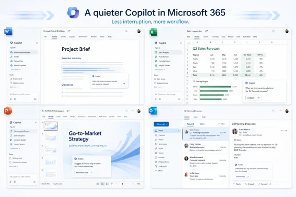
The redesign also gives Copilot room to surface tools and controls underneath the prompt based on the task at hand. If the user is doing something simple, the interface can stay sparse. If the user is preparing a complex document, data analysis, or presentation, Copilot can expose more options without dumping the entire toolbox onto the screen.
That is the right direction. The risk is that “contextual” controls can become a new kind of clutter if Microsoft guesses wrong. A quiet assistant that appears at the right time is useful; a quiet assistant that repeatedly misreads intent is merely a slower nuisance.
Microsoft’s Real Product Is No Longer the Chatbot
The redesign also marks a conceptual shift away from Copilot as a chat window. Microsoft now wants Copilot to behave like a connected layer across Microsoft 365, with a consistent entry point in Word, Excel, PowerPoint, and Outlook. In the company’s telling, the assistant sits above the work, understands the document or message beneath it, and suggests relevant actions.That is a bigger move than a cosmetic refresh. Microsoft is trying to collapse the distance between asking for help and applying the result. In the old model, the user asked Copilot for a draft, copied or accepted part of the output, then manually repaired what did not fit. In the newer model, Copilot is supposed to operate closer to the canvas itself: the paragraph, slide, spreadsheet cell, or email thread where the work is already happening.
This is where the “agentic” language enters. Microsoft is increasingly dividing Copilot into capability-focused agents such as Designer, Researcher, and app-specific assistants for Word, Excel, and PowerPoint. The pitch is that these agents are not generic chat personalities; they are role-based helpers that can take action within the app.
For WindowsForum readers, the distinction matters because it changes how administrators and users should evaluate Copilot. The question is no longer simply whether the chatbot gives a good answer. The question is whether an AI layer that can read context, propose edits, and potentially act inside business documents is governed well enough to trust.
That makes the interface part of the security model. Clear signals about what Copilot is seeing, what it is using, and what it is changing are not decorative niceties. They are the difference between assisted work and opaque automation.
The Side Pane Is Becoming Microsoft’s AI Dock
Microsoft says the redesigned experience includes a left navigation pane in the Copilot app that can expand and collapse, giving users access to agents, conversations, and history without permanently crowding the workspace. Across Microsoft 365 apps, Copilot opens in a side pane but can also be invoked directly on the canvas.That hybrid model is telling. Microsoft has tried several forms for Copilot: Windows sidebar, web app, Office ribbon button, floating button, taskbar-adjacent assistant, Edge pane, and app-native panel. The company has not always seemed sure whether Copilot should be an app, a service, a sidebar, a search box, or an operating-system feature.
The new direction appears to be less about one fixed location and more about one consistent behavior. Copilot should be reachable from a predictable place, but it should not require users to leave the thing they are working on. That is sensible, especially for Office documents where switching contexts can destroy the very momentum Copilot is supposed to preserve.
Still, there is a fine line between “available everywhere” and “inescapable everywhere.” Microsoft has already faced user irritation over Copilot buttons and AI affordances that feel imposed rather than invited. A collapsible pane and more restrained interface are useful only if users and administrators retain meaningful control over when Copilot appears.
The most successful version of this design would feel boring in the best possible way. It would be there when summoned, relevant when opened, and invisible when not needed. For a company as eager as Microsoft has been to brand every surface with Copilot, that restraint may be the hardest feature to ship.
Performance Claims Show the Stakes Behind the Polish
Microsoft says the redesigned Copilot app loads more than twice as fast, with load times reduced by more than 50 percent in testing, and that response times for complex chat prompts improved by about 10 percent at the slow end of measured requests. The company also says usage increased after the new in-app experiences rolled out, including gains in Word, Excel, PowerPoint, and Outlook.Those numbers should be read carefully. Microsoft’s own notes make clear that some measurements come from controlled testing windows and short-term usage comparisons. Early lifts after a redesigned experience do not necessarily prove long-term adoption, especially when the product is being placed more prominently inside daily productivity apps.
Even so, performance matters disproportionately for AI tools. A traditional feature can be slightly slow and still be predictable. An AI assistant that pauses, streams, revises, and sometimes produces unusable output has a much narrower tolerance window. If the user waits and then has to rewrite the answer anyway, the tool has not saved time; it has merely moved the labor.
This is why Microsoft’s emphasis on speed, structure, and output quality is not just marketing varnish. Copilot has to feel fast enough that users try it casually, but reliable enough that they return for consequential work. That second part is harder.
A prettier Copilot that produces the same uncertain output will not change much. A faster Copilot that more clearly structures responses, preserves context, and suggests sensible next steps could become part of the muscle memory of Office work. The redesign is Microsoft’s attempt to make the interface stop getting in the way of that possibility.
Work IQ Is the Promise and the Anxiety
Under the redesign sits Microsoft’s broader context system, which the company describes as drawing from emails, files, chats, and meetings to help Copilot understand work beyond a single prompt or document. Microsoft calls this intelligence layer Work IQ, and it is central to the new Copilot story.This is where Copilot becomes potentially valuable in a way a generic chatbot cannot. If it can understand the project folder, the last meeting, the email thread, the spreadsheet, and the deck, then it can do more than generate plausible text. It can help reconcile the actual mess of knowledge work.
But this is also where the anxiety sharpens. The more useful Copilot becomes, the more sensitive its context becomes. In enterprise environments, “draws from emails, files, chats, and meetings” is not a minor implementation detail. It is the entire governance problem.
Microsoft has spent years telling customers that Copilot respects existing permissions, and that remains the baseline administrators will expect. But permission inheritance is not the same thing as information hygiene. Many organizations have overshared SharePoint sites, stale Teams memberships, permissive file links, and legacy access patterns that were tolerable when discovery required human effort.
AI changes that equation. A document nobody should have broadly shared becomes more dangerous when an assistant can summarize it, connect it to related material, and surface it during an unrelated task. Copilot’s contextual intelligence will be only as safe as the tenant it is grounded in.
That is why the redesign’s quieter interface should not lull IT into thinking this is just a UX update. The visible Copilot may be calmer. The invisible dependency on data governance is getting stronger.
The Agent Era Makes Office More Powerful and Harder to Explain
Microsoft’s language around Designer, Researcher, Word, Excel, and PowerPoint agents shows where the company wants to go next. Copilot is not just a universal assistant; it is a family of task-specific systems that can operate inside Microsoft 365 workflows.That direction makes practical sense. A spreadsheet helper should not behave like a creative writing assistant. A presentation designer should not be optimized for the same interaction style as a research assistant. The more specific the role, the more likely the agent can expose relevant controls and produce useful output.
But specialization also creates a comprehension problem. Users already struggle to distinguish between Copilot in Windows, Copilot in Edge, Microsoft 365 Copilot, Copilot Chat, Copilot Pro, app-specific Copilot features, and paid enterprise entitlements. Adding agents can either clarify the experience or make the taxonomy more bewildering.
The redesign tries to solve that by shifting the burden away from product names and toward intent. If the user is in PowerPoint, Copilot should help with slides. If the user is in Excel, it should help reason through data. If the user is researching, a Researcher agent should know that the task requires sources, synthesis, and possibly deeper reasoning.
That is the right abstraction. People do not want to choose from Microsoft’s internal product architecture before asking for help. They want the system to infer the mode from the work in front of them.
The danger is that “agent” becomes another Microsoft word that means everything and therefore nothing. For administrators, documentation and controls will need to be sharper than the branding. Who can use which agents, what data they can access, what actions they can take, and how those actions are logged will matter more than whether the button looks elegant.
The Redesign Is Also a Competitive Admission
Microsoft is not redesigning Copilot in a vacuum. Google is pushing Gemini deeper into Workspace, OpenAI keeps expanding ChatGPT’s document and enterprise capabilities, and Anthropic has made a strong case for AI systems that feel more careful and less noisy. The productivity suite is becoming the new battleground for AI assistants.In that market, interface restraint is a competitive feature. The first wave of generative AI products could win attention by being dazzling. The next wave has to win repeat use by being dependable. In office software, dependable often means unglamorous: fast loading, predictable placement, good defaults, clear undo, and no surprise intrusions during a deadline.
Microsoft has an advantage its rivals envy. It owns the documents, calendars, mailboxes, meetings, spreadsheets, identity system, endpoint management story, and admin stack for a vast number of organizations. Copilot can become powerful precisely because it lives where the work already is.
That advantage also creates pressure. When Microsoft gets AI placement wrong, it does not feel like a random startup made a bad design choice. It feels like the operating environment of work has become noisier. A Copilot button in the wrong place is not just a button; it is a reminder that Microsoft can alter the texture of a billion-user workflow almost overnight.
The redesign suggests Microsoft knows that brute-force insertion has limits. Copilot cannot become the future of Office merely by appearing in more places. It has to justify each appearance.
The Office Ribbon Lesson Returns in AI Form
There is a familiar Microsoft pattern here. When Office introduced the Ribbon, the company was not merely changing icons; it was trying to surface buried capability without overwhelming users with menus. The Ribbon was controversial because it changed muscle memory, but it was also an attempt to solve a real discoverability problem.Copilot’s redesign is a similar exercise, except the stakes are stranger. Microsoft is not surfacing static commands. It is surfacing probabilistic assistance. A formatting button does the same thing every time; an AI assistant interprets intent, draws on context, and generates a result that must be judged.
That makes discoverability harder. Too little presence, and users forget Copilot exists. Too much presence, and they resent it. Too few controls, and Copilot feels vague. Too many controls, and it becomes another enterprise dashboard disguised as a helper.
Progressive disclosure is Microsoft’s answer because it lets the company defer complexity until the task demands it. The prompt starts simple, the controls appear in context, and the output gains structure as the user refines the request. In theory, that maps nicely to how people work.
In practice, Microsoft will need to prove that the system knows when to stop. The greatest risk for Copilot is not that it lacks features. It is that Microsoft’s appetite for AI engagement overwhelms the calm the redesign is supposed to create.
Where Windows Users Should Pay Attention
Although this redesign is centered on Microsoft 365 Copilot, Windows users should not treat it as an Office-only story. Microsoft’s broader AI strategy has been to move Copilot across the operating system, browser, productivity suite, and cloud services. Design patterns introduced in Microsoft 365 have a way of migrating.The idea of a single flexible Copilot entry point is especially relevant. If Microsoft can make that model work in Office, it will likely influence how Copilot appears elsewhere: in Windows search, Start, Edge, File Explorer, and taskbar-adjacent workflows. The company has already been exploring ways to make Copilot more central to Windows interaction.
That could be useful if done with restraint. Windows has many places where context-aware assistance would help: finding settings, explaining system errors, summarizing notifications, troubleshooting devices, or helping users understand security prompts. A Copilot that can reduce friction without hijacking attention would be welcome.
But Windows is also where users are least tolerant of unwanted AI chrome. Office is a workspace where drafting and analysis are natural AI use cases. The operating system is a control plane. When AI appears there, users expect clarity, reversibility, and administrative control.
For enthusiasts and sysadmins, the Microsoft 365 redesign is therefore a preview of Microsoft’s current thinking. The company is learning to make Copilot less obnoxious. The unresolved question is whether it can apply that lesson consistently outside the Office canvas.
Administrators Get a UX Update With Governance Consequences
For IT departments, the redesign should trigger a practical review rather than a shrug. A more integrated Copilot experience can change user behavior quickly, particularly if Copilot becomes easier to invoke inside the apps employees already use.That means administrators should revisit licensing, training, data access, retention, auditing, and user expectations. The redesigned interface may reduce friction, but reduced friction is exactly why governance matters. When asking Copilot becomes easier than searching manually, users will ask more, and they will ask across more sensitive contexts.
Training also needs to evolve. Early Copilot guidance often focused on how to write better prompts. That still matters, but the new experience pushes users toward a more iterative workflow: start with rough material, let Copilot structure it, refine the output, and apply changes inside the document. Users need to understand not just how to ask, but how to verify.
Verification is the quiet skill behind every successful AI deployment. Copilot can draft a performance review, summarize a project, analyze a spreadsheet, or reshape a presentation, but the human still owns the result. A better interface can make AI output look more polished, which may actually increase the risk that weak reasoning slips through.
The practical message for IT is simple: do not evaluate this redesign only by whether users like it. Evaluate whether it changes what they can access, how quickly they can act, and how easily mistakes can propagate into business documents.
Microsoft Finally Admits the Button Was Too Loud
The most encouraging part of the redesign is not any single control. It is the apparent admission that AI tools need manners. Copilot’s earlier rollout often felt like Microsoft was measuring success by visibility. The new design suggests the company is starting to measure success by fit.That is a healthier standard. The best productivity features become invisible through use. Spellcheck, autosave, version history, smart paste, and search all matter because they reduce cognitive load without demanding constant attention. Copilot wants to join that class of feature, but generative AI has to earn a higher level of trust because it produces new material rather than merely preserving or locating existing work.
Microsoft’s phrase about moving from intention to outcome is the key. If Copilot can reliably shorten that path, users will forgive its occasional presence. If it cannot, even a beautiful interface will feel like another layer between the user and the work.
There is also a broader cultural shift here. The first AI boom inside productivity software was about showing what models could do. The next phase is about deciding where they belong. Microsoft’s redesign is a sign that the company understands the difference, even if it has not always behaved that way.
A less intrusive Copilot is not a retreat. It is the necessary condition for making Copilot more ambitious.
The Practical Read on Microsoft’s Quieter Copilot
The redesign is best understood as Microsoft trying to domesticate Copilot: less spectacle, more workflow, and a stronger claim that AI belongs inside the daily mechanics of Office work. That makes the update more consequential than a visual refresh, but also more dependent on execution.- The redesigned Copilot app replaces the old fixed prompt line with a larger workspace that can handle more structured requests before the user submits them.
- Copilot now uses progressive disclosure to keep the interface cleaner while surfacing more tools when a task becomes complex.
- Microsoft is standardizing Copilot’s entry point across Word, Excel, PowerPoint, and Outlook so users can invoke it without leaving the document or message they are working on.
- The shift toward app-specific and capability-focused agents makes Copilot more powerful, but it also raises the importance of permissions, logging, and user education.
- Microsoft’s performance and usage claims are promising, but they should be treated as early indicators rather than proof that Copilot has solved long-term adoption.
- The redesign’s biggest test will be whether Copilot can remain useful without becoming another unavoidable layer of Microsoft 365 noise.
References
- Primary source: Digital Trends
Published: Fri, 29 May 2026 09:10:35 GMT

Copilot gets a redesign and it now wants to do more without being an eyesore
Microsoft is reshaping Copilot to feel like a workspace that adapts to you. The redesign focuses on cleaner design, smarter context, and fewer interruptions while you work. www.digitaltrends.com
- Related coverage: windowscentral.com
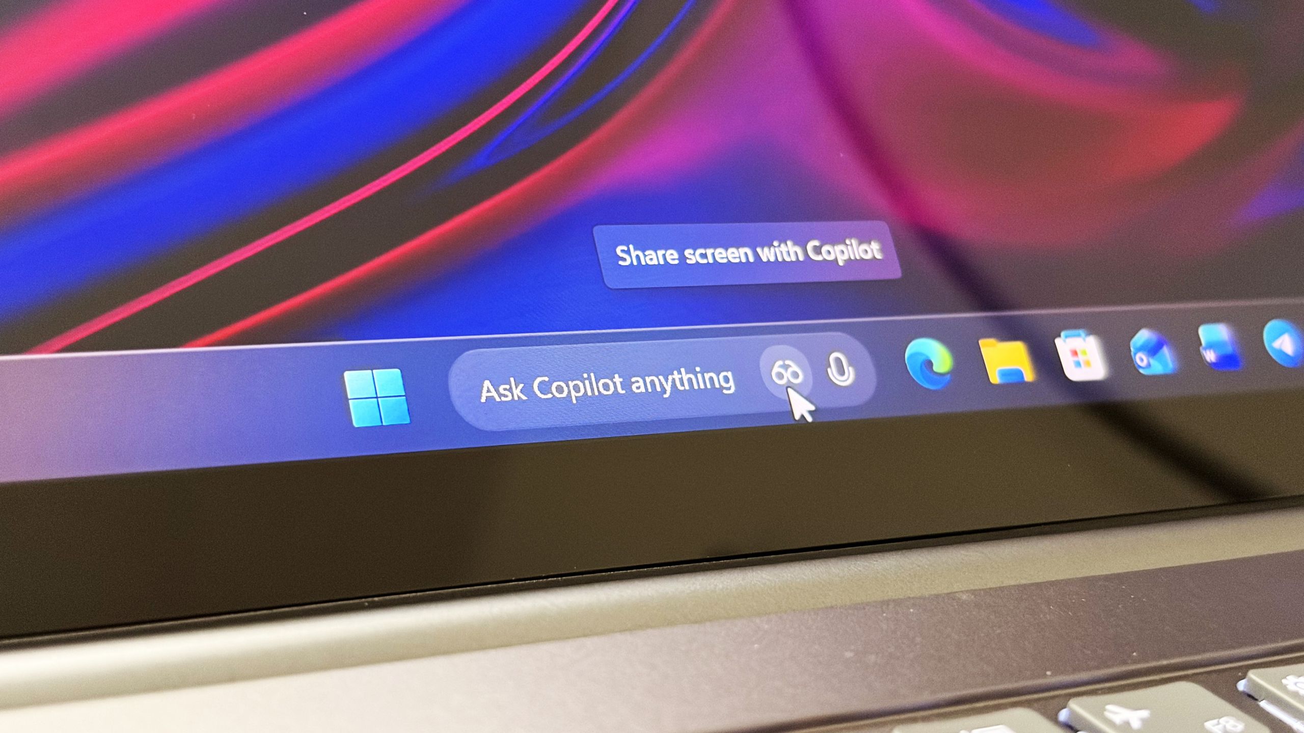
Microsoft confirms Ask Copilot is still coming to Windows 11's Taskbar this summer
First announced last year, a new document has confirmed that Microsoft's upcoming "Ask Copilot" feature for Windows 11's Taskbar is arriving mid-2026. www.windowscentral.com
- Official source: microsoft.com

Introducing a new design for Microsoft 365 Copilot | Microsoft 365 Blog
Copilot’s redesigned experience delivers faster performance, adaptive tools, and clearer AI-powered workflows to help you easily move from intention to outcome. www.microsoft.com
- Official source: support.microsoft.com
Get started using Researcher with Computer Use in Microsoft 365 Copilot (Frontier) | Microsoft Support
Learn about using Researcher with Computer Use in Microsoft 365 Copilot and how it can help complete advanced research and analysis tasks. support.microsoft.com
- Related coverage: howtogeek.com

Copilot on Windows Just Got a Redesign, Again
Pick something and stick with it, Microsoft. www.howtogeek.com
- Official source: techcommunity.microsoft.com
What’s New in Microsoft 365 Copilot | February 2026 | Microsoft Community Hub
Welcome to the February 2026 edition of What's New in Microsoft 365 Copilot! techcommunity.microsoft.com
- Related coverage: letsdatascience.com

Microsoft 365 Copilot adopts faster, cleaner design
Per Microsoft's blog post, **Microsoft 365 Copilot** receives a redesigned interface that aims to be cleaner and more responsive across desktop and mobile. The redesign introduces a feature Microsoft calls "progressive disclosure," which surfaces task-relevant tools and controls inside an... letsdatascience.com
- Official source: microsoft.design
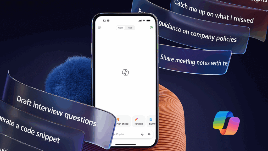
The new Microsoft 365 Copilot mobile experience - Microsoft Design
How we redesigned the Microsoft 365 Copilot mobile app to create a workspace built around conversation, dialogue, and discovery.microsoft.design
- Related coverage: moneycontrol.com
- Related coverage: engadget.com

Microsoft debuts a more buttoned-up look for Copilot - Engadget
Copilot will look a little more consistent, and lose a little personality www.engadget.com
- Related coverage: techradar.com
- Related coverage: m365maps.com