

Microsoft began rolling out a redesigned Microsoft 365 Copilot experience on May 28, 2026, across desktop and mobile, promising a cleaner interface, more structured answers, an expanded prompt box, contextual controls, and load times Microsoft says are more than twice as fast. The update is not a new model launch so much as a correction of the product’s first big usability problem: Copilot often felt bolted onto Office rather than native to it. For Windows users and IT departments, that distinction matters because Microsoft is trying to make AI feel less like a separate chatbot and more like a normal control surface inside Word, Excel, PowerPoint, Outlook, Teams, and the Microsoft 365 Copilot app. The redesign is Microsoft’s clearest admission yet that productivity AI will be judged not only by what it can generate, but by how little friction it adds while doing so.
The first wave of Microsoft 365 Copilot was sold like a productivity revolution. The second act is more modest and more important: making the thing tolerable to use all day. Microsoft’s redesign strips away some of the “look at me” energy that has defined Copilot’s arrival inside Office and replaces it with a quieter interface built around context, speed, and fewer visible controls.
That may sound like standard product-design housekeeping, but for Microsoft it is strategic. Copilot is not competing only with ChatGPT, Claude, or Gemini in a browser tab. It is competing with the user’s muscle memory inside Office, where every interruption has a cost and every misplaced button becomes part of the workday.
The new design leans on what Microsoft calls progressive disclosure, a phrase borrowed from interface design that means the product should reveal tools when they become relevant rather than dumping every possible option on the screen. In practical terms, Copilot should show different controls depending on whether a user is drafting a paragraph, analyzing a spreadsheet, revising a slide, or asking a broad workplace search question.
That is the right direction. It is also a tacit concession that the previous approach — scattering Copilot affordances across Office like promotional stickers — was never going to scale gracefully.
That change sounds small until you consider how people actually use workplace AI. They paste messy email threads. They drop in half-finished paragraphs. They ask for rewrites, tables, summaries, translations, and tone changes in a single breath. A prompt box that behaves like an afterthought makes those tasks feel fragile; a prompt box that behaves like part of Office makes them feel less like a hack.
This is why Microsoft’s redesign has echoes of the Ribbon era. The Ribbon was controversial because it rearranged decades of Office habits around a new interaction model. Copilot is trying something similar, but the target is not menus. It is the boundary between issuing a command and collaborating with software.
If Microsoft gets this right, users will not think of Copilot as a chatbot sitting beside Office. They will think of it as the place where instructions, documents, and app-specific actions meet. That is a much bigger ambition than a speed boost.
The company is also promising more reliable and structured responses that are easier to scan. That matters because enterprise AI output often fails in a very ordinary way: not by being catastrophically wrong, but by being verbose, shapeless, and hard to verify. A response that looks cleaner is not automatically more accurate, but structure helps users decide what to trust, what to edit, and what to ignore.
Speed is particularly important inside Office apps because the user is already in a task. In a standalone chatbot, waiting is part of the experience. In Excel or PowerPoint, waiting is an interruption to a workflow that used to be instantaneous.
That is the performance bar Copilot has to clear. It does not merely have to be faster than its previous version. It has to feel fast enough that invoking AI is not more annoying than doing the task manually.
The problem with omnipresent AI is that it can quickly feel like surveillance or nagging, even when the underlying feature is useful. If Copilot is always visually shouting for attention, users begin to treat it as clutter. If it appears at the right moment with the right affordance, it has a better chance of becoming part of the workflow.
That is why progressive disclosure is more than design jargon here. Microsoft wants Copilot to feel capable without feeling pushy. It wants the assistant to be visible enough to drive adoption but quiet enough that users do not rebel against it.
The tension is obvious. Microsoft has invested too heavily in Copilot to let it disappear into the background entirely. But Office users have also made clear, through complaints about floating buttons and intrusive prompts, that productivity software cannot behave like an ad for itself.
That should worry anyone who assumed Microsoft’s Office distribution advantage would be enough. Gemini has the benefit of being built into Google’s own productivity ecosystem, search surfaces, Android, and consumer AI habits. Microsoft has Windows, Office, Teams, Outlook, and enterprise identity. The competitive advantage will belong to whichever company makes AI feel less like a novelty layer and more like competent software.
For Microsoft, the stakes are higher in the workplace because Microsoft 365 Copilot is a paid enterprise product with administrators, budgets, compliance reviews, and adoption dashboards attached. A consumer may forgive a confusing chatbot interface. A CIO paying for thousands of seats will ask whether employees are using the tool, whether it saves time, and whether it creates new support burdens.
Design becomes a business metric in that context. If employees cannot find the right Copilot control, do not understand what it will do, or distrust the output format, the product’s theoretical value never reaches the balance sheet.
That integration is the moat. It is also the trap. The more places Microsoft inserts Copilot, the more inconsistent the experience can become if every app handles AI differently.
The new design attempts to solve that with a more unified experience: Copilot opens in side panels, contextual chat windows, and app-specific entry points that are supposed to feel related rather than random. Users can invoke Copilot from inside a paragraph, spreadsheet cell, or slide, which is exactly where an assistant should live if it is going to edit actual work rather than talk abstractly about it.
But consistency will be hard. Word, Excel, and PowerPoint are not interchangeable canvases. A useful Copilot interaction in Word may be disastrous in Excel if it obscures formulas, mishandles table structure, or offers vague advice where users need deterministic changes. Microsoft’s design challenge is to make Copilot familiar without flattening the differences between apps.
Microsoft’s business case for Copilot depends on employees trusting it enough to use it in real documents and messages. That trust is partly interface-driven, but it is also institutional. Workers need to know what data Copilot can access, what it is allowed to summarize, whether its answers are grounded in company content, and how much human review is expected before output becomes official work.
Administrators, meanwhile, need predictable controls. They need to understand how Copilot respects permissions, how sensitive documents surface in responses, and how to manage training for users who may not understand the difference between a grounded enterprise assistant and a public chatbot. A cleaner interface may even increase urgency here because lower friction often means more usage.
That is the paradox for Microsoft. The better Copilot becomes as a user experience, the more pressure it puts on organizations to make their information architecture and permissions sane.
Microsoft’s update is part of that shift. More structured responses, a smarter prompt area, contextual controls, and faster startup all attack the same underlying problem: AI tools too often make users do the work of figuring out how to work with them. That burden is acceptable for enthusiasts. It is poison for mainstream productivity software.
This is especially true in Microsoft 365, where users are not opening Copilot for entertainment. They are trying to finish a deck before a meeting, clean up a document before sending it to legal, or understand a spreadsheet they inherited from someone who left the company three years ago. In that environment, ambiguity is expensive.
A better interface cannot fix hallucinations, weak reasoning, or bad enterprise data. But it can reduce the number of moments where users give up before the model has a chance to help.
The redesign suggests Microsoft has absorbed at least part of that lesson. Rather than treating Copilot as an overlay, the company is trying to make it behave more like a contextual layer. That means fewer irrelevant controls, more task-specific suggestions, and entry points that appear closer to the content being edited.
The danger is that Microsoft could still overcorrect toward engagement metrics. If the company measures success primarily by Copilot invocation rates, it may be tempted to keep nudging users even when restraint would build more trust. Good enterprise software sometimes wins by staying out of the way.
That is the line Microsoft now has to walk. Copilot must be discoverable enough that users learn it exists, but not so conspicuous that they start looking for ways to disable it.
Before Copilot can credibly act like a workplace agent, it has to master the mundane. It has to open quickly, explain itself clearly, format output sensibly, and make controls visible only when they help. Those are not flashy capabilities, but they are the difference between a demo and a daily tool.
This is where Microsoft’s Office heritage helps. The company knows that productivity software becomes powerful through repetition. People do not love Excel because every interaction is magical; they rely on it because it is predictable, durable, and deeply embedded in business process.
Copilot has to earn that same kind of boring trust. A cleaner interface is a start, but the larger test will be whether users feel comfortable letting it touch real work without constantly bracing for cleanup.
That matters because Windows has had its own Copilot identity problem. Is Copilot a sidebar, a web app, a system assistant, a productivity tool, or a branding layer stretched across unrelated products? Microsoft has used the same name for experiences that do not always share the same capabilities, which has made the product family harder to understand than it needs to be.
The Microsoft 365 redesign points toward a more coherent answer: Copilot should be contextual, task-aware, and integrated where work happens. If Microsoft applies that lesson consistently, Windows Copilot could become less of a destination and more of a control surface for settings, files, apps, and workflows.
If it does not, users will continue to encounter Copilot as a shifting brand rather than a dependable assistant.
That unevenness is normal for Microsoft 365, but it can complicate communication. Help desks need to know which users have the new interface. Trainers need current screenshots. Security teams need to understand whether new affordances change how users attach files, reference work content, or invoke actions inside documents.
The mobile part is also worth watching. AI assistants can be useful on phones precisely because typing and navigation are worse there, but mobile productivity workflows are also more constrained. A prompt box that expands gracefully and shows relevant controls could be more valuable on a small screen than on a desktop monitor.
In other words, the redesign’s success will not be measured only in launch-day screenshots. It will be measured in whether Copilot feels less awkward after a month of actual work.
 Microsoft Moves From AI Spectacle to Office Furniture
The first wave of Microsoft 365 Copilot was sold like a productivity revolution. The second act is more modest and more important: making the thing tolerable to use all day. Microsoft’s redesign strips away some of the “look at me” energy that has defined Copilot’s arrival inside Office and replaces it with a quieter interface built around context, speed, and fewer visible controls.That may sound like standard product-design housekeeping, but for Microsoft it is strategic. Copilot is not competing only with ChatGPT, Claude, or Gemini in a browser tab. It is competing with the user’s muscle memory inside Office, where every interruption has a cost and every misplaced button becomes part of the workday.
The new design leans on what Microsoft calls progressive disclosure, a phrase borrowed from interface design that means the product should reveal tools when they become relevant rather than dumping every possible option on the screen. In practical terms, Copilot should show different controls depending on whether a user is drafting a paragraph, analyzing a spreadsheet, revising a slide, or asking a broad workplace search question.
That is the right direction. It is also a tacit concession that the previous approach — scattering Copilot affordances across Office like promotional stickers — was never going to scale gracefully.
The Prompt Box Becomes the New Ribbon
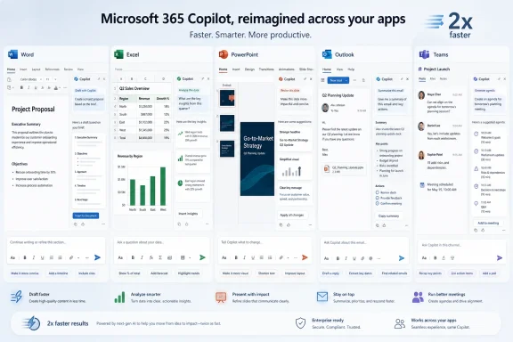
The most consequential part of the redesign is not the cleaner chrome or the faster loading claim. It is the upgraded prompt box, which Microsoft is turning from a plain text field into something closer to a lightweight workbench. Users can now format text directly inside the prompt area, and the box expands to fit longer pasted material instead of forcing people to work inside a cramped strip of UI.That change sounds small until you consider how people actually use workplace AI. They paste messy email threads. They drop in half-finished paragraphs. They ask for rewrites, tables, summaries, translations, and tone changes in a single breath. A prompt box that behaves like an afterthought makes those tasks feel fragile; a prompt box that behaves like part of Office makes them feel less like a hack.
This is why Microsoft’s redesign has echoes of the Ribbon era. The Ribbon was controversial because it rearranged decades of Office habits around a new interaction model. Copilot is trying something similar, but the target is not menus. It is the boundary between issuing a command and collaborating with software.
If Microsoft gets this right, users will not think of Copilot as a chatbot sitting beside Office. They will think of it as the place where instructions, documents, and app-specific actions meet. That is a much bigger ambition than a speed boost.
Twice as Fast Is a Product Claim and a Survival Requirement
Microsoft says the redesigned Microsoft 365 Copilot loads more than twice as fast, with load times reduced by over 50 percent, and that complex chat prompts begin responding faster than before. Those numbers are meaningful because AI latency has a way of ruining otherwise impressive demos. A five-second pause feels acceptable when a model is writing a polished report; it feels absurd when the user only wants a sentence tightened.The company is also promising more reliable and structured responses that are easier to scan. That matters because enterprise AI output often fails in a very ordinary way: not by being catastrophically wrong, but by being verbose, shapeless, and hard to verify. A response that looks cleaner is not automatically more accurate, but structure helps users decide what to trust, what to edit, and what to ignore.
Speed is particularly important inside Office apps because the user is already in a task. In a standalone chatbot, waiting is part of the experience. In Excel or PowerPoint, waiting is an interruption to a workflow that used to be instantaneous.
That is the performance bar Copilot has to clear. It does not merely have to be faster than its previous version. It has to feel fast enough that invoking AI is not more annoying than doing the task manually.
The Cleaner Interface Is Really a Trust Strategy
Microsoft’s design language around this update emphasizes calmness, focus, and fewer visible controls. That is not just aesthetic positioning. It is a trust strategy aimed at users who have spent the past two years being told that every blank page, empty spreadsheet, meeting transcript, and inbox thread is now an AI opportunity.The problem with omnipresent AI is that it can quickly feel like surveillance or nagging, even when the underlying feature is useful. If Copilot is always visually shouting for attention, users begin to treat it as clutter. If it appears at the right moment with the right affordance, it has a better chance of becoming part of the workflow.
That is why progressive disclosure is more than design jargon here. Microsoft wants Copilot to feel capable without feeling pushy. It wants the assistant to be visible enough to drive adoption but quiet enough that users do not rebel against it.
The tension is obvious. Microsoft has invested too heavily in Copilot to let it disappear into the background entirely. But Office users have also made clear, through complaints about floating buttons and intrusive prompts, that productivity software cannot behave like an ad for itself.
Google’s Gemini Redesign Raises the Table Stakes
The timing is hard to ignore. Google recently pushed a major redesign for its Gemini app, also focused on making AI responses more structured and contextually shaped around the user’s prompt. Microsoft and Google are converging on the same conclusion: the next phase of consumer and workplace AI is not simply about bigger models, but better presentation.That should worry anyone who assumed Microsoft’s Office distribution advantage would be enough. Gemini has the benefit of being built into Google’s own productivity ecosystem, search surfaces, Android, and consumer AI habits. Microsoft has Windows, Office, Teams, Outlook, and enterprise identity. The competitive advantage will belong to whichever company makes AI feel less like a novelty layer and more like competent software.
For Microsoft, the stakes are higher in the workplace because Microsoft 365 Copilot is a paid enterprise product with administrators, budgets, compliance reviews, and adoption dashboards attached. A consumer may forgive a confusing chatbot interface. A CIO paying for thousands of seats will ask whether employees are using the tool, whether it saves time, and whether it creates new support burdens.
Design becomes a business metric in that context. If employees cannot find the right Copilot control, do not understand what it will do, or distrust the output format, the product’s theoretical value never reaches the balance sheet.
Office Integration Is the Moat, but Also the Trap
Copilot’s biggest advantage remains its position inside Microsoft 365. In Word, it can help rewrite a document. In Excel, it can reason over cells and formulas. In PowerPoint, it can suggest or modify slides. In Outlook and Teams, it can summarize, draft, and retrieve context from the workplace graph.That integration is the moat. It is also the trap. The more places Microsoft inserts Copilot, the more inconsistent the experience can become if every app handles AI differently.
The new design attempts to solve that with a more unified experience: Copilot opens in side panels, contextual chat windows, and app-specific entry points that are supposed to feel related rather than random. Users can invoke Copilot from inside a paragraph, spreadsheet cell, or slide, which is exactly where an assistant should live if it is going to edit actual work rather than talk abstractly about it.
But consistency will be hard. Word, Excel, and PowerPoint are not interchangeable canvases. A useful Copilot interaction in Word may be disastrous in Excel if it obscures formulas, mishandles table structure, or offers vague advice where users need deterministic changes. Microsoft’s design challenge is to make Copilot familiar without flattening the differences between apps.
The Enterprise Question Is Not Whether Copilot Looks Better
For IT pros, the redesign is welcome but incomplete. A faster, cleaner Copilot lowers user friction, but it does not answer the harder questions around governance, data exposure, licensing, training, and support. Those are the issues that determine whether Copilot becomes a standard workplace tool or a premium experiment used by a fraction of licensed employees.Microsoft’s business case for Copilot depends on employees trusting it enough to use it in real documents and messages. That trust is partly interface-driven, but it is also institutional. Workers need to know what data Copilot can access, what it is allowed to summarize, whether its answers are grounded in company content, and how much human review is expected before output becomes official work.
Administrators, meanwhile, need predictable controls. They need to understand how Copilot respects permissions, how sensitive documents surface in responses, and how to manage training for users who may not understand the difference between a grounded enterprise assistant and a public chatbot. A cleaner interface may even increase urgency here because lower friction often means more usage.
That is the paradox for Microsoft. The better Copilot becomes as a user experience, the more pressure it puts on organizations to make their information architecture and permissions sane.
The Redesign Admits That AI Has a UX Problem
The first two years of generative AI were dominated by model capability: bigger context windows, stronger reasoning claims, multimodal input, agentic workflows, and benchmark victories. The next fight is less glamorous. It is about whether ordinary people can use these systems repeatedly without feeling like they are negotiating with a slot machine.Microsoft’s update is part of that shift. More structured responses, a smarter prompt area, contextual controls, and faster startup all attack the same underlying problem: AI tools too often make users do the work of figuring out how to work with them. That burden is acceptable for enthusiasts. It is poison for mainstream productivity software.
This is especially true in Microsoft 365, where users are not opening Copilot for entertainment. They are trying to finish a deck before a meeting, clean up a document before sending it to legal, or understand a spreadsheet they inherited from someone who left the company three years ago. In that environment, ambiguity is expensive.
A better interface cannot fix hallucinations, weak reasoning, or bad enterprise data. But it can reduce the number of moments where users give up before the model has a chance to help.
The Floating Button Era Was Always Temporary
The backlash to some Copilot entry points was predictable. Floating buttons, persistent prompts, and highly visible AI affordances may drive discovery, but they also break the sense of ownership users have over their workspace. Office is not a social feed; people do not want software constantly reminding them of the feature Microsoft wants them to try.The redesign suggests Microsoft has absorbed at least part of that lesson. Rather than treating Copilot as an overlay, the company is trying to make it behave more like a contextual layer. That means fewer irrelevant controls, more task-specific suggestions, and entry points that appear closer to the content being edited.
The danger is that Microsoft could still overcorrect toward engagement metrics. If the company measures success primarily by Copilot invocation rates, it may be tempted to keep nudging users even when restraint would build more trust. Good enterprise software sometimes wins by staying out of the way.
That is the line Microsoft now has to walk. Copilot must be discoverable enough that users learn it exists, but not so conspicuous that they start looking for ways to disable it.
Agentic Office Needs Boring Reliability Before Big Autonomy
Microsoft’s broader Copilot roadmap is moving toward more agentic behavior: software that can not only answer questions but take actions, edit content, coordinate workflows, and operate across applications. The redesign is a prerequisite for that future because users will not delegate meaningful work to an assistant they find confusing at the prompt level.Before Copilot can credibly act like a workplace agent, it has to master the mundane. It has to open quickly, explain itself clearly, format output sensibly, and make controls visible only when they help. Those are not flashy capabilities, but they are the difference between a demo and a daily tool.
This is where Microsoft’s Office heritage helps. The company knows that productivity software becomes powerful through repetition. People do not love Excel because every interaction is magical; they rely on it because it is predictable, durable, and deeply embedded in business process.
Copilot has to earn that same kind of boring trust. A cleaner interface is a start, but the larger test will be whether users feel comfortable letting it touch real work without constantly bracing for cleanup.
Windows Users Will Feel the Shift Indirectly
Although this update is focused on Microsoft 365 Copilot rather than Windows Copilot itself, Windows users will still feel the effects. Microsoft’s AI strategy increasingly treats the operating system, Office apps, Teams, Edge, and cloud identity as parts of a single productivity surface. A redesign in Microsoft 365 can influence expectations for how AI appears everywhere else.That matters because Windows has had its own Copilot identity problem. Is Copilot a sidebar, a web app, a system assistant, a productivity tool, or a branding layer stretched across unrelated products? Microsoft has used the same name for experiences that do not always share the same capabilities, which has made the product family harder to understand than it needs to be.
The Microsoft 365 redesign points toward a more coherent answer: Copilot should be contextual, task-aware, and integrated where work happens. If Microsoft applies that lesson consistently, Windows Copilot could become less of a destination and more of a control surface for settings, files, apps, and workflows.
If it does not, users will continue to encounter Copilot as a shifting brand rather than a dependable assistant.
The Real Test Starts After the Rollout
Microsoft says the redesigned experience is rolling out across desktop and mobile devices, which means the next few weeks will be less about announcement language and more about user reaction. Enterprise rollouts are rarely uniform. Some tenants see features before others, admins may have different controls enabled, and users may encounter slightly different Copilot behavior depending on license, app, platform, and update channel.That unevenness is normal for Microsoft 365, but it can complicate communication. Help desks need to know which users have the new interface. Trainers need current screenshots. Security teams need to understand whether new affordances change how users attach files, reference work content, or invoke actions inside documents.
The mobile part is also worth watching. AI assistants can be useful on phones precisely because typing and navigation are worse there, but mobile productivity workflows are also more constrained. A prompt box that expands gracefully and shows relevant controls could be more valuable on a small screen than on a desktop monitor.
In other words, the redesign’s success will not be measured only in launch-day screenshots. It will be measured in whether Copilot feels less awkward after a month of actual work.
The Copilot Update That IT Should Actually Remember
The headline version of this story is simple: Microsoft 365 Copilot is faster and cleaner. The operational version is more interesting. Microsoft is trying to remove the interface tax from workplace AI at the exact moment it wants customers to use Copilot for more consequential tasks.- Microsoft announced the redesigned Microsoft 365 Copilot experience on May 28, 2026, with rollout across desktop and mobile.
- Microsoft says the new experience loads more than twice as fast, with load times reduced by over 50 percent.
- The redesigned prompt box now supports richer formatting and expands to handle longer typed or pasted input.
- Progressive disclosure is intended to show Copilot controls based on the user’s task rather than exposing every option at once.
- Copilot’s Office integration remains its strongest advantage, but it also increases the need for consistent behavior across Word, Excel, PowerPoint, Outlook, and Teams.
- For administrators, the redesign lowers user friction but does not remove the need for governance, training, permission hygiene, and support planning.
References
- Primary source: The Verge
Published: Thu, 28 May 2026 20:14:07 GMT

Microsoft 365 Copilot gets a speed boost and cleaner design
The productivity-focused assistant will provide more ‘structured’ responses. www.theverge.com
- Official source: microsoft.com

Introducing a new design for Microsoft 365 Copilot | Microsoft 365 Blog
Copilot’s redesigned experience delivers faster performance, adaptive tools, and clearer AI-powered workflows to help you easily move from intention to outcome. www.microsoft.com
- Related coverage: letsdatascience.com
Microsoft 365 Copilot adopts faster, cleaner design
Per Microsoft's blog post, **Microsoft 365 Copilot** receives a redesigned interface that aims to be cleaner and more responsive across desktop and mobile. The redesign introduces a feature Microsoft calls "progressive disclosure," which surfaces task-relevant tools and controls inside an... letsdatascience.com
- Related coverage: aiwins.news
Microsoft 365 Copilot Redesign: Faster, Cleaner, and More Productive | AI Wins
Microsoft is rolling out a redesigned Microsoft 365 Copilot that the company says loads twice as fast and delivers clearer, more structured responses. New inter www.aiwins.news
- Related coverage: windowscentral.com

Microsoft is unifying Copilot shortcuts across Microsoft 365 apps
Microsoft is moving to a single floating icon and a unified keyboard shortcut for Copilot across Microsoft 365. www.windowscentral.com
- Related coverage: supersimple365.com
- Related coverage: windowsforum.com

Microsoft 365 Copilot Redesign: Cleaner UI, Work IQ Context, Faster & Better Models
Microsoft announced a redesigned Microsoft 365 Copilot experience on May 28, 2026, promising a cleaner interface, faster startup, smarter work context through Work IQ, and better model selection across Word, Excel, PowerPoint, Outlook, Teams, and the Microsoft 365 Copilot app. The redesign is... windowsforum.com
- Related coverage: mezha.ua

Copilot for Microsoft 365 is now twice as fast and has a new interface
Microsoft has begun rolling out the updated Copilot for Microsoft 365. The assistant now features a new interface, more structured responses and faster loading times. mezha.ua
- Official source: learn.microsoft.com

What's New for Microsoft 365 Copilot Developers
Find out what's new in Microsoft 365 Copilot extensibility, including declarative agents, custom engine agents, connectors, Copilot APIs, and more.learn.microsoft.com - Related coverage: winbuzzer.com
- Official source: techcommunity.microsoft.com
A more discoverable Copilot experience in Word, Excel, and PowerPoint
The ability for Copilot to better connect to your content when using a keyboard and screen readers has evolved. techcommunity.microsoft.com
- Related coverage: moneycontrol.com