

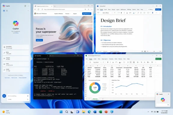
Microsoft is testing a new Copilot layout for Windows 11 in May 2026 that lets the AI assistant dock to the left or right edge of the desktop, resizing open apps around it instead of behaving only as a standalone window. The move is less a new idea than a return to Microsoft’s first instinct for Copilot: make AI spatially persistent inside Windows. The difference this time is that Microsoft appears to be trying to make the sidebar optional, movable, and less presumptive. That matters because Windows users have already shown they will tolerate AI helpers more readily when they behave like tools, not billboards.
The new Copilot behavior is being described as a docking mode rather than a normal Windows 11 Snap Layout. That distinction is important. Snap Layouts arrange ordinary windows into zones; this new Copilot treatment gives the assistant its own side-anchored state, with the rest of the desktop adapting around it.
That makes Copilot feel less like a chatbot app and more like a panel in the operating system. Once docked, it can sit beside documents, browser tabs, terminals, spreadsheets, or chat windows without floating over them. Windows reportedly shifts the remaining workspace to accommodate the panel, and even small details such as desktop watermark placement move out of the way.
There is also a picture-in-picture-style option for users who want Copilot visible without giving it a full column of screen real estate. That suggests Microsoft is not merely rebuilding the original sidebar, but trying to define a small family of AI window states: app, dock, and always-visible compact assistant.
The irony is hard to miss. Copilot first arrived in Windows 11 as a side panel, then became a more conventional app, then shifted again into a web-backed experience. Now Microsoft is circling back to the spatial metaphor it began with, but with a more cautious user interface.
The original design made Copilot feel stapled to Windows rather than integrated with it. It took up space, behaved differently from normal windows, and often felt like an overlay from Microsoft’s roadmap rather than a feature responding to user demand. For enthusiasts and administrators, that difference matters. Windows has decades of muscle memory built around predictable windows, taskbar states, and user-controlled placement.
By shifting Copilot into a standalone app, Microsoft implicitly admitted that the first pass had overreached. A regular app can be closed, resized, ignored, pinned, or uninstalled depending on policy and region. It fits the Windows model better, even if it also makes Copilot easier to forget.
The new docked mode tries to split the difference. It gives Microsoft the persistent AI surface it wants while giving users more say over where and when that surface appears. That is not a cosmetic refinement; it is the central design question for AI in operating systems.
The side panel has become the default AI shape because it solves two problems at once. It keeps the assistant close enough to feel contextual, but separate enough that the user still sees the original work. A chatbot in a full-screen app asks the user to change contexts; a sidebar implies that the assistant is part of the current context.
That is why AI companies keep returning to this interface even after users complain about clutter. The economics of AI features depend on repeated use, and repeated use depends on visibility. If Copilot lives behind an icon, engagement falls to people who already know they want it. If Copilot lives beside the work surface, it can become a habit.
The risk is that a habit can easily become an imposition. A browser sidebar is one thing; an operating-system sidebar is another. Chrome can claim Gemini is helping with the current website. Windows has to justify why an assistant should sit beside everything.
That may be defensible. AI assistants are not quite normal apps. They are meant to persist across tasks, ingest context, and remain available while the user works elsewhere. A docked assistant that resizes other windows is closer to a system panel than a standard application window.
But power users are rightly suspicious of special window rules. The more exceptions Microsoft adds, the more Windows feels like a negotiation between the user’s layout and Microsoft’s preferred surface. A developer with a terminal, browser, debugger, and documentation already has a carefully tuned desktop. A Copilot panel that behaves outside the usual Snap model needs to earn its special status.
The best version of this feature would make docking feel like an extension of Windows window management, not a Copilot privilege. The worst version would make it feel like yet another AI affordance that bypasses conventions other apps have to follow.
That is why the docking behavior is more interesting than another Copilot button. A button asks for attention. A docked workspace promises coexistence. The question is whether Microsoft can keep that promise.
A sidebar that opens only when the user chooses it is fundamentally different from one that appears because an app, link, document, or workflow triggered it. Users may accept persistent AI if they control persistence. They are far less likely to accept AI that treats the desktop as an advertising surface.
This is especially true for WindowsForum’s core audience. Enthusiasts can forgive unfinished features if they are optional. Sysadmins can plan around new surfaces if policy controls are clear. Security-minded users can evaluate AI features if permissions are explicit. What none of those groups like is ambiguity about what is running, what it can see, and why it appeared.
There are practical reasons for that. Web delivery lets Microsoft update Copilot quickly, test interface changes server-side, and keep the AI experience aligned across Windows, Edge, and the broader Microsoft account ecosystem. For an AI product evolving weekly, the old Windows model of slow, deeply native components is a poor fit.
But users notice when a supposedly integrated Windows feature feels like a browser frame. They notice performance quirks, inconsistent controls, account friction, and UI elements that do not quite match the operating system. A docked sidebar intensifies that scrutiny because it makes Copilot feel more system-level than a standalone app.
If Microsoft wants Copilot to occupy desktop space persistently, the assistant has to meet a higher bar. It cannot merely be a website that has learned to push windows aside. It has to feel reliable, policy-aware, resource-conscious, and predictable in the same way users expect core Windows components to behave.
The distinction between consumer Copilot, Microsoft 365 Copilot, Copilot Chat, Edge Copilot, and Windows Copilot has already been muddy for normal users. In enterprise settings, that confusion is more than branding noise. It affects which accounts can sign in, what data can be referenced, where prompts are processed, and which policies apply.
A docked Copilot panel also changes the optics of deployment. A standalone app can be treated as one more application in inventory. A panel that reshapes the Windows desktop feels closer to shell behavior, and shell behavior gets much more attention from IT departments.
Administrators will want clear answers before this becomes mainstream. Can it be disabled? Can docking be blocked while the app remains available? Does it behave differently under Entra ID versus a personal Microsoft account? Does it respect existing Copilot policies, Edge policies, and Windows feature controls? If Microsoft cannot make those answers simple, the sidebar will become another reason enterprises delay or suppress consumer-facing AI features.
The picture-in-picture mode could also prove valuable. A small always-on-top assistant is less disruptive than a full panel and better suited for quick reference, dictation, translation, or short command-style interactions. In that form, Copilot becomes a utility, closer to a calculator or clipboard manager than a second workspace.
The key is restraint. Microsoft does not need Copilot to occupy every possible UI surface. It needs Copilot to show up in a few places where the form factor makes the task easier. Docking is a sensible affordance when the user is deliberately working with AI and another app at the same time.
That is why this experiment deserves more credit than another random Copilot icon. It addresses a real workflow problem: how to keep an assistant visible without forcing users to juggle a floating window. If Microsoft can keep the feature user-initiated, it may have found one of the less annoying ways to make Copilot present.
A special Copilot docking mode could reinforce that perception if it feels like an exception built for Microsoft’s priorities. Users notice when old customization options take years to return while new AI surfaces arrive with privileged placement. They notice when the desktop becomes less about their chosen layout and more about the company’s current growth category.
The comparison with the returning taskbar flexibility in recent Windows 11 testing is instructive. Microsoft appears to be rediscovering that users value control over where interface elements live. A dockable Copilot could fit that philosophy if it respects user choice. It could clash with it if the assistant becomes another semi-permanent inhabitant of screen space that users have to manage around.
Windows has always been at its best when it gives users powerful defaults without locking them into Microsoft’s preferred workflow. The sidebar will be judged by that standard, not by how neatly it matches Google’s Gemini panel.
Microsoft’s most controversial AI moves have tended to be loud: new buttons, new branding, new keyboard keys, new prompts, new app integrations. The quieter path is to make Copilot behave like a tool with modes. Tools can be configured. Tools can be summoned. Tools can stay out of the way.
That shift would align with a broader course correction. After user pushback against Copilot sprawl across built-in apps, Microsoft has signaled a desire to remove unnecessary AI entry points and focus on experiences that are actually useful. A docked Copilot sidebar is useful only if it replaces clutter with coherence.
The danger is that Microsoft treats the sidebar as one more channel for engagement instead of one more option for users. The same interface can be either respectful or irritating depending on whether it waits to be invited. The implementation details will decide which version Windows users get.
That creates a new kind of UI competition. It is not just Microsoft versus Google versus OpenAI. It is Copilot versus notifications, widgets, taskbars, sidebars, snapped apps, browser panels, chat clients, and the user’s own need for empty space. On a 34-inch ultrawide monitor, a persistent AI rail may feel luxurious. On a 13-inch laptop, it may feel like rent-seeking.
Microsoft’s advantage is that it controls Windows. Microsoft’s liability is also that it controls Windows. Users hold operating-system changes to a different standard because there is no simple tab to close when the shell itself starts making room for AI.
The sidebar therefore becomes a test of Microsoft’s maturity in the AI era. Can it integrate Copilot where the operating system can genuinely help, while resisting the urge to turn every blank edge into a prompt surface? That is the difference between platform integration and platform abuse.
 Microsoft Returns to the Sidebar It Once Walked Away From
The new Copilot behavior is being described as a docking mode rather than a normal Windows 11 Snap Layout. That distinction is important. Snap Layouts arrange ordinary windows into zones; this new Copilot treatment gives the assistant its own side-anchored state, with the rest of the desktop adapting around it.That makes Copilot feel less like a chatbot app and more like a panel in the operating system. Once docked, it can sit beside documents, browser tabs, terminals, spreadsheets, or chat windows without floating over them. Windows reportedly shifts the remaining workspace to accommodate the panel, and even small details such as desktop watermark placement move out of the way.
There is also a picture-in-picture-style option for users who want Copilot visible without giving it a full column of screen real estate. That suggests Microsoft is not merely rebuilding the original sidebar, but trying to define a small family of AI window states: app, dock, and always-visible compact assistant.
The irony is hard to miss. Copilot first arrived in Windows 11 as a side panel, then became a more conventional app, then shifted again into a web-backed experience. Now Microsoft is circling back to the spatial metaphor it began with, but with a more cautious user interface.
The Old Copilot Sidebar Was a Product Strategy Wearing a Window
The first Windows Copilot sidebar was never just a place to type prompts. It was Microsoft’s claim that AI belonged next to every task, not inside one app. That was the right strategic instinct, but the wrong implementation.The original design made Copilot feel stapled to Windows rather than integrated with it. It took up space, behaved differently from normal windows, and often felt like an overlay from Microsoft’s roadmap rather than a feature responding to user demand. For enthusiasts and administrators, that difference matters. Windows has decades of muscle memory built around predictable windows, taskbar states, and user-controlled placement.
By shifting Copilot into a standalone app, Microsoft implicitly admitted that the first pass had overreached. A regular app can be closed, resized, ignored, pinned, or uninstalled depending on policy and region. It fits the Windows model better, even if it also makes Copilot easier to forget.
The new docked mode tries to split the difference. It gives Microsoft the persistent AI surface it wants while giving users more say over where and when that surface appears. That is not a cosmetic refinement; it is the central design question for AI in operating systems.
The Gemini Comparison Shows Where the Industry Is Heading
Digital Trends’ comparison to Gemini in Chrome is apt because browsers and operating systems are converging around the same AI layout: a persistent side panel that can inspect or assist with the thing you are already doing. Google wants Gemini beside tabs. Microsoft wants Copilot beside the desktop.The side panel has become the default AI shape because it solves two problems at once. It keeps the assistant close enough to feel contextual, but separate enough that the user still sees the original work. A chatbot in a full-screen app asks the user to change contexts; a sidebar implies that the assistant is part of the current context.
That is why AI companies keep returning to this interface even after users complain about clutter. The economics of AI features depend on repeated use, and repeated use depends on visibility. If Copilot lives behind an icon, engagement falls to people who already know they want it. If Copilot lives beside the work surface, it can become a habit.
The risk is that a habit can easily become an imposition. A browser sidebar is one thing; an operating-system sidebar is another. Chrome can claim Gemini is helping with the current website. Windows has to justify why an assistant should sit beside everything.
Docking Is Not Snapping, and That Difference Will Matter to Power Users
Windows users already understand Snap Layouts. They know how to drag a window to an edge, split the screen, build a quadrant layout, and move on. If Copilot’s new docking menu looks similar but operates independently, Microsoft is creating a parallel window-management vocabulary.That may be defensible. AI assistants are not quite normal apps. They are meant to persist across tasks, ingest context, and remain available while the user works elsewhere. A docked assistant that resizes other windows is closer to a system panel than a standard application window.
But power users are rightly suspicious of special window rules. The more exceptions Microsoft adds, the more Windows feels like a negotiation between the user’s layout and Microsoft’s preferred surface. A developer with a terminal, browser, debugger, and documentation already has a carefully tuned desktop. A Copilot panel that behaves outside the usual Snap model needs to earn its special status.
The best version of this feature would make docking feel like an extension of Windows window management, not a Copilot privilege. The worst version would make it feel like yet another AI affordance that bypasses conventions other apps have to follow.
Microsoft’s AI Problem Is Not Availability, It Is Trust
Copilot is not hard to find in Microsoft’s ecosystem. It has appeared in Windows, Edge, Microsoft 365, Paint, Notepad, Snipping Tool, File Explorer experiments, and the dedicated Copilot app. The problem is not that users lack entry points. The problem is that many users do not trust those entry points to respect the work they were already doing.That is why the docking behavior is more interesting than another Copilot button. A button asks for attention. A docked workspace promises coexistence. The question is whether Microsoft can keep that promise.
A sidebar that opens only when the user chooses it is fundamentally different from one that appears because an app, link, document, or workflow triggered it. Users may accept persistent AI if they control persistence. They are far less likely to accept AI that treats the desktop as an advertising surface.
This is especially true for WindowsForum’s core audience. Enthusiasts can forgive unfinished features if they are optional. Sysadmins can plan around new surfaces if policy controls are clear. Security-minded users can evaluate AI features if permissions are explicit. What none of those groups like is ambiguity about what is running, what it can see, and why it appeared.
The Web Wrapper Question Still Hangs Over the Whole Experiment
The Windows Latest report that prompted this round of coverage also notes Copilot’s web-backed nature. That has been a recurring tension in Microsoft’s AI rollout. Copilot is marketed as part of Windows, but much of the experience has behaved like a web app in native clothing.There are practical reasons for that. Web delivery lets Microsoft update Copilot quickly, test interface changes server-side, and keep the AI experience aligned across Windows, Edge, and the broader Microsoft account ecosystem. For an AI product evolving weekly, the old Windows model of slow, deeply native components is a poor fit.
But users notice when a supposedly integrated Windows feature feels like a browser frame. They notice performance quirks, inconsistent controls, account friction, and UI elements that do not quite match the operating system. A docked sidebar intensifies that scrutiny because it makes Copilot feel more system-level than a standalone app.
If Microsoft wants Copilot to occupy desktop space persistently, the assistant has to meet a higher bar. It cannot merely be a website that has learned to push windows aside. It has to feel reliable, policy-aware, resource-conscious, and predictable in the same way users expect core Windows components to behave.
Enterprise IT Will Ask the Questions Microsoft Least Wants to Answer
For consumers, the new sidebar is mostly a usability story. For managed environments, it is a governance story. Every new Copilot surface raises questions about identity, data boundaries, compliance, telemetry, and administrative control.The distinction between consumer Copilot, Microsoft 365 Copilot, Copilot Chat, Edge Copilot, and Windows Copilot has already been muddy for normal users. In enterprise settings, that confusion is more than branding noise. It affects which accounts can sign in, what data can be referenced, where prompts are processed, and which policies apply.
A docked Copilot panel also changes the optics of deployment. A standalone app can be treated as one more application in inventory. A panel that reshapes the Windows desktop feels closer to shell behavior, and shell behavior gets much more attention from IT departments.
Administrators will want clear answers before this becomes mainstream. Can it be disabled? Can docking be blocked while the app remains available? Does it behave differently under Entra ID versus a personal Microsoft account? Does it respect existing Copilot policies, Edge policies, and Windows feature controls? If Microsoft cannot make those answers simple, the sidebar will become another reason enterprises delay or suppress consumer-facing AI features.
The Best Case Is a Workbench, Not a Billboard
There is a genuinely useful version of this. Imagine a Copilot sidebar that sits beside a PowerShell session while helping explain an error, next to Event Viewer while summarizing logs, beside a browser while comparing documentation, or next to a Word document while turning meeting notes into a draft. The sidebar form makes sense when the assistant is anchored to a task rather than interrupting it.The picture-in-picture mode could also prove valuable. A small always-on-top assistant is less disruptive than a full panel and better suited for quick reference, dictation, translation, or short command-style interactions. In that form, Copilot becomes a utility, closer to a calculator or clipboard manager than a second workspace.
The key is restraint. Microsoft does not need Copilot to occupy every possible UI surface. It needs Copilot to show up in a few places where the form factor makes the task easier. Docking is a sensible affordance when the user is deliberately working with AI and another app at the same time.
That is why this experiment deserves more credit than another random Copilot icon. It addresses a real workflow problem: how to keep an assistant visible without forcing users to juggle a floating window. If Microsoft can keep the feature user-initiated, it may have found one of the less annoying ways to make Copilot present.
The Worst Case Is Another Exception in an Already Noisy Windows
Windows 11 has spent much of its life recovering from decisions that made the operating system feel less flexible than its predecessors. Taskbar limitations, redesigned context menus, Start menu tradeoffs, and shifting AI placements have all fed a perception that Microsoft sometimes optimizes Windows for strategy before workflow.A special Copilot docking mode could reinforce that perception if it feels like an exception built for Microsoft’s priorities. Users notice when old customization options take years to return while new AI surfaces arrive with privileged placement. They notice when the desktop becomes less about their chosen layout and more about the company’s current growth category.
The comparison with the returning taskbar flexibility in recent Windows 11 testing is instructive. Microsoft appears to be rediscovering that users value control over where interface elements live. A dockable Copilot could fit that philosophy if it respects user choice. It could clash with it if the assistant becomes another semi-permanent inhabitant of screen space that users have to manage around.
Windows has always been at its best when it gives users powerful defaults without locking them into Microsoft’s preferred workflow. The sidebar will be judged by that standard, not by how neatly it matches Google’s Gemini panel.
The Small Menu That Carries Microsoft’s Bigger AI Reset
The most revealing part of this change may be the dropdown itself. A title-bar menu that lets users choose app mode, side docking, or compact visibility is not flashy. It is almost boring. That is precisely why it may be the right direction.Microsoft’s most controversial AI moves have tended to be loud: new buttons, new branding, new keyboard keys, new prompts, new app integrations. The quieter path is to make Copilot behave like a tool with modes. Tools can be configured. Tools can be summoned. Tools can stay out of the way.
That shift would align with a broader course correction. After user pushback against Copilot sprawl across built-in apps, Microsoft has signaled a desire to remove unnecessary AI entry points and focus on experiences that are actually useful. A docked Copilot sidebar is useful only if it replaces clutter with coherence.
The danger is that Microsoft treats the sidebar as one more channel for engagement instead of one more option for users. The same interface can be either respectful or irritating depending on whether it waits to be invited. The implementation details will decide which version Windows users get.
The Screen Edge Is Becoming the New AI Battleground
The fight over AI assistants is increasingly a fight over the edge of the screen. Browsers want the right rail. Productivity suites want floating buttons. Operating systems want panels, overlays, recall surfaces, and contextual actions. Everyone wants to be close enough to the user’s work to claim relevance.That creates a new kind of UI competition. It is not just Microsoft versus Google versus OpenAI. It is Copilot versus notifications, widgets, taskbars, sidebars, snapped apps, browser panels, chat clients, and the user’s own need for empty space. On a 34-inch ultrawide monitor, a persistent AI rail may feel luxurious. On a 13-inch laptop, it may feel like rent-seeking.
Microsoft’s advantage is that it controls Windows. Microsoft’s liability is also that it controls Windows. Users hold operating-system changes to a different standard because there is no simple tab to close when the shell itself starts making room for AI.
The sidebar therefore becomes a test of Microsoft’s maturity in the AI era. Can it integrate Copilot where the operating system can genuinely help, while resisting the urge to turn every blank edge into a prompt surface? That is the difference between platform integration and platform abuse.
The Copilot Sidebar Will Succeed Only If It Behaves Like a Choice
The practical lesson from this experiment is not that Microsoft has discovered a perfect AI interface. It is that Microsoft is inching toward a more defensible bargain: Copilot can be persistent if persistence is user-controlled. That bargain needs to survive the rollout.- Microsoft is reportedly testing a docked Copilot mode that can attach to either side of the Windows 11 desktop and resize other windows around it.
- The new layout is separate from standard Snap Layouts, which means it may behave more like a special assistant panel than a normal snapped app.
- The design revives the original Windows Copilot sidebar concept, but with more placement control and an additional compact visibility mode.
- The feature’s reception will depend heavily on whether it opens only by user choice or begins appearing automatically in response to Microsoft-defined workflows.
- Enterprise acceptance will require clear policy controls, identity boundaries, and predictable behavior across consumer and Microsoft 365 Copilot experiences.
- The broader lesson is that AI assistants need to earn persistent screen space by being useful, quiet, and easy to dismiss.
References
- Primary source: Digital Trends
Published: Mon, 25 May 2026 11:30:12 GMT

Copilot is getting a sidebar treatment for Windows 11, just like Gemini in Chrome
Copilot is getting a dockable sidebar in Windows 11 that works similarly to Gemini in Chrome, an approach that Microsoft already tried and scrapped. www.digitaltrends.com
- Related coverage: windowscentral.com
- Related coverage: windowslatest.com

Microsoft's new Copilot turns into a Windows 11 sidebar that pushes your apps aside to make room
Microsoft is testing a docked Copilot sidebar in Windows 11 that pins the AI to the right edge of your screen, pushing the desktop aside. www.windowslatest.com
- Related coverage: windowsreport.com
- Related coverage: arstechnica.com

Five years later, Windows 11 brings back much-missed taskbar options (and more)
Microsoft is also testing a smaller taskbar and more customizable Start menu. arstechnica.com
- Related coverage: techspot.com
- Official source: learn.microsoft.com
Release Notes for Microsoft 365 Copilot
Lists the features that reach General Availability in each release of Microsoft 365 Copilot.learn.microsoft.com - Related coverage: windowsforum.com

Windows 11 May 2026 Test: Docked Copilot Sidebar Resizes Apps
Microsoft is testing a docked Copilot sidebar for Windows 11 in May 2026, according to Windows Latest, giving the assistant options to pin itself to the left or right edge of the desktop while open windows resize around it. The change is small in interface terms but large in operating-system... windowsforum.com
- Related coverage: macrumors.com

Google Chrome Gets Gemini Side Panel and Agentic Browsing Features
AI-powered browsing features have become a battleground among browser makers in recent months. OpenAI launched its Atlas browser in October, while Microsoft Edge and Opera have also introduced AI assistants and automated browsing capabilities. And now Google is upping the ante. The company has... www.macrumors.com
- Related coverage: techradar.com
- Related coverage: techcrunch.com

Chrome takes on AI browsers with tighter Gemini integration, agentic features for autonomous tasks | TechCrunch
Google Chrome is adding Gemini in the sidebar and is rolling out an agentic feature for AI Pro and Ultra users. techcrunch.com
- Related coverage: algonquincollege.com
