

Microsoft released Windows 11 Insider Experimental Preview Build 26300.8553 on May 29, 2026, adding Start menu size presets, section visibility controls, a renamed Recent area, and options to hide account identity from the menu. The move is small in code terms but large in Windows-politics terms. After years of defending Windows 11’s Start menu as a deliberate reset, Microsoft is now conceding that a modern desktop shell cannot be both personal and rigid. For users and administrators, the important part is not just that Start can be resized; it is that Microsoft is finally treating the Start menu as a configurable surface again.
Windows 11 launched in 2021 with a Start menu that felt less like an evolution of Windows 10 and more like a product manager’s mood board. Live Tiles disappeared, the centered layout became the default visual identity, and much of the spatial memory that power users relied on was replaced with a cleaner but narrower model. The design was polished, but it was also prescriptive.
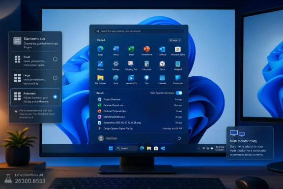
Build 26300.8553 does not bring back Windows 10’s tile wall, and it does not fully restore the old Start experience. What it does instead is more interesting: it gives users a sanctioned way to reduce the amount of Microsoft-defined structure inside Start. The new Size and Layout submenu offers Small, Large, and Automatic modes, ending the long-standing assumption that the Windows 11 Start menu should have one default physical footprint.
Automatic remains the politically safe option. It lets Microsoft preserve the default experience and adapt it based on display characteristics. But Small and Large matter because they acknowledge different desktop realities: a 13-inch laptop, a 49-inch ultrawide, a shared kiosk, and a sysadmin’s multi-monitor workstation should not all be forced into the same Start menu geometry.
This is the kind of change that sounds trivial until you remember how much muscle memory lives in the Windows shell. Start is not just an app launcher. It is where search, app pinning, recent documents, account controls, power options, and Microsoft’s own engagement surfaces collide. When Microsoft hard-codes that space, it is not merely choosing a layout; it is choosing a hierarchy of what the user is supposed to value.
Calling the section Recent is cleaner and more honest. It describes a behavior rather than implying editorial judgment. If Windows shows a file or app because it was recently used, the user can understand the logic. If Windows calls the same thing Recommended, it invites skepticism: recommended by whom, for whose benefit, and according to what incentives?
The new build goes further by allowing users to hide that section entirely. That is the real win. Many Windows 11 users have spent years trying to minimize or neutralize Recommended through partial settings, registry workarounds, third-party shell tools, or simple resignation. A checkbox is less glamorous than a redesign, but it is more durable than a hack.
The same logic applies to Pinned apps and All apps. Right-clicking the Start menu now exposes Customize sections, with independent controls for Pinned, Recent, and All. That means Start can become a lean launcher, a recency dashboard, a full app index, or some mixture of the three. The OS stops assuming that everyone wants the same balance of discovery, history, and manual curation.
Microsoft has spent years pushing Windows toward account-linked identity, cloud sync, Microsoft 365 integration, and increasingly visible user-context surfaces. Some of that is useful. Some of it is simply the modern operating system acting as the front end for a services business. But shared and enterprise environments have different expectations, and the Start menu has often treated identity as decorative rather than sensitive.
Letting users hide account identity does not solve every privacy concern in Windows 11. It does, however, show that Microsoft is listening to a complaint that was easy to dismiss until you saw it in the wild. A name and profile image in Start can leak context during presentations, remote troubleshooting, screen recordings, classroom demos, or public-facing deployments.
For administrators, this also hints at a future policy surface. If these options graduate beyond Insider builds, the natural next question is whether they become manageable through Settings, provisioning, MDM, Group Policy, or configuration profiles. Consumer choice is useful; fleet-level consistency is what turns a nice tweak into an enterprise feature.
This distinction is especially important because Microsoft shipped Beta Build 26220.8544 at the same time, and that build does not include the Start menu changes. Beta gets polish items: modernized loading spinners, substring search improvements, and a Windows Ready Print toggle. Experimental gets the shell fight.
That split tells us how Microsoft sees the risk. Changing spinners and improving search matching are quality-of-life improvements. Reworking the Start menu touches identity, habit, accessibility, productivity, branding, and IT support expectations. Microsoft may be willing to test it publicly, but it is not yet ready to tell mainstream testers that this is the future.
The channel naming also risks confusion. Microsoft is in the middle of reshaping the Insider Program, and some users may still see older labels while release notes use newer ones. For enthusiasts, that is merely annoying. For IT shops that use Insider builds to anticipate policy, support, training, and imaging changes, it is another reminder that the build number and branch matter more than the marketing label.
More consequential is substring matching in Windows Search. If a file is named MeetingNotesApril, searching for “april” should find it. That sounds obvious because users have been trained by web search, email search, and cloud storage search to expect partial matching. Windows Search has too often felt like a system that knew a file existed but refused to admit it unless the user guessed the right token boundary.
For office workers and administrators, substring search is not a gimmick. File names in real organizations are messy: project codes, dates, initials, version tags, client names, and department abbreviations often get jammed into compound strings. Better substring behavior can reduce the number of times users abandon local search and start digging manually through folders, Teams downloads, SharePoint sync locations, or Outlook attachments.
The Windows Ready Print toggle is another enterprise-flavored change hiding in plain sight. Microsoft has been moving Windows printing toward a more modern driver model, and the new toggle lets users control whether newly added printers default to Internet Printing Protocol rather than legacy drivers. Printing remains one of the least glamorous and most failure-prone parts of desktop administration; any change to defaults deserves attention from IT before it quietly becomes the baseline.
Windows 11 broke that bargain more than Microsoft seemed to appreciate at launch. The centered Start button could be moved left, but the broader Start experience remained constrained. Users who wanted density, hierarchy, folders with more expressive layout, or a less intrusive recommendation area were told, implicitly, that the new way was the way.
That posture may have made sense from a design-system perspective. Microsoft wanted Windows 11 to look cleaner, calmer, and more coherent than the accumulated compromises of Windows 10. But the desktop is not a phone home screen, and Windows users are not a single audience. The OS serves gamers, accountants, developers, hospital staff, students, accessibility users, retail workers, executives, hobbyists, and administrators who live in Remote Desktop windows all day.
Customization is not nostalgia. It is a recognition that the desktop is a working environment. The more central a surface is to daily behavior, the less credible it becomes to lock it down in the name of simplicity.
But a default becomes a problem when it masquerades as the only reasonable choice. The new Start menu controls suggest Microsoft is returning to a more mature Windows principle: opinionated out of the box, adjustable after that. That is the model that tends to survive contact with real users.
There is also a strategic reason for Microsoft to loosen up. Windows 11 is now competing not only with macOS and ChromeOS, but with user expectations shaped by launchers, tiling window managers, browser profiles, mobile widgets, and cloud workspaces. A rigid Start menu does not feel premium in that environment. It feels unfinished.
The timing is useful, too. As Microsoft continues to push AI features, account integration, cloud backup prompts, Copilot surfaces, and service-connected experiences, it needs credibility when it says user control still matters. Letting people hide Start sections and account identity is not a grand privacy revolution, but it is a practical concession in a product that often feels like it is negotiating with the user rather than serving them.
The submitted report suggests these controls could reach Beta within a few months and possibly general availability in the 26H2 timeframe. That is plausible, but not guaranteed. The safer reading is that Microsoft has moved the Start menu customization work from rumor and internal testing into visible public validation.
That matters because public validation creates a feedback trail. If users like the controls, complain about missing options, or discover accessibility and scaling bugs, Microsoft now has a channel for that data. If enterprises ask for policy controls, Microsoft can see that demand before the feature reaches broader deployment.
For AMD users, the known issue around machines with System Guard support is also a reminder that Insider participation is still real testing, not early access theater. Microsoft says affected Windows Insider Program devices with that configuration will not be offered the Experimental Future Platforms build this week, while the 26300.8553 Experimental build itself is not affected. The practical advice is simple: check the channel, check the branch, and do not assume every Experimental build is aimed at the same class of hardware or risk.
For enthusiasts, a clean install may be an acceptable weekend project. For anyone using Insider builds on a primary machine, it is a reminder that channel changes can carry real consequences. Apps, settings, credentials, development environments, virtual machines, and local data all complicate the idea of “just going back.”
This is where the new Insider model has to prove itself. If Microsoft wants more meaningful testing of features like Start customization, it needs testers to understand what branch they are on and what exit options remain available. Confusing labels or poorly communicated branch transitions will reduce the quality of feedback because users will hesitate to enroll machines they cannot easily recover.
That is especially true for IT pros who test ahead of deployment cycles. A Start menu change may be worth evaluating, but not if the cost is trapping a lab device on an awkward branch. Microsoft’s challenge is to make the Insider Program adventurous without making it opaque.
This is why the story is bigger than a submenu. Windows users have always tolerated change better when they can negotiate with it. Remove Live Tiles? Fine, some users disliked them anyway. Center the taskbar? Fine, as long as left alignment remains. But shrink the range of acceptable workflows too far, and every missing toggle becomes evidence of a company that has forgotten its own platform culture.
The new controls do not satisfy every old demand. They do not recreate Windows 7’s Start menu. They do not bring back Windows 10’s spatial tile groups. They do not settle the debate over web search, ads, account prompts, or Microsoft 365 surfacing inside the shell. But they move the argument from “why can’t I change this?” to “how far will Microsoft let this go?”
That is progress, and it is exactly the kind of progress Windows 11 has needed. The OS has improved substantially since launch, but many of those improvements have arrived as slow reversals of overconfident simplifications. The Start menu now joins the taskbar and other shell elements in the category of Windows 11 features that looked cleaner on day one but needed years of user pressure to become flexible again.
That does not mean Microsoft should avoid customization. It means the company should expose the right management controls when the feature matures. Enterprises may want to hide account identity by default, preserve Pinned apps, disable Recent on shared devices, or enforce a simplified layout for frontline worker PCs.
The balance is delicate. Too much policy control turns a user-facing improvement into another locked-down corporate surface. Too little policy control leaves administrators to script around registry keys, provisioning packages, or undocumented behavior. Microsoft’s best move would be to make the consumer setting straightforward and the enterprise management story explicit.
There is also an accessibility dimension. Start menu size is not merely aesthetic; it affects pointer travel, readability, touch targets, high-DPI behavior, and usability across multiple display setups. Automatic sizing may handle some of that, but manual presets give users another way to make the desktop fit their bodies, screens, and habits.
 Microsoft Stops Pretending One Start Menu Fits Everyone
Windows 11 launched in 2021 with a Start menu that felt less like an evolution of Windows 10 and more like a product manager’s mood board. Live Tiles disappeared, the centered layout became the default visual identity, and much of the spatial memory that power users relied on was replaced with a cleaner but narrower model. The design was polished, but it was also prescriptive.Build 26300.8553 does not bring back Windows 10’s tile wall, and it does not fully restore the old Start experience. What it does instead is more interesting: it gives users a sanctioned way to reduce the amount of Microsoft-defined structure inside Start. The new Size and Layout submenu offers Small, Large, and Automatic modes, ending the long-standing assumption that the Windows 11 Start menu should have one default physical footprint.
Automatic remains the politically safe option. It lets Microsoft preserve the default experience and adapt it based on display characteristics. But Small and Large matter because they acknowledge different desktop realities: a 13-inch laptop, a 49-inch ultrawide, a shared kiosk, and a sysadmin’s multi-monitor workstation should not all be forced into the same Start menu geometry.
This is the kind of change that sounds trivial until you remember how much muscle memory lives in the Windows shell. Start is not just an app launcher. It is where search, app pinning, recent documents, account controls, power options, and Microsoft’s own engagement surfaces collide. When Microsoft hard-codes that space, it is not merely choosing a layout; it is choosing a hierarchy of what the user is supposed to value.
The “Recommended” Era Gives Way to a More Honest “Recent”
The most symbolically loaded change is the renaming of Recommended to Recent. Microsoft’s old label always strained credibility because the section mixed useful recency with corporate ambition. To many users, Recommended felt less like a neutral convenience layer and more like a place where Windows could reserve screen real estate for suggestions, documents, nudges, and eventually whatever else the company wanted surfaced.Calling the section Recent is cleaner and more honest. It describes a behavior rather than implying editorial judgment. If Windows shows a file or app because it was recently used, the user can understand the logic. If Windows calls the same thing Recommended, it invites skepticism: recommended by whom, for whose benefit, and according to what incentives?
The new build goes further by allowing users to hide that section entirely. That is the real win. Many Windows 11 users have spent years trying to minimize or neutralize Recommended through partial settings, registry workarounds, third-party shell tools, or simple resignation. A checkbox is less glamorous than a redesign, but it is more durable than a hack.
The same logic applies to Pinned apps and All apps. Right-clicking the Start menu now exposes Customize sections, with independent controls for Pinned, Recent, and All. That means Start can become a lean launcher, a recency dashboard, a full app index, or some mixture of the three. The OS stops assuming that everyone wants the same balance of discovery, history, and manual curation.
Privacy Finally Reaches the Account Corner
The option to hide the account name and profile image is another quiet but meaningful correction. On a personal laptop, the account badge may seem harmless. On a conference room PC, a classroom machine, a support desk workstation, a lab system, or a device captured in screenshots and remote sessions, it can be unnecessary exposure.Microsoft has spent years pushing Windows toward account-linked identity, cloud sync, Microsoft 365 integration, and increasingly visible user-context surfaces. Some of that is useful. Some of it is simply the modern operating system acting as the front end for a services business. But shared and enterprise environments have different expectations, and the Start menu has often treated identity as decorative rather than sensitive.
Letting users hide account identity does not solve every privacy concern in Windows 11. It does, however, show that Microsoft is listening to a complaint that was easy to dismiss until you saw it in the wild. A name and profile image in Start can leak context during presentations, remote troubleshooting, screen recordings, classroom demos, or public-facing deployments.
For administrators, this also hints at a future policy surface. If these options graduate beyond Insider builds, the natural next question is whether they become manageable through Settings, provisioning, MDM, Group Policy, or configuration profiles. Consumer choice is useful; fleet-level consistency is what turns a nice tweak into an enterprise feature.
The Experimental Channel Becomes the Real Message
The build arrives under Microsoft’s updated Insider structure, and that context matters. Build 26300.8553 is in the Experimental channel, not the Beta channel. That means the feature is visible enough for public testing but not yet close enough to treat as a near-term production promise.This distinction is especially important because Microsoft shipped Beta Build 26220.8544 at the same time, and that build does not include the Start menu changes. Beta gets polish items: modernized loading spinners, substring search improvements, and a Windows Ready Print toggle. Experimental gets the shell fight.
That split tells us how Microsoft sees the risk. Changing spinners and improving search matching are quality-of-life improvements. Reworking the Start menu touches identity, habit, accessibility, productivity, branding, and IT support expectations. Microsoft may be willing to test it publicly, but it is not yet ready to tell mainstream testers that this is the future.
The channel naming also risks confusion. Microsoft is in the middle of reshaping the Insider Program, and some users may still see older labels while release notes use newer ones. For enthusiasts, that is merely annoying. For IT shops that use Insider builds to anticipate policy, support, training, and imaging changes, it is another reminder that the build number and branch matter more than the marketing label.
Beta Gets the Boring Changes That May Matter More at Work
The Beta build’s additions lack the emotional charge of a customizable Start menu, but they may have more immediate operational value. Build 26220.8544 introduces modern loading spinners across Boot, Logon, Restart, and Shutdown, replacing older animations with a more consistent solid donut-style indicator. It is the sort of visual cleanup that users notice only when it looks wrong, but consistency during system transitions still matters for perceived polish.More consequential is substring matching in Windows Search. If a file is named MeetingNotesApril, searching for “april” should find it. That sounds obvious because users have been trained by web search, email search, and cloud storage search to expect partial matching. Windows Search has too often felt like a system that knew a file existed but refused to admit it unless the user guessed the right token boundary.
For office workers and administrators, substring search is not a gimmick. File names in real organizations are messy: project codes, dates, initials, version tags, client names, and department abbreviations often get jammed into compound strings. Better substring behavior can reduce the number of times users abandon local search and start digging manually through folders, Teams downloads, SharePoint sync locations, or Outlook attachments.
The Windows Ready Print toggle is another enterprise-flavored change hiding in plain sight. Microsoft has been moving Windows printing toward a more modern driver model, and the new toggle lets users control whether newly added printers default to Internet Printing Protocol rather than legacy drivers. Printing remains one of the least glamorous and most failure-prone parts of desktop administration; any change to defaults deserves attention from IT before it quietly becomes the baseline.
The Start Menu Fight Was Always About Trust
The Windows 11 Start menu controversy was never only about pixels. It was about whether Microsoft trusted users to shape the most familiar interface in desktop computing. Windows has historically won loyalty not because every default was perfect, but because users could bend the system around their habits.Windows 11 broke that bargain more than Microsoft seemed to appreciate at launch. The centered Start button could be moved left, but the broader Start experience remained constrained. Users who wanted density, hierarchy, folders with more expressive layout, or a less intrusive recommendation area were told, implicitly, that the new way was the way.
That posture may have made sense from a design-system perspective. Microsoft wanted Windows 11 to look cleaner, calmer, and more coherent than the accumulated compromises of Windows 10. But the desktop is not a phone home screen, and Windows users are not a single audience. The OS serves gamers, accountants, developers, hospital staff, students, accessibility users, retail workers, executives, hobbyists, and administrators who live in Remote Desktop windows all day.
Customization is not nostalgia. It is a recognition that the desktop is a working environment. The more central a surface is to daily behavior, the less credible it becomes to lock it down in the name of simplicity.
Microsoft Is Relearning the Difference Between Defaults and Decisions
The best version of this change is not a retreat from design discipline. It is a better separation between defaults and decisions. Microsoft can still ship a polished default Start menu. It can still guide new users toward a simple layout. It can still use Automatic sizing as the recommended path.But a default becomes a problem when it masquerades as the only reasonable choice. The new Start menu controls suggest Microsoft is returning to a more mature Windows principle: opinionated out of the box, adjustable after that. That is the model that tends to survive contact with real users.
There is also a strategic reason for Microsoft to loosen up. Windows 11 is now competing not only with macOS and ChromeOS, but with user expectations shaped by launchers, tiling window managers, browser profiles, mobile widgets, and cloud workspaces. A rigid Start menu does not feel premium in that environment. It feels unfinished.
The timing is useful, too. As Microsoft continues to push AI features, account integration, cloud backup prompts, Copilot surfaces, and service-connected experiences, it needs credibility when it says user control still matters. Letting people hide Start sections and account identity is not a grand privacy revolution, but it is a practical concession in a product that often feels like it is negotiating with the user rather than serving them.
Insiders Should Treat 26300.8553 as a Signal, Not a Promise
The temptation with any Insider feature is to draw a straight line from preview to general availability. That is dangerous here. Experimental channel features can change, stall, disappear, or arrive in production with different defaults and policy hooks. Microsoft’s own release cadence has become more fluid, especially as enablement packages, staged rollouts, and controlled feature deployments blur the old meaning of a “version.”The submitted report suggests these controls could reach Beta within a few months and possibly general availability in the 26H2 timeframe. That is plausible, but not guaranteed. The safer reading is that Microsoft has moved the Start menu customization work from rumor and internal testing into visible public validation.
That matters because public validation creates a feedback trail. If users like the controls, complain about missing options, or discover accessibility and scaling bugs, Microsoft now has a channel for that data. If enterprises ask for policy controls, Microsoft can see that demand before the feature reaches broader deployment.
For AMD users, the known issue around machines with System Guard support is also a reminder that Insider participation is still real testing, not early access theater. Microsoft says affected Windows Insider Program devices with that configuration will not be offered the Experimental Future Platforms build this week, while the 26300.8553 Experimental build itself is not affected. The practical advice is simple: check the channel, check the branch, and do not assume every Experimental build is aimed at the same class of hardware or risk.
The 26H1 Deadline Turns Channel Choice Into a One-Way Door
The warning for Insiders on the 26H1 branch adds another layer to the story. Users reportedly have until June 5, 2026, to decide whether to stay on that branch, with a return to 25H2 requiring a clean install. That is not a footnote; it is the operational cost of living close to the front of Microsoft’s development pipeline.For enthusiasts, a clean install may be an acceptable weekend project. For anyone using Insider builds on a primary machine, it is a reminder that channel changes can carry real consequences. Apps, settings, credentials, development environments, virtual machines, and local data all complicate the idea of “just going back.”
This is where the new Insider model has to prove itself. If Microsoft wants more meaningful testing of features like Start customization, it needs testers to understand what branch they are on and what exit options remain available. Confusing labels or poorly communicated branch transitions will reduce the quality of feedback because users will hesitate to enroll machines they cannot easily recover.
That is especially true for IT pros who test ahead of deployment cycles. A Start menu change may be worth evaluating, but not if the cost is trapping a lab device on an awkward branch. Microsoft’s challenge is to make the Insider Program adventurous without making it opaque.
Notebookcheck’s Scoop Lands Because Users Were Already Waiting
The Notebookcheck framing resonates because it captures a frustration that has been building since Windows 11’s debut. The Start menu was one of the most visible symbols of Microsoft’s new design language, and it also became one of the most visible symbols of reduced user agency. Nearly five years later, Microsoft is finally addressing the complaint in the product rather than asking users to adapt around it.This is why the story is bigger than a submenu. Windows users have always tolerated change better when they can negotiate with it. Remove Live Tiles? Fine, some users disliked them anyway. Center the taskbar? Fine, as long as left alignment remains. But shrink the range of acceptable workflows too far, and every missing toggle becomes evidence of a company that has forgotten its own platform culture.
The new controls do not satisfy every old demand. They do not recreate Windows 7’s Start menu. They do not bring back Windows 10’s spatial tile groups. They do not settle the debate over web search, ads, account prompts, or Microsoft 365 surfacing inside the shell. But they move the argument from “why can’t I change this?” to “how far will Microsoft let this go?”
That is progress, and it is exactly the kind of progress Windows 11 has needed. The OS has improved substantially since launch, but many of those improvements have arrived as slow reversals of overconfident simplifications. The Start menu now joins the taskbar and other shell elements in the category of Windows 11 features that looked cleaner on day one but needed years of user pressure to become flexible again.
The New Start Menu Gives IT a Policy Problem to Watch
If these changes graduate to production, administrators will need to decide whether customization is a user benefit, a support risk, or both. A more configurable Start menu can reduce friction for power users, but it can also create inconsistent screenshots, training materials, help desk scripts, and remote support assumptions.That does not mean Microsoft should avoid customization. It means the company should expose the right management controls when the feature matures. Enterprises may want to hide account identity by default, preserve Pinned apps, disable Recent on shared devices, or enforce a simplified layout for frontline worker PCs.
The balance is delicate. Too much policy control turns a user-facing improvement into another locked-down corporate surface. Too little policy control leaves administrators to script around registry keys, provisioning packages, or undocumented behavior. Microsoft’s best move would be to make the consumer setting straightforward and the enterprise management story explicit.
There is also an accessibility dimension. Start menu size is not merely aesthetic; it affects pointer travel, readability, touch targets, high-DPI behavior, and usability across multiple display setups. Automatic sizing may handle some of that, but manual presets give users another way to make the desktop fit their bodies, screens, and habits.
The Start Menu Is Becoming a Negotiation Again
The concrete lesson from Build 26300.8553 is that Microsoft is no longer treating the Windows 11 Start menu as a finished monument. It is becoming a negotiation between design intent and user control, which is exactly what the Windows shell should be.- Microsoft released Build 26300.8553 to the Experimental channel on May 29, 2026, with Start menu size presets and section-level customization.
- The former Recommended section is now called Recent, and users can hide it entirely if they do not want that surface in Start.
- Users can separately toggle Pinned apps, Recent items, and All apps, allowing Start to function as a launcher, history view, app index, or hybrid.
- The account name and profile image can now be hidden, which matters for shared devices, presentations, screenshots, and managed environments.
- Beta Build 26220.8544 does not include the Start changes, but it adds modern loading animations, substring search, and Windows Ready Print controls.
- Insiders should treat the feature as promising but not guaranteed, because Experimental channel behavior can change before production release.
References
- Primary source: Notebookcheck
Published: Sun, 31 May 2026 16:46:00 GMT
Loading…
www.notebookcheck.net - Official source: learn.microsoft.com
Loading…
learn.microsoft.com - Related coverage: windowslatest.com

Tested: Windows 11's new Start menu lets you fully customize it, and it works surprisingly well
Windows 11’s new Start menu finally adds smaller layouts, removable sections, and deeper customization after years of user complaints. www.windowslatest.com
- Related coverage: fdaytalk.com
Loading…
www.fdaytalk.com - Related coverage: windowsforum.com
Loading…
windowsforum.com - Related coverage: pureinfotech.com
Loading…
pureinfotech.com
- Related coverage: windowsreport.com
Loading…
windowsreport.com - Related coverage: 24rows.com
Loading…
24rows.com - Related coverage: thurrott.com

Start Menu Improvements Are Available for Testing on the Experimental Channel
The various Start Menu improvements that Microsoft detailed earlier this month, alongside the new alternative taskbar positions, are now available for Insider testing. www.thurrott.com
- Related coverage: dataconomy.com

Windows 11 update adds major Start menu customization options
Microsoft is testing updates for Windows 11 that will enhance customization options for the Start menu and taskbar, with rollouts dataconomy.com
- Related coverage: windowscentral.com
Loading…
www.windowscentral.com - Related coverage: tomshardware.com
Microsoft simplifies Windows Insider program — fewer channels, and switching without wiping your device
The company will also make it easier to ensure you get all of the latest features.www.tomshardware.com