Windows 11 Insider Preview Extends Dark Mode to File Explorer Dialogs

  • Thread Author
Microsoft’s latest Insider preview builds extend the system-wide Dark theme into long-neglected corners of File Explorer and several legacy dialogs, eliminating many of the jarring white “flash” moments that have plagued Dark mode users and delivering a tangible quality‑of‑life polish ahead of the broader 24H2/25H2 enablement cycle.

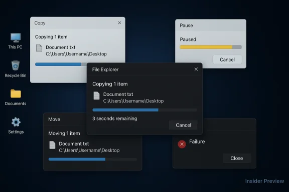
Multiple overlapping file transfer dialogs on a dark Windows desktop.Background​

For years, Windows’ system Dark mode has been undermined by a patchwork UI: modern WinUI elements and many built-in apps respected a dark palette while dozens of older Win32 dialogs, file-operation popups, and legacy shells continued to render in bright white. That inconsistency produced repeated, high‑contrast interruptions during routine tasks — most noticeably during file copies, moves and deletes — and has been a persistent annoyance for users who prefer dark themes or work on OLED displays. Recent Insider preview builds address that mismatch by theming a prioritized set of File Explorer surfaces and a few legacy utilities, with Microsoft explicitly listing these changes in the official Insider release notes.
These updates are arriving inside the existing servicing branch used for Windows 11 versions 24H2 and 25H2, where much of 25H2’s visible changes are delivered as an enablement package that flips already‑shipped code on or off. Practically, that means the same base binaries often exist across both versions and Microsoft stages the visual enablement through server-side flags and staged rollouts.

What shipped in the new preview builds​

The short list: visible surfaces that now respect Dark mode​

Microsoft’s Dev‑channel release notes and community testing confirm the initial theming wave covers the highest‑impact, most frequently encountered File Explorer surfaces:
  • Copy, Move, and Delete dialogs (both compact and expanded transfer views)
  • Progress bars and transfer chart views used during lengthy file operations
  • Confirmation and conflict dialogs, including replace/skip/override prompts and Empty Recycle Bin confirmations
  • Error and permission dialogs, such as Access Denied or File In Use messages
  • In some preview flights, the Run dialog (Win + R) has also received a dark treatment.
These changes are intended to remove the most visible “white flash” offenders and make everyday file operations feel visually consistent when the systemwide theme is set to Dark. Early screenshots from testers show dark greys for the dialog background and updated state colors, producing a calmer, more coherent shell experience.

Notable visual and semantic tweaks​

  • The transfer progress accent in dark-mode dialogs often renders in blue in current preview builds instead of the long-standing green used in light mode. Testers also report new state colors — yellow for paused transfers and a deeper red for failures — which improve at-a-glance recognition on dark backgrounds. These aesthetic choices are in active iteration and may evolve before general availability.
  • At present, several of the newly themed legacy dialogs do not honor custom system accent colors and use a fixed palette in dark-mode previews. Microsoft appears to be shipping a consistent baseline treatment first, with accent adaptability to follow.

How Microsoft is rolling this out — staged enablement, not a blanket flip​

Microsoft is shipping the code inside Insider builds but uses staged, server-side feature flags to enable visuals gradually across devices. That means:
  • The builds (for example, Dev-channel Build 26220.6772 and related Beta-channel builds) contain the theming work.
  • Microsoft flips the UI on for subsets of Insiders to collect telemetry and feedback before widening the rollout.
The practical result: two Insiders on the same build can see different behavior, and some devices may never receive a visual until Microsoft confirms stability and accessibility metrics. This controlled rollout reduces blast radius for regressions and gives Microsoft the ability to tune color contrast, button chrome, and accessibility semantics before broad release.

How to preview the changes safely​

If you want to try the updated dark dialog visuals, follow these practical steps and precautions:
  • Enroll a non‑critical test PC or VM in the Windows Insider Program (Settings > Windows Update > Windows Insider Program).
  • Select the Dev or Beta channel depending on the build you want to follow (Dev tends to be earlier and more experimental).
  • Check for updates and install the latest available Insider build (look for builds in the 26100/26200 family depending on your channel).
  • Set the system theme to Dark: Settings > Personalization > Colors > Choose your mode > Dark.
  • Trigger file operations that previously produced white dialogs (copy/move a large folder, empty the Recycle Bin, provoke a replace/skip conflict).
  • If you don’t see the theming immediately, understand the feature may be gated by a server flag; patience or repeated updates may be necessary.
Important precautions:
  • Use a secondary device or virtual machine for Insider Preview testing — these builds are preview code and can introduce regressions.
  • Back up important data and test accessibility workflows (screen readers, high-contrast themes, automated UI tests) before adopting broadly.

Why this matters: ergonomics, polish and perceived quality​

These changes are small technically but large in day‑to‑day impact. Dark mode is more than an aesthetic preference for many users — it reduces glare, can decrease perceived eye strain in dim lighting, and feels essential for OLED owners who dread bright white UI flashes. Bringing high‑frequency dialogs into the same theme:
  • Reduces visual disruption during routine tasks like file copies or deletions.
  • Improves perceived polish, making the shell feel coherent rather than a mix of modern and legacy pieces.
  • Aids accessibility when color semantics and contrast are tuned correctly.
From a design perspective, this work signals Microsoft’s willingness to invest effort into the long tail of legacy UI surfaces rather than limiting styling to freshly developed WinUI surfaces.

The gaps that remain — and why they’re not trivial​

The theming work in current flights is deliberately targeted, which means several legacy areas still appear in the default light treatment:
  • Registry Editor (regedit.exe) and many older MMC-based control panel applets remain unthemed in current builds.
  • Some property sheets and dialog controls inside newly themed windows can still show inconsistent button chrome or insufficient contrast.
  • Accent color adherence is not yet implemented for many of the updated legacy dialogs; the new dark-mode bars and accents may ignore user-chosen accent colors until later flights.
Why these are not trivial fixes: many of the legacy dialogs are built on decades-old Win32 code paths that don’t hook cleanly into modern theming APIs. Fixing them often requires careful refactors or compatibility layers to avoid breaking automation, scripting, or assistive‑tech workflows.

Accessibility, enterprise, and automation considerations​

These UI changes affect more than aesthetics. IT administrators, accessibility stakeholders, and automation engineers should treat the update as an operational change:
  • Contrast and legibility: dark backgrounds with poorly tuned text colors can reduce readability for certain users. Enterprises should validate the new dialogs against internal accessibility standards and the WCAG contrast thresholds where applicable.
  • Screen readers and automation: UI automation scripts, RPA flows, and screenshot-based tests that relied on fixed visual cues may need retesting and possible re-baselining. Small layout or color changes can break brittle automation.
  • Third‑party integrations: utilities that invoke or scrape legacy dialogs could encounter slight rendering changes; revalidation is recommended before broad deployment.
  • Staged exposure: because Microsoft gates the visual on a device-by-device basis, enterprise pilots must consider feature flags and staggered test cohorts when validating behavior across hardware classes.

Verification and cross-checking: what the sources say​

Microsoft’s official Insider release notes for the Dev Channel explicitly call out the File Explorer dark-mode improvements in Build 26220.6772, confirming the feature is deliberate and shipping in preview builds. Independent outlets and hands‑on testers have validated the presence of the visuals and reported the blue progress accent and state colors during transfer operations — providing a two-way confirmation from Microsoft and community reporting.
Community postings and forum roundups further document the rollout mechanics (server-side flags and staging), the remaining visual gaps, and practical guidance for preview testers. When possible, those community observations align with Microsoft’s notes but should be considered preview-stage reports subject to change before general availability.
If you see inconsistent screenshots or elements that appear to be light-mode on your machine, that’s an expected symptom of feature-gated testing rather than a device-specific bug in most cases.

Practical guidance for different audiences​

Enthusiasts and power users​

  • Test on a VM or spare device.
  • Use Feedback Hub to report contrast or focus issues and include screenshots, display profile, and reproduction steps.
  • Avoid enabling registry or third‑party feature‑flipping tools on production devices; manual toggles often remain unofficial and risky.

IT administrators and organizations​

  • Run a targeted pilot in a controlled test ring that includes accessibility users, automation owners, and power users.
  • Validate existing automation, RPA, and screenshot tests that interact with Explorer dialogs.
  • Track Insider channel progression and allow time for Microsoft’s staged rollout to complete before planning wide deployment.

Designers and accessibility stakeholders​

  • Evaluate the new color semantics (progress, paused, failed) against contrast guidelines and screen-reader workflows.
  • Provide prioritized feedback through enterprise channels or Feedback Hub reproducing issues with exact display settings and scaling where problems occur.

What to expect next​

The current work represents a measured first pass at theming the most visible pain points. Expect the following in upcoming flights:
  • Expanded coverage to more property sheets and legacy applets as Microsoft incrementally modernizes Win32 render paths.
  • Tweaks to color semantics and contrast based on telemetry and accessibility feedback.
  • Eventual support for user accent colors in the newly themed legacy dialogs (currently many previews use a fixed palette).
  • Potential regressions or layout fixes as Microsoft polishes the controls inside the dialogs (some button chrome and small controls still show inconsistent styling today).
Because the code is already shipping in preview builds, these changes are poised to graduate to Beta and Release Preview channels once Microsoft is confident about accessibility, compatibility, and telemetry outcomes.

Risks and caveats — exercise prudent skepticism​

  • Preview data and community screenshots are useful indicators but not a final specification; colors, contrast ratios, and exact surfaces may change before broad release.
  • Staged rollouts can create fragmented behavior across fleets; two devices on the same build may act differently until Microsoft widens the flag.
  • Some community-sourced reports reference local KB numbers or experimental flags; treat those as provisional and verify via official Microsoft release notes for your channel.
If a claim cannot be corroborated by Microsoft’s published Insider notes or multiple independent outlets, it should be treated as speculative. Where community posts or screenshots suggest a specific KB or internal flag, look for the corresponding official release note or cumulative update entry before acting on it.

Bottom line​

The recent Dev/Beta preview builds are a welcome, pragmatic step toward finishing Windows 11’s dark‑mode story. By theming the most visible File Explorer dialogs and priority legacy prompts, Microsoft has eliminated many of the everyday visual interruptions that made Dark mode feel unfinished. The rollout is intentionally cautious and staged — reflecting an engineering tradeoff between compatibility and user experience — and while several legacy areas still await modernization, this wave is the clearest sign yet that Microsoft is committed to closing the gap.
For enthusiasts and IT teams, the recommendation is straightforward: test the preview builds on non‑production hardware, validate accessibility and automation scenarios, and provide targeted feedback through the Insider channels so Microsoft can refine contrasts and control behaviors before general availability. The change is not a headline feature, but it is one of the small, persistent refinements that materially improve the daily feel of the operating system.

Source: Neowin Windows 11 25H2 and 24H2 get even more dark mode improvements in new builds
 

Microsoft’s long-running dark-mode inconsistency is finally getting a meaningful fix: Insider preview builds now include a dark theme for legacy File Explorer dialogs and the Run box, and early screenshots and hands-on reports show the change happening behind server-side feature flags and optional ViVeTool toggles.

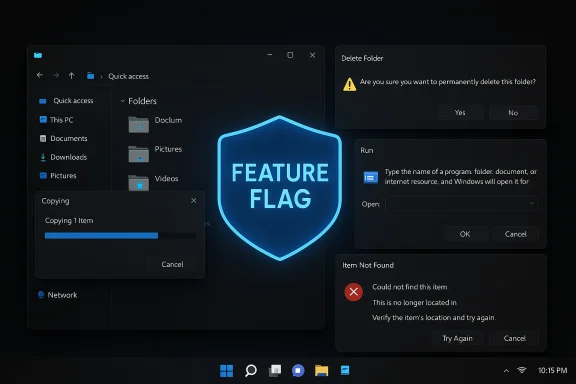
Dark Windows desktop with a glowing FEATURE FLAG shield and multiple floating dialog boxes.Background​

Windows has offered a system-wide dark theme since Windows 10, but adoption across the OS has been uneven: modern WinUI and many Store apps respect the setting, while a lengthy tail of legacy Win32 dialogs — copy/move progress boxes, confirm prompts, access-denied messages, and the Run dialog — often stayed stubbornly bright, producing jarring “white flash” moments on dark desktops. That mismatch has been a frequent complaint among power users, designers, and anyone working in low-light or on OLED screens.
The recent Insider preview updates mark a deliberate, incremental push to close that gap. Microsoft has shipped the underlying code in preview builds and is enabling the visuals gradually via staged feature flags — a conservative rollout pattern that lets engineers collect telemetry, adjust contrast and accessibility behavior, and limit the blast radius if regressions appear. Multiple independent outlets and tester posts confirm the visuals are present in Dev/Beta/Release Preview builds for at least a subset of Insider devices.

What changed — concrete details​

Dialogs and utilities now respecting Dark mode​

Hands-on reports and preview release notes show the initial theming wave focuses on the highest-impact, high-frequency surfaces inside File Explorer and a couple of legacy utilities:
  • Copy / Move progress windows (compact and expanded views).
  • Delete confirmations and Empty Recycle Bin prompts.
  • Replace / Skip / Override conflict dialogs encountered during file operations.
  • Access denied, file-in-use and other permission/error prompts.
  • Progress charts (speed/remaining time graphs) and status lists.
  • The Run dialog (Win + R) and Folder Options dialogs in some test flights.
These changes transform the dialog backgrounds to darker greys and update foreground text and icons for better contrast in Dark mode. Testers also report new state color choices (for example, the transfer progress accent switches to a blue tone in dark-mode previews, while paused and failed states show yellow and red tints, respectively) — design choices that are still being tuned.

Which builds and KBs carry the work​

The supporting code has been observed in the 26xxx build families used in recent Insider flights. Community reporting maps the theming work to preview builds in the Dev and Beta channels (for example, builds in the 26220 and 26120 families tied to preview KBs listed in Insider release notes), and Microsoft’s own channel posts mention File Explorer dark-mode improvements as part of those flights. Because feature enablement is staggered, the presence of the underlying build does not guarantee you’ll see the visuals until Microsoft flips the server-side flag.

How Microsoft is rolling this out (and why it matters)​

Microsoft is using a controlled feature rollout model: the binaries containing the new theming are included in preview builds, but visual enablement is gated server-side. This staged approach lets Microsoft:
  • Collect telemetry to detect regressions tied to contrast, focus, interaction models, and assistive technologies.
  • Iterate on color choices and control chrome before a broad public release.
  • Limit exposure if unexpected accessibility or compatibility issues arise.
For Insiders this means some devices on the same build will show the new dark dialogs while others will not. For organizations and IT administrators, it means validating these visuals in internal test rings before broad deployment. The staged model is sensible for UX changes that can have accessibility implications, but it does create temporary fragmentation in the test pool.

How to preview the new dark dialogs (Insider & power-user guide)​

The changes are currently hidden for many Insiders and are often accessible only when Microsoft has enabled the feature flag for a device. Enthusiasts who don’t want to wait can enable some of these features manually using ViVeTool, an open-source utility that flips feature IDs used in staged rollouts. Important safety notes follow the steps — enabling hidden flags is experimental and should be done on test hardware or inside a virtual machine, not on production systems.
  • Enroll in the Windows Insider Program and choose the Dev, Beta, or Release Preview channel depending on the build family you want to test. Confirm your device is on a build that includes the theming code (community reports point to late 26xxx or 26xxx family builds).
  • Download ViVeTool from its repository and run it as Administrator. The tool flips internal feature IDs that Microsoft uses for controlled rollouts.
  • Run the documented ViVeTool enable commands reported by community testers for the build you’re on. Example feature IDs reported in different community posts include sets such as:
  • 57857165, 57994323, 48433719, 49453572 (older reported set).
  • 58383338 (prereq), 59270880 (Run), 59203365 (Folder Options), and 48433719 (fallback/prereq) — reported for a later build.
  • Reboot and toggle Windows to Dark mode: Settings > Personalization > Colors > Choose your mode: Dark. Then exercise File Explorer operations to observe the new dialogs.
Caution: the specific feature IDs vary by build and community reports; they are not official Microsoft commands. Using ViVeTool to flip flags may expose you to unfinished UI, accessibility regressions, or unexpected behavior. Always back up data and prefer a VM or spare test machine for experimentation.

Design choices and practical observations​

Early screenshots and tester notes reveal several non-trivial design decisions and limitations worth highlighting:
  • Accent behavior: in current preview builds many of the newly themed dialogs use a fixed dark-mode accent (not always the user’s system accent), and several screens default to a blue progress accent rather than the classic green used in light-mode flows. That may be intentional to align with Windows 11’s modern palette, but it reduces per-user customization for now.
  • Partial control chrome: some inner controls, buttons, or focus outlines in certain dialogs still render in lighter tones or show mismatched contrast in early builds — evidence the theming pass is incomplete and being iterated.
  • Accessibility validation: Microsoft’s staged rollout is likely prioritizing checks for screen-reader parity, keyboard focus visibility, and contrast ratios. That’s why the rollout may feel slow — changing color semantics across decades-old UI paths is non-trivial and can break assistive workflows if done hastily.

Enterprise and IT implications​

For administrators and organizations the change is modest in functionality but meaningful in user experience. Points to consider:
  • Test rings: any organization using Insider or pre-release builds in their test rings should validate automation scripts, accessibility behavior, and any tool that relies on consistent dialog layouts (e.g., scripted confirmation flows or UI automation for deployment tools). Server-side staging means different test machines can show different behaviors even on the same build; plan test permutations accordingly.
  • Deployment timing: because the change is primarily visual, it’s unlikely to require significant policy updates or compatibility mitigation. Still, if an organization’s workflows depend on fixed dialog automation, validate for layout and control changes.
  • User training: the visual shift should be intuitive for most users, but note the accent color shift (blue progress in dark mode) and any changes to state coloring for paused/failed transfers. Communicate these minor visual semantics in release notes or internal update emails to avoid confusion.

Strengths of Microsoft’s approach​

  • High user impact, low functional risk: theming legacy dialogs fixes daily irritations (the “flashbang” problem) without changing workflows or commands.
  • Cautious gating: staged server-side enablement reduces the risk of widespread regressions and allows the engineering team to collect real-world telemetry.
  • Iterative UX work: the focused approach — starting with file operation dialogs and key legacy surfaces — addresses the highest-frequency pain points first, delivering meaningful polish early.

Potential risks and open questions​

  • Fragmented tester experience: staged flags can create inconsistency across machines that complicates testing and community reporting; two identically configured devices may show different visuals. That can be confusing to users and to admins trying to validate changes.
  • Accessibility regressions: theming legacy controls is risky if focus outlines, contrast ratios, or screen-reader text are altered unintentionally. Microsoft must validate across assistive tech ecosystems to avoid regressions.
  • ViVeTool temptation: publicized feature IDs invite users to flip flags themselves. While ViVeTool is a useful power-user tool, it exposes systems to unfinished code, and published IDs vary by build — attempts to enable the wrong IDs may do nothing or could expose unstable behavior. Community-reported IDs differ between posts and builds; treat any ViVeTool instructions as experimental and potentially transient.
  • Incomplete coverage: several legacy surfaces remain unthemed (Control Panel applets, some MMC snap-ins, older third-party installers), so the dark-mode puzzle is not finished yet. Microsoft’s scoped rollout suggests more waves to come, but there is no public timeline for a full completion.

Verifying claims and cross-references​

Multiple independent outlets and community forums corroborate the same core facts: preview builds include the theming code; the experience is gated by server-side flags; ViVeTool can (experimentally) force enable the visuals; and the Run dialog and Folder Options have appeared themed in later preview flights. Examples include reporting and release-note summaries from Windows Central, The Register, ElevenForum community build posts that list feature IDs for specific builds, and hands-on forum posts that document which dialogs follow Dark mode in practice. Because community-reported feature IDs and precise build-to-KB mappings vary, these items should be treated as verified in principle but variable in detail — the presence of the code is factual, while the exact numeric IDs or the rollout timing per device are subject to change.

Practical recommendations​

  • For everyday users: wait for the public rollout. The change is cosmetic and still under refinement; waiting avoids exposure to unfinished UI and potential accessibility glitches. When it arrives broadly, simply set Windows to Dark mode to enjoy more consistent visuals.
  • For enthusiasts and testers: use a VM or spare hardware and follow community guides if you wish to experiment with ViVeTool. Treat feature IDs as build-specific and double-check the most recent reports for the build you’re on. Back up data first.
  • For IT teams: add the updated preview builds to internal test rings and validate automation and assistive-tech paths. Don’t assume visual-only changes are risk-free — automation scripts that rely on exact control locations or text may need updates.

What’s still missing and what to watch next​

Microsoft’s initial pass addresses the most visible and frequently used file-operation dialogs and a handful of legacy utilities, but a full “finished” dark mode requires more work. Areas to watch:
  • Accent-color parity: whether the themed dialogs will eventually respect custom system accent colors instead of a fixed dark-mode palette.
  • Broader legacy coverage: theming for Control Panel applets, regedit, MMC snap-ins, installer dialogs, and third-party legacy installers.
  • Accessibility rollouts: confirmation from Microsoft that contrast ratios, keyboard focus, and screen-reader behavior are validated across major assistive technologies.
  • Public release timing: when Microsoft flips the server-side flag from staged rollout to broad availability in Release Preview / public channels.

Conclusion​

This is the kind of small, patient polish that materially improves the day-to-day feel of an operating system: when file copy dialogs, delete confirmations, and the Run box no longer flash painfully white on a dark desktop, the shell feels finished rather than patched. Microsoft’s staged approach and the inclusion of the code in recent Insider builds show engineering discipline — they are fixing a long-standing UX gap while trying to avoid accessibility regressions.
The trade-offs are familiar: progress now, with iteration ahead. Early adopters can force-enable the visuals with ViVeTool on test hardware, but the safest path for most users is to wait for Microsoft’s broader rollout. For IT professionals and accessibility advocates, the next weeks and months will be about validating parity, ensuring no regressions for automation or assistive workflows, and watching whether the theming work expands to the remaining legacy corners of Windows.
Practical polish, cautious engineering, and an incremental roadmap — this dark-mode cleanup is modest in scale but high in daily value, and it signals a pragmatic step toward the consistent Windows 11 visual language users have been asking for.

Source: XDA Microsoft is finally adding dark mode to the folder and Run windows, and they're looking slick
 

Back
Top