
For a change that should have been straightforward, Google’s revised Pixel connectivity interface feels unnecessarily complicated. The new layout looks like a victory for user choice, but its behavior suggests that the company has separated the controls without fully restoring the direct, predictable radio toggles that Android users remember.
That distinction matters. A Quick Settings tile is not merely an icon in a notification shade. It is a compact promise that a repeated task can be performed quickly, reliably, and without navigating through a secondary menu. Android 17’s approach to Wi‑Fi and mobile data weakens that promise.
 Background: How Pixel Connectivity Became a Long-Running Annoyance
Google replaced the traditional individual Wi‑Fi and mobile data Quick Settings controls with a unified Internet tile several Android generations ago. Instead of tapping a dedicated Wi‑Fi tile to turn the wireless radio on or off, users had to tap Internet, wait for a connectivity panel to appear, and then make the desired change.
The stated logic was understandable. Wi‑Fi, mobile data, SIM selection, carrier access, hotspot status, and network troubleshooting all sit within the broader category of internet connectivity. Grouping them in a single panel can reduce visual clutter and make switching between available networks easier for people who do not spend much time adjusting radio settings.
For experienced Android users, however, the design removed a familiar and efficient workflow. A person who only wants to disable Wi‑Fi before bed, disconnect from a troublesome router, or prevent a phone from automatically joining a network does not need a connectivity dashboard. They need an on/off control.
The combined Internet tile also represented a broader shift in mobile interface design: platforms increasingly favor guided, context-heavy controls over direct switches. That can make systems less intimidating for new users, but it often frustrates people who understand precisely what they want their devices to do.
Android 17 appeared poised to correct the problem. Separate Wi‑Fi and mobile data tiles returned to Pixel Quick Settings, bringing the interface visually closer to the Android layouts that longtime users had been requesting. On first inspection, it looked like Google had listened.
The problem is that the restored tiles do not always restore the old behavior.
The Core Issue: Disconnecting Is Not the Same as Turning Wi‑Fi Off
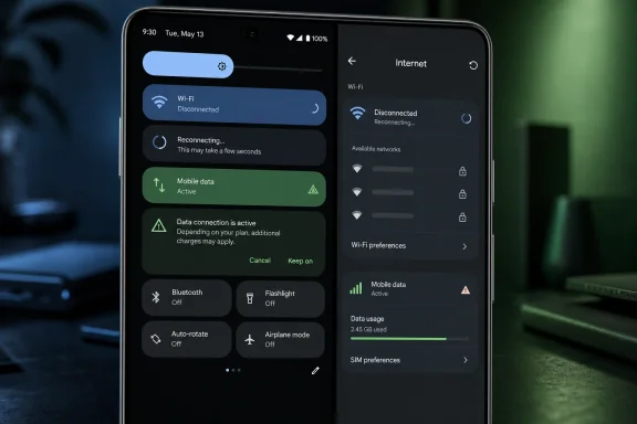
The most important complaint concerns the behavior of the new Wi‑Fi Quick Settings tile. On affected Pixel devices, tapping the tile can disconnect the phone from its current wireless network without actually disabling the Wi‑Fi radio.
That may sound like a minor distinction, but it has real implications for usability, battery expectations, privacy preferences, and network management.
A true Wi‑Fi toggle should do one thing clearly:
- On: Enable the Wi‑Fi radio and allow the phone to scan for or connect to networks.
- Off: Disable the Wi‑Fi radio until the user deliberately turns it on again.
A disconnect command is different:
- The Wi‑Fi radio remains active.
- The device may continue scanning for nearby networks.
- Android may reconnect automatically to a known network.
- The user may see an apparently successful action undone almost immediately.
For someone who simply wants to leave their home Wi‑Fi network while staying ready to reconnect later, this behavior could be useful. For someone who explicitly wants Wi‑Fi off, it is the wrong action.
Why Automatic Reconnection Makes the Problem Worse
The disconnect-only behavior would already be confusing if it were clearly labeled. It becomes much more frustrating when a Pixel immediately reconnects to the same saved network after the user taps the tile.
In that situation, the shortcut fails both as a radio toggle and as a temporary disconnect command. The interface gives the impression that a network state has changed, but the practical result is often fleeting. A user can pull down Quick Settings, tap Wi‑Fi, watch the tile change state, dismiss the shade, and then discover seconds later that the phone is connected again.
That creates a breakdown between interface feedback and actual device behavior. Quick Settings controls are supposed to communicate status at a glance. If a darkened or altered tile means “not currently connected, but still actively searching and likely to reconnect,” the visual language is far less intuitive than a simple disabled state.
The distinction is particularly significant for Pixel owners who turn off Wi‑Fi at night. Some users do this as part of a bedtime routine alongside enabling Do Not Disturb, Bedtime mode, or airplane mode. Others want to minimize background network activity, avoid joining a network outside the home, or simply know that the radio is not active.
A shortcut that only disconnects from one access point does not satisfy those use cases.
The Hidden Return of the Old Internet Panel
Android 17’s separate Wi‑Fi tile does not eliminate the old Internet panel. Instead, it effectively hides it behind a long press or, in some layouts, behind an expanded version of the tile.
To truly disable the Wi‑Fi radio, users may need to:
- Swipe down to open Quick Settings.
- Find the Wi‑Fi tile.
- Press and hold the tile, or open its secondary panel.
- Locate the actual Wi‑Fi control.
- Turn the radio off from there.
That is exactly the sort of multi-step interaction that separate tiles were meant to avoid.
The oddity is not that advanced controls exist behind a long press. That is normal Android design. A long press is appropriate for opening a network list, changing preferred networks, reviewing saved access points, or adjusting advanced Wi‑Fi settings.
The problem is that basic off functionality has become the advanced action.
Google’s own Quick Settings conventions have historically been simple: tap to change a setting, long press to configure it. When a normal tap means “disconnect, perhaps briefly,” while a long press means “actually turn off the setting,” the hierarchy feels inverted.
Tile Size Should Not Determine Basic Functionality
The revised Quick Settings interface also introduces a layout complication. Pixel users can resize tiles, and wider tiles can expose different touch targets or offer access to the broader Internet panel. In theory, this provides flexibility. In practice, it can force users to devote more screen space to a control just to access the behavior they expected from a compact tile.
Quick Settings space is limited. Many people rely on that panel for:
- Flashlight
- Bluetooth
- Wallet
- Home controls
- Hotspot
- Airplane mode
- Battery Saver
- Do Not Disturb
- Screen recording
- VPN controls
- Smart home shortcuts
- Accessibility features
Asking users to allocate a wider tile to restore a basic Wi‑Fi workflow is not a meaningful improvement. It is a workaround for a design decision that should not have required one.
Mobile Data Has a Different, but Related, Problem
The new mobile data tile performs more like a conventional switch when disabling cellular data. The trouble appears when users want to turn it back on.
On some Android 17 Pixel configurations, enabling mobile data triggers a recurring warning explaining that mobile service may incur charges under the user’s carrier plan. That warning has a rational purpose. Cellular data can cost money, especially for people on limited, roaming, prepaid, or international plans.
But the warning is not equally useful for everyone, and its repetition is difficult to justify.
A Pixel owner with an unlimited plan, a well-understood monthly allowance, or a personal habit of manually controlling mobile data may see the same prompt dozens of times. Rather than helping, it becomes friction: an extra tap and an interruption in a workflow that the user consciously initiated.
The resulting asymmetry is hard to ignore:
- Turning mobile data off can be fast.
- Turning mobile data on may require confirmation.
- Tapping Wi‑Fi may only disconnect rather than turn the radio off.
- Turning Wi‑Fi fully off may require a long press and another control.
Neither tile delivers the clean, one-tap bidirectional behavior that users associate with Quick Settings.
Safety Prompts Need an Escape Hatch
There is nothing inherently wrong with an initial warning before cellular data is enabled. In fact, it can protect users from accidental roaming charges or surprise usage on constrained plans.
The issue is the absence of personalization. Android could preserve the safety net while respecting informed users through options such as:
- Show this warning once
- Do not show again
- Warn only while roaming
- Warn only when Data Saver is enabled
- Require confirmation on the lock screen only
- Require confirmation for eSIM or secondary-SIM data
This would offer a sensible balance between protection and control. Instead, a repetitive warning risks training users to dismiss prompts automatically, which ultimately weakens the value of warnings that genuinely deserve attention.
Why This Matters More Than a Minor Interface Complaint
It is easy to dismiss Quick Settings behavior as a cosmetic issue. After all, the underlying Wi‑Fi and cellular controls still exist somewhere in Android’s settings. But that misses the point of the feature.
Quick Settings is designed for frequent actions. Every unnecessary tap is multiplied by the number of times a user performs that action. If a person changes connectivity settings twice a day, an awkward workflow becomes noticeable within a week. If they do it several times daily, it becomes a persistent annoyance.
The concern is also one of trust. Operating systems create confidence when controls do what their labels imply. A Wi‑Fi icon should not require users to guess whether it means:
- Wi‑Fi is connected.
- Wi‑Fi is disconnected.
- Wi‑Fi is scanning.
- Wi‑Fi will reconnect shortly.
- Wi‑Fi is actually disabled.
That ambiguity may be technically defensible, but it is poor human-centered design.
Direct Controls Are an Accessibility Feature Too
Extra steps do not inconvenience every user equally. For people with motor impairments, tremors, limited dexterity, visual challenges, or simply a preference for simplified workflows, the difference between one tap and a long press followed by a precise secondary action can be substantial.
A well-designed Quick Settings panel reduces effort. It should not force a user to learn subtle gesture distinctions merely to perform a common task. One-tap controls are not just about speed; they are about making device management more accessible and predictable.
Battery and Privacy Expectations Also Matter
Leaving the Wi‑Fi radio active after a user believes they have disabled Wi‑Fi can create confusion around battery life and device privacy. The actual impact varies by hardware, Android’s scanning policies, nearby network conditions, and other settings, so users should not assume that a disconnected Wi‑Fi state has a dramatic battery cost.
Still, the user intent is clear. If someone turns Wi‑Fi off, the phone should not quietly keep the radio active in a way that appears contrary to that request.
There is also a privacy dimension. Wi‑Fi scanning and automatic reconnection are useful features, but users may choose to disable wireless connectivity to reduce the chance of automatically joining remembered networks or interacting with nearby access points. A disconnect-only shortcut does not offer the same assurance as a genuine off switch.
A Third-Party Workaround Restores the Expected Behavior
For Pixel owners who want true one-tap Wi‑Fi and mobile data controls, third-party Quick Settings utilities have emerged as a practical workaround. One example is Better Internet Tiles, an app designed to add dedicated tiles that can directly enable or disable Wi‑Fi and mobile data rather than merely opening an Internet panel or disconnecting from a current network.
The appeal is obvious. The app promises the interaction Android users expected in the first place:
- Tap Wi‑Fi once to turn the Wi‑Fi radio off.
- Tap Wi‑Fi once again to turn it back on.
- Tap mobile data once to disable it.
- Tap mobile data once again to restore it.
- Avoid a recurring confirmation prompt for ordinary, user-initiated changes.
That workflow feels closer to the classic Android Quick Settings model. It is fast, legible, and easy to understand.
However, the workaround comes with an important caveat: it relies on Shizuku.
Understanding Shizuku Before Granting System-Level Access
Shizuku is a well-known open-source Android utility that allows compatible apps to perform certain privileged operations through Android debugging mechanisms, without requiring a traditionally rooted device. In this case, it can enable a custom Quick Settings app to issue system-level commands that normal third-party apps cannot access through standard Android permissions.
That capability is precisely why it can solve the problem. Android generally restricts direct modification of sensitive connectivity settings to system components, device-policy tools, or highly privileged software. A normal app cannot simply take over Wi‑Fi and cellular radio controls without some additional bridge.
The Convenience Comes With Security Trade-Offs
Shizuku is not automatically unsafe, and it does not provide unrestricted root access in the conventional sense. But it does raise the stakes of app trust.
Users considering this route should understand several points:
- Wireless debugging must be enabled during setup.
- The app receiving Shizuku access may be able to perform actions beyond ordinary app permission boundaries.
- The user is responsible for ensuring the companion app is legitimate and maintained.
- A poorly designed or malicious app with elevated access represents a more serious risk than a typical flashlight, wallpaper, or note-taking app.
- System updates, restarts, and debugging-service behavior can affect how reliably the solution remains active.
This is not a reason to avoid the workaround categorically. It is a reason to treat it as a power-user solution rather than a default recommendation for every Pixel owner.
Best Practices for Using a Custom Tile Solution
Anyone who decides that the convenience outweighs the trade-offs should take a careful approach:
- Install only from a trusted, established distribution channel. Avoid cloned apps, modified packages, and unverified downloads.
- Review the app’s permissions and Shizuku authorization carefully. If an app requests capabilities unrelated to connectivity control, reconsider the installation.
- Enable wireless debugging only for setup when possible. Do not leave developer features active indefinitely without a reason.
- Revoke access from apps no longer in use. Shizuku permissions should be treated as privileged access, not a set-and-forget approval.
- Keep Android and the utility updated. Connectivity tools interact with sensitive system behavior, so compatibility and security fixes matter.
- Test the tiles before relying on them. Confirm that Wi‑Fi truly turns off, mobile data behavior matches expectations, and emergency connectivity options remain available.
For technically comfortable users, this can be an effective fix. For everyone else, Google should provide the behavior natively.
What Google Should Change in a Future Pixel Update
The good news is that this problem does not require a major redesign to solve. The components already exist. Android can distinguish between a network connection and the underlying radio, and Pixel users can already reach the full controls through the Internet panel.
Google needs to align the shortcut behavior with the labels and expectations of the interface.
A Better Default Design
The most direct correction would be simple:
- A compact Wi‑Fi tile should toggle the Wi‑Fi radio on and off with one tap.
- A compact mobile data tile should toggle cellular data on and off with one tap.
- A long press should open detailed configuration and network selection.
- A wider tile can offer richer status and shortcuts, but it should not be required for basic functionality.
This model is familiar, consistent, and easy to explain.
Offer an Optional Disconnect Action Instead
If Google believes a quick disconnect function is valuable, it should be offered as a separate, explicitly named action rather than replacing the normal Wi‑Fi switch.
For example, Android could include:
- Wi‑Fi On/Off
- Disconnect Wi‑Fi
- Internet panel
- Preferred network selector
That would give users more control without making any single shortcut ambiguous. The key is transparency: the tile should say what it does and do what it says.
Make Mobile Data Warnings Contextual
The mobile data warning deserves a smarter implementation as well. It should appear when the risk is meaningful, not every time an experienced user intentionally taps a Quick Settings tile.
A more intelligent policy could account for:
- Roaming state
- Carrier plan data limits
- Whether the device has a saved Wi‑Fi network available
- Whether the user has already acknowledged the warning
- Whether the phone is using a secondary SIM
- Whether mobile data is being enabled from the lock screen
This would protect people who need a warning without making the Quick Settings panel feel slow and patronizing for everyone else.
The Larger Lesson for Android Interface Design
Android has always appealed to users who value flexibility. Pixel software often offers polish, security improvements, and clean visual design, but it sometimes pursues simplicity by concealing controls that advanced users consider essential.
The Android 17 connectivity changes show the danger of treating reduced visible complexity as synonymous with a better experience. A cleaner layout is valuable only when it does not obscure the function people actually need.
Separate Wi‑Fi and mobile data tiles were the right response to a long-standing complaint. But separating icons is not enough. The controls need to restore the directness that made older Quick Settings implementations useful in the first place.
A Wi‑Fi tile should turn Wi‑Fi off. A mobile data tile should enable mobile data without unnecessary ceremony when the user has chosen to do so. Anything else belongs in a clearly labeled secondary menu.
Conclusion
Android 17’s revised Pixel Quick Settings design is a frustrating near-miss. Google addressed the visible problem by splitting the old Internet tile into separate Wi‑Fi and mobile data controls, but the underlying behavior remains awkward. The Wi‑Fi tile can act like a temporary disconnect command instead of a true radio switch, while mobile data can demand repeated confirmation before turning back on.
The result is an interface that looks more flexible while, in important ways, becoming less direct. Power users can regain the expected one-tap experience through third-party custom tiles and Shizuku, but that solution introduces setup effort and security considerations that should never have been necessary for basic connectivity controls.
Google does not need another elaborate network dashboard to resolve this. It simply needs to make its Quick Settings tiles honest, predictable, and fast. For Pixel owners, the most sensible fix remains the most obvious one: tap Wi‑Fi to turn Wi‑Fi on or off, tap mobile data to turn mobile data on or off, and reserve the Internet panel for the detailed controls that actually belong there.
