
Chrome’s experimental Windows 11 Mica title bar is headed for removal from Chromium, ending a three-year effort that never became a supported Chrome feature. The immediate practical impact is limited: ordinary Chrome users will not lose a shipping preference or an enterprise policy. But the removal closes off a long-running, repeatedly exposed experiment that had let some Windows 11 testers make Chrome’s frame adopt a subtle wallpaper-derived tint.
PiunikaWeb first reported the change after spotting Chromium review 8021473, submitted by Google engineer David Pennington under the title “Remove Windows 11 Mica titlebar.” The change description says the feature flag was removed in Chrome 151 and that the remaining functionality is to be removed in Chrome 153.
There is an important qualification: a Chromium code review is not the same thing as a merged change or a Chrome release announcement. As of Friday, August 7, 2026, Google has not published a consumer-facing notice saying that Mica support has been removed from Chrome, nor has it set out a replacement Windows visual treatment. The review is nevertheless far more consequential than another temporary flag expiry: it proposes deleting the implementation itself across roughly 20 files.
The proposal should be read as the retirement of an unfinished experiment, not the rollback of a broadly deployed Windows 11 feature. Chromium’s
Windows Latest documented the project’s uneven progress in October 2025. At that point, Chrome’s Mica mode still had frame-layout defects involving the tab strip and the position of the minimize, maximize, and close buttons. Chromium developers described inconsistent coordinate handling in the Mica frame path, which could produce visibly wrong alignment and window-width calculations.
That technical history explains why the experiment repeatedly seemed to disappear and return. The Mica path was never a clean candidate waiting for a simple activation switch. It was tied to Chrome’s custom Windows frame, tab strip geometry, default theme handling, and Windows compositor behavior. A browser window with tabs consuming its title-bar area is a more awkward host for a native backdrop than a conventional Win32 app with a distinct caption bar.
Chrome’s original flag description also put a clear floor under the feature: Windows 11 version 22H2, build 22621, or newer. That restriction was not arbitrary. Chromium was calling into the Desktop Window Manager’s system-drawn Mica capability rather than drawing a generic blur effect of its own.
For IT administrators, this means there is no supported deployment action to take. Google did not document Mica as a managed Chrome setting, and there is no indication that organizations which deployed ordinary Stable-channel Chrome will see a policy regression. The people most likely to notice are Canary, Dev, Beta, and customization users who deliberately enabled an experimental feature.
Acrylic, by contrast, is Microsoft’s semi-transparent, frosted-glass material. Microsoft’s own Windows App SDK guidance says Acrylic is intended principally for transient surfaces such as flyouts, popups, and context menus, while Mica is recommended for main window backgrounds and title-bar regions. Mica is designed to avoid continuously blurring whatever happens to be behind the window; Microsoft says it captures the wallpaper once for its visualization.
That difference helps explain the internal design disagreement reported by PiunikaWeb in June. Chromium developers discussing a wider frame refresh argued over whether the desired result should be Mica’s wallpaper-and-theme integration or a lighter translucent surface closer to Acrylic. The answer was not merely a matter of branding. The two materials communicate different UI priorities: Mica gives an application a Windows-native, stable backdrop; Acrylic makes the window surface visibly more glass-like.
The review discussion, as reported by PiunikaWeb, suggested the Chrome UX goal was a translucent frame that could reveal content behind the window. If that remains Google’s preferred look, Mica was the wrong material for the job even if it was the more recognizably Windows 11-specific one.
That is the substantive reason the deletion matters. Google is not choosing between “native Windows” and “no polish.” It appears to be abandoning one particular compositor integration after the product team and engineering work failed to converge on a visual outcome worth shipping.
Still, the timing should be treated carefully. M151 is the current Chrome generation in early August 2026, while M153 is a future milestone. The code review names the target milestone but does not promise a Stable-channel delivery date, list the exact Chrome builds affected, or say when—if ever—the deletion will be backported to earlier branches.
Nor does the review answer several practical questions that matter to downstream Chromium users:
Windows Central reported in January that Edge Canary and Dev builds were testing a major interface refresh using rounded controls, colors, typography, settings panels, context menus, and a New Tab Page closer to the Windows Copilot app than the Fluent Design language visible across Windows 11. Microsoft’s own Edge announcements since then have leaned heavily toward Copilot features, AI-assisted browsing, and new tab experiences rather than a renewed commitment to Mica across the browser frame.
But Edge’s direction does not prove that Microsoft has discarded Fluent Design across Windows, and Microsoft has not said it no longer values Mica. Microsoft’s current developer documentation still presents Mica as the preferred foundation material for long-lived Windows app surfaces. The narrower reality is that Edge’s own interface is in transition, making it a moving target for Chrome to emulate.
Chrome has less reason to take on Windows-specific frame complexity if Microsoft’s flagship Chromium browser is itself moving away from a clearly Fluent-styled browser shell. For Google, maintaining a brittle Mica implementation solely to match a look that Edge may no longer prioritize is a poor engineering trade.
The platform boundary is explicit in the Chromium work cited by PiunikaWeb: the Glass Frame service is available to shared code but returns no service on non-macOS platforms. In other words, that work is structured so Chrome can share surrounding UI logic without bringing the glass effect to Windows or Linux.
That leaves Windows users with a clear answer. Chrome’s planned visual future is currently centered on a macOS-specific glass frame, while its Windows-specific Mica experiment is being dismantled. When Chrome 153 reaches the point where this review lands, the remaining Mica code should disappear with it—and Windows 11 will still have native Mica in its own apps, just not in Google Chrome.
There is an important qualification: a Chromium code review is not the same thing as a merged change or a Chrome release announcement. As of Friday, August 7, 2026, Google has not published a consumer-facing notice saying that Mica support has been removed from Chrome, nor has it set out a replacement Windows visual treatment. The review is nevertheless far more consequential than another temporary flag expiry: it proposes deleting the implementation itself across roughly 20 files.
 Chrome Mica never reached ordinary Windows users
The proposal should be read as the retirement of an unfinished experiment, not the rollback of a broadly deployed Windows 11 feature. Chromium’s Windows11MicaTitlebar option appeared in various forms from 2023 onward, sometimes listed in chrome://flags, sometimes hidden after scheduled flag expirations, and sometimes still reachable through feature switches used by enthusiasts.Windows Latest documented the project’s uneven progress in October 2025. At that point, Chrome’s Mica mode still had frame-layout defects involving the tab strip and the position of the minimize, maximize, and close buttons. Chromium developers described inconsistent coordinate handling in the Mica frame path, which could produce visibly wrong alignment and window-width calculations.
That technical history explains why the experiment repeatedly seemed to disappear and return. The Mica path was never a clean candidate waiting for a simple activation switch. It was tied to Chrome’s custom Windows frame, tab strip geometry, default theme handling, and Windows compositor behavior. A browser window with tabs consuming its title-bar area is a more awkward host for a native backdrop than a conventional Win32 app with a distinct caption bar.
Chrome’s original flag description also put a clear floor under the feature: Windows 11 version 22H2, build 22621, or newer. That restriction was not arbitrary. Chromium was calling into the Desktop Window Manager’s system-drawn Mica capability rather than drawing a generic blur effect of its own.
For IT administrators, this means there is no supported deployment action to take. Google did not document Mica as a managed Chrome setting, and there is no indication that organizations which deployed ordinary Stable-channel Chrome will see a policy regression. The people most likely to notice are Canary, Dev, Beta, and customization users who deliberately enabled an experimental feature.
Mica was never the “see-through” effect Chrome was chasing
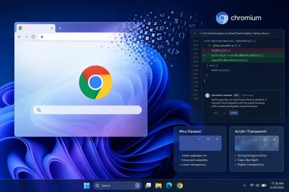
The reporting around this project has often blurred two separate Windows materials, and that distinction changes the story. Mica is not Windows 11’s transparent glass effect. Microsoft describes it as an opaque, wallpaper-aware backdrop designed for long-lived surfaces such as an app window’s title bar. It derives a muted tint from the desktop wallpaper and falls back toward a neutral color when a window is inactive.Acrylic, by contrast, is Microsoft’s semi-transparent, frosted-glass material. Microsoft’s own Windows App SDK guidance says Acrylic is intended principally for transient surfaces such as flyouts, popups, and context menus, while Mica is recommended for main window backgrounds and title-bar regions. Mica is designed to avoid continuously blurring whatever happens to be behind the window; Microsoft says it captures the wallpaper once for its visualization.
That difference helps explain the internal design disagreement reported by PiunikaWeb in June. Chromium developers discussing a wider frame refresh argued over whether the desired result should be Mica’s wallpaper-and-theme integration or a lighter translucent surface closer to Acrylic. The answer was not merely a matter of branding. The two materials communicate different UI priorities: Mica gives an application a Windows-native, stable backdrop; Acrylic makes the window surface visibly more glass-like.
The review discussion, as reported by PiunikaWeb, suggested the Chrome UX goal was a translucent frame that could reveal content behind the window. If that remains Google’s preferred look, Mica was the wrong material for the job even if it was the more recognizably Windows 11-specific one.
That is the substantive reason the deletion matters. Google is not choosing between “native Windows” and “no polish.” It appears to be abandoning one particular compositor integration after the product team and engineering work failed to converge on a visual outcome worth shipping.
The Chromium review points to a real retirement, but not a release date
Pennington’s change is unusually direct in its intent. The feature flag is already gone in M151, according to the review description; the M153 change removes the remaining source code. Removing both the user-facing experiment and the supporting implementation is a stronger signal than allowing a flag to expire, because expired Chromium flags are routinely revived or extended while their underlying feature survives.Still, the timing should be treated carefully. M151 is the current Chrome generation in early August 2026, while M153 is a future milestone. The code review names the target milestone but does not promise a Stable-channel delivery date, list the exact Chrome builds affected, or say when—if ever—the deletion will be backported to earlier branches.
Nor does the review answer several practical questions that matter to downstream Chromium users:
- It does not say whether Chromium-based browsers that carried their own Mica adaptations will retain them.
- It does not identify a Windows replacement for the deleted title-bar path.
- It does not explain whether any remaining command-line override will continue to function between Chrome 151 and the eventual M153 code removal.
- It does not provide a migration path because Google never promoted Mica as a supported Chrome customization feature.
Edge’s redesign makes Chrome’s Windows mimicry less attractive
PiunikaWeb framed the decision partly against Microsoft Edge’s shift toward a Copilot-influenced interface. That broader point is supported by independent reporting, though it should not be overstated as Google’s stated rationale.Windows Central reported in January that Edge Canary and Dev builds were testing a major interface refresh using rounded controls, colors, typography, settings panels, context menus, and a New Tab Page closer to the Windows Copilot app than the Fluent Design language visible across Windows 11. Microsoft’s own Edge announcements since then have leaned heavily toward Copilot features, AI-assisted browsing, and new tab experiences rather than a renewed commitment to Mica across the browser frame.
But Edge’s direction does not prove that Microsoft has discarded Fluent Design across Windows, and Microsoft has not said it no longer values Mica. Microsoft’s current developer documentation still presents Mica as the preferred foundation material for long-lived Windows app surfaces. The narrower reality is that Edge’s own interface is in transition, making it a moving target for Chrome to emulate.
Chrome has less reason to take on Windows-specific frame complexity if Microsoft’s flagship Chromium browser is itself moving away from a clearly Fluent-styled browser shell. For Google, maintaining a brittle Mica implementation solely to match a look that Edge may no longer prioritize is a poor engineering trade.
Google’s glass work is continuing—on macOS
The Mica removal does not mean Chrome’s desktop interface work has stopped. PiunikaWeb reported in July that Chromium is actively refining an experimental Glass Frame treatment for macOS, including transparent tab styling, a Settings choice between classic and modern transparent tabs, and work to disable the visual effect when Battery Saver is active.The platform boundary is explicit in the Chromium work cited by PiunikaWeb: the Glass Frame service is available to shared code but returns no service on non-macOS platforms. In other words, that work is structured so Chrome can share surrounding UI logic without bringing the glass effect to Windows or Linux.
That leaves Windows users with a clear answer. Chrome’s planned visual future is currently centered on a macOS-specific glass frame, while its Windows-specific Mica experiment is being dismantled. When Chrome 153 reaches the point where this review lands, the remaining Mica code should disappear with it—and Windows 11 will still have native Mica in its own apps, just not in Google Chrome.
References
- Primary source: PiunikaWeb
Published: August 7, 2026 at 6:25 AM UTC
Loading…
piunikaweb.com - Related coverage: chromium.googlesource.com
Loading…
chromium.googlesource.com - Related coverage: chromium.googlesource.com
Loading…
chromium.googlesource.com - Related coverage: windowsforum.com
Loading…
windowsforum.com - Related coverage: windowsforum.com
Loading…
windowsforum.com - Related coverage: dpcdpc11.gumroad.com
Loading…
dpcdpc11.gumroad.com - Related coverage: support.google.com
Loading…
support.google.com - Related coverage: support.google.com
Loading…
support.google.com - Related coverage: pureinfotech.com
Loading…
pureinfotech.com - Related coverage: techcommunity.microsoft.com
Loading…
techcommunity.microsoft.com - Related coverage: gitlab.collabora.com
Loading…
gitlab.collabora.com - Related coverage: uscomkempkled.weebly.com
Loading…
uscomkempkled.weebly.com - Related coverage: techcommunity.microsoft.com
Loading…
techcommunity.microsoft.com - Related coverage: niek.github.io
Loading…
niek.github.io - Related coverage: explore.market.dev
Loading…
explore.market.dev - Related coverage: techyorker.com
Loading…
techyorker.com - Related coverage: positioniseverything.net
Loading…
www.positioniseverything.net - Related coverage: techyorker.com
Loading…
techyorker.com - Related coverage: learn.microsoft.com
Loading…
learn.microsoft.com - Related coverage: learn.microsoft.com
Loading…
learn.microsoft.com - Related coverage: piunikaweb.com
Loading…
piunikaweb.com - Related coverage: images.apple.com
- Related coverage: apple.com
Loading…
www.apple.com - Related coverage: techradar.com
Loading…
www.techradar.com - Related coverage: blogs.windows.com
New updates to Edge across desktop and mobile
Edge just made it easier to go from first tab to final plan, wherever you go. Your favorite Copilot experiences, plus new ones, are now available directly in Edge on desktop and, for the first time, in the Edge mobile app. This includes capabilitiesblogs.windows.com - Related coverage: blogs.windows.com
New in Edge for Business: AI for work, safe from day one
TL;DR: Edge for Business adds agentic browsing in limited preview, a Copilot-inspired new tab page, and mobile availability for multi-tab reasoning and YouTube summarization. These experiences are built on a secure enterprise browser foundation wblogs.windows.com - Related coverage: windowscentral.com
Microsoft is slowly turning Edge into another Copilot app — tests redesigned UI that takes inspiration from Copilot | Windows Central
The latest Edge preview builds now feature an updated UI that borrows the design language that first debuted in Microsoft's Copilot app.www.windowscentral.com - Related coverage: adoption.microsoft.com
- Related coverage: rilegislature.gov
- Related coverage: techradar.com
- Related coverage: windowscentral.com
Microsoft Edge's Read Aloud taken over by Copilot Vision | Windows Central
Does the simple text reader really need to change over to Copilot?www.windowscentral.com