
As reported by Neowin and set out more fully in a Document Foundation post published August 21, LibreOffice’s maintainers say the Ribbon is competent for occasional and intermediate users who discover commands by browsing. Their objection is that the design makes trade-offs around vertical space, keyboard-led work, familiarity, accessibility, and small displays, then applies those trade-offs across the product.
LibreOffice 26.8 is meant to answer that criticism in an unusual way: it will improve the suite’s Ribbon-like Tabbed interface while keeping its older layouts. The Foundation says the change broadens the available options rather than replacing the menu-and-toolbar interface. That is the substantive product news beneath a blog post that otherwise reads more like a design manifesto than a release announcement.
 LibreOffice 26.8 is still approaching release
The Document Foundation’s own project update says LibreOffice 26.8.0 Release Candidate 2 has been tagged and distributed, while release preparations continue. That means 26.8 is close, but it is not the same thing as a finished general release that Windows administrators should deploy broadly.
The Foundation has not published a detailed feature-by-feature account of what its “improved Tabbed interface” changes in the August 21 post. Earlier coverage from OMG! Ubuntu and ComputerBase identified one visible change in 26.8 development builds: application theming can apply color to the Tabbed UI background. That is cosmetic, however, and does not establish a wholesale redesign of the underlying command model.
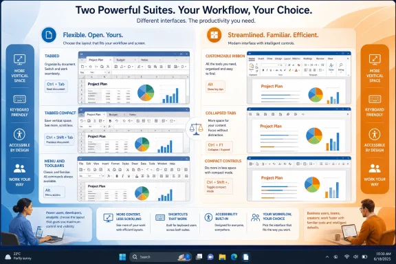
For now, the practical takeaway is narrower. LibreOffice 26.8 will retain the Tabbed interface intended to feel familiar to Office users, while continuing to offer alternate layouts for people who prefer a conventional menu bar, compact controls, a sidebar-heavy workspace, or a single toolbar.
That continuity matters more than the color treatment. Organizations moving from Office to LibreOffice often face two separate adoption problems: document compatibility and staff muscle memory. The second can be eased when users can begin with a familiar tabbed command surface, then switch to a denser layout if their workflow benefits from it.
Microsoft Office does offer Ribbon controls
The Foundation’s central criticism becomes too absolute when it says Microsoft makes the choice for everyone. Microsoft Office does default to the Ribbon model in its Windows desktop apps, and Office does not provide a built-in return to the old Office 2003-style menu-and-toolbar shell. On that structural point, LibreOffice offers more distinct interface paradigms.
But Microsoft does not leave the Ribbon fixed in place. Microsoft’s current support documentation for Word says users can reorder tabs and groups, hide tabs, add custom tabs and custom groups, hide less-used commands, and export or import Ribbon customizations. Excel’s documentation also describes options to keep the full Ribbon visible, collapse it to a single line, show tabs only, or auto-hide it entirely.
Those controls directly answer part of the Foundation’s vertical-space complaint. In Excel, for example, the Single Line Ribbon and “Show tabs only” modes reduce the permanent height consumed by commands; auto-hide gives the worksheet the greatest available display space until controls are invoked. The Ribbon is therefore not an all-or-nothing choice on a smaller display.
There are meaningful limits. Microsoft says Word users cannot reduce the size of Ribbon text or icons independently, and default command groups cannot be freely rebuilt in place. Ribbon customizations also apply per application: a layout created in Word does not automatically carry over to Excel. Microsoft’s flexibility is primarily about rearranging, hiding, and collapsing the Ribbon—not replacing it with an entirely different UI philosophy.
That is the real distinction. LibreOffice offers a selection of predesigned working environments; Microsoft Office lets users customize the contents and visibility of its one dominant environment.
LibreOffice’s choice is real, but it has boundaries too
LibreOffice’s documentation confirms that Windows users can select layouts through View > User Interface. Its choices include Standard Toolbar, Tabbed, Tabbed Compact, Groupedbar Compact, Contextual Single, Single Toolbar, and Sidebar modes, with compact variants available for the Tabbed and Groupedbar approaches.
The differences are not merely visual. Tabbed arranges commands into contextual tabs and is explicitly described by LibreOffice as the closest match to Microsoft Office’s Ribbon. Tabbed Compact is designed to preserve more vertical room. Contextual Single changes the available controls based on the selected object, while the Sidebar mode is aimed at expert users who need frequent access to many properties.
This gives LibreOffice a straightforward advantage for a mixed fleet: a support team can leave the standard interface in place for users familiar with older desktop-office applications, while allowing Office-trained staff to select Tabbed or Tabbed Compact. The choice is immediately accessible rather than dependent on assembling a personal Ribbon layout from a settings dialog.
Still, the Foundation’s presentation smooths over a limitation in its own Tabbed UI. LibreOffice’s official help says the Notebookbar—the technology behind its Tabbed layouts—cannot itself be customized. It also notes that the current Notebookbar implementation is shared across Writer, Calc, Draw, and Impress, so a change to it in one of those modules affects the others.
That is a different compromise, not a fatal flaw. LibreOffice gives users more choices among layouts, while Microsoft provides more granular customization within the Ribbon model. Neither product fully combines both approaches.
The ergonomic argument needs evidence, not a slogan
The Foundation is on firmer ground when it rejects the idea of one objectively “best” office interface. A user working quickly with keyboard shortcuts, a first-time user searching for a formatting command, and a laptop user with limited vertical resolution can reasonably prefer different control schemes.
But its post also argues that ergonomics is measurable without supplying the measurements that would substantiate its conclusions. There is no task comparison, usability study, accessibility evaluation, screen-size test matrix, error-rate data, or time-on-task result attached to its discussion of the Ribbon.
That omission matters because ergonomics is being used to cover several different questions. Discoverability, speed for practiced users, pointer travel, keyboard access, screen use, cognitive load, and assistive-technology behavior do not necessarily produce the same winner. A layout that helps a new Word user find Mail Merge may be less efficient for an accountant who spends all day in Excel and has already memorized keyboard sequences.
The Foundation’s argument should therefore be read as a product-design position, rather than as a demonstrated performance result. Its strongest point is not that LibreOffice has proved its interface is more ergonomic. It is that its interface options let users select different compromises without installing an add-on or waiting for a vendor to redesign the default.
What Windows users and IT teams should do
For individual Office users, the immediate fix for an oversized Ribbon is simpler than the debate suggests. In Word, Excel, and PowerPoint, try collapsing the Ribbon or using tabs-only or single-line display options before treating vertical space as an unavoidable cost of Office. Users who repeatedly reach for the same commands should also consider custom groups and the Quick Access Toolbar.
For organizations evaluating LibreOffice, the UI discussion should be handled as part of a pilot rather than as a slogan about “choice.” Test the Tabbed and Tabbed Compact modes with users coming from Microsoft 365, then test the Standard Toolbar or Sidebar layouts with specialists who rely on dense, persistent controls. The right setting may differ between Writer users, Calc-heavy finance teams, and staff working primarily on presentations.
LibreOffice 26.8’s improved Tabbed interface may make that transition smoother, but the Foundation has not yet published enough detail to claim a major productivity leap. With Release Candidate 2 already available, the useful next step is for Windows users to test the finished layout against real Word, Excel, and PowerPoint documents before the final release lands.
