

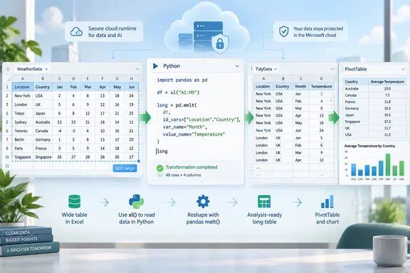
melt() method to turn repeating month, quarter, or category columns into two fields: one containing the former headers and another containing their values.The important practical detail is that this is not a local Python script bolted onto Excel. Microsoft’s Python in Excel feature runs calculations in a secure Microsoft Cloud runtime, then can return the result as ordinary Excel values. That makes the technique a convenient bridge between a spreadsheet workflow and a repeatable data transformation—but it also means the formula depends on a qualifying Microsoft 365 license, connected experiences, and an internet connection.
The two-line unpivot formula is valid
The core example supplied by How-To Geek is:
df = xl("WeatherData[#All]", headers=True)
df.melt(id_vars=["Location", "Country"], var_name="Month", value_name="Temperature")
Microsoft documents the xl() function as the supported way for Python cells to read an Excel range, named range, table, image, or Power Query connection. The table reference in the example, WeatherData[#All], includes the table headers, while headers=True instructs Python to treat the first row as column names.
The second line uses pandas, the data-analysis library Microsoft supplies in its managed Python environment. Pandas documents melt() as an unpivot operation: specified identifier columns remain in place, while every other column becomes a row-level attribute and value.
For the weather-table example, Location and Country remain identifiers. Columns called Jan, Feb, through Dec are no longer separate measures. Instead, Jan becomes a value in the new Month field, and the number beneath it becomes the related Temperature value.
A source table with 100 locations and 12 monthly columns produces 1,200 records, assuming every location has a value for every month. That increase in row count is expected. It is the representation required for Excel features that need a single categorical field—such as filtering a particular month in a PivotTable or placing Month on a chart axis.
melt() is broader than a months-to-rows trick
The strength of the formula is not merely that it handles 12 month names without typing each one. By naming only the columns that must remain fixed in id_vars, pandas treats all other columns as values to unpivot.
That makes it resilient when a report acquires another period column. A sales sheet with Product, Department, Q1, Q2, Q3, and Q4 can use:
df = xl("SalesData[#All]", headers=True)
df.melt(id_vars=["Product", "Department"], var_name="Quarter", value_name="Sales")
If the sender later adds Q5, the formula will absorb it without an edit. More realistically, the same behavior matters when a monthly report grows from January–December to include a new forecast column, or when imported data adds a new metric.
That convenience has a boundary: every column not listed in id_vars will be melted. If the table also contains columns such as Notes, LastUpdated, RegionalManager, or a row-level source-system ID, leaving them out will turn them into records alongside the months. The formula will still run, but the output will be structurally wrong for analysis.
The safer version for a mixed table is to explicitly list the columns that should be transformed:
df = xl("SalesData[#All]", headers=True)
df.melt(
    id_vars=["Product", "Department", "Region"],
    value_vars=["Q1", "Q2", "Q3", "Q4"],
    var_name="Quarter",
    value_name="Sales"
)
That is more maintenance when future period columns arrive, but it guards against accidental restructuring of unrelated fields. The choice comes down to whether the source layout is predictable and whether the non-period columns are stable.
Excel tables make the formula dynamic, but the output needs room
How-To Geek correctly recommends formatting the input as an Excel table with Ctrl+T before using the formula. Structured table references expand as source rows are added or removed, so WeatherData[#All] follows the table rather than a fixed A1-style range.
Microsoft’s dynamic-array guidance adds a critical placement rule: a formula that spills a multi-cell result must sit outside an Excel table. The source should be an Excel table; the Python output should occupy an ordinary worksheet range with enough empty cells beneath and to the right.
If another value, formula, or merged cell blocks the result, Excel returns #SPILL!. This is easy to mistake for a Python failure when it is actually a worksheet-layout problem. Clear the intended output area rather than attempting to place the result inside another table.
The output setting also matters. Python in Excel can return a Python object or Excel Value. A DataFrame returned as an Excel value spills into the grid as a usable range, which is what the workflow requires if the next step is a PivotTable, chart, filter, or conventional worksheet formula.
The spill-range operator then gives that output a dynamic address. If the formula begins in P1, P1# refers to the entire current result rather than a manually estimated range such as P1:S1201. That prevents a common PivotTable mistake: a new input row expands the Python result, but the report is still pointed at yesterday’s fixed source range.
Power Query remains the lower-friction option for many workbooks
The formula approach is clever, but it does not replace Excel’s existing transformation tool. Microsoft’s Power Query documentation has an Unpivot Other Columns command designed for precisely this case: select the identifier fields that should remain unchanged, and Power Query unpivots everything else. New non-identifier columns added during refresh are also included.
For recurring imports from CSV files, databases, SharePoint folders, or business systems, Power Query generally provides a better operational path. It stores transformation steps in a visible query, can load results to a worksheet or Data Model, and is already the standard refresh layer in many managed Excel workbooks.
Python in Excel earns its place where an analyst wants the reshaping logic directly beside a worksheet-based model, needs to chain it with pandas work later in the same calculation, or simply finds a concise formula easier to retain than a Power Query workflow. In other words, it is a useful in-grid transformation, not a reason to rebuild a robust import process around a cloud calculation cell.
There is also a compatibility consideration. Python in Excel is available on supported Microsoft 365 editions for Windows, the web, and Mac, but it is unavailable in Excel for iPad, iPhone, and Android. Microsoft says unsupported clients can view a workbook containing Python cells, but recalculation produces an error. Perpetual-license Excel editions and device-based or shared-computer-activation Microsoft 365 deployments are also excluded.
Cloud execution changes the risk review
The seemingly modest formula sends referenced workbook data to a managed Python container in Microsoft’s cloud for processing. Microsoft says the containers are hypervisor-isolated, data is not persisted, the code has no network access, and the environment cannot access a user’s local computer, token, or unrelated workbook properties.
Those controls are meaningful, particularly compared with opening an untrusted macro-enabled workbook. But organizations that restrict Microsoft 365 connected experiences, handle regulated data, or operate with strict data-residency controls should still check policy before deploying Python cells in production templates. A workbook that works on an analyst’s fully licensed desktop can fail in a shared-device environment or in a tenant where the relevant connected service is disabled.
Microsoft also documents a 100 MB processing limit for a Python-in-Excel calculation. The weather-table example is trivial, but a wide extract from an ERP system can become significantly larger after unpivoting. A table with 50,000 records and 24 monthly measure columns becomes 1.2 million output rows before adding any other dimensions. At that point, a worksheet spill and PivotTable may be the wrong destination; Power Query and the Data Model are likely more appropriate.
Test the grain before trusting the PivotTable
The most important validation step occurs after the formula succeeds. Confirm what one output row means.
For the weather example, a row should mean: one location, in one country, for one month, with one temperature. If the long table contains duplicates at that grain, a PivotTable set to Average may hide the problem while still producing a plausible result. If blanks or text values appear among numeric month columns, Excel and pandas may preserve them in ways that affect counts, averages, and charts.
A quick check is to filter the long data to one known location and compare its 12 transformed records with the original row. Then inspect whether the generated Month values sort correctly. Labels such as Jan, Feb, and Mar may sort alphabetically in some reports rather than chronologically; real dates or a separate month-number field avoid that reporting error.
The formula is worth saving, but it should be treated as a controlled reshape step: define the identifiers, reserve spill space, choose Excel Value output, and verify the resulting row grain. Done that way, it converts a one-off report layout into a table that Excel can actually analyze without manually copying 12 columns into 1,200 rows.
References
- I fixed my messy Excel dataset with a single formula How-To Geek · 2026-09-20T11:00:14+00:00