

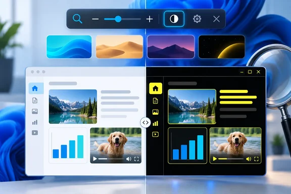
Microsoft released build 26340.9502 to the Experimental channel on September 18, 2026, as part of the Windows 11 26H2 development branch. Its release notes say the feature is rolling out gradually and is available only to a subset of Experimental Insiders at first. The company also makes the usual pre-release warning unusually relevant here: features tested in Experimental can change, disappear, or never reach stable Windows builds.
Neowin’s hands-on testing supplies the useful detail missing from Microsoft’s announcement. The report found that the new control leaves images and video color intact while applying the selected contrast scheme to Windows controls, text, and much of the surrounding interface. For people who use inversion purely because a bright desktop is uncomfortable, that distinction fixes the most disruptive part of the old workflow.
The four themes are familiar; the entry point is new
Aquatic, Desert, Dusk, and Night Sky are not newly invented Magnifier themes. Microsoft’s Windows design documentation identifies those same four names as the built-in Windows contrast themes already available under Settings > Accessibility > Contrast themes. The new part is that Magnifier can now turn on the selected contrast theme directly from its toolbar, with the selection managed under Settings > Accessibility > Magnifier.
That makes the change more practical than it initially sounds. Previously, a user who wanted lower glare without using inversion had to visit the broader Contrast themes settings page, select a theme, and apply it. The new Magnifier switch appears designed as a quick accessibility control: configure the preferred scheme once, then enable or disable it when needed from the tool already associated with viewing assistance.
Microsoft says Dark is the default selection for the toggle, although the user can choose a different contrast theme in Magnifier settings. Neowin reports seeing the four established choices—Aquatic, Desert, Dusk, and Night Sky—and describes their expected character: cyan-heavy dark treatments for Aquatic and Dusk, warm tones for Desert, and the familiar black-and-yellow Night Sky scheme.
The editorially important point is that Microsoft has repackaged an existing accessibility capability around a common use case rather than replacing Windows’ normal light and dark themes. Readers expecting a new OLED black mode or a general-purpose dark-theme scheduler will find a different tool: this is a contrast theme with the stronger borders, simplified surfaces, and high-visibility control treatment that entails.
It solves the media problem that inversion cannot
Magnifier’s existing inversion feature has a simple, blunt effect: it reverses the colors of the entire image presented to the display. It can make a bright document easier to read, but it also changes a photo’s color balance, makes video look wrong, and can turn charts into something difficult to interpret.
Microsoft explicitly says the contrast-theme toggle is separate from color inversion and preserves the original colors of photos, videos, and charts. Neowin’s testing of images and video found the same result: the user interface and surrounding text changed, while the media itself did not. That is the core functional difference, not a cosmetic preference.
For users with photophobia, low vision, migraine sensitivity, or simply a need to limit harsh white interfaces, preserving media color removes a major compromise. A person can darken a browser’s chrome, Windows controls, and text-heavy pages without rendering a training video, medical image, design proof, or presentation slide visibly false.
It also explains why the feature belongs in Magnifier rather than only in Personalization. Magnifier is one of Windows’ primary low-vision tools, and it already contains controls such as zoom and color inversion that users may need to toggle quickly during a session. Placing a lower-glare option there recognizes that screen comfort can be situational: a user may need it for an hour of reading, not necessarily as their permanent desktop appearance.
Web pages remain the weak point
The media-preservation claim should not be mistaken for a guarantee that every application or website will look polished. Microsoft’s own support documentation on contrast themes explains that they can alter the background, text, hyperlinks, selected text, button text, and inactive text across Windows and webpages. That is why contrast themes can make otherwise unreadable color combinations legible, but it is also why they can override an application’s intended visual hierarchy.
Neowin observed precisely that unevenness in build 26340.9502. Desert reportedly made relatively limited changes to some web text and links, while Night Sky could make a webpage appear deeply dark. Aquatic and Dusk were more aggressive on some pages, recoloring backgrounds, text, and hyperlinks to match their cyan-toned treatment.
Those results should be read as an expected consequence of the feature’s accessibility role, rather than a defect unique to the new toggle. A contrast theme must substitute strong, consistent colors where an application supplies low-contrast or decorative styling. The same mechanism can make navigation and controls more visible, while making a carefully designed website look flatter and less like its original palette.
For developers and enterprise IT teams, this is also a reminder that contrast-theme support is not optional polish. Microsoft’s Windows app guidance tells developers to use theme-aware system resources so foreground and background colors adapt correctly at runtime. Applications that hard-code gray backgrounds, subtle borders, or brand-colored text may remain usable in a normal theme yet become difficult to parse when a user enables contrast settings.
The Magnifier behavior change may be the quieter win
Neowin also reports that Magnifier no longer immediately zooms the screen when launched in this build. That is a small change with a large usability effect for anyone who opens Magnifier to access its non-zoom controls.
Historically, opening Magnifier could immediately alter the desktop scale, forcing users to undo or work around the magnification before they could reach color inversion or other settings. If the new behavior persists beyond Experimental testing, it changes Magnifier from a tool that assumes zoom is always the first intent into a more flexible accessibility control panel.
It fits with Microsoft’s recent Magnifier work in the same 26H2 Experimental branch. Earlier September builds added per-display zoom, allowing each monitor in an extended multi-monitor setup to retain its own zoom level. The contrast-theme toggle continues that shift toward treating Magnifier as a collection of independent visual accommodations instead of a single full-screen enlargement feature.
There is one practical complication: switching full contrast themes has never been instantaneous. Microsoft’s support guidance notes that Windows can show a brief wait while colors change, and Neowin saw occasional delays or failed first attempts when switching themes in 26340.9502. That behavior is worth reporting through Feedback Hub, but it is not yet evidence of a regression; this feature is explicitly in the Experimental channel and rolling out through Controlled Feature Rollout.
Who should use it now
This is a sensible feature to test on a noncritical Insider PC if color inversion is currently the only tolerable way to reduce glare. Configure a preferred scheme under Settings > Accessibility > Magnifier, then use the toolbar toggle when working through bright interfaces or long reading sessions. Night Sky may appeal to users who want a black-forward interface with conspicuous yellow controls, while Desert offers the warmer light-background alternative.
It is not a reason to move a production machine onto the Experimental channel. Build 26340.9502 is a Windows 11 26H2 preview delivered through an enablement package, and Microsoft says the new capability is reaching only a subset of eligible testers. There is no public commitment yet on a stable-release date, a supported Windows 11 version outside 26H2, or whether the current control behavior will remain unchanged.
The immediate consequence is modest but concrete: Windows users who need lower glare can now test a selective alternative to screen-wide inversion. The larger lesson is clearer still—Microsoft’s existing contrast themes work best when they are reachable at the moment a user needs them, and Magnifier is finally becoming a more credible place to reach them.