

Microsoft’s latest Windows 11 Insider preview adds a redesigned Account Control flyout in the Start menu, giving users a clearer view of their Microsoft account, Microsoft 365 subscription status, benefits, storage, and upgrade options before the feature reaches the broader Windows 11 audience. The change, reported by WinCentral and presented as part of Microsoft’s continuing Windows 11 interface cleanup, is small enough to miss and revealing enough to matter. It turns the humble Start menu profile button into another surface where Windows explains, promotes, and operationalizes the Microsoft account. That is the real story: Windows 11 is not merely getting prettier; it is getting better at making Microsoft’s services feel like part of the operating system’s natural grammar.
The old account flyout in Windows was utilitarian. It gave users the basics: profile identity, lock, sign out, switch user, and a path toward account settings. The new version, according to WinCentral’s report, brings Microsoft account status, subscription badges, cloud storage, benefits, and upgrade pathways into the same lightweight Start menu surface.
That sounds like a minor visual refresh, and in one sense it is. The flyout gets cleaner spacing, more modern cards, and a layout better aligned with Windows 11’s rounded, airy design language. But the design change is also a product strategy change, because Microsoft is choosing to put commercial account context in a place users open dozens of times a day.
The profile flyout is not the Microsoft Store. It is not the Microsoft 365 website. It is not a promotional banner tucked inside a setup wizard. It sits at the edge of Start, one of the most politically sensitive pieces of Windows real estate, and Microsoft is using it to make subscription state visible.
That visibility has two readings. For paying Microsoft 365 customers, it is useful: storage and subscription status are easier to check without spelunking through Settings or a browser. For everyone else, it is another reminder that the Microsoft account is no longer just a login credential; it is the control plane for a growing bundle of paid services.
A badge is not an ad in the crude sense. It does not need to flash, animate, or interrupt the workflow. Its power is softer: it normalizes the idea that Windows should know whether you are a subscriber and should surface that status inside shell UI.
Microsoft has been moving in this direction for years. The Settings app already includes account and Microsoft 365 surfaces, and earlier Insider builds have tested subscription-related cards and cloud storage reminders. The difference here is intimacy. Settings is where users expect account administration; Start is where users expect launching, search, power, and identity switching.
That distinction matters because Windows users have spent the Windows 11 era debating the boundary between helpful integration and service promotion. A subscription badge that saves a Microsoft 365 customer three clicks is genuinely convenient. A subscription badge that nudges a free user toward a paid plan is also a conversion surface. Microsoft would prefer those two facts not be in tension, but for many users they are.
The problem is that Windows 11’s modernization program has never been purely aesthetic. The rounded corners, redesigned Settings pages, refreshed File Explorer, new Start menu behaviors, and system flyouts all belong to a broader remaking of Windows as a connected endpoint. A connected endpoint has to look modern, but it also has to steer users toward cloud services, sync, storage, identity protection, Copilot features, and subscriptions.
This is where Microsoft’s consumer and enterprise instincts collide. The company wants Windows to feel like the front door to Microsoft 365, OneDrive, Game Pass, Copilot, and account security. But Windows is also an operating system people paid for, deploy at scale, image, manage, troubleshoot, and expect to remain predictable.
For home users, the new flyout may simply feel like a polished convenience. For administrators and power users, it will invite the usual questions: Can it be controlled? Does it respect local account workflows? Will it appear differently for Entra-managed PCs? Will it become another policy surface to audit after broad release?
The account flyout sits in a particularly sensitive corner because it intersects with sign-out and user switching. Previous iterations of account-related Start menu changes have drawn criticism when users felt Microsoft buried practical commands under account marketing or service cards. Even if the new flyout is cleaner, Microsoft is still operating in a trust deficit created by years of aggressive prompts around Edge, OneDrive backup, Microsoft account sign-in, and Microsoft 365 upsells.
That does not make the new design bad. It makes it politically expensive. A Start menu change that saves time for subscribers has to avoid making non-subscribers feel like second-class citizens inside their own OS.
The best version of this feature would be glanceable without being nagging, useful without being sticky, and respectful of users who do not want Windows to behave like a storefront. The worst version would be another conversion panel wearing the clothes of account management. The distinction will come down to frequency, dismissibility, policy controls, and how aggressively Microsoft tunes the experience after Insider feedback.
The redesigned flyout could solve a real problem: Microsoft account state is scattered. OneDrive has its own tray icon and sync status. Microsoft 365 has its own account portal. Windows Settings has its own account pages. The Microsoft Store knows another slice of purchase history. The new flyout tries to collapse some of that into a single, lightweight view.
That is especially useful for households where one person manages a family subscription. Seeing storage availability and plan status quickly could help users understand why OneDrive is complaining, why Office apps are licensed, or whether a subscription is active before renewal. It also helps Microsoft reduce support friction by putting account context closer to where users already are.
The danger is that Microsoft will confuse account clarity with account monetization. Storage visibility is helpful when a user wants to know why sync is failing. Storage visibility becomes annoying when every low-storage warning becomes an upsell before it becomes a cleanup tool.
The official Windows Insider blog regularly reminds testers that features may roll out gradually, change, disappear, or arrive in different channels at different times. That caveat matters here because a polished flyout in an Insider build is not a guarantee of the exact same experience in stable Windows. Microsoft can change the copy, the cards, the account logic, the eligibility rules, and the regional behavior before release.
The regional point is particularly important. Microsoft has already adjusted some account-based Windows experiences for users in the European Economic Area, especially where regulatory scrutiny around bundling and defaults is stronger. A Start menu account surface that looks straightforward in one market may need different behavior in another.
For WindowsForum readers, the practical message is simple: do not assume screenshots tell the whole deployment story. Insider features are staged, controlled, and sometimes A/B tested. If the new flyout is not visible on a given Insider PC, that may reflect rollout targeting rather than a failed installation.
On a managed PC, the distinction between a Microsoft account and an Entra ID is not cosmetic. Work and school accounts carry compliance, governance, and data boundary implications. If Microsoft keeps richer consumer account cards away from Entra-managed commercial environments, the feature becomes less controversial. If account cards, storage prompts, or service suggestions leak into business contexts, administrators will want controls.
There is also a support dimension. The more Windows surfaces account and subscription information, the more users may interpret licensing or storage problems as Windows problems rather than Microsoft 365, OneDrive, or account portal problems. That can be good if the OS points users to the right fix. It can be bad if it creates yet another place where partial information is shown without enough administrative context.
Microsoft has been trying to make Windows more helpful through contextual surfaces. The account flyout fits that strategy. But helpfulness at enterprise scale is not measured by whether a card looks nice; it is measured by whether it can be documented, governed, hidden, localized, and supported without increasing ticket volume.
The redesigned flyout will not settle that debate, but it will feed it. A Start menu card that shows Microsoft 365 benefits only makes sense if Windows is deeply aware of your Microsoft account. That is precisely what Microsoft wants, and precisely what privacy-minded or autonomy-minded users dislike.
The irony is that the feature is likely most useful to people who have already accepted Microsoft’s account model. If you live in OneDrive, subscribe to Microsoft 365, use Edge sync, and rely on Windows backup, the flyout is a welcome dashboard. If you deliberately avoid those services, the flyout risks feeling like another piece of the shell designed for someone else.
Microsoft could reduce the tension by making the experience modest and configurable. The company does not need to pretend local-account users want subscription cards. It needs to resist the temptation to treat every empty account surface as unused advertising inventory.
A refreshed Account Control flyout is part of that long cleanup. Better spacing, clearer cards, and more readable hierarchy are not trivial; they reduce cognitive load. Windows has often suffered when important settings were buried under old UI assumptions, and account management is one of the areas where ordinary users can get lost quickly.
But polish also makes commercial surfaces more persuasive. A clumsy upsell is easy to resent. A clean, integrated account card can feel like part of the operating system even when it is nudging the user toward a paid plan. That is why design choices here deserve scrutiny.
The deeper Microsoft integrates account commerce into elegant shell UI, the more responsibility it has to separate status from solicitation. Showing “you have Microsoft 365 Family and 600GB free” is status. Pushing an upgrade card every time a user opens Start is solicitation. The line is not hard to define; it is just hard for platform companies to stop approaching it.
That is the operating system Microsoft is building. It is not Windows as a boxed product. It is Windows as a front end to an account-centered services ecosystem, with local compute, cloud storage, identity, productivity, gaming, and AI stitched together through shell surfaces.
There are real benefits to that model. Cross-device file resume can be convenient. OneDrive backup can save users after hardware failure. Subscription visibility can reduce confusion. Account security prompts can prevent lockouts. The problem is not integration itself; the problem is when integration becomes indistinguishable from leverage.
Microsoft has to earn the right to put more account intelligence into Windows. It earns that right by making the surfaces useful, quiet, controllable, and honest. It loses that right when the OS feels less like a personal computer and more like a funnel.
Microsoft’s redesigned Account Control flyout may become one of those features most users barely think about once it ships: a cleaner card, a visible badge, a quicker path to storage and subscription details. But it is also a useful marker of where Windows is going. The next phase of Windows is not defined only by Copilot, ARM PCs, or refreshed icons; it is defined by the steady conversion of familiar shell surfaces into account-aware service panels, and the success of that strategy will depend on whether Microsoft can make those panels feel like help rather than pressure.
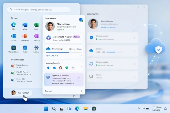 Microsoft Turns the Profile Button Into a Service Dashboard
The old account flyout in Windows was utilitarian. It gave users the basics: profile identity, lock, sign out, switch user, and a path toward account settings. The new version, according to WinCentral’s report, brings Microsoft account status, subscription badges, cloud storage, benefits, and upgrade pathways into the same lightweight Start menu surface.That sounds like a minor visual refresh, and in one sense it is. The flyout gets cleaner spacing, more modern cards, and a layout better aligned with Windows 11’s rounded, airy design language. But the design change is also a product strategy change, because Microsoft is choosing to put commercial account context in a place users open dozens of times a day.
The profile flyout is not the Microsoft Store. It is not the Microsoft 365 website. It is not a promotional banner tucked inside a setup wizard. It sits at the edge of Start, one of the most politically sensitive pieces of Windows real estate, and Microsoft is using it to make subscription state visible.
That visibility has two readings. For paying Microsoft 365 customers, it is useful: storage and subscription status are easier to check without spelunking through Settings or a browser. For everyone else, it is another reminder that the Microsoft account is no longer just a login credential; it is the control plane for a growing bundle of paid services.
The Subscription Badge Is Small, but the Placement Is Not
The new subscription badge is the headline feature because it distills the whole change into one glance. If your Microsoft account has an active subscription, the flyout can show that status directly from Start. If you are eligible for premium plans, the same space can point you toward upgrade options.A badge is not an ad in the crude sense. It does not need to flash, animate, or interrupt the workflow. Its power is softer: it normalizes the idea that Windows should know whether you are a subscriber and should surface that status inside shell UI.
Microsoft has been moving in this direction for years. The Settings app already includes account and Microsoft 365 surfaces, and earlier Insider builds have tested subscription-related cards and cloud storage reminders. The difference here is intimacy. Settings is where users expect account administration; Start is where users expect launching, search, power, and identity switching.
That distinction matters because Windows users have spent the Windows 11 era debating the boundary between helpful integration and service promotion. A subscription badge that saves a Microsoft 365 customer three clicks is genuinely convenient. A subscription badge that nudges a free user toward a paid plan is also a conversion surface. Microsoft would prefer those two facts not be in tension, but for many users they are.
Windows 11’s Modernization Has Always Had a Business Model
Microsoft’s stated rationale is straightforward: make account management clearer, faster, and more visually coherent. WinCentral describes the redesigned Account Control flyout as part of the company’s ongoing effort to modernize Windows 11 and simplify account management while giving Microsoft 365 subscribers quicker access to their benefits. That is the user-facing pitch, and it is not wrong.The problem is that Windows 11’s modernization program has never been purely aesthetic. The rounded corners, redesigned Settings pages, refreshed File Explorer, new Start menu behaviors, and system flyouts all belong to a broader remaking of Windows as a connected endpoint. A connected endpoint has to look modern, but it also has to steer users toward cloud services, sync, storage, identity protection, Copilot features, and subscriptions.
This is where Microsoft’s consumer and enterprise instincts collide. The company wants Windows to feel like the front door to Microsoft 365, OneDrive, Game Pass, Copilot, and account security. But Windows is also an operating system people paid for, deploy at scale, image, manage, troubleshoot, and expect to remain predictable.
For home users, the new flyout may simply feel like a polished convenience. For administrators and power users, it will invite the usual questions: Can it be controlled? Does it respect local account workflows? Will it appear differently for Entra-managed PCs? Will it become another policy surface to audit after broad release?
The Start Menu Remains Microsoft’s Most Contested Canvas
No part of Windows carries more emotional baggage than the Start menu. It is muscle memory, brand identity, launcher, search box, power menu, and complaint magnet all at once. Every change to it is judged not only on usability, but on what users think Microsoft is trying to take away or sell back.The account flyout sits in a particularly sensitive corner because it intersects with sign-out and user switching. Previous iterations of account-related Start menu changes have drawn criticism when users felt Microsoft buried practical commands under account marketing or service cards. Even if the new flyout is cleaner, Microsoft is still operating in a trust deficit created by years of aggressive prompts around Edge, OneDrive backup, Microsoft account sign-in, and Microsoft 365 upsells.
That does not make the new design bad. It makes it politically expensive. A Start menu change that saves time for subscribers has to avoid making non-subscribers feel like second-class citizens inside their own OS.
The best version of this feature would be glanceable without being nagging, useful without being sticky, and respectful of users who do not want Windows to behave like a storefront. The worst version would be another conversion panel wearing the clothes of account management. The distinction will come down to frequency, dismissibility, policy controls, and how aggressively Microsoft tunes the experience after Insider feedback.
The Useful Part Is Real, Especially for Microsoft 365 Households
It is easy to sneer at subscription integration, but Microsoft 365 is not a niche add-on. Millions of Windows users rely on OneDrive storage, Office apps, family sharing, and account security features that are tied to the same identity they use to sign into their PC. For those users, hiding subscription and storage state behind account.microsoft.com or several Settings pages is needless friction.The redesigned flyout could solve a real problem: Microsoft account state is scattered. OneDrive has its own tray icon and sync status. Microsoft 365 has its own account portal. Windows Settings has its own account pages. The Microsoft Store knows another slice of purchase history. The new flyout tries to collapse some of that into a single, lightweight view.
That is especially useful for households where one person manages a family subscription. Seeing storage availability and plan status quickly could help users understand why OneDrive is complaining, why Office apps are licensed, or whether a subscription is active before renewal. It also helps Microsoft reduce support friction by putting account context closer to where users already are.
The danger is that Microsoft will confuse account clarity with account monetization. Storage visibility is helpful when a user wants to know why sync is failing. Storage visibility becomes annoying when every low-storage warning becomes an upsell before it becomes a cleanup tool.
Insiders Are Testing More Than a New Flyout
Microsoft’s Windows Insider program is often framed as a testing pipeline for features, but it is also a testing pipeline for tolerance. The company ships small UI experiments, measures engagement, watches feedback, and decides how far to push. The new account flyout belongs in that category.The official Windows Insider blog regularly reminds testers that features may roll out gradually, change, disappear, or arrive in different channels at different times. That caveat matters here because a polished flyout in an Insider build is not a guarantee of the exact same experience in stable Windows. Microsoft can change the copy, the cards, the account logic, the eligibility rules, and the regional behavior before release.
The regional point is particularly important. Microsoft has already adjusted some account-based Windows experiences for users in the European Economic Area, especially where regulatory scrutiny around bundling and defaults is stronger. A Start menu account surface that looks straightforward in one market may need different behavior in another.
For WindowsForum readers, the practical message is simple: do not assume screenshots tell the whole deployment story. Insider features are staged, controlled, and sometimes A/B tested. If the new flyout is not visible on a given Insider PC, that may reflect rollout targeting rather than a failed installation.
Enterprise IT Will Read the Flyout as Another Policy Question
Consumer Windows changes often arrive wrapped in pastel colors and friendly copy. Enterprise administrators see something else: a new shell surface that may expose account state, subscriptions, storage, or promotional pathways on machines they are expected to govern. Even if the feature is consumer-focused, it raises predictable management questions.On a managed PC, the distinction between a Microsoft account and an Entra ID is not cosmetic. Work and school accounts carry compliance, governance, and data boundary implications. If Microsoft keeps richer consumer account cards away from Entra-managed commercial environments, the feature becomes less controversial. If account cards, storage prompts, or service suggestions leak into business contexts, administrators will want controls.
There is also a support dimension. The more Windows surfaces account and subscription information, the more users may interpret licensing or storage problems as Windows problems rather than Microsoft 365, OneDrive, or account portal problems. That can be good if the OS points users to the right fix. It can be bad if it creates yet another place where partial information is shown without enough administrative context.
Microsoft has been trying to make Windows more helpful through contextual surfaces. The account flyout fits that strategy. But helpfulness at enterprise scale is not measured by whether a card looks nice; it is measured by whether it can be documented, governed, hidden, localized, and supported without increasing ticket volume.
The Local Account Crowd Will See One More Line Being Crossed
Windows 11 has steadily raised the pressure to use a Microsoft account, especially during setup for consumer editions. Microsoft argues that account sign-in enables backup, Find My Device, Store access, subscription management, and cross-device continuity. Critics argue that the OS increasingly treats a local account as an edge case to be discouraged rather than a first-class choice.The redesigned flyout will not settle that debate, but it will feed it. A Start menu card that shows Microsoft 365 benefits only makes sense if Windows is deeply aware of your Microsoft account. That is precisely what Microsoft wants, and precisely what privacy-minded or autonomy-minded users dislike.
The irony is that the feature is likely most useful to people who have already accepted Microsoft’s account model. If you live in OneDrive, subscribe to Microsoft 365, use Edge sync, and rely on Windows backup, the flyout is a welcome dashboard. If you deliberately avoid those services, the flyout risks feeling like another piece of the shell designed for someone else.
Microsoft could reduce the tension by making the experience modest and configurable. The company does not need to pretend local-account users want subscription cards. It needs to resist the temptation to treat every empty account surface as unused advertising inventory.
The Design Language Is Finally Catching Up to the Strategy
One reason this change may land better than earlier account prompts is that Windows 11’s visual system has matured. The first releases of Windows 11 often felt inconsistent: modern Settings pages sat beside legacy dialogs, new flyouts beside old control panels, and dark mode beside decades-old white boxes. Microsoft has spent years smoothing those seams.A refreshed Account Control flyout is part of that long cleanup. Better spacing, clearer cards, and more readable hierarchy are not trivial; they reduce cognitive load. Windows has often suffered when important settings were buried under old UI assumptions, and account management is one of the areas where ordinary users can get lost quickly.
But polish also makes commercial surfaces more persuasive. A clumsy upsell is easy to resent. A clean, integrated account card can feel like part of the operating system even when it is nudging the user toward a paid plan. That is why design choices here deserve scrutiny.
The deeper Microsoft integrates account commerce into elegant shell UI, the more responsibility it has to separate status from solicitation. Showing “you have Microsoft 365 Family and 600GB free” is status. Pushing an upgrade card every time a user opens Start is solicitation. The line is not hard to define; it is just hard for platform companies to stop approaching it.
Microsoft’s Cloud OS Is Being Built One Flyout at a Time
The account flyout is another small tile in a much larger mosaic. Windows 11 increasingly acts as a local interface for cloud state: files you worked on elsewhere, storage you consume online, subscriptions you manage through Microsoft, apps licensed through the Store, and AI features whose availability may depend on hardware, region, account type, or service tier.That is the operating system Microsoft is building. It is not Windows as a boxed product. It is Windows as a front end to an account-centered services ecosystem, with local compute, cloud storage, identity, productivity, gaming, and AI stitched together through shell surfaces.
There are real benefits to that model. Cross-device file resume can be convenient. OneDrive backup can save users after hardware failure. Subscription visibility can reduce confusion. Account security prompts can prevent lockouts. The problem is not integration itself; the problem is when integration becomes indistinguishable from leverage.
Microsoft has to earn the right to put more account intelligence into Windows. It earns that right by making the surfaces useful, quiet, controllable, and honest. It loses that right when the OS feels less like a personal computer and more like a funnel.
The Start Menu Badge Tells Users Where Windows Is Heading
The practical impact of the new flyout is limited for now, because it is in Insider testing and subject to staged rollout. But the direction is clear enough to read.- The redesigned Account Control flyout makes Microsoft account, subscription, benefits, storage, and upgrade information more visible from the Start menu.
- The feature is most useful for Microsoft 365 subscribers who want quicker access to plan and storage status without opening Settings or a browser.
- The same design also gives Microsoft another prominent surface for subscription awareness and potential upgrades inside Windows 11.
- Insider availability does not guarantee immediate public release, because Microsoft can alter, delay, or remove features based on testing and feedback.
- Administrators should watch for policy controls, commercial-account behavior, and regional differences before treating the flyout as a predictable fleet feature.
- The user reaction will depend less on the badge itself than on whether Microsoft keeps the experience informational rather than promotional.
Microsoft’s redesigned Account Control flyout may become one of those features most users barely think about once it ships: a cleaner card, a visible badge, a quicker path to storage and subscription details. But it is also a useful marker of where Windows is going. The next phase of Windows is not defined only by Copilot, ARM PCs, or refreshed icons; it is defined by the steady conversion of familiar shell surfaces into account-aware service panels, and the success of that strategy will depend on whether Microsoft can make those panels feel like help rather than pressure.