Enable Color Filters & High Contrast for Easy Reading (Win 10/11)
Difficulty: Beginner | Time Required: 10 minutesIf you’ve ever squinted at a page, struggled with a busy color scheme, or simply want text to “pop” more for comfortable reading, color filters and high contrast can be real life-savers. These built-in accessibility features in Windows help boost readability and reduce eye strain, whether you’re using Windows 10 or Windows 11. In this guide, you’ll learn how to enable and switch between color filters and high-contrast themes, with quick tips to tailor them to your needs.
Introduction: Why this helps
Quick walkthrough
- Color filters adjust the color balance of your screen to accommodate color vision differences or to create higher contrast for easier reading.
- High contrast themes swap colors across the UI to create bold text and distinct backgrounds, which is especially helpful for long reading sessions or when you’re working in bright light.
- Both features can improve legibility in different contexts (documents, websites, apps) and can be used together or separately as needed.
- A Windows PC running Windows 10 (any supported version) or Windows 11. The steps are similar, but the wording in Settings may differ slightly between versions.
- You can enable accessibility features as a standard user. Some managed devices may restrict these options; if so, contact your admin.
Part A — Enable Color Filters
- Open Settings
- Press Windows key + I to open the Settings app quickly.
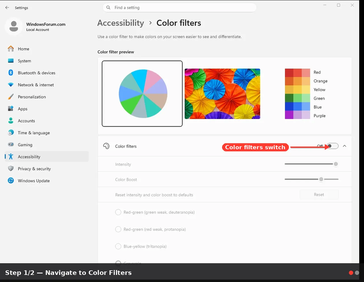
- Navigate to Color Filters
- Windows 10: Go to Ease of Access, then Color filters.
- Windows 11: Go to Accessibility, then Color filters.
- Turn on color filters
- Toggle the switch to Turn on color filters. If you don’t see the option, make sure you’re on a supported Windows build (modern Windows 10 or Windows 11) and that accessibility features aren’t being blocked by policy.
- Choose a filter that fits your needs
- Grayscale: Converts colors to grayscale for high-contrast text.
- Grayscale inverted: Inverts grayscale, which can help in some lighting conditions.
- Red/Green (Protanopia/Deuteranopia): Helpful for common color-vision differences.
- Blue/Yellow: May improve readability for some users.
- Tip: Try a few options and test on your most-used apps, documents, and websites. You can switch anytime.
- Confirm visibility across apps
- Open a document, a webpage, or a video to verify readability. Some color-coded visuals might look unusual with certain filters; that’s normal—pick the one that works best for your daily tasks.
- Quick toggle (handsy shortcut)
- Use Windows key + Ctrl + C to toggle color filters on and off. This is handy when you want to switch quickly for a specific task (e.g., editing a photo vs. reading a long article).
- Turn off if needed
- When you’re done, return to Settings > Accessibility > Color filters and switch Turn on color filters to Off. You can also toggle via the Windows shortcut.
- Open Settings
- Again, press Windows key + I to open Settings.
- Go to High contrast
- Windows 10: Settings > Ease of Access > High contrast.
- Windows 11: Settings > Accessibility > High contrast.
- Turn on High Contrast
- Flip the “Turn on high contrast” switch to On. Windows will apply a high-contrast theme immediately, making text and UI elements stand out more distinctly.
- Pick a theme and customize colors
- Choose a preset theme (e.g., High Contrast Black, White, or others). You can tailor element colors such as Text, Link, Background, Highlight, Disabled, and more to suit your preferences.
- Tip: If you work long hours at the computer, you might prefer a black background with bright text to reduce glare; if you collaborate in bright spaces, a lighter theme might be more comfortable.
- Apply and test
- After selecting a theme, observe your desktop, File Explorer, browsers, and apps. Most standard Windows UI will reflect the high-contrast colors, and many common apps will adapt as well.
- Quick toggle (keyboard shortcut)
- Use Left Alt + Left Shift + Print Screen to toggle high contrast on and off. If this shortcut doesn’t work, check your language/keyboard layout or hotkeys settings in Windows.
- Reverting to default
- To return to the default Windows appearance, either switch High contrast off in Settings or choose a standard theme and revert the color choices under the same menu.
- Compatibility caveats
- Some apps, especially those with custom UI themes or those using web-based interfaces, may not fully respect color filter or high-contrast settings. If you notice an app that seems off, try toggling the feature off for that app or check for in-app display options.
- Some websites use their own color schemes; a color filter might make them easier or harder to read depending on the design. Test your most frequently used sites.
- When to use each feature
- Color filters are great for day-to-day reading and for users who want to preserve color visitations (e.g., when color is meaningful in content but needs clarity).
- High contrast is especially helpful for long-form reading, coding, or working in bright environments, where stark text on high-contrast backgrounds reduces eye strain.
- Performance and device considerations
- These accessibility features are lightweight options and should not noticeably impact performance on modern PCs. If you notice flickering or unusual visuals, try turning off color filters or high-contrast themes.
- Admin or policy restrictions
- On school or corporate devices, certain accessibility settings may be blocked by system policy. If you can’t enable color filters or high contrast, contact your IT admin or try updating Windows to a supported release.
- Fine-tuning beyond the basics
- If you need larger text, adjust display scaling: Settings > System > Display > Scale and layout. Increasing the scaling can complement color or contrast changes.
- If you use a dark theme but want high-contrast text, experiment with combining a high-contrast color combination that still aligns with your comfort level.
- Consider pairing with a larger cursor or a magnifier for additional readability if needed (Settings > Accessibility > Vision > Magnifier).
Enabling color filters and high-contrast themes is a simple yet powerful way to make Windows more readable and comfortable. Whether you’re navigating dense documents, browsing the web, or working on code, these features adapt your screen’s appearance to your vision needs. By starting with a single filter or theme and tweaking from there, you can tailor a setup that reduces eye strain, speeds up reading, and makes Windows feel welcoming again.
Key takeaways
- Color filters adjust overall screen color to boost readability for users with color-vision differences or preference for higher contrast.
- High-contrast themes provide bold, distinct UI colors that help focus on text and controls.
- Shortcuts (Windows key + Ctrl + C for color filters; Left Alt + Left Shift + Print Screen for high contrast) let you switch quickly as needs change.
- Both features are available in Windows 10 and Windows 11 via Settings > Accessibility or Ease of Access, with slightly different menu paths.
- Some apps may not perfectly adopt these changes; test across your most-used tools and adjust as needed.
This tutorial was generated to help WindowsForum.com users get the most out of their Windows experience.
Last edited: