

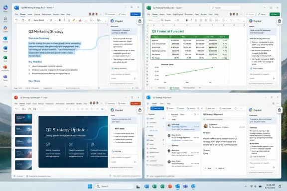
Microsoft on May 28, 2026, announced a redesigned Microsoft 365 Copilot app and refreshed in-app Copilot experiences across Word, Excel, PowerPoint, and Outlook, including a larger prompt surface, faster app performance, and a less intrusive approach to the floating Copilot entry point. The redesign is not a retreat from AI in Office; it is a tactical correction. After months of pushing Copilot into every available corner of the Microsoft 365 interface, Redmond is discovering that visibility and usefulness are not the same thing. The real story is not that Copilot got prettier, but that Microsoft is trying to make Copilot feel inevitable without making it feel unavoidable.
The most telling part of Microsoft’s latest Copilot redesign is not the new prompt area, the performance claim, or the soft-focus language about craft and intention. It is the fate of the floating Copilot button, the little interface barnacle that appeared over working content in Office apps and immediately became a symbol of Microsoft’s AI overreach.
For users who spend their day inside Excel grids, Word documents, or PowerPoint slides, interface placement is not decorative. A button that hovers over a spreadsheet cell is not “ambient intelligence”; it is an obstruction. Microsoft framed the button as a consistent entry point that understands the context beneath it, but many users saw something simpler: an AI upsell parked on top of the work they were trying to finish.
The company has now softened that approach. The redesigned system still keeps Copilot close, but Microsoft is emphasizing fewer scattered touchpoints and a more coherent, contextual model. That is a quiet admission that the original AI land grab across Microsoft 365 had a discoverability problem, a trust problem, and a manners problem.
This matters because Office is not a playground for speculative UI experiments. It is infrastructure. When Microsoft changes the affordances inside Word, Excel, PowerPoint, and Outlook, it is not merely nudging consumer behavior; it is altering the working environment of millions of employees, analysts, accountants, teachers, lawyers, civil servants, and sysadmins who must support the consequences.
That shift is strategically important. A small chat box encourages small questions. A larger, more structured prompt canvas invites users to bring in chunks of documents, messy instructions, tables, drafts, and multi-step requests. Microsoft is trying to move Copilot from the realm of “summarize this” toward something closer to a workbench.
This is also where the redesign gets more serious than a cosmetic refresh. The first generation of Copilot experiences often felt like a chatbot had been bolted to Office. The new design suggests Microsoft knows that knowledge workers do not merely ask isolated questions; they assemble context, revise intent, compare outputs, and iterate against the shape of a real deliverable.
If Copilot is going to justify its place in Microsoft 365, it cannot live forever as a sidebar oracle. It has to become a system that understands the object the user is making: a quarterly forecast, a contract redline, a board deck, a hiring plan, a client email, or a meeting brief. Microsoft’s new design is an attempt to make the prompt itself feel like part of the document workflow rather than an interruption beside it.
The risk, of course, is that “task-aware” becomes another way of saying “always watching.” Microsoft has learned to talk carefully about enterprise data boundaries, tenant grounding, and work context, but users experience those abstractions through the UI. A prompt surface that expands at the right moment feels helpful; one that seems to anticipate too much can feel invasive.
A slow AI assistant does not merely waste time. It breaks the user’s train of thought. In productivity software, a three-second delay can feel longer than it is because users are often mid-task, mid-sentence, or mid-analysis when they ask for help.
Speed also changes user behavior. If Copilot feels like opening a separate destination, users will ration their interactions. If it feels immediate, they may start using it for smaller tasks: rewriting a sentence, checking a formula explanation, turning a meeting note into an action list, or testing alternate phrasing before sending an email.
But Microsoft’s problem has never been only speed. The company can optimize loading times and first-token response all it wants; the harder challenge is reliability at the level of business judgment. A fast wrong answer is still wrong. A polished hallucination in a board deck is still a governance issue. A confident summary of a sensitive email thread is still something administrators and legal teams will want to understand before it becomes routine.
That is why the redesign should be read as part of a larger adoption campaign rather than a standalone product improvement. Microsoft needs Copilot to feel fast enough to be habitual, visible enough to be tried, and restrained enough not to generate rebellion from the very users it is trying to convert.
Those numbers sound impressive until you look at the measurement window. For Word, Excel, and PowerPoint, Microsoft compared activity from May 8–12, 2026, after rollout, with activity from May 1–5, 2026, before rollout. The company itself cautioned that the results reflect short-term changes and may not indicate long-term trends.
That caveat is doing heroic work. A one-week comparison around a UI change can capture novelty, curiosity, forced exposure, tenant rollout effects, internal promotion, and user confusion as easily as it captures durable adoption. If a new button appears in a place where users cannot miss it, engagement may rise because people are exploring, misclicking, or trying to dismiss it.
This does not make the numbers meaningless, but it does make them incomplete. In enterprise software, the metric that matters is not whether users touched a feature after it was moved into their path. The better question is whether they returned to it after the novelty faded, whether it helped complete work faster, whether it reduced rework, and whether organizations renewed licenses after comparing cost to measurable output.
Microsoft knows this. The company has sophisticated telemetry, customer research, and adoption analytics. It chose to publish short-term uplift figures because they support the story it wants to tell now: the redesign is working, users are responding, and Copilot is becoming more embedded in daily Microsoft 365 behavior.
A more convincing version of the story would include longer retention windows, task completion rates, satisfaction movement, license cohort behavior, and some separation between voluntary engagement and exposure-driven clicks. Until then, the numbers are best understood as a signal of early movement, not proof of a transformed workday.
Microsoft has long treated Excel as a flagship target for AI assistance, and for good reason. Spreadsheets contain exactly the sort of semi-structured business data that makes AI demos look magical: forecast tables, messy exports, budget models, survey results, operational logs, and ad hoc analysis. A capable assistant that can explain formulas, spot anomalies, generate charts, and guide users through unfamiliar functions would be genuinely valuable.
But Excel is also where trust is hardest to earn. A bad paragraph in Word can be edited. A weak slide in PowerPoint can be reworked. A wrong spreadsheet recommendation can distort a forecast, break a model, or send someone hunting through dependent formulas for the source of a subtle error.
That makes UI humility more important, not less. The assistant needs to be available when summoned, contextual when invited, and very careful when it proposes changes. The more Microsoft makes Copilot feel like a co-author inside Excel, the more it must respect that many users will treat unsupervised suggestions as a risk rather than a convenience.
The redesigned entry model appears to acknowledge this tension. Microsoft still wants Copilot visible, but it is now speaking the language of flow, context, and restraint. That is progress, even if it comes after users had to remind the company that an assistant placed over the work is still in the way.
That should not surprise anyone who has watched previous platform shifts. The PC, the web, smartphones, and cloud software all became mainstream not merely because the underlying technology improved, but because the interaction model became legible. Users need to understand where a tool lives, what it can do, when it is safe to use, and how to recover when it goes wrong.
Copilot has struggled here because Microsoft put the same brand name across too many surfaces at once. There is Copilot in Windows, Copilot in Microsoft 365, Copilot Chat, Copilot Studio, Copilot in Edge, Copilot in Teams, Copilot in Office apps, and various licensed and unlicensed experiences that behave differently depending on tenant, app, platform, and subscription status. Even IT pros can find the naming and entitlement maze irritating.
The redesign tries to impose a more unified grammar. A consistent entry point, contextual suggestions, expanded prompt surfaces, and shared keyboard patterns are all attempts to make Copilot feel like a system rather than a pile of AI features. That is the right instinct.
But consistency cuts both ways. If Copilot becomes more predictable, users may trust it more. If it becomes predictably present in places where organizations do not want it, administrators will ask for sharper controls. The same design coherence that helps adoption can also intensify resistance if Microsoft does not give enterprises clear governance knobs.
This is why users are right to be skeptical when Microsoft frames every Copilot surface as a productivity improvement. Some of it is. Some of it may become so. But some of it is also product placement inside software that customers already pay for, designed to normalize an additional AI subscription and make the absence of Copilot feel like a missing capability.
That tension is particularly visible in organizations where only some users have premium Copilot licenses. Admins must explain why one employee sees certain features in Word while another sees a prompt to upgrade or a limited chat experience elsewhere. The more Microsoft redesigns Office around Copilot, the more licensing asymmetry becomes a user experience problem.
There is also a procurement issue. A better UI may improve trial engagement, but it does not answer the CFO’s question: does Copilot save enough time, improve enough output, or reduce enough operational friction to justify the cost across a large seat base? For some roles, the answer may be yes. For others, it may remain speculative.
Microsoft’s redesign is therefore doing double duty. It is trying to make Copilot more useful for existing users while making the case that Copilot belongs at the center of Microsoft 365. The former is a product goal. The latter is a business model.
That does not mean the ribbon disappears. It means the prompt becomes a parallel interface for people who either do not know where a feature lives or do not want to manually compose a sequence of operations. In theory, this is powerful. In practice, it requires the assistant to understand intent, constraints, permissions, document state, and user preference with far more precision than a generic chatbot.
The comparison to a command line is useful because it clarifies both promise and danger. A command line is efficient for those who know what they want, but unforgiving when commands are ambiguous. A natural-language command line is more approachable, but ambiguity does not disappear; it merely becomes conversational.
If a user asks Copilot to “make this more executive-ready,” the assistant has to infer audience, tone, length, risk tolerance, and organizational norms. If a user asks it to “clean up this spreadsheet,” it must understand whether that means formatting, deduplication, formula repair, outlier detection, or all of the above. These are not just language problems. They are work-context problems.
Microsoft’s advantage is that it owns the work context. It has the documents, emails, meetings, chats, calendars, files, and identity graph that define how many organizations operate. Its challenge is to turn that privileged position into reliable assistance without making users feel like the software has become an overconfident middle manager.
A prettier Copilot app does not reduce the need for policy clarity. Admins will want to know which experiences appear for which license types, how the floating entry point can be moved or disabled, how changes roll through Current Channel versus enterprise-managed update channels, and what documentation exists for help desk teams when users see different Copilot behavior across apps.
There is also the issue of shadow process creation. When AI tools become easier to invoke, employees may begin using them to draft customer communications, summarize sensitive files, transform datasets, or produce decision material without fully understanding the review obligations. That is not a reason to ban the tools outright, but it is a reason to govern them like production software rather than novelty features.
Security teams will look past the interface and ask where prompts and responses are stored, what logs are available, how retention policies apply, and whether sensitive information can be exposed through careless prompting. Legal and compliance teams will ask whether AI-generated content is discoverable, how citations or grounding are represented, and how users should validate outputs before relying on them.
The best version of Copilot in Microsoft 365 is one that gives administrators confidence while giving users speed. The worst version is one that gives users just enough power to create unmanaged risk and gives IT just enough telemetry to be blamed after the fact.
Microsoft’s short-term usage figures suggest that interface changes can drive engagement. That is not surprising. Office users respond to affordances. Put a feature in the ribbon, place an icon near selected content, expose a shortcut, or make the prompt area more inviting, and more people will try it.
The harder problem is habit formation. A workplace habit forms when a tool repeatedly solves a real problem with less friction than the old method. Copilot must beat muscle memory, not just competitors. It must be easier than asking a colleague, faster than searching old files, safer than improvising, and more reliable than doing the task manually.
That bar varies by app. In Outlook, summarizing threads and drafting replies are obvious use cases. In PowerPoint, generating structure and speaker notes may save time even when the output needs heavy editing. In Word, rewriting and summarization are familiar. In Excel, the upside is enormous, but so is the penalty for misplaced confidence.
Microsoft’s design challenge is to let Copilot be aggressive where the cost of error is low and cautious where the stakes are high. A single interface system across Microsoft 365 must still respect that not all Office work has the same risk profile.
For years, software companies have treated interface space as a growth channel. Notifications, banners, badges, recommendation panels, trial prompts, and “what’s new” popovers all compete for attention. AI raises the stakes because the product is no longer merely asking to be noticed; it is asking to participate in the work itself.
That is why the button mattered. It was not just a button. It was Microsoft asserting that Copilot deserved persistent physical presence in the user’s workspace. The backlash was users asserting that their workspace still belonged to them.
The redesign does not end that conflict, but it makes Microsoft’s position more sophisticated. Instead of scattering Copilot across the interface, the company now talks about anchoring it as a connected system. That sounds less chaotic, and it may be less annoying. But it still places Copilot at the center of Microsoft’s future for Office.
The real test will be whether Microsoft treats user control as a design principle or a concession. Moving the button back to the ribbon is useful. Making Copilot predictable, dismissible, governable, and respectful by default would be better.
Microsoft’s Copilot push asks users to renegotiate how they interact with documents. Instead of directly producing every paragraph, slide, formula, and summary, users are invited to delegate parts of the work to an assistant. That can be liberating when the task is tedious. It can be unsettling when the task requires judgment, authorship, or accountability.
This tension will not be solved by cleaner icons or faster load times. It will be solved through repeated experiences in which Copilot helps without getting in the way, suggests without nagging, and produces outputs that users can trust enough to edit rather than rebuild. Design can open the door, but reliability keeps the room occupied.
Microsoft has the advantage of distribution. It can put Copilot in front of users at massive scale, and the latest redesign shows it is willing to tune the interface when the first attempt irritates customers. But distribution can also mask weak adoption signals. If a feature is everywhere, usage will rise; that does not prove love.
The strongest argument for the redesign is that Microsoft appears to be moving away from brute-force insertion and toward a more considered AI layer. The strongest argument against it is that the company still seems too eager to translate early engagement into validation.
It could show how many users return weekly after first trying the redesigned prompt surface. It could report whether Copilot-assisted sessions reduce time to completion for common tasks. It could separate engagement caused by passive exposure from engagement initiated by users through keyboard shortcuts, contextual selections, or explicit app commands.
It could also be more transparent about satisfaction. A thumbs-up rate is helpful but limited. Enterprise buyers need to know where Copilot performs well, where users abandon responses, and where generated output requires so much correction that the time savings evaporate.
Most importantly, Microsoft should acknowledge that different workloads deserve different evidence. A PowerPoint outline generated from a Word document is not the same as a financial model analysis in Excel. A meeting recap is not the same as a legal summary. Adoption data becomes more meaningful when it is tied to task categories and risk levels.
Until then, the current figures should be treated as Microsoft’s opening argument. The redesigned Copilot is getting more attention. Whether it earns more trust remains to be seen.
 Microsoft Discovers That an Assistant Can Stand Too Close
The most telling part of Microsoft’s latest Copilot redesign is not the new prompt area, the performance claim, or the soft-focus language about craft and intention. It is the fate of the floating Copilot button, the little interface barnacle that appeared over working content in Office apps and immediately became a symbol of Microsoft’s AI overreach.For users who spend their day inside Excel grids, Word documents, or PowerPoint slides, interface placement is not decorative. A button that hovers over a spreadsheet cell is not “ambient intelligence”; it is an obstruction. Microsoft framed the button as a consistent entry point that understands the context beneath it, but many users saw something simpler: an AI upsell parked on top of the work they were trying to finish.
The company has now softened that approach. The redesigned system still keeps Copilot close, but Microsoft is emphasizing fewer scattered touchpoints and a more coherent, contextual model. That is a quiet admission that the original AI land grab across Microsoft 365 had a discoverability problem, a trust problem, and a manners problem.
This matters because Office is not a playground for speculative UI experiments. It is infrastructure. When Microsoft changes the affordances inside Word, Excel, PowerPoint, and Outlook, it is not merely nudging consumer behavior; it is altering the working environment of millions of employees, analysts, accountants, teachers, lawyers, civil servants, and sysadmins who must support the consequences.
The New Copilot Pitch Is Less Button, More Workspace
Microsoft’s new language around the prompt line is doing a lot of work. The company says the prompt surface is no longer just a text box but a “task-aware workspace,” capable of expanding, preserving pasted structure, supporting inline formatting, and surfacing relevant options as the user types.That shift is strategically important. A small chat box encourages small questions. A larger, more structured prompt canvas invites users to bring in chunks of documents, messy instructions, tables, drafts, and multi-step requests. Microsoft is trying to move Copilot from the realm of “summarize this” toward something closer to a workbench.
This is also where the redesign gets more serious than a cosmetic refresh. The first generation of Copilot experiences often felt like a chatbot had been bolted to Office. The new design suggests Microsoft knows that knowledge workers do not merely ask isolated questions; they assemble context, revise intent, compare outputs, and iterate against the shape of a real deliverable.
If Copilot is going to justify its place in Microsoft 365, it cannot live forever as a sidebar oracle. It has to become a system that understands the object the user is making: a quarterly forecast, a contract redline, a board deck, a hiring plan, a client email, or a meeting brief. Microsoft’s new design is an attempt to make the prompt itself feel like part of the document workflow rather than an interruption beside it.
The risk, of course, is that “task-aware” becomes another way of saying “always watching.” Microsoft has learned to talk carefully about enterprise data boundaries, tenant grounding, and work context, but users experience those abstractions through the UI. A prompt surface that expands at the right moment feels helpful; one that seems to anticipate too much can feel invasive.
Performance Claims Are the Easy Part
Microsoft says the updated Copilot app loads more than twice as fast and that response times for complex chat prompts have improved by 10 percent. Those are welcome claims, if borne out in the real world, because latency has been one of the most underrated obstacles to workplace AI adoption.A slow AI assistant does not merely waste time. It breaks the user’s train of thought. In productivity software, a three-second delay can feel longer than it is because users are often mid-task, mid-sentence, or mid-analysis when they ask for help.
Speed also changes user behavior. If Copilot feels like opening a separate destination, users will ration their interactions. If it feels immediate, they may start using it for smaller tasks: rewriting a sentence, checking a formula explanation, turning a meeting note into an action list, or testing alternate phrasing before sending an email.
But Microsoft’s problem has never been only speed. The company can optimize loading times and first-token response all it wants; the harder challenge is reliability at the level of business judgment. A fast wrong answer is still wrong. A polished hallucination in a board deck is still a governance issue. A confident summary of a sensitive email thread is still something administrators and legal teams will want to understand before it becomes routine.
That is why the redesign should be read as part of a larger adoption campaign rather than a standalone product improvement. Microsoft needs Copilot to feel fast enough to be habitual, visible enough to be tried, and restrained enough not to generate rebellion from the very users it is trying to convert.
One Week of Usage Data Is Not a Victory Lap
The most eyebrow-raising part of Microsoft’s announcement is the usage boast. The company says Copilot usage increased by 27 percent in Word, 33 percent in Excel, 43 percent in PowerPoint, and 30 percent in Outlook after the new in-app experiences rolled out.Those numbers sound impressive until you look at the measurement window. For Word, Excel, and PowerPoint, Microsoft compared activity from May 8–12, 2026, after rollout, with activity from May 1–5, 2026, before rollout. The company itself cautioned that the results reflect short-term changes and may not indicate long-term trends.
That caveat is doing heroic work. A one-week comparison around a UI change can capture novelty, curiosity, forced exposure, tenant rollout effects, internal promotion, and user confusion as easily as it captures durable adoption. If a new button appears in a place where users cannot miss it, engagement may rise because people are exploring, misclicking, or trying to dismiss it.
This does not make the numbers meaningless, but it does make them incomplete. In enterprise software, the metric that matters is not whether users touched a feature after it was moved into their path. The better question is whether they returned to it after the novelty faded, whether it helped complete work faster, whether it reduced rework, and whether organizations renewed licenses after comparing cost to measurable output.
Microsoft knows this. The company has sophisticated telemetry, customer research, and adoption analytics. It chose to publish short-term uplift figures because they support the story it wants to tell now: the redesign is working, users are responding, and Copilot is becoming more embedded in daily Microsoft 365 behavior.
A more convincing version of the story would include longer retention windows, task completion rates, satisfaction movement, license cohort behavior, and some separation between voluntary engagement and exposure-driven clicks. Until then, the numbers are best understood as a signal of early movement, not proof of a transformed workday.
Excel Remains the Most Dangerous Place to Annoy People
The backlash to the floating button was especially sharp in Excel, and that is not an accident. Excel users are unusually sensitive to interface interference because the application is both a canvas and a machine. Every visible cell might matter. Every pixel of screen real estate competes with formulas, references, filters, charts, and tabs.Microsoft has long treated Excel as a flagship target for AI assistance, and for good reason. Spreadsheets contain exactly the sort of semi-structured business data that makes AI demos look magical: forecast tables, messy exports, budget models, survey results, operational logs, and ad hoc analysis. A capable assistant that can explain formulas, spot anomalies, generate charts, and guide users through unfamiliar functions would be genuinely valuable.
But Excel is also where trust is hardest to earn. A bad paragraph in Word can be edited. A weak slide in PowerPoint can be reworked. A wrong spreadsheet recommendation can distort a forecast, break a model, or send someone hunting through dependent formulas for the source of a subtle error.
That makes UI humility more important, not less. The assistant needs to be available when summoned, contextual when invited, and very careful when it proposes changes. The more Microsoft makes Copilot feel like a co-author inside Excel, the more it must respect that many users will treat unsupervised suggestions as a risk rather than a convenience.
The redesigned entry model appears to acknowledge this tension. Microsoft still wants Copilot visible, but it is now speaking the language of flow, context, and restraint. That is progress, even if it comes after users had to remind the company that an assistant placed over the work is still in the way.
Redmond’s AI Strategy Is Becoming an Interface Strategy
For the past two years, Microsoft’s Copilot strategy has often been described in terms of models, agents, subscriptions, and data grounding. Those remain important, but the current redesign shows that the battle is increasingly about interface design.That should not surprise anyone who has watched previous platform shifts. The PC, the web, smartphones, and cloud software all became mainstream not merely because the underlying technology improved, but because the interaction model became legible. Users need to understand where a tool lives, what it can do, when it is safe to use, and how to recover when it goes wrong.
Copilot has struggled here because Microsoft put the same brand name across too many surfaces at once. There is Copilot in Windows, Copilot in Microsoft 365, Copilot Chat, Copilot Studio, Copilot in Edge, Copilot in Teams, Copilot in Office apps, and various licensed and unlicensed experiences that behave differently depending on tenant, app, platform, and subscription status. Even IT pros can find the naming and entitlement maze irritating.
The redesign tries to impose a more unified grammar. A consistent entry point, contextual suggestions, expanded prompt surfaces, and shared keyboard patterns are all attempts to make Copilot feel like a system rather than a pile of AI features. That is the right instinct.
But consistency cuts both ways. If Copilot becomes more predictable, users may trust it more. If it becomes predictably present in places where organizations do not want it, administrators will ask for sharper controls. The same design coherence that helps adoption can also intensify resistance if Microsoft does not give enterprises clear governance knobs.
The Licensing Shadow Hangs Over the Redesign
No Microsoft 365 Copilot story is complete without talking about money. Copilot is not just an assistant; it is a monetization layer sitting on top of Microsoft’s most entrenched productivity estate. Every design decision exists in the shadow of that commercial reality.This is why users are right to be skeptical when Microsoft frames every Copilot surface as a productivity improvement. Some of it is. Some of it may become so. But some of it is also product placement inside software that customers already pay for, designed to normalize an additional AI subscription and make the absence of Copilot feel like a missing capability.
That tension is particularly visible in organizations where only some users have premium Copilot licenses. Admins must explain why one employee sees certain features in Word while another sees a prompt to upgrade or a limited chat experience elsewhere. The more Microsoft redesigns Office around Copilot, the more licensing asymmetry becomes a user experience problem.
There is also a procurement issue. A better UI may improve trial engagement, but it does not answer the CFO’s question: does Copilot save enough time, improve enough output, or reduce enough operational friction to justify the cost across a large seat base? For some roles, the answer may be yes. For others, it may remain speculative.
Microsoft’s redesign is therefore doing double duty. It is trying to make Copilot more useful for existing users while making the case that Copilot belongs at the center of Microsoft 365. The former is a product goal. The latter is a business model.
The Prompt Box Becomes the New Command Line
The expanded prompt surface is the most consequential part of the redesign because it hints at Microsoft’s long-term view of Office. For decades, productivity software has been built around menus, ribbons, toolbars, keyboard shortcuts, and direct manipulation. Copilot suggests a different abstraction: describe the desired outcome, supply context, and let the software assemble the path.That does not mean the ribbon disappears. It means the prompt becomes a parallel interface for people who either do not know where a feature lives or do not want to manually compose a sequence of operations. In theory, this is powerful. In practice, it requires the assistant to understand intent, constraints, permissions, document state, and user preference with far more precision than a generic chatbot.
The comparison to a command line is useful because it clarifies both promise and danger. A command line is efficient for those who know what they want, but unforgiving when commands are ambiguous. A natural-language command line is more approachable, but ambiguity does not disappear; it merely becomes conversational.
If a user asks Copilot to “make this more executive-ready,” the assistant has to infer audience, tone, length, risk tolerance, and organizational norms. If a user asks it to “clean up this spreadsheet,” it must understand whether that means formatting, deduplication, formula repair, outlier detection, or all of the above. These are not just language problems. They are work-context problems.
Microsoft’s advantage is that it owns the work context. It has the documents, emails, meetings, chats, calendars, files, and identity graph that define how many organizations operate. Its challenge is to turn that privileged position into reliable assistance without making users feel like the software has become an overconfident middle manager.
Administrators Will Ask for Control Before They Applaud
For WindowsForum’s core audience, the redesign is not merely a UX story. It is an operations story. Every new Copilot entry point raises questions about deployment rings, licensing, training, accessibility, compliance, data boundaries, auditability, and support tickets.A prettier Copilot app does not reduce the need for policy clarity. Admins will want to know which experiences appear for which license types, how the floating entry point can be moved or disabled, how changes roll through Current Channel versus enterprise-managed update channels, and what documentation exists for help desk teams when users see different Copilot behavior across apps.
There is also the issue of shadow process creation. When AI tools become easier to invoke, employees may begin using them to draft customer communications, summarize sensitive files, transform datasets, or produce decision material without fully understanding the review obligations. That is not a reason to ban the tools outright, but it is a reason to govern them like production software rather than novelty features.
Security teams will look past the interface and ask where prompts and responses are stored, what logs are available, how retention policies apply, and whether sensitive information can be exposed through careless prompting. Legal and compliance teams will ask whether AI-generated content is discoverable, how citations or grounding are represented, and how users should validate outputs before relying on them.
The best version of Copilot in Microsoft 365 is one that gives administrators confidence while giving users speed. The worst version is one that gives users just enough power to create unmanaged risk and gives IT just enough telemetry to be blamed after the fact.
Microsoft Is Learning the Difference Between Adoption and Endurance
The Copilot redesign sits inside a broader industry correction. The first wave of generative AI in enterprise software was about presence: add AI to the product, announce the integration, show a demo, and encourage customers to imagine the future. The next wave is about endurance: does the tool become part of how work is actually done after the keynote fades?Microsoft’s short-term usage figures suggest that interface changes can drive engagement. That is not surprising. Office users respond to affordances. Put a feature in the ribbon, place an icon near selected content, expose a shortcut, or make the prompt area more inviting, and more people will try it.
The harder problem is habit formation. A workplace habit forms when a tool repeatedly solves a real problem with less friction than the old method. Copilot must beat muscle memory, not just competitors. It must be easier than asking a colleague, faster than searching old files, safer than improvising, and more reliable than doing the task manually.
That bar varies by app. In Outlook, summarizing threads and drafting replies are obvious use cases. In PowerPoint, generating structure and speaker notes may save time even when the output needs heavy editing. In Word, rewriting and summarization are familiar. In Excel, the upside is enormous, but so is the penalty for misplaced confidence.
Microsoft’s design challenge is to let Copilot be aggressive where the cost of error is low and cautious where the stakes are high. A single interface system across Microsoft 365 must still respect that not all Office work has the same risk profile.
The Button Moved Because the Politics Changed
The floating Copilot button became irritating because it exposed the politics of modern software. Users thought they were opening a document, spreadsheet, or presentation. Microsoft saw an opportunity to place an AI assistant inside that workspace. Those two perspectives collided in the lower-right corner of the screen.For years, software companies have treated interface space as a growth channel. Notifications, banners, badges, recommendation panels, trial prompts, and “what’s new” popovers all compete for attention. AI raises the stakes because the product is no longer merely asking to be noticed; it is asking to participate in the work itself.
That is why the button mattered. It was not just a button. It was Microsoft asserting that Copilot deserved persistent physical presence in the user’s workspace. The backlash was users asserting that their workspace still belonged to them.
The redesign does not end that conflict, but it makes Microsoft’s position more sophisticated. Instead of scattering Copilot across the interface, the company now talks about anchoring it as a connected system. That sounds less chaotic, and it may be less annoying. But it still places Copilot at the center of Microsoft’s future for Office.
The real test will be whether Microsoft treats user control as a design principle or a concession. Moving the button back to the ribbon is useful. Making Copilot predictable, dismissible, governable, and respectful by default would be better.
The Office Suite Is Becoming a Negotiation
There is a reason Copilot debates can feel more emotional than typical feature complaints. Office applications are not just tools people use; they are places where people spend their working lives. A change to that environment can feel like a change to the terms of employment.Microsoft’s Copilot push asks users to renegotiate how they interact with documents. Instead of directly producing every paragraph, slide, formula, and summary, users are invited to delegate parts of the work to an assistant. That can be liberating when the task is tedious. It can be unsettling when the task requires judgment, authorship, or accountability.
This tension will not be solved by cleaner icons or faster load times. It will be solved through repeated experiences in which Copilot helps without getting in the way, suggests without nagging, and produces outputs that users can trust enough to edit rather than rebuild. Design can open the door, but reliability keeps the room occupied.
Microsoft has the advantage of distribution. It can put Copilot in front of users at massive scale, and the latest redesign shows it is willing to tune the interface when the first attempt irritates customers. But distribution can also mask weak adoption signals. If a feature is everywhere, usage will rise; that does not prove love.
The strongest argument for the redesign is that Microsoft appears to be moving away from brute-force insertion and toward a more considered AI layer. The strongest argument against it is that the company still seems too eager to translate early engagement into validation.
The Numbers Microsoft Should Publish Next
The short-term usage increases are a start, but they are not the scoreboard that matters. If Microsoft wants skeptical admins and power users to believe Copilot is becoming essential, it should publish metrics that distinguish curiosity from value.It could show how many users return weekly after first trying the redesigned prompt surface. It could report whether Copilot-assisted sessions reduce time to completion for common tasks. It could separate engagement caused by passive exposure from engagement initiated by users through keyboard shortcuts, contextual selections, or explicit app commands.
It could also be more transparent about satisfaction. A thumbs-up rate is helpful but limited. Enterprise buyers need to know where Copilot performs well, where users abandon responses, and where generated output requires so much correction that the time savings evaporate.
Most importantly, Microsoft should acknowledge that different workloads deserve different evidence. A PowerPoint outline generated from a Word document is not the same as a financial model analysis in Excel. A meeting recap is not the same as a legal summary. Adoption data becomes more meaningful when it is tied to task categories and risk levels.
Until then, the current figures should be treated as Microsoft’s opening argument. The redesigned Copilot is getting more attention. Whether it earns more trust remains to be seen.
The Copilot Redesign Gives IT a New Checklist
Microsoft’s latest Copilot changes are not something administrators can ignore, even if their organizations are still cautious about AI licensing. The interface is changing around users, and support teams will be expected to explain what moved, what appeared, and what can be controlled.- Microsoft is redesigning the Microsoft 365 Copilot app around a larger, more structured prompt surface intended for longer, more complex work.
- The company says the app now loads more than twice as fast and that complex prompt response times have improved by 10 percent.
- The controversial floating Copilot button is being repositioned as part of a more consistent and less scattered entry-point system across Microsoft 365 apps.
- Microsoft’s published usage increases are based on short comparison windows, and the company warns they may not predict long-term behavior.
- Excel remains the most sensitive test case because interface obstruction and AI error carry higher practical costs in spreadsheets.
- Administrators should review licensing, deployment channels, user training, policy controls, and help desk guidance before treating the redesign as merely cosmetic.
References
- Primary source: The Register
Published: 2026-05-29T14:51:13.451999
Microsoft slaps new coat of paint on Copilot, buries annoying button
Look, says Redmond, usage up 27-43% based on one week of data - admits it 'may not be indicative of long-term usage trends'www.theregister.com - Official source: microsoft.com
Introducing a new design for Microsoft 365 Copilot | Microsoft 365 Blog
Copilot’s redesigned experience delivers faster performance, adaptive tools, and clearer AI-powered workflows to help you easily move from intention to outcome.www.microsoft.com - Official source: microsoft.design
A simplified system - Microsoft Design
Our ongoing process to build an AI-forward design system that supports work today, while carrying us into tomorrow.microsoft.design
- Official source: techcommunity.microsoft.com
A more discoverable Copilot experience in Word, Excel, and PowerPoint
The ability for Copilot to better connect to your content when using a keyboard and screen readers has evolved. techcommunity.microsoft.com
- Related coverage: windowscentral.com
New Copilot keyboard shortcuts are coming to Microsoft 365 | Windows Central
A new floating icon and Alt + C shortcut are replacing old entry points in Microsoft 365 apps.www.windowscentral.com - Related coverage: office-watch.com
Copilot Floating Button Now Hovers Over Word, Excel and PowerPoint
Microsoft has added a Copilot floating button to Word, Excel and PowerPoint, parking a persistent icon in the bottom right corner of every document, spreadsheetoffice-watch.com
- Related coverage: windowslatest.com
Microsoft confirms Ask Copilot is coming to the Windows 11 taskbar in mid-2026
Footnotes in a new Microsoft e-book confirm Ask Copilot and Click to Do are launching in mid-2026 for enterprise "Frontier Firms." www.windowslatest.com
- Related coverage: techradar.com
Microsoft spent billions on Copilot, but only 3.3% of users are actually paying for the AI tools | TechRadar
Microsoft spent $37.5 billion on AI tools, with limited returns so farwww.techradar.com - Official source: cdn-dynmedia-1.microsoft.com
