Microsoft Discovers That Presence Is Not the Same as Usefulness
The Copilot problem inside Microsoft 365 has never been merely whether the assistant can summarize a document, draft a slide, or explain a spreadsheet formula. The harder problem is whether Microsoft can insert an AI layer into mature, muscle-memory-heavy applications without making those applications feel like they have been rented out to a marketing campaign.
That is the significance of the new Copilot Design System being described around Microsoft 365. John Friedman, Microsoft’s chief design officer for Microsoft 365, has framed the work as an “AI-forward” system meant to feel intentional and humane. Strip away the design-studio language, and the message is straightforward: Microsoft knows that Copilot cannot keep appearing as one more thing users must close, move, decode, or tolerate.
The timing is not accidental. In recent weeks, Microsoft faced pushback over floating Copilot controls in Office apps, particularly where the button sat inside the work area rather than politely waiting in a ribbon or menu. In Excel, where every pixel can carry meaning, a persistent floating control is not a neutral interface flourish. It is an object sitting on top of someone’s work.
Microsoft’s answer is not to retreat to the old Office model. It is to build a more coordinated layer where Copilot can move between chat, document canvas, contextual prompts, and side panels without behaving like a separate app that wandered into Word by mistake. That is a more ambitious fix than simply hiding a button. It is also a more dangerous one, because it gives Microsoft more ways to be helpful and more ways to get in the way.
The Floating Button Became a Referendum on AI Creep
The Dynamic Action Button is Microsoft’s attempt to turn Copilot from a static launch icon into a contextual control. In theory, that is exactly what an AI assistant inside Office should be. If the user is editing a paragraph, it should offer writing help; if they are working with a table, it should understand data operations; if they are building a presentation, it should meet them on the slide canvas rather than dumping them into a generic chatbot.
The trouble is that “contextual” can look a lot like “persistent” from the user’s chair. A button that follows the task may feel intelligent in a product video, but in a spreadsheet full of live cells, it can feel like an animated sales rep leaning over the keyboard. Microsoft’s own rollback and removability changes show that the company has recognized the obvious: visibility bought through irritation is not product adoption.
This is a familiar Microsoft pattern. The company often introduces a strategic surface aggressively, then sands down the rough edges after telemetry, complaints, and admin anxiety arrive. Edge prompts, Teams integration, Windows widgets, OneDrive nudges, and now Copilot controls have all lived somewhere on this spectrum between helpful onboarding and corporate insistence.
The difference with Copilot is that the stakes are higher. Microsoft is not just promoting a new app. It is trying to redefine Office itself as a workspace where AI is always close enough to act. That makes placement a product decision, not a cosmetic one.
When the interface is wrong, the AI feels wrong. A capable assistant presented at the wrong moment becomes a nag. A useful feature that cannot be dismissed becomes an imposition. A workflow layer that blocks the workflow has already lost the argument.
Throw and Catch Is Microsoft’s Real Design Bet
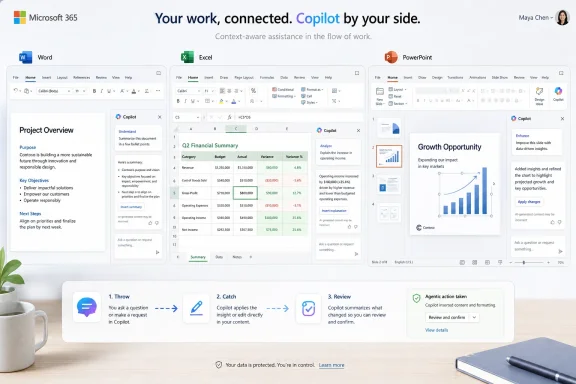
The more interesting idea is not the floating button; it is the handoff model Microsoft calls Throw & Catch. The phrase sounds like design-team shorthand, but the underlying concept is important. Copilot needs to move between surfaces without making the user rebuild context every time.
Today, AI in productivity apps often feels fragmented. A user asks something in chat, then edits a document elsewhere, then opens a side panel, then invokes another command with slightly different context rules. Each surface may be useful on its own, but the total experience can feel like several assistants wearing the same badge.
Throw & Catch is Microsoft’s attempt to make Copilot behave more like a continuous workflow layer. The user should be able to start with a chat-style instruction, move into an on-canvas edit, inspect the result in a side panel, and return to the document without feeling that the assistant has forgotten what just happened. If Microsoft can make that work, Copilot becomes less like Clippy with a foundation model and more like an operating layer for work.
That is the prize Microsoft is chasing. Word, Excel, PowerPoint, Outlook, Teams, OneNote, SharePoint, and the Microsoft 365 Copilot app already form the daily geography of many organizations. A context-carrying AI layer across those surfaces could be genuinely valuable, especially for work that jumps between meetings, documents, data, and presentations.
But continuity is not the same as control. If Copilot follows the user too eagerly, it becomes ambient pressure. If it hides too deeply, it becomes another feature nobody remembers to use. The design challenge is not to make Copilot omnipresent; it is to make its presence legible.
Office Users Are Not Beta Testers in a Design Lab
Microsoft’s difficulty is that Office is not a greenfield interface. Word, Excel, and PowerPoint are legacy environments in the best and worst senses of the word. They carry decades of habits, shortcuts, templates, compliance workflows, add-ins, and informal office folklore.
That means any AI surface inside them has to negotiate with existing behavior. Excel users do not merely “use” Excel; many of them inhabit it. They know where the ribbon command lives, how wide columns should be, what parts of the sheet must remain visible, and how much visual noise they can tolerate before trust starts to fray.
PowerPoint users may be more forgiving of visual suggestion, but they are also building compositions where placement matters. Word users may welcome summarization or rewriting help, but not if the assistant feels like it is hovering over a draft before being invited. The same Copilot control can read differently across each app because the work itself is different.
This is where Microsoft’s earlier fragmentation matters. The company has acknowledged in design discussions that Copilot’s growth across products created unevenness. That is unsurprising: Copilot was attached to everything from Bing to Windows to Office to GitHub to security tools, often under intense strategic pressure.
A unified design system is supposed to solve that. The question is whether it will unify the experience around user intent or around Microsoft’s desire to make Copilot visible. Those are not always the same thing.
Enterprise IT Will Judge the Redesign by Friction, Not Flair
For administrators, the Copilot interface is not just a user-experience story. It is a rollout story. Every confusing button, unexpected panel, changed shortcut, or blocked cell can become a ticket, a training note, a policy question, or a reason for a department head to ask why the expensive AI deployment is annoying people.
Microsoft’s own workplace research has argued that organizational factors drive much of AI’s reported impact. That should make the company unusually sensitive to rollout design. If manager support, training, trust, and internal norms determine whether AI adoption succeeds, then surprise UI changes are not a harmless experiment.
The enterprise version of the complaint is not “I dislike the button.” It is “we cannot govern the experience if Microsoft keeps changing where the assistant appears.” In regulated sectors, large finance teams, legal departments, healthcare environments, and public agencies, consistency is not a luxury. It is part of the control model.
Copilot also raises questions that ordinary Office features do not. Users need to know when the assistant is acting on document content, when it is grounded in organizational data, when it is making changes, and when it is merely suggesting them. A quieter interface must not become a vaguer interface.
That is the central risk in Microsoft’s redesign. If Copilot becomes too subtle, users may misunderstand what it can see or do. If it becomes too assertive, users will turn it off, move it back to the ribbon, or ask IT to suppress it. The acceptable zone is narrow.
The Agentic Future Needs a Boring Control Surface
Microsoft’s broader ambition is not just chat in Office. The company is pushing toward app-native agentic capabilities: AI that can take multi-step actions inside documents, worksheets, presentations, and other work surfaces. That makes interface clarity more important, not less.
A chatbot that writes a paragraph can be judged after the fact. An agent that edits a workbook, generates slides, restructures a document, or acts across files needs a stronger model of consent and review. Users must understand what Copilot intends to do before it does it, what it has changed after it acts, and how to reverse or constrain those actions.
This is why the Dynamic Action Button and Throw & Catch are not trivial design ornaments. They are early pieces of a control scheme for AI that may soon do more than answer questions. If Microsoft wants users to trust Copilot with multi-step work, the UI must make agency visible.
The best version of this future is almost boring. Copilot appears where it is relevant, explains its proposed action, carries context across surfaces, and gets out of the way when the user returns to manual work. The worst version is a swarm of prompts, badges, sidebars, and floating controls that make every Office document feel like a negotiation.
The industry has a bad habit of treating AI capability as the hard part and interface as a wrapper. In enterprise software, that is backwards. The model can be brilliant, but if the assistant interrupts the wrong workflow, lands in the wrong place, or obscures the wrong cell, the user experiences it as bad software.
Microsoft’s Advantage Is Also Its Burden
Notion, Slack, Google Workspace, and other productivity platforms are all trying to fold AI into the daily flow of work. Microsoft’s advantage is distribution. Word, Excel, PowerPoint, Outlook, Teams, and SharePoint are already where many companies keep their institutional memory.
That advantage lets Microsoft place Copilot closer to the work than almost any competitor can. It also means Microsoft has fewer excuses. A startup can experiment with a new AI-first surface because its users opted into a newer workflow. Microsoft is modifying the default tools of corporate life.
This creates a paradox. Copilot must be prominent enough to justify Microsoft’s platform strategy and licensing push, but restrained enough not to feel like forced AI adoption. It must be cross-app and consistent, but also respectful of each application’s culture. It must be powerful, but not mysterious.
The floating button backlash showed how quickly that balance can fail. Users do not experience “strategic AI integration.” They experience a button covering content. They do not care that engagement might rise when a control is made more visible. They care whether the software respects their attention.
Microsoft should be wary of telemetry that flatters intrusive design. A button placed in the middle of the path will be clicked more often. That does not mean users like it, trust it, or want it there. Engagement is a dangerous metric when the interface itself can manufacture the behavior being measured.
The Ribbon Still Has a Vote
The Office ribbon has been criticized for years, but it solved a real problem: it gave users a stable place to find commands. People could dislike its density while still understanding its bargain. Commands lived in a visible hierarchy, and the document canvas remained the document canvas.
Copilot disrupts that bargain because AI does not fit neatly into the old command model. It is not merely one command among many. It can draft, summarize, transform, explain, analyze, and automate. Microsoft understandably wants a more fluid surface for something that does not behave like “Bold” or “Insert Table.”
Yet the ribbon’s persistence is a reminder that productivity software needs predictable geography. When Microsoft lets users move Copilot back to a more conventional location, it is not just conceding to nostalgia. It is acknowledging that users value boundaries.
The best Copilot design may end up being hybrid. The ribbon can remain the stable home base. The Dynamic Action Button can appear only when its contextual value is obvious. Side panels can host longer reasoning, review, and settings. Chat can remain useful for broad instruction and discovery.
That model is less flashy than a single floating AI orb that promises to follow the user everywhere. It is also more likely to survive contact with real work.
The Cost of Getting Quiet Wrong
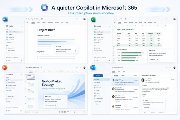
A quieter Copilot can fail in two ways. It can still be too loud, nagging users under the softer language of context. Or it can become so distributed and subtle that users cannot tell what Copilot is doing, where its suggestions came from, or why one app behaves differently from another.
The first failure produces irritation. The second produces distrust. Microsoft needs to avoid both.
For consumers and small-business users, the annoyance threshold may decide whether Copilot feels like value added to a Microsoft 365 subscription or like a feature tax. For enterprises, the issue is more operational. If the interface changes faster than training and policy can keep up, Copilot becomes a governance problem.
There is also a security-adjacent dimension. AI tools that operate across documents, chats, emails, and files depend heavily on permissions and grounding. Even when the underlying access model is sound, the user interface must communicate boundaries clearly. A cross-surface assistant that feels magical but opaque will make cautious administrators nervous.
Microsoft has learned this lesson before in different forms. Windows security prompts, Office macro warnings, OneDrive sync states, Teams meeting controls, and SharePoint sharing dialogs all show that enterprise trust depends on tiny interface decisions. Copilot is entering that same world, but with higher ambiguity.
The Real Test Is the Monday Morning Spreadsheet
The redesign should be judged not by Microsoft’s design language but by mundane work. Does Copilot stay out of the way when an accountant is reconciling a workbook? Does it appear at the right moment when a project manager needs to turn meeting notes into a plan? Does it preserve context when a sales lead moves from Outlook to PowerPoint? Does it make clear when it is suggesting, editing, or acting?
Those are unglamorous questions, but they are where adoption lives. The best AI assistant is not the one users notice most. It is the one they invoke confidently because previous encounters did not punish them.
Microsoft’s challenge is made harder by the fact that Copilot is both a product and a strategy. The company needs usage, revenue, and proof that AI can make Microsoft 365 more valuable. Users need calm software that helps them finish work. Those incentives can align, but only if Microsoft resists the temptation to equate prominence with success.
There is a version of Copilot that becomes an essential part of Office. It would summarize without grandstanding, analyze without obscuring, suggest without hovering, and automate with visible guardrails. It would feel less like a new panel added to every app and more like a shared layer of competence underneath them.
There is also a version that becomes the new symbol of unwanted AI: always nearby, frequently moving, hard to ignore, and easy to blame. Microsoft’s redesign is an attempt to avoid that fate. Whether it succeeds will depend less on the names of its design patterns than on the restraint with which they are deployed.
The Copilot Button Is Only the Visible Symptom
The concrete lesson from the current redesign is that Microsoft has reached the interface phase of the AI platform war. The early phase was about model access, branding, demos, and licensing. The next phase is about ergonomics.
That is a less glamorous battlefield, but it is where Microsoft often wins or loses with WindowsForum readers. Admins remember when a UI change triggered tickets. Power users remember when a shortcut moved. Developers remember when a platform abstraction leaked. Excel users remember when something covered a cell.
Copilot’s future inside Microsoft 365 will be shaped by those memories. Microsoft can call the new system humane, contextual, dynamic, or agentic, but the user will apply a simpler test: did this help me, and did it respect my work?
The company deserves credit for recognizing that the floating-button fight was not a minor aesthetic complaint. It exposed a deeper tension in AI software design. Assistants must be available enough to be useful, but not so present that they become another layer of digital debt.
A Quieter Copilot Still Has to Prove It Is Listening
Microsoft’s redesign gives IT pros and Office users a few concrete things to watch as the new Copilot model evolves.
- Microsoft is trying to move Copilot from a collection of app-specific entry points into a coordinated workflow layer across Microsoft 365.
- The Dynamic Action Button will succeed only if it appears with clear contextual value rather than acting as a persistent reminder that Copilot exists.
- Throw & Catch is the more important idea because it promises continuity between chat, canvas actions, prompts, and side panels.
- The recent rollback around floating controls shows that Microsoft is still calibrating the line between discoverability and intrusion.
- Enterprise adoption will depend as much on training, policy, user trust, and predictable placement as on Copilot’s raw feature set.
- Agentic Office features will require clearer controls, review steps, and explanations than today’s simpler AI suggestions.
Microsoft is right that AI needs a new design language inside productivity software, but the company should treat the recent backlash as an early warning rather than a temporary messaging problem. Copilot will not become indispensable because it floats closer to the cursor; it will become indispensable only if it learns the oldest rule of Office software: the work surface belongs to the user.