

Microsoft added a Microsoft 365 Roadmap entry on July 7, 2026, for Outlook that will let users pin a mail category to Favorites and apply it by dragging messages onto that favorite category, with general availability planned for September 2026 on the web. The feature is small enough to sound like housekeeping, but it points directly at the larger redesign bargain Microsoft has been trying to sell with the new Outlook: less ribbon hunting, more direct manipulation, and a UI that behaves like a modern web app rather than a Win32 relic. For users who live by color-coded inboxes, this is not just cosmetic polish. It is Microsoft admitting that mail triage still depends on muscle memory, not AI summaries alone.
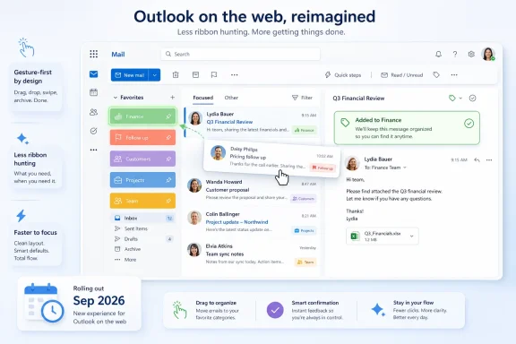
The new Outlook feature is straightforward: add a category to Favorites, then drag an email onto it to assign that category. Microsoft describes it as a way to avoid opening menus or right-clicking individual messages, and the Roadmap lists it under Outlook for the web, Worldwide Standard Multi-Tenant, with General Availability scheduled for September 2026.
That platform detail matters. The hashtag attached to the announcement points to the new Outlook for Windows, but the Roadmap itself names the web platform, which is consistent with how the new Outlook increasingly inherits Outlook on the web capabilities. The new Windows client is not a traditional desktop rewrite so much as a web-backed Outlook experience packaged for Windows, and that means web roadmap items often foreshadow what Windows users will see in the new client.
The action itself sounds almost comically obvious. If a category is important enough to live in Favorites, it should be important enough to receive dropped messages. Yet Outlook has long treated categories as metadata managed through menus, context commands, and ribbon affordances rather than as first-class places where work can be moved.
That is the philosophical shift here. Microsoft is turning a category from a hidden property into something spatial. Once a category sits in Favorites, it becomes less like a tag buried in a command list and more like a destination.
That is why drag-to-categorize is more interesting than its size suggests. Microsoft has spent the last several years talking about Copilot, semantic search, intelligent scheduling, and mail summarization. Those features matter, but they do not replace the mundane mechanics of getting 200 messages under control before lunch.
Categories are one of those mechanics. They are personal, visual, and often organization-specific. One user’s “Finance” category is another user’s “Waiting on vendor,” “Escalated,” “FYI only,” or “Do not forget this exists.” Outlook’s power has always come from letting people impose their own system on a messy inbox.
This Roadmap item is therefore a credibility play. It says Microsoft is still paying attention to the hand motions of email work, not merely the AI story around it. The new Outlook needs more of these changes because its skeptics are often not asking for futuristic features; they are asking for fewer clicks.
A folder asks the user to decide where a message lives. A category lets the user describe what the message means. One email can be “Project Alpha,” “Urgent,” and “Waiting for approval” at the same time, which is exactly how work actually behaves.
Drag-and-drop categorization strengthens that model because it lowers the cost of classification. If applying a category requires a right-click, submenu, search, or ribbon trip, many users simply will not do it consistently. If it is a drop target in Favorites, categorization becomes closer to the physical act of sorting paper into a tray.
That difference matters at scale. A five-second improvement repeated hundreds of times a week becomes a real workflow change. More importantly, a lower-friction system is a system people are more likely to keep using after the initial burst of organizational enthusiasm fades.
That is a subtle but useful design direction. A visible category in Favorites can act as a reminder of a workflow: invoices to process, messages to review, candidates to follow up with, incidents to monitor. When users can drag messages directly onto that category, the reminder and the action are in the same place.
The best productivity interfaces collapse distance. They remove the gap between deciding what something is and making the software reflect that decision. In classic desktop software, that gap often appears as a menu. In modern productivity software, it is increasingly a gesture.
This is where the new Outlook’s web lineage helps. Drag targets, pinned objects, and dynamic navigation regions are easier to iterate in a web-first UI than in older command-heavy desktop frameworks. The risk, of course, is that Microsoft must preserve enough precision for power users while making the interface simpler for everyone else.
For that audience, drag-to-categorize will not settle the debate. It does not answer every concern about offline behavior, advanced account support, extensibility, performance, or feature parity. It does not recreate classic Outlook’s most obscure but deeply loved corners.
Still, it is the kind of feature that reduces friction in a visible way. A user does not need a white paper to understand it. Pin category, drag message, done. That sort of immediacy is exactly what the new Outlook needs if Microsoft wants users to perceive modernization as a gain rather than a managed loss.
The deeper issue is trust. Classic Outlook users have watched Microsoft remove, reframe, or delay capabilities during the transition to the new app. A small feature like this helps only if it arrives reliably, works consistently, and is accompanied by a steady march of practical improvements.
That does not mean admins should ignore it. Categories often become informal business process markers, especially in shared mailboxes and team workflows. Customer support groups, HR teams, finance departments, and executive assistants may use categories as lightweight status indicators even when they are not formally documented.
If drag-and-drop makes categorization easier, usage may increase. That could be good for consistency, but it may also expose the usual problem with informal taxonomy: everyone thinks the colors mean something slightly different. When a tool becomes easier to use, the process around it becomes more visible.
Organizations that already rely on shared mailbox categories may want to revisit naming conventions before this lands. A category called “Done,” “Closed,” or “Approved” can carry process meaning beyond simple organization. If users can apply it more quickly, the organization should be clear about what applying it actually means.
Microsoft has not yet published implementation details beyond the Roadmap description. The important questions are therefore practical ones: Will Outlook show a clear hover state over the favorite category? Will it confirm the category was applied? Can users undo the action quickly? Will multi-select drag behavior be supported? Will keyboard users get an equivalent fast path?
That last point matters. A drag gesture is efficient for mouse and touchpad users, but Outlook is also home turf for keyboard-centric workers. If the new experience improves mouse workflows while leaving keyboard categorization unchanged, Microsoft will have improved one lane rather than the whole road.
There is also the possibility of accidental classification. In many inboxes, categories are not merely decorative. They can influence views, rules, team expectations, and downstream decisions. A fast gesture needs a fast recovery path.
The listing is also careful about platform. It says Outlook on the web, not explicitly “new Outlook for Windows,” even though the announcement framing references the new Outlook for Windows. For readers, the safest interpretation is that this is a web Outlook capability expected to matter to the new Outlook experience, rather than proof that every Windows user will see it on the same day in September.
That distinction is especially important in enterprise environments. General Availability does not always mean instantly visible to every user. Microsoft commonly rolls out features gradually, and administrators may observe different timing across tenants.
In other words, September 2026 is the planning window, not a calendar appointment. Users should watch the Outlook UI, Microsoft 365 message center posts, and tenant-specific rollout notices before building training material around an exact day.
Drag-to-categorize adds seconds back. It also gives Microsoft a better story for the new Outlook: not just that it is unified, web-powered, and easier to maintain, but that it can make ordinary inbox work more direct. That story is more persuasive than another abstract modernization claim.
There is a broader design pattern here. Microsoft has been trying to make Outlook less dependent on command discovery. Instead of asking users to remember where a feature lives, the interface increasingly tries to put actions near the objects they affect. Dragging a message onto a favorite category is exactly that.
The risk is inconsistency. If some objects in Favorites are destinations, some are filters, some are folders, and some are categories, the interface needs to make those differences clear without turning the sidebar into a puzzle. The more Favorites becomes a mixed control panel, the more design discipline it requires.
But Outlook categories have always suffered from being powerful and under-explained. Many users know they exist but do not build systems around them. Making categories more visible in Favorites may nudge more people toward using them as part of everyday work.
That will create pressure for related improvements. Users who categorize faster will want faster category editing, better category search, clearer cross-device consistency, and more useful category views. Once Microsoft makes a category feel like a place, users will expect the rest of Outlook to treat it like one.
This is how small UI changes become product commitments. The moment a category becomes a drop target, it becomes part of the navigation model, not merely an attribute. Microsoft should be prepared for users to ask for more.
 Microsoft Turns a Label into a Drop Target
The new Outlook feature is straightforward: add a category to Favorites, then drag an email onto it to assign that category. Microsoft describes it as a way to avoid opening menus or right-clicking individual messages, and the Roadmap lists it under Outlook for the web, Worldwide Standard Multi-Tenant, with General Availability scheduled for September 2026.That platform detail matters. The hashtag attached to the announcement points to the new Outlook for Windows, but the Roadmap itself names the web platform, which is consistent with how the new Outlook increasingly inherits Outlook on the web capabilities. The new Windows client is not a traditional desktop rewrite so much as a web-backed Outlook experience packaged for Windows, and that means web roadmap items often foreshadow what Windows users will see in the new client.
The action itself sounds almost comically obvious. If a category is important enough to live in Favorites, it should be important enough to receive dropped messages. Yet Outlook has long treated categories as metadata managed through menus, context commands, and ribbon affordances rather than as first-class places where work can be moved.
That is the philosophical shift here. Microsoft is turning a category from a hidden property into something spatial. Once a category sits in Favorites, it becomes less like a tag buried in a command list and more like a destination.
The New Outlook Needs Wins That Are Not About Copilot
Outlook has been carrying a heavy modernization load. Microsoft wants one Outlook experience across Windows, Mac, and the web, while longtime Windows users still compare the new client against classic Outlook’s dense, keyboard-heavy, COM-add-in-friendly world. Every small workflow improvement now lands in that political context.That is why drag-to-categorize is more interesting than its size suggests. Microsoft has spent the last several years talking about Copilot, semantic search, intelligent scheduling, and mail summarization. Those features matter, but they do not replace the mundane mechanics of getting 200 messages under control before lunch.
Categories are one of those mechanics. They are personal, visual, and often organization-specific. One user’s “Finance” category is another user’s “Waiting on vendor,” “Escalated,” “FYI only,” or “Do not forget this exists.” Outlook’s power has always come from letting people impose their own system on a messy inbox.
This Roadmap item is therefore a credibility play. It says Microsoft is still paying attention to the hand motions of email work, not merely the AI story around it. The new Outlook needs more of these changes because its skeptics are often not asking for futuristic features; they are asking for fewer clicks.
The Inbox Is Still a Filing Cabinet, No Matter What Microsoft Calls It
Email has survived every attempt to replace it because it is not only a communication system. It is also a task list, archive, evidence trail, notification bus, customer record, legal artifact, and workplace memory. Outlook categories exist because folders alone are too rigid for that mess.A folder asks the user to decide where a message lives. A category lets the user describe what the message means. One email can be “Project Alpha,” “Urgent,” and “Waiting for approval” at the same time, which is exactly how work actually behaves.
Drag-and-drop categorization strengthens that model because it lowers the cost of classification. If applying a category requires a right-click, submenu, search, or ribbon trip, many users simply will not do it consistently. If it is a drop target in Favorites, categorization becomes closer to the physical act of sorting paper into a tray.
That difference matters at scale. A five-second improvement repeated hundreds of times a week becomes a real workflow change. More importantly, a lower-friction system is a system people are more likely to keep using after the initial burst of organizational enthusiasm fades.
Favorites Becomes a Control Surface, Not Just a Shortcut Shelf
Favorites in Outlook has usually meant quick access: pin a folder, a group, or another frequently used location so it stays visible. By letting categories live there as actionable targets, Microsoft is broadening the role of the Favorites area. It becomes a lightweight command surface.That is a subtle but useful design direction. A visible category in Favorites can act as a reminder of a workflow: invoices to process, messages to review, candidates to follow up with, incidents to monitor. When users can drag messages directly onto that category, the reminder and the action are in the same place.
The best productivity interfaces collapse distance. They remove the gap between deciding what something is and making the software reflect that decision. In classic desktop software, that gap often appears as a menu. In modern productivity software, it is increasingly a gesture.
This is where the new Outlook’s web lineage helps. Drag targets, pinned objects, and dynamic navigation regions are easier to iterate in a web-first UI than in older command-heavy desktop frameworks. The risk, of course, is that Microsoft must preserve enough precision for power users while making the interface simpler for everyone else.
For Classic Outlook Holdouts, This Is Useful but Not Persuasive by Itself
The new Outlook’s hardest audience is not the casual webmail user. It is the classic Outlook user with ten years of habits, a forest of rules, multiple mailboxes, PST archives, custom views, add-ins, Quick Steps, and a deep suspicion of anything that feels like a web app wearing a Windows badge.For that audience, drag-to-categorize will not settle the debate. It does not answer every concern about offline behavior, advanced account support, extensibility, performance, or feature parity. It does not recreate classic Outlook’s most obscure but deeply loved corners.
Still, it is the kind of feature that reduces friction in a visible way. A user does not need a white paper to understand it. Pin category, drag message, done. That sort of immediacy is exactly what the new Outlook needs if Microsoft wants users to perceive modernization as a gain rather than a managed loss.
The deeper issue is trust. Classic Outlook users have watched Microsoft remove, reframe, or delay capabilities during the transition to the new app. A small feature like this helps only if it arrives reliably, works consistently, and is accompanied by a steady march of practical improvements.
Administrators Should See a Workflow Change, Not a Governance Event
For Microsoft 365 administrators, this Roadmap item is unlikely to create a major deployment headache. It is not a security boundary change, not a compliance retention feature, and not a new data connector. It is a user interface improvement around existing category behavior.That does not mean admins should ignore it. Categories often become informal business process markers, especially in shared mailboxes and team workflows. Customer support groups, HR teams, finance departments, and executive assistants may use categories as lightweight status indicators even when they are not formally documented.
If drag-and-drop makes categorization easier, usage may increase. That could be good for consistency, but it may also expose the usual problem with informal taxonomy: everyone thinks the colors mean something slightly different. When a tool becomes easier to use, the process around it becomes more visible.
Organizations that already rely on shared mailbox categories may want to revisit naming conventions before this lands. A category called “Done,” “Closed,” or “Approved” can carry process meaning beyond simple organization. If users can apply it more quickly, the organization should be clear about what applying it actually means.
Accessibility and Error Handling Will Decide Whether the Feature Feels Finished
Drag-and-drop features live or die in the details. They are delightful when they are obvious, reversible, and forgiving. They are infuriating when the target area is too small, the visual feedback is vague, or an accidental drop silently changes metadata.Microsoft has not yet published implementation details beyond the Roadmap description. The important questions are therefore practical ones: Will Outlook show a clear hover state over the favorite category? Will it confirm the category was applied? Can users undo the action quickly? Will multi-select drag behavior be supported? Will keyboard users get an equivalent fast path?
That last point matters. A drag gesture is efficient for mouse and touchpad users, but Outlook is also home turf for keyboard-centric workers. If the new experience improves mouse workflows while leaving keyboard categorization unchanged, Microsoft will have improved one lane rather than the whole road.
There is also the possibility of accidental classification. In many inboxes, categories are not merely decorative. They can influence views, rules, team expectations, and downstream decisions. A fast gesture needs a fast recovery path.
The Roadmap Date Is a Promise Written in Pencil
The Microsoft 365 Roadmap says September 2026 for General Availability, but Microsoft’s own Roadmap language has long emphasized that dates are estimates and can change. That caution is not boilerplate; it is the operating reality of Microsoft 365. Features move, rollouts stage, tenants vary, and UI availability can depend on client, ring, and account configuration.The listing is also careful about platform. It says Outlook on the web, not explicitly “new Outlook for Windows,” even though the announcement framing references the new Outlook for Windows. For readers, the safest interpretation is that this is a web Outlook capability expected to matter to the new Outlook experience, rather than proof that every Windows user will see it on the same day in September.
That distinction is especially important in enterprise environments. General Availability does not always mean instantly visible to every user. Microsoft commonly rolls out features gradually, and administrators may observe different timing across tenants.
In other words, September 2026 is the planning window, not a calendar appointment. Users should watch the Outlook UI, Microsoft 365 message center posts, and tenant-specific rollout notices before building training material around an exact day.
This Is the Kind of Small Feature That Makes Big Redesigns Survivable
Major software transitions are often judged by their missing features, but they are lived through in small moments. A user decides whether a new app is better or worse when they archive a message, find a file, switch accounts, flag a task, or apply a category. The emotional balance sheet is written in seconds.Drag-to-categorize adds seconds back. It also gives Microsoft a better story for the new Outlook: not just that it is unified, web-powered, and easier to maintain, but that it can make ordinary inbox work more direct. That story is more persuasive than another abstract modernization claim.
There is a broader design pattern here. Microsoft has been trying to make Outlook less dependent on command discovery. Instead of asking users to remember where a feature lives, the interface increasingly tries to put actions near the objects they affect. Dragging a message onto a favorite category is exactly that.
The risk is inconsistency. If some objects in Favorites are destinations, some are filters, some are folders, and some are categories, the interface needs to make those differences clear without turning the sidebar into a puzzle. The more Favorites becomes a mixed control panel, the more design discipline it requires.
The Real Test Comes After the First Drop
The first use case is obvious: a user pins “Follow up” or “Finance” and drags messages onto it. The second-order use cases are more interesting. A recruiter could tag candidates by stage. A project manager could triage stakeholder mail. A support lead could classify escalations in a shared mailbox. A solo consultant could keep invoices and client communications sorted without building elaborate rules.But Outlook categories have always suffered from being powerful and under-explained. Many users know they exist but do not build systems around them. Making categories more visible in Favorites may nudge more people toward using them as part of everyday work.
That will create pressure for related improvements. Users who categorize faster will want faster category editing, better category search, clearer cross-device consistency, and more useful category views. Once Microsoft makes a category feel like a place, users will expect the rest of Outlook to treat it like one.
This is how small UI changes become product commitments. The moment a category becomes a drop target, it becomes part of the navigation model, not merely an attribute. Microsoft should be prepared for users to ask for more.
September’s Sidebar Gesture Carries a Bigger Outlook Message
This feature is not revolutionary, and pretending otherwise would insult the people who spend their days inside Outlook. Its importance is that it aims at a real point of friction and does so with a design move users can understand immediately.- Microsoft’s Roadmap entry says the feature is in development, was created on July 7, 2026, and is planned for General Availability in September 2026.
- The feature applies to Outlook on the web in Worldwide Standard Multi-Tenant environments, while the surrounding messaging points at the new Outlook for Windows experience.
- Users will be able to add a category to Favorites and drag emails onto that favorite category to apply the label.
- The practical value is reduced click work for people who use categories as inbox triage, workflow status, or personal organization markers.
- Administrators should treat the change as a usability improvement, while remembering that easier category application can make informal team processes more visible.
- The September date should be read as a rollout target, not a guaranteed date for every tenant or client.
References
- Primary source: Microsoft 365 Roadmap
Published: 2026-07-07T23:01:01.6729014Z
Loading…
www.microsoft.com