

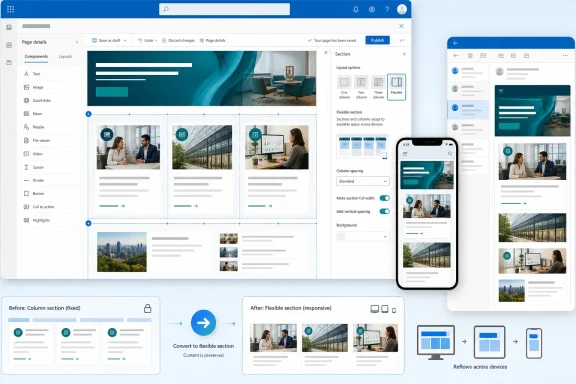
Microsoft is preparing a substantial usability upgrade for Flexible Sections in SharePoint Pages, addressing several of the rough edges that have made free-form page design powerful but occasionally unpredictable. Scheduled for general availability in August 2026, the update will add familiar column-layout guides, keep gridlines and alignment aids visible during editing, and let authors convert existing sections into Flexible Sections with a single action while preserving the placement of their content. Although Roadmap ID 567889 may sound like a collection of small interface refinements, the combined effect could make sophisticated SharePoint layouts easier to create, migrate, govern, and maintain across desktop browsers, mobile devices, and email.
SharePoint’s modern page experience has long balanced two competing priorities. Microsoft wants ordinary employees to create polished intranet content without learning web development, but it must also ensure that pages remain responsive, accessible, secure, and manageable inside large Microsoft 365 environments.
Traditional modern SharePoint sections solve that problem through constraints. Authors select a predefined layout—such as one, two, or three columns—and then place web parts into those containers. The resulting pages are relatively predictable because SharePoint controls the dimensions, alignment, and responsive behavior of each column.
That flexibility enables designs that conventional SharePoint sections handle poorly. A communications team can place text over part of an image, build an asymmetrical campaign banner, arrange statistics into a dashboard-like composition, or create a visual hierarchy that does not fit neatly into three equal columns.
The freedom comes with a cost. A blank grid offers fewer visual clues than a conventional column template, and authors can struggle to judge spacing, alignment, or the likely responsive outcome while they are still composing the page.
The rollout is listed as in development for SharePoint on the web, covering the Worldwide Standard Multi-Tenant cloud. Microsoft plans both Targeted Release and general availability distribution, with GA currently scheduled for August 2026.
As always, a roadmap month should be treated as a deployment window rather than a guarantee that every tenant will receive the feature on August 1. Microsoft 365 capabilities commonly roll out progressively, and administrative configuration, tenant release preferences, regional deployment sequencing, or late engineering changes can affect when an individual organization sees them.
An author could, for example, establish the visual equivalent of a two-column composition and then resize or reposition selected web parts without being permanently bound to two rigid containers. That creates a bridge between template-driven authoring and free-form design.
The guides should also reduce guesswork. Rather than manually estimating where the midpoint or column boundary sits, an author can work against a visible reference that communicates the intended structure.
That persistent visual feedback matters because layout errors tend to accumulate. A web part shifted slightly out of alignment may be difficult to notice in isolation, but repeated inconsistencies can make an entire page look unprofessional.
Visible guides turn alignment from a hidden system behavior into something authors can actively reason about. They should make it easier to compare widths, maintain gutters, line up edges, and understand where a component will land before releasing it.
The planned conversion command should remove much of the rebuilding work. Authors will no longer need to create a blank Flexible Section, manually add or move every web part, reconfigure the components, verify their content, and then delete the original section.
Preserving placement is especially important. A conversion tool that merely transfers the web parts would save some configuration work, but one that also retains their visual relationships can turn a potentially disruptive redesign into an incremental editing decision.
SharePoint’s existing section layouts avoid that issue by presenting obvious templates. A three-column section immediately communicates where three pieces of content belong, even if the author has little design experience.
This is a sensible design strategy for SharePoint because most page creators are not professional designers. They may be human resources specialists, project managers, executive assistants, departmental communicators, or subject-matter experts who publish only occasionally.
For these authors, complete freedom can be less useful than guided flexibility. A clear structure creates confidence, while the ability to break that structure supports more advanced requirements.
A familiar column overlay gives teams a shared visual vocabulary. An editor can tell a colleague to align content with the second guide or preserve the gutter between two regions, rather than relying on vague instructions about moving an item slightly left or right.
This also lowers the training burden. Existing SharePoint authors already understand column-based sections, so Microsoft can extend that mental model instead of introducing an entirely separate layout language.
Persistent gridlines should make the Flexible Section feel more like a deliberate page-layout tool and less like a collection of floating web parts. They provide a stable frame of reference as the author switches between text, imagery, links, lists, and other components.
Visible gridlines help explain that behavior. If the top-left corner of a web part snaps to the nearest supported boundary, the author can see the available boundaries and anticipate the result.
That does not eliminate every potential authoring issue. Different web parts support different resizing behaviors, and third-party components may not offer the same dimensional flexibility as Microsoft’s native Text or Image web parts. The guides nevertheless make the underlying layout system more legible.
A persistent grid makes spacing easier to audit during composition. Authors can detect when one card is wider than its neighbors, when a text block is too close to an image, or when unrelated items appear grouped because the gap between them is too small.
The result should be more than cosmetic. Clear spacing helps readers understand which elements belong together, where one topic ends, and which items deserve the most attention.
A transition path therefore matters as much as the new authoring experience itself. If adoption requires manual reconstruction, many organizations will leave established pages untouched even when a newer layout model would improve them.
A two-column section, for example, contains semantic layout information: some web parts belong on the left, and others belong on the right. During conversion, SharePoint can translate those relationships into coordinates or grid positions within the new canvas.
More complex sections may present edge cases. Stacked web parts, unusual column ratios, unsupported components, section backgrounds, dynamic data-driven web parts, or custom SharePoint Framework solutions could complicate the translation.
Organizations should therefore treat conversion as a reversible editing operation until testing proves otherwise. Saving drafts, retaining page-version history, previewing multiple output modes, and validating business-critical web parts will remain prudent even if the conversion appears seamless.
SharePoint addresses this by reflowing Flexible Section content for smaller or linear presentation surfaces. On mobile devices and in email, the section can be transformed into a one-column sequence.
That choice affects meaning. Consider a design with an image on the left, a headline on the upper right, and explanatory text below the headline. An algorithm that reads strictly from left to right might place the image before the headline, while a top-to-bottom interpretation could produce another order.
Neither approach is universally correct. Authors need to preview the result and choose a composition whose visual placement also translates into a logical reading sequence.
Email clients are notoriously inconsistent in how they render complex layouts. A single-column reflow is therefore not merely a convenience; it is a compatibility strategy that protects readability across Outlook configurations, mobile mail clients, and other inbox environments.
Microsoft’s statement that the new authoring improvements support consistency across desktop, mobile, and email should not be interpreted as pixel-for-pixel uniformity. The more realistic goal is content continuity and predictable adaptation, with each surface presenting the same information in a form suitable for its dimensions.
A disciplined review should include:
Microsoft’s broader guidance has traditionally favored straightforward structures, strong contrast, meaningful headings, image descriptions, and layouts that remain understandable with assistive technologies. Free-form placement does not invalidate those principles.
Screen readers and linearized views cannot always infer those relationships from appearance alone. Authors must ensure that headings, labels, alternative text, link wording, and web-part ordering communicate the same structure without depending exclusively on coordinates.
Grouping related web parts can help responsive behavior, but authors should verify the resulting sequence. A visually grouped composition is not automatically an accessible composition.
However, the same tools can also encourage dense compositions if authors treat every grid cell as space that must be filled. White space is functional, not wasted; it separates ideas and makes important information easier to identify.
Authors should also test zoom and scaling. A page that looks orderly at 100 percent may become difficult to use at 200 percent, particularly if fixed-size web parts, overlapping elements, or text-heavy cards compete for limited space.
The August improvements can reduce some of that governance burden because clearer guides should make acceptable layouts easier to reproduce. At the same time, easier conversion and free-form composition may encourage broader use, making standards more important.
Visual guides may make those templates easier to modify safely. An author can see the intended boundaries and understand which elements may be resized without disrupting the composition.
Conversion could also support template modernization. Instead of recreating every established page pattern, a site owner may be able to convert representative sections, refine them, validate responsive behavior, and then use the result as the foundation for future pages.
Testing should focus on realistic content rather than demonstration pages. Existing sections with nested content patterns, heavy text, images, dynamic lists, and custom components are more likely to reveal conversion or rendering problems.
Documenting the results will give support teams a practical internal knowledge base. It can also reveal whether the organization needs new publishing guidance before general availability reaches the wider tenant.
Developers cannot assume that a web part will always occupy one of the familiar predefined column widths. Even where SharePoint limits a custom component to several supported sizes, the surrounding composition may differ significantly from a conventional section.
Developers should avoid layouts that depend on one exact container dimension. Text should wrap without clipping, controls should remain reachable, and important data should not disappear merely because the author resizes the component.
Testing should cover at least:
Custom developers should keep bundles efficient and avoid unnecessary re-rendering. Site owners should likewise resist treating Flexible Sections as a reason to place dashboard-scale complexity on every landing page.
A visually sophisticated page that loads slowly on a managed Windows laptop, VPN connection, or mobile network undermines the communications objective. Layout freedom does not remove SharePoint’s performance constraints.
That indirect impact can still be substantial. Better authoring tools generally produce better reading experiences when organizations pair them with sound editorial standards.
Traditional equal-width columns sometimes imply that every item has equal importance. A flexible composition can express hierarchy more accurately, guiding the reader from the main point to supporting information.
The risk is that authors use size and overlap for decoration rather than communication. The most effective pages will employ flexibility selectively, preserving simple reading paths even when the desktop design looks distinctive.
Microsoft’s emphasis on consistency across desktop, mobile, and email recognizes that reality. Improved authoring cues can encourage creators to think of responsive adaptation during construction instead of discovering problems after publication.
For Windows users in particular, browser zoom, display scaling, touch-enabled devices, and varied monitor sizes complicate the idea of a single desktop layout. A grid-guided design still needs to accommodate everything from a compact laptop window to an ultrawide display.
Flexible Sections are part of Microsoft’s effort to close that usability gap without turning SharePoint into an unrestricted website-development platform. The new improvements suggest that Microsoft is refining the authoring model based on practical experience rather than merely adding more visual features.
SharePoint pages cannot behave exactly like presentation slides because they must respond to different screens and reading modes. Still, persistent gridlines and familiar column guides borrow concepts that users already understand.
This creates a productive middle ground. Authors receive enough visual control to build expressive pages, while SharePoint retains the responsive rules and web-part framework needed for managed enterprise publishing.
A more explicit grid and recognizable layout-guide system may make generated designs easier for humans to understand and adjust. Instead of receiving an opaque composition, the author can see the structure against which the result was created.
Conversion is relevant here as well. Future authoring workflows could begin with an existing conventional section, convert it to a flexible format, and then use assisted design capabilities to produce alternative arrangements. That broader workflow is an inference rather than a confirmed feature of Roadmap ID 567889, but the new conversion path clearly makes such scenarios more practical.
Version history will be important. If a conversion produces an undesirable result, authors need a clear recovery path that does not depend on manually reconstructing the original section.
Organizations should also watch how the interface behaves at different browser zoom levels and Windows display-scaling settings. An authoring grid must remain stable when editors work on laptops, high-density displays, or constrained browser windows.
A useful pilot should include pages containing headlines, text, images, Quick Links, People, dynamic lists, and one or more custom components. Testing only a simple promotional banner would not expose the full range of potential reflow behavior.
Microsoft 365 administrators should monitor the Message Center in addition to the public roadmap. The roadmap communicates intent, while tenant-specific messages usually provide more actionable deployment dates and administrative guidance.
Microsoft’s Flexible Section improvements represent the kind of SharePoint update that may look modest in a feature list but materially change day-to-day publishing. Familiar column guides, persistent editing aids, and one-click conversion address the gap between free-form creative control and the predictable structure enterprise authors need. If Microsoft delivers reliable conversion and organizations pair the new tools with responsive testing, accessibility checks, and reusable design standards, Flexible Sections could move from a specialist layout option to a practical foundation for modern SharePoint communication across desktop Windows devices, mobile screens, and the inbox.
 Background
SharePoint’s modern page experience has long balanced two competing priorities. Microsoft wants ordinary employees to create polished intranet content without learning web development, but it must also ensure that pages remain responsive, accessible, secure, and manageable inside large Microsoft 365 environments.Traditional modern SharePoint sections solve that problem through constraints. Authors select a predefined layout—such as one, two, or three columns—and then place web parts into those containers. The resulting pages are relatively predictable because SharePoint controls the dimensions, alignment, and responsive behavior of each column.
From fixed columns to a two-dimensional canvas
Flexible Sections expanded that model by giving authors a two-dimensional grid. Instead of dropping every web part into a rigid column, authors can move supported components around the section, resize them, overlap them, and group related items.That flexibility enables designs that conventional SharePoint sections handle poorly. A communications team can place text over part of an image, build an asymmetrical campaign banner, arrange statistics into a dashboard-like composition, or create a visual hierarchy that does not fit neatly into three equal columns.
The freedom comes with a cost. A blank grid offers fewer visual clues than a conventional column template, and authors can struggle to judge spacing, alignment, or the likely responsive outcome while they are still composing the page.
Why the August 2026 update matters
Microsoft’s latest improvements focus less on expanding what Flexible Sections can render and more on making the authoring process understandable. The central idea is to combine the freedom of a design canvas with the visual predictability of traditional SharePoint sections.The rollout is listed as in development for SharePoint on the web, covering the Worldwide Standard Multi-Tenant cloud. Microsoft plans both Targeted Release and general availability distribution, with GA currently scheduled for August 2026.
As always, a roadmap month should be treated as a deployment window rather than a guarantee that every tenant will receive the feature on August 1. Microsoft 365 capabilities commonly roll out progressively, and administrative configuration, tenant release preferences, regional deployment sequencing, or late engineering changes can affect when an individual organization sees them.
What Microsoft Is Changing
The roadmap entry groups three closely related authoring changes into one release. Each improvement targets a different point of friction: starting a layout, refining it, and migrating existing content.Visual column layout guides
Authors will be able to use visual column guides that resemble familiar SharePoint section layouts. These guides should make it easier to begin with a recognizable structure before taking advantage of the more advanced placement options available within a Flexible Section.An author could, for example, establish the visual equivalent of a two-column composition and then resize or reposition selected web parts without being permanently bound to two rigid containers. That creates a bridge between template-driven authoring and free-form design.
The guides should also reduce guesswork. Rather than manually estimating where the midpoint or column boundary sits, an author can work against a visible reference that communicates the intended structure.
Persistent gridlines and layout aids
Flexible Sections already rely on a grid and provide alignment behavior, but the editing experience has not always exposed those aids as consistently as authors might expect. The new release will keep gridlines and layout guides visible while a page is being edited.That persistent visual feedback matters because layout errors tend to accumulate. A web part shifted slightly out of alignment may be difficult to notice in isolation, but repeated inconsistencies can make an entire page look unprofessional.
Visible guides turn alignment from a hidden system behavior into something authors can actively reason about. They should make it easier to compare widths, maintain gutters, line up edges, and understand where a component will land before releasing it.
One-click section conversion
The most consequential change may be the ability to convert an existing section into a Flexible Section while preserving content placement. Until now, the boundary between conventional and flexible section types has been relatively rigid, complicating attempts to modernize an established page.The planned conversion command should remove much of the rebuilding work. Authors will no longer need to create a blank Flexible Section, manually add or move every web part, reconfigure the components, verify their content, and then delete the original section.
Preserving placement is especially important. A conversion tool that merely transfers the web parts would save some configuration work, but one that also retains their visual relationships can turn a potentially disruptive redesign into an incremental editing decision.
A More Familiar Starting Point
Flexible design tools often confront users with the “blank canvas” problem. The application offers extensive freedom, but the user does not know where to begin or which choices will produce a coherent result.SharePoint’s existing section layouts avoid that issue by presenting obvious templates. A three-column section immediately communicates where three pieces of content belong, even if the author has little design experience.
Structure without permanent constraints
Visual column guides could give Flexible Sections the same approachable starting point without imposing a permanent structural limit. Authors can begin with a conventional arrangement and depart from it only when the content calls for something more expressive.This is a sensible design strategy for SharePoint because most page creators are not professional designers. They may be human resources specialists, project managers, executive assistants, departmental communicators, or subject-matter experts who publish only occasionally.
For these authors, complete freedom can be less useful than guided flexibility. A clear structure creates confidence, while the ability to break that structure supports more advanced requirements.
Reducing layout experimentation
Without strong guides, authors may repeatedly move and resize web parts to discover what looks right. That trial-and-error process consumes time and creates inconsistent results, particularly when several people contribute to the same intranet.A familiar column overlay gives teams a shared visual vocabulary. An editor can tell a colleague to align content with the second guide or preserve the gutter between two regions, rather than relying on vague instructions about moving an item slightly left or right.
This also lowers the training burden. Existing SharePoint authors already understand column-based sections, so Microsoft can extend that mental model instead of introducing an entirely separate layout language.
Why Persistent Guides Improve Authoring
A layout guide is useful only when it appears at the moment an author needs it. If gridlines disappear too early, appear only during a drag operation, or vary depending on the selected component, the author must remember an invisible structure.Persistent gridlines should make the Flexible Section feel more like a deliberate page-layout tool and less like a collection of floating web parts. They provide a stable frame of reference as the author switches between text, imagery, links, lists, and other components.
More predictable drag-and-drop behavior
Drag-and-drop interfaces can be frustrating when the final placement differs from the position implied by the pointer. Snapping rules, minimum web-part dimensions, internal padding, and neighboring objects can all influence where a component settles.Visible gridlines help explain that behavior. If the top-left corner of a web part snaps to the nearest supported boundary, the author can see the available boundaries and anticipate the result.
That does not eliminate every potential authoring issue. Different web parts support different resizing behaviors, and third-party components may not offer the same dimensional flexibility as Microsoft’s native Text or Image web parts. The guides nevertheless make the underlying layout system more legible.
Better spacing discipline
Professional-looking pages depend heavily on consistent spacing. Authors often focus on colors, images, and typography while overlooking the gutters and margins that separate content.A persistent grid makes spacing easier to audit during composition. Authors can detect when one card is wider than its neighbors, when a text block is too close to an image, or when unrelated items appear grouped because the gap between them is too small.
The result should be more than cosmetic. Clear spacing helps readers understand which elements belong together, where one topic ends, and which items deserve the most attention.
Converting Existing SharePoint Sections
The one-click conversion capability changes Flexible Sections from a largely greenfield feature into a practical modernization tool. Organizations rarely build every page from scratch; they maintain years of news posts, landing pages, departmental portals, policy centers, and campaign content.A transition path therefore matters as much as the new authoring experience itself. If adoption requires manual reconstruction, many organizations will leave established pages untouched even when a newer layout model would improve them.
How conversion may simplify redesign work
A typical manual migration would involve several operations:- The author would create a new Flexible Section near the existing section.
- Each web part would be moved or recreated in the new area.
- Web-part properties, links, images, data sources, and display settings would be checked.
- The author would reconstruct the original visual order.
- Desktop, mobile, and email previews would be reviewed.
- The old section would be removed only after the replacement passed validation.
Preserving content placement is the critical promise
Content preservation and layout preservation are related but distinct. SharePoint must retain not only the web parts and their settings, but also enough spatial information to produce a sensible Flexible Section.A two-column section, for example, contains semantic layout information: some web parts belong on the left, and others belong on the right. During conversion, SharePoint can translate those relationships into coordinates or grid positions within the new canvas.
More complex sections may present edge cases. Stacked web parts, unusual column ratios, unsupported components, section backgrounds, dynamic data-driven web parts, or custom SharePoint Framework solutions could complicate the translation.
Organizations should therefore treat conversion as a reversible editing operation until testing proves otherwise. Saving drafts, retaining page-version history, previewing multiple output modes, and validating business-critical web parts will remain prudent even if the conversion appears seamless.
Responsive Behavior Across Desktop, Mobile, and Email
A flexible desktop canvas cannot simply shrink until it fits a phone. Overlapping components, asymmetrical rows, and side-by-side content may become unreadable when compressed into a narrow viewport.SharePoint addresses this by reflowing Flexible Section content for smaller or linear presentation surfaces. On mobile devices and in email, the section can be transformed into a one-column sequence.
The importance of reflow order
Once a two-dimensional design becomes one-dimensional, the system must decide which web part appears first, second, and third. SharePoint’s Flexible Section model has supported reflow approaches that prioritize items based on their horizontal or vertical placement.That choice affects meaning. Consider a design with an image on the left, a headline on the upper right, and explanatory text below the headline. An algorithm that reads strictly from left to right might place the image before the headline, while a top-to-bottom interpretation could produce another order.
Neither approach is universally correct. Authors need to preview the result and choose a composition whose visual placement also translates into a logical reading sequence.
Email adds another layer of constraint
SharePoint news frequently travels beyond the site itself. Content may be distributed through email or surfaced in experiences where modern browser layout capabilities are unavailable or deliberately restricted.Email clients are notoriously inconsistent in how they render complex layouts. A single-column reflow is therefore not merely a convenience; it is a compatibility strategy that protects readability across Outlook configurations, mobile mail clients, and other inbox environments.
Microsoft’s statement that the new authoring improvements support consistency across desktop, mobile, and email should not be interpreted as pixel-for-pixel uniformity. The more realistic goal is content continuity and predictable adaptation, with each surface presenting the same information in a form suitable for its dimensions.
Previewing remains essential
No set of layout guides can fully represent every destination. Authors should continue to preview pages before publication, especially when they use overlap, tightly sized text regions, decorative images, or unusual web-part combinations.A disciplined review should include:
- The desktop view should preserve the intended alignment, hierarchy, and spacing.
- The mobile view should present content in a logical reading order without awkward gaps.
- The email view should retain the primary message even if decorative positioning is simplified.
- Text should remain readable when browser or operating-system scaling is increased.
- Interactive or dynamic components should degrade sensibly when their complete experience cannot be embedded.
Accessibility and Inclusive Design
Flexible positioning expands the range of possible SharePoint designs, including some that may be visually impressive but difficult to navigate. Accessibility must therefore remain a core part of authoring rather than a check performed after the design is complete.Microsoft’s broader guidance has traditionally favored straightforward structures, strong contrast, meaningful headings, image descriptions, and layouts that remain understandable with assistive technologies. Free-form placement does not invalidate those principles.
Visual order versus reading order
A desktop layout can imply relationships through position. A heading may sit above two related cards, or a callout may overlap an image to create a single visual unit.Screen readers and linearized views cannot always infer those relationships from appearance alone. Authors must ensure that headings, labels, alternative text, link wording, and web-part ordering communicate the same structure without depending exclusively on coordinates.
Grouping related web parts can help responsive behavior, but authors should verify the resulting sequence. A visually grouped composition is not automatically an accessible composition.
Persistent guides can support consistency
The new gridlines may indirectly improve accessibility by encouraging cleaner alignment and more consistent spacing. Users with cognitive disabilities or low vision can find crowded, irregular pages harder to scan.However, the same tools can also encourage dense compositions if authors treat every grid cell as space that must be filled. White space is functional, not wasted; it separates ideas and makes important information easier to identify.
Authors should also test zoom and scaling. A page that looks orderly at 100 percent may become difficult to use at 200 percent, particularly if fixed-size web parts, overlapping elements, or text-heavy cards compete for limited space.
Enterprise Governance and Publishing Operations
Large organizations do not evaluate a SharePoint authoring feature solely by asking whether it produces attractive pages. They also consider consistency, training, support, lifecycle management, and the risk of hundreds of authors interpreting “flexible” in hundreds of different ways.The August improvements can reduce some of that governance burden because clearer guides should make acceptable layouts easier to reproduce. At the same time, easier conversion and free-form composition may encourage broader use, making standards more important.
Design systems for intranet teams
Enterprise communications teams should define recommended patterns for Flexible Sections rather than allowing every author to invent a design. A lightweight SharePoint design system might specify:- Approved column-guide patterns should be used for common page types.
- Standard spacing should separate headings, images, calls to action, and supporting content.
- Overlapping elements should be reserved for decorative or campaign-oriented layouts.
- Mobile and email previews should be required before important news is published.
- Custom web parts should be tested before they become part of a reusable Flexible Section pattern.
- Accessibility checks should form part of the publishing workflow.
Page templates and repeatability
The real productivity gain will appear when organizations combine improved Flexible Section authoring with templates. A skilled communications designer can create an approved layout once, while departmental authors replace the content without rebuilding its underlying structure.Visual guides may make those templates easier to modify safely. An author can see the intended boundaries and understand which elements may be resized without disrupting the composition.
Conversion could also support template modernization. Instead of recreating every established page pattern, a site owner may be able to convert representative sections, refine them, validate responsive behavior, and then use the result as the foundation for future pages.
Change management for Targeted Release
Organizations using Targeted Release should identify a controlled group of authors who can test the feature before wider deployment. The ideal group includes communications professionals, ordinary departmental editors, accessibility specialists, and administrators responsible for custom web parts.Testing should focus on realistic content rather than demonstration pages. Existing sections with nested content patterns, heavy text, images, dynamic lists, and custom components are more likely to reveal conversion or rendering problems.
Documenting the results will give support teams a practical internal knowledge base. It can also reveal whether the organization needs new publishing guidance before general availability reaches the wider tenant.
Implications for SharePoint Developers
Flexible Sections are primarily an authoring feature, but they also affect developers building SharePoint Framework web parts. A custom component designed for fixed columns may encounter new dimensions, neighboring overlaps, or resizing expectations when placed on a flexible grid.Developers cannot assume that a web part will always occupy one of the familiar predefined column widths. Even where SharePoint limits a custom component to several supported sizes, the surrounding composition may differ significantly from a conventional section.
Responsive web parts become more important
A robust web part should adapt its internal layout according to the actual space available. Navigation, tables, cards, charts, and button groups need sensible behavior at narrow and wide widths.Developers should avoid layouts that depend on one exact container dimension. Text should wrap without clipping, controls should remain reachable, and important data should not disappear merely because the author resizes the component.
Testing should cover at least:
- Minimum and maximum supported widths.
- Placement beside native SharePoint web parts.
- Overlap and stacking scenarios where supported.
- Browser zoom and Windows display scaling.
- Mobile reflow and narrow browser windows.
- High-contrast and keyboard-navigation modes.
- Conversion from a traditional section containing the custom web part.
Performance still matters
Rich layouts can tempt authors to add more components, larger images, and visually layered content. Each addition can increase network requests, script execution, rendering work, and the amount of content a reader must process.Custom developers should keep bundles efficient and avoid unnecessary re-rendering. Site owners should likewise resist treating Flexible Sections as a reason to place dashboard-scale complexity on every landing page.
A visually sophisticated page that loads slowly on a managed Windows laptop, VPN connection, or mobile network undermines the communications objective. Layout freedom does not remove SharePoint’s performance constraints.
Consumer and Employee Experience
For most readers, these changes will be invisible because the new capabilities operate in edit mode. Employees will not care which grid or conversion command produced a page; they will notice whether the page is clear, responsive, and easy to navigate.That indirect impact can still be substantial. Better authoring tools generally produce better reading experiences when organizations pair them with sound editorial standards.
Clearer visual hierarchy
Flexible Sections allow publishers to distinguish a primary message from supporting details. A large announcement, key statistic, deadline, or call to action can occupy more visual weight than secondary links.Traditional equal-width columns sometimes imply that every item has equal importance. A flexible composition can express hierarchy more accurately, guiding the reader from the main point to supporting information.
The risk is that authors use size and overlap for decoration rather than communication. The most effective pages will employ flexibility selectively, preserving simple reading paths even when the desktop design looks distinctive.
More consistent cross-device communication
Employees increasingly encounter SharePoint content through several entry points: a desktop browser, Teams-integrated experiences, a phone, a notification, or an email version of a news post. The page author cannot assume that the audience will open the full desktop presentation first.Microsoft’s emphasis on consistency across desktop, mobile, and email recognizes that reality. Improved authoring cues can encourage creators to think of responsive adaptation during construction instead of discovering problems after publication.
For Windows users in particular, browser zoom, display scaling, touch-enabled devices, and varied monitor sizes complicate the idea of a single desktop layout. A grid-guided design still needs to accommodate everything from a compact laptop window to an ultrawide display.
Competitive and Strategic Context
SharePoint competes not only with other intranet platforms but also with employees’ expectations shaped by consumer website builders and visual design applications. Users accustomed to drag-and-drop canvases can find rigid enterprise content systems dated, even when those constraints exist for good operational reasons.Flexible Sections are part of Microsoft’s effort to close that usability gap without turning SharePoint into an unrestricted website-development platform. The new improvements suggest that Microsoft is refining the authoring model based on practical experience rather than merely adding more visual features.
Bridging document culture and web design
Microsoft 365 users often approach page authoring with habits learned in Word or PowerPoint. They expect guides, snapping, alignment feedback, and the ability to reposition content visually.SharePoint pages cannot behave exactly like presentation slides because they must respond to different screens and reading modes. Still, persistent gridlines and familiar column guides borrow concepts that users already understand.
This creates a productive middle ground. Authors receive enough visual control to build expressive pages, while SharePoint retains the responsive rules and web-part framework needed for managed enterprise publishing.
A foundation for AI-assisted page creation
Microsoft has also been expanding AI-assisted SharePoint authoring, including experiences that can generate or restructure page content. Flexible Sections are a natural target for those systems because AI can propose not only text and imagery but also spatial relationships.A more explicit grid and recognizable layout-guide system may make generated designs easier for humans to understand and adjust. Instead of receiving an opaque composition, the author can see the structure against which the result was created.
Conversion is relevant here as well. Future authoring workflows could begin with an existing conventional section, convert it to a flexible format, and then use assisted design capabilities to produce alternative arrangements. That broader workflow is an inference rather than a confirmed feature of Roadmap ID 567889, but the new conversion path clearly makes such scenarios more practical.
Strengths and Opportunities
The improvements address concrete authoring problems without discarding the underlying flexibility that differentiates the section type. Their greatest value lies in making advanced layout capabilities approachable to a wider group of SharePoint editors.Practical advantages
- Visual column guides should reduce the blank-canvas problem. Authors can start from a familiar structure while retaining the ability to create asymmetrical or layered designs.
- Persistent gridlines should improve alignment and spacing. Stable references make accidental offsets easier to detect before publication.
- One-click conversion should lower migration costs. Existing pages can adopt Flexible Sections without requiring every web part to be recreated manually.
- Content-placement preservation should protect author effort. The converted section can serve as a faithful starting point rather than an empty replacement.
- Cross-device awareness should improve publishing quality. The emphasis on desktop, mobile, and email encourages authors to treat responsive presentation as a normal part of page creation.
- Templates can become more expressive. Communications teams can establish approved designs that combine repeatability with controlled flexibility.
- Developer testing can become more systematic. A visible grid and defined conversion path give SharePoint Framework teams clearer scenarios against which to validate custom components.
- Incremental modernization becomes feasible. Organizations can improve selected high-value sections without committing to a complete intranet redesign.
Risks and Concerns
Greater freedom can produce better pages, but it can also magnify weak design decisions. Microsoft’s authoring aids will reduce ambiguity; they will not guarantee that every composition is accessible, responsive, fast, or coherent.Issues organizations should anticipate
- Conversion may encounter edge cases. Custom web parts, unusual column ratios, complex backgrounds, and heavily stacked sections may not translate perfectly.
- Desktop polish can conceal mobile problems. An attractive two-dimensional composition may reflow into an illogical sequence on a narrow screen.
- Overlap can harm readability. Text placed over imagery may lose contrast, while layered controls may become difficult to select or navigate.
- Inconsistent local designs can weaken intranet identity. If every department creates its own visual language, readers may struggle to recognize standard navigation and content patterns.
- Dense pages can affect performance. Flexible placement may encourage authors to add more components than the page’s communication goal requires.
- Authors may mistake guides for accessibility validation. Alignment aids do not verify heading order, alternative text, keyboard support, contrast, or screen-reader behavior.
- Custom components may expose resizing defects. Web parts created with fixed-column assumptions can clip, overflow, or waste space on the flexible grid.
- Roadmap timing may change. August 2026 is Microsoft’s current general-availability target, not an immutable delivery date for every tenant.
What to Watch Next
The most important unanswered questions concern how conversion behaves in real-world pages and how much control authors receive over the new layout guides. Microsoft’s roadmap description establishes the direction, but detailed behavior will become clearer as the feature reaches Targeted Release tenants.Conversion fidelity
Administrators and site owners should observe whether converted sections retain web-part order, relative widths, section backgrounds, spacing, and responsive intent. They should also determine how SharePoint handles unsupported combinations and whether the editor displays warnings before conversion.Version history will be important. If a conversion produces an undesirable result, authors need a clear recovery path that does not depend on manually reconstructing the original section.
Guide behavior and customization
It remains to be seen whether authors can choose among several standard guide patterns, adjust ratios, hide individual guides, or apply them after a section has already been composed. The usefulness of the feature will depend partly on whether the guides are merely visual references or active snapping frameworks.Organizations should also watch how the interface behaves at different browser zoom levels and Windows display-scaling settings. An authoring grid must remain stable when editors work on laptops, high-density displays, or constrained browser windows.
Mobile and email validation
Microsoft’s claims of greater consistency should be tested with realistic arrangements, especially grouped and overlapping web parts. Enterprises should compare the visual desktop order with the linear order presented on mobile and in email.A useful pilot should include pages containing headlines, text, images, Quick Links, People, dynamic lists, and one or more custom components. Testing only a simple promotional banner would not expose the full range of potential reflow behavior.
Documentation and rollout signals
As the August 2026 window approaches, Microsoft will likely update support guidance to describe the conversion command and revised editing interface. That documentation should clarify limitations, supported section types, web-part behavior, and any differences between Targeted Release and standard rollout timing.Microsoft 365 administrators should monitor the Message Center in addition to the public roadmap. The roadmap communicates intent, while tenant-specific messages usually provide more actionable deployment dates and administrative guidance.
Microsoft’s Flexible Section improvements represent the kind of SharePoint update that may look modest in a feature list but materially change day-to-day publishing. Familiar column guides, persistent editing aids, and one-click conversion address the gap between free-form creative control and the predictable structure enterprise authors need. If Microsoft delivers reliable conversion and organizations pair the new tools with responsive testing, accessibility checks, and reusable design standards, Flexible Sections could move from a specialist layout option to a practical foundation for modern SharePoint communication across desktop Windows devices, mobile screens, and the inbox.
References
- Primary source: Microsoft 365 Roadmap
Published: 2026-07-20T22:37:15.9046041Z
Microsoft 365 Roadmap | Microsoft 365
The Microsoft 365 Roadmap lists updates that are currently planned for applicable subscribers. Check here for more information on the status of new features and updates.www.microsoft.com
- Official source: techcommunity.microsoft.com
- Official source: support.microsoft.com
Authoring modern pages in SharePoint | Microsoft Support
Authoring modern pages in SharePointsupport.microsoft.com - Official source: learn.microsoft.com
Authoring pages in a SharePoint site | Microsoft Learn
Author pages using Edit mode, Published mode, and consider the mobile view.learn.microsoft.com
