

Microsoft’s Windows 11 design team has added the “Switch to a local account” BitLocker recovery-key warning dialog to its rejuvenation list after Windows Latest highlighted that a 25H2 build still tells users to use the long-dead Windows 8 Search charm. That is a small dialog, but a revealing one. It shows both the depth of Windows’ archaeological layers and the seriousness of Microsoft’s late-stage effort to make Windows 11 feel like one operating system rather than several eras wearing the same wallpaper.
As reported by Windows Latest, Marcus Ash, who leads Design and Research for Windows and Devices at Microsoft, confirmed on X that the dialog is now “on our list of rejuvenation surfaces.” The phrase sounds corporate, but the work behind it is concrete: Microsoft is rewriting old Win32-era and Windows 8-era interface pieces in WinUI 3, extending dark mode, updating language, and trying to remove the seams that Windows 11 has never quite hidden. The local-account dialog is not the most important surface in Windows, but it may be the funniest evidence yet that Microsoft’s cleanup campaign is finally reaching the neglected corners.
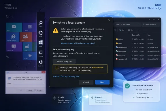
The offending dialog appears when a user switches from a Microsoft account to a local account on a device with BitLocker or device encryption enabled. Before proceeding, Windows tells the user to back up the recovery key, which is sensible security advice. The problem is the instruction: it says to close the dialog and use the “Search charm” to search for device encryption.
That wording belongs to Windows 8 and 8.1, where the Charms Bar was a central gesture-driven interface element. It appeared from the right edge of the screen and carried Search, Share, Start, Devices, and Settings. Windows 10 removed it in 2015, which means Windows 11 is still shipping text that points users toward an interface that has not existed for more than a decade.
Windows Latest says the screenshot came from Windows 11 25H2 build 26200.8655, and the public exchange became notable because the user tagged Ash directly. Windows historian Albacore also pointed out that the giveaway was not merely the old visual style but the phrase “Search charm” itself. In Windows, stale chrome is common; stale instructions are worse because they turn cosmetic neglect into user confusion.
The more interesting part is Ash’s response. Microsoft did not treat the screenshot as a one-off typo to be quietly corrected someday. Ash said it was on the company’s rejuvenation list, placing it alongside a broader backlog of dialogs and surfaces being dragged into the Windows 11 design system.
Windows is not a single clean product in the way a modern mobile operating system pretends to be. It is a compatibility machine, a platform, an enterprise runtime, a consumer product, and a museum of decisions that could not be broken without angering someone. That is why a modern Windows 11 PC can show a Fluent Settings page, a Windows 95-style properties dialog, a Windows 8-style recovery surface, and a web-powered Start component within the same hour.
The local-account angle adds another layer. Microsoft has spent years nudging users toward Microsoft accounts, especially during setup, where local-account paths have often been hidden, discouraged, or made conditional depending on edition and connectivity. A dialog that appears when a user is moving away from Microsoft’s account ecosystem was never likely to be the first thing on the design team’s whiteboard.
That does not mean Microsoft intentionally ignored this specific screen because it involved local accounts. It does mean incentives matter. The surfaces that reinforce cloud identity, subscriptions, backup, OneDrive, Copilot, and Store distribution get attention first; the screens that serve escape hatches, recovery paths, and legacy workflows often wait until someone with a screenshot and a following embarrasses the company in public.
That distinction matters. A shallow facelift can make a dialog look modern while leaving its behavior, accessibility quirks, scaling problems, and dark-mode failures intact. A rewrite can solve more foundational problems, but it also risks regressions in workflows that have been stable for decades. Windows users know this bargain well: the old thing is ugly, but it works; the new thing is pretty, but maybe the keyboard shortcut is different, maybe it opens in the wrong place, maybe it is slower.
WinUI 3 is Microsoft’s modern native UI framework for Windows desktop apps, delivered through the Windows App SDK. In theory, that makes it the right tool for rebuilding familiar Windows surfaces without relying on the oldest parts of the shell. In practice, Windows 11 has spent years proving that picking the framework is the easy part; migrating the operating system’s long tail is the hard part.
The promise of this rejuvenation push is not that every dialog will suddenly become beautiful. The promise is that Microsoft may finally have a repeatable process for identifying, porting, testing, and shipping modern replacements for the old surfaces that have survived because nobody owned the whole mess.
According to Windows Latest, Microsoft’s hidden modern Run dialog uses WinUI 3 and .NET ahead-of-time compilation. Microsoft’s own telemetry reportedly showed it loading in 94 milliseconds, compared with 103 milliseconds for the legacy implementation. That difference is small in human terms, but symbolically important: Microsoft produced a modern UI replacement that was not slower than the old one.
That matters because Windows 11’s reputation problem is not only visual inconsistency. It is the suspicion that modern Windows UI layers are heavier, less predictable, and more interested in animation than throughput. Every sluggish Settings page, delayed context menu, and half-web Start experience reinforces the idea that the old control panels were ugly because they were efficient, and the new ones are elegant because they are detached from reality.
If Microsoft can repeatedly modernize legacy surfaces without making them slower, the debate changes. Users may still dislike the new look, but they lose the strongest practical objection. A modern Run dialog that launches faster than the Windows 95-era one it replaces is a small but useful rebuttal to years of Windows cynicism.
File operations have been part of that story. Copy, move, delete, and cut dialogs picked up dark mode support, and Microsoft has reportedly confirmed that the file copy dialog has already been rewritten in WinUI 3. March Rogers, Partner Director of Design at Microsoft, wrote on X that the team is working through older dialogs and rewriting them in WinUI 3, with the common file dialog also on the list.
That is a much bigger deal than a prettier progress bar. The common file dialog is one of Windows’ most frequently encountered pieces of shared infrastructure. It appears across applications and workflows, and any change to it touches developers, administrators, accessibility tools, automation, and user muscle memory.
The Properties dialog in File Explorer is another obvious candidate. Windows Latest reported that strings such as “DeletedFileProperties” appeared in File Explorer resource files, suggesting work on a modern replacement. Anyone who has opened file properties in Windows 11 dark mode knows why this matters: the shell can look modern right until the moment it opens a modal time capsule.
Windows Latest notes that a Windows 11 login-screen input method switcher still carried Windows 8-style design cues, and that Microsoft design leaders acknowledged the issue publicly. The same broad problem applies to WinRE and the old “Please wait” screens, which still evoke the Windows 8 era more than the Windows 11 one. Those surfaces may not sell PCs, but they shape trust at exactly the wrong time to look neglected.
For administrators, recovery UI is not decoration. It is part of the operational experience of supporting BitLocker, boot failures, update rollbacks, and account problems. If the system is telling users to search for a nonexistent charm, or dropping them into a recovery interface that looks abandoned, it undermines confidence in the instructions at the moment those instructions need to feel authoritative.
This is where Microsoft’s design debt becomes support debt. Every stale phrase, mismatched dialog, and inconsistent flow increases the chance that a user calls the help desk, searches the web, or makes the wrong decision. Visual modernization is easy to mock until the old UI is the thing standing between a user and a recovered machine.
For many consumers, that integration is convenient. For privacy-minded users, lab builders, offline environments, schools, small businesses, and some enterprise workflows, it is friction. The local account is still a legitimate Windows mode, but Microsoft often treats it less like a first-class choice and more like a grudging compatibility concession.
That tension gives the outdated dialog its sting. The instructions are not just old; they appear in a workflow Microsoft would rather users avoid. A polished Microsoft-account setup flow and a stale local-account exit flow communicate priorities even if nobody at Microsoft says them out loud.
Microsoft can fix the words in this dialog quickly. The harder fix is treating account choice with equal clarity. If Windows is going to support local accounts, the supporting UI should be accurate, modern, and respectful rather than looking like a forgotten service corridor behind the cloud-first lobby.
Windows 11 looked new enough to invite scrutiny, but not new enough to escape comparison with the old parts. The more elegant the Settings app became, the more jarring it felt when an advanced option opened an ancient Control Panel applet. The smoother File Explorer became in one view, the more obvious it was when another view stuttered or fell back to older behavior.
That is why these belated rejuvenation efforts matter in 2026. They suggest Microsoft understands that Windows 11 cannot simply add AI features, Start menu experiments, and cloud services while leaving the shell’s foundations visibly unfinished. At some point, the old seams become the story.
The risk is that Microsoft frames this as craft polish rather than product repair. Users do not need every dialog to be fashionable. They need the operating system to stop feeling like it was assembled by teams that never met.
A file picker is not just a file picker. It is a contract with every application that invokes it, every shell extension that augments it, every policy that restricts it, and every user who has learned how it behaves. The more central the surface, the harder it is to replace without breaking something that only a hospital imaging app, a factory workstation, or a government deployment still depends on.
That is why Microsoft’s claimed tooling effort is the most important detail in the Windows Latest report. One-off rewrites can create islands of modernity. Tooling can create a pipeline. The difference is whether Windows 11 gets a few showcase dialogs or a systematic reduction in the number of places where old frameworks leak through.
Still, tooling will not eliminate judgment. Microsoft must decide which surfaces to modernize first, which old behaviors to preserve, and when to accept short-term compatibility risk in exchange for long-term maintainability. That is not a design exercise; it is platform governance.
This is where Microsoft’s recent Windows history cuts both ways. The company has shown it can modernize core experiences without disaster, but it has also shipped changes that feel under-tested in enterprise contexts. New context menus, Settings migrations, taskbar changes, Start menu revisions, and account setup flows have all produced their share of “why did this change?” moments.
The rejuvenation program must therefore earn trust incrementally. A faster Run dialog is good. Dark-mode file operations are good. A modern Properties dialog will be good if it preserves the density and reliability of the old one. But administrators will not applaud a prettier dialog that hides critical information, removes keyboard access, or makes support documentation obsolete overnight.
The best version of Microsoft’s plan is boring in the right way. Users notice fewer white flashes, fewer ancient icons, fewer dead references, and fewer mismatched workflows. Administrators notice almost nothing broke.
When that kind of surface lands on an official rejuvenation list, it suggests the list is getting deeper. Windows Latest’s reporting points to Run, file operation dialogs, the common file dialog, File Explorer Properties, login-screen elements, WinRE, and even system sounds as areas of attention or discussion. That is no longer a single redesign; it is a slow cleanup of Windows’ inherited clutter.
The system-sounds aside is especially interesting. Ash reportedly mentioned that the sound designer behind the original Windows 11 startup chime had rejoined his team. That does not guarantee a new sound scheme, but it shows Microsoft is thinking beyond rectangles and buttons. A coherent operating system is visual, auditory, behavioral, and linguistic.
Windows 11’s problem has never been that it lacked a design language. It has been that the design language did not reach far enough. The next phase is less glamorous than the launch keynote, but it may be more important to how the OS feels day to day.
Windows 8 tried to reinvent Windows around touch-first metaphors and edge gestures. Windows 10 retreated from that model and restored a more traditional desktop balance. Windows 11 then tried to soften and simplify the desktop without repeating Windows 8’s overreach. Yet here is Windows 11, still carrying a sentence from the very interface era Microsoft abandoned.
That continuity is both Windows’ strength and its burden. Old things survive because Windows tries very hard not to break workflows. But old things also survive because nobody wants to own the unglamorous work of removing them. The current rejuvenation push is Microsoft belatedly admitting that compatibility cannot be an excuse for visible neglect forever.
The company does not need to erase history. It needs to stop making users trip over it.
As reported by Windows Latest, Marcus Ash, who leads Design and Research for Windows and Devices at Microsoft, confirmed on X that the dialog is now “on our list of rejuvenation surfaces.” The phrase sounds corporate, but the work behind it is concrete: Microsoft is rewriting old Win32-era and Windows 8-era interface pieces in WinUI 3, extending dark mode, updating language, and trying to remove the seams that Windows 11 has never quite hidden. The local-account dialog is not the most important surface in Windows, but it may be the funniest evidence yet that Microsoft’s cleanup campaign is finally reaching the neglected corners.
 A Windows 8 Ghost Walks Into a Windows 11 Build
The offending dialog appears when a user switches from a Microsoft account to a local account on a device with BitLocker or device encryption enabled. Before proceeding, Windows tells the user to back up the recovery key, which is sensible security advice. The problem is the instruction: it says to close the dialog and use the “Search charm” to search for device encryption.That wording belongs to Windows 8 and 8.1, where the Charms Bar was a central gesture-driven interface element. It appeared from the right edge of the screen and carried Search, Share, Start, Devices, and Settings. Windows 10 removed it in 2015, which means Windows 11 is still shipping text that points users toward an interface that has not existed for more than a decade.
Windows Latest says the screenshot came from Windows 11 25H2 build 26200.8655, and the public exchange became notable because the user tagged Ash directly. Windows historian Albacore also pointed out that the giveaway was not merely the old visual style but the phrase “Search charm” itself. In Windows, stale chrome is common; stale instructions are worse because they turn cosmetic neglect into user confusion.
The more interesting part is Ash’s response. Microsoft did not treat the screenshot as a one-off typo to be quietly corrected someday. Ash said it was on the company’s rejuvenation list, placing it alongside a broader backlog of dialogs and surfaces being dragged into the Windows 11 design system.
The Dialog Is Small Because the Problem Is Huge
It is tempting to laugh this off as a harmless leftover. Most people will never see this dialog, and those who do can probably infer that modern Windows search has replaced the old charm. But that argument misses why these artifacts matter: they are symptoms of how Windows is built, maintained, and politically prioritized inside Microsoft.Windows is not a single clean product in the way a modern mobile operating system pretends to be. It is a compatibility machine, a platform, an enterprise runtime, a consumer product, and a museum of decisions that could not be broken without angering someone. That is why a modern Windows 11 PC can show a Fluent Settings page, a Windows 95-style properties dialog, a Windows 8-style recovery surface, and a web-powered Start component within the same hour.
The local-account angle adds another layer. Microsoft has spent years nudging users toward Microsoft accounts, especially during setup, where local-account paths have often been hidden, discouraged, or made conditional depending on edition and connectivity. A dialog that appears when a user is moving away from Microsoft’s account ecosystem was never likely to be the first thing on the design team’s whiteboard.
That does not mean Microsoft intentionally ignored this specific screen because it involved local accounts. It does mean incentives matter. The surfaces that reinforce cloud identity, subscriptions, backup, OneDrive, Copilot, and Store distribution get attention first; the screens that serve escape hatches, recovery paths, and legacy workflows often wait until someone with a screenshot and a following embarrasses the company in public.
Rejuvenation Is Microsoft’s Polite Word for Excavation
Microsoft’s use of “rejuvenation” is doing a lot of work here. It sounds like a visual refresh, as if someone is applying rounded corners and a new coat of Mica to old windows. In practice, the company appears to be doing something more expensive: replacing legacy UI surfaces with WinUI 3 implementations and building tooling to repeat the process across the operating system.That distinction matters. A shallow facelift can make a dialog look modern while leaving its behavior, accessibility quirks, scaling problems, and dark-mode failures intact. A rewrite can solve more foundational problems, but it also risks regressions in workflows that have been stable for decades. Windows users know this bargain well: the old thing is ugly, but it works; the new thing is pretty, but maybe the keyboard shortcut is different, maybe it opens in the wrong place, maybe it is slower.
WinUI 3 is Microsoft’s modern native UI framework for Windows desktop apps, delivered through the Windows App SDK. In theory, that makes it the right tool for rebuilding familiar Windows surfaces without relying on the oldest parts of the shell. In practice, Windows 11 has spent years proving that picking the framework is the easy part; migrating the operating system’s long tail is the hard part.
The promise of this rejuvenation push is not that every dialog will suddenly become beautiful. The promise is that Microsoft may finally have a repeatable process for identifying, porting, testing, and shipping modern replacements for the old surfaces that have survived because nobody owned the whole mess.
The Run Dialog Became the Proof of Concept
The modern Run dialog is the best example of why this effort deserves more than a shrug. Win+R is one of those tiny Windows affordances that power users use constantly and casual users barely think about. It is also a fossil from an older Windows era, exactly the kind of thing that critics expect Microsoft to modernize badly.According to Windows Latest, Microsoft’s hidden modern Run dialog uses WinUI 3 and .NET ahead-of-time compilation. Microsoft’s own telemetry reportedly showed it loading in 94 milliseconds, compared with 103 milliseconds for the legacy implementation. That difference is small in human terms, but symbolically important: Microsoft produced a modern UI replacement that was not slower than the old one.
That matters because Windows 11’s reputation problem is not only visual inconsistency. It is the suspicion that modern Windows UI layers are heavier, less predictable, and more interested in animation than throughput. Every sluggish Settings page, delayed context menu, and half-web Start experience reinforces the idea that the old control panels were ugly because they were efficient, and the new ones are elegant because they are detached from reality.
If Microsoft can repeatedly modernize legacy surfaces without making them slower, the debate changes. Users may still dislike the new look, but they lose the strongest practical objection. A modern Run dialog that launches faster than the Windows 95-era one it replaces is a small but useful rebuttal to years of Windows cynicism.
Dark Mode Exposed the Shell’s Real Fragmentation
Dark mode has been the great revealer of Windows 11’s unfinished architecture. It is one thing for a legacy dialog to look old in light mode; users can dismiss that as aesthetic inconsistency. It is another for the same dialog to flash bright white in the middle of a dark workflow, reminding everyone that the operating system is not sharing one coherent design substrate.File operations have been part of that story. Copy, move, delete, and cut dialogs picked up dark mode support, and Microsoft has reportedly confirmed that the file copy dialog has already been rewritten in WinUI 3. March Rogers, Partner Director of Design at Microsoft, wrote on X that the team is working through older dialogs and rewriting them in WinUI 3, with the common file dialog also on the list.
That is a much bigger deal than a prettier progress bar. The common file dialog is one of Windows’ most frequently encountered pieces of shared infrastructure. It appears across applications and workflows, and any change to it touches developers, administrators, accessibility tools, automation, and user muscle memory.
The Properties dialog in File Explorer is another obvious candidate. Windows Latest reported that strings such as “DeletedFileProperties” appeared in File Explorer resource files, suggesting work on a modern replacement. Anyone who has opened file properties in Windows 11 dark mode knows why this matters: the shell can look modern right until the moment it opens a modal time capsule.
The Login Screen and Recovery Environment Still Break the Spell
Some old surfaces are merely ugly; others appear at moments when users are already anxious. The Windows Recovery Environment, failed-boot screens, and login-time language or input switchers are not everyday interface trivia. They appear when a user is locked out, troubleshooting, changing keyboards, repairing startup, or trying to recover a machine.Windows Latest notes that a Windows 11 login-screen input method switcher still carried Windows 8-style design cues, and that Microsoft design leaders acknowledged the issue publicly. The same broad problem applies to WinRE and the old “Please wait” screens, which still evoke the Windows 8 era more than the Windows 11 one. Those surfaces may not sell PCs, but they shape trust at exactly the wrong time to look neglected.
For administrators, recovery UI is not decoration. It is part of the operational experience of supporting BitLocker, boot failures, update rollbacks, and account problems. If the system is telling users to search for a nonexistent charm, or dropping them into a recovery interface that looks abandoned, it undermines confidence in the instructions at the moment those instructions need to feel authoritative.
This is where Microsoft’s design debt becomes support debt. Every stale phrase, mismatched dialog, and inconsistent flow increases the chance that a user calls the help desk, searches the web, or makes the wrong decision. Visual modernization is easy to mock until the old UI is the thing standing between a user and a recovered machine.
Local Accounts Remain the Awkward Edge of Microsoft’s Windows Strategy
The fact that this particular dialog involves switching to a local account is not incidental. Windows 11 is increasingly designed around Microsoft identity. That identity unlocks sync, Store purchases, OneDrive backup, passkeys, device tracking, Edge integration, Copilot features, and a growing set of cloud-connected defaults.For many consumers, that integration is convenient. For privacy-minded users, lab builders, offline environments, schools, small businesses, and some enterprise workflows, it is friction. The local account is still a legitimate Windows mode, but Microsoft often treats it less like a first-class choice and more like a grudging compatibility concession.
That tension gives the outdated dialog its sting. The instructions are not just old; they appear in a workflow Microsoft would rather users avoid. A polished Microsoft-account setup flow and a stale local-account exit flow communicate priorities even if nobody at Microsoft says them out loud.
Microsoft can fix the words in this dialog quickly. The harder fix is treating account choice with equal clarity. If Windows is going to support local accounts, the supporting UI should be accurate, modern, and respectful rather than looking like a forgotten service corridor behind the cloud-first lobby.
Windows 11’s Original Sin Was Promising Coherence Too Early
When Microsoft introduced Windows 11 in 2021, the company sold it as a calmer, more coherent, more human Windows. Fluent Design, rounded corners, centered taskbar icons, refreshed sounds, new iconography, and modernized inbox apps were all part of the pitch. The trouble was that the promise was visible on the surface faster than it was true underneath.Windows 11 looked new enough to invite scrutiny, but not new enough to escape comparison with the old parts. The more elegant the Settings app became, the more jarring it felt when an advanced option opened an ancient Control Panel applet. The smoother File Explorer became in one view, the more obvious it was when another view stuttered or fell back to older behavior.
That is why these belated rejuvenation efforts matter in 2026. They suggest Microsoft understands that Windows 11 cannot simply add AI features, Start menu experiments, and cloud services while leaving the shell’s foundations visibly unfinished. At some point, the old seams become the story.
The risk is that Microsoft frames this as craft polish rather than product repair. Users do not need every dialog to be fashionable. They need the operating system to stop feeling like it was assembled by teams that never met.
The Engineering Challenge Is Compatibility, Not Taste
Critics often ask why Microsoft cannot simply rewrite all the old dialogs. The answer is that Windows’ backwards compatibility is both its moat and its trap. Old dialogs are tied to APIs, shell extensions, accessibility hooks, enterprise scripts, localization strings, undocumented behaviors, and decades of user expectations.A file picker is not just a file picker. It is a contract with every application that invokes it, every shell extension that augments it, every policy that restricts it, and every user who has learned how it behaves. The more central the surface, the harder it is to replace without breaking something that only a hospital imaging app, a factory workstation, or a government deployment still depends on.
That is why Microsoft’s claimed tooling effort is the most important detail in the Windows Latest report. One-off rewrites can create islands of modernity. Tooling can create a pipeline. The difference is whether Windows 11 gets a few showcase dialogs or a systematic reduction in the number of places where old frameworks leak through.
Still, tooling will not eliminate judgment. Microsoft must decide which surfaces to modernize first, which old behaviors to preserve, and when to accept short-term compatibility risk in exchange for long-term maintainability. That is not a design exercise; it is platform governance.
IT Pros Will Judge the New Dialogs by Failure Modes
For Windows enthusiasts, rejuvenation is about coherence and pride. For IT pros, it is about predictability. A rewritten dialog is welcome only if it respects policy, scales across displays, behaves under remote access, works with screen readers, localizes correctly, and does not introduce a new class of weird bugs.This is where Microsoft’s recent Windows history cuts both ways. The company has shown it can modernize core experiences without disaster, but it has also shipped changes that feel under-tested in enterprise contexts. New context menus, Settings migrations, taskbar changes, Start menu revisions, and account setup flows have all produced their share of “why did this change?” moments.
The rejuvenation program must therefore earn trust incrementally. A faster Run dialog is good. Dark-mode file operations are good. A modern Properties dialog will be good if it preserves the density and reliability of the old one. But administrators will not applaud a prettier dialog that hides critical information, removes keyboard access, or makes support documentation obsolete overnight.
The best version of Microsoft’s plan is boring in the right way. Users notice fewer white flashes, fewer ancient icons, fewer dead references, and fewer mismatched workflows. Administrators notice almost nothing broke.
Microsoft’s Cleanup Campaign Is Finally Reaching the Corners
The local-account recovery-key dialog tells us something useful precisely because it is obscure. High-traffic surfaces always get attention eventually. The Start menu, taskbar, Settings home page, File Explorer command bar, and Copilot entry points are politically visible inside Microsoft. A BitLocker warning shown during a local-account transition is not.When that kind of surface lands on an official rejuvenation list, it suggests the list is getting deeper. Windows Latest’s reporting points to Run, file operation dialogs, the common file dialog, File Explorer Properties, login-screen elements, WinRE, and even system sounds as areas of attention or discussion. That is no longer a single redesign; it is a slow cleanup of Windows’ inherited clutter.
The system-sounds aside is especially interesting. Ash reportedly mentioned that the sound designer behind the original Windows 11 startup chime had rejoined his team. That does not guarantee a new sound scheme, but it shows Microsoft is thinking beyond rectangles and buttons. A coherent operating system is visual, auditory, behavioral, and linguistic.
Windows 11’s problem has never been that it lacked a design language. It has been that the design language did not reach far enough. The next phase is less glamorous than the launch keynote, but it may be more important to how the OS feels day to day.
The Charm Reference Is Funny Because It Is True
A reference to the Search charm in 2026 is the kind of bug that travels well on social media because everyone understands it immediately. It is absurd, specific, and faintly embarrassing. It also compresses a decade of Windows strategy into one sentence.Windows 8 tried to reinvent Windows around touch-first metaphors and edge gestures. Windows 10 retreated from that model and restored a more traditional desktop balance. Windows 11 then tried to soften and simplify the desktop without repeating Windows 8’s overreach. Yet here is Windows 11, still carrying a sentence from the very interface era Microsoft abandoned.
That continuity is both Windows’ strength and its burden. Old things survive because Windows tries very hard not to break workflows. But old things also survive because nobody wants to own the unglamorous work of removing them. The current rejuvenation push is Microsoft belatedly admitting that compatibility cannot be an excuse for visible neglect forever.
The company does not need to erase history. It needs to stop making users trip over it.
The 2026 Windows Cleanup Has a Very Specific To-Do List
The story is not that Microsoft found one embarrassing string. The story is that the company’s designers are publicly acknowledging a backlog of legacy surfaces and increasingly describing a technical path for replacing them rather than merely reskinning them.- The “Switch to a local account” BitLocker recovery-key dialog is now on Microsoft’s rejuvenation list after being spotted in Windows 11 25H2 build 26200.8655.
- The stale “Search charm” wording matters because Windows removed the Charms Bar with Windows 10 in 2015, making the instruction both obsolete and confusing.
- Microsoft’s broader effort appears to involve rewriting older dialogs in WinUI 3, not merely changing icons, corners, and colors.
- The modern Run dialog is an important proof point because Microsoft reportedly made it faster than the legacy version, weakening the argument that modern Windows UI must be slower.
- File operation dialogs, the common file dialog, File Explorer Properties, login-screen elements, recovery surfaces, and possibly system sounds are all part of the same widening cleanup conversation.
- The biggest test for IT pros will be whether Microsoft can modernize these surfaces without breaking policies, accessibility, automation, localization, or long-standing workflows.
References
- Primary source: Windows Latest
Published: Tue, 07 Jul 2026 15:02:49 GMT
Loading…
www.windowslatest.com - Official source: learn.microsoft.com
Loading…
learn.microsoft.com - Official source: microsoft.com
Windows 11: The operating system for hybrid work and learning | Microsoft 365 Blog
If the past year has taught us anything, it’s that organizations must be resilient, and technology has been more critical to that resilience than ever before. The global pandemic accelerated digital transformation in ways never before imagined, and we are honored and humbled that so many...www.microsoft.com - Related coverage: pcworld.com
Loading…
www.pcworld.com - Related coverage: windowscentral.com
Loading…
www.windowscentral.com - Official source: blogs.windows.com
Introducing Windows 11
At a time when the PC is playing a more central role in our lives, Windows 11 is designed to bring you closer to what you love.blogs.windows.com
- Official source: developer.microsoft.com
Developing Apps for Windows | Microsoft Developer
Create exceptional desktop experiences for Windows with the latest tools and frameworks.developer.microsoft.com - Related coverage: tomshardware.com
Loading…
www.tomshardware.com - Related coverage: techradar.com
Windows 11 review | TechRadar
Windows 11 is the latest operating system from Microsoft, and while it gets a lot right, there's still work to be done.www.techradar.com