• Thread Author
Microsoft appears to be closing one of Windows’ longest-running cosmetic grievances: preview builds released in August 2025 show legacy file‑operation dialogs and several system prompts finally obeying the system Dark theme, reducing the jarring white “flash” that has plagued Dark Mode since the feature’s debut in 2016. (blogs.windows.com)

Two retro, window-like panels connected by a dark strip against a blue gradient backdrop.Background​

Since Windows 10 introduced a system Dark theme in 2016, users have repeatedly pointed out that Microsoft’s implementation was incomplete. Modern surfaces built with WinUI and many UWP/WinRT apps adopted dark palettes quickly, but a large swath of the operating system — particularly legacy Win32 dialogs, file‑operation windows and some elevation prompts — continued to render with bright white chrome even when the system was set to Dark. That mismatch created frequent, high‑contrast interruptions for people working in low‑light environments and undermined the visual polish Microsoft advertises for Windows 11. (blogs.windows.com)
The recent change is not a single magic switch; it is the result of staged engineering work that ships supporting code in preview builds while Microsoft enables the visuals progressively for subsets of devices. This staged rollout model explains why two Insiders on the same build may see different results. Microsoft documented that rollout model for the relevant preview release in mid‑August 2025. (blogs.windows.com)

What changed in practical terms​

The visible differences testers are seeing​

Across Insider preview builds — most prominently Build 26100.5061 (KB5064081) and follow‑on 26120 series flights — testers and independent publications have reported that a set of file‑operation and file‑related dialogs are now rendered with dark chrome when the system theme is set to Dark. The primary items observed so far include:
  • File copy / move progress windows (the “calculating time remaining…” dialog) now appear dark‑grey instead of bright white. (theverge.com)
  • Delete confirmations (including permanently delete and Empty Recycle Bin prompts) adopt darker styling. (windowscentral.com)
  • Access denied, file‑in‑use, and replace/merge conflict dialogs show darker palettes in many preview instances. (windowsforum.com)
These changes reduce sudden luminance shifts and make a Dark Mode session feel more consistent. Test screenshots circulated in community forums and press articles show the results, though some screenshots also reveal leftover mismatches (for example, some buttons or small controls still rendering in light colors). (theverge.com)

What still looks incomplete​

The work is explicitly incremental. Areas that remain inconsistent — and which Microsoft has not yet fully darkened in the preview wave — include:
  • Certain elevated or secure‑desktop prompts (for example, some UAC elevation dialogs may still show light buttons or bright backgrounds).
  • Complex legacy tools such as Registry Editor (regedit.exe), Group Policy Editor (gpedit.msc), and some MMC snap‑ins and Control Panel applets have not been universally converted and present additional engineering challenges.
  • Visual rough edges remain: mismatched button colors, absent focus indicators, and sporadic contrast regressions in some early screenshots. These are being iterated in preview builds.
Microsoft’s Insider post and the staged enablement approach make it clear that the company is shipping scaffolding in the builds and then turning features on for cohorts of devices while monitoring telemetry and feedback. That conservative deployment reduces regression risk but means full coverage will take additional preview cycles. (blogs.windows.com)

Why this fix took so long​

Architectural debt and multiple UI stacks​

Windows’ UI is an accretion of decades of technology: modern WinUI/Fluent surfaces coexist with legacy Win32/GDI controls and a multitude of compatibility shims. Many of the legacy dialogs were built before the concept of a system‑wide Dark theme existed, and they rely on default rendering behavior that assumes a white background. Mapping those old controls to modern dark tokens without breaking compatibility is non‑trivial. Engineers must consider:
  • Color token mapping and accessibility contrast ratios.
  • Keyboard focus visuals and automation hooks relied upon by assistive technologies and enterprise automation.
  • Secure‑desktop and elevated contexts that have stricter rendering rules.
Because naïvely swapping colors risks breaking text readability or accessibility, Microsoft has adopted a layered approach — per‑dialog fixes, temporary window “cloaking” during paint operations to avoid white flashes, and incremental migration when feasible to WinUI renderers. These techniques mitigate visible white flashes while preserving backward compatibility.

Testing and accessibility obligations​

Dark themes aren’t purely cosmetic; they affect contrast, keyboard navigation, and screen‑reader behavior. Microsoft must validate changes across many scenarios and hardware configurations — a task that grows in complexity when third‑party automation, enterprise scripts, and accessibility tools rely on consistent dialog appearance. This adds QA overhead and justifies a staged rollout.

How this ties to 25H2 and the broader update strategy​

Microsoft’s next major update — Windows 11 version 25H2 — is widely expected to be delivered as an enablement package rather than a full OS re‑image. That approach lets Microsoft ship supporting code earlier and enable features later via server flags and staged rollouts, which is precisely what we’re seeing with the Dark Mode work. 25H2’s public rollout window has been discussed for the second half of 2025, and many of the interface polishing efforts in preview builds are being framed as preparatory work for that release. (windowscentral.com)
This delivery model has advantages:
  • Faster activation of new features with a simple reboot rather than a full system upgrade.
  • Reduced download and installation friction for users.
  • The ability to ship code and then selectively enable features for subsets of users — limiting blast radius while collecting telemetry.
The downside is that users may not immediately see changes even when on the same build. That inconsistency can be confusing, but it is an intentional trade‑off to reduce risk.

Why this matters to users (and IT)​

For general users and power users​

  • Reduced eye strain and fewer visual surprises: Users who rely on Dark Mode will see fewer bright, interruptive flashes when copying files or responding to delete prompts, improving comfort during low‑light sessions. (windowscentral.com)
  • Perceived polish: A consistent theme makes the OS feel finished and cared‑for; for many users, this matters more than incremental functional updates.

For accessibility and productivity​

  • Improved readability when done correctly: Proper contrast mapping reduces cognitive load and helps users who are visually sensitive. That benefit only materializes if Microsoft finishes the accessibility checks (focus indicators, contrast ratios, screen‑reader labels). Early screenshots show places that still need adjustment.
  • Automation reliability: For people who automate UI interactions or run scripts that depend on predictable dialog behavior, fewer surprises mean more stable automated workflows. That is especially relevant in testing environments and scripted deployments.

For IT admins and enterprises​

  • Policy and management implications: Enterprises will expect clear documentation and Group Policy (ADMX) controls for theme behavior if changes affect automation or accessibility configurations. Early engineering commentary signals attention to enterprise telemetry, but full policy controls are not yet documented and should be watched.

Technical deep dive: how Microsoft is implementing the theming changes​

Microsoft engineers are applying several pragmatic techniques to make legacy surfaces theme‑aware without causing regressions:
  • Per‑control color mapping: Where feasible, legacy control colors are mapped to modern Fluent tokens, giving older dialogs a dark appearance while preserving contrast semantics.
  • Window cloaking during paint: To prevent a white client area from briefly appearing while a dialog initializes, windows can be cloaked until the application paints its dark background, then revealed. This hides the “white flash” without changing underlying control behavior. Cloaking must be implemented carefully to avoid race conditions, which is why staged testing is necessary.
  • Incremental migration: Over time, some dialogs may be reimplemented using modern renderers (WinUI/WinRT) which are naturally themeable. This long‑term migration is slow but reduces the need for ad‑hoc shims.
These methods reflect a conservative engineering posture: minimize user disruption while gradually closing the visual gap between legacy and modern UI stacks.

Independent verification and the public record​

Multiple independent outlets and the official Windows Insider blog corroborate the core claims:
  • The Windows Insider blog confirms Build 26100.5061 (KB5064081) was released to the Release Preview channel on August 14, 2025, and documents a gradual rollout model for several features. (blogs.windows.com)
  • Coverage and hands‑on reporting from outlets such as The Verge and Windows Central independently observed darkened file‑operation dialogs in preview builds and noted remaining visual rough edges. (theverge.com, windowscentral.com)
  • Community and forum reporting — including aggregated Insider sightings and screenshot threads — provide practical, device‑level confirmation of the changes and the staged enablement.
Where reporting relies on community screenshots or a user post on X (formerly Twitter), those sightings should be treated as useful but not definitive evidence of full system behavior; Microsoft’s official blog remains the authoritative record for build release and rollout mechanics. The staged nature of the change means visibility will vary across devices and channels. (blogs.windows.com, windowscentral.com)

Risks, caveats, and things to watch​

Potential regressions and accessibility risks​

  • A rushed, global color swap could break contrast or keyboard focus indicators that assistive technologies depend upon. Microsoft’s staged approach mitigates that risk, but users should watch for regressions in high‑contrast, screen‑reader, or keyboard‑only workflows after preview updates.

Enterprise automation and third‑party dependencies​

  • Enterprises that run UI automation or expect consistent screenshots for testing may see differences between devices as the staged rollout progresses. IT teams should treat preview builds as test beds and avoid deploying them widely in production.

Misinterpretation of “done”​

  • Early preview screenshots and selective enablement do not mean every legacy surface is complete. Expect the work to continue across multiple preview builds and possibly past the public 25H2 enablement window. Claims of “complete” system‑wide Dark Mode should be treated cautiously until Microsoft publishes full release notes and documentation.

How to try it (Insider preview guidance)​

For those comfortable with preview software and who want to see these changes early:
  • Join the Windows Insider Program (use the Release Preview, Beta, or Dev channels depending on tolerance for instability). (blogs.windows.com)
  • Update to builds in the 26100 / 26120 series (KB5064081 and subsequent preview flights are where the supporting code has been shipped).
  • Expect feature visibility to be staged; not every device on the build will show the new dark dialogs immediately. Monitor Feedback Hub and Insider forums for the latest notes. (blogs.windows.com)
Note: Insider builds are experimental and can cause data loss or instability. Back up important data and avoid installing previews on critical production machines.

What this suggests about Microsoft’s priorities and product management​

The persistent Dark Mode inconsistency had become emblematic of a deeper tension in modern Windows: delivering new features rapidly while managing decades of backward compatibility. The current staged approach — shipping underlying code in an enablement build and then selectively activating features — signals a refined operational model:
  • Microsoft is prioritizing risk‑managed rollouts that allow faster iteration while protecting a large installed base.
  • The company is balancing cosmetic polish (Dark Mode consistency) with technical due diligence required for accessibility and enterprise stability.
This work also aligns with the broader 25H2 narrative: rather than a revolutionary release, 25H2 looks set to be an accumulation of polishing, AI integrations, and targeted UX fixes that make Windows 11 feel more cohesive and reliable.

Conclusion​

The long‑running Dark Mode inconsistency is finally showing concrete signs of being fixed. Preview builds released in mid‑August 2025 (notably Build 26100.5061 / KB5064081) contain supporting code and visible examples of legacy file‑operation dialogs respecting the system Dark theme. The work is staged and incomplete — some dialogs and elevated prompts still show light elements, and several accessibility and contrast issues remain under refinement. Microsoft’s use of a gradual enablement model reduces risk and allows iterative improvement, but it also means not every user on the same build will immediately see the new visuals. (blogs.windows.com, theverge.com)
For users, this change improves comfort and perceived polish; for enterprises and accessibility stakeholders, it highlights the importance of careful validation. The visible progress toward a cohesive Dark Mode is a meaningful quality‑of‑life improvement and an indicator that Microsoft is investing engineering effort into reconciling its long history of UI architectures with the modern Fluent design language. Continued monitoring of Insider release notes and official Microsoft documentation will be the best way to track when the work finishes and reaches general availability.

Source: MARCA The latest Windows 11 update will fix a 10-year-old interface bug
 

Windows 11’s dark mode has taken a meaningful step out of “half-finished” status: recent Insider and Release Preview builds now render several long‑neglected file‑operation dialogs in dark palettes, reducing the jarring white popups that have plagued dark‑theme users for years while signaling a cautious, telemetry‑driven approach to modernizing legacy UI surfaces. (blogs.windows.com) (windowscentral.com)

Stacks of dark UI panels with neon blue icons on a laptop backdrop.Background / Overview​

For nearly a decade, Windows’ system‑wide Dark theme has been incomplete by design rather than accident. Modern parts of the shell — the Taskbar, Start menu, Settings, and many Store apps — adopted dark palettes relatively quickly, but a long tail of legacy Win32 dialogs and shell surfaces remained stubbornly light. Those bright interruptions during routine tasks (copying large files, deleting folders, resolving conflicts) created the so‑called “flashbang” moments that undermined the overall polish of Windows in low‑light conditions. The issue was architectural: Windows contains multiple UI stacks (GDI/Win32, common controls, COM shell components, UWP/XAML, and now WinUI) that evolved over decades, and not all were built to honor a single theming model. (windowslatest.com)
The concrete change arriving in mid‑August 2025 is modest in scope but high in perceived impact: the Windows Insider and Release Preview flights around Build 26100.5061 (KB5064081) include staged enablement of dark theming for a set of file‑operation dialogs. Microsoft’s official release notes explicitly describe a gradual rollout model for some features in that build, which explains why the dark dialogs may appear on some machines and not others even when the same build is installed. (blogs.windows.com)

What changed — the visible delta​

The dialogs now getting dark treatment​

Hands‑on reporting, community screenshots, and preview coverage converge on a consistent list of dialogs that are now rendering with dark chrome when the system theme is set to Dark:
  • File copy / move progress window (the legacy “calculating time remaining…” dialog).
  • Delete confirmations (including permanently delete and Empty Recycle Bin prompts).
  • Access denied / destination folder permission dialogs.
  • File‑in‑use notifications and replace/merge conflict prompts.
  • Smaller file‑operation warnings (path/filename too long, not enough disk space, rename conflicts). (windowslatest.com)
These are precisely the surfaces that produced the most visible friction for dark‑mode users — the frequent, repeated interruptions where a white dialog would momentarily blind the dark session. Fixing them substantially improves visual continuity and day‑to‑day comfort.

What still looks out of place​

The update is not a global switch. Early screenshots and tester notes reveal several persistent mismatches:
  • Some inner controls (notably action buttons) can remain light or retain legacy styling, producing a mixed‑mode appearance.
  • Focus indicators, keyboard navigation cues, and contrast ratios in a few dialogs still need polish for accessibility compliance.
  • Deep legacy surfaces — many Control Panel applets, Registry Editor, certain MMC snap‑ins, and secure‑desktop UAC prompts — remain largely unchanged for now. (windowsforum.com)
Microsoft’s staged enablement approach explains this surface‑by‑surface rollout: the code can be shipped inside a build while visuals are toggled on server‑side for cohorts of devices, allowing telemetry to guide the expansion without risking a mass regression. (blogs.windows.com)

Why this matters (UX, accessibility, and polish)​

Dark mode today is not merely an aesthetic choice — for many users it’s a usability and accessibility preference with measurable benefits:
  • Reduced eye strain during low‑light work by lowering sudden luminance contrast.
  • Improved continuity and focus, which helps workflow and reduces cognitive friction.
  • Better perceived product quality, aligning Windows more closely with expectations set by macOS and modern mobile OSes.
By targeting the file‑operation dialogs — the daily, repeat offenders — Microsoft fixes a small slice of UI debt that disproportionately affected user experience. The result is immediacy: a handful of themed dialogs yields an outsized improvement in perceived polish.

The technical reality: why it took so long​

The delay in achieving a consistent Dark mode across Windows is not negligence; it’s the result of complex engineering tradeoffs:
  • Windows is an accumulation of UI frameworks spanning decades. Many legacy dialogs were written before theme‑aware rendering was standard, so they never cleanly accepted a dark palette without compatibility workarounds.
  • Two pragmatic engineering strategies exist:
  • Map legacy control colors to modern Fluent tokens and add paint‑time shims — lower risk, incremental improvements.
  • Migrate to modern renderers (WinUI/WinRT) — more future‑proof, but expensive and compatibility‑sensitive.
  • Additional complications include the secure desktop used for UAC prompts (which is isolated for security), thousands of enterprise automation scripts and UI‑scraping tools that rely on consistent UI elements, and third‑party shell extensions that may reintroduce light surfaces.
Microsoft’s current path — incremental mapping combined with staged server‑side enablement — is designed to minimize risk while closing visible gaps.

Verification and timeline: what Microsoft actually shipped​

  • The Windows Insider blog confirms Build 26100.5061 (KB5064081) went to the Release Preview Channel on August 14, 2025, and that several features in the build are subject to gradual rollout. The build’s release notes list many other features and fixes (Recall, Click to Do, AI actions in File Explorer), making it clear the theming work is part of a broader cumulative update. (blogs.windows.com)
  • Independent outlets and hands‑on testers (The Verge, Windows Central, WindowsLatest, Windows Latest’s hands‑on reviews) observed the darkened file‑operation dialogs in Insider/Beta/Release‑Preview flights and documented the remaining rough edges. These reports align with Microsoft’s staged rollout model and corroborate that the change is visible on some, but not all, devices running the update. (theverge.com) (windowscentral.com) (windowslatest.com)
  • Claims that a complete system‑wide Dark mode will arrive in a particular public release (for example, the 25H2 public build) remain speculative until Microsoft explicitly commits to a timeline. Coverage suggests broader updates could be enabled around the 25H2 window, but Microsoft’s blog emphasizes staged visibility and telemetry gating rather than a single delivery date. Treat any assertion of “full coverage in 25H2” as informed speculation. (windowscentral.com)

Hands‑on checklist: how to see the change on your PC​

  • Confirm your Windows build: open Settings > System > About, or press Win+R and run winver. Look for Build 26100.5061 (KB5064081) or a later preview in the 26120 series. (blogs.windows.com)
  • Switch to Dark mode: Settings > Personalization > Colors > Choose your mode > Dark.
  • Trigger file dialogs that were previously white: copy a large file (to force the progress dialog), delete a folder (delete confirmation), or attempt a copy that causes an access‑denied prompt. If the dialog respects Dark mode, your device has the staged theming enabled; if not, the build may contain the code but the server‑side feature flag is not yet active for your hardware.
Caveat: Avoid enabling hidden flags (ViVeTool or similar) on production machines; use a VM or non‑critical device to experiment. The staged rollout is intentional to reduce regression risk.

Accessibility, enterprise and automation risks​

Polishing visuals is necessary but insufficient — accessibility and enterprise stability must be preserved. Key risks and action items:
  • Accessibility regressions: early screenshots show occasional missing focus indicators and contrast issues. These must be corrected to meet WCAG and assistive‑technology expectations. Screen reader semantics and keyboard focus behavior should be validated thoroughly.
  • Automation and UI scraping: enterprises using UI automation should pilot the update because themed dialogs may alter automation paths, screenshot expectations, and test baselines. Maintain representative pilot rings and validate PowerShell scripts, RPA workflows, and screenshot comparisons.
  • Third‑party extensions: shell add‑ins and drivers that draw custom chrome can reintroduce inconsistent visuals. IT teams should test common enterprise tools that integrate with File Explorer and shell dialogs.
  • Staged rollout confusion: because Microsoft flips features on server cohorts, two identical machines can behave differently. That can generate inconsistent bug reports; IT and community moderators should carefully note build and rollout cohort when triaging issues.

What developers and ISVs should do​

  • Test UI automation and accessibility: validate scripts, RPA workflows, and assistive‑technology behaviors against affected Insider builds and corrected control color mappings.
  • Use modern theming APIs: where possible, migrate shell integrations to WinUI/Fluent tokens so your components align with Microsoft’s theming model.
  • Monitor telemetry and feedback: anticipate that Microsoft’s staged rollout will progress as telemetry confirms stability; plan for iterative compatibility fixes.

Broader design context: Liquid Glass, translucency, and the aesthetic roadmap​

Microsoft has signaled ongoing UI work beyond this targeted theming effort. The broader aesthetic updates under discussion — including Liquid Glass translucency and deeper Fluent refinements — aim to provide cohesion across the shell. The darkening of file dialogs complements translucency and translucency‑driven lighting, improving the overall sense of a single, unified visual language. However, those larger UI projects are separate engineering efforts and may follow their own timelines. Expect them to be rolled out incrementally and validated against accessibility and compatibility constraints. (theverge.com)

Practical recommendations for users and IT admins​

  • Consumers / Enthusiasts:
  • If you want to see the changes early, join the Windows Insider Program (prefer Release Preview, Beta, or Dev depending on your tolerance for risk), install the builds, and test in a VM or spare device first. (blogs.windows.com)
  • Avoid forcing experimental flags on production machines; use community tools only in test environments.
  • Power Users:
  • Use third‑party theming tools (Auto Dark Mode, StartAllBack) sparingly and understand they may conflict with Microsoft’s updates. Prefer built‑in improvements when they arrive.
  • IT Admins:
  • Pilot the update in representative rings that mirror production hardware and workflows; validate automation, accessibility, and enterprise management scenarios.
  • Prepare rollback/runbooks and keep backups as always when testing Insider or Release Preview builds.

Critical analysis — strengths and limitations​

Strengths
  • Targeted, high‑impact fix: addressing file‑operation dialogs yields outsized UX benefit for relatively modest engineering changes.
  • Conservative rollout strategy: shipping code in a build but enabling UI changes server‑side reduces catastrophic regressions while allowing telemetry‑guided expansion.
  • Sign of continued investment: this work signals Microsoft is committed to chipping away at long‑standing UI debt rather than ignoring it.
Limitations and risks
  • Partial coverage: the long tail of legacy surfaces (Control Panel, Registry Editor, UAC secure desktop) will take longer, and Microsoft has not published a definitive timeline for all surfaces.
  • Accessibility and automation fragility: rushed theming can easily create regressions for screen readers and automation scripts if focus, contrast, or semantic labels are not correctly handled.
  • Perception vs. reality: visible screenshots of dark dialogs are powerful signals but do not guarantee comprehensive, stable behavior across diverse enterprise environments. Any claim that the entire OS will be dark‑mode consistent in 25H2 should be treated as aspirational until Microsoft confirms specifics.

The bottom line​

This update is an overdue but welcome correction of one of Windows 11’s most visible UX shortcomings. By making file‑operation dialogs respect system Dark mode in preview builds (notably Build 26100.5061), Microsoft has removed a recurring irritation for many users and demonstrated a pragmatic path to modernizing legacy surfaces without risking broad regressions. The work is incremental, staged, and intentionally cautious — which is the right engineering posture for a platform with decades of backward compatibility to preserve. Expect continued iteration: more surfaces will likely be targeted over time, but full coverage remains a medium‑ to long‑term program that must balance accessibility, automation stability, and ecosystem compatibility. (blogs.windows.com) (theverge.com)
For anyone who’s tired of the sudden white popups in an otherwise dark workspace, this is a notable milestone — not the finish line, but a clear and positive step toward a more consistent, polished Windows.

Source: HT Tech Windows 11 dark mode finally gets serious; About time
 

Microsoft has quietly begun repairing one of Windows 11’s most persistent annoyances: several long‑neglected file‑operation and system dialogs are now respecting the system Dark theme in recent Insider and Release Preview builds, marking the first visible progress toward a genuinely system‑wide dark mode. as has offered a user‑selectable Dark theme, yet the experience has been famously inconsistent: modern WinUI‑based surfaces generally respect a dark palette, while a long tail of legacy Win32 dialogs, Control Panel applets, and some Explorer prompts continued to render bright white, producing the now‑familiar “flashbang” interruptions in dark sessions. This mismatch has been an accessibility and polish problem as much as an aesthetic one.
Microsoft shipped supporting code for thmdows 11 Build 26100.5061 (KB5064081)**, delivered to the Release Preview channel on August 14, 2025. The company is enabling the visuals progressively using server‑side feature flags and telemetry gating rather than flipping a single global switch. That staged rollout explains why two machines on the same build can behave differently.

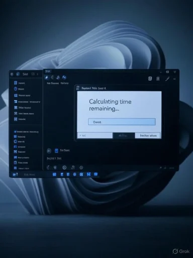
Dark, blue-themed desktop window showing “Calculating time remaining…” on an abstract blue wallpaper.What changed — the concrete fixes you can see now​

The visible delta: tsters and community screenshots show the following commonly encountered surfaces now render with dark chrome when the system theme is set to Dark:​

  • File copy / move progress window (the “calculating time remaining…” dialog).
  • Delete confirmations and Empty Recycle Bin prompts.
  • Access denied / destination‑folder permission dialogs.
  • File‑in‑use and replace/merge conflict dialogs.
  • Several smaller path, filename, or space warnings tied to file operations.
Early screenshots show these dialog frames and backgrounds adopting dark greys that match the rest of File Explorer and the mgt luminance shifts and makes evening or low‑light workflows significantly more comfortable.

What hasn’t changed (yet)​

The work is explicitly incremental. Micro‑elements inside the darkened dialogs — notably some buttons, focus outlines, and smaller retain lighter styling or legacy colors in early flights. Deeply legacy surfaces such as Registry Editor (regedit.exe), certain MMC/Control Panel applets, and some UAC secure‑desktop elevation prompts remain outside this wave and will require more invasive refactoring to modern theming APIs.

Why this matters: UX, accessibility and credibility​

Dark Mode is no longer mere decoration. For many users it’s a functional accessibility feature that:
  • Reduces eye strain insual continuity** and flow across tasks.
  • Can yield battery savings on OLED devices when dark pixels dominate.
  • Improves perceived polish and parity with other modern desktop OSes.
The long tail of bright, legacy dialogs contradicts those benefits. By targeting file‑operation dialogs — high‑frequency, high‑visibility pain points — Microsoft delivers the most immediate day‑to‑day return on investment for users wtiple independent outlets and community testers corroborated the improvements, making this not just an experiment but a measurable user‑impact change.

How Microsoft is rolling this out (and why it matters for admins)​

Microsoft’s approach is pragmatic: ship the code broadly in Insider / Release Preview builds, then enable the new visuals gradually for subsets of devices via **server‑side flagsttion and a limited blast radius for regressions. It also means early adopters will see the change before most production systems do.
Practical implications for IT and administrators:
  • Treat this as a UI/behavior change that merits pilot testing in controlled rings.
  • Validate automation, RPA, and UI‑dependent scripts that interact with system dialogs; color and element changes can break OCR‑based or coordinate‑s3ity audits** — keyboard focus, screen reader semantics, and contrast ratios must be validated before broad enablement.
The staged rollout rees short‑term variability; organizations should adopt pilot rings and use Insider channels in VMs to validate workflows before permitting wider distribution.

Technic hard and why Microsoft’s incremental strategy makes sense​

Windows is a multi‑generation platform. Its UI comprises multiple rendering stacks — ommon controls, UWP/XAML, and the newer WinUI — each with different theme semantics. Many legacy dialogs were written before theme‑aware rendering was common and therefore don’t automatically inheritConverting them either requires per‑control theming, adding theme‑aware APIs, or migrating the surface to a modern rendering stack, all of which carry compatibility risk.
Microsoft’s current pathway appears to be:
  • Move high‑value shell surfaces toward WinUI where possible.
  • Ship theme‑aware rendering where it’s safe and testable.
  • Use server‑side feature flags to enable visuals progressively and collect telemetry.
That approach balances the need for polish with the platform’s long history of backwards compatibility — it’s slower, but safer for enterprise and for the myriad that depends on stable shell behavior.

Strengths of Microsoft’s approach​

  • High user impact, low surface area: Targeting file dialogs fixes the most visible and frequent dark‑mode complaints without requiring an immediate full rearchitecture.
  • **Co Server‑side flags and telemetry minimise the blast radius of regressions while enabling incremental polish.
  • Signal of ongoing investment: This work is a visible sign that Microsoft continues to refine Windows 11’s ’s pragmatic, not revolutionary, but meaningful.

Risks and potential regressions to watch​

  • Accessibility regressions: Rushed theming can remove or obscure keyboard focus indicators, degrade contrast ratieader semantics. That risk is why Microsoft must complete accessibility audits before broad enablement.
  • **Automation and RPA breakage: text contrast, or element geometry changes can silently break automated workflows in enterprises. Administrators should test and be ready to rollback or pin versions.
  • **Third‑part Legacy installers, custom shell extensions, or apps that draw directly with old APIs might assume light backgrounds, leading to broken visual affordances or clipped text.
  • Partial polish confusion: Because the rollout is staged, users on the same build may see different appearances, incs and confusion. Clear communication and pilot programs can mitigate this.
When these regressions occur, staged rollouts make remediation easier: Microsoft can flip flags off, iterate, and re‑enable once telemetry looks heial waves must be watched closely.

What users and enthusiasts should do today​

  • If you want the new dialogs now, test Build 26100.5061 (KB5064081) or later Insider flights in a VM or a dedicatet staged behavior and inconsistent coverage.
  • Avoid force‑enabling experimental flags on production machines; tools like ViVeTool can enable hidden features but carry stability and security risks.
  • Report regressio steps to the Feedback Hub so Microsoft’s telemetry and support teams can prioritize fixes.
For those who can’t wait and want a more immediate, consistent dark experience, third‑party theming tools exist trade‑offs: potential compatibility issues, security concerns, and no guarantee of accessibility compliance. Use them cautiously and preferably on non‑critical systems.

Enterprise guidance: how to pilot and evaluate safely​

Enterpis as a routine UI change and follow established validation cycles:
  • Create a small pilot ring with representative hardware and software stacks.
    2.sion suites focusing on file operations, installers, and any OCR/vision‑based tooling.
  • Validate assistive technologies (sc themes, keyboard‑only navigation).
  • Monitor telemetry and user feedback closely during the pilot.
  • Only widen deployment once confidence thresholds are met and rollback procedures are in place.
If Microsoft publishes ADMX or Intune policy controls for the staged flags, businesses should consitrol adoption timing for production fleets. That level of control would be ideal but is not guaranteed — enterprises should keep pilot rings lean and observability high.

Long‑term outlook: what remains and a realistic timeline​

The current wave fixes the most visible pain points. The deeper work — theming Registry Editor, many MMC snap‑ins, secure desktop UAC, and third‑party legacy apps — will take considerably more engineering time. Microsoft’s staged model suggests a steady, iterative expansion of coverage rather than a single definitive update; expect months of gradual improvements across Insider channels besistent in general availability. Any claim tying full dark‑mode completion to a specific feature update (for example, “25H2 will finish this”) should be treated as speculative unless Microsoft explicitly confirms it.
A realistic sequence looks like this:
  • Short term (weeks): more file‑Explorer surfaces adopt dark palettes in Insider and Release Preview channels.
  • Medium term (months): button and micro‑element polish, accessibility fixes, and wider staged enablement across beta/dev channels.
  • Long term (12+ months): deeper legacy surfaces and secure‑desktop elements require major refactors and will arrive sporadically. Expect continued incremental progress rather than a single “dark mode completed” moment.

Critical analysis: strength, shortcomings, and what Microsoft should do next​

This work addresses a long‑standing usability gap with a sensible engineering pattern: focus on the highest‑impact surfaces and iterate. The strategy is technically sound delivering noticeable improvements for everyday users. That said, the execution matters: rushed visual changes without robust accessibility and automation validation will causise customers and users relying on assistive technologies.
Recommended priorities for Microsoft going forward:
  • **Publish a clearer ng legacy surfaces so IT organizations can plan pilots and risk mitigation.
  • Prioritize accessibility audits and public fixes for any lost focus indicators, contrast regressions, or screen‑reader incompatibilities. tion impacts**, including guidance for UI Automation IDs and best practices to future‑proof scripts and RPA flows.
  • Provide enterprise controls (policy or administrative toggles) to manage staged enablement for production fleets.
If Microsoft follows this path, the present work could mature from a cosmetic win into a sustainable platform improvement that restores confidence in Windows’ theming behavior.

Final assessment​

The darkening of several legacy file‑operation dialogs in Windows 11 preview builds is an overdue and meaningful a daily annoyance for many Dark Mode users and demonstrates Microsoft is willing to address long‑standing UI debt. However, the change is incremental, staged, and not yet prry environment. Accessibility gaps, micro‑element inconsistencies, and enterprise automation impacts remain the primary risks that must be mitigatebe declared finished.
For everyday users the upgrade will feel like a real quality‑of‑life improvement. For IT professionals and enterh is to pilot, validate, and wait for Microsoft’s broader polish and controls before rolling the change out widely. If the terate with the same cautious, telemetry‑driven approach — and prioritizes accessibility and enterprise documentation — Windows 11’s Dark Mode may finally stop feeling like an unfinished promise and begin to deliver the consistent experience users have expected for years.
Conclusion: this is not the end of the Dark Mode story, but it is a clearly visible, practical step forward — one that reduces daily visual friction and signals a renewed attention to the small details that make an OS feel polished and modern.

Source: Ammon News https://en.ammonnews.net/article/83987/
 

Microsoft has quietly begun fixing one of Windows 11’s most visible cosmetic complaints: the jarring white pop-ups that break the flow for users who run the OS in Dark Mode. Insider builds now include code that darkens long-neglected file‑operation dialogs — copy/move progress, delete confirmations, access‑denied boxes and similar prompts — but the work is partial, gated behind staged rollouts and hidden feature flags, and many legacy surfaces remain untouched for now. (blogs.windows.com, windowslatest.com)

A dark install/update window with a blue progress bar on a laptop screen.Background​

Why dark mode matters more than a color swap​

Dark themes are not a mere aesthetic choice; they influence comfort on OLED and high-contrast displays, reduce perceived glare during low‑light work, and can materially affect user experience consistency. When parts of the OS — notably older Win32 dialogs — stubbornly display a bright white background while the rest of the shell respects the system theme, the result is a frequent, disorienting flash that undermines both usability and accessibility expectations. Microsoft introduced a system dark theme with Windows 10 years ago, but adoption across every UI surface has been incremental and inconsistent. (techradar.com, windowslatest.com)

What triggered the renewed attention​

The current wave of attention comes from screenshots and reportings surfaced in mid‑August 2025 that show file‑operation dialogs rendered in darker hues inside preview builds — most notably in code shipped with Windows 11 Build 26100.5061 (KB5064081), which Microsoft released to the Release Preview Channel on August 14, 2025. Community researchers and UI sleuths flagged the visuals after activating staged changes in Insider builds; mainstream outlets and hands‑on testers later confirmed the sightings. (blogs.windows.com, windowslatest.com)

What changed in Build 26100.5061​

Dialogs receiving dark treatment (so far)​

Early reports and screenshots indicate Microsoft has prioritized the most frequently seen “flashbang” offenders. Where enabled by the staged rollout, the following dialogs have begun to render in dark palettes:
  • Copy / Move progress window (the progress bar / “calculating time remaining…” overlay).
  • Delete confirmations and Empty Recycle Bin prompts.
  • Access‑denied and permission‑related alerts.
  • File‑in‑use and “cannot complete because the file is open” dialogs.
  • Replace / merge conflict prompts and smaller file‑operation warnings (path too long, insufficient disk space, rename conflicts). (windowslatest.com, theverge.com)
These are cosmetic changes with immediate practical benefit: fewer abrupt luminance shifts and a more cohesive visual experience when the system theme is Dark. Testers report the new dialogs use the same dark greys used elsewhere in modernized UI surfaces, creating a more consistent File Explorer interaction. (windowslatest.com)

Not everything is done — visual rough edges remain​

The work is clearly in progress. Screenshots reveal that some subcomponents — notably iconography, animation contrast and certain button chrome in the upper corner of dialogs — remain light or only partially themed. That partial state explains why Microsoft has not broadly advertised the change: it has shipped the enabling code to Insiders while gatekeeping the visual flip so devices receive a stable, polished experience rather than incomplete visuals. (theverge.com, neowin.net)

Why this has taken so long: a technical and organizational breakdown​

Multiple UI stacks, not one global toggle​

Windows is not a single, unified UI framework. Over decades, Microsoft has layered modern WinUI and XAML surfaces on top of legacy Win32 code paths. System dialogs, shell components, Control Panel applets and dozens of background utilities use different rendering frameworks, each with their own theming model and color metrics. Applying a single dark theme that works correctly across all of these is more than a palette swap — it’s a careful, selective migration. (windowslatest.com)

Accessibility and contrast considerations​

Dark themes must maintain readable contrast ratios, ensure iconography and animations remain visible, and avoid reducing clarity for users with low vision. Buttons, glyphs and progress indicators that looked fine on light backgrounds can become illegible if a dark fill is chosen without adjusting foreground colors. Microsoft has to balance the desire for a holistic dark theme with strict accessibility obligations. That extra scrutiny slows the rollout when compared to a quick “invert colors” solution. (windowscentral.com)

Backwards compatibility and third‑party integrations​

Many legacy dialogs interact with installers, enterprise management tools, and file‑system utilities. Changing dialog chrome can expose layout assumptions in third‑party software and enterprise management scripts. Microsoft’s staged approach — shipping code but gating rollout server‑side — reduces the risk of mass regressions in enterprise fleets. It’s slower and less visible, but safer for the broad Windows install base. (blogs.windows.com)

Organizational priorities and development bandwidth​

Windows is a vast product with many high‑profile priorities right now: AI integrations, performance and security updates, and migration of Control Panel functionality into Settings. Visual finish may feel like low priority compared with security or feature work, explaining why the dark mode cleanup has been incremental across multiple Windows releases. That does not excuse the delay, but it clarifies resource allocation realities inside a complex product team. (windowscentral.com)

Microsoft’s rollout strategy: staged gating and feature flags​

Ship the code, flip the switch later​

Microsoft’s Insider release notes for Build 26100.5061 explicitly describe a gradual rollout model: code can be present in a build while activation is rolled out server‑side to a subset of devices. This explains why two Insiders running the same build can see different results. The staged model gives Microsoft control: monitor telemetry for regressions and stop the rollout if problems appear. (blogs.windows.com)

Community toggles: ViVeTool and the risks of forcing features​

Enthusiasts can expose hidden features using community tools such as ViVeTool, and several reports list specific enable IDs that unlock the darkened dialogs for testing. However, toggling internal flags bypasses Microsoft’s safety gates and can surface unfinished visual states or bugs. Third‑party manipulation of feature gates carries stability and telemetry risks and is not supported by Microsoft. Insiders should test in virtual machines and keep backups if they experiment. (vivetool.com, neowin.net)

What still needs work — the long tail of legacy surfaces​

Even with these dialog updates, a significant set of UI areas remain outside Microsoft’s completed dark theme scope:
  • Control Panel applets and legacy management dialogs.
  • Run prompt and many shell extension dialogs.
  • Registry Editor and Group Policy Editor.
  • Some file properties dialogs and older installer prompts.
  • Third‑party app dialogs that use custom draw routines tied to system colors.
These surfaces often rely on decades‑old APIs or bespoke drawing code. Migrating them requires careful refactoring or replacement, a process Microsoft has been steadily advancing (migrating more settings from Control Panel to Settings), but it’s not a one‑release fix. (windowscentral.com, windowslatest.com)

Strengths of Microsoft’s approach — measured, telemetry‑backed, cautious​

  • Safety-first rollout: Staged activation minimizes catastrophic regressions across millions of devices and lets Microsoft monitor real‑world telemetry before wider distribution. (blogs.windows.com)
  • Targeting the highest‑impact dialogs first: Focusing on file‑operation dialogs addresses the most commonly visible “flashbang” problem, delivering immediate perceptual benefits to Dark Mode users. (windowslatest.com)
  • Acknowledgement of accessibility: Prioritizing contrast, icon clarity and readable animations reduces the chance of introducing accessibility regressions. (windowscentral.com)
  • Maintaining enterprise compatibility: By not flipping a global visual switch overnight, Microsoft reduces the risk for device fleets managed by enterprises and ISVs. (blogs.windows.com)

Risks and downsides — why some users remain frustrated​

  • Perceived slowness: For users who expect a finished experience, incremental improvements spaced across multiple releases feel like underinvestment. The mismatch between modern UIs and legacy dialogs has persisted for years, leading to frustration. (techradar.com)
  • Incomplete theming during testing: For users who force features with ViVeTool, the experience may be inconsistent or buggy — and then community screenshots amplify the perception of unfinished work. (neowin.net)
  • Fragmentation risk: Staged rollouts mean people on the same build can have different UI states; that inconsistency complicates support and documentation. (blogs.windows.com)
  • Third‑party incompatibilities: Subtle UI changes can influence assumptions in tooling or enterprise scripts, increasing the testing burden for ISVs and admins. (windowscentral.com)

How and when users will see changes​

  • Check your build number: open Settings > System > About or run winver. The Release Preview build relevant to this work is Build 26100.5061 (KB5064081), published to the Release Preview Channel on August 14, 2025. (blogs.windows.com)
  • If your device is on that build, Microsoft may still be gating the dark dialog visuals to sub‑sets of Insiders; you may or may not see the change immediately. (blogs.windows.com)
  • Advanced users who accept risk can expose hidden flags with ViVeTool, but this bypasses staged rollouts and is unsupported — back up, test in VMs, and proceed only on non‑critical systems. (vivetool.com, neowin.net)

Could this arrive broadly with Windows 25H2?​

Many outlets and community trackers speculate that broader theming improvements could be included in the next major feature update (commonly discussed as Windows 11 version 25H2) scheduled for late 2025. That is plausible: Microsoft has used annual feature updates to gate larger UI refreshes and often uses enablement packages for more incremental platform work. However, whether every legacy surface will be completed in 25H2 is uncertain; Microsoft’s official release notes and staged gating suggest a gradual, iterative approach rather than a single sweeping flip. Treat any timeline beyond the public Release Preview entry as speculative until Microsoft marks features as generally available. (windowscentral.com, notebookcheck.net)

Practical guidance for power users and admins​

  • Do not enable hidden feature flags on production machines. The community ViVeTool IDs circulating online can expose promising visuals — but they also expose unfinished code paths and can interfere with telemetry and enterprise policies. Test in isolated VMs first. (vivetool.com)
  • If you depend on consistent visuals for training or documentation, plan for phased behavior: some users may see themed dialogs while others do not, for a period of weeks or months. (blogs.windows.com)
  • Keep devices updated through official channels. Staged rollouts reduce the likelihood of regressions and let Microsoft monitor accessibility and compatibility metrics before enabling features more widely. (blogs.windows.com)
  • Provide feedback through the Windows Insider feedback channels if you encounter contrast or accessibility regressions; Microsoft actively uses Insider telemetry and feedback to iterate on these designs. (blogs.windows.com)

A critical look — progress, but not a finish line​

This move is an important and overdue refinement. Addressing the prominent file‑operation dialogs reduces one of the most annoying daily interruptions for Dark Mode users. Microsoft’s cautious rollout approach is defensible given the platform’s complexity and the sheer number of legacy code paths that require careful treatment.
Still, the pace of completion matters. The “dark mode remains unfinished” narrative has persisted for years, and incremental, hidden changes — while low risk — do little to change perception among users who expect consistent themeing out of the box. To achieve parity with competitors that have delivered cohesive system dark modes for years, Microsoft will need to sustain focused work across Control Panel migrations, Registry and Group Policy theming, and third‑party compatibility testing. Until those broader areas are addressed, Dark Mode’s finish line remains visible but distant. (techradar.com, windowslatest.com)

What to watch next​

  • Official rollout status in the Windows Insider blog and the Windows release notes for subsequent builds and for Windows 25H2 announcements. (blogs.windows.com, windowscentral.com)
  • Community testing reports from Beta/Dev channel hands‑on writeups — they will reveal what remains unthemed and identify regressions. (windowslatest.com)
  • Microsoft responses in Insider Q&A and developer docs explaining migration of legacy APIs to WinUI/XAML patterns; those will indicate the scale and timeline of the work. (blogs.windows.com)

Conclusion​

The darkening of Windows 11’s file‑operation dialogs is a welcome fix to an irritant that has annoyed users for years. Microsoft’s measured approach — shipping code into Insider builds while activating visuals progressively — balances user experience improvements with risk management. The result is incremental improvement rather than a single dramatic release: meaningful visible progress, but still a long list of legacy surfaces awaiting attention. For users, the sensible path is patience: enjoy the improvements as they arrive via official builds, avoid forcing unfinished flags on mission‑critical machines, and expect more incremental refinements rather than an overnight transformation. (blogs.windows.com, windowslatest.com)

Source: BetaNews Windows 11’s dark mode remains a work in progress for Microsoft
 

Microsoft’s long-running “flashbang” problem is finally losing its punch: recent Windows Insider preview builds include dark-themed versions of long-neglected file‑operation dialogs (copy/move progress, delete confirmations, access‑denied prompts and several related warnings), and the change is already visible in some systems — albeit behind staged flags and experimental toggles. (windowslatest.com)

A dark software update dialog with a progress bar and floating UI cards on a blue backdrop.Background: the dark-mode gap that wouldn’t go away​

Dark Mode has been part of Windows’ settings since the Windows 10 Anniversary Update in 2016, but the implementation across the operating system remained patchy. Modern UI surfaces built on WinUI and XAML embraced darker palettes quickly, while a long tail of legacy Win32 dialogs, Control Panel applets, and certain Explorer prompts continued to present bright white chrome. The result was the now-famous “flashbang” user experience: a dark desktop punctured by sudden white dialogs that were visually jarring and ergonomically poor for low‑light work.
Microsoft’s engineering path has long been incremental: rather than rewriting the entire shell in one pass, teams have moved pieces to newer rendering stacks and applied theme-aware tokens where feasible. That pragmatic approach reduces compatibility risk but leaves interim mismatches for users. The recent preview work is therefore less a radical overhaul and more a visible, measured step toward consistency. (blogs.windows.com)

What changed in the preview builds​

The visible delta: which dialogs now go dark​

Hands‑on reports, community screenshots, and early testing converge on a similar set of dialogs that now respect the system Dark theme when the staged flag is active on a device. Commonly observed surfaces include:
  • File copy/move progress window (the classic “calculating time remaining…” dialog). (windowslatest.com)
  • Delete confirmations (permanently delete, Empty Recycle Bin prompts). (windowslatest.com)
  • Access denied / destination‑folder permission dialogs.
  • File‑in‑use (“cannot complete because the file is open”) and replace/merge conflict prompts.
These updates give a more consistent dark backdrop for day‑to‑day file management tasks, reducing abrupt luminance changes and improving visual continuity. Early screenshots show the window chrome and backgrounds switching to dark greys that match the rest of a dark‑themed shell, while some inner controls still reveal rough edges. (neowin.net)

Rough edges remain: the work isn’t finished​

Although the overall shift is obvious, implementation is incomplete in places. Testers and screenshots frequently show mismatched control elements — for example, pale buttons or inconsistent focus outlines within otherwise dark dialogs — which indicates the theming work is iterative and not yet production‑polished. Accessibility indicators (keyboard focus rings, contrast of low‑priority text) and secure‑desktop elevation dialogs still require careful validation before broad deployment. (neowin.net)

Release mechanics: builds, channels and staged enablement​

Microsoft shipped the underlying code for these dialog updates inside Windows 11 preview builds released in August 2025. Notably, Build 26100.5061 (KB5064081) arrived in the Release Preview Channel on August 14, 2025, and Microsoft’s release notes explicitly describe gradual (staged) rollouts for multiple items — meaning the code is present in the build but the visuals can be enabled progressively for subsets of devices via server‑side flags. That explains why two machines on the same build may show different results. (blogs.windows.com) (pureinfotech.com)
The staged model is a deliberate risk‑mitigation strategy: it allows telemetry to validate behavior, limits the blast radius of regressions, and gives Microsoft the ability to fine‑tune contrast and accessibility before wider exposure. For testers and admins, that means visibility is uneven and may change rapidly across Insider flights.

How to try the new dialogs (advanced users only)​

The new visuals are being gated. Community testers discovered that certain feature flags can be toggled to surface the dark dialogs sooner, using the third‑party utility ViVeTool (an open‑source tool widely used by Insiders to toggle hidden Windows feature flags). Multiple publications and community threads have published example commands that reveal the dialogs on compatible preview builds. (windowsforum.com) (windowslatest.com)
Important: toggling hidden flags bypasses Microsoft’s staged rollout and telemetry gating. That increases the risk of exposing incomplete UI, stability issues, or accessibility regressions. Only use these steps on a non‑critical test machine or inside a virtual machine.
  • Download ViVeTool (official CLI build) and extract it to a folder. (maketecheasier.com)
  • Open Windows Terminal (Admin) or an elevated Command Prompt and change to the folder with ViVeTool.
  • Example command reported by community testers (note: IDs vary between reports):
    vivetool /enable /id:57857165,57994323,48433719
  • Restart Windows and perform file operations to see whether the new dark dialogs appear.
  • To revert, use /disable instead of /enable for the same IDs and restart. (windowslatest.com)
Several outlets and threads report slightly different ID sets; a separate report (and the Digitec piece you provided) lists a broader sequence of IDs (45620306, 57857165, 57994323, 48433719, 49453572). Those extra IDs appear to be community‑reported and may map to related theming or rollout flags; they are not officially documented by Microsoft and can vary by build. Treat reported IDs as community signals rather than authoritative registry keys. (windowsforum.com)

Why this change matters (usability, accessibility and power users)​

A consistent Dark Mode is more than cosmetic. The visible gains include:
  • Reduced eye strain and fewer abrupt luminance shifts for users working in dim environments or on OLED screens where darker pixels can save a measurable amount of power.
  • Improved perceived polish — shipping fewer jarring white dialogs makes the UI feel finished and reduces cognitive friction.
  • Better automation and testing predictability for teams whose scripts and UIs interact with dialogs; predictable theming reduces flaky visual automation conditions.
However, the improvements must be balanced against accessibility requirements. Dark themes must preserve contrast, focus visibility, and assistive technology compatibility; early screenshots show places where these factors are not yet fully validated. Microsoft’s staged rollout suggests the company is aware of these tradeoffs and is gathering telemetry to avoid regressions.

The technical reason it took so long​

The fragmentation of Windows’ UI stacks is the root cause. Windows is the sum of decades of APIs, toolkits, and rendering approaches:
  • Classic Win32 dialogs and GDI‑based drawing predate theme‑aware design and often lack modern color tokens.
  • Modern WinUI/XAML surfaces are theme‑aware by design and can adopt Dark Mode consistently.
  • Some system components render on a secure desktop (e.g., certain UAC prompts), which imposes stricter rendering constraints.
Bringing legacy dialogs into a consistent dark theme requires either adding theme hooks to old controls or migrating surfaces to modern rendering stacks — both engineering‑intensive choices with compatibility implications. Microsoft’s incremental approach (migrate where possible, theme where safe) reduces immediate risk but produces intermediate mismatches that persisted until now.

Enterprise, automation and developer considerations​

For IT teams and administrators the rollout has practical implications:
  • Pilot first: validate file‑operation flows and any UI automation (RPA tools, scripted installers, or test suites) in a controlled pilot ring before wide deployment. Unexpected theming can change control offsets and image‑based automation.
  • Accessibility audits: confirm keyboard focus visibility, screen‑reader labeling and contrast ratios in dark dialogs. Early community evidence points to places where focus rings and contrast need refinement.
  • Policy and imaging: if you manage base images for broader deployment, plan test windows to confirm that theming changes don’t break device‑specific third‑party utilities that interact with system dialogs.
Microsoft’s staged enablement model reduces the risk of a sudden, organization‑wide change, but it also means visibility will vary across test devices — making coordinated testing essential. (blogs.windows.com)

Risks of flipping flags with ViVeTool (practical warning)​

ViVeTool is a community tool that manipulates Windows’ internal feature‑flag store. While it’s invaluable for enthusiasts and researchers, the documented risks are real:
  • It bypasses Microsoft’s server‑side staging and telemetry checks — exposing incomplete UI and exposing you to regressions. (vivetool.com)
  • Some feature flags interact with backend services or depend on server directives. Enabling the flag locally may surface UI without the corresponding server behavior, creating visual or functional inconsistencies. (windowsforum.com)
  • There is no official support for third‑party toggles; using them on production devices is strongly discouraged. Always test in a VM or on a non‑essential machine, and maintain backups/restore points. (maketecheasier.com)

What still remains bright — and why​

Even with the file‑operation dialogs moving toward Dark Mode, several legacy surfaces remain unthemed or are harder to migrate:
  • Control Panel applets and some MMC snap‑ins still rely on older rendering code.
  • Registry Editor (regedit), many third‑party installers, and certain secure‑desktop elevation prompts have historically been challenging to rework because of backward compatibility and security context constraints.
  • Applets executing on the secure desktop or within elevated contexts may require special handling to preserve integrity and avoid introducing attack surfaces. This often delays their inclusion in general theming efforts.
Because these surfaces are more fragile or security‑sensitive, expect Microsoft to take a cautious, measured approach to theming rather than a blanket replacement. The company’s staged rollout language and telemetry gating are consistent with that posture. (blogs.windows.com)

How to interpret the signals: product strategy and timeline​

The observable work — code included in Build 26100.5061 / KB5064081 and visible dark dialogs in Beta/Dev test flights — is a strong signal that Microsoft intends to finish more of the dark‑mode story in the coming releases. Multiple outlets and community testers see this as a practical move to eliminate one of the most visible UX complaints about Windows 11. (windowslatest.com, neowin.net)
That said, the presence of rough edges suggests the change is still being validated. Expect iterative fixes in subsequent Insider flights and a gradual rollout to broader channels (Beta/Release → Stable) as Microsoft addresses accessibility and automation compatibility. Enterprises should plan for pilot testing during the next cumulative update window rather than an immediate, broad‑scale roll. (pureinfotech.com)

Bottom line: meaningful progress, but not the finish line​

The new dark file‑operation dialogs are a tangible and welcome fix for a pain point that has persisted for nearly a decade. They reduce a frequent visual disruption and raise the baseline polish of Windows for dark‑theme users. Yet the update is explicitly incremental: controls still show mismatches, accessibility items need validation, and several deeply legacy surfaces remain untouched.
Practical takeaways:
  • Enthusiasts can peek at the changes in Insider builds or via community toggles, but they should do so only on test hardware or VMs.
  • Administrators should pilot the new visuals in controlled rings, validate automation scripts, and monitor accessibility telemetry before broader rollout.
  • Expect Microsoft to iterate; the staged rollout model means some devices will see the improvements earlier while others wait for refined and validated updates. (blogs.windows.com)
The darkening of file‑operation dialogs is not merely an aesthetic tweak — it’s a usability upgrade that shows Microsoft is methodically retiring long‑standing UI debt. If Microsoft follows through with accessibility fixes and a measured extension to remaining legacy surfaces, Dark Mode will finally feel like a consistent, system‑wide feature rather than a piecemeal option.

Microsoft shipped the code for these dialog improvements inside the Release Preview update and is enabling visuals progressively; enthusiasts who decide to enable the hidden flags should proceed with caution and respect the staging mechanics designed to protect stability and accessibility. (blogs.windows.com, windowsforum.com)

Source: Digitec https://www.digitec.ch/en/page/dark-mode-in-windows-11-more-bright-spots-disappear-39171/
 

Back
Top