• Thread Author
Microsoft’s slow-but-steady march to a truly consistent dark theme in Windows has taken a visible step forward: the latest Windows 11 Insider Preview in the Dev Channel finally extends dark mode into the previously stubborn light-mode pockets of File Explorer, while also adding a handful of AI-enabled Copilot+ features and improvements to Windows Hello’s Enhanced Sign-in Security.

A futuristic desktop with multiple floating file-management dialogs over a blue circuit background.Background​

Windows has supported a system-wide dark theme since Windows 10 popularized it, but many users have long complained that the experience was incomplete. Core UI surfaces such as File Explorer dialog boxes, certain progress and confirmation dialogs, and some legacy UI elements persisted in bright, white-on-black-inconsistent ways that broke visual continuity and, for many, the primary reason they chose dark mode: reduced glare and eye strain. The October Insider release — Build 26220.6772 (KB5065797) — is Microsoft’s latest attempt to close these gaps by bringing key File Explorer interactions into the dark palette.
This update arrives as part of the Dev Channel’s ongoing 25H2 enablement path and is being distributed using Microsoft’s Controlled Feature Rollout system, which means not every Insider will see every feature immediately; many elements will stagger in as telemetry and feedback dictate. The blog post announcing the build explicitly lists the File Explorer dark mode polish, several Click to Do (Copilot+) enhancements, and other fixes and platform improvements.

What changed: Dark Mode finally reaches File Explorer dialogs​

What’s included​

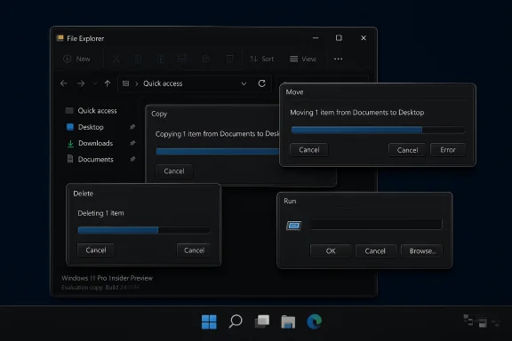
The most concrete visual change in Build 26220.6772 is the expansion of dark mode to several previously light-mode File Explorer surfaces. The update covers:
  • Copy, Move, and Delete dialogs in both default and expanded states.
  • Progress bars and chart views used during long file operations.
  • Confirmation, error, and file selection prompts including replace/skip dialogs and recycle bin confirmation.
  • A more consistent presentation for multiple confirmation and error dialogs.
These changes are focused strictly on the dialog and prompt surfaces inside File Explorer rather than on older control panels or legacy settings panes. The goal is visual consistency during everyday file operations so that dark mode no longer “breaks” when you interact with files.

Why this matters to users​

Dark mode is not purely cosmetic; for many users it’s about ergonomics and readability. When UI elements unexpectedly flash to bright themes, it can cause eye discomfort and a jarring experience. By bringing these transient but frequent dialogs into the dark theme, Microsoft reduces cognitive friction during day-to-day file tasks like copying large archives, dealing with conflicts, or emptying the recycle bin. Early screenshots and Insiders’ reports show a uniform, darker look for these dialogs that aligns with the rest of the File Explorer UI.

What’s still missing​

Despite the improvements, several legacy or peripheral UI areas remain unaffected in this flight. Notable omissions include:
  • The Run dialog and some file properties sheets.
  • Certain Control Panel pages and older Windows dialogs built on legacy frameworks.
  • Portions of localized UI or accessibility-specific renderings that Microsoft notes may not be fully polished in preview.
Microsoft’s release notes and commentary make clear this is an incremental improvement rather than a complete overhaul of every system dialog. Expect more work across future builds as the company continues to modernize UI surfaces.

Copilot+ and Click to Do: smarter selection and conversions​

Image object selection (Click to Do)​

The build also ships enhancements to Click to Do for Copilot+ PCs, most notably Image Object Select. This is a context-aware selection feature that detects discrete objects inside images, lets you hover to preview selectable areas, and then copy/paste those objects into other apps or bring them into a Copilot chat for further transformations. This is the same kind of object isolation seen in other modern image editors, but implemented as an OS-level convenience for quick, cross-app workflows. Microsoft’s release notes and support pages describe this as a local, device-powered action for Copilot+ hardware.

Unit conversion and number+unit detection​

Click to Do now supports on‑screen unit conversion for number + unit combinations it detects. Initially the supported categories include:
  • Length
  • Area
  • Volume
  • Weight
  • Temperature
  • Speed
Hovering over a number+unit produces a floating tooltip with instant conversion; selecting it opens additional conversion options in the Copilot app. This turns screenshots, diagrams, and photos into immediately actionable data without manual copy, calculator lookups, or web searches — a practical time-saver for engineers, students, and anyone working with measured values.

Selection modes and multi-object workflows​

Microsoft has been refining Click to Do selection modes in prior preview builds, and the new dev flight inherits those improvements, including:
  • Freeform selection for irregular shapes (ideal on touch and pen devices).
  • Rectangle selection for bounding-box style captures.
  • Ctrl + Click multi-selection for picking disparate elements across the screen.
These modes make Click to Do more flexible for mixed-content capture (text + images) and improve compatibility with creative workflows that mix assets quickly between apps.

Windows Hello: Enhanced Sign-in Security updates and peripheral fingerprint support​

What Microsoft changed​

Windows Hello’s Enhanced Sign‑in Security (ESS) — the Virtualization-Based Security-backed architecture that isolates biometric templates and on-device matching — is getting updated to more flexibly support fingerprint sensors and peripherals. The platform documentation clarifies that ESS requires sensors with match‑on‑sensor capabilities and vendor‑embedded certificates, and that hardware/driver dependencies make full support conditional. Microsoft’s documentation notes that full external/peripheral ESS support is expected later in 2025.

What this means in practice​

  • On-device matching and isolated storage remain the standard for ESS-capable sensors, improving security by ensuring biometric templates and matching occur in protected memory and hardware-backed pathways.
  • Peripheral fingerprint support (external USB sensors) is explicitly on the roadmap, but Microsoft warns that peripheral support may be gated behind additional firmware, driver, and integration requirements; some peripherals labeled “Windows Hello compatible” may function only after specific setup procedures and/or with ESS toggled off. The company recommends enrolment during OOBE for some scenarios.

Security trade-offs and deployment realities​

ESS raises the bar for biometric security by enforcing stronger isolation mechanisms. The trade-off is that not all fingerprint modules will work out of the box — only those with support for match-on-sensor and manufacturer-suppliedcertificates will be enumerated when ESS is active. Enterprises and users should be aware that enabling ESS may disable non‑ESS biometric hardware until compatible drivers or firmware are provided by the device maker. Microsoft documents these limitations and the configuration toggle in Settings for environments that need external sensors to remain usable.

Rollout, testing, and who will see these features​

Insider Dev Channel delivery model​

Build 26220.6772 is being distributed to Windows Insiders in the Dev Channel and uses Microsoft’s controlled rollout mechanism, which can gate features behind an opt-in toggle in Settings. This means:
  • Not all Insiders will immediately see all features.
  • Microsoft may A/B test different experiences and pull or alter features based on quality and feedback.
  • Some features previewed here might never ship to general availability or may be reworked heavily before release.

When mainstream users should expect it​

Microsoft does not provide precise public dates for when Dev Channel features will reach Beta or Release Preview, let alone general public updates. Historically, features validated in Dev move to Beta and then broadly to production channels as part of cumulative feature updates or enablement packages. Given the controlled rollout and the incremental nature of the changes, expect a staged arrival over weeks to months rather than immediate availability for all users. Microsoft’s ESS peripheral support is more explicitly scheduled for “late 2025” in official guidance.

How to try it today​

  • Enroll in the Windows Insider Program and pick the Dev Channel (note: Dev builds are early and may be unstable).
  • Enable the toggle for receiving the latest features as they roll out via Settings > Windows Update (if you want the earliest exposure).
  • Update to the listed build (26220.6772, KB5065797) when it appears.
  • For Click to Do and Copilot+ features, ensure you are on Copilot+ hardware (Copilot+ PCs meet specific NPU and hardware requirements) and have the relevant apps updated via the Microsoft Store.

Why Microsoft is taking this incremental approach​

Microsoft’s UI modernization is a vast undertaking that spans decades of platform code, multiple UI frameworks (Win32, WPF, UWP/WinUI), and countless OEM customizations. The incremental strategy — modernize a section, gate it behind controlled rollouts, gather telemetry, fix edge cases — reduces the risk of wide regressions while allowing the company to iterate on user feedback. For example, dialog boxes in File Explorer are historically implemented with older components; replacing or theming them uniformly requires careful compatibility work to avoid breaking accessibility, localization, or third-party shell extensions. The staged rollouts reflect this pragmatic engineering posture.

Strengths and benefits​

  • User experience continuity: Applying dark mode to dialog flows reduces jarring theme switches and improves perceived polish.
  • Productivity gains: Click to Do’s object selection and unit conversion are immediate workflow accelerators for creative, technical, and educational use cases.
  • Security improvements: Continued maturation of ESS strengthens biometric protections by isolating templates and match logic in hardware-backed zones.
  • Device-level AI integration: Copilot+ features that rely on on-device NPUs minimize cloud dependency and preserve responsiveness for common tasks.

Risks, limitations, and things to watch​

1. Controlled rollouts and fragmentation​

Because Microsoft uses staged rollouts, some users will see new behaviors while others do not. This can create confusion for support teams, knowledge-base content, and community troubleshooting. Enterprise environments should be cautious about adopting early releases outside test rings.

2. Compatibility with third-party shell extensions​

File Explorer customizations and shell extensions installed by third-party apps have historically been brittle across Explorer updates. Theming dialog boxes could expose new compatibility issues with installers or legacy apps that inject UI into file operations. Enterprises should test critical workflows before broadly deploying newer builds.

3. ESS hardware gating​

Enhanced Sign‑in Security requires specific sensor capabilities and vendor-supplied certificates. Many external fingerprint readers will not be immediately supported when ESS is enabled, potentially forcing users to disable ESS to use third-party peripherals — a choice that can reduce the security posture if not carefully managed. Expect driver and firmware updates from OEMs to be required before wide peripheral support is practical. Microsoft’s guidance explicitly warns of these constraints.

4. Privacy and AI data flow​

Click to Do’s “Ask Copilot” and related features interact with on-device and cloud-based Copilot components. While many actions run locally on Copilot+ hardware, some workflows (especially those invoking cloud intelligence or add-ins like Microsoft 365 Copilot) will surface data to Microsoft’s backend systems. Organizations with strict data handling policies must evaluate these behaviors and apply governance controls. Microsoft’s rollout notes and feature descriptions make distinctions between on-device actions and those that rely on cloud services; administrators should consult official guidance when enabling AI features in corporate environments.

5. Accessibility and localization not fully finalized​

Microsoft warns that some accessibility features may not yet be fully compatible with Click to Do and related preview experiences. Users relying on assistive technologies should test the experiences and provide feedback through the Insider channels to minimize regressions before general release.

Practical tips for users and admins​

  • If you rely on third-party fingerprint readers, do not enable ESS globally until hardware vendors confirm compatibility; use the Settings toggle to temporarily disable ESS if required.
  • For Insiders: turn on the “Get the latest updates as soon as they’re available” toggle to receive Controlled Feature Rollout items sooner, but expect instability.
  • Keep Copilot and related apps (Photos, Paint, Recall) updated via the Microsoft Store; many Click to Do actions depend on companion app capabilities.
  • Test file‑operation automation scripts and installers in a virtualized or test environment after upgrading Explorer-related builds, since dialog behavior and focus may change.

The larger picture: polish, parity, and the future of Windows UI​

This build is less about dramatic new functionality and more about polish — addressing the small mismatches that make an OS feel unfinished. In a post‑Windows 10 era where users expect consistent theming across apps and dialogs, these changes matter a surprising amount. Microsoft’s strategy of rolling out incremental UI updates, backed by telemetry and Insider feedback, reflects lessons learned from past large-scale visual overhauls.
Simultaneously, the Click to Do and Copilot+ investments show that Microsoft is still betting on AI features tightly integrated into the OS. By combining local NPUs for private, responsive tasks (object select, sticker generation, basic conversions) with cloud Copilot services for more complex queries, Microsoft is trying to strike a balance between immediacy and capability. The long-term user value will depend on reliable, secure hardware integration and predictable rollout schedules.

Conclusion​

Windows 11 Insider Preview Build 26220.6772 is a meaningful, if incremental, step toward the day when dark mode truly covers the entire operating environment. For users who prefer a darker aesthetic, the extension of dark theming into File Explorer’s dialogs removes a persistent annoyance. At the same time, Microsoft’s Copilot+ enhancements and the ongoing refinement of Windows Hello’s ESS show a platform that continues to iterate on both usability and security.
The net effect is not revolutionary, but it is important: Microsoft is addressing long-standing UI friction while advancing device-level AI and biometric security — and doing so in a way that lets it course-correct based on real-world feedback. Insiders can try these changes now via the Dev Channel, but broader availability will depend on Microsoft’s controlled rollout and hardware vendors’ cooperation, especially around ESS peripheral support later in 2025.


Source: TweakTown Microsoft finally delivers a proper Dark Mode in the latest Windows 11 update
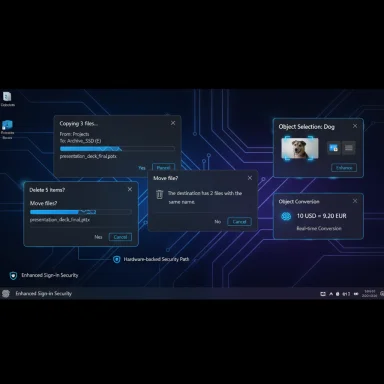
 

Microsoft quietly closed one of the most persistent UX gripes in Windows 11 this summer by finally extending dark-mode styling to File Explorer’s file-operation dialogs, progress charts, and a clutch of legacy prompts — the same white “flashbang” windows that would appear during copy/move/delete actions even when a dark theme was active. The change first surfaced inside Insider preview builds in mid‑August and has been rolling out behind feature flags in the 26xxx build series, marking a meaningful step toward the system‑wide dark theme Windows users have been asking for for years.

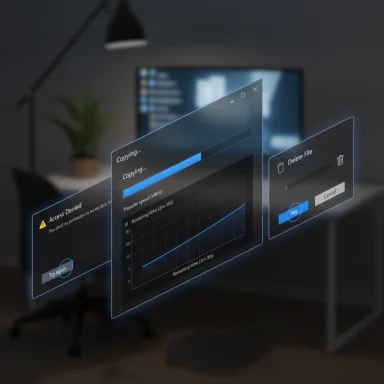
Holographic progress windows hover in a dim office, showing a file transfer.Background​

Windows 10 introduced a formal dark-mode toggle in 2016, but the implementation was partial: Store (UWP) apps and some shell surfaces obeyed the setting while many classic dialogs did not. That partial coverage carried into Windows 11, leaving users to contend with regular bright interruptions while working in a dark desktop environment. Apple’s macOS Mojave delivered a polished, system‑level dark mode in 2018 that set a clear bar for cross‑system consistency; Windows has chased that goal ever since.
Over the last year Microsoft has been incrementally modernizing and unifying UI elements across Windows 11. The latest milestone is focused, practical and highly visible: the copy/move progress window and many file‑related dialogs now render in dark greys and match Windows 11’s modern visual language in Insider flights where the staged flag is enabled. Small details — like the long‑standing green transfer bar — have also been re‑tuned for a dark theme, adopting a bluer accent that better matches Windows 11’s palette.

What changed in the preview builds​

The surfaces that now obey dark mode​

  • Copy and move progress windows — both the compact and expanded transfer views have darker chrome and backgrounds.
  • Delete confirmations and Empty Recycle Bin prompts — these now render with dark backgrounds instead of the old white panels.
  • Access denied and file‑in‑use warnings — permission and error dialogs follow the system dark theme.
  • Replace/skip/override prompts and conflict dialogs — decision prompts during file operations are updated to match Dark mode.
  • Progress charts and status views — the charts that show transfer speed, remaining time and file lists have darker surfaces.
These changes are being shipped in Insider preview builds as code that’s enabled gradually by a server‑side feature flag. That means being on a given build does not guarantee you’ll see the new visuals — Microsoft can turn the UI on or off per device while they gather telemetry and bug reports.

Visual refinements and new hues​

One of the most noticeable cosmetic tweaks is the change in the transfer‑progress accent. The classic green expanded progress indicator — a fixture since the Windows 8 era — is being replaced with a blue tone when the dialog is rendered in Dark mode. The blue accent fits Windows 11’s default palette more naturally against dark greys and reduces the abrupt luminance shift that used to feel like a “flash” in dark environments.
A few more details remain work in progress: some inner controls (notably a handful of buttons and micro‑icons) may still appear in a lighter style in early test runs. Microsoft is iterating on control theming, contrast, focus rings and accessibility to avoid regressions.

Why this took so long​

Technical debt: Win32 vs modern shell​

Windows is a decades‑old platform with layers of UI tech — from the classic Win32 dialogs to modern WinUI/UWP shells. Bringing a consistent theme across those layers is not a simple color swap. Legacy controls, GDI‑based drawing, third‑party drivers and OEM shells can all introduce rendering quirks. Engineering teams must ensure that changes don’t break contrast ratios, keyboard navigation, screen‑reader behavior, or custom accessibility settings that enterprises rely on.

Accessibility and contrast concerns​

Dark themes change contrast relationships across many UI components. Buttons, icons, selection highlights and focus outlines must remain visible to keyboard users and assistive tech. Rushing a theme change risks creating accessibility regressions, which would be a significant issue for a platform used in enterprises and by people with disabilities. That explains why some inner controls are being left for further iteration rather than flipped immediately.

Staged rollout and telemetry safety​

Microsoft often ships the capability in Insider builds but gates the UI via server flags so it can test telemetry and fix problems on a smaller set of devices. This staged deployment approach slows immediate visibility to all Insiders, but it reduces the risk of widespread regressions and lets Microsoft tune the experience in the field.

What this means for users​

Immediate benefits​

  • Fewer visual interruptions — long copy jobs, deletes and permission prompts will no longer “flash” bright white on screens when Dark mode is active.
  • Cleaner night‑time workflows — the changes make evening or low‑light usage more comfortable for people who prefer dark themes.
  • A more cohesive Windows 11 aesthetic — the updated dialogs and progress charts match the OS’s modern design language and translucency, improving perceived polish.

Limitations still in place​

  • Not every legacy window is covered yet — Registry Editor, many Control Panel applets, Group Policy Editor panes, the Run dialog and some file properties dialogs remain outside the newer dark‑theming wave.
  • Accent color integration is inconsistent — the new blue progress accent does not always follow a user’s chosen system accent color in early test builds.
  • Staged availability — many testers will not immediately see the updated visuals even on the same build number because Microsoft enables the UI per device.

How Microsoft made the change (high level)​

  • The engineering team implemented modern rendering for file‑operation surfaces in the codebase for the 26xxx build train.
  • The underlying support shipped in Insider preview builds (Release Preview, Beta and Dev channels), but the visible UI remains gated behind a feature flag that Microsoft enables selectively.
  • Community testers and leakers exposed screenshots and initial reports; Microsoft then expanded staged testing and incorporated fixes based on feedback and telemetry.
  • The update is being refined for accessibility, accent color behavior and control theming before a wider rollout.

Advanced testing and the Insider experience​

Microsoft’s Release Preview/Beta/Dev channels are where these changes are first visible. Inside those channels:
  • The update is packaged as a cumulative update tied to a specific build (the preview series in which the work appears is identified by 26xxx build numbers).
  • Microsoft uses server‑side feature flags to control which devices see the new dark UI.
  • Some community testers use third‑party tooling to flip local flags and preview unfinished visuals. That practice can reveal the UI earlier but carries risks.
Important caution: forcing hidden flags with third‑party utilities (for example, to preview unannounced features) bypasses Microsoft’s staged rollout safety checks and can expose devices to unfinished behaviors. This approach is for advanced testers and non‑production machines only.

Strengths of Microsoft’s approach​

  • Measured, telemetry‑driven rollout reduces the risk of breaking accessibility, localization or enterprise scenarios on millions of devices.
  • Focused improvements that matter — rather than chasing a complete re‑skin, Microsoft fixed a set of high‑impact pain points (copy dialogs, permission prompts) that affect daily productivity.
  • Visual consistency without abrupt design upheaval — the changes fit into Windows 11’s existing palette and design language, minimizing user friction.
  • Opportunity to fix other legacy surfaces — the same engineering work that enabled file dialogs makes it simpler to extend theming to other stubborn areas in future updates.

Risks and what to watch for​

  • Incomplete theming causing mixed UIs — partial updates can create awkward mix‑and‑match windows where outer chrome is dark but inner controls remain light, making the UI feel inconsistent.
  • Accent color mismatch — early builds show a blue transfer bar that doesn’t follow a user’s accent color. If Microsoft doesn’t harmonize that behavior, users who strongly customize accents could be disappointed.
  • Enterprise compatibility and automation — scripted UI automation, kiosk setups, and legacy management tools that rely on specific color/contrast cues might be affected by theme changes.
  • Third‑party tool hazards — community-reported methods to force the feature (via local flags) can create instability; support channels may not cover machines using those hacks.

Developer and admin implications​

For app and tool developers​

  • Expect subtle changes to system colors and contrast that may affect application chrome matching and screenshots.
  • If your automation or UI tests depend on pixel colors or exact UI geometry, update test harnesses to be theme‑aware.
  • Consider following system theme APIs and best practices so applications automatically match the user’s chosen mode.

For IT administrators​

  • Test theme-dependent workflows — particularly automated workflows that rely on UI telemetry or image‑based automation — before broad deployment.
  • Communicate with end users about staged features and advise that preview visuals may differ across machines.
  • Reserve third‑party flag‑flipping on non‑production devices only.

Where Microsoft still needs to go​

  • Registry Editor and Group Policy — these core admin tools remain largely light and will need re‑theming for a true system‑wide dark mode.
  • Control Panel applets and older system dialogs — some legacy elements continue to render in the classic light style.
  • Full accent color integration — transferring accent color behavior consistently across both light and dark surfaces is still a work in progress.
  • Consistent keyboard/focus states and screen‑reader behavior — ensuring the same accessibility quality across switched controls must be completed before a public rollout.

Practical advice for users​

  • If you prefer a complete dark desktop experience, keep Windows updated and opt into the Windows Insider channels (Beta or Dev) if you want to see and test these changes early — but expect variability until Microsoft flips staged flags more broadly.
  • Avoid using third‑party flag tools on primary or production machines; they can reveal unfinished features and cause unexpected results.
  • For users who need immediate theme control, third‑party utilities can still help with broader automatic dark/light switching, but treat them as stopgaps rather than fixes to the underlying OS inconsistency.

The bigger picture: what this tells us about Windows’ evolution​

This dark‑mode update is emblematic of Microsoft’s incremental approach to modernizing a massive, legacy‑laden OS. Rather than attempting a single sweeping rewrite, the company is shipping targeted fixes and iterating based on telemetry and Insider feedback. That pragmatic deployment model reduces the blast radius of regressions but can feel slow to users who expect a finished, system‑wide dark theme today.
The tradeoff is clear: measured progress that preserves broad compatibility versus the faster, riskier path of immediate, universal changes. For many users the result will be welcome — fewer white surprises when working at night and a cleaner, more professional UI — but the job is not complete. True system‑wide dark mode requires reworking decades of UI assumptions, and Microsoft appears to be taking that work seriously rather than applying a superficial filter.

Conclusion​

The recent preview builds that bring dark theming to File Explorer’s operation dialogs and progress views are a small but meaningful quality‑of‑life win for Windows 11 users. They remove one of the more jarring inconsistencies in Microsoft’s dark‑theme story and demonstrate that the company is methodically closing long‑standing gaps between modern and legacy UI surfaces.
There’s still work to do — from Registry Editor windows to Group Policy panes and consistent accent behavior — but this stage of fixes shows the OS moving toward a more coherent, less distracting dark experience. For anyone who spends time in low‑light conditions or simply prefers a darker palette, the change reduces friction immediately and signals that Microsoft is listening to UX complaints that have persisted for nearly a decade.

Source: Moneycontrol https://www.moneycontrol.com/techno...th-windows-11-dark-mode-article-13607578.html
 

Microsoft’s slow march toward a truly consistent dark theme took another visible step this week as Dev Channel Insider Preview builds extended dark-mode styling deeper into File Explorer — but the much-talked-about Run box remains a notable holdout in many flights, leaving users to wonder why a tiny, ubiquitous dialog has taken so long to get dark treatment.

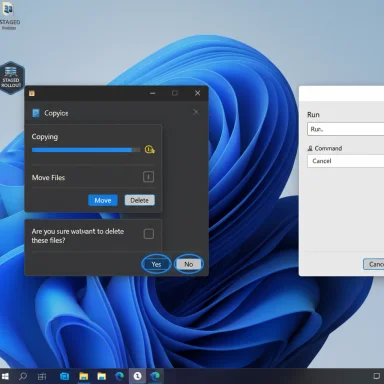
Windows desktop showing a copy progress dialog and a Run window over a blue abstract wallpaper.Background​

Windows introduced a user-configurable dark appearance years ago, yet the experience has been fragmented: modern shell surfaces and Store apps largely adopt dark palettes, while a long tail of legacy Win32 dialogs and system applets continued to appear in bright, light-themed windows. That mismatch produced repeated “flashbang” moments — brief, jarring white dialogs that break immersion and can cause eye strain, particularly on OLED displays and in low-light environments. Recent Insider builds aim to close some of the most visible gaps in this patchwork.
The Windows Insider release notes for the latest Dev Channel build explicitly call out improvements to File Explorer’s dark-mode behavior for copy/move/delete dialogs, progress bars, and several confirmation and error dialogs. Microsoft is shipping the underlying code in preview builds while enabling the visuals progressively with server-side feature flags to limit risk and collect telemetry. That staged rollout is why two machines on the same build can look different.

What changed in the Dev Channel build​

The visible delta (what most users will notice)​

  • Copy / Move / Delete dialogs (both default and expanded states) now render in dark greys and match the desktop Dark setting rather than appearing as bright white sheets.
  • Progress bars and chart views that appear during long file transfers are now themed for dark mode, including a refreshed accent color in many preview instances.
  • Confirmation and error dialogs tied to file operations — skip/override prompts, access-denied warnings, “file-in-use” alerts, path-too-long and low-disk-space prompts — have been updated to follow the system dark theme in devices where the staged flag is active.
These changes are small at an engineering level but high-impact in everyday use: the frequent, repetitive flashes of white during file operations were a disproportionate annoyance relative to the size of the change required to fix them. Many hands-on testers and screenshots shared in the community confirm the change where the feature has been enabled.

Aesthetic tweaks worth noting​

  • The long-familiar green transfer bar commonly seen in older flows is appearing as a blue accent in many dark-mode previews. This is a deliberate visual retune to align legacy surfaces with Windows 11’s modern palette, not merely a color swap. Testers have also observed new state colors (a yellow pause tint and a darker red for failed transfers) in some flights. These details remain subject to iteration.

Build numbers, rollout mechanics and what to expect​

Microsoft has included the underlying support in a family of preview builds (reporting centers on the 26100/26120 build families and specific Dev Channel releases such as Build 26220.6772), but visibility of the dark visuals is controlled with server-side feature flags and telemetry gating. That means:
  • The code can be present on your PC, but the dark visuals may be disabled until Microsoft flips the feature flag for your device.
  • Enrolling in Insider channels (Dev or Beta) and enabling “get the latest updates as they are available” increases the chance of seeing staged features earlier — but still isn’t a guarantee.
Staged rollouts are deliberate: they restrict the initial exposure to a smaller set of devices, letting Microsoft gather feedback, fix regressions, and iterate on contrast, focus behavior and accessibility before a broader public launch. That approach reduces the blast radius for potential regressions but produces a transitional period where the OS can look inconsistent across machines.

The Run dialog: why it matters and whether it’s actually themed​

The Run dialog (Win+R) is one of Windows’ smallest, most frequently used surfaces — a text-first command box that power users and administrators invoke dozens of times daily to jump straight to apps, settings and system tools. Because it is modal, global and invoked by keyboard, it’s highly visible despite its tiny footprint.
Despite broad theming work, multiple hands-on reports and the release notes indicate that the Run dialog is still largely unthemed in current preview flights. Community screenshots and independent hands-on coverage show File Explorer dialogs getting the dark treatment, while Run, many Control Panel applets, Registry Editor and some property sheets remain in light mode for now. That gap is repeatedly called out across coverage and community testing.
If you saw headlines claiming the Run box has gone dark in a particular flight, treat them cautiously: the feature is being enabled incrementally and some users/testers have used third-party tools to flip local flags, which can make it look as if Run is themed when that isn’t the case broadly or officially. In short, File Explorer dialogs are being darkened in staged builds; Run remains a planned follow-up for many devices, not a universal change today.

Why did this take so long? Technical realities and priorities​

Several concrete, structural reasons explain why small UI surfaces like Run — and many other legacy dialogs — took years to fully respect system Dark mode:
  • A multi-decade UI stack: Windows is an accumulation of UI technologies — from classic Win32 and GDI-based common dialogs to newer WinUI/XAML surfaces. Many legacy dialogs were implemented with hardcoded light chrome or with rendering paths that predate modern theming APIs. Untangling those assumptions safely requires careful engineering.
  • Compatibility and third-party integrations: Some OEM components, drivers, or enterprise tooling assume specific colors, sizes, or behaviors. A global flip could break automation, layout-dependent scripts, or screen-scraping tools used in enterprise workflows.
  • Accessibility and contrast: Darkening UI surfaces isn’t only about swapping background colors. Buttons, focus rings, selection highlights, icons, and state colors must maintain sufficient contrast for keyboard and assistive-tech users. Rushing this risks creating accessibility regressions, which would be far worse than leaving a dialog light while the rest of the shell goes dark. Microsoft’s staged approach prioritizes testing these accessibility vectors in the field.
  • Staged rollout to mitigate risk: Enabling a visual change across millions of device configurations without telemetry and feature gating is risky. Microsoft typically ships the capability in preview builds and flips the visible feature gradually so they can iterate with real-world telemetry. That adds time, but reduces the chance of a bad global rollout.
Put together, these constraints explain why a seemingly trivial cosmetic change (a dark Run box) can take months or years of engineering, testing and incremental rollout.

Practical steps: how to preview the changes — safely​

For enthusiasts and IT pros who want to try the new dark File Explorer dialogs on a test device, follow a cautious, controlled process:
  • Use a non-production machine or a virtual machine for Insider testing. Preview builds and staged flags can trigger unfinished UI or regressions.
  • Enroll the test device in Windows Insider Program (Settings > Windows Update > Windows Insider Program) and choose Dev or Beta channel depending on your risk tolerance.
  • Enable the “get the latest updates as they are available” toggle if present — this increases the likelihood of staged features appearing.
  • Update to the latest Dev/Beta flight (look for builds in the 26100/26220 family or specific KB packages that match Insider release notes).
  • Switch to Dark mode (Settings > Personalization > Colors > Choose your mode > Dark).
  • Trigger file operations (copy/move/delete), or test dialogs like “Empty Recycle Bin” and error prompts to verify whether dark visuals are present.
Caveats:
  • Avoid enabling third-party “flag flippers” (like ViveTool) on primary devices; they can expose unfinished features and may destabilize the system.
  • If you depend on automated UI workflows, re-run those tests under the preview build and confirm layout and color-dependent scripts remain functional.

Risks, accessibility and enterprise considerations​

The visual polish matters, but so do the potential side effects:
  • Contrast regressions: Poorly tuned dark palettes can reduce legibility, especially for small controls or dialogs that mix legacy and modern control styling. That’s why Microsoft is iterating on button chrome, focus rings and control theming in staged flights.
  • Automation and tooling: Enterprises that rely on UI automation or screen-scraping should validate scripts against preview builds — a themed dialog may change the DOM or window hierarchy used by automation tools.
  • Assistive technology: Screen readers and high-contrast modes must be tested. Theme changes can alter the way content is exposed programmatically; accessibility regressions are non-starters for many organizations.
  • Inconsistent experience across fleets: During the staged rollout two employees on identical models may see different visuals, which can complicate help-desk workflows and documentation during the transition. Plan communication and testing accordingly.

What remains unfinished — the to-do list​

Microsoft’s current pass is targeted: it focuses on the highest-impact, high-frequency offenders first. The likely next items include:
  • Run dialog — still largely light-mode in many preview devices and a natural candidate for subsequent theming.
  • Registry Editor (regedit) and MMC-based applets — deep legacy shells that frequently ignore modern theme hooks.
  • File Properties and property sheets — numerous property sheets still use legacy chrome.
  • Control Panel applets and older system dialog families — a long tail of small applets that will require careful attention.
Microsoft appears to be prioritizing consistency and accessibility over speed: first get the basics right for the most common flows, then expand to the deeper legacy surfaces. That incremental approach is prudent, but it means the job won’t be done overnight.

Critical analysis — strengths and limitations of Microsoft’s approach​

Strengths
  • Prioritizing impact: Microsoft’s initial wave addresses the most jarring and frequently encountered white flashes — a practical UX-first move that improves perceived polish for many users.
  • Staged rollout reduces risk: Using server-side flags and telemetry targeting lets Microsoft iterate with real user data and avoid hits that would affect the entire user base.
  • Design alignment: The shift in accents and state hues shows intentional design thinking rather than a mechanical color swap; that’s important when folding legacy pieces into a modern design language.
Limitations and risks
  • Piecemeal inconsistency: The incremental rollout results in an uneven experience across devices and dialogs during the transition period. That may frustrate users who expect a single, coherent dark experience out of the box.
  • Accessibility risk if rushed: The only reason to be patient with a gradual rollout is to avoid accessibility regressions. If that testing doesn’t keep pace, the net effect could be negative for users relying on assistive technologies.
  • Expectation gap: Public messaging that suggests “dark mode now covers X” can mislead users into believing every surface is done, which prolongs the perception of slowness. Clearer communication about the staged nature and remaining gaps would reduce friction.
Overall verdict: The work is meaningful and overdue. It’s not headline-grabbing, but it materially improves day-to-day ergonomics and polish. The tradeoffs Microsoft is making — slower, staged rollout over a risky global flip — are sensible for a platform that must support billions of different hardware and software combinations.

What users should watch next​

  • Check Insider release notes for the next Dev/Beta flight announcements and look for language about additional legacy surfaces being themed.
  • Watch for accessibility-focused updates that specifically cite focus, contrast or screen-reader fixes — those will indicate Microsoft is addressing deeper parity concerns.
  • Expect the Run dialog and other legacy admin surfaces (regedit, MMC) to appear in subsequent waves rather than the first pass.

Conclusion​

The recent Dev Channel improvements mark a practical, welcome advance in Windows 11’s long-running dark-mode story: file-operation dialogs, progress views and many confirmation windows are finally obeying the system Dark setting in preview flights, reducing frequent luminance interruptions and improving the shell’s perceived polish. That said, the Run dialog remains a visible exception in many builds, and the overall effort is deliberately incremental — prioritizing accessibility, compatibility and telemetry-driven iteration over a fast global flip.
For users, the immediate wins are tangible: fewer sudden white pop-ups during file work and a calmer, more consistent desktop in the flows they use most. For administrators and accessibility stakeholders, the message is to test and validate — the change brings real benefits, but also the potential for subtle regressions until the theming work is complete across Windows’ deep legacy surface area. Microsoft’s cautious, staged approach reduces the risk of breakage and should produce a more mature result in the long run — but it also means the full, system-wide dark mode that many users expect will arrive gradually, not instantly.

Source: The Verge Dark mode Run.
 

Windows 11’s long-running Dark Mode gap has finally narrowed: the Run dialog and several legacy File Explorer dialogs are receiving a dark theme in recent Insider preview builds, part of a cautious, staged effort from Microsoft to make the shell’s appearance consistent for users who prefer dark UI.

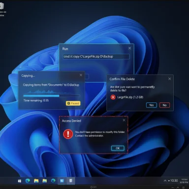
Windows desktop with multiple overlapping dialogs: copy progress, delete confirmation, and access denied.Background​

For nearly a decade Windows has offered a system-level dark theme, but adoption has been partial: modern WinUI and many built-in apps obey the setting while a large collection of legacy Win32 dialogs and system surfaces continued to render in bright white. That mismatch produced frequent, jarring “white flash” moments during everyday tasks such as copying, moving, or deleting files — an annoyance for users on OLED displays or working in low-light conditions. Recent Insider flights address many of those pain points by extending dark theming to previously stubborn dialogs.
Microsoft documented these changes in its Windows Insider release notes for the Dev Channel, where the company explicitly notes that dark theming for dialogs (including updates to the Run dialog) is being rolled out gradually using a controlled feature-enablement model. The blog post announcing Build 26220.6780 (Dev Channel) lists dark mode improvements, Click to Do enhancements for Copilot+ PCs, the return of Administrator Protection toggles, OneDrive icon updates in Settings, and a set of stability fixes.

What changed: the specifics​

Legacy dialogs that now respect Dark Mode​

Microsoft’s recent Dev/Beta Insider builds shift several file-operation surfaces to darker palettes when the system is set to Dark. The changes most visible to users include:
  • Copy / Move progress windows (compact and expanded views).
  • Delete confirmations and Empty Recycle Bin prompts.
  • Replace / Skip / Override dialogs encountered during file conflicts.
  • Access denied and file-in-use error dialogs.
  • Progress charts, status views, and multiple confirmation dialogs tied to file operations.
These changes aim to remove the most glaring visual interruptions when performing file operations in a dark environment. Microsoft’s release notes emphasize that the rollout is gradual and controlled, meaning not all Insiders will see the visuals immediately.

The Run dialog — finally joining the dark side​

The Run dialog has been a particularly visible oddball: when invoked on a system using Dark mode, it would often appear as a bright white box. That incongruity is now being addressed in the Dev Channel flights — the Run box is listed specifically as receiving a dark theme in the latest insider release notes. Microsoft warns that the change is on a very slow rollout and will expand to more Insiders in subsequent flights.

Design tweaks beyond background color​

Testers and community screenshots indicate that the theming work includes more than a simple color swap. Observations include:
  • A blue transfer progress accent in dark dialogs (replacing the long-standing green in light mode) to better match Windows 11’s visual palette.
  • Adjustments to state cues — for example, a yellow tint for paused transfers and a deeper red for failures.
  • Some inner controls (notably certain buttons and focus rings) still retain legacy styling in early test runs.
These details were reported by hands-on testers and community observers and should be treated as in-progress design choices that may change before a broad release.

How Microsoft is rolling this out (and why it matters)​

Staged enablement via feature flags​

Microsoft is using its usual Insider staged rollout mechanism: the underlying builds contain the supporting code, but server-side feature flags and telemetry gating determine whether a given device sees the new visuals. That approach reduces the blast radius for regressions and lets Microsoft iterate on accessibility, contrast, and compatibility using real-world signals. In practice, two identical machines on the same build can display different dialog theming if one has the server-side flag enabled.
Why this approach matters:
  • It protects users from regressive changes slipping into stable releases.
  • It allows Microsoft to tune visual parameters (contrast ratios, focus behavior, screen-reader compatibility) before enabling the feature globally.
  • It creates a temporary inconsistency across devices that support the feature, which can complicate troubleshooting and documentation for IT admins.

Accessibility and testing priorities​

Dark mode is not purely cosmetic. Microsoft’s staged approach lets the engineering teams validate that dark theming does not introduce accessibility regressions — e.g., insufficient contrast, broken focus outlines, or screen-reader failures. The company’s release notes and community feedback show Microsoft is deliberately iterating rather than flipping every legacy surface at once because the platform contains deep, decades-old UI code paths that can misbehave if changed hastily.

How to preview or test the new dark dialogs (for Insiders and power users)​

If you want to try these changes now, follow a cautious approach. These steps summarize the typical route insiders use, but they come with warnings about preview builds.
  • Enroll in the Windows Insider Program and select Dev or Beta Channel (Settings → Windows Update → Windows Insider Program).
  • Ensure your system is on a recent preview build (for example, builds in the 26100/26120/26200 family or specific builds cited in release notes). Use winver to confirm your build number.
  • Set your system theme to Dark (Settings → Personalization → Colors → Choose your mode → Dark).
  • Trigger file operations (large file copies, delete actions, provoke an access-denied) to see whether the dialog renders in dark mode on your device.
Advanced (unsupported) option for experienced testers:
  • Third-party tools such as ViVeTool have been used by enthusiasts to force local feature flags on preview builds. Specific enablement IDs have circulated among testers, but this is unofficial, unsupported, and may expose unfinished UI states or stability issues. Only use this on a test machine or VM and understand the risks.

What still remains unthemed — the gaps and limitations​

Despite meaningful progress, the work is incomplete. Notable areas that continued reports and community testing indicate may still appear in light mode or display inconsistent styling include:
  • Run dialog (rolling out slowly; not yet visible to all Insiders).
  • File Properties and many property sheets.
  • Control Panel applets, Registry Editor (regedit.exe) and older MMC snap-ins.
  • Some buttons, focus rings, and micro-controls inside newly darkened dialogs may remain light.
  • In many test runs, the new dark dialogs do not yet honor custom system accent colors (progress bars often use a fixed blue instead of the user’s accent).
These areas likely require deeper engineering changes because they live in older UI code paths that predate the modern theming APIs. Microsoft is prioritizing the highest-impact surfaces first.
Caveat on specific visual claims: several color and control observations come from hands-on tester screenshots and community reports. While these observations are repeatable in many cases, color rendering varies by display profile, HDR settings, and per-device tuning — treat these as current behavior in Insider previews, not final design commitments.

Other headline changes in the same Dev Channel flights​

The dialog darkening is part of a broader set of small-but-important updates rolling out to Insiders, including:
  • Click to Do (Preview) enhancements for Copilot+ PCs: visual cues now highlight actionable entities (emails, tables) to speed workflows.
  • Administrator Protection toggle in Windows Security under Account protection is re-enabled.
  • OneDrive icon updates in Accounts and Homepages within Settings.
  • Fixes addressing File Explorer crashes that affected some Insiders, Start menu interaction bugs (unexpected scrolling and touch context-menu issues), and WIN+[Number] taskbar-window cycling issues.
These ancillary improvements highlight Microsoft’s iterative approach: numerous small refinements, stability fixes, and Copilot-related usability tweaks are being bundled into preview flights as the company refines Windows 11 ahead of broader releases.

Why this matters for users, power users, and IT admins​

For everyday users​

A consistent dark UI reduces eye strain in dim environments, diminishes abrupt luminance changes on OLED displays, and improves perceived polish. The change doesn’t add new functionality but removes a frequent, low-level annoyance that affected many daily workflows.

For power users​

Power users who run many long-running file operations will notice a calmer visual rhythm — fewer “flashbang” moments making working in a dark desktop less distracting. However, because the rollout is staged and patchy, testers should expect mixed experiences across machines.

For IT administrators​

  • Treat these preview updates as experimental; validate them in internal test rings before broad deployment.
  • Re-test automation scripts, accessibility tooling (screen readers, high-contrast modes), and any third-party tools that interact with system dialogs—layout and color changes can affect automated workflows and visual parsing logic.
  • Plan for a phased QA approach: Microsoft’s staged rollout may produce inconsistent UX across fleets during the transition.

Risks, trade-offs and unanswered questions​

  • Piecemeal inconsistency: The staged enablement creates a transient fragmentation problem where users and support staff may see different visuals while the rollout progresses.
  • Accessibility risk if rushed: A design that improves aesthetics but reduces contrast or breaks focus outlines could hurt users relying on assistive tech. Microsoft’s telemetry-driven rollout reduces this risk, but it remains a key area to watch.
  • Third-party workarounds: Community tools (e.g., ViVeTool) can force features early but bypass Microsoft’s safety gating, potentially exposing users to unfinished or buggy UI states. Use only on test machines.
  • Unclear timeline for deeper surfaces: There’s no firm public schedule for when items like the Registry Editor, Control Panel applets, or properties dialogs will receive full dark theming — these may require additional engineering waves. Expect incremental improvements over time rather than a single global update.

Practical recommendations​

  • If you value visual consistency and want to test the new dialogs, enroll in the Windows Insider Program on a spare or virtual machine and enable the Dev/Beta channels. Keep critical systems on stable builds.
  • For enterprise environments, add the preview flight(s) to a controlled test ring first, validate accessibility and automation again, and monitor Feedback Hub reports before approving wider rollouts.
  • Do not use third-party enablement tools on production hardware; they can reveal unfinished UI that Microsoft has intentionally hidden for stability reasons.

Conclusion​

This incremental dark-mode work is the kind of quiet, user-facing polish that often goes unnoticed until it’s missing — and then becomes impossible to ignore. By extending the system dark theme to the Run dialog and several high-frequency File Explorer prompts, Microsoft has addressed one of the most visible and persistent UX gripes in Windows 11. The change is not a final, system-wide dark-mode completion, but it’s a significant, practical step: fewer bright interruptions, a calmer night-time experience, and a more cohesive visual language across the shell.
Expect continued incremental updates: Microsoft will likely expand theming to deeper legacy surfaces and refine accent/color behavior over time. Until then, Insiders and testers will be the canaries in the user-experience coal mine — reporting regressions, accessibility issues, and polish requests that will determine when and how those last gaps are closed.

Source: How-To Geek Windows 11's Run Dialog Finally Has Dark Mode
 

Microsoft’s long-running dark-mode mismatch has been nudged closer to resolution: the classic Run dialog in Windows 11 is now receiving a dark theme in Insider preview builds tied to KB5067103, and Settings is gaining one‑click “agentic” controls for faster toggles on Copilot+ PCs — both changes rolling out gradually to Insiders as Microsoft continues an incremental, telemetry‑driven modernization of legacy UI surfaces.

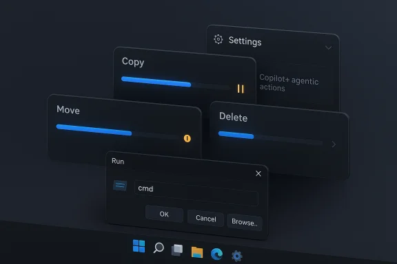
A dark, layered futuristic OS UI with translucent panels, blue progress bars and a Run dialog.Background​

For nearly a decade Windows has supported a system‑level dark appearance, but the experience has been inconsistent because Windows is composed of multiple UI generations. Modern WinUI/UWP/Win32 wrappers adopt dark themes, while older dialog boxes, Control Panel applets, and other legacy shells often remain stubbornly bright. The result is visual jank — sudden white “flashbang” dialogs that interrupt low‑light workflows and undermine the polished Fluent Design language Microsoft aims for. Recent Insider flights address a subset of those problems by theming frequently encountered file‑operation dialogs and, importantly, the Run dialog itself.
Microsoft’s approach is deliberately incremental: the underlying code is present in preview builds, but server‑side feature flags and telemetry control which devices see the visuals. That staged enablement reduces risk during a large, delicate migration of legacy components to modern theming. However, it also produces a temporarily fragmented experience where two identical machines on the same build may show different visuals.

What changed: Run dialog, file dialogs, and visual tweaks​

The Run dialog finally respects Dark Mode​

The Run dialog (invoked with Win + R) now adopts a dark background and updated controls when the system theme is set to Dark in the Insider previews associated with KB5067103. The update is subtle but meaningful: the top border in tester screenshots appears pitch black while inner chrome uses a muted grey to reduce contrast and eye strain. This is a cosmetic update only — the Run box’s behavior and keyboard semantics remain unchanged.

File operation and confirmation dialogs​

Multiple high‑frequency File Explorer surfaces have received dark theming in the same preview flights:
  • Copy/Move progress dialogs (compact and expanded)
  • Delete confirmations and Empty Recycle Bin prompts
  • Replace/Skip/Override conflict dialogs
  • Access denied and file‑in‑use error dialogs
Those dialogs now render with dark backgrounds and updated state colors in Dark mode, reducing the jarring transitions that previously occurred during common file tasks. Testers also report a new progress color palette in dark mode — a blue tone replaces the legacy green in many cases — and subtle state cues (a yellow tint for paused transfers, a deeper red for failures).

Settings: agentic actions and Copilot+ exclusives​

The Settings app’s Recommended page and the search box are gaining agentic actions — one‑click controls that toggle recently changed settings directly from the search results or Recommended card, without navigating into nested pages. Examples include a toggle to enable/disable Do Not Disturb or a quick scale adjustment after searching for “display scaling.” These agentic actions are part of a broader Copilot-era usability push and, in current previews, are gated to Copilot+ PCs (hardware that supports on‑device AI acceleration).

Technical specifics and verification​

  • Preview builds and KB mapping: builds carrying this UI work have been reported in the 26100/26120/26200 family. Specific examples include Dev Channel Build 26220.6780 and Beta Channel Build 26120.6780, both associated with a preview KB identified in community reporting as KB5067103. Note that public-facing KB-to-build mappings can vary between Microsoft channels and may differ by device; the change is staged server‑side.
  • Rollout model: the code exists in the binary, but a controlled feature rollout (server‑side flag + telemetry gating) determines who sees the change. Activating the Insider toggle “Get the latest updates as soon as they’re available” increases the likelihood of early exposure, but even that does not guarantee the visuals because Microsoft uses telemetry to expand enablement progressively.
  • Visual design notes: early testing indicates the new dark dialogs do not yet uniformly respect the user’s system accent color — dark mode dialogs often use a fixed blue for progress indicators while light mode retains green — suggesting Microsoft prioritized consistent baseline styling before accent adaptability. Some inner controls retain legacy light styling in early flights.
  • Accessibility validation: Microsoft’s staged approach is intended to allow iterative testing of contrast ratios, focus outlines, screen‑reader compatibility, and other assistive scenarios before broader release. The company has explicitly emphasized accessibility as a primary reason for the slow, telemetry‑driven rollout.
Caveat: public reports and hands‑on screenshots from testers corroborate the presence of these visuals in Insider builds, but the exact build numbers and KB labels tied to specific machines can vary; enterprises and testers should verify winver on the target device and consult Insider flight notes for definitive mapping.

Why the change matters​

Ergonomics and perceived polish​

Darkening frequently used dialogs reduces sudden luminance shifts, which:
  • Lowers eye strain for users in dim environments and on OLED displays
  • Reduces perceived visual noise during sustained workflows
  • Gives the OS a more coherent visual language that aligns legacy surfaces with Fluent Design
These are small but cumulatively meaningful quality-of-life improvements for power users, IT professionals, and anyone who prefers Dark mode.

Low risk, high ROI​

Because the changes are primarily cosmetic (color and theming, not functional behavior), they present a relatively low risk of breaking core workflows. The staged enablement further reduces blast radius and preserves enterprise validation windows. That said, any visual change can affect assistive tools or automation that parses dialogs visually, so validation is still necessary.

Signal about Microsoft’s priorities​

The Run dialog’s update is symbolic: it signals willingness to invest engineering effort to modernize even decades‑old UI surfaces. This suggests future waves may target remaining holdouts like File Properties dialogs, Control Panel applets, Registry Editor and MMC snap‑ins — components that will likely require deeper work.

Limitations, risks, and remaining gaps​

Piecemeal inconsistency​

The staged rollout creates a real short‑term drawback: inconsistent visuals across devices and across dialogs. Users and support teams may encounter mixed experiences — an issue for documentation, screenshots, and troubleshooting until the feature is widely enabled.

Accessibility regressions risk​

If theming is applied hastily, contrast or focus outlines could be degraded, harming screen‑reader users or those who rely on high‑contrast modes. Microsoft’s telemetry gating aims to detect regressions, but organizations should test accessibility flows under real conditions.

Unfinished legacy surfaces​

Several deep legacy surfaces remain unthemed at this stage:
  • File Properties sheets
  • Many Control Panel applets
  • Registry Editor (regedit.exe)
  • Some MMC snap‑ins
These components may require architectural refactors before they accept modern theming properly, so a complete system‑wide dark experience will likely take more preview cycles.

Third‑party enablement tools and unsupported tweaking​

Community tools like ViVeTool can flip local feature flags to force visuals early, but doing so bypasses Microsoft’s telemetry and gating and can surface unfinished UI states that were intentionally withheld for stability testing. Using such tools on production hardware is risky.

How to preview and validate the changes safely​

  • Use a non‑production machine or a virtual machine to avoid instability on primary devices.
  • Enroll in the Windows Insider Program and choose the Beta or Dev channel depending on desired exposure; confirm the build with winver.
  • Enable the toggle “Get the latest updates as soon as they’re available” to increase the chance of early staged enablement; note that this still does not guarantee immediate appearance because server flags and telemetry determine rollout.
  • Install pending preview updates that include the relevant KB (identified in community reports as KB5067103) and reboot.
  • Switch system theme to Dark (Settings > Personalization > Colors > Choose your mode: Dark) and open the Run dialog with Win + R, then exercise file operations to observe progress and confirmation dialogs.
  • Test assistive technologies (screen readers, high‑contrast modes) and verify automation tools that interact with dialogs to ensure no regressions.

Enterprise and IT implications​

  • Validation in test rings: Enterprises should treat these preview flights as experimental. Include them in controlled test rings and validate accessibility, automation, and third‑party compatibility before approving wide deployment.
  • Documentation and training: Support docs and screenshots may become outdated quickly because the staged rollout produces visual divergence. Maintain a single‑source reference and communicate clearly which test devices reflect the new visuals.
  • Automation considerations: Visual changes to dialogs (layout, button chrome, colors) can break screen‑scraping or UI automation tools; regression testing should include any scripts that parse dialog contents visually.
  • Timing and rollout expectation: There is no public calendar publishing an avalanche of dark mode fixes for every legacy surface; expect iterative waves that prioritize frequent, high‑impact dialogs first and deeper legacy work later. Plan migrations and QA with that incremental timeline in mind.

Critical analysis — strengths and potential blind spots​

Notable strengths​

  • Practical prioritization: Microsoft focused first on the dialogs that cause the most frequent and noticeable friction, which delivers immediate UX wins for many users.
  • Risk mitigation: Staged server‑side enablement and telemetry gating reduce the likelihood of a widespread regression, allowing real‑world feedback to refine colors and accessibility behavior.
  • Design alignment: The choice to update state colors and refine progress tones rather than only swapping background color shows an attention to cohesive design and semantic clarity.

Potential blind spots​

  • Fragmentation pain: The temporary fragmentation of experiences can be confusing for users and support staff and hurts reproducibility for bug reports and guidance.
  • Accessibility remains work in progress: Animating a broad theming pass across decades‑old code paths carries the risk of subtle assistive‑tech regressions; thorough accessibility testing must remain central.
  • Uncertain timeline for deeper surfaces: The absence of a clear public schedule for theming Registry Editor, Control Panel applets and property sheets leaves users uncertain about when Windows will reach full theming parity. That expectation gap can fuel frustration even as incremental wins arrive.

Practical takeaways​

  • For everyday users: The Run dialog and many file‑operation dialogs will start to look less jarring in Dark mode if running Insider builds with the staged flag enabled; however, some legacy surfaces will still appear white for the time being.
  • For power users: Running preview flights on a spare machine provides early access to these refinements. Avoid forcing features with third‑party tools on production systems.
  • For administrators: Validate preview updates in internal test rings, pay special attention to accessibility and UI automation tests, and delay broad deployment until regression windows close.

Conclusion​

The arrival of Dark Mode for the Run dialog is a small but telling milestone: it demonstrates Microsoft’s commitment to closing long‑standing theming gaps across Windows 11’s mixed‑generation UI. Delivered as part of a careful, telemetry‑managed preview wave (commonly tracked under KB5067103 in community reports), the change improves ergonomics and perceived polish with minimal functional risk. At the same time, the staged rollout and remaining legacy surfaces mean the job is far from finished: File Properties, Control Panel applets, Registry Editor and other deep legacy components still need attention, and accessibility testing must remain central as the theming effort expands. For now, users gain one less bright pop‑up to worry about — and administrators gain a reminder that finishing a platform’s visual language is an incremental engineering effort that requires patience, validation, and careful rollout management.

Source: Windows Latest Windows 11 will soon support dark mode for Run dialog box
 

Microsoft has quietly moved from patching to finishing one of Windows 11’s longest‑running visual complaints: the operating system’s dark mode is finally being applied across long-neglected File Explorer dialogs and several legacy UI popups, and Microsoft has made the work official in recent Insider releases. The change is small on paper but huge in daily impact: copy/move/delete dialogs, progress charts, confirmation and error prompts, and even the long‑standing Run box now respect the system Dark theme in preview builds, eliminating the jarring white “flashbang” moments that have annoyed power users for years.

Dark-themed Windows 11 File Explorer with multiple floating progress dialogs (Copy, Move, Delete, Run).Background​

Dark mode as a user preference has been part of Windows since Windows 10, but adoption was always partial. Modern components based on WinUI and the Settings app embraced dark palettes early, while a sprawling set of legacy Win32 dialogs, Control Panel applets, and related shells often remained anchored to light-themed chrome. That mismatch produced frequent, high‑contrast interruptions in routine workflows — particularly noticeable during long file transfers or when working in dim environments or on OLED screens. The recent Insider updates represent a concentrated engineering effort to close the most visible gaps rather than a simple cosmetic tweak.
Microsoft’s official Windows Insider release notes for the October Dev channel build list these dark mode improvements under File Explorer, confirming that the change is deliberate, staged, and shipping as part of ongoing preview testing. Independent outlets that track Insider builds have validated the same surfaces in hands‑on reports.

What changed — concrete details​

The initial wave of theming improvements focuses on the most frequently encountered, high‑friction surfaces in File Explorer and a few legacy utilities. The update set includes:
  • Copy, Move, and Delete dialogs — both the compact and expanded transfer views now render using dark backgrounds and darker chrome, matching the rest of the File Explorer UI.
  • Progress bars and chart views — expanded transfer charts, speed/remaining time graphs and status lists receive darker surfaces with updated color semantics for state indicators.
  • Confirmation and conflict dialogs — replace/skip/override prompts, Empty Recycle Bin confirmations, and file selection dialogs now respect Dark mode.
  • Error and permission dialogs — common prompts like Access denied, File in use, and Path too long are included in the initial theming pass.
  • Run dialog — the classic Win + R box, a long-time outlier, now displays a dark background and updated controls on systems set to Dark. This change is listed in KB5067103 for Insider builds.
A visible cosmetic choice worth noting: the transfer progress accent shifts from the old green in light-mode dialogs to a blue tone in dark mode. Testers report additional state colors (a yellow tint for paused transfers, a deeper red for failures) which improve at-a-glance recognition against dark backgrounds. These choices are under iteration and may evolve before broad release.

How Microsoft is rolling it out​

This work is being delivered through the Windows Insider program as part of Dev/Beta preview builds and is enabled progressively using Microsoft’s controlled feature‑enablement mechanisms. Practically, that means:
  • The code is included in a published preview build (for example, Dev Channel builds in the 26220 family and updates listed under KB5067103).
  • Visual enablement is gated by server‑side flags and telemetry; not every Insider machine on the same build will see the new visuals at once.
  • Microsoft uses this staged approach to collect feedback and telemetry, tune contrasts and accessibility behavior, and limit the blast radius for regressions.
For Insiders who want to increase the likelihood of seeing these changes earlier, Microsoft recommends enabling the toggle “Get the latest updates as they are available” under Settings > Windows Update, though even that does not guarantee immediate exposure because the company controls the staged rollout server‑side.

Why this matters — practical user impact​

The work targets a highly visible, frequently encountered pain point. The benefits are immediate and concrete:
  • Reduced visual disruption — no more sudden white popups when copying or deleting files on a dark desktop, which was a common complaint especially on OLED displays.
  • Lower eye strain in low light — consistent dark surfaces cut down on contrast spikes and perceived glare for users working at night.
  • Better perceived polish — unifying modern and legacy surfaces improves the overall feeling of completeness and maturity for Windows 11’s visual language.
  • Accessibility and focus — when executed correctly, theming reduces cognitive friction and helps users maintain visual focus during long-running operations.
These are not trivial UX wins. Many users contend with small daily irritations far more often than with infrequent major features; fixing a recurring annoyance raises the baseline quality of the OS for millions of daily tasks.

The technical reality: why this took so long​

Windows is built on layers of UI tech accumulated over decades. Modern WinUI‑based components sit beside older GDI/Win32 dialogs and even COM-based applets. That heterogeneity is at the heart of the problem:
  • Many legacy dialogs draw directly with hardcoded colors or use drawing paths that bypass modern theming hooks.
  • Some dialog code assumes light chrome and relies on color semantics that would break if switched carelessly to dark palettes.
  • Accessibility concerns — contrast ratios, focus outlines, keyboard navigation, and screen‑reader compatibility — must be verified for each change to avoid regressions for users with disabilities.
The result: bringing legacy surfaces into a coherent dark theme often requires architectural work, careful testing across accessibility scenarios, and incremental rollouts — not just a color swap. Microsoft’s staged enablement reflects the cautious approach necessary to avoid inadvertent regressions in broad, diverse deployments.

Risks, trade-offs, and what to watch for​

The improvement is welcome, but it brings a set of practical risks and trade‑offs:
  • Rollout fragmentation — staged flags mean inconsistent experiences across machines on the same build. That makes community reporting noisier and can be confusing for testers and IT teams.
  • Accessibility regressions — mismatched button contrast, missing focus indicators, or disturbed keyboard navigation could harm users who rely on assistive technologies. Microsoft’s teams must validate these changes across high‑contrast and assistive‑tech scenarios.
  • Transient white flashes — several testers reported brief bright flashes before a dark dialog fully initializes on some hardware. That likely reflects timing or compositor order issues and may persist in early flights.
  • Enterprise caution — Insider code is preview software. Enterprises and users with production work should avoid applying preview builds to mission‑critical machines; the gradual nature of the rollout and the potential for unexpected side effects make testing essential.
Flagged claims and cautionary notes: some community commentary referenced exact build numbers and KB identifiers (for example, KB5067103 and various 26220/26120 builds) across Dev and Beta channels; while the Windows Insider blog confirms the File Explorer dark mode text, rollout details such as which specific build ID will flip the server-side flag for any given device can vary and are subject to change. Treat per‑device visibility as conditional until Microsoft widens the rollout.

How to try it (Insider preview steps and precautions)​

For readers who want to test dark theming in File Explorer on an Insider device, here are responsible steps:
  • Back up important data and avoid installing preview builds on production systems. Snapshot or create a system image if you need to test on a work machine.
  • Enroll the device in the Windows Insider program and select the Dev or Beta channel depending on which preview build you want.
  • Enable “Get the latest updates as they are available” in Settings > Windows Update (this increases the likelihood of receiving staged features but does not guarantee them).
  • Check for updates and install the relevant preview (for example, the Dev Channel builds in the 26220 family or the KB5067103 flight where the Run dialog dark mode is documented). After reboot, set Settings > Personalization > Colors to Dark, and perform common file operations (copy, move, delete) to verify dialogs.
Do not rely on third‑party tools to flip server flags; unofficial methods can cause instability (explorer.exe crashes have been reported when forcing staged features). When reporting bugs to Feedback Hub, include Winver output, exact steps to reproduce, and screenshots or screen recordings to help Microsoft triage regressions.

What remains unthemed (and next steps)​

This recent wave addresses the most noticeable offenders, but it does not complete the job. Key legacy surfaces that still require further work include:
  • File Properties dialogs — many still render in light themes in some builds and will need additional engineering to align with dark mode.
  • Control Panel applets, Registry Editor, and certain MMC snap‑ins — deeper architectural and compatibility work is required before these can be safely themed.
  • Accent color inheritance — in dark-mode File Explorer dialogs the progress accent currently uses a fixed blue rather than inheriting a user’s custom system accent; Microsoft may tune or extend accent logic later.
Expect Microsoft to expand coverage in subsequent preview flights as telemetry and accessibility validation permit. The company’s staged rollout model and public Insider notes indicate a measured progression: ship code to Insiders, enable visuals to a subset, iterate on feedback, and widen the rollout. That process will likely continue over months rather than weeks.

Critical analysis — strengths and potential pitfalls​

Strengths
  • The work addresses high‑impact UX friction that users encounter daily; because it touches frequent workflows, the perceived value is greater than the engineering scope suggests.
  • Microsoft’s staged rollout and telemetry approach is prudent: it reduces the risk of a widespread accessibility or visual regression and lets engineers iterate on contrast and focus behaviors without exposing every device at once.
  • The visual choices (blue progress accent, refined state colors) show attention to perceptual contrast and to aligning legacy visuals with Windows 11’s Fluent palette.
Potential pitfalls
  • Fragmentation during rollout could produce inconsistent impressions of the change in public discussion forums and make problem reproduction harder for both Microsoft and the community.
  • Accessibility regressions are the most serious risk. Dark theme changes must preserve or improve contrast ratios, keyboard focus visibility, and Narrator/VoiceAccess behavior. The work should be tested across assistive scenarios and display modes (HDR, high‑DPI, OLED).
  • There’s a communications risk: incremental visual polish makes a product feel like it’s “not finished” until all legacy surfaces are updated. Microsoft needs to set expectations about timelines and the scope of subsequent waves to avoid frustration among users who expect a complete system‑wide dark mode immediately.

Broader implications for Windows design​

This practical, incremental effort signals a broader maturity in Microsoft’s approach: beyond headline features, the company is investing in finishing work that improves everyday ergonomics. Fixing decade‑old inconsistencies is the kind of engineering that doesn’t make splashy announcements but contributes measurably to usability and perceived quality.
If Microsoft follows through and continues to methodically modernize legacy shells, the result will be a notably more cohesive Windows experience. That has knock‑on effects: fewer surprises for users, stronger parity between light and dark experiences, and a cleaner foundation for future UI innovations (including any expanded theming options, dynamic wallpapers, or AI‑driven personalization that Microsoft may ship later).

Conclusion​

The arrival of consistent dark theming for File Explorer dialogs and other legacy popups — together with the Run dialog’s new dark appearance in Insider builds — is more than a cosmetic refresh. It removes repeated, everyday friction and moves Windows 11 closer to a coherent visual platform. Microsoft’s staged rollout reflects the care required to modernize decades‑old UI code without regressing accessibility or stability, and early hands‑on reports show thoughtful color choices and tangible UX benefits.
This update is a timely reminder that design polish matters. Small, well‑executed fixes like this improve comfort, reduce eye strain, and make the OS feel finished. Users should expect further incremental work to widen dark mode coverage to properties dialogs, Control Panel items, and other legacy surfaces over time, and they should treat current preview builds as what they are: work in progress.

Source: Windows Central Microsoft makes it official: Dark mode is getting a major (and sorely needed) upgrade on Windows 11
 

Back
Top