

Microsoft released Windows 11 Insider Preview Build 26300.8553 on May 29, 2026, bringing a redesigned, highly configurable Start menu to the Experimental channel, while Beta Build 26220.8544 shipped alongside it without the same Start customization controls for now. The change matters because Start is not a decorative surface in Windows; it is the operating system’s front door. After nearly five years of treating Windows 11’s Start menu as a fixed design statement, Microsoft is finally treating it as a workspace users should be allowed to shape. The result is not a full return to Windows 10 freedom, but it is the clearest sign yet that Redmond has heard the complaints it spent too long minimizing.
Windows 11 launched with a Start menu that looked clean in screenshots and felt strangely constrained in daily use. It centered the taskbar, flattened the menu into a tidy panel, removed Live Tiles, and replaced much of the old spatial flexibility with a fixed arrangement of pinned apps and recommendations. The design was coherent, but coherence was not the same as usefulness.
The deeper issue was not that Microsoft changed Start. Windows users have lived through Start menu reinventions before, from the cascading menus of Windows 95 through the tile-first shock of Windows 8 and the hybrid compromise of Windows 10. The problem with Windows 11 was that Microsoft removed choice while insisting the new structure was calmer, simpler, and more modern.
That argument worked better for product decks than for people who actually used the menu all day. Users who wanted a launcher saw recommendations. Users who wanted recent files saw a layout that still felt like an advertising surface. Users who wanted app organization found themselves boxed into a design that allowed some pinning, some folders, and some hiding, but not enough control over the menu’s basic anatomy.
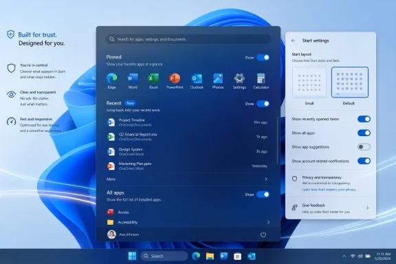
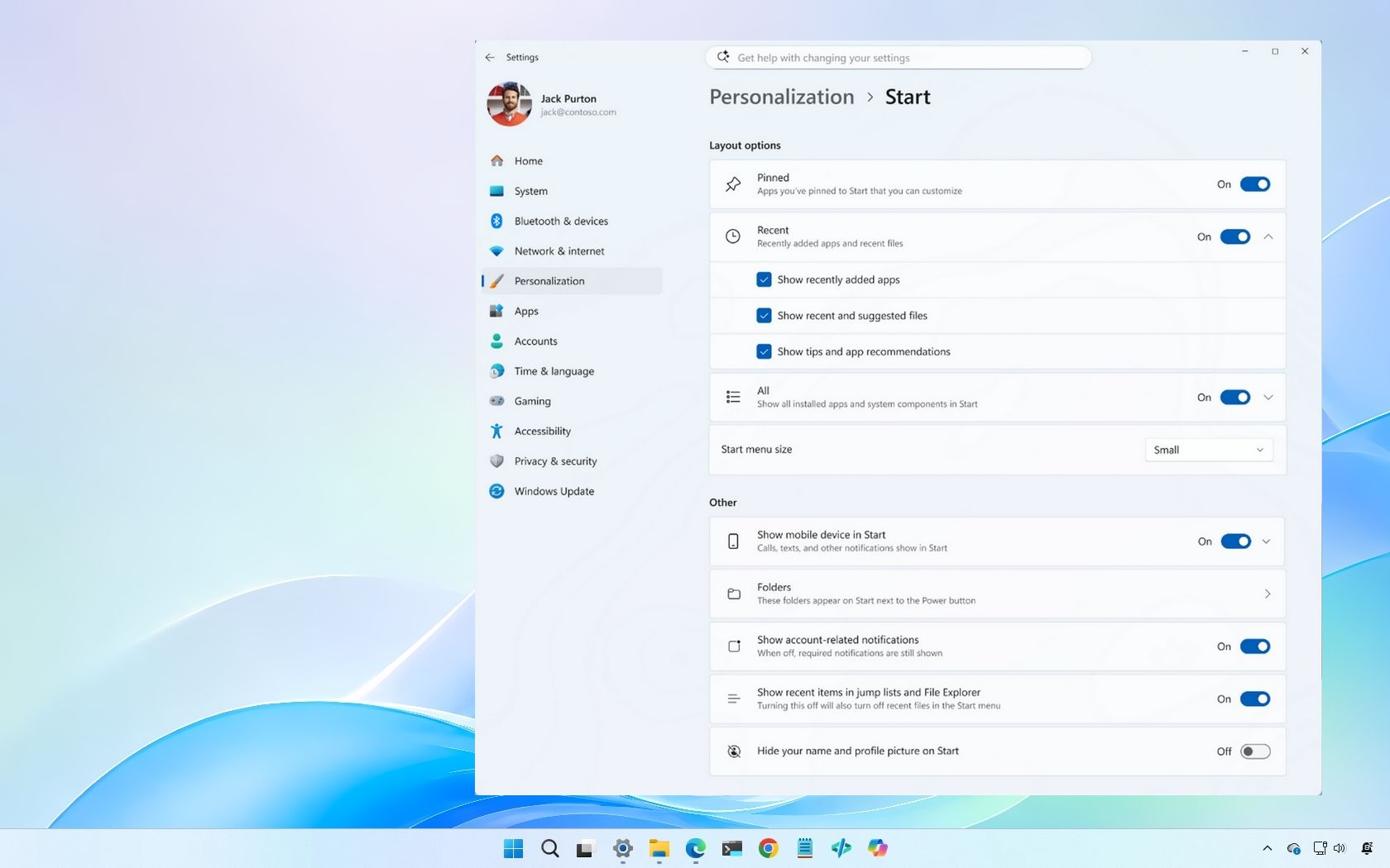
The new Insider build changes that premise. Pinned apps, Recent, and All apps can now be shown or hidden independently, and the settings live in a redesigned Start settings page rather than scattered compromises. That is the important shift: Microsoft is not merely adding another preference toggle; it is decomposing the Start menu into parts the user can decide to keep or discard.
For an operating system that often treats defaults as destiny, that is a meaningful course correction. Windows 11’s original Start menu asked users to adapt to Microsoft’s idea of calm. The new one asks a more useful question: what do you actually want Start to do?
That suspicion is not paranoia. Windows has accumulated too many places where the line between helpfulness, promotion, cloud nudging, and engagement engineering feels blurry. When a user sees “Recommended,” they do not necessarily think “recently opened document.” They think “something Microsoft wants me to click.”
Renaming and reframing the area as Recent is therefore not just a branding tweak. It gives the feature a job that users can understand. Recent files, recently added apps, and current activity are practical. They belong in a launcher because they reflect what the user has done, not what the platform hopes the user might do next.
This matters because Start is a trust surface. A Start menu can contain search, app lists, files, web hooks, account controls, and promotional affordances, but every extra role makes the user wonder whose interests are being served. By making Recent feel more like a live reflection of local activity and less like a recommendation engine, Microsoft reduces that friction.
The customization also matters here. Users can show recently added apps, recent files, both, or neither. That makes Recent less of an imposition and more of a tool. If it proves useful, it earns space. If it does not, it disappears.
That is how personalization should work. The user should not have to disable broad Windows behaviors elsewhere just to clean up one section of Start. The old design made “turning off recommendations” feel like a system-level tradeoff. The new design moves closer to common sense: this surface should have its own controls.
That will invite jokes, and some of them will be deserved. A Start menu with almost nothing in it is not an obvious triumph of interface design. But the fact that Windows now allows this state is more important than whether most people will use it.
For years, Microsoft’s Start design has been too afraid of user-created ugliness. The company has tended to prefer a polished default over a flexible system that might be configured badly. That instinct produces beautiful screenshots, but it also produces resentment among power users, administrators, accessibility-minded users, and anyone with a workflow that does not map neatly onto Microsoft’s intended path.
A configurable interface must tolerate edge cases. Some users will create empty menus. Some will hide everything except pins. Some will use All apps as the main view. Some will make Start small enough that it stops dominating the desktop. That is not a design failure; it is the cost of returning agency to the person sitting at the keyboard.
The new size controls are especially significant. Microsoft is not restoring Windows 10-style freeform drag resizing, which will disappoint users who want direct manipulation rather than presets. But the presence of multiple Start sizes, including a smaller layout, addresses one of the most persistent Windows 11 complaints: the menu often felt too large for what it contained.
Windows 11’s Start menu has long had a density problem. It occupied generous space while showing a modest amount of information. That imbalance made the menu feel less like a launcher and more like a stage. A smaller Start option restores some proportionality, particularly on laptops and compact displays where every inch of screen real estate matters.
Windows 11 historically buried All apps behind an extra click, which was one of those small decisions that accumulated disproportionate irritation. The operating system had a complete app list, but the primary Start surface did not treat it as primary. Microsoft seemed to assume that pins, recommendations, and search would carry the load.
That assumption was only partly right. Search is fast when it works, but it is not a substitute for browsing. Pins are excellent for favorites, but they do not help when the user cannot remember the exact name of a tool. Recommendations are useful only when the system correctly infers intent, and users have every reason to distrust that inference when cloud services and web results lurk nearby.
The newer All apps layouts, including grid and list-style presentations and a category-oriented view, suggest Microsoft is finally recognizing that browsing remains a first-class interaction. That may sound old-fashioned in an age when every platform wants users to type or ask an assistant, but it is true. People still scan. People still organize visually. People still remember roughly where something is before they remember what it is called.
The category view is particularly interesting because it gestures toward a Start menu that can be both compact and informational. A pure alphabetical list is predictable but long. A grid is visually efficient but can become noisy. Categories offer a middle path, assuming Microsoft’s grouping logic is transparent and not too clever for its own good.
This is where the company must be careful. If categories become another opaque layer of “Microsoft knows best,” the feature will repeat old mistakes. If they are stable, legible, and fast, they could make All apps feel less like a fallback and more like the menu’s main event.
That perception matters even on powerful hardware. Users judge operating systems by the surfaces they touch constantly: Start, taskbar, search, notification center, File Explorer, context menus. If those feel sluggish, benchmark numbers become academic. A fast PC that hesitates at the shell feels slow.
Microsoft’s recent Low Latency Profile work, included in the May 2026 optional update KB5089573, reportedly improves the feel of core shell experiences such as Start, Search, and Action Center. Hands-on accounts suggest the Start menu opens more smoothly and that some animation stutter is reduced. That is welcome, but it also highlights how long this problem has lingered.
A CPU boost profile can make the shell feel snappier, but it is not the same as making the shell lean. There is a difference between optimizing the system around a heavy component and rebuilding the component so it no longer needs special treatment. Windows enthusiasts understand that distinction instinctively because they have spent years watching modern Windows layer web-connected, framework-heavy surfaces on top of an operating system that once prized immediacy.
Microsoft’s broader push toward more native Windows components, including work tied to WinUI 3, is therefore the more consequential performance story. If Start becomes more native, more consistent, and less prone to the micro-lag that has haunted parts of Windows 11, then the customization work will land on a stronger foundation. If it does not, users will have a prettier set of toggles attached to a menu that still occasionally feels like it is waking from sleep.
This is the trap Microsoft must avoid. Users may forgive a limited menu if it is instantaneous. They may forgive a feature-rich menu if it is smooth. They are less forgiving when a menu is both constrained and sluggish. The new Start redesign tackles the constraint; now the engineering must finish the job on latency.
Windows 10 was the compromise: tiles for modernity, a menu shape for continuity, resize handles for flexibility, and enough configurability that most users could bend it into something tolerable. It was not elegant in the way Windows 11 wanted to be elegant, but it respected the messy habits of desktop users. That messiness was part of its success.
Windows 11 tried to clean house. It removed Live Tiles, simplified the layout, centered the experience, and made Start feel more like a mobile launcher. There was a logic to that decision, especially for new users and touch-adjacent devices. But it underestimated how much Windows loyalty is bound up in the ability to make the system slightly ugly in a personally useful way.
That is why this new redesign feels like a philosophical retreat. Microsoft is not bringing back the Windows 10 Start menu. It is not resurrecting Live Tiles or full-screen Start as a mainstream desktop option. But it is acknowledging that the Windows 11 model was overcorrected.
The lesson of Windows 8 was not simply “do not change Start.” The lesson was “do not seize control of Start from the user.” Windows 11 forgot that lesson in a quieter, more polished way. This Insider build remembers it.
There is also a generational difference in how users think about Start. Some want it to be an app launcher. Some want it to be a dashboard. Some want it to be invisible because they launch everything from search, PowerToys Run, Windows Terminal, or pinned taskbar icons. A modern Start menu must survive all of those use cases without insisting that one is more legitimate than the others.
Windows 11 has already put administrators through several rounds of Start and taskbar adjustment. Default pins, consumer-facing apps, cloud account prompts, search behavior, and recommendation surfaces have all been recurring points of friction. Even when Microsoft provides management hooks, the cadence of UI change can make desktop standardization feel like a moving target.
The new Start controls could help if they map cleanly to policy and provisioning. A company that wants a pin-only Start menu should be able to deploy one. A school lab that wants All apps visible and Recent hidden should be able to enforce that without elaborate scripts. A regulated environment that does not want recent files surfaced in a shared or semi-shared context should not have to rely on users finding the right Settings page.
But there is a second administrative concern: discoverability after change. When Microsoft ships a visible UI redesign, help desks inherit the first wave of confusion. Users ask where their apps went, why a section disappeared, or why Start looks different from a colleague’s machine. The more configurable Start becomes, the more important it is for Microsoft to make the settings understandable and stable.
That is not an argument against customization. It is an argument for Microsoft to treat Start settings as a serious management surface, not just a consumer preference panel. Windows is still the operating system of fleets, labs, call centers, clinics, classrooms, and government offices. A Start menu redesign that delights enthusiasts but complicates fleet consistency would be only half a win.
The better outcome is obvious: give users more agency on personal machines, give administrators stronger controls on managed machines, and stop tying unrelated shell behaviors together behind one overloaded toggle. The move from Recommended to more granular Recent controls suggests Microsoft understands at least part of that.
Start has always been a launcher, but in modern Windows it is also a search entry point, a content surface, an account surface, and a staging ground for Microsoft services. Every time Microsoft adds intelligence to that mix, it increases the risk that users will see Start as something being done to them rather than something working for them. The only antidote is transparent control.
A customizable Start menu therefore becomes a kind of trust infrastructure. If Microsoft wants to introduce more assistive features, it must also prove that users can decline, hide, simplify, and reconfigure. Otherwise, every new surface will be interpreted through the lens of past annoyances: ads in the OS, web results in local search, unwanted prompts, and features that arrive before users ask for them.
The irony is that AI makes the old-fashioned app launcher more valuable. When an operating system grows more ambient and predictive, users need stable places where cause and effect remain obvious. Click Start, see apps, open app. That simplicity is not primitive. It is grounding.
This is why the ability to hide profile identity, remove sections, and reduce the menu’s footprint matters symbolically. It tells users that Start does not have to become a billboard for Microsoft’s roadmap. It can still be a tool. In 2026, that is a bigger statement than it sounds.
Microsoft will almost certainly continue to integrate Copilot and related experiences into Windows. The question is whether those integrations arrive as optional enhancements or as gravity wells that bend the shell around them. A Start menu with stronger user controls gives Microsoft a better chance of threading that needle.
That uncertainty is particularly relevant because Start is a high-visibility component. Microsoft may discover layout bugs, localization problems, accessibility issues, policy conflicts, or telemetry suggesting that certain combinations confuse users. The empty-menu edge cases alone are likely to provoke internal debate about how much freedom is too much.
The Beta channel split is also worth noting. Microsoft released Build 26220.8544 alongside the Experimental build, but the new Start menu controls are only part of the Experimental rollout for now. That suggests the company is still testing confidence, feedback, and compatibility before moving the experience more broadly through the Insider pipeline.
For enthusiasts, that is both exciting and frustrating. The new controls are close enough to feel real, but not close enough to assume they will arrive unchanged on stable PCs next month. Windows development has become increasingly fluid, with enablement packages, controlled feature rollouts, and server-side switches complicating the old idea that a build number tells the whole story.
Still, the direction is difficult to dismiss. Microsoft has now publicly framed Start and taskbar personalization as part of a Windows quality push. That framing matters because it places customization in the same conversation as reliability and responsiveness. In other words, this is not just eye candy; it is part of the company’s attempt to repair Windows 11’s relationship with its most demanding users.
For too much of the Windows 11 cycle, Microsoft seemed to treat these requests as nostalgia. The implication was that critics wanted the past back because they disliked change. Some did, of course. But many users were making a more precise complaint: Windows 11 had reduced control over a core workflow without delivering enough speed or intelligence to compensate.
That is the central lesson here. A modern desktop interface does not become better by removing knobs. It becomes better by choosing sensible defaults and then letting users depart from them. The default can be clean. The customization can be deep. These are not opposing values unless the design team insists they are.
The new Start menu suggests Microsoft is rediscovering that balance. It still has a Windows 11 visual identity. It still avoids the tile chaos of earlier eras. It still channels users toward a calmer, more centered experience out of the box. But it no longer treats that default as the only respectable configuration.
That is why the redesign feels larger than its individual toggles. It marks a shift from prescription to permission. For Windows, a platform whose strength has always been breadth, permission is not a luxury feature. It is part of the bargain.
 Microsoft Finally Admits the Centered Start Menu Was Too Rigid
Windows 11 launched with a Start menu that looked clean in screenshots and felt strangely constrained in daily use. It centered the taskbar, flattened the menu into a tidy panel, removed Live Tiles, and replaced much of the old spatial flexibility with a fixed arrangement of pinned apps and recommendations. The design was coherent, but coherence was not the same as usefulness.The deeper issue was not that Microsoft changed Start. Windows users have lived through Start menu reinventions before, from the cascading menus of Windows 95 through the tile-first shock of Windows 8 and the hybrid compromise of Windows 10. The problem with Windows 11 was that Microsoft removed choice while insisting the new structure was calmer, simpler, and more modern.
That argument worked better for product decks than for people who actually used the menu all day. Users who wanted a launcher saw recommendations. Users who wanted recent files saw a layout that still felt like an advertising surface. Users who wanted app organization found themselves boxed into a design that allowed some pinning, some folders, and some hiding, but not enough control over the menu’s basic anatomy.
The new Insider build changes that premise. Pinned apps, Recent, and All apps can now be shown or hidden independently, and the settings live in a redesigned Start settings page rather than scattered compromises. That is the important shift: Microsoft is not merely adding another preference toggle; it is decomposing the Start menu into parts the user can decide to keep or discard.
For an operating system that often treats defaults as destiny, that is a meaningful course correction. Windows 11’s original Start menu asked users to adapt to Microsoft’s idea of calm. The new one asks a more useful question: what do you actually want Start to do?
The “Recommended” Rebrand Is More Than Cosmetic
One of the smartest moves in this redesign is the retreat from the word “Recommended.” In the old Windows 11 Start menu, Recommended was a small label with an outsized reputational problem. It sounded like Microsoft was suggesting things, and in the Windows 11 era, users have learned to be suspicious of suggestion surfaces.That suspicion is not paranoia. Windows has accumulated too many places where the line between helpfulness, promotion, cloud nudging, and engagement engineering feels blurry. When a user sees “Recommended,” they do not necessarily think “recently opened document.” They think “something Microsoft wants me to click.”
Renaming and reframing the area as Recent is therefore not just a branding tweak. It gives the feature a job that users can understand. Recent files, recently added apps, and current activity are practical. They belong in a launcher because they reflect what the user has done, not what the platform hopes the user might do next.
This matters because Start is a trust surface. A Start menu can contain search, app lists, files, web hooks, account controls, and promotional affordances, but every extra role makes the user wonder whose interests are being served. By making Recent feel more like a live reflection of local activity and less like a recommendation engine, Microsoft reduces that friction.
The customization also matters here. Users can show recently added apps, recent files, both, or neither. That makes Recent less of an imposition and more of a tool. If it proves useful, it earns space. If it does not, it disappears.
That is how personalization should work. The user should not have to disable broad Windows behaviors elsewhere just to clean up one section of Start. The old design made “turning off recommendations” feel like a system-level tradeoff. The new design moves closer to common sense: this surface should have its own controls.
Empty Space Becomes a Feature, Not a Failure
The screenshots and hands-on reports make one thing clear: the new Start menu can look odd when users aggressively disable sections. Turn off Pinned and Recent, and the remaining layout can expose white space. Turn everything off, and the menu becomes a kind of minimalist shell. Hide the account name and profile picture, and the familiar Windows identity strip disappears too.That will invite jokes, and some of them will be deserved. A Start menu with almost nothing in it is not an obvious triumph of interface design. But the fact that Windows now allows this state is more important than whether most people will use it.
For years, Microsoft’s Start design has been too afraid of user-created ugliness. The company has tended to prefer a polished default over a flexible system that might be configured badly. That instinct produces beautiful screenshots, but it also produces resentment among power users, administrators, accessibility-minded users, and anyone with a workflow that does not map neatly onto Microsoft’s intended path.
A configurable interface must tolerate edge cases. Some users will create empty menus. Some will hide everything except pins. Some will use All apps as the main view. Some will make Start small enough that it stops dominating the desktop. That is not a design failure; it is the cost of returning agency to the person sitting at the keyboard.
The new size controls are especially significant. Microsoft is not restoring Windows 10-style freeform drag resizing, which will disappoint users who want direct manipulation rather than presets. But the presence of multiple Start sizes, including a smaller layout, addresses one of the most persistent Windows 11 complaints: the menu often felt too large for what it contained.
Windows 11’s Start menu has long had a density problem. It occupied generous space while showing a modest amount of information. That imbalance made the menu feel less like a launcher and more like a stage. A smaller Start option restores some proportionality, particularly on laptops and compact displays where every inch of screen real estate matters.
The All Apps View Is Becoming the Real Battleground
The ability to hide Pinned or Recent will get much of the attention, but the All apps experience may be where this redesign wins or loses in practice. For many users, All apps is the real Start menu. It is the place they go when muscle memory fails, when search misses, or when a newly installed application does not land where expected.Windows 11 historically buried All apps behind an extra click, which was one of those small decisions that accumulated disproportionate irritation. The operating system had a complete app list, but the primary Start surface did not treat it as primary. Microsoft seemed to assume that pins, recommendations, and search would carry the load.
That assumption was only partly right. Search is fast when it works, but it is not a substitute for browsing. Pins are excellent for favorites, but they do not help when the user cannot remember the exact name of a tool. Recommendations are useful only when the system correctly infers intent, and users have every reason to distrust that inference when cloud services and web results lurk nearby.
The newer All apps layouts, including grid and list-style presentations and a category-oriented view, suggest Microsoft is finally recognizing that browsing remains a first-class interaction. That may sound old-fashioned in an age when every platform wants users to type or ask an assistant, but it is true. People still scan. People still organize visually. People still remember roughly where something is before they remember what it is called.
The category view is particularly interesting because it gestures toward a Start menu that can be both compact and informational. A pure alphabetical list is predictable but long. A grid is visually efficient but can become noisy. Categories offer a middle path, assuming Microsoft’s grouping logic is transparent and not too clever for its own good.
This is where the company must be careful. If categories become another opaque layer of “Microsoft knows best,” the feature will repeat old mistakes. If they are stable, legible, and fast, they could make All apps feel less like a fallback and more like the menu’s main event.
Performance Is the Other Half of the Start Menu Problem
Customization fixes only one side of the Windows 11 Start complaint. The other side is responsiveness, and it has been harder to excuse. A Start menu should feel instant. When it hesitates, stutters, or animates unevenly, the whole operating system feels heavier than it is.That perception matters even on powerful hardware. Users judge operating systems by the surfaces they touch constantly: Start, taskbar, search, notification center, File Explorer, context menus. If those feel sluggish, benchmark numbers become academic. A fast PC that hesitates at the shell feels slow.
Microsoft’s recent Low Latency Profile work, included in the May 2026 optional update KB5089573, reportedly improves the feel of core shell experiences such as Start, Search, and Action Center. Hands-on accounts suggest the Start menu opens more smoothly and that some animation stutter is reduced. That is welcome, but it also highlights how long this problem has lingered.
A CPU boost profile can make the shell feel snappier, but it is not the same as making the shell lean. There is a difference between optimizing the system around a heavy component and rebuilding the component so it no longer needs special treatment. Windows enthusiasts understand that distinction instinctively because they have spent years watching modern Windows layer web-connected, framework-heavy surfaces on top of an operating system that once prized immediacy.
Microsoft’s broader push toward more native Windows components, including work tied to WinUI 3, is therefore the more consequential performance story. If Start becomes more native, more consistent, and less prone to the micro-lag that has haunted parts of Windows 11, then the customization work will land on a stronger foundation. If it does not, users will have a prettier set of toggles attached to a menu that still occasionally feels like it is waking from sleep.
This is the trap Microsoft must avoid. Users may forgive a limited menu if it is instantaneous. They may forgive a feature-rich menu if it is smooth. They are less forgiving when a menu is both constrained and sluggish. The new Start redesign tackles the constraint; now the engineering must finish the job on latency.
Windows 8 Still Haunts Every Start Menu Decision
Microsoft’s caution around Start did not come from nowhere. The Windows 8 Start screen was a dramatic bet that one interface could bridge tablets and PCs, and the backlash permanently changed how the company approaches the desktop. Ever since, Start has been less a menu than a political settlement between competing Windows identities.Windows 10 was the compromise: tiles for modernity, a menu shape for continuity, resize handles for flexibility, and enough configurability that most users could bend it into something tolerable. It was not elegant in the way Windows 11 wanted to be elegant, but it respected the messy habits of desktop users. That messiness was part of its success.
Windows 11 tried to clean house. It removed Live Tiles, simplified the layout, centered the experience, and made Start feel more like a mobile launcher. There was a logic to that decision, especially for new users and touch-adjacent devices. But it underestimated how much Windows loyalty is bound up in the ability to make the system slightly ugly in a personally useful way.
That is why this new redesign feels like a philosophical retreat. Microsoft is not bringing back the Windows 10 Start menu. It is not resurrecting Live Tiles or full-screen Start as a mainstream desktop option. But it is acknowledging that the Windows 11 model was overcorrected.
The lesson of Windows 8 was not simply “do not change Start.” The lesson was “do not seize control of Start from the user.” Windows 11 forgot that lesson in a quieter, more polished way. This Insider build remembers it.
There is also a generational difference in how users think about Start. Some want it to be an app launcher. Some want it to be a dashboard. Some want it to be invisible because they launch everything from search, PowerToys Run, Windows Terminal, or pinned taskbar icons. A modern Start menu must survive all of those use cases without insisting that one is more legitimate than the others.
Administrators Will Like the Direction but Watch the Defaults
For managed environments, the interesting question is not whether enthusiasts can make a cleaner Start menu. It is whether Microsoft’s new flexibility can be governed predictably. IT departments do not merely care about what a feature can do; they care about what it will do by default, how it behaves after updates, and whether policies can control the experience without brittle workarounds.Windows 11 has already put administrators through several rounds of Start and taskbar adjustment. Default pins, consumer-facing apps, cloud account prompts, search behavior, and recommendation surfaces have all been recurring points of friction. Even when Microsoft provides management hooks, the cadence of UI change can make desktop standardization feel like a moving target.
The new Start controls could help if they map cleanly to policy and provisioning. A company that wants a pin-only Start menu should be able to deploy one. A school lab that wants All apps visible and Recent hidden should be able to enforce that without elaborate scripts. A regulated environment that does not want recent files surfaced in a shared or semi-shared context should not have to rely on users finding the right Settings page.
But there is a second administrative concern: discoverability after change. When Microsoft ships a visible UI redesign, help desks inherit the first wave of confusion. Users ask where their apps went, why a section disappeared, or why Start looks different from a colleague’s machine. The more configurable Start becomes, the more important it is for Microsoft to make the settings understandable and stable.
That is not an argument against customization. It is an argument for Microsoft to treat Start settings as a serious management surface, not just a consumer preference panel. Windows is still the operating system of fleets, labs, call centers, clinics, classrooms, and government offices. A Start menu redesign that delights enthusiasts but complicates fleet consistency would be only half a win.
The better outcome is obvious: give users more agency on personal machines, give administrators stronger controls on managed machines, and stop tying unrelated shell behaviors together behind one overloaded toggle. The move from Recommended to more granular Recent controls suggests Microsoft understands at least part of that.
The AI Era Makes a User-Controlled Start Menu More Important
There is a broader context around this Start redesign that Microsoft cannot avoid: Windows is being rebuilt in the shadow of Copilot. The company wants AI to become a more natural part of the desktop, and the taskbar and Start menu are obvious places to put that ambition. That makes user control over these surfaces more important, not less.Start has always been a launcher, but in modern Windows it is also a search entry point, a content surface, an account surface, and a staging ground for Microsoft services. Every time Microsoft adds intelligence to that mix, it increases the risk that users will see Start as something being done to them rather than something working for them. The only antidote is transparent control.
A customizable Start menu therefore becomes a kind of trust infrastructure. If Microsoft wants to introduce more assistive features, it must also prove that users can decline, hide, simplify, and reconfigure. Otherwise, every new surface will be interpreted through the lens of past annoyances: ads in the OS, web results in local search, unwanted prompts, and features that arrive before users ask for them.
The irony is that AI makes the old-fashioned app launcher more valuable. When an operating system grows more ambient and predictive, users need stable places where cause and effect remain obvious. Click Start, see apps, open app. That simplicity is not primitive. It is grounding.
This is why the ability to hide profile identity, remove sections, and reduce the menu’s footprint matters symbolically. It tells users that Start does not have to become a billboard for Microsoft’s roadmap. It can still be a tool. In 2026, that is a bigger statement than it sounds.
Microsoft will almost certainly continue to integrate Copilot and related experiences into Windows. The question is whether those integrations arrive as optional enhancements or as gravity wells that bend the shell around them. A Start menu with stronger user controls gives Microsoft a better chance of threading that needle.
This Is Still an Insider Build, Not a Victory Lap
The usual Insider caveats apply, and they matter. Build 26300.8553 is not a general availability release. Features can change, rollouts can be staged, A/B tests can produce different behavior across machines, and Microsoft can still adjust or remove pieces before they reach mainstream Windows 11 users.That uncertainty is particularly relevant because Start is a high-visibility component. Microsoft may discover layout bugs, localization problems, accessibility issues, policy conflicts, or telemetry suggesting that certain combinations confuse users. The empty-menu edge cases alone are likely to provoke internal debate about how much freedom is too much.
The Beta channel split is also worth noting. Microsoft released Build 26220.8544 alongside the Experimental build, but the new Start menu controls are only part of the Experimental rollout for now. That suggests the company is still testing confidence, feedback, and compatibility before moving the experience more broadly through the Insider pipeline.
For enthusiasts, that is both exciting and frustrating. The new controls are close enough to feel real, but not close enough to assume they will arrive unchanged on stable PCs next month. Windows development has become increasingly fluid, with enablement packages, controlled feature rollouts, and server-side switches complicating the old idea that a build number tells the whole story.
Still, the direction is difficult to dismiss. Microsoft has now publicly framed Start and taskbar personalization as part of a Windows quality push. That framing matters because it places customization in the same conversation as reliability and responsiveness. In other words, this is not just eye candy; it is part of the company’s attempt to repair Windows 11’s relationship with its most demanding users.
The Best Start Menu Is the One Microsoft Stops Overexplaining
The encouraging thing about this redesign is that it does not require a grand theory to justify itself. Users want to hide sections. Users want a smaller menu. Users want All apps to be more useful. Users want recent activity to be practical rather than promotional. None of that is exotic.For too much of the Windows 11 cycle, Microsoft seemed to treat these requests as nostalgia. The implication was that critics wanted the past back because they disliked change. Some did, of course. But many users were making a more precise complaint: Windows 11 had reduced control over a core workflow without delivering enough speed or intelligence to compensate.
That is the central lesson here. A modern desktop interface does not become better by removing knobs. It becomes better by choosing sensible defaults and then letting users depart from them. The default can be clean. The customization can be deep. These are not opposing values unless the design team insists they are.
The new Start menu suggests Microsoft is rediscovering that balance. It still has a Windows 11 visual identity. It still avoids the tile chaos of earlier eras. It still channels users toward a calmer, more centered experience out of the box. But it no longer treats that default as the only respectable configuration.
That is why the redesign feels larger than its individual toggles. It marks a shift from prescription to permission. For Windows, a platform whose strength has always been breadth, permission is not a luxury feature. It is part of the bargain.
The Start Menu Redesign Gives Windows 11 a Rare Chance to Unannoy People
The practical take is simple: this is one of the more promising Windows 11 interface changes in years, but its success depends on whether Microsoft ships it broadly, keeps the controls granular, and finishes the performance work underneath. A configurable Start menu that still stutters will feel unfinished. A fast Start menu that reverts to Microsoft-knows-best defaults will feel cynical.- Users in the Experimental channel on Build 26300.8553 are seeing the new Start customization controls first, while Beta Build 26220.8544 does not appear to receive the same Start changes yet.
- The redesigned settings let users independently show or hide Pinned, Recent, and All apps, which is a major departure from the more rigid Windows 11 Start model.
- The shift from Recommended to Recent is important because it makes the section feel tied to user activity rather than platform suggestion.
- The new preset Start sizes help address Windows 11’s long-running density problem, even though Microsoft still has not restored freeform drag resizing.
- Performance improvements from the Low Latency Profile are encouraging, but a more native and consistently responsive Start menu remains the real test.
- Administrators should welcome the direction while watching closely for policy support, default behavior, and how these settings survive updates.
References
- Primary source: Windows Latest
Published: Sat, 30 May 2026 01:47:11 GMT

Tested: Windows 11's new Start menu lets you fully customize it, and it works surprisingly well
Windows 11’s new Start menu finally adds smaller layouts, removable sections, and deeper customization after years of user complaints. www.windowslatest.com
- Related coverage: windowscentral.com
“A cleaner, more useful Start menu” — Windows 11 is getting 4 upgrades soon
Microsoft is finally fixing some of the biggest frustrations with the Windows 11 Start menu, including resizing and better customization controls. www.windowscentral.com
- Related coverage: techradar.com
- Official source: microsoft.com
Start Menu | Microsoft Windows
Get the most out of your Windows 11 experience with the Start menu. With the Start menu, you can save time, and find it faster with enhanced search. Find apps, settings, recommended files, and more.www.microsoft.com
- Official source: blogs.windows.com
Improving Windows quality: Making Taskbar and Start more personal
In our commitment to Windows quality, we outlined our plans to deliver improvements in performance, reliability, and craft. We are also committed to blogs.windows.com
- Official source: learn.microsoft.com
Customize The Start Layout For Managed Windows Devices
Learn how to customize the Windows Start layout, export its configuration, and deploy the customization to other devices.learn.microsoft.com
- Related coverage: arstechnica.com
Five years later, Windows 11 brings back much-missed taskbar options (and more)
Microsoft is also testing a smaller taskbar and more customizable Start menu. arstechnica.com
- Related coverage: techrepublic.com

Windows 11 Start Menu, Taskbar Are Getting More Customization
Microsoft is testing Windows 11 taskbar and Start menu updates, including movable taskbar positions, cleaner Start controls, and compact layout options.www.techrepublic.com
- Related coverage: dataconomy.com

Windows 11 update adds major Start menu customization options
Microsoft is testing updates for Windows 11 that will enhance customization options for the Start menu and taskbar, with rollouts dataconomy.com
- Related coverage: pureinfotech.com

Windows 11 is finally fixing the Start menu with long‑overdue resizing options
Windows 11 will soon let users resize the Start menu, hide sections, and separate recommendations from recent files. pureinfotech.com
- Related coverage: pcgamer.com
Microsoft announces plans to let you put the taskbar in Windows 11 pretty much anywhere you want
Top, bottom, left and right.www.pcgamer.com
- Related coverage: pcworld.com

Why the new Windows 11 25H2 Start Menu is better
The new Start menu in Windows 11 25H2 and 24H2 is designed to enable more effective operation of programs and provide a better overview. Here are all of the new features. www.pcworld.com
- Related coverage: tomsguide.com
