

Paul Thurrott published a Thurrott.com attachment page titled “snap-suggestion” on Jul 08, 2026, as part of the Windows 11 Field Guide’s multitasking coverage, spotlighting one of Windows 11’s most consequential interface bets: that the operating system can make window management feel guided instead of merely available. That sounds small, almost comically so, until you remember how many hours Windows users spend shuffling app windows around a desktop. Snap suggestions are not a new app, not a Copilot feature, and not a security update, but they sit at the center of Microsoft’s modern Windows philosophy. The desktop is no longer just a blank workspace; it is a system that increasingly tries to infer what you are doing and nudge you into a layout.
The important thing about the Thurrott page is not its length. It is barely a page in the conventional article sense, carrying the title, Paul Thurrott’s byline, the Jul 08, 2026 date, and a share count of zero. Its significance is contextual: it appears inside the Windows 11 Field Guide’s multitasking material, where a single image or attachment can do what a paragraph sometimes cannot—show how Microsoft now expects ordinary users to discover structured window layouts. In Windows 11, Snap is no longer just the old drag-to-the-edge trick inherited from earlier Windows releases. It has become a layered system of Snap layouts, Snap Assist, Snap groups, and suggestions that blur the line between user command and operating-system recommendation.
That is the tension worth taking seriously. Microsoft has made one of Windows’ oldest power-user behaviors more visible and more teachable, but also more opinionated. The same feature that helps a novice arrange Outlook, Teams, Edge, File Explorer, and a document side by side can become visual clutter for a user who already knows exactly where every window should go. Snap suggestions are useful because they reduce friction; they are controversial because they introduce a new kind of friction in the process.
The Thurrott.com page titled “snap-suggestion” is best read as a small piece of a much larger editorial project: the Windows 11 Field Guide’s attempt to document how the operating system actually works for real people, not just how Microsoft markets it. Paul Thurrott has spent years chronicling the gap between Windows as a product plan and Windows as a daily work surface. A page like this one is therefore less a standalone scoop than an artifact from the operating system’s lived interface.
That matters because Windows 11 is full of such artifacts. Its most important changes are often not grand new subsystems but small affordances: a flyout here, a visual grouping there, a suggested next action when the user pauses or drags something near an edge. Microsoft’s desktop team has been trying to make Windows feel less like a pile of overlapping rectangles and more like a managed canvas.
Snap suggestions belong to that effort. Microsoft’s own documentation frames Snap layouts as a way to introduce users to the power of window snapping, and it emphasizes discoverability: hover over the maximize button, press Windows key + Z, choose a zone, and then use Snap Assist to complete the arrangement. That is a very different philosophy from the older Windows model, where capability existed but the user had to know the trick.
The older model rewarded memory. The newer model rewards recognition. If you can see the layout choices, you do not need to remember every keyboard shortcut or drag gesture. But once Microsoft moves from invisible capability to visible suggestion, it enters the dangerous terrain of all assistive software: help is only help when it appears at the right moment, in the right place, and with the right amount of restraint.
Windows 11 turned Snap into a family of related behaviors. Snap layouts expose possible arrangements before the user commits. Snap Assist suggests what should fill the remaining space. Snap groups preserve the arrangement so the user can return to it from the taskbar, Task View, or app switching. Snap suggestions then add another layer: Windows is not merely waiting for the user to choose a rectangle; it is proposing how the desktop should be assembled around the current task.
That layered approach is powerful on modern hardware. A 13-inch laptop, a 27-inch monitor, an ultrawide display, and a portrait screen all demand different layout logic. Microsoft’s documentation explicitly notes that Snap layouts are tailored to screen size and orientation, including three side-by-side windows on larger landscape displays and stacked arrangements on portrait screens. This is the sort of thing an operating system should do better than a user with a mouse and patience.
But the layering also explains why some users experience Snap as busy. The feature is no longer just a geometry trick. It is now a miniature workflow engine that touches the title bar, the taskbar, Alt + Tab, Task View, app compatibility, monitor behavior, touch, keyboard shortcuts, and Settings. If any one of those pieces is too aggressive, the entire system can feel like it is interrupting rather than assisting.
That is why Windows 11’s maximize-button Snap menu was such an important design move. The maximize button is already where users look when they want to change a window’s size. By making that button reveal layouts, Microsoft turned an old control into a teaching surface. Windows key + Z gives keyboard users the same entry point without requiring pointer precision.
Snap suggestions extend that teaching model. After the first window is placed, the operating system can suggest what to put next to it. This matters because most users do not think in abstract layout grids. They think in tasks: respond to a message while reading a document, compare two folders, keep a meeting visible while taking notes, watch a dashboard while editing a spreadsheet. The value of Snap Assist is that it transforms a one-window action into a multi-window workspace.
The catch is that experienced users already have those workspaces in their heads. For them, suggestion can feel like a beginner’s overlay that never goes away. It is the same divide visible throughout modern Windows: Microsoft wants the OS to be self-explaining, while long-time users want it to be predictable, quiet, and fast.
Neither side is wrong. A self-explaining desktop is more accessible and less intimidating. A quiet desktop is more efficient and less fatiguing. The design problem is not whether Snap suggestions should exist. It is whether Windows gives users and administrators enough control over when the system speaks.
A good window manager is infrastructure. Nobody praises the road when the commute is smooth, but everyone notices the pothole. Snap is one of those features that succeeds when it disappears into habit. The user drags, hovers, taps, or presses a shortcut, and the desktop settles into a useful shape.
That is also why Microsoft has invested so much in the details. The available layouts vary by screen. The system can guide the user to fill remaining zones. Groups can be recalled after switching tasks. Developers are told how to make custom title bars and desktop apps participate correctly. Microsoft’s guidance for app makers even calls out minimum window widths, warning that an app can technically show Snap layouts and still fail to snap properly if its minimum size is too large.
This is the unglamorous engineering behind a polished desktop. A Snap suggestion only feels magical if the apps cooperate. If a custom title bar does not expose the maximize button correctly, or if a window cannot shrink into the selected zone, the suggestion becomes a broken promise. For users, it looks like Windows being inconsistent. For IT departments, it becomes one more compatibility edge case to test.
Microsoft’s app guidance makes clear that most apps get Snap layouts automatically if they use standard window chrome and expose the maximize caption button. The problem begins when developers customize the title bar, draw their own caption buttons, or use frameworks that do not behave like conventional Win32 windows. In those cases, an app may need to respond properly to non-client hit testing so Windows recognizes the maximize area as a maximize area.
That sounds like plumbing, because it is. But it is exactly the kind of plumbing that determines whether a Windows feature feels universal or half-finished. Users do not care whether an app is Win32, Electron, WinUI, WPF, or something else. They expect the maximize button to behave like a maximize button, and they expect the OS-level layout menu to appear when Microsoft has trained them to look for it.
The deeper lesson is that Windows 11’s desktop polish depends on the ecosystem behaving consistently. Microsoft can design Snap suggestions, but it cannot unilaterally make every app’s custom title bar cooperate. The company can document the right behavior, recommend platform-drawn caption buttons, and push framework updates, but Windows remains Windows: a vast compatibility surface where decades of application design decisions meet a modern shell.
For enterprise IT, this is not theoretical. A line-of-business app with a custom title bar that ignores modern Snap behavior may be more annoying on Windows 11 than it was on Windows 10, precisely because Windows 11 makes the feature more visible. Once the operating system teaches users to expect layout support everywhere, the exceptions become support tickets.
Coverage from Windows-focused outlets and user discussions has repeatedly drawn a distinction between deliberate Snap entry points and automatic overlays. The maximize-button menu feels intentional: the user hovers over a control that is already associated with window size. Windows key + Z feels intentional: the user invokes a shortcut. Dragging a window near the top edge, however, can be ambiguous. The user might want a layout, or might simply be moving the window.
That ambiguity is where annoyance lives. A feature can be both objectively useful and subjectively intrusive if it appears during a gesture the user did not mean as a request. Windows has always had edge behaviors—maximize at the top, half-screen snap at the sides—but Windows 11’s richer flyouts make those behaviors more visible. Visibility is good for learning and bad for muscle memory.
The strongest version of the critique is not that Snap suggestions should be removed. It is that Microsoft sometimes treats discoverability as an unconditional good. Discoverability has a cost. Every visible suggestion competes with the user’s intention, and every overlay asks the brain to classify it as relevant or irrelevant. That moment is tiny, but it repeats all day.
That granularity is not perfect, but it is important. It means the debate does not have to be binary. A user can keep keyboard snapping and maximize-button layouts while disabling the more intrusive top-of-screen behavior. An admin can decide whether suggested next windows are helpful in a fleet of shared devices or distracting in a focused production environment. A trainer can teach one workflow without pretending the other workflows do not exist.
Here is the practical comparison Windows users and IT staff should have in mind:
The table reveals the real design tradeoff. Microsoft is not replacing one behavior with another. It is stacking behaviors on top of one another and relying on Settings to keep the stack tolerable. That is powerful for users who explore settings. It is messy for everyone who never opens the Multitasking page.
The first administrative issue is consistency. If some devices have one Snap configuration and others have another, screenshots in documentation stop matching user screens. That matters in training materials and support walkthroughs, especially for organizations that are still acclimating users to Windows 11. A small visual mismatch can derail a self-service guide.
The second issue is application testing. Microsoft’s developer guidance makes clear that apps with custom title bars or unusual window constraints can behave differently with Snap layouts. Organizations with internal apps should test not only whether those apps launch and authenticate, but whether they participate sanely in the modern Windows shell. A desktop application that cannot fit into common snapped widths may be technically compatible with Windows 11 and still feel clumsy in daily use.
The third issue is user segmentation. Not everyone benefits from the same Snap defaults. A call-center worker with two fixed apps may need a stable layout and minimal visual noise. A project manager on a large display may benefit from Snap groups and suggestions. A warehouse tablet user may appreciate top-edge drag discovery. A developer on an ultrawide monitor may already use PowerToys FancyZones or a custom window manager and view Windows’ own suggestions as redundant.
The lesson for IT is blunt: do not treat Snap as a cosmetic preference. It is part of the desktop workflow. If your Windows 11 deployment plan includes Start menu layout, taskbar pins, OneDrive setup, browser defaults, and update rings, it should also include a position on Multitasking settings.
That distinction matters because Snap suggestions are not trying to be a professional tiling window manager. They are trying to make common layouts obvious. FancyZones serves a different audience: people who want custom zones, persistent complex layouts, and deeper control over unusual screen real estate. On ultrawide monitors, multi-monitor workstations, or specialized workflows, built-in Snap can feel too generic.
The existence of FancyZones also limits how harshly Snap should be judged. Microsoft does not need the default Windows shell to satisfy every window-management obsessive. It needs the default shell to help hundreds of millions of users get from overlapping clutter to a usable workspace. The advanced users have an escape hatch, and Microsoft is unusually explicit about supporting that audience through PowerToys.
Still, there is a risk of split-brain design. If Windows has Snap suggestions for ordinary users and FancyZones for power users, Microsoft needs to make the boundary clear. Otherwise, users stumble into overlapping systems, each trying to help with layout in a slightly different way. The best version of Windows would make built-in Snap quiet and predictable enough for most people while leaving advanced layout construction to tools built for that purpose.
The interesting question is not whether Snap suggestions are “intelligent” in the modern marketing sense. The question is how much inference users want from the shell. When Windows suggests what to snap next, it is making a modest inference based on open windows and available space. When it preserves a Snap group, it is inferring that a set of windows belongs together as a task. When it surfaces that group in task switching, it is saying the unit of work may be larger than a single app.
That is a profound shift for Windows. The traditional desktop is app-centric: launch an app, switch to an app, close an app. Snap groups are task-centric: return to the arrangement that represents the work. The shell begins to understand that “writing a report” might mean Word, Edge, File Explorer, and Teams in a specific geometry.
This is where Snap hints at a broader future. If Microsoft wants Windows to become more context-aware, it does not have to start with a chatbot. It can start with the desktop’s physical arrangement. Which apps appear together? Which layouts recur? Which monitor gets which tools? Which windows are ignored when suggestions appear? The shell has a lot of behavioral context before an AI model enters the room.
That future is useful and unsettling for the same reason. A desktop that recognizes work patterns can save time. A desktop that overpredicts intent can become exhausting. Snap suggestions are a small, relatively harmless test case for a larger design question Microsoft will keep facing: when should Windows anticipate, and when should it simply wait?
That layer has changed. In Windows 10, a reasonably competent user could understand multitasking through the taskbar, Alt + Tab, virtual desktops, and edge snapping. In Windows 11, that same user must also understand layout flyouts, saved groups, suggested window placements, and the relationship between Snap settings and app behavior. The feature set is better, but the mental model is larger.
This is where Microsoft has to be careful. A field guide can explain complexity; the operating system should reduce it. If users need too much explanation to understand why a flyout appeared, or why an app does not show the layout menu, or why a group appears in one switching surface and not another, then the feature’s polish becomes fragile.
Thurrott’s broader Windows writing often circles a recurring theme: Windows 11 contains many good ideas wrapped in Microsoft’s modern tendency to overdecorate, overprompt, or overintegrate. Snap suggestions are one of the better ideas. They help users discover structure in a chaotic desktop. But they live one design nudge away from becoming another example of the OS getting in the user’s way.
But the quietness is instructive. Some of the most important Windows changes do not arrive as viral stories. They arrive as habits. A layout menu appears, users try it, support desks answer questions, developers fix title bars, admins tweak defaults, and eventually the behavior becomes part of what people expect Windows to do.
That is how desktop conventions are made. Not with a single keynote moment, but with repeated exposure. The maximize button used to mean one thing. Now, for many Windows 11 users, it also means layout choice. The taskbar used to be mostly an app switcher. Now it can represent a group of snapped apps. Dragging a window used to be a direct manipulation of one rectangle. Now it may summon a layout surface.
This is why a small page in a field guide can reveal a larger shift. Microsoft is not just documenting Snap suggestions; it is normalizing them. Once a behavior appears in the guidebook layer of Windows culture, it has moved from novelty to expected knowledge.
The second improvement is better language in Settings. Multitasking controls are useful, but they need to be understandable to non-specialists. Users should not have to learn Microsoft’s internal taxonomy of Snap layouts, Snap Assist, and Snap groups just to turn off the one overlay that bothers them. A small visual preview beside each toggle would do more good than another paragraph of text.
The third improvement is stronger enterprise documentation around defaults and manageability. Microsoft already documents that some Snap settings participate in Windows Backup for Organizations and that users can manage some features through Settings. Admins need a clean, practical story for policy, provisioning, reset behavior, and user education. If Windows wants to be a managed productivity platform, its productivity surfaces need the same deployment clarity as its security surfaces.
The fourth improvement belongs to developers. Microsoft should keep pushing app frameworks toward consistent title-bar behavior and realistic minimum window sizes. A modern Windows app should not merely run on Windows 11; it should behave like it belongs in the Windows 11 shell. Snap compatibility is now part of that belonging.
The final improvement is restraint. Microsoft should resist the temptation to make every desktop action suggestive, predictive, or promotional. Snap suggestions work because they are close to the user’s immediate goal: arrange windows. The further a suggestion drifts from that goal, the more likely it becomes noise.
For power users, the question is whether built-in Snap is now good enough. On a laptop or standard desktop monitor, the answer may be yes. On an ultrawide or complex multi-monitor setup, PowerToys FancyZones may still be the better fit. Microsoft’s built-in feature has the advantage of being everywhere; advanced tools have the advantage of being yours.
For developers, the message is sharper: if your app does not behave properly with Snap layouts, users will blame your app and Windows interchangeably. Custom chrome is not free. Every time an app redraws basic window controls, it takes responsibility for preserving the behaviors users expect from the operating system.
For admins, the lesson is to stop ignoring “small” shell features. Windows 11 migration is not just a matter of hardware readiness and update compliance. It is also a matter of whether users understand the desktop they are being asked to inhabit. Snap suggestions are part of that desktop.
The important thing about the Thurrott page is not its length. It is barely a page in the conventional article sense, carrying the title, Paul Thurrott’s byline, the Jul 08, 2026 date, and a share count of zero. Its significance is contextual: it appears inside the Windows 11 Field Guide’s multitasking material, where a single image or attachment can do what a paragraph sometimes cannot—show how Microsoft now expects ordinary users to discover structured window layouts. In Windows 11, Snap is no longer just the old drag-to-the-edge trick inherited from earlier Windows releases. It has become a layered system of Snap layouts, Snap Assist, Snap groups, and suggestions that blur the line between user command and operating-system recommendation.
That is the tension worth taking seriously. Microsoft has made one of Windows’ oldest power-user behaviors more visible and more teachable, but also more opinionated. The same feature that helps a novice arrange Outlook, Teams, Edge, File Explorer, and a document side by side can become visual clutter for a user who already knows exactly where every window should go. Snap suggestions are useful because they reduce friction; they are controversial because they introduce a new kind of friction in the process.
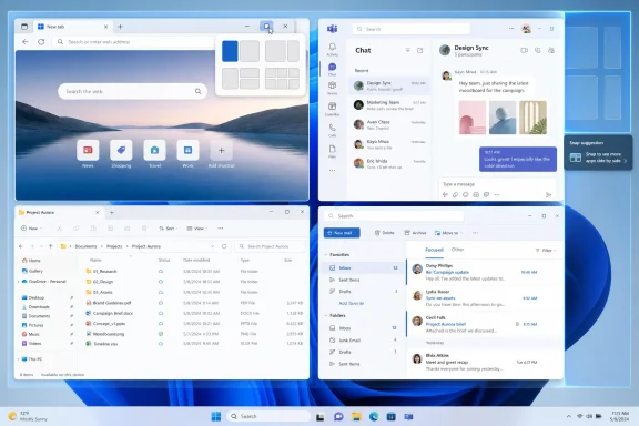 A Screenshot Becomes a Window Into Microsoft’s Desktop Strategy
The Thurrott.com page titled “snap-suggestion” is best read as a small piece of a much larger editorial project: the Windows 11 Field Guide’s attempt to document how the operating system actually works for real people, not just how Microsoft markets it. Paul Thurrott has spent years chronicling the gap between Windows as a product plan and Windows as a daily work surface. A page like this one is therefore less a standalone scoop than an artifact from the operating system’s lived interface.That matters because Windows 11 is full of such artifacts. Its most important changes are often not grand new subsystems but small affordances: a flyout here, a visual grouping there, a suggested next action when the user pauses or drags something near an edge. Microsoft’s desktop team has been trying to make Windows feel less like a pile of overlapping rectangles and more like a managed canvas.
Snap suggestions belong to that effort. Microsoft’s own documentation frames Snap layouts as a way to introduce users to the power of window snapping, and it emphasizes discoverability: hover over the maximize button, press Windows key + Z, choose a zone, and then use Snap Assist to complete the arrangement. That is a very different philosophy from the older Windows model, where capability existed but the user had to know the trick.
The older model rewarded memory. The newer model rewards recognition. If you can see the layout choices, you do not need to remember every keyboard shortcut or drag gesture. But once Microsoft moves from invisible capability to visible suggestion, it enters the dangerous terrain of all assistive software: help is only help when it appears at the right moment, in the right place, and with the right amount of restraint.
Snap Is No Longer One Feature
The word “Snap” is deceptively simple. In the Windows 7 and Windows 10 era, most users understood it as dragging a window to the left or right edge of the screen until it resized itself. It was fast, physical, and discoverable only in the way a good door handle is discoverable: you tried it, it worked, and then muscle memory took over.Windows 11 turned Snap into a family of related behaviors. Snap layouts expose possible arrangements before the user commits. Snap Assist suggests what should fill the remaining space. Snap groups preserve the arrangement so the user can return to it from the taskbar, Task View, or app switching. Snap suggestions then add another layer: Windows is not merely waiting for the user to choose a rectangle; it is proposing how the desktop should be assembled around the current task.
That layered approach is powerful on modern hardware. A 13-inch laptop, a 27-inch monitor, an ultrawide display, and a portrait screen all demand different layout logic. Microsoft’s documentation explicitly notes that Snap layouts are tailored to screen size and orientation, including three side-by-side windows on larger landscape displays and stacked arrangements on portrait screens. This is the sort of thing an operating system should do better than a user with a mouse and patience.
But the layering also explains why some users experience Snap as busy. The feature is no longer just a geometry trick. It is now a miniature workflow engine that touches the title bar, the taskbar, Alt + Tab, Task View, app compatibility, monitor behavior, touch, keyboard shortcuts, and Settings. If any one of those pieces is too aggressive, the entire system can feel like it is interrupting rather than assisting.
Microsoft Bets That Discovery Beats Muscle Memory
Microsoft’s strongest argument for Snap suggestions is simple: most people do not use features they cannot find. A keyboard shortcut can be elegant and still invisible. A drag gesture can be efficient and still unknown. A hover menu over the maximize button, by contrast, announces that Windows can do more than maximize, minimize, and close.That is why Windows 11’s maximize-button Snap menu was such an important design move. The maximize button is already where users look when they want to change a window’s size. By making that button reveal layouts, Microsoft turned an old control into a teaching surface. Windows key + Z gives keyboard users the same entry point without requiring pointer precision.
Snap suggestions extend that teaching model. After the first window is placed, the operating system can suggest what to put next to it. This matters because most users do not think in abstract layout grids. They think in tasks: respond to a message while reading a document, compare two folders, keep a meeting visible while taking notes, watch a dashboard while editing a spreadsheet. The value of Snap Assist is that it transforms a one-window action into a multi-window workspace.
The catch is that experienced users already have those workspaces in their heads. For them, suggestion can feel like a beginner’s overlay that never goes away. It is the same divide visible throughout modern Windows: Microsoft wants the OS to be self-explaining, while long-time users want it to be predictable, quiet, and fast.
Neither side is wrong. A self-explaining desktop is more accessible and less intimidating. A quiet desktop is more efficient and less fatiguing. The design problem is not whether Snap suggestions should exist. It is whether Windows gives users and administrators enough control over when the system speaks.
The Feature Works Because It Is Boring
Snap suggestions are easy to underestimate because they are not glamorous. They do not have the cultural heat of AI, the enterprise urgency of security baselines, or the visual drama of a redesigned Start menu. Yet they may affect more daily user behavior than many louder Windows features.A good window manager is infrastructure. Nobody praises the road when the commute is smooth, but everyone notices the pothole. Snap is one of those features that succeeds when it disappears into habit. The user drags, hovers, taps, or presses a shortcut, and the desktop settles into a useful shape.
That is also why Microsoft has invested so much in the details. The available layouts vary by screen. The system can guide the user to fill remaining zones. Groups can be recalled after switching tasks. Developers are told how to make custom title bars and desktop apps participate correctly. Microsoft’s guidance for app makers even calls out minimum window widths, warning that an app can technically show Snap layouts and still fail to snap properly if its minimum size is too large.
This is the unglamorous engineering behind a polished desktop. A Snap suggestion only feels magical if the apps cooperate. If a custom title bar does not expose the maximize button correctly, or if a window cannot shrink into the selected zone, the suggestion becomes a broken promise. For users, it looks like Windows being inconsistent. For IT departments, it becomes one more compatibility edge case to test.
The Developer Burden Hides Behind the User Interface
Windows users see a layout flyout. Developers see a contract.Microsoft’s app guidance makes clear that most apps get Snap layouts automatically if they use standard window chrome and expose the maximize caption button. The problem begins when developers customize the title bar, draw their own caption buttons, or use frameworks that do not behave like conventional Win32 windows. In those cases, an app may need to respond properly to non-client hit testing so Windows recognizes the maximize area as a maximize area.
That sounds like plumbing, because it is. But it is exactly the kind of plumbing that determines whether a Windows feature feels universal or half-finished. Users do not care whether an app is Win32, Electron, WinUI, WPF, or something else. They expect the maximize button to behave like a maximize button, and they expect the OS-level layout menu to appear when Microsoft has trained them to look for it.
The deeper lesson is that Windows 11’s desktop polish depends on the ecosystem behaving consistently. Microsoft can design Snap suggestions, but it cannot unilaterally make every app’s custom title bar cooperate. The company can document the right behavior, recommend platform-drawn caption buttons, and push framework updates, but Windows remains Windows: a vast compatibility surface where decades of application design decisions meet a modern shell.
For enterprise IT, this is not theoretical. A line-of-business app with a custom title bar that ignores modern Snap behavior may be more annoying on Windows 11 than it was on Windows 10, precisely because Windows 11 makes the feature more visible. Once the operating system teaches users to expect layout support everywhere, the exceptions become support tickets.
The Best Windows 11 Features Are Also the Most Annoying
There is a familiar pattern in Windows 11 criticism: the feature is useful, but the surface is too eager. Snap suggestions fit that pattern. So does the broader family of visual flyouts that appear when dragging windows or files near the top of the screen.Coverage from Windows-focused outlets and user discussions has repeatedly drawn a distinction between deliberate Snap entry points and automatic overlays. The maximize-button menu feels intentional: the user hovers over a control that is already associated with window size. Windows key + Z feels intentional: the user invokes a shortcut. Dragging a window near the top edge, however, can be ambiguous. The user might want a layout, or might simply be moving the window.
That ambiguity is where annoyance lives. A feature can be both objectively useful and subjectively intrusive if it appears during a gesture the user did not mean as a request. Windows has always had edge behaviors—maximize at the top, half-screen snap at the sides—but Windows 11’s richer flyouts make those behaviors more visible. Visibility is good for learning and bad for muscle memory.
The strongest version of the critique is not that Snap suggestions should be removed. It is that Microsoft sometimes treats discoverability as an unconditional good. Discoverability has a cost. Every visible suggestion competes with the user’s intention, and every overlay asks the brain to classify it as relevant or irrelevant. That moment is tiny, but it repeats all day.
The Settings Matter More Than the Marketing
The practical redemption of Snap suggestions is that Windows exposes meaningful controls for many of the behaviors. Users can go into Settings, System, and Multitasking to manage Snap windows and related options. Microsoft’s documentation and Windows settings catalog both point to a collection of toggles that govern whether Snap is enabled, whether Windows suggests what to snap next, whether layouts appear on maximize-button hover, whether layouts appear when dragging to the top of the screen, and whether snapped windows appear in task switching surfaces.That granularity is not perfect, but it is important. It means the debate does not have to be binary. A user can keep keyboard snapping and maximize-button layouts while disabling the more intrusive top-of-screen behavior. An admin can decide whether suggested next windows are helpful in a fleet of shared devices or distracting in a focused production environment. A trainer can teach one workflow without pretending the other workflows do not exist.
Here is the practical comparison Windows users and IT staff should have in mind:
| Snap behavior | How users invoke it | Main benefit | Main risk | Best fit |
|---|---|---|---|---|
| Snap layouts | Hover over maximize or press Windows key + Z | Makes layout choices visible | Can fail in apps with nonstandard title bars | General productivity users |
| Snap Assist | Snap one window, then choose what fills the rest | Turns one placement into a full workspace | Suggestions may not match intent | Multitaskers with several open apps |
| Snap groups | Return to a saved snapped arrangement | Preserves task context | Can add complexity to task switching | Users who work in repeatable app sets |
| Top-edge layout flyout | Drag a window to the top of the screen | Fast mouse and touch discovery | Can interrupt ordinary window movement | New users, touch devices, large screens |
| Traditional edge snapping | Drag to screen edge or use keyboard shortcuts | Fast and familiar | Less discoverable | Power users and managed desktops |
Why Admins Should Care About a Consumer-Looking Feature
Snap suggestions may look like a consumer convenience, but they have enterprise implications. Window management affects training, accessibility, app compatibility, help desk scripts, and user migration from Windows 10 to Windows 11. In a corporate environment, “how do I stop this thing from popping up?” is not a philosophical question; it is a ticket.The first administrative issue is consistency. If some devices have one Snap configuration and others have another, screenshots in documentation stop matching user screens. That matters in training materials and support walkthroughs, especially for organizations that are still acclimating users to Windows 11. A small visual mismatch can derail a self-service guide.
The second issue is application testing. Microsoft’s developer guidance makes clear that apps with custom title bars or unusual window constraints can behave differently with Snap layouts. Organizations with internal apps should test not only whether those apps launch and authenticate, but whether they participate sanely in the modern Windows shell. A desktop application that cannot fit into common snapped widths may be technically compatible with Windows 11 and still feel clumsy in daily use.
The third issue is user segmentation. Not everyone benefits from the same Snap defaults. A call-center worker with two fixed apps may need a stable layout and minimal visual noise. A project manager on a large display may benefit from Snap groups and suggestions. A warehouse tablet user may appreciate top-edge drag discovery. A developer on an ultrawide monitor may already use PowerToys FancyZones or a custom window manager and view Windows’ own suggestions as redundant.
The lesson for IT is blunt: do not treat Snap as a cosmetic preference. It is part of the desktop workflow. If your Windows 11 deployment plan includes Start menu layout, taskbar pins, OneDrive setup, browser defaults, and update rings, it should also include a position on Multitasking settings.
Action checklist for admins
- Test Snap layouts, Snap Assist, and Snap groups on the organization’s most common laptop, desktop, docked, ultrawide, and portrait-monitor configurations.
- Validate line-of-business apps with custom title bars to confirm that the Snap layouts menu appears and that windows can fit into common snapped zones.
- Decide whether top-edge Snap layout flyouts should remain enabled for new users or disabled for power-user and production-focused groups.
- Document the Settings path under System and Multitasking so help desk staff can guide users through changing Snap behavior without disabling all snapping.
- Include Snap behavior in Windows 11 migration training, especially for users moving from Windows 10 who may know edge snapping but not Snap groups or Windows key + Z.
- Review whether third-party or Microsoft tools such as advanced window managers are already in use before standardizing Snap guidance.
PowerToys Is the Shadow Standard for People Who Outgrow Snap
Any serious discussion of Windows window management eventually runs into PowerToys FancyZones. Microsoft’s built-in Snap features are designed for mainstream discoverability and consistency. FancyZones is for users who already know that the default layouts are not enough.That distinction matters because Snap suggestions are not trying to be a professional tiling window manager. They are trying to make common layouts obvious. FancyZones serves a different audience: people who want custom zones, persistent complex layouts, and deeper control over unusual screen real estate. On ultrawide monitors, multi-monitor workstations, or specialized workflows, built-in Snap can feel too generic.
The existence of FancyZones also limits how harshly Snap should be judged. Microsoft does not need the default Windows shell to satisfy every window-management obsessive. It needs the default shell to help hundreds of millions of users get from overlapping clutter to a usable workspace. The advanced users have an escape hatch, and Microsoft is unusually explicit about supporting that audience through PowerToys.
Still, there is a risk of split-brain design. If Windows has Snap suggestions for ordinary users and FancyZones for power users, Microsoft needs to make the boundary clear. Otherwise, users stumble into overlapping systems, each trying to help with layout in a slightly different way. The best version of Windows would make built-in Snap quiet and predictable enough for most people while leaving advanced layout construction to tools built for that purpose.
The Most Interesting Part Is What Microsoft Does Not Call AI
In 2026, it is tempting to frame every suggestion feature as part of the AI wave. Snap suggestions do not need that framing to matter. They are a reminder that operating systems have been moving toward contextual assistance for years, long before every assistive behavior was branded as an AI experience.The interesting question is not whether Snap suggestions are “intelligent” in the modern marketing sense. The question is how much inference users want from the shell. When Windows suggests what to snap next, it is making a modest inference based on open windows and available space. When it preserves a Snap group, it is inferring that a set of windows belongs together as a task. When it surfaces that group in task switching, it is saying the unit of work may be larger than a single app.
That is a profound shift for Windows. The traditional desktop is app-centric: launch an app, switch to an app, close an app. Snap groups are task-centric: return to the arrangement that represents the work. The shell begins to understand that “writing a report” might mean Word, Edge, File Explorer, and Teams in a specific geometry.
This is where Snap hints at a broader future. If Microsoft wants Windows to become more context-aware, it does not have to start with a chatbot. It can start with the desktop’s physical arrangement. Which apps appear together? Which layouts recur? Which monitor gets which tools? Which windows are ignored when suggestions appear? The shell has a lot of behavioral context before an AI model enters the room.
That future is useful and unsettling for the same reason. A desktop that recognizes work patterns can save time. A desktop that overpredicts intent can become exhausting. Snap suggestions are a small, relatively harmless test case for a larger design question Microsoft will keep facing: when should Windows anticipate, and when should it simply wait?
Thurrott’s Field Guide Framing Is the Right Lens
The reason Thurrott’s “snap-suggestion” artifact is worth more attention than its raw page content suggests is that field guides are about practical navigation. They are not press releases. They explain how something behaves when users encounter it. A screenshot of a Snap suggestion in a multitasking chapter tells us that this is now part of the Windows literacy layer.That layer has changed. In Windows 10, a reasonably competent user could understand multitasking through the taskbar, Alt + Tab, virtual desktops, and edge snapping. In Windows 11, that same user must also understand layout flyouts, saved groups, suggested window placements, and the relationship between Snap settings and app behavior. The feature set is better, but the mental model is larger.
This is where Microsoft has to be careful. A field guide can explain complexity; the operating system should reduce it. If users need too much explanation to understand why a flyout appeared, or why an app does not show the layout menu, or why a group appears in one switching surface and not another, then the feature’s polish becomes fragile.
Thurrott’s broader Windows writing often circles a recurring theme: Windows 11 contains many good ideas wrapped in Microsoft’s modern tendency to overdecorate, overprompt, or overintegrate. Snap suggestions are one of the better ideas. They help users discover structure in a chaotic desktop. But they live one design nudge away from becoming another example of the OS getting in the user’s way.
The Share Count Says Nothing, and That Is the Point
The source page’s share count is listed as zero. That is not surprising for an attachment page, and it should not be overread as a measure of interest. Interface documentation rarely travels like outage news, exploit writeups, or product leaks.But the quietness is instructive. Some of the most important Windows changes do not arrive as viral stories. They arrive as habits. A layout menu appears, users try it, support desks answer questions, developers fix title bars, admins tweak defaults, and eventually the behavior becomes part of what people expect Windows to do.
That is how desktop conventions are made. Not with a single keynote moment, but with repeated exposure. The maximize button used to mean one thing. Now, for many Windows 11 users, it also means layout choice. The taskbar used to be mostly an app switcher. Now it can represent a group of snapped apps. Dragging a window used to be a direct manipulation of one rectangle. Now it may summon a layout surface.
This is why a small page in a field guide can reveal a larger shift. Microsoft is not just documenting Snap suggestions; it is normalizing them. Once a behavior appears in the guidebook layer of Windows culture, it has moved from novelty to expected knowledge.
Where Microsoft Still Needs to Tighten the Experience
The first improvement Microsoft should prioritize is clearer separation between intentional and accidental invocation. Hovering over maximize and pressing Windows key + Z are intentional. Dragging near the top of the display is not always intentional. Windows should be conservative where intent is ambiguous and generous where intent is explicit.The second improvement is better language in Settings. Multitasking controls are useful, but they need to be understandable to non-specialists. Users should not have to learn Microsoft’s internal taxonomy of Snap layouts, Snap Assist, and Snap groups just to turn off the one overlay that bothers them. A small visual preview beside each toggle would do more good than another paragraph of text.
The third improvement is stronger enterprise documentation around defaults and manageability. Microsoft already documents that some Snap settings participate in Windows Backup for Organizations and that users can manage some features through Settings. Admins need a clean, practical story for policy, provisioning, reset behavior, and user education. If Windows wants to be a managed productivity platform, its productivity surfaces need the same deployment clarity as its security surfaces.
The fourth improvement belongs to developers. Microsoft should keep pushing app frameworks toward consistent title-bar behavior and realistic minimum window sizes. A modern Windows app should not merely run on Windows 11; it should behave like it belongs in the Windows 11 shell. Snap compatibility is now part of that belonging.
The final improvement is restraint. Microsoft should resist the temptation to make every desktop action suggestive, predictive, or promotional. Snap suggestions work because they are close to the user’s immediate goal: arrange windows. The further a suggestion drifts from that goal, the more likely it becomes noise.
The Practical Meaning for Windows Users
For ordinary Windows 11 users, the best advice is to treat Snap as a toolkit, not a mandate. If the maximize-button menu helps, use it. If Windows key + Z is faster, learn it. If the top-edge flyout annoys you, disable that behavior without turning off snapping entirely. The mistake many users make is assuming the choice is between accepting every Snap surface or abandoning the feature. It is not.For power users, the question is whether built-in Snap is now good enough. On a laptop or standard desktop monitor, the answer may be yes. On an ultrawide or complex multi-monitor setup, PowerToys FancyZones may still be the better fit. Microsoft’s built-in feature has the advantage of being everywhere; advanced tools have the advantage of being yours.
For developers, the message is sharper: if your app does not behave properly with Snap layouts, users will blame your app and Windows interchangeably. Custom chrome is not free. Every time an app redraws basic window controls, it takes responsibility for preserving the behaviors users expect from the operating system.
For admins, the lesson is to stop ignoring “small” shell features. Windows 11 migration is not just a matter of hardware readiness and update compliance. It is also a matter of whether users understand the desktop they are being asked to inhabit. Snap suggestions are part of that desktop.
The Desktop Is Becoming a Guided Workspace
The concrete takeaways from Thurrott’s “snap-suggestion” page and Microsoft’s Snap documentation are less about one screenshot than about Windows 11’s direction. Microsoft is using the shell to guide users into more structured work patterns, and Snap is one of the clearest examples because the benefit is immediate and the tradeoffs are visible.- Paul Thurrott’s “snap-suggestion” page was published on Jul 08, 2026, as a Windows 11 Field Guide multitasking artifact rather than a conventional long-form article.
- Snap suggestions sit inside a larger Windows 11 Snap system that includes layouts, Assist, groups, keyboard invocation, task-switching integration, and display-aware arrangements.
- The feature’s value is discoverability: users can see and complete useful window layouts without memorizing old snapping tricks.
- The feature’s risk is interruption: automatic flyouts and suggestions can feel intrusive when Windows misreads a drag or workflow.
- Admins should test Snap behavior with real apps, real monitors, and real user roles before treating the defaults as harmless.
- Developers with custom title bars or restrictive minimum window sizes need to treat Snap compatibility as part of Windows 11 readiness.
References
- Primary source: thurrott.com
Published: 2026-07-08T22:10:12.391954
snap-suggestion - Thurrott.com
 www.thurrott.com
- Official source: learn.microsoft.com
Support snap layouts for desktop apps on Windows 11 - Windows apps | Microsoft Learn
Support the snap layouts menu in your desktop application.learn.microsoft.com - Official source: support.microsoft.com
Snap Your Windows | Microsoft Support
Discover the power of the Snap feature in Windows, designed to enhance your multitasking and productivity. The Snap feature allows you to quickly resize and position windows on your screen by dragging them to the edges or corners. With Snap, you can easily organize multiple windows, making it...support.microsoft.com - Official source: microsoft.com
How to Use Snap Layouts | Microsoft Windows
Organize your screen with Snap layouts in Windows 11. From multitasking on calls to optimizing research, Snap layouts help make screen time more productive.www.microsoft.com
- Official source: blogs.windows.com
Introducing Windows 11
At a time when the PC is playing a more central role in our lives, Windows 11 is designed to bring you closer to what you love.blogs.windows.com - Related coverage: information-services.ed.ac.uk
- Related coverage: teachucomp.com
- Related coverage: windowscentral.com
Two new Windows 11 features are frustrating users | Windows Central
Windows 11 keeps adding features, but not all of them improve productivity. Here's why the Snap Assist and Drag Tray flyouts miss the mark.www.windowscentral.com