

Windows 11’s redesigned Widgets panel may be one of Microsoft’s smallest interface changes of 2026, but it addresses a disproportionately large source of irritation: a system feature that routinely demanded attention instead of quietly providing information. The updated experience, now rolling out through Windows 11 Release Preview builds 26100.8942 and 26200.8942, separates pinned widgets from the Discover news feed, stops the panel from opening on hover by default, simplifies its controls, and—most importantly—lets users disable Discover completely. For the first time, the Windows 11 Widgets panel feels capable of being a utility rather than a delivery mechanism for MSN content.
Microsoft introduced Widgets with Windows 11 in 2021 as a modern, glanceable information surface. The concept was reasonable: open a lightweight panel to check the weather, calendar, stocks, sports, photos, tasks, or other personal information without launching several full applications.
The problem was that Microsoft combined those utilities with a personalized news feed powered by Microsoft Start. What should have been a compact dashboard became a dense stream of headlines, recommendations, entertainment stories, market updates, and algorithmically selected content.
Live Tiles had limitations, including inconsistent developer support and an interface that never won universal affection. Even so, they gave users direct control over which applications occupied the Start menu and how much space each tile received.
Windows 11 removed Live Tiles as part of its simplified Start redesign. Widgets became their spiritual replacement, but the implementation moved glanceable information away from user-selected applications and toward a Microsoft-managed web experience.
That design created an obvious mismatch of intent. The user wanted one piece of information, while the panel attempted to maximize engagement with an entire feed.
Microsoft added more personalization and feed controls over time, but those controls did not solve the fundamental problem. A supposedly optional feature still appeared designed around content consumption rather than quick access to information.
This is more than a visual reorganization. It changes the purpose of the default surface.
That restores the original value proposition of a widget system. The dashboard becomes a place for information the user selected, arranged in a form intended for quick inspection.
A minimal configuration is now practical. Someone who wants only a weather widget can keep only that weather widget instead of accepting a news portal as the price of admission.
The critical difference is that entering the Widgets experience no longer requires entering Discover. News becomes a destination the user can choose rather than the dominant component of the panel.
This distinction matters because a choice is meaningful only when declining it does not break the rest of the feature. Separating the two surfaces allows Microsoft to keep its content feed while letting users treat Widgets as a conventional desktop tool.
This is the clean break many Windows 11 users have wanted since the operating system launched.
A user who does not want algorithmic news should not have to train the algorithm. Nor should that user need to hide dozens of unwanted stories in the hope that the system eventually understands the message.
The new control recognizes a simpler preference: some people do not want Discover in Windows. Turning it off is more transparent than trying to transform it into something tolerable through repeated feedback.
When an operating-system surface repeatedly exposes content that users did not request, it can feel less like assistance and more like an advertisement. Even relevant stories may be unwelcome when they appear in a context associated with system controls.
Providing a complete disable option is therefore a trust decision, not merely a personalization feature. It communicates that the operating system can respect a user’s refusal without continually trying to reopen the conversation.
This sounds minor, but it removes one of the most disruptive aspects of the original experience.
Passing the pointer over the lower-left corner could therefore summon a substantial interface without an intentional command. On systems with left-aligned taskbar icons, multi-monitor arrangements, or frequent pointer movement near the taskbar, accidental openings were difficult to avoid.
The problem was especially noticeable when the panel took a moment to render. A brief pointer mistake could produce a delayed animation, loading placeholders, or a feed that appeared after the user had already moved elsewhere.
Microsoft has not eliminated the old behavior. Users who genuinely prefer hover activation can re-enable it, which is the right compromise between calmer defaults and individual choice.
The new default follows a broader usability principle: large, attention-consuming surfaces should require deliberate input. That principle should also guide Microsoft’s treatment of Start recommendations, Search highlights, taskbar alerts, and other shell features.
The result looks calmer, although the redesign exposes another problem: the panel does not adapt well when very few widgets are pinned.
The absence of a prominent full-screen control also reinforces the idea that Widgets should be glanceable. A dashboard intended for quick reference does not necessarily need to expand into an immersive reading environment.
Discover can still serve users who want a longer content session. The dedicated widget view benefits from remaining focused on short interactions.
That empty space is preferable to unwanted news, but it does not look fully resolved. It makes the panel feel like a container designed for far more content than the user has chosen to provide.
A responsive width would improve the experience. Microsoft could offer compact, standard, and expanded layouts or automatically size the panel according to the widget grid.
It also reveals how much the feed, rather than the widgets themselves, was responsible for the feature’s poor reputation.
A weather widget may display a selected location, while finance-related cards can follow chosen securities. Other widgets expose account-specific or application-specific information depending on their provider.
The experience remains constrained by what developers and Microsoft make available. A cleaner panel will not automatically create a vibrant widget ecosystem, but it gives that ecosystem a more credible place to exist.
Part of that hesitation may have been strategic. Developers had little incentive to invest in a surface where their widgets competed with a large, attention-grabbing news feed.
A dedicated widgets-only view improves the proposition. Developers can now expect their cards to appear in a user-curated workspace rather than beside unpredictable editorial content.
For the ecosystem to grow, Microsoft still needs to improve documentation, discovery, telemetry, stability, and cross-device consistency. It must also avoid constantly redesigning the platform in ways that make developers question whether today’s work will survive tomorrow’s Windows update.
Microsoft has acknowledged broader performance concerns across Windows and has identified Widgets as one area targeted for architectural and memory improvements.
A traditional native weather utility might read cached data and display almost instantly. A modular dashboard may need to initialize its host, check account state, contact several services, construct multiple cards, and retrieve personalized content.
That complexity is largely invisible until something becomes slow. Users do not care which component delayed the panel; they simply notice that clicking the weather icon did not produce the weather quickly enough.
There is an unavoidable tradeoff. Preloading can make the panel open faster, while unloading components saves memory and power.
Windows can manage that balance intelligently by considering device capabilities and usage patterns. A system with 64GB of RAM and frequent widget use can cache more aggressively than an 8GB laptop whose owner rarely opens the panel.
A simple panel that hesitates feels unfinished. A visually richer panel that opens instantly may feel more efficient despite doing more work.
For the redesign to succeed, Microsoft needs to optimize three moments in particular:
The biggest beneficiaries will be people who previously disabled the taskbar icon because the panel was too intrusive.
The revised panel supports that approach without filling the remaining area with content. Although the unused space is visually awkward, it is functionally honest: Windows displays only what the user requested.
The following setup offers a sensible starting point:
Removing the feed reduces those risks. A family PC can show neutral utilities such as weather or traffic without exposing a stream of recommendation-driven stories.
It does not replace separate Windows accounts, content controls, or responsible browser settings. It does, however, remove an unnecessary source of unpredictable material from the desktop.
A system component that can be simplified or disabled is easier to govern than one that mixes productivity cards with consumer news.
A widgets-only dashboard is easier to justify. Microsoft 365, calendar, task, security, or organization-specific widgets could eventually provide useful at-a-glance information without introducing a consumer feed.
The redesign therefore creates an opportunity for Microsoft to position Widgets as an enterprise dashboard platform. That possibility depends on stronger administrative controls and a better selection of business-focused cards.
Microsoft should provide clear controls for:
Together, these changes suggest that the company is responding to years of criticism about Windows 11 feeling crowded with recommendations, promotions, alerts, and services.
The best operating system often disappears into the background. It launches applications, manages files, connects hardware, protects data, and stays out of the user’s way.
Microsoft’s 2026 focus on “calm” appears to recognize that difference. Disabling hover activation and reducing default badges may lower engagement with Widgets, but they can increase satisfaction with Windows as a whole.
Years later, engineering resources are being used to separate those components and restore controls that could have existed from the beginning. That pattern has appeared elsewhere in Windows 11, where Microsoft simplifies a feature, adds layers of recommendation-driven behavior, and then partially retreats after sustained criticism.
The lesson should not be that backlash eventually produces an off switch. The better lesson is that Windows defaults must begin from user intent, with optional services layered on afterward.
Microsoft increasingly delivers Windows features through gradual controlled rollouts rather than a single universal release date.
That means installing the latest Release Preview build may not be sufficient. Some users will receive the redesigned panel earlier than others while Microsoft monitors reliability and feedback.
This approach limits the impact of defects, but it complicates testing and communication. Build numbers no longer provide a complete description of the experience installed on a device.
The rollout could extend beyond August if telemetry reveals performance, compatibility, accessibility, or reliability problems. Individual components may also arrive at different times because the interface depends partly on independently serviced web-experience packages.
Users should therefore view the Release Preview appearance as a strong sign of approaching availability, not a fixed launch commitment.
Longer-term success will depend on whether Microsoft treats the change as a new design philosophy or a temporary concession.
The company should also communicate availability clearly. If the redesign depends on both a cumulative update and a Windows Web Experience Pack version, users need a straightforward way to identify what they have installed.
Useful additions could include battery status for connected devices, storage capacity, package deliveries, focused calendar views, clipboard history, recent files, system health, smart-home controls, and richer Phone Link integration. Enterprise providers could add ticket queues, approval requests, service alerts, and operational dashboards.
Each card should deliver meaningful information or an immediate action without forcing the user into another application for routine tasks.
Microsoft could make this automatic or expose a simple size selector. Either method would make the panel feel intentionally designed for both minimalists and heavy users.
Windows users have learned to distrust controls that seem temporary. Microsoft can reverse that perception only through consistency over many update cycles.
The redesigned Windows 11 Widgets panel does not reinvent desktop computing, and it does not need to. Its achievement is more fundamental: it allows a user to request a small piece of information without first negotiating with a news feed, accidental hover behavior, or a cluttered interface. If Microsoft improves responsiveness, adds adaptive sizing, strengthens enterprise controls, and preserves the new off switches, Widgets could finally become the quiet, glanceable Windows utility it should have been from the beginning.
 Overview
Microsoft introduced Widgets with Windows 11 in 2021 as a modern, glanceable information surface. The concept was reasonable: open a lightweight panel to check the weather, calendar, stocks, sports, photos, tasks, or other personal information without launching several full applications.The problem was that Microsoft combined those utilities with a personalized news feed powered by Microsoft Start. What should have been a compact dashboard became a dense stream of headlines, recommendations, entertainment stories, market updates, and algorithmically selected content.
From Live Tiles to a Web-Powered Dashboard
Windows has experimented with glanceable information for years. Windows 8 and Windows 10 used Live Tiles, allowing supported Start menu tiles to display changing information such as weather forecasts, unread messages, calendar appointments, and news headlines.Live Tiles had limitations, including inconsistent developer support and an interface that never won universal affection. Even so, they gave users direct control over which applications occupied the Start menu and how much space each tile received.
Windows 11 removed Live Tiles as part of its simplified Start redesign. Widgets became their spiritual replacement, but the implementation moved glanceable information away from user-selected applications and toward a Microsoft-managed web experience.
Why the Original Design Felt So Aggressive
The first Widgets panel blurred the distinction between a Windows utility and a content service. A user might open it for a weather forecast and immediately encounter a screen dominated by news cards, videos, celebrity stories, sports coverage, and suggested topics.That design created an obvious mismatch of intent. The user wanted one piece of information, while the panel attempted to maximize engagement with an entire feed.
Microsoft added more personalization and feed controls over time, but those controls did not solve the fundamental problem. A supposedly optional feature still appeared designed around content consumption rather than quick access to information.
The New Widgets and Discover Split
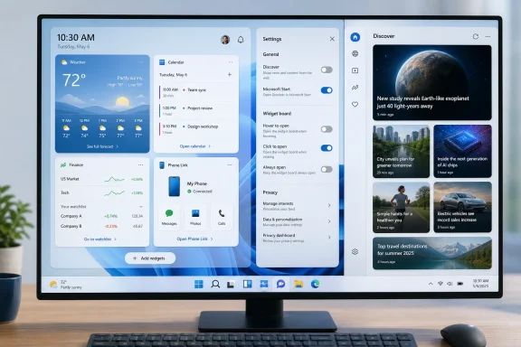
The most consequential redesign is also the most straightforward: Widgets and Discover are now separate destinations. A navigation rail on the left side of the panel lets users move between their widget dashboard and Microsoft’s Discover feed instead of mixing both into a single canvas.This is more than a visual reorganization. It changes the purpose of the default surface.
Widgets Finally Get Their Own Space
The dedicated Widgets view contains the cards a user has deliberately pinned. Weather, Phone Link, a watchlist, calendar information, traffic, photos, or another supported widget can appear without being surrounded by unrelated headlines.That restores the original value proposition of a widget system. The dashboard becomes a place for information the user selected, arranged in a form intended for quick inspection.
A minimal configuration is now practical. Someone who wants only a weather widget can keep only that weather widget instead of accepting a news portal as the price of admission.
Discover Becomes an Explicit Destination
Discover remains available through its own navigation icon. It still presents the familiar selection of recommended stories and MSN-powered content, and Microsoft continues to experiment with alternative card styling.The critical difference is that entering the Widgets experience no longer requires entering Discover. News becomes a destination the user can choose rather than the dominant component of the panel.
This distinction matters because a choice is meaningful only when declining it does not break the rest of the feature. Separating the two surfaces allows Microsoft to keep its content feed while letting users treat Widgets as a conventional desktop tool.
Discover Can Finally Be Disabled
The redesign’s most important control appears in the updated Widgets settings: users can disable Discover altogether. Once switched off, its navigation entry disappears, leaving only the widget dashboard and any other enabled dashboards.This is the clean break many Windows 11 users have wanted since the operating system launched.
A Real Off Switch Instead of Feed Tuning
Previous versions offered ways to personalize topics, hide individual publishers, remove cards, or reduce certain categories. Those options treated the problem as poor recommendation quality rather than a lack of interest in the feed itself.A user who does not want algorithmic news should not have to train the algorithm. Nor should that user need to hide dozens of unwanted stories in the hope that the system eventually understands the message.
The new control recognizes a simpler preference: some people do not want Discover in Windows. Turning it off is more transparent than trying to transform it into something tolerable through repeated feedback.
Why This Matters for Trust
Windows occupies a privileged position on a PC. Its taskbar, Start menu, Search interface, notification system, and desktop are unavoidable parts of the environment, so Microsoft must apply a higher standard to promotional or engagement-oriented content placed there.When an operating-system surface repeatedly exposes content that users did not request, it can feel less like assistance and more like an advertisement. Even relevant stories may be unwelcome when they appear in a context associated with system controls.
Providing a complete disable option is therefore a trust decision, not merely a personalization feature. It communicates that the operating system can respect a user’s refusal without continually trying to reopen the conversation.
Hover Activation Is No Longer the Default
The redesigned panel also stops opening merely because the pointer passes over its taskbar icon. Users must click the icon unless they deliberately restore the old hover behavior in settings.This sounds minor, but it removes one of the most disruptive aspects of the original experience.
Accidental Activation Was a Design Failure
Hover activation works best when it reveals a small preview or tooltip that disappears without interrupting the task. The Widgets panel was different: it occupied a large portion of the screen, loaded dynamic content, and visually displaced whatever the user was doing.Passing the pointer over the lower-left corner could therefore summon a substantial interface without an intentional command. On systems with left-aligned taskbar icons, multi-monitor arrangements, or frequent pointer movement near the taskbar, accidental openings were difficult to avoid.
The problem was especially noticeable when the panel took a moment to render. A brief pointer mistake could produce a delayed animation, loading placeholders, or a feed that appeared after the user had already moved elsewhere.
Click-to-Open Restores Intentionality
Requiring a click establishes a clear interaction contract. The panel opens because the user requested it, not because Windows interpreted pointer proximity as interest.Microsoft has not eliminated the old behavior. Users who genuinely prefer hover activation can re-enable it, which is the right compromise between calmer defaults and individual choice.
The new default follows a broader usability principle: large, attention-consuming surfaces should require deliberate input. That principle should also guide Microsoft’s treatment of Start recommendations, Search highlights, taskbar alerts, and other shell features.
A Cleaner but Imperfect Layout
The updated Widgets panel removes the row of controls previously positioned across the top, including the full-screen button. Settings now live in the left navigation area, producing a less crowded header and a clearer visual hierarchy.The result looks calmer, although the redesign exposes another problem: the panel does not adapt well when very few widgets are pinned.
Less Interface Chrome
Removing redundant controls gives the actual widgets more visual priority. Settings, navigation, and content are easier to distinguish, while the panel no longer resembles a miniature web portal with several competing action buttons.The absence of a prominent full-screen control also reinforces the idea that Widgets should be glanceable. A dashboard intended for quick reference does not necessarily need to expand into an immersive reading environment.
Discover can still serve users who want a longer content session. The dedicated widget view benefits from remaining focused on short interactions.
Too Much Empty Space
A single-widget setup demonstrates the redesign’s weakness. The panel retains a large fixed canvas even when only one small card is present, leaving a broad area of unused background.That empty space is preferable to unwanted news, but it does not look fully resolved. It makes the panel feel like a container designed for far more content than the user has chosen to provide.
A responsive width would improve the experience. Microsoft could offer compact, standard, and expanded layouts or automatically size the panel according to the widget grid.
Responsive Sizing Would Complete the Idea
A more adaptive implementation could follow several rules:- One or two small widgets could open in a narrow flyout similar to the Calendar or Quick Settings panel.
- Larger widget collections could use the current dashboard width without reducing available information.
- Discover could retain a wider reading layout because headlines and image cards need more horizontal room.
- Touch devices could use a larger target area while mouse-driven desktops receive a denser panel.
- The chosen size could persist per device, acknowledging that a tablet and a multi-monitor workstation have different needs.
Widget Management Remains Familiar
The mechanics of adding, removing, resizing, and rearranging widgets have not changed substantially. That continuity is useful because the redesign does not force users to relearn basic dashboard management.It also reveals how much the feed, rather than the widgets themselves, was responsible for the feature’s poor reputation.
Existing Controls Still Work
Users can open the widget picker, select supported cards, choose available sizes, and arrange them within the dashboard. Individual cards retain their own menus for customization or removal.A weather widget may display a selected location, while finance-related cards can follow chosen securities. Other widgets expose account-specific or application-specific information depending on their provider.
The experience remains constrained by what developers and Microsoft make available. A cleaner panel will not automatically create a vibrant widget ecosystem, but it gives that ecosystem a more credible place to exist.
Third-Party Support Still Needs Momentum
Microsoft opened Windows 11 Widgets to third-party developers through the Windows App SDK, yet adoption has remained modest compared with mobile widget platforms. Many prominent Windows applications still do not provide useful dashboard cards.Part of that hesitation may have been strategic. Developers had little incentive to invest in a surface where their widgets competed with a large, attention-grabbing news feed.
A dedicated widgets-only view improves the proposition. Developers can now expect their cards to appear in a user-curated workspace rather than beside unpredictable editorial content.
For the ecosystem to grow, Microsoft still needs to improve documentation, discovery, telemetry, stability, and cross-device consistency. It must also avoid constantly redesigning the platform in ways that make developers question whether today’s work will survive tomorrow’s Windows update.
Performance and Resource Use Still Matter
A calmer interface can still be frustrating if it responds slowly. The redesigned panel reportedly remains less responsive than it should be, particularly while opening, switching dashboards, or loading web-connected cards.Microsoft has acknowledged broader performance concerns across Windows and has identified Widgets as one area targeted for architectural and memory improvements.
The Cost of a Web-Connected Surface
Widgets rely heavily on web services and the Windows Web Experience Pack. That architecture lets Microsoft update parts of the system outside major operating-system releases, but it can also introduce loading delays, background activity, service dependencies, and inconsistent rendering.A traditional native weather utility might read cached data and display almost instantly. A modular dashboard may need to initialize its host, check account state, contact several services, construct multiple cards, and retrieve personalized content.
That complexity is largely invisible until something becomes slow. Users do not care which component delayed the panel; they simply notice that clicking the weather icon did not produce the weather quickly enough.
Quiet Defaults Should Include Quiet Resource Use
Microsoft has discussed reducing the default memory footprint of Widgets, returning memory more aggressively when the panel is not active, and limiting pre-launch behavior on lower-memory devices. These are important goals because a feature used for seconds at a time should not maintain a disproportionate background presence.There is an unavoidable tradeoff. Preloading can make the panel open faster, while unloading components saves memory and power.
Windows can manage that balance intelligently by considering device capabilities and usage patterns. A system with 64GB of RAM and frequent widget use can cache more aggressively than an 8GB laptop whose owner rarely opens the panel.
Responsiveness Is Part of the Redesign
Performance should not be treated as a separate engineering concern added after the interface is complete. Speed influences how users perceive the entire design.A simple panel that hesitates feels unfinished. A visually richer panel that opens instantly may feel more efficient despite doing more work.
For the redesign to succeed, Microsoft needs to optimize three moments in particular:
- The first opening after sign-in should not produce a prolonged blank or placeholder-filled canvas.
- Subsequent openings should feel immediate, even if some cards refresh asynchronously.
- Switching between Widgets and Discover should not reconstruct the entire interface unnecessarily.
The Consumer Impact
For home users, the redesign offers something Windows 11 has often struggled to provide: a default experience that does less. That restraint can make the operating system feel more personal than another layer of algorithmic customization.The biggest beneficiaries will be people who previously disabled the taskbar icon because the panel was too intrusive.
A Practical Minimal Setup
A useful Widgets configuration does not need to be elaborate. A consumer might pin only Weather, Phone Link, and a small finance or sports card.The revised panel supports that approach without filling the remaining area with content. Although the unused space is visually awkward, it is functionally honest: Windows displays only what the user requested.
The following setup offers a sensible starting point:
- Open Widgets by clicking its taskbar button.
- Enter Widgets settings from the left navigation rail.
- Disable Discover if news recommendations are not wanted.
- Leave hover activation off to prevent accidental openings.
- Remove every default widget that does not provide regular value.
- Pin one to four cards that can be understood at a glance.
- Resize and arrange those cards so the most important information appears first.
Fewer Distractions on Shared and Family PCs
The Discover feed could be particularly awkward on shared devices because personalized content might not match the person currently using the computer. Sensational headlines or sensitive subjects could also appear without warning.Removing the feed reduces those risks. A family PC can show neutral utilities such as weather or traffic without exposing a stream of recommendation-driven stories.
It does not replace separate Windows accounts, content controls, or responsible browser settings. It does, however, remove an unnecessary source of unpredictable material from the desktop.
The Enterprise Impact
Widgets have limited strategic value in many managed environments, where administrators prioritize predictable interfaces, reduced bandwidth use, information governance, and focused workflows. The redesigned separation nevertheless improves Windows 11’s suitability for business deployments.A system component that can be simplified or disabled is easier to govern than one that mixes productivity cards with consumer news.
Reduced Distraction in Managed Environments
Organizations frequently standardize taskbar layouts and remove optional experiences that do not support business objectives. Discover content can distract employees, create reputational concerns, and generate support questions when recommendations appear inappropriate or irrelevant.A widgets-only dashboard is easier to justify. Microsoft 365, calendar, task, security, or organization-specific widgets could eventually provide useful at-a-glance information without introducing a consumer feed.
The redesign therefore creates an opportunity for Microsoft to position Widgets as an enterprise dashboard platform. That possibility depends on stronger administrative controls and a better selection of business-focused cards.
Policy and Predictability Remain Essential
Enterprise administrators need more than a visible toggle. They need documented policy settings that behave consistently across Windows editions, servicing channels, user profiles, and managed device states.Microsoft should provide clear controls for:
- Disabling Discover while preserving approved widgets.
- Disabling the entire Widgets experience when required.
- Controlling hover activation and notification badging.
- Restricting widget providers to an approved list.
- Preventing consumer content from returning after an update.
- Managing account requirements and data-sharing behavior.
- Configuring defaults without blocking later user customization where appropriate.
A Broader Windows 11 Course Correction
The Widgets redesign does not exist in isolation. Microsoft has recently emphasized a quieter Windows experience, more focused Search results, improved shell performance, reduced notification pressure, and clearer controls over AI-powered features.Together, these changes suggest that the company is responding to years of criticism about Windows 11 feeling crowded with recommendations, promotions, alerts, and services.
From Engagement to Calm
Many modern software products measure success through engagement: opens, clicks, time spent, and return frequency. Those metrics can be useful for an application, but they become dangerous when applied too aggressively to an operating system.The best operating system often disappears into the background. It launches applications, manages files, connects hardware, protects data, and stays out of the user’s way.
Microsoft’s 2026 focus on “calm” appears to recognize that difference. Disabling hover activation and reducing default badges may lower engagement with Widgets, but they can increase satisfaction with Windows as a whole.
Undoing Complexity Microsoft Created
There is an uncomfortable aspect to the redesign: most of these problems were avoidable. Microsoft chose to combine widgets and news, chose hover activation, chose prominent taskbar alerts, and chose defaults that prioritized content exposure.Years later, engineering resources are being used to separate those components and restore controls that could have existed from the beginning. That pattern has appeared elsewhere in Windows 11, where Microsoft simplifies a feature, adds layers of recommendation-driven behavior, and then partially retreats after sustained criticism.
The lesson should not be that backlash eventually produces an off switch. The better lesson is that Windows defaults must begin from user intent, with optional services layered on afterward.
Release Preview and Rollout Expectations
The redesigned Widgets experience is appearing in the Release Preview Channel through builds 26100.8942 for Windows 11 version 24H2 and 26200.8942 for version 25H2. Release Preview is Microsoft’s closest Insider stage to general availability, but inclusion there does not guarantee that every PC will receive the feature immediately.Microsoft increasingly delivers Windows features through gradual controlled rollouts rather than a single universal release date.
Why Insiders May Not See It Immediately
Two computers running the same build can expose different features because Microsoft uses staged enablement, server-side configuration, Windows Web Experience Pack updates, and controlled feature rollout technology. Geography, account state, device configuration, and experimentation groups can also affect availability.That means installing the latest Release Preview build may not be sufficient. Some users will receive the redesigned panel earlier than others while Microsoft monitors reliability and feedback.
This approach limits the impact of defects, but it complicates testing and communication. Build numbers no longer provide a complete description of the experience installed on a device.
When the Public Could Receive It
The redesign could begin reaching production PCs through a future optional preview update before becoming more broadly enabled in a monthly security release. August 11, 2026, is the next scheduled Patch Tuesday, making it an obvious candidate for broader distribution, but Microsoft has not guaranteed that timing.The rollout could extend beyond August if telemetry reveals performance, compatibility, accessibility, or reliability problems. Individual components may also arrive at different times because the interface depends partly on independently serviced web-experience packages.
Users should therefore view the Release Preview appearance as a strong sign of approaching availability, not a fixed launch commitment.
Strengths and Opportunities
The redesign succeeds because it removes friction rather than adding another feature layer. It gives Microsoft a cleaner foundation on which to build a genuinely useful Windows dashboard.- The separation of Widgets and Discover aligns the interface with user intent. Utilities and news no longer have to compete within the same view.
- The Discover off switch provides a clear and complete choice. Users can reject the feed without losing the widgets they want.
- Click-to-open prevents accidental interruption. Hover remains available as an opt-in preference rather than an imposed behavior.
- The simplified navigation reduces visual clutter. Fewer top-level buttons help the panel feel like a dashboard instead of a web portal.
- A widgets-only experience could attract more developers. Third-party cards have a better chance of being noticed in a curated workspace.
- Enterprise-focused widgets could make the panel useful at work. Calendars, service health, tickets, approvals, and security notices are natural candidates.
- Adaptive layouts could turn Widgets into a versatile flyout. A compact mode would suit minimal configurations, while a larger dashboard could serve power users.
- The calmer defaults may rebuild confidence in Windows personalization. Respectful opt-in behavior gives users more reason to experiment with optional features.
Risks and Concerns
The new design is a major improvement, but it does not resolve every technical or strategic weakness surrounding Windows Widgets.- The panel still wastes space with minimal configurations. Fixed dimensions make a one-widget dashboard look unfinished.
- Performance may remain inconsistent. A cleaner interface cannot compensate for slow initialization, delayed cards, or excessive placeholders.
- The third-party ecosystem is still thin. Without more high-quality widgets, many users will have little reason to keep the panel enabled.
- Server-side rollouts reduce transparency. Users and administrators may struggle to determine why identical builds show different experiences.
- Discover could regain prominence later. Microsoft has repeatedly adjusted Windows promotional surfaces, so current settings must remain durable.
- Web dependencies can affect reliability and resource use. Service outages, account problems, or package defects may impair an otherwise local-looking feature.
- Administrative controls may lag behind consumer options. Enterprises need stable policies, not only switches exposed through the graphical interface.
- Notification and animation experiments could undermine the calmer design. Dynamic taskbar content must remain restrained and fully controllable.
- Removing full-screen mode may inconvenience a minority of users. Microsoft should verify that the streamlined design does not eliminate legitimate accessibility or reading workflows.
- Discover itself remains largely unchanged. Separation makes the feed avoidable, but it does not necessarily make its recommendations more relevant or trustworthy.
What to Watch Next
The most immediate question is whether Microsoft can carry the redesign into production without reintroducing clutter. Release Preview provides a final opportunity to fix rough edges, including the oversized canvas and inconsistent responsiveness.Longer-term success will depend on whether Microsoft treats the change as a new design philosophy or a temporary concession.
Public Rollout Quality
Microsoft should monitor opening speed, memory use, crashes, rendering failures, accessibility, keyboard navigation, multi-monitor behavior, and interactions with different taskbar alignments. A polished rollout matters because many users disabled Widgets years ago and may give the feature only one more chance.The company should also communicate availability clearly. If the redesign depends on both a cumulative update and a Windows Web Experience Pack version, users need a straightforward way to identify what they have installed.
Better Widgets, Not More Widgets
Microsoft’s next priority should be quality rather than volume. A small set of reliable, configurable widgets is more valuable than dozens of cards that act as links to websites.Useful additions could include battery status for connected devices, storage capacity, package deliveries, focused calendar views, clipboard history, recent files, system health, smart-home controls, and richer Phone Link integration. Enterprise providers could add ticket queues, approval requests, service alerts, and operational dashboards.
Each card should deliver meaningful information or an immediate action without forcing the user into another application for routine tasks.
A Compact Mode
Responsive sizing is the most obvious missing feature. A user with one weather card should receive a small weather flyout, while a user with a full productivity dashboard should receive the larger canvas.Microsoft could make this automatic or expose a simple size selector. Either method would make the panel feel intentionally designed for both minimalists and heavy users.
Durable User Choice
The ultimate test will be whether the settings remain respected across updates. Discover must stay disabled when disabled, hover activation must not return unexpectedly, and taskbar badges should not reappear because of a package refresh or account change.Windows users have learned to distrust controls that seem temporary. Microsoft can reverse that perception only through consistency over many update cycles.
The redesigned Windows 11 Widgets panel does not reinvent desktop computing, and it does not need to. Its achievement is more fundamental: it allows a user to request a small piece of information without first negotiating with a news feed, accidental hover behavior, or a cluttered interface. If Microsoft improves responsiveness, adds adaptive sizing, strengthens enterprise controls, and preserves the new off switches, Widgets could finally become the quiet, glanceable Windows utility it should have been from the beginning.
References
- Primary source: Neowin
Published: 2026-07-21T23:04:01+00:00
Hands-on: Windows 11's redesigned Widgets panel is finally bearable - Neowin
Take a closer look at all the upcoming changes Microsoft has in store for the Widgets panel in Windows 11. www.neowin.net