Windows 8 Windows 8 no Aero

kemical

Windows Forum Admin
Staff member
Premium Supporter
According to the site WinUnleaked a few images of Windows 8 non aero look has been leaked: Although this look didn't make it into the preview it will be with us by the time the final release is made public..

no aero1.JPG

no aero 2.JPG

no aero 3.JPG

Reference:
[NEWS] Windows 8 Pre-RTM and his Metro UI.
 
Colour choices & adjustments but, no (more) transparency. Not the end of the world but, I had kinda grown to like the transparent bit... though, I didn't, @ 1st. Yeah, I thought it was going to be like that as of the RP.

Drew
 
To be honest with you I'm not convinced.. After looking at the images again, look at the top left of the block of choices. That looks suspiciously like an aero package to me. Here is a piccie of my colour changer on preview:

aero..JPG
 
Oh, yeah, I remember now it did seem to make a difference what colour was used/chosen whether one had transparency or not.

Yes, exactly my point, RP has transparency. I had heard it would not be in the RP. But, then, sometimes crystal ball info doesn't always come to be reality.
 
I'm currently running Enterprise x64 (Final Build 9200) and yes, they have removed Aero/Glass, somewhat, there is no transparency box to click on, but the slider will show some faint transparency in the Taskbar, but none in the windows. You will also notice that the window now resembles XP and there is no separation between the min/max/close tabs unless hovered over and then a color/box will be shown.
Still evaluating how it looks and feels, apps so far, no issue, the windows are boxy, maybe even 98 style, other than that at this point not much change from the RP version.
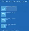
Below is a screenshot of my boot menu and the change color window.
 

Attachments

  • Enterprise.png
    Enterprise.png
    83.1 KB · Views: 695
  • Boot Menu3.png
    Boot Menu3.png
    24.6 KB · Views: 537
I'm currently running Enterprise x64 (Final Build 9200) and yes, they have removed Aero/Glass, somewhat, there is no transparency box to click on, but the slider will show some faint transparency in the Taskbar, but none in the windows. You will also notice that the window now resembles XP and there is no separation between the min/max/close tabs unless hovered over and then a color/box will be shown.
Still evaluating how it looks and feels, apps so far, no issue, the windows are boxy, maybe even 98 style, other than that at this point not much change from the RP version.
Below is a screenshot of my boot menu and the change color window.

Yup been running the RTM since release and you can 'trick' Windows 8 into a kind of Aero if you use the 'high contrast' trick but it's not the same and I have just got on with the new status quo. Besides from time to time, depending on my desktop picture, I would colour my task bar to match. So for me it's not such a huge loss.

[Video] How to enable Aero Glass in Windows 8 RTM
 
I liked transparency but, 'cute' as it is/was not having it is nothing terrible.

Drew
new_windows_logo1.jpg
 
While the glass effect is gone, the 3D acceleration is still functional. If you have a slew of HD desktop backgrounds, the desktop taskbar will change colors to match the overall color wheel of the image. The taskbar also remains semi-transparent and transparency effects still remain within Aero and the operating system, but control is not available for the level of this transparency, and it is obviously gone from application windows. Desktop Window Manager (DWM) is the 3D hardware accelerated GUI engine that the original Aero Glass theme was based on, and still exists in Windows 8. A quick check of Visual Studio 2012 for what are still being called Metro apps there shows that they want programmers to use Direct2D to create their own native user interfaces again, and not one based on the desktop. There is also an evidence, at least for Metro and Windows RT apps, of examples wanting developers in C# and Visual Studio to do the type of pre-interface you see on existing MS apps on the Start Screen, with the scroll left-to-right, with tiles within the app that lead to web-based content or their own Direct2D UI. One template is of two rows, and another of 3 rows of tiles and an index menu. It looks like the Windows Presentation Foundation (WPF) didn't work out for them and so they moved in favor of Direct2D design in Visual Studio. The version before RTM had no transparency effect at all on the taskbar, but it looks like they added just a bit before release. The window borders and titlebars have no doubt been unrounded and streamlined in favor of the tiled look. And yes, even the glass/chrome effect is gone on the taskbar so it is safe to say that some streamlining has taken place.

LOL, not a happy ending:

 
Last edited:
I liked being able to have my Taskbar 97% transparent, but, I'm beginning to like the change in color to match my slideshow themes.
Looks pretty good with some of my wallpaper/theme packs.

@ kemical, I tried that trick, close, but no cigar and it caused an issue when dragging a window, the menu bar or top portion of the window showed trails as it was being dragged, not sure if the trick had anything to do with it so, I went back to auto.
Still not to sure about the boxy look, but I'll get over it with time.

Don
 
For every resource that goes unused is some resource gained. It is quite possible, that to achieve similar benchmarks to Windows 7, some corners needed to be cut (quite literally), in order to facilitate the implementation of the Start Screen and its live app update/RSS news feed-style components. This is just a guestimate, as specific information as to how and why some features were truncated altogether has not been made entirely clear.

The official reason for the desktop change was that Aero was designed to highlight the app currently functioning in the foreground, and that the new style does this more effectively. Ultimately, another reason comes to mind. It is not so easy to move around titlebars and windows that have excessive transparency on them and in them, perhaps by default. Thus, the new Windows desktop theme tries to fit in with the "Start Screen" look and feel to some degree.

There can be no doubt in my mind that additional rounded edges for every window, in a 3D accelerated environment, ultimately add up after awhile. So, too, does transparency. There was a time when windows7forums.com used almost exclusive transparency on most of its content, and many users on slower computers complained of bad load times; not because of any server or connection difficulty but because of browser rendering in relation to disk I/O and video processor capabilities. Unless we hear it from a dev team member, or straight out of the horse's mouth, we may never know why the transparency and rounded edges were truncated to such a degree,

However, I imagine that this has taken place to make room for new features, to make the desktop easier on touch screens, and to one day, in the distant future, make the Start Screen as good as the desktop, or vice versa. Judging by some things I saw in early alpha builds, like the user profile picture and options appearing on the bottom right hand corner near the system tray, I suspect much experimenting went on with improving and/or streamlining the desktop. It is quite possible the choice was made, when resources are constrained in project management, to streamline the desktop and focus more on the Start Screen.

This is all conjecture, of course, but for Windows 8 to succeed in the marketplace, it must be known as its own beast. Re-using the exact same theme from the prior version of Windows would likely have elicited more protest than tinkering here and there for some minor changes to the desktop behavior. After all, it is Microsoft that has mandated the development of "Metro" or "Modern" apps, and not a renewed emphasis on thin-client, cloud-based services, and not necessarily traditional desktop applications.

I am left to find myself using the desktop more and more in Windows 8; conscious of the Start Screen's existence, and using it when necessary, but not finding it or its related applications (even third party ones) appealing. Many of the third party apps I have encountered are simply thin-client API versions of websites that are easier to navigate on tablet computers than in a web browser. I think the only exception to this, for me, may be the Kindle app, which I have tried to make some use of.

Basically, an application programming interface (API) is set up by the service provider (example: NBC-TV, Amazon, or ChaCha.com), and this allows for left-to-right and menu-based use of a pre-existing website that would not normally be intuitive on touch screen monitors. I find this to be deeply regrettable, since I am unlikely to find myself using a touch screen system that runs any version of Windows 8 any time soon. This is simply due to the realities that exist here, unless some client I haven't met yet goes on a buying spree.

The traditional mouse, keyboard, and desktop continues to work just fine for me, and my use of a "Metro" or "Modern" app like "Weather" or "Calendar" is something rare. In either case, I can just navigate to a bookmarked website and make the viewing and editing decisions I would like. I am unlikely to be highly motivated into a Windows Phone or tablet, since I am already using Android's Ice Cream Sandwich and Jellybean (Samsung Galaxy S3 and Nexus 7). I find these devices to be suitable for my consumer needs, while my real work and entertainment still takes place in a desktop environment, where instant access to reliable, productivity applications is just as necessary as it was during the Developer Preview and prior.
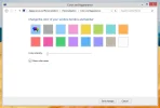
 
If you have the guts to do it, you can *cough* hack up the uxtheme and other dlls in Windows 8 just like you did in Windows 7 to get custom theming capability. I got my hands on the theme Microsoft put in the Windows 8 RP, and while there's no transparency, it's still better than what I would've gotten out of the RTM theme or high-contrast "glitch".
 
I really hated the thought of losing Aero for Win 8 but actually I got used to not having it in the first couple of days. That part of 8 isn't that unattractive. So I don't miss it now.
 
Back
Top