

The immaculate Windows desktop has become one of the most persistent productivity myths in personal computing: a nearly empty background, a minimalist taskbar, a meticulously curated Start menu, and every file filed away the moment it lands. It looks calm in screenshots. It can look even better in a desk-tour video. But for many Windows users, that carefully restrained setup fails the moment real work begins.
A more honest approach accepts that a desktop is not a showroom. It is an active workspace. Files arrive quickly, tasks are interrupted, reference material accumulates, and the next action often matters more than a perfect filing system. For people who spend their day jumping between documents, screenshots, browser windows, chat apps, code editors, PDFs, remote sessions, and creative tools, a deliberately messy Windows desktop can be faster, clearer, and more productive than a sparse one.
That does not mean surrendering to chaos. The best alternative to minimalist Windows setups is controlled visual density: keeping the information, applications, and temporary materials that matter most visible, while establishing just enough structure to prevent the desktop from becoming an archaeological dig. The result may not win a minimalism contest, but it can dramatically reduce friction in a real-world workflow.
Minimalist desktop advice usually starts from an appealing premise: remove distractions, reduce visual clutter, and make every item earn its place. In theory, fewer visible choices should make it easier to focus.
The problem is that this advice often confuses visual neatness with operational efficiency. A desktop can be pristine because nothing useful is there. It can also be full because it contains the exact shortcuts, files, reminders, and work-in-progress materials needed to move through the day quickly.
A clean desktop often relies on a rigid routine:
The minimalist model assumes every piece of information has a final destination from the moment it appears. Real work rarely behaves that way.
A downloaded installer may only need to remain visible until it is tested. A PDF may need to stay close at hand until a meeting ends. A folder of screenshots may be relevant for three days, then become irrelevant forever. Forcing each temporary item into a deep folder structure creates a small but repeated cost: the time required to decide where it belongs, move it there, and remember how to retrieve it later.
Those costs are easy to dismiss individually. Across a week, they become a recurring source of friction.
The better question is not, “Does this desktop look organized?” It is, “Can I find what I need at the moment I need it?”
A folder system asks users to remember several things:
This does not mean folders are obsolete. Long-term storage absolutely requires meaningful organization, especially for tax documents, customer records, development projects, family photos, legal files, and other material that must remain accessible months or years later.
But a working desktop and an archive serve different purposes.
A more practical Windows workflow lets active material remain visible. Once it loses immediate relevance, it can move into a project folder, cloud archive, external drive, or a dedicated “Sort Later” location.
This approach is not a rejection of organization. It is organization based on time horizon.
Visual placement matters. A user may keep current documents in one column, images on another side, shortcuts near the top, and temporary downloads at the bottom. Over time, those positions become familiar. The user does not have to read every filename; they remember roughly where an item lives.
That is not so different from a physical desk. Papers placed in a specific area can be easier to retrieve than papers filed away immediately, provided the workspace has recognizable zones.
This creates an informal spatial system that is difficult to replicate inside File Explorer. Folder trees are logical, but they are also abstract. A desktop layout can communicate status and urgency at a glance.
The key is not to let every item compete equally for attention. A functional desktop needs zones, even if those zones are loose rather than perfectly aligned.
A simple arrangement might look like this:
Of course, there is a limit. If every icon is equally important, none of them is. A desktop with hundreds of unrelated files, duplicate shortcuts, vague filenames, and abandoned downloads will stop functioning as a workspace.
The goal is not maximal disorder. It is visible relevance.
Windows supports taskbar pinning precisely because repeated access benefits from a fixed, visible location. A pinned taskbar can act as a personal launchpad, showing the software that is one click away and, when apps are running, the work that is already in progress.
For a heavy Windows user, a taskbar might reasonably include:
Place the applications used most often near the Start button or at the position your eye reaches first. Keep related tools together. For example, a browser, password manager, and communication app might form one cluster, while File Explorer, terminal, and editor form another.
Less frequently used but still valuable applications can drift toward the far side. This preserves access without forcing the most important tools to compete with occasional ones.
A practical order might be:
This is where intentionality matters. Do not pin every application you have ever found useful. Pin the apps that genuinely save time through constant visibility.
A useful rule is to periodically ask: Has this icon helped me avoid searching in the past two weeks? If the answer is no, unpin it.
A shortcut is not a duplicate file. It is a deliberately placed access point. It can reduce a seven-step navigation path to one click.
That matters when the destination is a deeply nested project folder, a shared network location, an internal web portal, a virtual machine, a script, a frequently used document, or a utility that does not deserve permanent taskbar space.
Use names that answer the question before the item is opened:
That is where lightweight tools such as Sticky Notes and the Windows Widgets board can make sense.
A pinned note can serve as a temporary command center: a phone number to call, an error code to investigate, a set of questions for a meeting, a list of files to send, or a reminder that needs to remain visible until it is handled.
Sticky Notes is not a full project-management system, and it should not be used as the only place to store critical long-term information. Its strength is immediacy. It keeps a small amount of context directly in the user’s field of view.
Good examples include:
The best widget setup remains selective. A panel full of attention-grabbing cards can become another distraction channel, especially if it includes a constant stream of news, sports updates, finance content, or promotional material.
Use widgets to answer recurring glanceable questions:
The biggest risk is that temporary material becomes permanent. Downloads linger for months, old installers consume space, duplicate files multiply, and confidential documents remain exposed on the desktop. What began as a practical staging area can become a security, privacy, and performance concern.
For users who present frequently, one of these approaches can help:
The answer is not a complete return to minimalism. It is a lightweight review process.
A five-minute reset at the end of the day or week can be enough:
A developer who lives in Windows Terminal, File Explorer, an IDE, documentation pages, and remote servers needs a different taskbar than a student working with PDFs, note-taking tools, Microsoft Word, and browser research. A photographer needs different desktop zones from an accountant. A help-desk professional needs different shortcuts from a video editor.
There is no universally correct desktop.
Then make adjustments based on evidence.
Ask these practical questions:
For some Windows users, that will mean a clean background with only a Recycle Bin icon. For others, it will mean folders in columns, a taskbar full of trusted tools, a visible note with today’s priorities, and an assortment of temporary files that reflect work still in motion.
The important distinction is between intentional mess and neglect. Intentional mess keeps active work visible, places tools where habit can find them, and clears material when its purpose ends. Neglect leaves everything in place indefinitely and eventually makes the system harder to use.
The ideal Windows desktop is not the one that looks best in a screenshot. It is the one that makes the next useful action feel obvious.
A more honest approach accepts that a desktop is not a showroom. It is an active workspace. Files arrive quickly, tasks are interrupted, reference material accumulates, and the next action often matters more than a perfect filing system. For people who spend their day jumping between documents, screenshots, browser windows, chat apps, code editors, PDFs, remote sessions, and creative tools, a deliberately messy Windows desktop can be faster, clearer, and more productive than a sparse one.
That does not mean surrendering to chaos. The best alternative to minimalist Windows setups is controlled visual density: keeping the information, applications, and temporary materials that matter most visible, while establishing just enough structure to prevent the desktop from becoming an archaeological dig. The result may not win a minimalism contest, but it can dramatically reduce friction in a real-world workflow.
 The Problem With the “Clean Desktop” Ideal
Minimalist desktop advice usually starts from an appealing premise: remove distractions, reduce visual clutter, and make every item earn its place. In theory, fewer visible choices should make it easier to focus.The problem is that this advice often confuses visual neatness with operational efficiency. A desktop can be pristine because nothing useful is there. It can also be full because it contains the exact shortcuts, files, reminders, and work-in-progress materials needed to move through the day quickly.
A clean desktop often relies on a rigid routine:
- Download a file.
- Rename it immediately.
- Move it into the correct folder.
- Close the app.
- Repeat without interruption.
The minimalist model assumes every piece of information has a final destination from the moment it appears. Real work rarely behaves that way.
A Desktop Is Often a Staging Area
The Windows desktop is not merely wallpaper with icons on it. For many users, it is a staging area between incoming work and long-term storage.A downloaded installer may only need to remain visible until it is tested. A PDF may need to stay close at hand until a meeting ends. A folder of screenshots may be relevant for three days, then become irrelevant forever. Forcing each temporary item into a deep folder structure creates a small but repeated cost: the time required to decide where it belongs, move it there, and remember how to retrieve it later.
Those costs are easy to dismiss individually. Across a week, they become a recurring source of friction.
The better question is not, “Does this desktop look organized?” It is, “Can I find what I need at the moment I need it?”
Recognition Beats Recall in Everyday Windows Use
One reason a visible, busier desktop can work so well is simple: people are generally better at recognizing an item in front of them than recalling a filename, a folder path, or an app location from memory.A folder system asks users to remember several things:
- Which project a file belonged to.
- What the file was called.
- Whether it was saved locally, in cloud storage, or in a shared folder.
- Whether it was renamed after downloading.
- Which version is the current one.
- How deeply nested the file is inside a directory structure.
This does not mean folders are obsolete. Long-term storage absolutely requires meaningful organization, especially for tax documents, customer records, development projects, family photos, legal files, and other material that must remain accessible months or years later.
But a working desktop and an archive serve different purposes.
Active Work Is Not the Same as Storage
A useful distinction is to separate files into three categories:- Active items: documents, screenshots, downloads, and shortcuts needed now or within the next few days.
- Reference items: materials used regularly but not constantly, such as templates, documentation, project folders, or recurring reports.
- Archive items: completed work and important records that need durable, logical storage.
A more practical Windows workflow lets active material remain visible. Once it loses immediate relevance, it can move into a project folder, cloud archive, external drive, or a dedicated “Sort Later” location.
This approach is not a rejection of organization. It is organization based on time horizon.
The Case for a Desktop That Looks Busy on Purpose
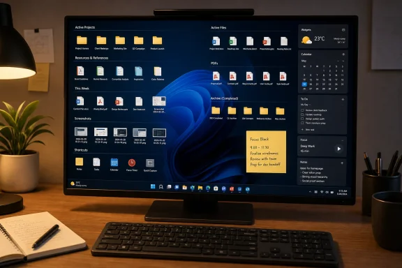
A desktop with 20, 30, or even more icons can look random to anyone who does not use that PC. To its owner, however, it may contain a rich map of priorities and habits.Visual placement matters. A user may keep current documents in one column, images on another side, shortcuts near the top, and temporary downloads at the bottom. Over time, those positions become familiar. The user does not have to read every filename; they remember roughly where an item lives.
That is not so different from a physical desk. Papers placed in a specific area can be easier to retrieve than papers filed away immediately, provided the workspace has recognizable zones.
Spatial Memory Has Real Value
Windows icons can become landmarks. The important invoice might be near the left edge beneath a project folder. The current screenshot batch might be on the right side. A temporary shortcut to a server share may sit near the top because it is only needed this week.This creates an informal spatial system that is difficult to replicate inside File Explorer. Folder trees are logical, but they are also abstract. A desktop layout can communicate status and urgency at a glance.
The key is not to let every item compete equally for attention. A functional desktop needs zones, even if those zones are loose rather than perfectly aligned.
A simple arrangement might look like this:
- Left side: current project documents and folders.
- Center area: temporary files that need action soon.
- Right side: screenshots, images, and visual assets.
- Top row: critical shortcuts and frequently opened folders.
- Bottom corner: low-priority items awaiting review or cleanup.
“Clutter” Can Carry Useful Context
The word clutter suggests uselessness, but visible items can communicate context. A desktop full of open tasks tells a user what is in motion. A pile of screenshots may indicate an unfinished troubleshooting case. A group of PDFs may signal research still underway.Of course, there is a limit. If every icon is equally important, none of them is. A desktop with hundreds of unrelated files, duplicate shortcuts, vague filenames, and abandoned downloads will stop functioning as a workspace.
The goal is not maximal disorder. It is visible relevance.
A Full Taskbar Can Be a Productivity Tool
The same principle applies to the Windows taskbar. A sparse taskbar looks elegant, but it can force users into repeated searches, keyboard shortcuts they may not remember, or Start menu navigation for applications they open constantly.Windows supports taskbar pinning precisely because repeated access benefits from a fixed, visible location. A pinned taskbar can act as a personal launchpad, showing the software that is one click away and, when apps are running, the work that is already in progress.
For a heavy Windows user, a taskbar might reasonably include:
- A web browser.
- File Explorer.
- An email client.
- A messaging platform.
- A password manager.
- A text editor or code editor.
- A screenshot utility.
- A note-taking app.
- A media player.
- A virtualization or remote-desktop tool.
- A terminal.
- A project-management client.
- Frequently used Microsoft 365 apps.
- A creative application such as Photoshop, DaVinci Resolve, or Audacity.
Arrange the Taskbar by Habit, Not Alphabetically
The most effective taskbar organization is rarely alphabetical. It should reflect movement and frequency.Place the applications used most often near the Start button or at the position your eye reaches first. Keep related tools together. For example, a browser, password manager, and communication app might form one cluster, while File Explorer, terminal, and editor form another.
Less frequently used but still valuable applications can drift toward the far side. This preserves access without forcing the most important tools to compete with occasional ones.
A practical order might be:
- Core navigation: File Explorer, browser, search tools.
- Communication: email, chat, meeting software.
- Production: office apps, editors, design tools, terminals.
- Utilities: screenshots, media tools, remote access, system utilities.
- Occasional apps: specialized software that is useful but not opened daily.
The Limits of Taskbar Density
A crowded taskbar can also become counterproductive. Windows may combine multiple windows under one application button, and icons can become harder to distinguish when there are too many of them. On smaller displays, a long pinned list can create the same visual overload that minimalist setups are trying to avoid.This is where intentionality matters. Do not pin every application you have ever found useful. Pin the apps that genuinely save time through constant visibility.
A useful rule is to periodically ask: Has this icon helped me avoid searching in the past two weeks? If the answer is no, unpin it.
Desktop Shortcuts Are Not a Sign of Failure
Shortcuts are often treated as evidence that someone has failed to organize their files correctly. That view misunderstands what shortcuts are for.A shortcut is not a duplicate file. It is a deliberately placed access point. It can reduce a seven-step navigation path to one click.
That matters when the destination is a deeply nested project folder, a shared network location, an internal web portal, a virtual machine, a script, a frequently used document, or a utility that does not deserve permanent taskbar space.
Use Shortcuts for Destinations, Not Everything
The strongest shortcut strategy focuses on high-value destinations:- Current project folders.
- Shared team folders.
- A client or department portal.
- A recurring spreadsheet or report.
- A Remote Desktop connection.
- A PowerShell, Windows Terminal, or batch-file workflow.
- A development repository.
- A frequently used template.
- An active support or troubleshooting folder.
- A local folder for screenshots, exports, or recordings.
Shortcut Names Matter More Than People Think
A desktop shortcut should use a name that explains its destination immediately. “Project,” “New Folder,” and “Document (2)” are not useful labels when the desktop gets busy.Use names that answer the question before the item is opened:
ClientA_WeeklyReportsScreenshots_ToSendVPN_TestServerExpenseTemplateWebsite_StagingMeeting_Notes_Current
Sticky Notes and Widgets Can Turn the Desktop Into a Dashboard
A productive Windows desktop does not have to consist solely of files and application icons. It can also display the information most likely to prevent a needless search.That is where lightweight tools such as Sticky Notes and the Windows Widgets board can make sense.
A pinned note can serve as a temporary command center: a phone number to call, an error code to investigate, a set of questions for a meeting, a list of files to send, or a reminder that needs to remain visible until it is handled.
Sticky Notes is not a full project-management system, and it should not be used as the only place to store critical long-term information. Its strength is immediacy. It keeps a small amount of context directly in the user’s field of view.
Keep Notes Short and Actionable
The risk with any visible note is habituation. If a Sticky Note becomes a dense wall of text, it turns into background noise. The best notes are brief and action-oriented.Good examples include:
Send revised PDF before 3 PMTest printer driver on laptopAsk IT about VPN certificateCheck screenshot labelsCall back after meeting
Widgets Work Best as Passive Information
Windows widgets can provide quick visibility into time-sensitive information such as weather, calendar events, headlines, watchlists, or other app-provided updates. Their value is not that they replace dedicated applications. Their value is that they may prevent the user from opening those applications in the first place.The best widget setup remains selective. A panel full of attention-grabbing cards can become another distraction channel, especially if it includes a constant stream of news, sports updates, finance content, or promotional material.
Use widgets to answer recurring glanceable questions:
- What is on the calendar next?
- Is bad weather approaching?
- Is there an important alert?
- What information should be noticed before opening another app?
The Risks of Embracing Controlled Chaos
A messy desktop is not automatically productive. It works only when the mess has a purpose and a cleanup boundary.The biggest risk is that temporary material becomes permanent. Downloads linger for months, old installers consume space, duplicate files multiply, and confidential documents remain exposed on the desktop. What began as a practical staging area can become a security, privacy, and performance concern.
Privacy and Shared-Screen Concerns
Desktop visibility matters more than ever in hybrid work. A file name that seems harmless on a personal machine can be awkward during screen sharing. Sensitive financial records, customer data, passwords stored in text files, HR documents, or private screenshots should never sit openly on a desktop likely to appear in a meeting.For users who present frequently, one of these approaches can help:
- Use a separate Windows virtual desktop for presentations.
- Create a dedicated presentation folder with only safe materials.
- Hide desktop icons temporarily before sharing.
- Use a separate work account or Windows profile.
- Keep confidential material in protected folders rather than on the desktop.
- Review the desktop before joining a meeting with screen sharing enabled.
A Cluttered Desktop Can Mask Urgent Work
Another risk is visual saturation. If unfinished tasks, completed tasks, reference files, shortcuts, and discarded downloads all occupy the same space, it becomes difficult to distinguish what needs attention today.The answer is not a complete return to minimalism. It is a lightweight review process.
A five-minute reset at the end of the day or week can be enough:
- Delete obvious junk and duplicate downloads.
- Move completed project materials to their long-term folder.
- Rename vague files that are still active.
- Review Sticky Notes and remove completed items.
- Keep only current shortcuts visible.
- Archive or delete old screenshots and exports.
- Clear the “sort later” zone before it becomes permanent storage.
Building a Windows Workspace Around Your Actual Behavior
The most valuable lesson is that a Windows setup should match the user’s habits rather than conform to a generic productivity aesthetic.A developer who lives in Windows Terminal, File Explorer, an IDE, documentation pages, and remote servers needs a different taskbar than a student working with PDFs, note-taking tools, Microsoft Word, and browser research. A photographer needs different desktop zones from an accountant. A help-desk professional needs different shortcuts from a video editor.
There is no universally correct desktop.
Start With Observation, Not Rules
Instead of immediately reorganizing everything, observe the workflow for a few days. Notice what gets searched for repeatedly. Notice which folders are opened again and again. Notice what remains on the desktop because it is genuinely active rather than because it was forgotten.Then make adjustments based on evidence.
Ask these practical questions:
- Which apps do I open daily?
- Which folders do I navigate to repeatedly?
- Which files must remain visible until a task is finished?
- Which desktop items have been untouched for a month?
- What information do I keep looking up?
- What causes the most repetitive clicking?
- Which tools create distraction instead of reducing it?
A Sensible Baseline Configuration
For many users, a balanced Windows desktop setup might include:- A moderately populated taskbar with genuinely frequent apps.
- Desktop shortcuts to active projects and repeated destinations.
- A visible but controlled area for temporary files.
- A separate folder for downloads that need later sorting.
- One or two short Sticky Notes for immediate reminders.
- Selective widgets for information worth seeing at a glance.
- A recurring cleanup routine rather than constant micro-organization.
- A privacy plan for screen sharing and sensitive documents.
Productivity Is Not an Interior Design Style
The pressure to maintain an empty desktop comes partly from the idea that a tidy screen signals discipline. But productivity is not a visual performance. A desktop should be judged by whether it helps its owner complete work accurately, quickly, and with less cognitive overhead.For some Windows users, that will mean a clean background with only a Recycle Bin icon. For others, it will mean folders in columns, a taskbar full of trusted tools, a visible note with today’s priorities, and an assortment of temporary files that reflect work still in motion.
The important distinction is between intentional mess and neglect. Intentional mess keeps active work visible, places tools where habit can find them, and clears material when its purpose ends. Neglect leaves everything in place indefinitely and eventually makes the system harder to use.
The ideal Windows desktop is not the one that looks best in a screenshot. It is the one that makes the next useful action feel obvious.
References
- Primary source: How-To Geek
Published: 2026-07-22T21:00:13+00:00
Loading…
www.howtogeek.com - Official source: learn.microsoft.com
Customize the Windows 11 Taskbar | Microsoft Learn
Customize the Windows 11 Taskbarlearn.microsoft.com