
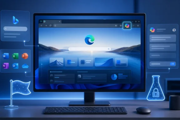
 Overview: A Small Icon With a Larger Product Message
A new toolbar icon is hardly a headline-grabbing browser feature on its own. It will not make web pages load faster, strengthen tracking protection, improve tab management, or suddenly transform Copilot’s answers. Yet in a browser increasingly built around AI-assisted browsing, the icon that launches Copilot has become one of the most strategically important pixels in the Edge interface.
Microsoft’s reported internal test is specifically described as a Copilot icon refresh, not a newly announced Copilot capability. The redesigned icon is not currently exposed to the public, which means there is no reliable public visual to assess and no basis for declaring that a particular color, shape, animation, or placement is final. The original Canary finding is therefore best understood as evidence of active work—not as confirmation of a pending public release.
That distinction matters. Edge users often encounter references to experimental switches, feature IDs, and hidden entries in edge://flags, then assume that enabling a flag will unlock a finished feature. In this case, the report says the flag is backed by an internal configuration that consumer Canary users do not receive, so toggling it currently produces no visible result. WinCentral notes that the setting remains inaccessible outside Microsoft’s internal environment.
The more meaningful development is what the experiment indicates about Microsoft’s priorities. The company is not treating Copilot as a detachable sidebar or an optional service with a separate identity. It is continuing to make Copilot a primary visual and functional layer inside the Edge browsing experience.
Why the Edge Copilot Icon Matters More Than It Seems
An icon is an interface promise. It tells users where an action starts, suggests what will happen after a click, and forms a repeated visual cue in a browser used all day. When that icon belongs to an AI assistant, it also communicates how central that assistant is meant to be.
In Edge, Copilot is already positioned as a contextual companion available while users browse. Microsoft’s support documentation describes Copilot in Edge as accessible through the Copilot icon in the toolbar, where it can answer questions about the current page, summarize material, and help users continue tasks without leaving the active tab. Microsoft’s Copilot in Edge guide makes clear that this toolbar entry point is not decorative: it is one of the principal ways Microsoft expects users to access AI assistance in the browser.
That gives the icon two jobs:
- It must remain recognizable at a glance among bookmarks, extensions, profiles, settings, and other browser controls.
- It must visually align with the wider Microsoft Copilot family, so users understand that Edge’s AI features belong to the same product universe as Copilot experiences in Windows, Microsoft 365, and the web.
The second requirement has become increasingly important as Microsoft has broadened the Copilot brand. The Microsoft 365 app itself was renamed Microsoft 365 Copilot, and Microsoft says its name and icon rollout began in January 2025 across Windows, web, and mobile endpoints. Microsoft’s transition documentation explicitly frames the new name and icon as a reflection of Copilot’s deeper integration into the productivity suite.
A refreshed Edge icon would fit that pattern. It would not merely modernize a button; it would make Edge look like another native surface for the same AI product.
Branding consistency is now a usability issue
Visual consistency is often dismissed as cosmetic work, but consistent branding can reduce friction in complex software ecosystems. When the same product name, iconography, colors, interaction cues, and vocabulary appear across applications, users spend less time asking whether they are opening a different service or a familiar one in a different context.
Microsoft has made that argument in its own recent release documentation. A Microsoft 365 Copilot release note says Edge is receiving a “modern, unified, and updated” Copilot visual design intended to align with other Microsoft AI surfaces. The listed changes include spacing, corners, fonts, and default colors, with Copilot and Bing named as comparison points. Microsoft’s Microsoft 365 Copilot release notes describe this as a move toward a more unified AI experience.
Against that background, a Copilot icon refresh in Edge looks less like an isolated test and more like a final-mile branding exercise. Once interface geometry, typography, colors, and panels move toward a shared design language, a mismatched launch icon becomes conspicuous.
What the Hidden Flag Does—and Does Not—Tell Us
The reported internal-only flag is meaningful, but it has strict evidentiary limits. It indicates that Microsoft has code and configuration work associated with a Copilot icon refresh. It does not confirm the exact final artwork, the intended release channel, a deployment date, or even a guaranteed public rollout.
That may sound cautious, but it is the proper way to read pre-release browser evidence. Feature flags frequently exist before the feature is complete, while an experiment is gathering data, or while different designs are being compared internally. The fact that a flag is present does not automatically mean the code path is ready for broad activation.
Microsoft’s documentation on Edge configurations and experimentation offers useful context. Edge communicates with the company’s Experimentation and Configuration Service to receive configurations, feature rollouts, and experimental payloads. Microsoft Learn’s Edge experimentation documentation explains that feature configurations can be used to enable or disable behavior, including disabling a feature when a bug is identified.
The same documentation distinguishes between two important deployment models:
- Controlled Feature Rollout (CFR): Microsoft gradually expands a feature to a randomly selected user population, allowing comparison with a control group that does not receive the feature.
- Experiments: Smaller-scale tests of concepts still in development, typically hidden by default until the test is rolled out or concluded. Microsoft’s explanation of CFR and Edge experiments confirms that experiment flags can control whether such in-development features are enabled.
This architecture explains why a visible switch may not be enough. A local interface for a flag can exist while the server-side configuration, eligibility criteria, assets, or associated feature implementation remain unavailable to the broader Canary audience.
Internal-only access is a useful signal, not a release promise
The report’s most important technical detail is that the Copilot icon refresh remains restricted to Microsoft internal machines and employees. WinCentral reports that consumer Canary builds do not display a change even if the flag is enabled.
That restriction suggests the test is still at a stage where Microsoft wants more control over the participant pool. Internal deployment can help validate whether the icon is legible at common display scales, distinguishable in light and dark themes, compatible with accessibility modes, properly localized in surrounding UI, and visually coherent with other Edge toolbar assets.
It can also help answer more subjective questions:
- Does the icon look too similar to another toolbar button?
- Is its visual weight too strong or too weak beside extension icons?
- Does it clearly communicate Copilot rather than a generic Microsoft service?
- Does it feel recognizable to people who have encountered Copilot in other applications?
- Does it preserve adequate contrast in high-density and high-contrast environments?
Those are not trivial matters. A browser toolbar gives every control very little room to make its purpose understood. A redesign that looks elegant in a presentation could still fail if it is difficult to identify in a crowded everyday browser profile.
Understanding the Edge Canary Pipeline
The phrase “Edge Canary” often creates the impression that everything visible there is about to arrive in the mainstream browser. That is not how Microsoft’s channel structure works.
Microsoft describes Canary as its daily-updated, bleeding-edge Edge channel. It is designed for the newest investments and may develop problems precisely because it receives changes before the Dev, Beta, and Stable channels. Microsoft’s Edge channel overview advises that Canary users may want another channel installed alongside it because instability can occur over time.
Microsoft currently characterizes the channels this way:
| Channel | Primary role | Update rhythm |
|---|---|---|
| Canary | Earliest, bleeding-edge testing | Daily |
| Dev | Planning and early development validation | Weekly |
| Beta | Representative pre-release validation | Approximately every two weeks |
| Stable | Broad public deployment | Approximately every two weeks |
These roles and cadences are documented in Microsoft’s Edge channel guidance.
The internal Copilot icon test is earlier still. It has been spotted in Canary-related code or configuration, but it is not exposed to the general Canary population. That puts it outside the normal “download Canary and try it” expectation.
The likely path—if Microsoft ships it
If the design survives internal validation, the probable journey would be familiar:
- Internal Microsoft testing evaluates the artwork, behavior, compatibility, and user feedback.
- A small controlled experiment may reach a limited segment of Canary users.
- A broader Canary activation could follow if no major issues emerge.
- Dev and Beta testing would provide more structured validation.
- Stable rollout would happen only after Microsoft is comfortable with the design and any connected UI changes.
However, this is a likely workflow, not a confirmed roadmap. The report offers no date and no Microsoft announcement has committed to a public release schedule for the revised icon. WinCentral’s coverage correctly frames the work as an early preview rather than a promised feature.
Even after a feature reaches Stable, Edge can distribute it progressively rather than enabling it for every user at once. Microsoft says its gradual rollout process lets the company monitor update health while limiting the impact of defects before the change reaches the full population. Microsoft’s documentation on progressive Edge rollouts notes that staged deployments are designed to reduce the risk of widespread issues.
The Broader Copilot-First Direction for Edge
The icon experiment arrives as Edge evolves beyond a conventional browser with a bolt-on chat panel. Microsoft increasingly presents the browser as a place where browsing, searching, enterprise content, AI chat, and guided action intersect.
For work users, Microsoft says Copilot in Edge can offer contextual assistance without requiring the user to leave the current page. The product also has a Copilot new-tab-page experience that can combine search, chat, calendars, recent files, work cards, and suggested prompts in one view. Microsoft’s Edge support guide describes these as integrated browser experiences rather than separate websites.
Microsoft is also testing more agentic browser scenarios. Its documentation says Browse with Copilot can navigate and complete browser actions when explicitly instructed, while providing visible indicators such as a cursor in the tab heading and a blue hue around the active tab. Microsoft’s description of Browse with Copilot states that the feature does not access saved passwords or payment methods and pauses for confirmation on sensitive actions.
This makes a recognizable Copilot identity more consequential. As the assistant moves from answering questions to surfacing contextual information, summarizing pages, accessing approved work context, and potentially carrying out user-directed browsing tasks, it needs a clear visual presence that does not leave users guessing which system is active.
Visual indicators and trust
The potential icon refresh should also be viewed through a trust lens. AI-assisted browsing brings useful capabilities, but it can also make the boundary between passive interface and active assistant less obvious. Clear icons, labels, tab treatments, consent prompts, and status cues are part of how software communicates control.
Microsoft’s work-oriented Edge documentation says users may receive a consent dialog before Copilot accesses page content, unless organizational policy has explicitly enabled or disabled that access. Microsoft’s documentation on Copilot data and consent in Edge also states that Data Loss Prevention protections can prevent Copilot from accessing or summarizing protected pages and PDFs.
In other words, interface design is tied to governance. A new icon should not only fit the Copilot brand; it should continue to make the feature’s scope, status, and activation point intelligible.
Strengths of the Potential Redesign
The strongest case for a refreshed Copilot icon is not novelty. It is coherence.
A clearer cross-product identity
Microsoft has a sprawling product portfolio, and Copilot now appears in many of its most-used services. A more consistent icon across Edge, Microsoft 365, and other Microsoft AI experiences could give users a more reliable mental model of where Copilot is available and what it represents.
That consistency is especially valuable for organizations that deploy Microsoft 365 Copilot across multiple environments. Microsoft itself says Edge’s updated Copilot look is intended to make the experience more familiar and easier to navigate across its AI products. The Microsoft 365 Copilot release notes identify cross-surface familiarity as a personal benefit of the broader visual refresh.
Better alignment with Edge’s current interface work
A redesigned launch icon can make sense when it arrives alongside changes to fonts, spacing, color, and surface styling. If Edge is being tuned to resemble the rest of Microsoft’s AI interface family, retaining an older Copilot mark could undermine the consistency of those broader adjustments.
This is a sensible moment for Microsoft to conduct the test. A small icon change is easier to evaluate while the larger design system is still being shaped than after every screenshot, internal training deck, support article, and enterprise guide has settled around a different visual language.
Potential accessibility gains
There is no public evidence yet that accessibility is the explicit objective of the new icon. Still, internal testing creates an opportunity to improve contrast, distinguishability, sizing, focus treatment, and recognition at high display scaling.
For Windows users who run high-DPI monitors, browser zoom, compact toolbars, dark themes, or accessibility-oriented display configurations, a logo refresh can be beneficial if it produces a more distinct and better-balanced visual target. Microsoft should ensure any final change is judged on those practical conditions rather than only on marketing mock-ups.
Risks: When “Unified” Starts to Feel Overbearing
The risks are equally clear. Microsoft has spent years making Copilot more prominent in Windows and Edge, and some users may see another branding change as further evidence that the company is prioritizing AI visibility over browser calm.
Recognition can be lost during a redesign
A new icon can improve consistency while making an existing shortcut less recognizable in the short term. Users often develop muscle memory around toolbar location and visual shape. If the refreshed mark departs too sharply from the current design, habitual Edge users may briefly overlook it or mistake it for an extension, account control, or a different Microsoft service.
This is not an argument against change. It is an argument for continuity: preserve enough of the existing visual identity that a user who already knows where Copilot lives in Edge can still find it instantly.
Visual prominence should not become pressure
An icon that is clearer is a win. An icon that dominates the toolbar, glows unnecessarily, or competes with essential browser controls is not. The best design outcome would be one that makes Copilot easy to identify for people who want it without making the rest of Edge feel like an advertising surface for AI.
That concern is sharper in enterprise environments. Organizations often value a predictable, low-distraction interface and need clear separation between work tools, personal services, extensions, profiles, and managed browser features. Microsoft’s own documentation emphasizes that work Copilot respects tenant controls, Enterprise Data Protection, and organizational policy. Microsoft’s security and policy overview for Copilot in Edge A visual refresh should reinforce that professional clarity rather than blur product boundaries.
Screenshots, documentation, and support costs
Microsoft’s release notes explicitly advise organizations to update screenshots and internal training material when Edge’s visual design changes. Microsoft’s release notes for the unified Edge Copilot appearance recognize that design refinements can create documentation debt, even when functionality remains the same.
For a single icon, that cost is modest. But businesses that maintain self-service support portals, onboarding videos, service-desk scripts, browser standards guides, or regulated workflow instructions may need to revise materials. The larger the Copilot redesign becomes, the more that small visual changes accumulate.
What Edge Users Should Expect Next
The most realistic expectation is patience. The icon refresh is not currently a feature for ordinary Edge Canary testing, and there is no published release schedule. The report that surfaced the flag provides no commitment that it will move into Canary, Dev, Beta, or Stable.
Users should also avoid treating hidden configuration switches as a reliable way to force unreleased interface changes. Edge’s experimentation model depends on centrally delivered payloads, not simply on what a local settings page happens to expose. Microsoft’s Edge experimentation documentation confirms that the browser receives configurations, rollouts, and experiment values through its service infrastructure.
For IT administrators, there is no immediate deployment action attached to this discovery. The more useful preparation is procedural:
- Keep internal Edge screenshots and how-to material easy to update.
- Monitor official Edge and Microsoft 365 Copilot release documentation for broader UI changes.
- Maintain a pilot group on Beta or other appropriate preview channels when evaluating browser changes.
- Make sure employees know the functional location of Copilot in Edge, rather than relying exclusively on a particular icon appearance.
- Review Copilot data-access and policy settings independently of branding changes.
Microsoft recommends a multi-channel testing strategy for organizations that need to validate browser behavior before broad deployment, with Beta serving as a representative preview population and Dev or Canary available for more fluid testing needs. Microsoft’s Edge deployment guidance supports that layered approach.
Conclusion
Microsoft’s secret Edge Canary test is a minor visual development with outsized strategic meaning. The company appears to be preparing a refreshed Copilot icon, but the design is still internal-only, currently unavailable to normal Canary users, and not attached to a public rollout date. The initial report should be read as an early sign of active product work, not a promise that the change will ship unchanged.
Still, the test fits cleanly into a visible pattern. Microsoft is already updating Edge’s Copilot interface to align its spacing, colors, fonts, and general look with other Microsoft AI products. Microsoft’s published release notes make that broader visual unification explicit. A refreshed icon would be a natural extension of that effort.
The best final result would be understated: an icon that is instantly recognizable, accessible, consistent with Microsoft’s broader Copilot identity, and prominent enough to find without overwhelming the browser. If Microsoft gets that balance right, the change will feel less like another AI push and more like a polished correction to an interface that increasingly treats Copilot as part of Edge’s core experience.
Update: Refreshed Copilot icon briefly appears, then vanishes from Edge Canary (August 4, 2026)
The redesigned Copilot icon has reportedly moved beyond an internal-only configuration: according to WinCentral, it briefly appeared in a recent Microsoft Edge Canary build before Microsoft removed it in a subsequent update. That rollback suggests the asset may have been enabled prematurely rather than formally released for testing.
WinCentral also reports that the same new icon was spotted inside Microsoft 365, based on an image shared by observer @minto494. Its appearance in both Edge and Microsoft 365 provides more concrete evidence that Microsoft is preparing one visual identity for Copilot across products.
For users and administrators, the removal means there is still no dependable preview feature to enable or a rollout timetable to plan around. But unlike the earlier hidden-flag discovery, this sighting indicates that the refreshed artwork has at least reached visible pre-release surfaces—albeit briefly.
