
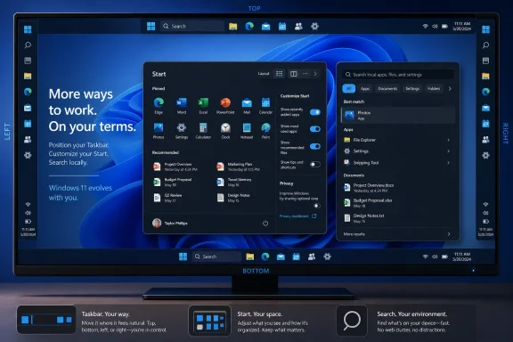
 Overview: A Windows 11 Update About Choice Rather Than Spectacle
For much of Windows 11’s life, Microsoft has treated the desktop shell as a relatively fixed design. Centered icons, a bottom-only Taskbar, a constrained Start menu, and search results frequently mingling local content with web and Store material created a consistent interface—but not necessarily one that worked for every user.
The 2026 Windows quality initiative signals a different emphasis. Microsoft has explicitly tied its work to performance, reliability, “craft,” reduced distraction, and more opportunities for personalization, including changes to Start, Taskbar, and search behavior. Microsoft’s March quality roadmap framed the work as an effort to make core Windows interactions more responsive, dependable, and controllable rather than simply adding another layer of visual novelty.
That is significant because these are not niche settings aimed only at power users. A Taskbar position affects how every application window is managed. Start determines how people launch software and retrieve recent work. Search decides whether a quick keyboard query ends in a file, a setting, a web page, or an unwanted recommendation.
Microsoft is not promising to recreate Windows 10 wholesale. There is no indication of freeform Start-menu resizing, a classic live-tile interface, or a broad restoration of every legacy shell behavior. But the upcoming Windows 11 update does acknowledge a core lesson from the platform’s first years: a clean default is not a substitute for user agency.
The Taskbar Returns to the Edges of the Screen
The single most consequential 26H2-era Taskbar change is also one of the simplest to explain: Windows 11 is restoring the ability to place the Taskbar at the top, bottom, left, or right edge of the display. Microsoft began rolling out the capability to Windows Insiders in its Experimental channel in May, describing it as one of the most requested Windows 11 features. Microsoft’s Taskbar announcement confirms that the setting is available through Settings > Personalization > Taskbar > Taskbar behaviors.
This is a reversal of one of Windows 11’s most criticized desktop decisions. Previous Windows releases allowed users to drag or configure the Taskbar around the display, while Windows 11 initially limited the bar itself to the bottom edge, even if its icons could be aligned left or center. The distinction mattered: moving icons left is not remotely the same as moving the entire workspace control surface to the side or top.
Why Taskbar placement still matters
Taskbar position is not just an aesthetic preference. It can influence productivity, ergonomics, and the effective usable area of a display.
A vertical Taskbar can be particularly useful on wide monitors, where horizontal screen real estate is abundant but vertical room is scarce. Developers working in code editors, writers using document windows, and users monitoring long lists can reclaim some vertical space by moving the Taskbar to a side. Microsoft specifically highlights the value of side placement for users who want to see more code or content vertically. Its Insider post also notes that vertical layouts can make separate application windows easier to distinguish when labels are enabled.
The new implementation is designed to adapt the surrounding shell rather than simply rotating the old bottom Taskbar. When the bar is placed at the top, for example, Start and related flyouts open downward from that edge. On side-mounted Taskbars, users can choose either a centered or top-aligned icon layout; on top and bottom placements, the choice is left-aligned or centered. Microsoft’s feature description makes clear that these alignment options apply to each placement.
For users who keep numerous windows open, Windows 11’s existing Never combine Taskbar mode becomes more valuable in this context. On a vertical Taskbar with labels enabled, each open window can occupy its own labeled entry instead of being collapsed behind a single application icon. That is familiar territory for users of earlier Windows versions and a welcome alternative to the ambiguity of icon-only switching. Microsoft’s May announcement describes this as a supported workflow for alternate Taskbar positions.
Smaller Taskbar, smaller compromise
Alongside relocation, Windows 11 is gaining a smaller Taskbar option. The setting reduces both Taskbar height and icon size, reclaiming screen space on laptops, compact displays, and workflows where every vertical pixel counts. It is configured from the same Taskbar behaviors page through Show smaller taskbar buttons, with the compact view enabled when the option is set to “Always.” Microsoft’s Experimental build notes state that Start, Search, and the system tray scale with the smaller bar to keep the interface aligned.
This is a sensible addition, but it is not the same as a fully user-defined Taskbar height control. Microsoft is offering a binary-style choice between its standard spacious design and a more compact version, not a slider or arbitrary sizing system. For many users, that will be enough. For those who want a Taskbar tuned precisely around a high-DPI display, an ultrawide monitor, or a specialized workstation setup, the control may still feel constrained.
The decision nevertheless reflects an important shift. Windows 11’s default Taskbar was intentionally roomy, in part to accommodate touch-oriented interaction. That can be helpful on tablets and convertibles, but a desktop PC with a mouse and keyboard does not always benefit from consuming more screen height for larger touch targets. Microsoft acknowledges that tension directly, explaining that the compact option is meant for situations where usable space is more important than the default layout’s larger footprint. The company’s Taskbar post positions the change as a way to recover vertical space without altering the standard default.
Early limitations matter
The return of alternate Taskbar positions should not be mistaken for complete parity with the bottom layout on day one. Microsoft lists several limitations in the current Insider implementation:
- Auto-hide is not yet supported when the Taskbar is in an alternate position.
- The tablet-optimized Taskbar is also not yet supported in those positions.
- Touch gestures have been a work in progress during testing.
- A full Search box is not yet supported in alternate placements; Windows uses a Search icon instead.
- Microsoft is still evaluating capabilities such as different Taskbar positions for different monitors and drag-and-drop refinements. Microsoft’s detailed status update outlines these limitations and pending considerations.
That list is more than a footnote. It illustrates the difficulty of restoring a mature desktop feature after years of architectural change. A movable Taskbar touches hit targets, animations, notifications, app switching, display configuration, touch behavior, and flyouts. Microsoft is right to treat it as more than a simple switch.
Still, the risk is obvious: if alternate positions reach broad availability with noticeably reduced functionality, some users may conclude that the feature has returned only in a partial form. The best outcome for 26H2 is not merely that a side Taskbar exists, but that it feels like a first-class Windows configuration rather than an experimental exception.
Start Menu: More Control, Less Forced “Recommendation”
Windows 11’s Start menu is receiving the most substantial wave of customization since the operating system launched. The changes are not a return to the Windows 10 layout, but they address recurring complaints about unused sections, recent-content controls, and the inability to make Start consistently fit a preferred workflow.
Microsoft’s new direction is built around section-level control. Users will be able to independently show or hide the Pinned, Recommended, and All areas. The company says these controls are intended to make it possible to build anything from a minimal pinned-app launcher to a fuller Start menu containing app lists and recently used material. Microsoft’s Start menu rollout post describes the forthcoming toggles as one-control-per-section settings.
A Start menu that can finally be shaped
The value here is practical. Plenty of Windows users want Start to be a clean application launcher. Others treat it as a recent-work hub. Some need a readily available All apps view, while others prefer to search rather than browse. The old Windows 11 approach assumed a more uniform usage pattern than the Windows audience actually has.
With the new controls, a user who wants a pins-only Start menu can turn off the other sections. A user who wants a more traditional directory-like experience can retain All apps. Someone who values recent documents but dislikes the pinned grid can adjust differently. The interface becomes more modular without requiring registry edits, third-party shell replacements, or a choice between all-or-nothing settings.
This matters for Windows enthusiasts, but it matters just as much for ordinary office PCs. A tidier Start menu reduces cognitive friction. It can make a shared workstation less distracting, a family PC easier to navigate, and a managed device less prone to showing irrelevant content to the wrong person.
“Recommended” becomes “Recent”
Microsoft is also renaming the Recommended section to Recent. The change may seem cosmetic, but it better communicates what the section is supposed to do: surface recently used files and recently installed applications rather than present a vaguely algorithmic set of suggestions. Microsoft’s official explanation says the new name is intended to reflect that the section primarily contains recent files and newly installed apps.
The company is also promising improvements to file relevancy and ordering, aiming to remove less useful entries and make the content better reflect current work. That is the correct priority. Recent lists are only valuable when they are genuinely recent, contextually relevant, and predictable enough to build trust.
However, the retention of recently installed app promotion deserves scrutiny. Microsoft says keeping new apps visible is important for both users and developers, particularly alongside the Microsoft Store. The same Start menu announcement confirms that recently installed apps will remain visible. This is understandable from a discoverability standpoint, but it also means the “Recent” section may still feel less purely user-controlled than its new name suggests.
The mitigation is choice. If the section can be hidden completely, and if file recommendations can be managed separately, Microsoft has given users a reasonable escape hatch. The test will be whether those controls remain easy to find and whether policy-managed business devices receive equally clear administrative options.
Separating Start recommendations from recent files elsewhere
One of the more thoughtful improvements is the planned separation between file recommendations in Start and recent-content features elsewhere in Windows. Today, turning off Recommended content in Start can affect Jump Lists and recent-file behavior in File Explorer. Microsoft says the upcoming control will let users disable file recommendations in Start without disabling recent files throughout the rest of the desktop. Microsoft’s May 2026 details confirm that this decoupling is part of the update.
That is a quality-of-life change with outsized benefits. Users should not have to sacrifice useful recent-document history in File Explorer or application Jump Lists simply because they do not want sensitive files appearing in Start. The prior linkage blurred two distinct preferences: whether Windows should remember recent work and where Windows should display it.
For organizations, this distinction is equally valuable. IT administrators may want users to retain normal productivity features while limiting incidental exposure of file names during presentations, demonstrations, or desk-side support sessions. A better separation of settings makes that policy conversation more precise.
Start size options and privacy on shared screens
Windows 11 is also adding explicit Start menu size choices: Small, Large, and the existing automatic behavior. Current Insider release notes confirm those options, alongside a redesigned Start settings page. Microsoft Learn’s notes for Experimental Build 26300.8553 list the new sizing settings and revised customization controls.
These are presets rather than freeform resizing, so they will not satisfy every Windows 10 veteran. A user still cannot drag a Start-menu edge into a personally chosen shape or summon a classic full-screen Start interface. Yet the ability to keep the menu consistently small or large across display contexts is far more useful than allowing screen size alone to dictate the layout.
The other Start enhancement is a straightforward privacy improvement: an option to hide the user’s name and profile picture while the Start menu is visible. Microsoft explicitly positions this feature for people sharing a screen, presenting, or streaming. Its Start menu announcement describes it as a way to prevent personal account details from appearing in those situations.
It is not enterprise-grade data-loss prevention, and it will not hide file names, notifications, browser tabs, or content visible in other areas of the desktop. But it is a low-friction safeguard for a common and avoidable exposure. In a hybrid-work era, that is precisely the kind of small privacy control operating systems should provide by default.
Windows Search Gets a More Local, Less Promotional Identity
Windows Search may be the most quietly important part of this update. It is one of Windows’ fastest paths to an app, system setting, document, folder, cloud file, or web result. When it works, users spend less time navigating. When it prioritizes the wrong result, it turns a simple command into a detour.
Microsoft’s July Insider rollout focuses on four broad goals: a calmer home screen, clearer result labels, fewer promotions, and more direct user control over web and Store suggestions. The Windows Search Box announcement says these features are gradually rolling out in the Experimental channel through Controlled Feature Rollout.
Search home becomes a history tool rather than a content feed
The redesigned Search home screen removes some of the visual noise associated with trending topics and promotional material, instead emphasizing recent searches. Microsoft describes the intent as reducing clutter and making it faster to return to previous queries. Microsoft’s July post calls this a simplified, calmer search home.
That is a welcome change in philosophy. Search should generally begin from user intent, not a publisher’s desire to fill an empty pane with content. Recent queries are not universally useful, but they are at least connected to work the user has performed. Promotional blocks and broadly popular web topics often are not.
The broader implication is important: Windows Search appears to be moving away from treating the empty search state as an engagement surface. That should make the OS feel quieter and more purposeful, which aligns closely with Microsoft’s wider commitment to reducing distraction in Windows. The company’s 2026 quality roadmap specifically identifies a more focused, less distracting user experience as a product goal.
Clear source labels and better result ranking
The updated results interface is expected to make sources clearer by labeling whether an entry is an app, setting, file, web result, or Microsoft Store suggestion. That should help users understand what will happen before they click, especially when similarly named local and online items appear together. Microsoft’s Search update says the goal is to make the origin and destination of each result easier to identify.
More critically, Windows Search is being tuned to prioritize local content when it is the stronger match. Apps, settings, and files should more reliably appear above web and Store suggestions, while system items such as This PC and Recycle Bin are also meant to be easier to discover. Microsoft’s July Search announcement confirms this local-first ranking behavior.
This is the right hierarchy for an operating-system search box. When someone types the name of an installed application, a Control Panel-adjacent setting, or a document stored on the PC, Windows should not make them compete with an internet result. Web integration still has a place, particularly for informational queries, but it should be visibly secondary whenever the local answer is more relevant.
Microsoft also says it has removed promotional content from web results, allowing the most relevant answer to appear before related products and promotions. The official Search blog post presents that as a direct reduction in distraction. The change does not eliminate web search from Windows, but it recognizes that product promotion should not crowd out a user’s immediate question.
Separate toggles for web and Store suggestions
Perhaps the most user-respecting element is a new setting in Settings > Privacy & security > Search that lets users choose whether web results and Microsoft Store suggestions appear alongside local content. Microsoft’s announcement confirms that these controls are being exposed directly in Settings.
The wording matters: users are not necessarily being forced into a completely disconnected local-only mode, nor are they required to accept all external suggestions as the price of using Windows Search. They can tailor how much of the cloud and Store ecosystem enters a local search workflow.
This should appeal to several groups:
- Privacy-conscious users who want less web-connected behavior in system search.
- Professionals who use Search primarily to launch tools, locate files, and open Settings.
- Parents and shared-device users who want fewer unpredictable web suggestions.
- Power users who prefer deterministic, local-first results.
- Organizations that need clearer boundaries between local content and internet-driven recommendations.
The risk, as always, lies in discoverability. A good setting has little value if it is buried, poorly named, or reset through an upgrade. Microsoft should surface the control clearly during onboarding and retain the user’s preference reliably across cumulative updates.
Tolerance for imperfect typing
Search is also gaining more forgiving matching for application names, including typos, omitted letters, extra letters, and partial words. Microsoft’s example is a misspelling such as “utlook” still finding Outlook. The July Search rollout says this improved matching is designed to help users find applications with less precise queries.
An earlier Experimental build also introduced substring search for files, allowing compound names such as MeetingNotesApril or ProjectStatusReport to be found by searching for a contained word like “april” or “status.” Microsoft Learn’s Build 26300.8553 release notes document that behavior.
These are not glamorous advances, but they are exactly how search earns trust. Users do not think in file-system syntax, and they should not need perfect spelling or exact word boundaries to find a program or document. Better tolerance for natural, incomplete input reduces the burden on the user instead of demanding that the user adapt to the machine.
Release Timing, Version Numbers, and the Reality of Windows Servicing
The headline version number—Windows 11 26H2—should be read carefully. The changes are widely associated with the fall 2026 update, but they are already appearing in Windows Insider testing and may not be held exclusively for a single annual release.
Microsoft’s Experimental Preview Build 26300.8493 states that its updates are based on Windows 11 version 25H2 via an enablement package, while noting that features are being deployed gradually through Controlled Feature Rollout. The official build notes also make clear that not all Insiders receive every feature simultaneously.
That means two things can be true at once:
- Version 26H2 is the expected home for this broader set of 2026 desktop improvements.
- Individual Start, Taskbar, and Search features may arrive for eligible 25H2 devices beforehand through monthly updates.
This is increasingly how Windows development works. A feature does not necessarily wait for a once-a-year release label; Microsoft can test, gate, expand, pause, or adjust individual components independently. It is a more flexible delivery model, but it can create confusion when users compare PCs and discover that two machines on ostensibly similar Windows 11 versions do not have the same interface.
Microsoft has acknowledged that confusion in its Insider-program changes, noting that gradual feature rollout can leave users reading about a feature that is not yet present on their updated PC. The company’s Insider experience update identifies this gap between announcement and availability as a major point of frustration.
For enthusiasts, the appropriate expectation is therefore not a single switch-flip date for every feature. It is a staged rollout: Insider validation first, refinement of missing capabilities, wider servicing delivery where appropriate, and eventual incorporation into the 26H2 release story.
The Bigger Picture: Windows 11 Learns from Its Most Persistent Criticism
The strongest aspect of the Windows 11 2026 update is not any individual toggle. It is the pattern behind them. Microsoft is making the Taskbar movable, making Start modular, separating privacy controls from unrelated recent-item behavior, and allowing users to decide whether Windows Search includes web and Store content.
Each decision returns some authority to the person using the PC.
That does not mean every Windows 11 criticism has been resolved. The Start menu is still preset-driven rather than freely resizable. The compact Taskbar is still a defined mode rather than a fully configurable scale. Alternate Taskbar positions still have functional gaps during testing. Search may be more respectful of local intent, but it retains web integration and Store suggestions as optional elements rather than fully decoupled experiences.
Even so, those caveats should not overshadow the significance of the direction. Microsoft’s own quality plan has emphasized more personalized core Windows experiences, clearer search behavior, and less distraction across the operating system. Its March roadmap connected these goals to broader work on responsiveness, reliability, and user control.
Windows 11 26H2 is shaping up to be an update defined by restraint—and that may be its greatest strength. Instead of demanding that users embrace an entirely new desktop concept, Microsoft is revisiting the places where Windows users have consistently asked for more freedom. Restoring choice to the Taskbar, Start menu, and Windows Search will not make every Windows 11 workflow perfect, but it can make the operating system feel more personal, less prescriptive, and considerably easier to live with every day.
