
AR 4789’s “Windows 7 Remastered” concept imagines the familiar Windows 7 desktop with Fluent-style transparency, rounded windows, an updated Start menu, widgets, and an AI-assisted File Explorer search. It is a polished design exercise, as Neowin reports, but it is not a Microsoft product, a Windows 7 update, or an installable operating system.
That distinction deserves more than the customary disclaimer at the foot of a concept-video story. The video presents a coherent answer to a real Windows design complaint: many people liked Windows 7’s information-dense Start menu, left-aligned taskbar logic, and clear separation between system controls and application content. But it also evades the parts of a modern Windows release that decide whether a design succeeds outside a motion-rendered desktop.
Windows 7 Remastered has no downloadable build, no ISO, no stated hardware target, no licensing terms, no application compatibility plan, and no evidence of keyboard, screen-reader, high-contrast, touch, multi-monitor, or enterprise-management testing. It is a visual proposal for a Windows interface—not a product roadmap hiding in plain sight.
The central design move is easy to recognize. AR 4789 keeps the broad identity of Windows 7: the circular Start button, the left-edge taskbar arrangement, a Start menu organized around familiar app and system destinations, and a desktop that still looks like a desktop rather than a launcher. The updated Windows logo, iconography, rounded corners, and translucent surfaces bring it closer to the Fluent Design treatment Microsoft has pursued across Windows 11.
The most effective part of the concept is not the glass effect. It is the attempt to preserve hierarchy. In the video, the Start menu still appears to give users a direct route to programs, documents, settings, and shutdown controls without asking them to navigate a separate full-screen layer. That was one of Windows 7’s practical strengths: the shell was visually ornate by today’s standards, but the navigation model was compact and learnable.
Microsoft’s own Windows 11 interface has moved in the opposite direction in several places. The centered taskbar, simplified context menus, overflow menus, and the split between Settings and remaining legacy interfaces have created an experience that can look cleaner while demanding more clicks from experienced users. AR 4789’s concept channels the enduring appeal of Windows 7 without simply reproducing Aero glass and 2009-era icons pixel for pixel.
There is, however, a conflict at the heart of the visual pitch. Fluent transparency, shadows, rounded geometry, widget cards, and animated surfaces all consume space and attention. Windows 7 Remastered looks restrained in the video because every panel has been composed for a reveal. A real operating system has to cope with crowded taskbars, third-party notification icons, eleven open windows, mismatched app styles, accessibility scaling, low-resolution displays, and years of backwards-compatible controls. The concept shows the ideal state; Windows users spend much of their time in the accumulated state.
That is a more interesting proposal than merely moving Windows 11’s Start menu back to the left. Position is only part of the dispute. Windows 7 made its menu feel like a control center connected to the taskbar, while Windows 11’s Start experience has often felt like a separate recommendation surface with a smaller working area for the user’s own organization.
The concept’s widgets and reminders introduce a potential problem, though. Microsoft has spent several Windows generations discovering that information surfaces become controversial when they blend utility with content delivery, recommendations, or account-linked personalization. A widget area is useful when it is optional, local, and predictable. It becomes an interruption when it is used to steer users toward web content, advertising inventory, or Microsoft account services.
AR 4789’s design does not have to resolve that business tension because it is a video. Microsoft does. A real revival of the Windows 7 Start menu would need clear rules on whether suggested apps, cloud activity, web feeds, and account notifications can be disabled completely—not merely minimized.
Semantic search is a persuasive demo feature because anyone can understand the promise. Search for “quarterly travel receipts” and find an image, PDF, spreadsheet, or email attachment that never used those exact words. In a real Windows deployment, that feature raises implementation questions the concept leaves unanswered: whether indexing happens locally or in the cloud, what content is scanned, how encrypted files are handled, how much storage and CPU it requires, and what controls administrators have over it.
For a home PC, those questions concern privacy, battery life, and search quality. For business systems, they become governance questions. A semantic index spanning locally stored documents can expose more than filenames and metadata; a cloud-assisted search model could add data-handling and compliance concerns. Microsoft’s current Windows experience has shown that AI features are never just a matter of adding a button to an existing pane.
The concept is right about one thing: File Explorer remains one of the places where Windows modernization has the most value. It is used constantly, and even small improvements in navigation, previewing, filtering, file actions, and search can save real time. The weakness is that a sleek Explorer mockup cannot demonstrate whether those actions remain fast, predictable, and scriptable for power users.
Microsoft has spent years moving functions from Control Panel into Settings, but the coexistence of both interfaces still causes friction. Administrative tasks can surface in different places depending on the Windows edition, policy state, driver, installed tool, or age of the feature. Search may point users toward Settings in one case and a legacy Control Panel applet in another. The concept’s unified view acknowledges that the problem is not visual inconsistency alone; it is that Windows still has multiple paths to basic configuration.
A real merger would be difficult because Control Panel is tied to decades of Windows components, management scripts, and support documentation. Enterprises do not need a prettier front end that silently removes familiar controls. They need a transition that preserves documented administrative entry points, supports automation, and makes it clear which replacements are equivalent.
This is where the concept’s nostalgic framing has an advantage. Windows 7 was not beloved solely because of its wallpaper and taskbar. It made many settings visible and named them in terms users recognized. Modern Windows can simplify presentation without treating discoverability as clutter.
That does not diminish the concept’s design value, but it does mean readers should resist the predictable reaction: searching for a “Windows 7 Remastered” download to revive an old PC. Any installer claiming to be this project would be unofficial at best and potentially dangerous. A modern-looking skin cannot supply current kernel hardening, signed driver support, browser support, security patches, management tooling, or application compatibility.
The concept also cannot make the original Windows 7 codebase a viable foundation for current hardware. A remaster worthy of the name would have to be a modern Windows platform with a Windows 7-inspired shell, not Windows 7 with new icons and acrylic blur. That means the difficult engineering work would still be Windows 11-era work: modern drivers, security architecture, servicing, identity, virtualization, accessibility, and supportability.
Windows 7 Remastered has no downloadable build, no ISO, no stated hardware target, no licensing terms, no application compatibility plan, and no evidence of keyboard, screen-reader, high-contrast, touch, multi-monitor, or enterprise-management testing. It is a visual proposal for a Windows interface—not a product roadmap hiding in plain sight.
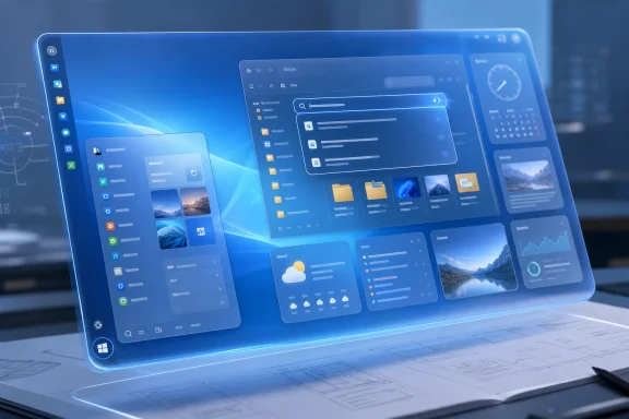 A Windows 7 shell with current Windows visual language
The central design move is easy to recognize. AR 4789 keeps the broad identity of Windows 7: the circular Start button, the left-edge taskbar arrangement, a Start menu organized around familiar app and system destinations, and a desktop that still looks like a desktop rather than a launcher. The updated Windows logo, iconography, rounded corners, and translucent surfaces bring it closer to the Fluent Design treatment Microsoft has pursued across Windows 11.The most effective part of the concept is not the glass effect. It is the attempt to preserve hierarchy. In the video, the Start menu still appears to give users a direct route to programs, documents, settings, and shutdown controls without asking them to navigate a separate full-screen layer. That was one of Windows 7’s practical strengths: the shell was visually ornate by today’s standards, but the navigation model was compact and learnable.
Microsoft’s own Windows 11 interface has moved in the opposite direction in several places. The centered taskbar, simplified context menus, overflow menus, and the split between Settings and remaining legacy interfaces have created an experience that can look cleaner while demanding more clicks from experienced users. AR 4789’s concept channels the enduring appeal of Windows 7 without simply reproducing Aero glass and 2009-era icons pixel for pixel.
There is, however, a conflict at the heart of the visual pitch. Fluent transparency, shadows, rounded geometry, widget cards, and animated surfaces all consume space and attention. Windows 7 Remastered looks restrained in the video because every panel has been composed for a reveal. A real operating system has to cope with crowded taskbars, third-party notification icons, eleven open windows, mismatched app styles, accessibility scaling, low-resolution displays, and years of backwards-compatible controls. The concept shows the ideal state; Windows users spend much of their time in the accumulated state.
The Start menu gets the balance mostly right
The Start menu shown in the concept is the clearest argument for revisiting Windows 7’s conventions. It borrows Windows 11-style app groupings, widgets, reminders, and a modern card-based presentation, but its overall structure remains anchored to the left and appears to retain the familiar distinction between pinned items and system functions.That is a more interesting proposal than merely moving Windows 11’s Start menu back to the left. Position is only part of the dispute. Windows 7 made its menu feel like a control center connected to the taskbar, while Windows 11’s Start experience has often felt like a separate recommendation surface with a smaller working area for the user’s own organization.
The concept’s widgets and reminders introduce a potential problem, though. Microsoft has spent several Windows generations discovering that information surfaces become controversial when they blend utility with content delivery, recommendations, or account-linked personalization. A widget area is useful when it is optional, local, and predictable. It becomes an interruption when it is used to steer users toward web content, advertising inventory, or Microsoft account services.
AR 4789’s design does not have to resolve that business tension because it is a video. Microsoft does. A real revival of the Windows 7 Start menu would need clear rules on whether suggested apps, cloud activity, web feeds, and account notifications can be disabled completely—not merely minimized.
File Explorer is where the concept becomes a product question
The remastered File Explorer carries over the contemporary Windows treatment: rounded surfaces, refreshed icons, a cleaner layout, and an interface visibly influenced by AR 4789’s earlier “Windows 12 File Explorer” work. It also proposes an AI-powered semantic search that can locate files by meaning rather than exact keywords.Semantic search is a persuasive demo feature because anyone can understand the promise. Search for “quarterly travel receipts” and find an image, PDF, spreadsheet, or email attachment that never used those exact words. In a real Windows deployment, that feature raises implementation questions the concept leaves unanswered: whether indexing happens locally or in the cloud, what content is scanned, how encrypted files are handled, how much storage and CPU it requires, and what controls administrators have over it.
For a home PC, those questions concern privacy, battery life, and search quality. For business systems, they become governance questions. A semantic index spanning locally stored documents can expose more than filenames and metadata; a cloud-assisted search model could add data-handling and compliance concerns. Microsoft’s current Windows experience has shown that AI features are never just a matter of adding a button to an existing pane.
The concept is right about one thing: File Explorer remains one of the places where Windows modernization has the most value. It is used constantly, and even small improvements in navigation, previewing, filtering, file actions, and search can save real time. The weakness is that a sleek Explorer mockup cannot demonstrate whether those actions remain fast, predictable, and scriptable for power users.
Combining Control Panel and Settings would fix a long-running split
The video also imagines a unified control area combining Windows 7’s Control Panel with the Settings app. That is a sensible target, provided it means actual consolidation rather than a new dashboard that points to two underlying configuration systems.Microsoft has spent years moving functions from Control Panel into Settings, but the coexistence of both interfaces still causes friction. Administrative tasks can surface in different places depending on the Windows edition, policy state, driver, installed tool, or age of the feature. Search may point users toward Settings in one case and a legacy Control Panel applet in another. The concept’s unified view acknowledges that the problem is not visual inconsistency alone; it is that Windows still has multiple paths to basic configuration.
A real merger would be difficult because Control Panel is tied to decades of Windows components, management scripts, and support documentation. Enterprises do not need a prettier front end that silently removes familiar controls. They need a transition that preserves documented administrative entry points, supports automation, and makes it clear which replacements are equivalent.
This is where the concept’s nostalgic framing has an advantage. Windows 7 was not beloved solely because of its wallpaper and taskbar. It made many settings visible and named them in terms users recognized. Modern Windows can simplify presentation without treating discoverability as clutter.
The Windows 7 name cannot be separated from support reality
The biggest practical issue is the name. Microsoft ended support for Windows 7 Service Pack 1 on January 14, 2020. The paid Extended Security Updates program continued for eligible business editions for three more years, ending on January 10, 2023. Microsoft’s lifecycle record is unambiguous: a machine running ordinary Windows 7 in August 2026 is outside supported Windows servicing.That does not diminish the concept’s design value, but it does mean readers should resist the predictable reaction: searching for a “Windows 7 Remastered” download to revive an old PC. Any installer claiming to be this project would be unofficial at best and potentially dangerous. A modern-looking skin cannot supply current kernel hardening, signed driver support, browser support, security patches, management tooling, or application compatibility.
The concept also cannot make the original Windows 7 codebase a viable foundation for current hardware. A remaster worthy of the name would have to be a modern Windows platform with a Windows 7-inspired shell, not Windows 7 with new icons and acrylic blur. That means the difficult engineering work would still be Windows 11-era work: modern drivers, security architecture, servicing, identity, virtualization, accessibility, and supportability.
What Microsoft could actually take from it
AR 4789’s video is worth watching as interface criticism expressed through design rather than as a forecast of Microsoft’s plans. It identifies several things Microsoft could adopt without attempting the impossible task of reviving Windows 7 as a supported operating system.- Microsoft could offer a first-party taskbar and Start menu mode built around Windows 7’s left-aligned, information-rich navigation model.
- Microsoft could finish the Settings migration by pairing feature consolidation with stable administrative paths for professionals and managed devices.
- Microsoft could make desktop widgets genuinely user-controlled, with a clean option that contains no news feed, recommendations, advertising, or forced account integration.
- Microsoft could develop semantic file search with local-first processing, transparent indexing controls, and policies that let organizations disable or govern it.
References
- Primary source: Neowin
Published: 2026-08-02T18:06:01+00:00
Loading…
www.neowin.net - Related coverage: learn.microsoft.com
Loading…
learn.microsoft.com - Related coverage: support.microsoft.com
Loading…
support.microsoft.com - Related coverage: learn.microsoft.com
Windows 7 - Microsoft Lifecycle | Microsoft Learn
Windows 7 follows the Fixed Lifecycle Policy.learn.microsoft.com - Related coverage: support.microsoft.com
What does it mean if Windows isn't supported? | Microsoft Support
Learn what it means if you have an older version of Windows that's no longer supported.support.microsoft.com - Related coverage: microsoft.com
Loading…
www.microsoft.com - Related coverage: microsoft.com
Loading…
www.microsoft.com - Related coverage: blogs.windows.com
Loading…
blogs.windows.com - Related coverage: blogs.windows.com
Loading…
blogs.windows.com - Related coverage: techcommunity.microsoft.com
Loading…
techcommunity.microsoft.com - Related coverage: cdn2.hubspot.net
Loading…
cdn2.hubspot.net - Related coverage: windowscentral.com
Windows 10 LTSB (LTSC) will get Extended Security Updates | Windows Central
Windows 10 2016 LTSB support ends in 2026. Microsoft details ESU costs, deadlines, and upgrade paths to LTSC and Server 2025.www.windowscentral.com - Related coverage: windowscentral.com
Loading…
www.windowscentral.com - Related coverage: techradar.com
Loading…
www.techradar.com - Related coverage: tomshardware.com
Windows 10 update incorrectly tells some users they've reached end-of-life, despite having extended support — Microsoft confirms message sent to Enterprise, Pro, and Education users in error | Tom's Hardware
Windows 10 is not completely dead, yet.www.tomshardware.com - Related coverage: tomsguide.com
Windows 10 will die this fall — here's how to survive | Tom's Guide
Windows 10 will reach end of life in October of 2025, and after that Microsoft won't be issuing any new security updates — but there are some ways around that, and you can keep using Windows 10 well into 2026 if you follow these tips!www.tomsguide.com - Related coverage: as.com
Cómo seguir usando Windows 10 después del fin del soporte en octubre de 2025: así funciona el programa ESU de Microsoft - Meristation
Microsoft continuará ofreciendo una alternativa para los usuarios de Windows 10 tras el cese del soporte oficial. Así funciona el programa ESU de W10.as.com - Related coverage: neowin.net
Loading…
www.neowin.net - Related coverage: punto-informatico.it
Loading…
www.punto-informatico.it - Related coverage: hwupgrade.it
Loading…
www.hwupgrade.it - Related coverage: windowsreport.com
Loading…
windowsreport.com - Related coverage: r2.community.samsung.com
Loading…
r2.community.samsung.com - Related coverage: sempreupdate.com.br
Loading…
sempreupdate.com.br - Related coverage: touchit.sk
Loading…
touchit.sk - Related coverage: touchit.sk
Loading…
touchit.sk - Related coverage: softzone.es
Loading…
www.softzone.es - Related coverage: pl.gov-civil-setubal.pt
Loading…
pl.gov-civil-setubal.pt - Related coverage: cozumpark.com
Loading…
www.cozumpark.com - Related coverage: tweakhound.com
Loading…
www.tweakhound.com