

This was one person testing one workbook, not a benchmark. Still, it's a useful look at how Copilot in Excel makes design choices, and it suggests a sensible way to work with it.
The test: 5,000 rows of movie habits
Phillips says he has built Excel dashboards for years, using formulas, PivotTables and, more often lately, AI. His test workbook held 5,000 movie-viewing records. He asked for a dashboard three different ways and compared the results.
Attempt one: analyze first, then build
First he asked Copilot in Excel to analyze the data, find interesting patterns and build a dashboard around what it found. Copilot reported:
- 878 unique movies across the 5,000 records
- 82.4% of viewing records were repeat watches
- Viewing volume peaked in 2023
- Netflix's share of his viewing changed over time
- Completion rate had almost no relationship to his ratings
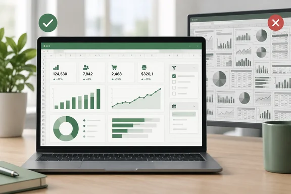
The dashboard had six summary cards, six slicers and four charts. Phillips says it worked, looked good, was interactive and was easy to follow.
The trouble was that Copilot had found a story it liked. Repeat viewing became the main theme, with several slicers and charts about new versus repeat viewing. Phillips found the analysis interesting. What bothered him was what got dropped: metrics that might have mattered more to him were pushed aside because Copilot had decided rewatching was the headline.
Takeaway: If you ask the AI to find what's interesting, the dashboard will show what the AI found interesting. Phillips got exactly what he asked for, and that turned out to be the problem.
Attempt two: get a plan from the chatbot, then build it
Next he asked the web-based Copilot chatbot to analyze the data and recommend a dashboard. The recommendations were much longer. They covered viewing patterns, platforms, genres, ratings, completion and seasonal trends, plus slicers, heat maps, scorecards and extra calculations. He gave that plan to Copilot in Excel to build.
The result had:
- eight charts
- two tabular visualizations
- five slicers
- five summary cards
- a current-filter insights area
It was more analytical than the first version, but it was too much. Even on his larger second monitor, he had to zoom out so far that the text was hard to read. It no longer gave him a quick snapshot when he opened the workbook.
Upkeep was the other cost. Phillips says he always tests an AI-built dashboard before trusting it, and this one had a lot of charts, calculations and filters to check. He also noticed that some of the questions it answered could have been handled faster with a PivotTable or by sorting the source table.
Takeaway: A detailed plan produced a bigger dashboard, not a better one. Every extra component is one more thing to check.
Attempt three: state the goal and let Copilot work
Finally, Phillips gave Copilot in Excel basic information about the 5,000 records and asked for a useful interactive dashboard. He didn't ask it to analyze anything first or tell it which components to include.
He got:
- five summary cards with the key numbers
- four charts: viewing volume by year, genre, platform and rating distribution
- two slicers connected to everything
- a summary line at the top showing the peak year, most-watched genre and leading platform
- supporting PivotTables on a separate worksheet, out of the way but available
This version fit on his screen and was the fastest of the three to build. Because it wasn't built around one finding in his current data, he expects it to keep working as his viewing history grows.
Takeaway: A plain goal produced a plain, general-purpose dashboard: the kind you can open every morning, not the kind you have to decode.
Why Copilot's choice of mode matters here
Phillips' second attempt used two different tools, and Microsoft draws a clear line between them. Microsoft's FAQ says Copilot in Excel can plan, run and verify changes directly in a workbook. Copilot Chat is grounded in web data and gives conversational help across Microsoft 365 apps. So in attempt two, a general chatbot wrote a specification and a separate in-workbook tool built it. Some of the bloat may have come from that handoff.
There's also a built-in option that sits between attempts two and three. Copilot in Excel offers three modes: edit, plan, or chat. Plan mode creates a structured approach to completing tasks. Instead of immediate actions, Copilot generates a plan so you can review and confirm the approach before starting. Phillips doesn't say whether he used it. For dashboards, though, it lets you check the layout before Copilot fills your workbook with components you'll later delete. Microsoft also says Chat only mode can analyze your workbook data and provide insights without making changes to your workbook. That's a tidier way to do the exploring Phillips did in attempt one without letting it drive the dashboard design.
Mode support depends on platform. Microsoft says edit, chat, and plan modes are available on Windows, Mac, and the web. On iPad, chat and plan modes are available. If you want to try this, use Excel on Windows, Mac or the web.
A caveat on the "OpenAI explanation"
Phillips connects his third approach to OpenAI's updated prompting guidance: give the AI a clear goal and let it work out the route. He wondered whether that applied because Microsoft Copilot can use OpenAI models. It's a reasonable idea, but the model behind Copilot isn't fixed. Microsoft's FAQ says Copilot in Excel supports both Anthropic's Claude models and OpenAI's GPT models for editing workbooks. Users with the right subscription can switch models or pick Auto, and the choice resets to the default when Excel closes. Phillips doesn't say which model built his dashboards, so the OpenAI connection can't be confirmed.
OpenAI's own guidance is also more mixed than "say less." It includes the goal-first principle, but it also stresses clear instructions, enough context and refining prompts over several rounds. Microsoft's support pages say something similar for PivotTables: You can use it to get insights, generate formulas, create charts and PivotTables, apply formatting, and make direct changes to your workbook, all by describing what you want to do. They also advise adding detail and regenerating when a result misses. So a broad goal is a good starting point, not a rule against follow-up instructions.
When to use which approach
Here's a practical way to read the three attempts (my synthesis, not a controlled study):
| Approach | Use it when | Watch out for |
|---|---|---|
| Analyze first, then build | You're exploring a new dataset | One striking pattern taking over the layout |
| Detailed plan first | You already know which metrics must appear | Crowded screens and more work to check and maintain |
| Goal only | You want a reusable overview | Missing metrics you care about; add them in a follow-up |
| Plan mode (built-in) | You want to approve the layout before Copilot builds it | Still needs your review; a plan is not a finished dashboard |
If your boss or compliance team needs specific KPIs, list them in the prompt. The "less is more" result is about leaving out instructions you don't need, not about leaving out requirements you have.
Before you trust an AI-built dashboard
Phillips' habit of testing before trusting is the most useful advice in the piece, and Microsoft agrees. Microsoft's FAQ warns that Copilot can make mistakes, misread information or produce inaccurate results, and that saved changes are visible to anyone with access to the file, including co-authors. A short checklist:
- Work on a copy or make sure version history is on. Microsoft says you can undo changes or view prior versions.
- Check that calculation is set to Automatic. Microsoft says Copilot editing only works when Calculation Options is set to Automatic, which catches out people who switch big models to Manual for speed.
- Check the summary cards against the data. Use a quick PivotTable or a filtered count to confirm the numbers.
- Test every slicer. Microsoft's dashboard guidance warns that PivotTables can't overlap as they grow and shrink with filtering, and some filter choices will trigger errors.
- Add test records and refresh, to confirm new data actually shows up.
- Ask whether you need a dashboard at all. As Phillips found, some questions are answered faster with a sort or a PivotTable. Microsoft's edit-mode documentation makes a similar point: For simple, one-step tasks—like inserting a single chart or PivotTable—Excel's Recommended Charts and Recommended PivotTables may be faster.
Licensing: who can try this?
Microsoft lists four ways to get Copilot in Excel: a Microsoft 365 Personal or Family subscription with an AI credits plan, Microsoft 365 Premium, a commercial Microsoft Copilot subscription, or a Copilot Chat-eligible Microsoft 365 or Office 365 business or enterprise subscription. Admins should know that Microsoft says Copilot in Excel is a Copilot Chat tool and can't be turned off on its own; the existing Copilot Chat controls apply.
The bottom line
Phillips' experiment doesn't prove that short prompts always win. It shows that Copilot builds dashboards around whatever you point it at. If you ask it to analyze, it builds around its own findings. If you hand it a long plan, it builds every item on the list. If you ask for a useful dashboard, it builds a general overview that fits on one screen. Start with a clear goal, review the result (in plan mode if you want to approve it first), then add only the requirements that are missing.
References
- I tested 3 ways to build an Excel dashboard with AI, and the simplest method won How-To Geek · 2026-10-01T21:00:14+00:00
- Frequently asked questions about Copilot in Excel | Microsoft Support support.microsoft.com
- Visualize your data with Copilot in Excel | Microsoft Support support.microsoft.com