

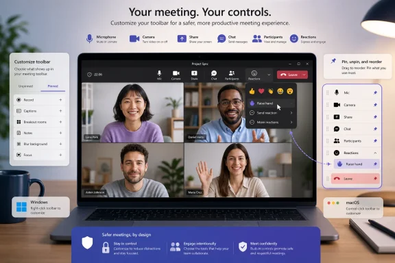
Microsoft Teams is rolling out a redesigned meeting toolbar that gives desktop users direct control over which meeting commands remain visible, where those commands appear, and which less-used tools stay out of the way. The change, listed under Microsoft 365 Roadmap ID 560321, allows participants to pin, unpin, and reorder controls, while moving Raise Hand into the Reactions menu and separating the Leave button on the right. This is a relatively small interface update with potentially significant everyday consequences, because the meeting toolbar is one of the most frequently used—and most error-sensitive—parts of Teams.
Microsoft describes the redesigned toolbar as a faster and easier way to work during meetings, although the company acknowledges that the new arrangement may feel unfamiliar at first. The feature reached the rolling-out stage in July 2026 after first appearing on the Microsoft 365 Roadmap on April 17, 2026, and receiving its latest recorded update on July 21, 2026.
The rollout covers the Teams desktop clients on Windows and macOS. It is scheduled for General Availability and Targeted Release across Worldwide Standard Multi-Tenant environments, as well as GCC, GCC High, and Department of Defense cloud instances.
The redesign introduces four notable changes:
Microsoft often expands Teams interface changes across platforms in stages, but no additional platform availability should be presumed until it is documented. For mixed-device organizations, the practical outcome may be a period in which meeting participants see different layouts and have different customization capabilities.
That makes toolbar design more consequential than the visual footprint suggests. The best meeting interface is not merely attractive; it minimizes hesitation and reduces the probability of mistakes under pressure.
This multitasking increases the importance of predictable placement. Even a delay of one or two seconds can feel awkward when someone is called upon and cannot immediately find the microphone button or when a presenter needs to stop sharing sensitive content.
Customization gives users a way to reduce that search burden. A participant who primarily listens can emphasize microphone, camera, chat, and reactions, while a presenter can prioritize sharing, view controls, notes, participant management, and other presentation-related commands.
A toolbar cannot display every function equally without becoming crowded. Microsoft therefore has to balance discoverability against visual simplicity, particularly on smaller laptop screens or in narrow meeting windows.
The redesigned toolbar effectively transfers part of that balancing decision to the user. Microsoft still establishes the overall framework and default layout, but individuals can decide which supported controls deserve permanent space.
The important difference is that meeting customization occurs in a time-sensitive environment. Users are not simply arranging shortcuts for convenience; they are optimizing commands that may be needed within seconds.
A pinned command has value when it eliminates navigation through a secondary menu. This can reduce friction for presenters who frequently alternate between content, participant engagement, and meeting-management tasks.
Pinning can also improve confidence for less experienced users. A carefully prepared toolbar gives them a stable set of recognizable commands instead of requiring them to remember where each function is hidden.
A user who never manages breakout rooms, for example, gains little from keeping that command prominent when another supported action would be more useful. Similarly, an attendee may not need organizer-oriented tools occupying valuable toolbar space.
There is a potential tradeoff: hiding a command can make it harder to rediscover later. Microsoft must therefore ensure that unpinned controls remain logically available through a clearly labeled overflow area rather than appearing to vanish from Teams entirely.
However, the benefit emerges only after the arrangement stabilizes. Frequent rearrangement would undermine the very predictability that customization is meant to create.
Organizations should encourage users to configure the toolbar deliberately and then allow time for new habits to form. A layout designed around genuine meeting behavior will be more effective than one organized merely by icon appearance or alphabetical order.
Conceptually, the grouping is defensible. Raising a hand and sending a live reaction are both forms of nonverbal participation, but they do not have identical consequences.
Putting both functions under one engagement control makes the toolbar less crowded. It also creates a single place for users to express approval, acknowledgment, amusement, surprise, or a desire to speak.
For established Teams users, however, the extra grouping changes a familiar workflow. Someone accustomed to clicking a dedicated hand icon may initially pause or select the wrong control until the new location becomes habitual.
The concern is that Raise Hand is not merely decorative. In classrooms, town halls, regulated meetings, public-sector sessions, and large internal briefings, it can be the principal mechanism for orderly participation.
If raising a hand now requires opening Reactions and making another selection, users may experience a small increase in interaction cost. That additional step is unlikely to be severe, but it matters most in meetings where rapid questions and tightly managed speaking queues are common.
Discoverability also deserves attention. New users may not intuitively recognize Raise Hand as a reaction because it serves a procedural purpose rather than expressing an emotion.
Clear tooltips, accessible names, and training materials will be important during the transition. Organizations that frequently host external participants should not assume guests already know where the function has moved.
Placing destructive or session-ending commands apart from routine actions follows a well-established interface-design principle. A command with immediate consequences should be visually isolated from controls used repeatedly during normal activity.
Separating Leave should reduce the chance that users click it while aiming for another command. The right-aligned position may also make the toolbar easier to understand by creating a clear endpoint: participation controls occupy the main area, while the exit action stands alone.
The benefit depends on consistency. If the Leave button shifts unexpectedly as the window changes size or as controls are added and removed, some of the safety advantage could be lost.
Leaving allows the session to continue without that person. Ending the meeting closes it for participants, which can disrupt ongoing discussion, breakout activity, or follow-up work.
The redesign must preserve a clear distinction between those choices. Visual separation protects against clicking the general control accidentally, but confirmation behavior and menu wording remain essential when an organizer chooses a meeting-wide action.
One arrangement will not suit everyone, and that is precisely the point of the update.
A practical attendee configuration may emphasize:
Their configuration should prioritize the controls required to recover from common presentation problems. For example, screen sharing and participant management may deserve more prominent positions than reaction tools.
Facilitators should also consider the physical direction in which they scan the toolbar. Positioning frequently paired controls near one another can reduce cursor travel and mental switching during fast-paced sessions.
The broad cloud coverage—including commercial, GCC, GCC High, and DoD environments—means the change can reach organizations with very different security, compliance, and training requirements.
A useful test group might contain executive assistants, trainers, help-desk staff, accessibility specialists, project managers, webinar producers, and employees who regularly use small-screen laptops. Their feedback can reveal issues that a purely technical review would miss.
Testing should examine several scenarios:
Training should explain three facts: controls can be personalized, Raise Hand has moved under Reactions, and Leave is now separated on the right. Users should also know how to find an unpinned control and restore a layout if they become confused.
Organizations should avoid prescribing a single mandatory arrangement unless there is a strong operational reason. The productivity benefit comes from personalization, and forcing every employee into the same custom layout would largely defeat that purpose.
Support documentation should refer to control names and symbols rather than positions. Screen-sharing support may also become more important when a user cannot find a command they previously unpinned.
This is a manageable issue, but it illustrates an unavoidable tradeoff: personalization improves individual efficiency while reducing interface uniformity across the organization.
Each context places different pressure on the meeting interface.
The cleaner toolbar could ultimately help these users by presenting fewer competing commands. However, simplification only succeeds if hidden functions remain easy to discover.
External guests are particularly important because organizations cannot train them in advance. Meeting hosts may need to mention the new Raise Hand location when structured participation is required.
Moving it under Reactions may initially slow participation, particularly for younger pupils or students using Teams under time pressure. Schools should update visual guides and provide a brief demonstration before relying on the new workflow.
On the positive side, teachers and instructors can tailor their own toolbars around participant management, chat, breakout rooms, notes, sharing, and other classroom functions. A role-specific layout could make lesson administration more efficient once staff become familiar with it.
Any screenshots or step-by-step instructions embedded in internal documentation may need revision. That includes help-desk runbooks, training manuals, onboarding content, accessibility instructions, and incident-response procedures involving Teams meetings.
The customization itself should not alter meeting policy or compliance capabilities. Nevertheless, changing where users find recording, participant, engagement, or session controls can affect how reliably they follow established procedures.
A toolbar must work across different screen resolutions, window sizes, display scaling levels, and meeting states.
If preferences remain local to each installation, users may need to repeat the setup on every computer. Shared workstations and virtualized environments could introduce additional complexity.
Organizations should test this behavior rather than assume that toolbar preferences synchronize. The distinction will matter to employees who move between office desktops, home computers, managed laptops, and temporary devices.
Microsoft therefore has to reconcile user preference with practical layout constraints. “Pinned” cannot always mean “visible under every possible window size” if the interface physically lacks room.
The best implementation would preserve the user’s priority order when deciding which controls remain visible. Lower-priority commands should enter overflow first, while critical actions such as microphone, camera, and Leave remain predictable.
A customized toolbar should handle these differences gracefully. If a user pins a presenter-related control but joins another meeting as an attendee, Teams should not leave a confusing blank space or permanently erase the preference.
Dynamic interfaces become frustrating when controls appear, disappear, or reorder themselves without explanation. Microsoft will need to preserve as much consistency as possible while respecting role-based permissions.
Focus indicators must also remain visible against different themes and meeting backgrounds. Raise Hand’s new location under Reactions adds another navigation layer, making efficient menu access especially important.
Accessibility is not a secondary refinement here. Teams meetings may be essential workplace infrastructure, and every participant must be able to mute, leave, request to speak, and manage privacy without unnecessary barriers.
Microsoft’s customization approach recognizes that feature abundance can become a liability when users cannot find what they need.
For Microsoft, this is particularly relevant because Teams spans chat, meetings, telephony, files, apps, AI assistance, webinars, town halls, and organizational workflows. A fixed meeting toolbar has to serve too many scenarios.
A personalized toolbar can make Teams feel simpler without actually removing functionality. That is strategically useful because Microsoft can continue expanding the platform while allowing individuals to maintain a focused experience.
Microsoft must therefore make customization understandable and reversible. Users should always know which controls are pinned, where unpinned commands went, and how to return to a familiar default.
The strongest implementation will combine flexibility with a recognizable baseline. The weakest would create a maze of individually arranged controls that complicates training and troubleshooting.
The July 2026 General Availability target identifies the planned release window, not a guarantee that every eligible user will see the feature at the same moment.
Administrators should also watch for service advisories and updated support documentation. Roadmap descriptions provide a concise feature summary, while operational details often become clearer as rollout advances.
Testing should include sign-out and sign-in behavior, client restarts, updates, multiple accounts, and switching between commercial and guest tenants. Guest access is especially relevant because users may participate in meetings hosted by several organizations.
Mobile devices may require a different approach because their limited screen space makes full toolbar reordering more difficult. Microsoft may choose to offer simplified prioritization rather than reproduce the desktop design exactly.
Excessive administrative restriction would weaken the personalization benefit, but optional presets could provide a useful balance. A company might supply a standard presenter layout while allowing employees to modify it afterward.
If users struggle, Microsoft could refine the Reactions menu, add stronger visual cues, introduce a keyboard shortcut reminder, or permit Raise Hand to be pinned separately. The customization model potentially gives Microsoft room to preserve grouping by default while allowing experienced users to restore quicker access.
Microsoft’s redesigned Teams meeting toolbar is a sensible acknowledgment that one fixed arrangement can no longer serve every participant, role, and meeting format. Pinning, unpinning, and reordering controls should make routine meetings faster once users establish stable layouts, while the separated Leave button addresses a meaningful source of accidental disruption. The decision to place Raise Hand under Reactions is more debatable and will require careful attention to discoverability, accessibility, and education, but the broader direction is sound: Teams is moving from a toolbar designed for the average user toward one shaped by the person actually attending the meeting.
 Overview
Microsoft describes the redesigned toolbar as a faster and easier way to work during meetings, although the company acknowledges that the new arrangement may feel unfamiliar at first. The feature reached the rolling-out stage in July 2026 after first appearing on the Microsoft 365 Roadmap on April 17, 2026, and receiving its latest recorded update on July 21, 2026.The rollout covers the Teams desktop clients on Windows and macOS. It is scheduled for General Availability and Targeted Release across Worldwide Standard Multi-Tenant environments, as well as GCC, GCC High, and Department of Defense cloud instances.
What is changing
The central improvement is user-configurable meeting controls. Instead of accepting a fixed toolbar arrangement selected by Microsoft, participants can adapt the interface to their roles, habits, devices, and meeting types.The redesign introduces four notable changes:
- Users can pin important controls so they remain readily accessible.
- Users can unpin commands that they rarely need.
- Users can reorder supported controls to create a more useful sequence.
- Raise Hand now sits under Reactions, while Leave is visually separated on the right.
Where the update applies
The roadmap entry specifically identifies Desktop and Mac as the supported platforms. That means organizations should not assume that the same customization experience will immediately appear in Teams for the web, mobile applications, virtual desktop infrastructure, Teams Rooms, desk phones, or other specialized endpoints.Microsoft often expands Teams interface changes across platforms in stages, but no additional platform availability should be presumed until it is documented. For mixed-device organizations, the practical outcome may be a period in which meeting participants see different layouts and have different customization capabilities.
Why the Teams Meeting Toolbar Matters
Meeting controls may look like a narrow user-interface concern, but they sit at the intersection of communication, presentation, privacy, and meeting governance. A misplaced click can mute a speaker, expose an unintended window, interrupt a presentation, trigger an unwanted reaction, or remove someone from a call at the wrong moment.That makes toolbar design more consequential than the visual footprint suggests. The best meeting interface is not merely attractive; it minimizes hesitation and reduces the probability of mistakes under pressure.
A high-frequency interface
Teams users repeatedly interact with microphone, camera, screen sharing, chat, participant, reaction, view, and meeting-management controls. In a busy meeting, people may use these commands while simultaneously following a presentation, reading chat messages, taking notes, checking a document, and preparing to speak.This multitasking increases the importance of predictable placement. Even a delay of one or two seconds can feel awkward when someone is called upon and cannot immediately find the microphone button or when a presenter needs to stop sharing sensitive content.
Customization gives users a way to reduce that search burden. A participant who primarily listens can emphasize microphone, camera, chat, and reactions, while a presenter can prioritize sharing, view controls, notes, participant management, and other presentation-related commands.
The challenge of feature growth
Teams meetings have gained a large collection of capabilities over the years. Depending on licensing, meeting type, organizational policies, and participant role, users may encounter recording, transcription, Copilot, breakout rooms, collaborative notes, apps, meeting options, accessibility features, language tools, presenter modes, background effects, device settings, and engagement controls.A toolbar cannot display every function equally without becoming crowded. Microsoft therefore has to balance discoverability against visual simplicity, particularly on smaller laptop screens or in narrow meeting windows.
The redesigned toolbar effectively transfers part of that balancing decision to the user. Microsoft still establishes the overall framework and default layout, but individuals can decide which supported controls deserve permanent space.
From Fixed Commands to a Personal Meeting Workspace
The ability to pin, unpin, and reorder controls reflects a broader movement in Microsoft 365 toward adaptable work surfaces. Teams already lets users reorganize applications and personalize aspects of their workspace, so extending that philosophy to the meeting toolbar is a logical step.The important difference is that meeting customization occurs in a time-sensitive environment. Users are not simply arranging shortcuts for convenience; they are optimizing commands that may be needed within seconds.
Pinning frequently used controls
Pinning should be most useful for commands that a person needs repeatedly or must access with minimal delay. The best candidates will vary by role, but they may include chat, participants, sharing, view options, meeting notes, or other available controls.A pinned command has value when it eliminates navigation through a secondary menu. This can reduce friction for presenters who frequently alternate between content, participant engagement, and meeting-management tasks.
Pinning can also improve confidence for less experienced users. A carefully prepared toolbar gives them a stable set of recognizable commands instead of requiring them to remember where each function is hidden.
Unpinning low-priority commands
Unpinning is equally important because customization is not only about adding things. Removing lower-priority controls can create more visual space and decrease the number of icons competing for attention.A user who never manages breakout rooms, for example, gains little from keeping that command prominent when another supported action would be more useful. Similarly, an attendee may not need organizer-oriented tools occupying valuable toolbar space.
There is a potential tradeoff: hiding a command can make it harder to rediscover later. Microsoft must therefore ensure that unpinned controls remain logically available through a clearly labeled overflow area rather than appearing to vanish from Teams entirely.
Reordering around muscle memory
Reordering can produce the largest long-term productivity gain because people build muscle memory around interface positions. Once microphone, camera, sharing, and engagement controls occupy predictable locations, users can act with less visual scanning.However, the benefit emerges only after the arrangement stabilizes. Frequent rearrangement would undermine the very predictability that customization is meant to create.
Organizations should encourage users to configure the toolbar deliberately and then allow time for new habits to form. A layout designed around genuine meeting behavior will be more effective than one organized merely by icon appearance or alphabetical order.
Raise Hand Moves Under Reactions
The most immediately noticeable functional relocation is Raise Hand, which Microsoft is grouping under Reactions. The company says the move is intended to reduce mis-clicks, suggesting that the former position or visual relationship between commands created enough accidental interactions to warrant a redesign.Conceptually, the grouping is defensible. Raising a hand and sending a live reaction are both forms of nonverbal participation, but they do not have identical consequences.
A logical engagement category
Reactions provide brief visual feedback without interrupting the speaker. Raise Hand communicates a more persistent request to contribute and typically places the participant into an ordered queue visible to presenters and other attendees.Putting both functions under one engagement control makes the toolbar less crowded. It also creates a single place for users to express approval, acknowledgment, amusement, surprise, or a desire to speak.
For established Teams users, however, the extra grouping changes a familiar workflow. Someone accustomed to clicking a dedicated hand icon may initially pause or select the wrong control until the new location becomes habitual.
Fewer accidental clicks, but potentially more deliberate steps
Microsoft’s rationale focuses on preventing mis-clicks, and grouping related commands can indeed reduce accidental activation. The separation between a general reaction and a persistent raised-hand status should become clearer if the menu labels and icons are sufficiently distinct.The concern is that Raise Hand is not merely decorative. In classrooms, town halls, regulated meetings, public-sector sessions, and large internal briefings, it can be the principal mechanism for orderly participation.
If raising a hand now requires opening Reactions and making another selection, users may experience a small increase in interaction cost. That additional step is unlikely to be severe, but it matters most in meetings where rapid questions and tightly managed speaking queues are common.
Accessibility and discoverability implications
Microsoft will need to ensure that the nested control remains accessible to keyboard-only users and people using assistive technologies. A visually logical menu can still be difficult if focus order, labels, shortcuts, or screen-reader announcements are unclear.Discoverability also deserves attention. New users may not intuitively recognize Raise Hand as a reaction because it serves a procedural purpose rather than expressing an emotion.
Clear tooltips, accessible names, and training materials will be important during the transition. Organizations that frequently host external participants should not assume guests already know where the function has moved.
The Leave Button Gets Its Own Space
The Leave command will be clearly separated on the right side of the toolbar. This is more than a cosmetic adjustment because leaving a meeting is a high-impact action that should not be confused with ordinary participation controls.Placing destructive or session-ending commands apart from routine actions follows a well-established interface-design principle. A command with immediate consequences should be visually isolated from controls used repeatedly during normal activity.
Reducing accidental departures
An accidental reaction is embarrassing, but an accidental exit can interrupt audio, remove the user from shared context, and force a reconnection. For a presenter or organizer, the disruption can be even more serious.Separating Leave should reduce the chance that users click it while aiming for another command. The right-aligned position may also make the toolbar easier to understand by creating a clear endpoint: participation controls occupy the main area, while the exit action stands alone.
The benefit depends on consistency. If the Leave button shifts unexpectedly as the window changes size or as controls are added and removed, some of the safety advantage could be lost.
Leave versus End Meeting
Organizers and presenters may have additional choices associated with the Leave control, including the ability to end a meeting for everyone when their role permits it. These actions differ sharply in impact.Leaving allows the session to continue without that person. Ending the meeting closes it for participants, which can disrupt ongoing discussion, breakout activity, or follow-up work.
The redesign must preserve a clear distinction between those choices. Visual separation protects against clicking the general control accidentally, but confirmation behavior and menu wording remain essential when an organizer chooses a meeting-wide action.
Practical Customization Strategies
The redesigned toolbar will be most valuable when users configure it according to recurring responsibilities rather than trying to display every available command. A useful layout should emphasize frequency, urgency, and the cost of selecting the wrong action.One arrangement will not suit everyone, and that is precisely the point of the update.
A sensible setup process
Users can approach customization methodically rather than rearranging icons during an important call:- Identify the controls used in nearly every meeting. Microphone, camera, chat, participants, and sharing are likely starting points, depending on the user’s role.
- Prioritize time-sensitive actions. Commands needed without delay should remain visible or occupy predictable positions.
- Unpin specialist tools used only occasionally. These can remain available through secondary menus without consuming permanent toolbar space.
- Group controls mentally by task. Communication, presentation, engagement, and meeting management can each occupy a recognizable area.
- Test the arrangement in a low-risk meeting. Users should verify that the layout remains usable when the meeting window is resized or content is shared.
- Avoid repeated changes. Once the toolbar works well, consistency will help build muscle memory.
Suggested layout for ordinary attendees
Most attendees primarily need to manage their presence and participation. Their most valuable controls are therefore likely to revolve around audio, video, conversation, and engagement.A practical attendee configuration may emphasize:
- Microphone and camera controls should remain easy to locate because they are used frequently and can affect privacy.
- Chat and participant controls should remain visible when the meeting relies on written questions or attendance awareness.
- Reactions should remain accessible because Raise Hand is now grouped there.
- Sharing can remain prominent for employees who routinely present documents or demonstrate work.
- Organizer-specific or specialist commands can be unpinned if the user rarely has permission to use them.
Suggested layout for presenters and facilitators
Presenters need a more operational workspace. They may need to share content, monitor participants, track chat, manage questions, change the view, access notes, and respond quickly when something goes wrong.Their configuration should prioritize the controls required to recover from common presentation problems. For example, screen sharing and participant management may deserve more prominent positions than reaction tools.
Facilitators should also consider the physical direction in which they scan the toolbar. Positioning frequently paired controls near one another can reduce cursor travel and mental switching during fast-paced sessions.
Enterprise Deployment and Change Management
Although toolbar customization is a user-facing feature, the rollout has organizational implications. Enterprises should treat the update as a workflow change rather than assuming everyone will adapt immediately without guidance.The broad cloud coverage—including commercial, GCC, GCC High, and DoD environments—means the change can reach organizations with very different security, compliance, and training requirements.
Targeted Release as an early-warning mechanism
Organizations using Targeted Release can use early access to evaluate the interface before broader deployment. Pilot participants should include more than IT administrators because toolbar usability depends heavily on real meeting behavior.A useful test group might contain executive assistants, trainers, help-desk staff, accessibility specialists, project managers, webinar producers, and employees who regularly use small-screen laptops. Their feedback can reveal issues that a purely technical review would miss.
Testing should examine several scenarios:
- Users should verify whether customized layouts persist reliably across meetings and client restarts.
- Presenters should test the toolbar during screen sharing and when shared content changes the available workspace.
- Accessibility teams should evaluate keyboard navigation, focus visibility, labels, and screen-reader behavior.
- Support staff should determine how easily they can guide users who have different control arrangements.
- Security teams should check whether high-impact controls remain sufficiently clear in restricted meetings.
Training without overcomplication
The update does not justify a lengthy training course. A concise internal announcement with annotated images or a short demonstration will usually be more effective.Training should explain three facts: controls can be personalized, Raise Hand has moved under Reactions, and Leave is now separated on the right. Users should also know how to find an unpinned control and restore a layout if they become confused.
Organizations should avoid prescribing a single mandatory arrangement unless there is a strong operational reason. The productivity benefit comes from personalization, and forcing every employee into the same custom layout would largely defeat that purpose.
Help-desk complications
Customization can make support conversations more difficult because technicians can no longer assume that every user sees the same toolbar order. Instructions such as “click the third icon” will become even less reliable.Support documentation should refer to control names and symbols rather than positions. Screen-sharing support may also become more important when a user cannot find a command they previously unpinned.
This is a manageable issue, but it illustrates an unavoidable tradeoff: personalization improves individual efficiency while reducing interface uniformity across the organization.
Consumer, Education, and Public-Sector Impact
The redesigned toolbar will affect more than conventional office meetings. Teams is used for tutoring, remote lessons, community sessions, healthcare-related communication, government work, interviews, family conversations, and volunteer coordination.Each context places different pressure on the meeting interface.
Consumers and occasional users
Occasional Teams users may experience the greatest initial confusion because they are less likely to follow product updates or build strong familiarity with menus. A person joining an interview or appointment may expect Raise Hand to appear as an independent control and not think to open Reactions.The cleaner toolbar could ultimately help these users by presenting fewer competing commands. However, simplification only succeeds if hidden functions remain easy to discover.
External guests are particularly important because organizations cannot train them in advance. Meeting hosts may need to mention the new Raise Hand location when structured participation is required.
Education environments
In classrooms, Raise Hand is a core behavioral control rather than a minor engagement feature. Teachers use it to maintain an orderly speaking sequence, especially when students cannot freely unmute themselves.Moving it under Reactions may initially slow participation, particularly for younger pupils or students using Teams under time pressure. Schools should update visual guides and provide a brief demonstration before relying on the new workflow.
On the positive side, teachers and instructors can tailor their own toolbars around participant management, chat, breakout rooms, notes, sharing, and other classroom functions. A role-specific layout could make lesson administration more efficient once staff become familiar with it.
Government and regulated organizations
The inclusion of GCC, GCC High, and DoD indicates that Microsoft intends the redesigned experience to reach public-sector cloud environments, although precise timing can differ between cloud instances. These organizations often use carefully documented operating procedures and may have stricter requirements around meeting control.Any screenshots or step-by-step instructions embedded in internal documentation may need revision. That includes help-desk runbooks, training manuals, onboarding content, accessibility instructions, and incident-response procedures involving Teams meetings.
The customization itself should not alter meeting policy or compliance capabilities. Nevertheless, changing where users find recording, participant, engagement, or session controls can affect how reliably they follow established procedures.
Technical and Design Considerations
The success of the redesign will depend on details not fully captured by a roadmap description. Persistence, responsive layout behavior, role awareness, and accessibility will determine whether customization feels dependable or merely decorative.A toolbar must work across different screen resolutions, window sizes, display scaling levels, and meeting states.
Persistence across devices and accounts
One major question is where the customized arrangement is stored. If settings roam with the user’s Teams account, people could receive a consistent layout across supported Windows and Mac devices.If preferences remain local to each installation, users may need to repeat the setup on every computer. Shared workstations and virtualized environments could introduce additional complexity.
Organizations should test this behavior rather than assume that toolbar preferences synchronize. The distinction will matter to employees who move between office desktops, home computers, managed laptops, and temporary devices.
Responsive behavior on smaller windows
The toolbar must adapt when users resize the meeting window, open side panels, or share content. A control pinned on a wide monitor may be moved into overflow when space becomes limited.Microsoft therefore has to reconcile user preference with practical layout constraints. “Pinned” cannot always mean “visible under every possible window size” if the interface physically lacks room.
The best implementation would preserve the user’s priority order when deciding which controls remain visible. Lower-priority commands should enter overflow first, while critical actions such as microphone, camera, and Leave remain predictable.
Role-aware controls
Teams exposes different capabilities to organizers, co-organizers, presenters, and attendees. Meeting policies, licensing, and event types can further change which commands are available.A customized toolbar should handle these differences gracefully. If a user pins a presenter-related control but joins another meeting as an attendee, Teams should not leave a confusing blank space or permanently erase the preference.
Dynamic interfaces become frustrating when controls appear, disappear, or reorder themselves without explanation. Microsoft will need to preserve as much consistency as possible while respecting role-based permissions.
Keyboard navigation
Mouse and touchpad users will notice icon placement first, but keyboard users depend on logical focus order. Reordering controls should ideally update keyboard traversal in a predictable way rather than creating a mismatch between visual and programmatic order.Focus indicators must also remain visible against different themes and meeting backgrounds. Raise Hand’s new location under Reactions adds another navigation layer, making efficient menu access especially important.
Accessibility is not a secondary refinement here. Teams meetings may be essential workplace infrastructure, and every participant must be able to mute, leave, request to speak, and manage privacy without unnecessary barriers.
Competitive Implications
Teams competes with Zoom, Google Meet, Cisco Webex, Slack-based workflows, and a growing range of specialized collaboration platforms. Most mature meeting products already offer broad sets of controls, so competition increasingly centers on how intelligently those controls are presented.Microsoft’s customization approach recognizes that feature abundance can become a liability when users cannot find what they need.
Personalization as a productivity feature
Collaboration vendors frequently add capabilities to satisfy enterprise requirements, but every new feature increases interface pressure. Customization provides a way to accommodate advanced functions without forcing all users to see them equally.For Microsoft, this is particularly relevant because Teams spans chat, meetings, telephony, files, apps, AI assistance, webinars, town halls, and organizational workflows. A fixed meeting toolbar has to serve too many scenarios.
A personalized toolbar can make Teams feel simpler without actually removing functionality. That is strategically useful because Microsoft can continue expanding the platform while allowing individuals to maintain a focused experience.
The danger of inconsistent complexity
Competitors can also benefit if Teams becomes perceived as unpredictable. A toolbar that differs by user, device, role, license, policy, and meeting type may be difficult to explain.Microsoft must therefore make customization understandable and reversible. Users should always know which controls are pinned, where unpinned commands went, and how to return to a familiar default.
The strongest implementation will combine flexibility with a recognizable baseline. The weakest would create a maze of individually arranged controls that complicates training and troubleshooting.
Strengths and Opportunities
The redesigned toolbar addresses a genuine usability problem: modern meeting platforms offer more functions than can comfortably fit in a single static interface. Giving users control over prominence and order is a practical response.Where the redesign could succeed
- Personalized layouts can reduce visual scanning. Users can place important commands where they expect to find them instead of searching through a Microsoft-defined sequence.
- Pinning can accelerate role-specific workflows. Presenters, facilitators, trainers, and ordinary attendees can each emphasize different tools.
- Unpinning can reduce clutter. Removing low-value commands leaves more room for controls that matter during everyday meetings.
- Separating Leave can prevent disruptive mistakes. The exit action becomes more distinct from routine communication and presentation controls.
- Grouping engagement functions can simplify the toolbar. Reactions and Raise Hand share a conceptual category, even though their precise purposes differ.
- A customizable framework can absorb future features. Microsoft gains more room to add meeting capabilities without permanently crowding every user’s toolbar.
- Government cloud support broadens the value of the change. Public-sector customers are included rather than being limited to a substantially older interface.
- Customization may improve user confidence. People who know exactly where their critical controls are can focus more attention on the meeting itself.
Risks and Concerns
Personalization introduces new failure modes alongside its benefits. Most are not severe, but they could create frustration if the rollout lacks clear guidance or consistent behavior.Potential trouble spots
- Raise Hand may become less discoverable. Users may not immediately understand that a procedural speaking control now lives under Reactions.
- An extra interaction could slow participation. Opening a menu before raising a hand may feel cumbersome in fast-moving meetings.
- Customized layouts can complicate support. Help-desk technicians cannot rely on commands appearing in identical positions for every user.
- Cross-platform inconsistency may confuse mixed-device teams. Desktop and Mac users may have capabilities that web, mobile, or specialized endpoint users do not yet share.
- Responsive layouts may override user expectations. Pinned controls could still move into overflow when the meeting window becomes too narrow.
- Users may hide controls and forget where they went. Unpinning must be easy to reverse, with a clearly organized location for concealed commands.
- Role changes can destabilize the arrangement. Commands available to a presenter may disappear when the same person joins another meeting as an attendee.
- Documentation can become outdated quickly. Organizations using screenshots or position-based instructions will need to refresh training material.
- Accessibility issues could offset the productivity gain. Nested menus and custom ordering must retain logical focus behavior and accurate assistive-technology labels.
What to Watch Next
The feature is rolling out rather than appearing everywhere simultaneously. Users and administrators should expect availability to vary by tenant, update channel, cloud instance, and client version during the deployment period.The July 2026 General Availability target identifies the planned release window, not a guarantee that every eligible user will see the feature at the same moment.
Rollout consistency
The first question is whether the customized toolbar behaves consistently across Windows and Mac. Differences in menu behavior, dragging, persistence, or responsive layout could undermine the promise of a unified Teams experience.Administrators should also watch for service advisories and updated support documentation. Roadmap descriptions provide a concise feature summary, while operational details often become clearer as rollout advances.
Preference synchronization
Users will want to know whether their layouts follow them between computers. Reliable account-level synchronization would make customization significantly more valuable for hybrid workers.Testing should include sign-out and sign-in behavior, client restarts, updates, multiple accounts, and switching between commercial and guest tenants. Guest access is especially relevant because users may participate in meetings hosted by several organizations.
Platform expansion
The roadmap currently identifies Desktop and Mac. Future support for the web, mobile clients, VDI, and other Teams endpoints would reduce inconsistency.Mobile devices may require a different approach because their limited screen space makes full toolbar reordering more difficult. Microsoft may choose to offer simplified prioritization rather than reproduce the desktop design exactly.
Organizational policy options
Another issue is whether administrators will eventually receive controls over customization. Some enterprises may want to recommend or preconfigure layouts for call-center staff, trainers, regulated teams, or frontline roles.Excessive administrative restriction would weaken the personalization benefit, but optional presets could provide a useful balance. A company might supply a standard presenter layout while allowing employees to modify it afterward.
User feedback on Raise Hand
The relocation of Raise Hand is likely to attract the most immediate reaction. Microsoft will need to assess whether reduced mis-clicks outweigh any loss of speed or discoverability.If users struggle, Microsoft could refine the Reactions menu, add stronger visual cues, introduce a keyboard shortcut reminder, or permit Raise Hand to be pinned separately. The customization model potentially gives Microsoft room to preserve grouping by default while allowing experienced users to restore quicker access.
Indicators of a successful release
The redesign should be considered successful if users spend less time searching for controls without generating a corresponding increase in support requests. Several practical signals will reveal whether Microsoft has achieved that balance:- Users can configure the toolbar without formal instruction.
- Pinned controls remain stable through ordinary meeting and window changes.
- Raise Hand remains easy to locate for guests and occasional users.
- Leave and End Meeting actions remain unmistakably distinct.
- Keyboard and assistive-technology workflows remain efficient.
- Support staff can reset or troubleshoot layouts quickly.
- Preferences behave predictably across supported devices and accounts.
Microsoft’s redesigned Teams meeting toolbar is a sensible acknowledgment that one fixed arrangement can no longer serve every participant, role, and meeting format. Pinning, unpinning, and reordering controls should make routine meetings faster once users establish stable layouts, while the separated Leave button addresses a meaningful source of accidental disruption. The decision to place Raise Hand under Reactions is more debatable and will require careful attention to discoverability, accessibility, and education, but the broader direction is sound: Teams is moving from a toolbar designed for the average user toward one shaped by the person actually attending the meeting.
References
- Primary source: Microsoft 365 Roadmap
Published: 2026-07-21T22:37:32.0478671Z
Microsoft 365 Roadmap | Microsoft 365
The Microsoft 365 Roadmap lists updates that are currently planned for applicable subscribers. Check here for more information on the status of new features and updates.www.microsoft.com
- Official source: support.microsoft.com
Use meeting controls in Microsoft Teams | Microsoft Support
Learn how to use meeting controls like chat, apps, and more in a Microsoft Teams meeting.support.microsoft.com - Official source: cdn-dynmedia-1.microsoft.com
</rdf:Alt> </dc:title> <dc:creator> <rdf:Seq> <rdf:li>Ryan Fowles
PDF documentcdn-dynmedia-1.microsoft.com