

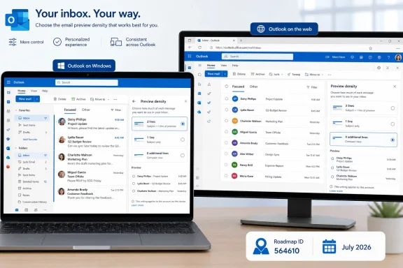
Microsoft is rolling out a July 2026 Outlook update that lets Outlook for Windows and Outlook on the web users choose whether email preview text in the message list takes two lines, one full line, or no additional lines. That sounds like a small view-setting tweak because it is one. But in the long-running migration from classic Outlook to the new Outlook experience, small view-setting tweaks are exactly where Microsoft’s credibility with power users has often been won or lost. The feature, listed on the Microsoft 365 Roadmap as ID 564610 and updated on July 6, is less about preview text than it is about Microsoft restoring a sense of control to an inbox that has increasingly felt designed at users rather than with them.
The new setting applies to Outlook on the desktop and web, with general availability marked for July 2026 across Worldwide, GCC, GCC High, and DoD cloud environments. Microsoft describes the change plainly: users can modify how preview text for emails appears in the message list, choosing between two lines, one line, or zero additional lines. The status is “rolling out,” which in Microsoft 365 language means some tenants may see it before others rather than everyone receiving it at once.
That last detail matters because Outlook is no longer one product in the old sense. There is classic Outlook for Windows, new Outlook for Windows, Outlook on the web, Outlook for Mac, mobile Outlook, and a web-backed design philosophy threading through much of it. When Microsoft says “Outlook” on the roadmap, administrators have learned to read the platform field carefully.
In this case, the platform field is important: Desktop and Web. That strongly suggests Microsoft is continuing to align the new Windows client with Outlook on the web, not bolting another feature onto the old Win32-era Outlook model. For users who have complained that new Outlook has been too opinionated about density, spacing, and mail list layout, this is one of those boring but welcome knobs that should arguably never have disappeared from view.
The preview-line choice is also a reminder that productivity software is made of defaults, and defaults are politics with a settings menu. A two-line preview invites scanning. A one-line preview balances density and context. No preview lines turns the message list into something closer to a compact triage grid, which many heavy mail users still prefer.
Message previews sit directly in that fault line. They are not glamorous, and they will not appear in a keynote demo beside Copilot summarization or AI-assisted scheduling. But they affect the first five seconds of every mail interaction: whether a user can identify junk without opening it, spot a customer reply in a noisy thread, or keep a narrow folder list dense enough to avoid constant scrolling.
Classic Outlook users have long had various ways to tune views, including message preview settings that could show different amounts of body text in the list. Microsoft Support documentation for classic Outlook still describes message preview as a way to show lines of each message alongside sender and subject, while Microsoft Learn troubleshooting material refers to 1-line, 2-line, and 3-line preview states in older Outlook search scenarios. Those references illustrate why this latest roadmap item may feel less like an innovation than a restoration.
That is not a criticism so much as a diagnosis. A mature product does not win trust only by adding new capabilities. Sometimes it wins trust by putting the old switches back where people can reach them.
Outlook is not just an email client in many organizations. It is a personal operating system for work. It contains mail, calendar, tasks, contacts, rules, shared mailboxes, delegated workflows, message filing systems, retention habits, compliance behaviors, and a thousand local rituals that never made it into a requirements document.
Changing the number of preview lines touches that ritual layer. The user who chooses zero lines may not be expressing an aesthetic preference; they may be protecting a practiced scanning method built over years. The user who chooses two lines may be avoiding unnecessary opens, especially in a high-volume mailbox where subject lines are unreliable. The user who wants one whole line may simply want Outlook to stop wasting vertical space.
Microsoft’s roadmap entry is therefore more consequential than its wording suggests. It says the company is still sanding down the edges of the new Outlook experience, not merely expecting users to adapt to whatever the web client currently exposes. In enterprise software, that sanding work is not optional polish. It is the difference between adoption and resentment.
Email density is especially sensitive because the inbox is already a compressed decision engine. Each row competes for attention using sender, subject, time, attachment indicators, flags, categories, unread state, mention badges, importance markers, and now preview text. Add too much body text and the list becomes visually noisy. Remove too much and users lose the quick semantic cues that separate a human reply from an automated notification.
That is why the new three-state control is more elegant than a single Microsoft-chosen default. It acknowledges that there is no universal inbox. A lawyer reviewing client correspondence, a help-desk dispatcher watching ticket replies, a teacher sorting parent emails, and a security analyst scanning phishing reports may all want different amounts of preview text.
The “0 additional lines” option is particularly interesting. It is a concession to compactness at a time when many Microsoft interfaces still feel tuned for spacious modernity. For some WindowsForum readers, that will be the setting that matters: less excerpt, more mail, fewer scrolls.
It also has a privacy angle, albeit a modest one. Preview text can expose sensitive message content to shoulder surfers, shared screens, conference-room projectors, or remote support sessions. Disabling additional preview lines will not turn Outlook into a secure enclave, but it reduces accidental disclosure in a part of the UI that is constantly visible.
This preview-line setting looks like one of the rebuilt pieces. It gives users something they recognize from classic Outlook, but likely implemented in the newer Outlook settings and rendering model rather than the old View tab machinery. That distinction matters to administrators because the same feature name can behave differently depending on whether it is rooted in classic Outlook customization or in web-backed mailbox configuration.
Microsoft Learn documentation for Exchange’s Set-MailboxMessageConfiguration cmdlet notes that it configures Outlook on the web settings for specific mailboxes, including reading pane and message options, and that some settings also apply to the new Outlook client. That does not automatically mean this new preview-line feature has a corresponding administrative control today. It does, however, show the direction of travel: Outlook on the web settings are increasingly relevant to the Windows client that Microsoft wants users to adopt.
For IT departments, the immediate question will be whether this is purely a per-user preference or something that can be seeded, controlled, or migrated. Microsoft’s roadmap entry, as provided, does not advertise an admin policy or PowerShell parameter. Until Microsoft documents one, organizations should assume this is primarily a user-facing view preference.
That will be fine for most tenants. But in highly standardized environments — call centers, regulated operations, shared workstations, government desktops — even view density can become a support issue. If an inbox suddenly shows more or less preview text after rollout, the help desk will be asked whether Outlook is broken.
That does not make preview lines a compliance breakthrough. It does make the feature operationally cleaner for organizations that maintain split environments or compare commercial and government tenant behavior. A small UI difference can become surprisingly irritating when training material, screenshots, and support scripts have to fork by cloud.
Government availability also reinforces that this is not a consumer-only polish item. The roadmap places the change in General Availability, not preview, and across serious enterprise environments. In other words, Microsoft is treating this as part of the baseline Outlook experience.
For DoD and GCC High users, “rolling out” still deserves caution. Availability can lag within rings, tenants, and clients, and desktop users may need the correct new Outlook build or web service exposure before seeing the setting. The roadmap date is a release target, not a guarantee that every endpoint will look identical on July 6.
Still, the cloud coverage suggests Microsoft wants this preference to become ordinary. That is the right ambition. The best UI controls are eventually boring because nobody has to argue about them anymore.
Users may therefore see inconsistent timing. One tenant may receive the setting in Outlook on the web first. Another may see it in new Outlook for Windows after client update timing catches up. A government tenant may trail a commercial tenant despite the same calendar month appearing on the roadmap. None of that would be surprising.
Administrators should resist the urge to treat the roadmap item as a precise switch-flip moment. The operationally safer approach is to add it to change-awareness notes, update help-desk guidance, and wait for Microsoft’s in-product messaging or Message Center details if they arrive. The roadmap tells us the what and the broad when; it rarely provides the full support script.
There is also an adoption wrinkle. If users have been complaining that new Outlook does not let them get a compact list, this is a feature worth pointing out proactively. If users are comfortable with their current layout, the change may only matter if Microsoft changes a default or exposes a new prompt. The safest communication is simple: Outlook is adding a control for message-list preview density, and users can choose less or more preview text according to preference.
That kind of low-drama communication is preferable to overselling it. Nobody should be told this “fixes” new Outlook. It fixes one narrow but visible irritation.
Two preview lines are useful when subject lines are vague or automated systems bury the meaningful part of the message in the body. They can help distinguish “Please review” from “Please review by 3 p.m. because the customer escalated.” In messy human workflows, that extra line can prevent a missed priority.
One preview line is the compromise setting. It provides a taste of the body without letting each row balloon. For many users, it will likely be the default-feeling choice because it preserves the subject-first structure of the inbox while adding just enough semantic information to guide triage.
Zero additional lines is for those who treat the inbox like a table. These users care about sender, subject, timestamp, flags, categories, and unread status more than body excerpts. They may already rely on reading pane placement, keyboard shortcuts, search folders, rules, or categories to process mail quickly.
The important point is not which choice is best. The important point is that Microsoft is allowing the choice in both web and desktop contexts.
But support teams know that client-side experience changes generate tickets precisely because they are visible. When a user’s inbox looks different, they do not file a ticket saying “a minor roadmap item reached general availability.” They file a ticket saying Outlook changed, Outlook is broken, or Microsoft removed something again.
That is why this feature should be logged in internal readiness notes even if it does not require a formal change advisory board review. The help desk should know the setting exists, what it does, and that it is intentional. Screenshots may need refreshing once the option appears broadly.
Organizations piloting new Outlook should also treat this as a small positive point in readiness scoring. If a pilot group previously objected to message-list density, the setting may remove one complaint. It will not address every missing classic Outlook feature, but migration readiness is cumulative.
The deeper lesson for Microsoft is also cumulative. The company is not going to win over Outlook skeptics with one restored view control. It wins by repeatedly proving that the new client can accommodate real workflows rather than flattening them.
Can users make the message list dense enough? Can they keep the reading pane where they want it? Can they manage multiple accounts without surprises? Can shared mailboxes, delegated calendars, offline access, rules, attachments, add-ins, and search behave predictably? Each answer either lowers or raises the friction of the migration.
Preview-line control is one answer. It is a narrow answer, but a meaningful one because it respects user preference rather than pretending a single modern layout fits everyone. Microsoft’s best argument for new Outlook is not that it is cleaner, newer, or more aligned with the web. Its best argument is that it can become flexible enough to replace the thing people already depend on.
The company should also learn from the phrasing of its own roadmap entry. “Variable number of message preview lines” is almost comically plain, but the plainness is refreshing. No AI halo, no productivity superlative, no reinvention. Just a setting that gives users a little more control over the inbox.
That may be the tone Outlook needs more often. After years of forced-feeling transitions and feature-gap anxiety, users are not asking every update to be visionary. Sometimes they just want the mail list to show the amount of mail they want to see.
 Microsoft Gives the Inbox Back a Few Pixels at a Time
The new setting applies to Outlook on the desktop and web, with general availability marked for July 2026 across Worldwide, GCC, GCC High, and DoD cloud environments. Microsoft describes the change plainly: users can modify how preview text for emails appears in the message list, choosing between two lines, one line, or zero additional lines. The status is “rolling out,” which in Microsoft 365 language means some tenants may see it before others rather than everyone receiving it at once.That last detail matters because Outlook is no longer one product in the old sense. There is classic Outlook for Windows, new Outlook for Windows, Outlook on the web, Outlook for Mac, mobile Outlook, and a web-backed design philosophy threading through much of it. When Microsoft says “Outlook” on the roadmap, administrators have learned to read the platform field carefully.
In this case, the platform field is important: Desktop and Web. That strongly suggests Microsoft is continuing to align the new Windows client with Outlook on the web, not bolting another feature onto the old Win32-era Outlook model. For users who have complained that new Outlook has been too opinionated about density, spacing, and mail list layout, this is one of those boring but welcome knobs that should arguably never have disappeared from view.
The preview-line choice is also a reminder that productivity software is made of defaults, and defaults are politics with a settings menu. A two-line preview invites scanning. A one-line preview balances density and context. No preview lines turns the message list into something closer to a compact triage grid, which many heavy mail users still prefer.
The “Small” Outlook Settings Are Where the Migration Gets Real
Microsoft’s Outlook strategy has spent the last few years colliding with the habits of people who live in email for eight hours a day. The company’s goal is understandable: modernize Outlook around a shared web foundation, reduce duplicated engineering, and bring features across Windows and the browser faster. The user reaction has been equally understandable: if the replacement cannot reproduce the affordances that made the old tool efficient, it does not feel like modernization.Message previews sit directly in that fault line. They are not glamorous, and they will not appear in a keynote demo beside Copilot summarization or AI-assisted scheduling. But they affect the first five seconds of every mail interaction: whether a user can identify junk without opening it, spot a customer reply in a noisy thread, or keep a narrow folder list dense enough to avoid constant scrolling.
Classic Outlook users have long had various ways to tune views, including message preview settings that could show different amounts of body text in the list. Microsoft Support documentation for classic Outlook still describes message preview as a way to show lines of each message alongside sender and subject, while Microsoft Learn troubleshooting material refers to 1-line, 2-line, and 3-line preview states in older Outlook search scenarios. Those references illustrate why this latest roadmap item may feel less like an innovation than a restoration.
That is not a criticism so much as a diagnosis. A mature product does not win trust only by adding new capabilities. Sometimes it wins trust by putting the old switches back where people can reach them.
New Outlook’s Problem Was Never Just Missing Features
The controversy around new Outlook has often been summarized as a missing-feature checklist: no COM add-ins here, awkward offline behavior there, PST and workflow concerns, different account handling, changed view controls, and a general sense that a browser-shaped client had been dropped into a desktop-shaped job. That framing is useful for administrators, but it misses the emotional layer of the complaint.Outlook is not just an email client in many organizations. It is a personal operating system for work. It contains mail, calendar, tasks, contacts, rules, shared mailboxes, delegated workflows, message filing systems, retention habits, compliance behaviors, and a thousand local rituals that never made it into a requirements document.
Changing the number of preview lines touches that ritual layer. The user who chooses zero lines may not be expressing an aesthetic preference; they may be protecting a practiced scanning method built over years. The user who chooses two lines may be avoiding unnecessary opens, especially in a high-volume mailbox where subject lines are unreliable. The user who wants one whole line may simply want Outlook to stop wasting vertical space.
Microsoft’s roadmap entry is therefore more consequential than its wording suggests. It says the company is still sanding down the edges of the new Outlook experience, not merely expecting users to adapt to whatever the web client currently exposes. In enterprise software, that sanding work is not optional polish. It is the difference between adoption and resentment.
Density Is a Feature, Not a Cosmetic Preference
Modern Microsoft 365 interfaces have tended to favor airier layouts, larger click targets, and consistency across device types. Those are defensible choices for accessibility, touch readiness, and cross-platform coherence. But for keyboard-heavy desktop users, especially on large monitors, too much whitespace can feel like lost information.Email density is especially sensitive because the inbox is already a compressed decision engine. Each row competes for attention using sender, subject, time, attachment indicators, flags, categories, unread state, mention badges, importance markers, and now preview text. Add too much body text and the list becomes visually noisy. Remove too much and users lose the quick semantic cues that separate a human reply from an automated notification.
That is why the new three-state control is more elegant than a single Microsoft-chosen default. It acknowledges that there is no universal inbox. A lawyer reviewing client correspondence, a help-desk dispatcher watching ticket replies, a teacher sorting parent emails, and a security analyst scanning phishing reports may all want different amounts of preview text.
The “0 additional lines” option is particularly interesting. It is a concession to compactness at a time when many Microsoft interfaces still feel tuned for spacious modernity. For some WindowsForum readers, that will be the setting that matters: less excerpt, more mail, fewer scrolls.
It also has a privacy angle, albeit a modest one. Preview text can expose sensitive message content to shoulder surfers, shared screens, conference-room projectors, or remote support sessions. Disabling additional preview lines will not turn Outlook into a secure enclave, but it reduces accidental disclosure in a part of the UI that is constantly visible.
The Web Client Is Becoming the Reference Design
The roadmap’s “Desktop, Web” pairing is a tell. Microsoft’s center of gravity for Outlook has moved toward the web architecture, and new Outlook for Windows is part of that shift. The practical benefit is faster feature parity between browser and desktop-like experiences; the practical cost is that old desktop expectations must be rebuilt, reinterpreted, or abandoned.This preview-line setting looks like one of the rebuilt pieces. It gives users something they recognize from classic Outlook, but likely implemented in the newer Outlook settings and rendering model rather than the old View tab machinery. That distinction matters to administrators because the same feature name can behave differently depending on whether it is rooted in classic Outlook customization or in web-backed mailbox configuration.
Microsoft Learn documentation for Exchange’s Set-MailboxMessageConfiguration cmdlet notes that it configures Outlook on the web settings for specific mailboxes, including reading pane and message options, and that some settings also apply to the new Outlook client. That does not automatically mean this new preview-line feature has a corresponding administrative control today. It does, however, show the direction of travel: Outlook on the web settings are increasingly relevant to the Windows client that Microsoft wants users to adopt.
For IT departments, the immediate question will be whether this is purely a per-user preference or something that can be seeded, controlled, or migrated. Microsoft’s roadmap entry, as provided, does not advertise an admin policy or PowerShell parameter. Until Microsoft documents one, organizations should assume this is primarily a user-facing view preference.
That will be fine for most tenants. But in highly standardized environments — call centers, regulated operations, shared workstations, government desktops — even view density can become a support issue. If an inbox suddenly shows more or less preview text after rollout, the help desk will be asked whether Outlook is broken.
Government Clouds Getting It Matters More Than It Sounds
The inclusion of Worldwide, GCC, GCC High, and DoD cloud instances is worth pausing on. Microsoft 365 roadmap entries often stagger features across commercial and government clouds, especially where compliance, data boundaries, or feature dependencies complicate deployment. Here, the feature is listed for the full spread of major Microsoft 365 cloud instances.That does not make preview lines a compliance breakthrough. It does make the feature operationally cleaner for organizations that maintain split environments or compare commercial and government tenant behavior. A small UI difference can become surprisingly irritating when training material, screenshots, and support scripts have to fork by cloud.
Government availability also reinforces that this is not a consumer-only polish item. The roadmap places the change in General Availability, not preview, and across serious enterprise environments. In other words, Microsoft is treating this as part of the baseline Outlook experience.
For DoD and GCC High users, “rolling out” still deserves caution. Availability can lag within rings, tenants, and clients, and desktop users may need the correct new Outlook build or web service exposure before seeing the setting. The roadmap date is a release target, not a guarantee that every endpoint will look identical on July 6.
Still, the cloud coverage suggests Microsoft wants this preference to become ordinary. That is the right ambition. The best UI controls are eventually boring because nobody has to argue about them anymore.
The Roadmap Date Is the Start of the Rollout, Not the End of the Story
Microsoft created the roadmap item on May 27, 2026, and last updated it on July 6, 2026, with general availability set for July 2026. That chronology is typical of a feature moving from planned public disclosure into active deployment. It is also a reminder that Microsoft 365 rollouts are service events, not boxed-product releases.Users may therefore see inconsistent timing. One tenant may receive the setting in Outlook on the web first. Another may see it in new Outlook for Windows after client update timing catches up. A government tenant may trail a commercial tenant despite the same calendar month appearing on the roadmap. None of that would be surprising.
Administrators should resist the urge to treat the roadmap item as a precise switch-flip moment. The operationally safer approach is to add it to change-awareness notes, update help-desk guidance, and wait for Microsoft’s in-product messaging or Message Center details if they arrive. The roadmap tells us the what and the broad when; it rarely provides the full support script.
There is also an adoption wrinkle. If users have been complaining that new Outlook does not let them get a compact list, this is a feature worth pointing out proactively. If users are comfortable with their current layout, the change may only matter if Microsoft changes a default or exposes a new prompt. The safest communication is simple: Outlook is adding a control for message-list preview density, and users can choose less or more preview text according to preference.
That kind of low-drama communication is preferable to overselling it. Nobody should be told this “fixes” new Outlook. It fixes one narrow but visible irritation.
Preview Text Has Always Been a Productivity Trade
There is an old argument in email design between context and speed. More context reduces unnecessary opens but increases visual scanning load. Less context increases density but forces more clicks or keyboard actions. Outlook’s new setting does not resolve that argument; it lets users choose their side.Two preview lines are useful when subject lines are vague or automated systems bury the meaningful part of the message in the body. They can help distinguish “Please review” from “Please review by 3 p.m. because the customer escalated.” In messy human workflows, that extra line can prevent a missed priority.
One preview line is the compromise setting. It provides a taste of the body without letting each row balloon. For many users, it will likely be the default-feeling choice because it preserves the subject-first structure of the inbox while adding just enough semantic information to guide triage.
Zero additional lines is for those who treat the inbox like a table. These users care about sender, subject, timestamp, flags, categories, and unread status more than body excerpts. They may already rely on reading pane placement, keyboard shortcuts, search folders, rules, or categories to process mail quickly.
The important point is not which choice is best. The important point is that Microsoft is allowing the choice in both web and desktop contexts.
The Admin Burden Is Small, but the Support Signal Is Real
For IT administrators, this is not a migration-blocking feature on its own. It does not change authentication, compliance posture, add-in compatibility, mailbox storage, transport rules, retention labels, or Exchange Online behavior. It is a client-side experience change in the message list.But support teams know that client-side experience changes generate tickets precisely because they are visible. When a user’s inbox looks different, they do not file a ticket saying “a minor roadmap item reached general availability.” They file a ticket saying Outlook changed, Outlook is broken, or Microsoft removed something again.
That is why this feature should be logged in internal readiness notes even if it does not require a formal change advisory board review. The help desk should know the setting exists, what it does, and that it is intentional. Screenshots may need refreshing once the option appears broadly.
Organizations piloting new Outlook should also treat this as a small positive point in readiness scoring. If a pilot group previously objected to message-list density, the setting may remove one complaint. It will not address every missing classic Outlook feature, but migration readiness is cumulative.
The deeper lesson for Microsoft is also cumulative. The company is not going to win over Outlook skeptics with one restored view control. It wins by repeatedly proving that the new client can accommodate real workflows rather than flattening them.
Microsoft’s Outlook Reset Depends on Boring Wins Like This
The story of new Outlook has often been framed around big architectural questions: web versus native, feature parity versus simplification, speed of development versus local integration, Copilot-era intelligence versus old-school mail handling. Those questions remain unresolved for many users. But the day-to-day acceptance of new Outlook will be decided by smaller things.Can users make the message list dense enough? Can they keep the reading pane where they want it? Can they manage multiple accounts without surprises? Can shared mailboxes, delegated calendars, offline access, rules, attachments, add-ins, and search behave predictably? Each answer either lowers or raises the friction of the migration.
Preview-line control is one answer. It is a narrow answer, but a meaningful one because it respects user preference rather than pretending a single modern layout fits everyone. Microsoft’s best argument for new Outlook is not that it is cleaner, newer, or more aligned with the web. Its best argument is that it can become flexible enough to replace the thing people already depend on.
The company should also learn from the phrasing of its own roadmap entry. “Variable number of message preview lines” is almost comically plain, but the plainness is refreshing. No AI halo, no productivity superlative, no reinvention. Just a setting that gives users a little more control over the inbox.
That may be the tone Outlook needs more often. After years of forced-feeling transitions and feature-gap anxiety, users are not asking every update to be visionary. Sometimes they just want the mail list to show the amount of mail they want to see.
The Inbox Control Microsoft Should Have Shipped Sooner
This rollout is a useful checkpoint for anyone tracking new Outlook readiness, especially in organizations where inbox density has become a sticking point. The change is modest, but its practical value is immediate: users get to decide whether preview text helps or hinders their workflow.- Outlook for Windows and Outlook on the web are gaining a setting for two preview lines, one full preview line, or no additional preview lines in the message list.
- Microsoft lists the feature as Roadmap ID 564610, with a July 2026 general availability window and a rolling-out status as of July 6, 2026.
- The rollout covers Worldwide, GCC, GCC High, and DoD cloud instances, making it relevant beyond commercial Microsoft 365 tenants.
- The feature should help users who want either a denser inbox or more body-text context without opening each message.
- Administrators should treat it as a visible user-experience change, not a backend Exchange change, unless Microsoft later documents policy or mailbox-configuration controls.
- The setting does not solve broader new Outlook parity concerns, but it removes one of the small irritations that can make migrations feel worse than they need to be.
References
- Primary source: Microsoft 365 Roadmap
Published: 2026-07-06T23:00:50.6928566Z
Loading…
www.microsoft.com - Related coverage: mc.merill.net
Loading…
mc.merill.net - Related coverage: m365admin.handsontek.net
Loading…
m365admin.handsontek.net - Official source: support.microsoft.com
Loading…
support.microsoft.com - Official source: learn.microsoft.com
Loading…
learn.microsoft.com - Official source: answers.microsoft.com
Outlook on web and Outlook (new) - no longer an option to show a line of preview text? - Microsoft Q&A
I access Outlook through my work Microsoft 365 subscription and I prefer to access it through my browser instead of an app on my computer. Today I noticed that I no longer get a line of preview text for messages in my inbox. The help I found online…answers.microsoft.com
- Official source: cdn-dynmedia-1.microsoft.com