

Microsoft is developing Microsoft Teams Roadmap ID 567301 for GCC High and DoD tenants, bringing user controls for quick views in the chat and channels list across Android, desktop, iOS, and Mac with general availability targeted for August 2026. The change sounds modest because it is: no Copilot fireworks, no meeting-room spectacle, no new compliance acronym. But it lands in exactly the part of Teams that determines whether the app feels like a command center or a slot machine. Microsoft is effectively admitting that its unified chat-and-channels redesign needs a pressure valve.
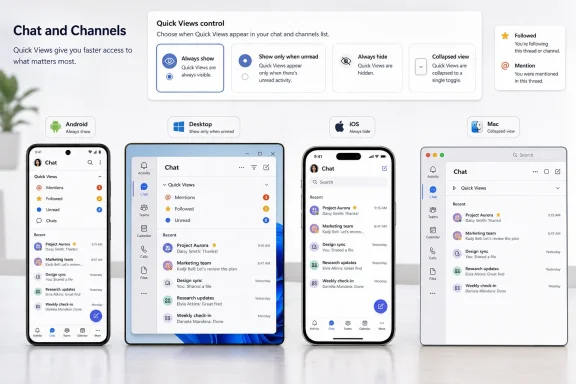
The feature, newly created and last updated on July 8, 2026, is still marked “In development” on the Microsoft 365 Roadmap. Its purpose is narrow and practical: the quick views that sit at the top of the new chats and channels list — including views into mentions, followed threads, and related attention buckets — will become more controllable. Users will be able to set those views to always show, always hide, or show only when unread, and they will also be able to collapse the quick views section.
That is not a cosmetic tweak. It is Microsoft moving from “we reorganized your communications for you” toward “you can decide how much triage machinery you want staring at you all day.”
The new Teams chat and channels experience was built around a simple premise: put conversations in one place and make the app better at surfacing what needs attention. Microsoft’s own support material describes the experience as a way to customize how users view chats and channels, organize them into sections, and use quick views to focus on items that need attention. Microsoft Adoption materials make the same pitch in more polished language: bring chat, teams, and channels into one place; triage unread messages and mentions; organize conversations by favorites and custom sections; and switch back toward a more familiar view when needed.
That last clause has always been the tell. Microsoft knows the new model is not merely a new coat of paint. It changes the mental map of Teams, especially for users who spent years treating Chat and Teams as distinct workspaces: one for direct communication, the other for durable team collaboration. The unified experience tries to erase that boundary, or at least soften it, because the old separation made it too easy to miss channel activity while living in chat.
Quick views are the mechanism that makes the unified model useful. If channels, chats, mentions, and followed threads all pour into one left rail, the app needs high-level shortcuts that act like a triage layer. A mention view is not just a convenience; it is a claim that directed work can be extracted from the general noise. A followed-threads view is not just a list; it is Microsoft’s attempt to make channel threading behave more like the focused conversation systems users already understand from competing collaboration tools.
But quick views also create a new problem: the triage layer itself becomes another thing to triage. A row of persistent attention buckets at the top of the list can help a user who lives in high-volume channels. It can also annoy someone whose workflow is simpler, whose screen is smaller, or whose priority is keeping a small set of chats and channels visible without another interface module competing for space.
Roadmap ID 567301 is Microsoft’s response to that tension. It does not roll back the unified experience. It does not abandon quick views. It turns them into a preference surface.
That combination says a lot. Microsoft is not presenting this as an experiment for a preview ring. It is listed for General Availability, and it spans the major Teams client surfaces in the fact table: Android, Desktop, iOS, and Mac. The target month is August 2026, which gives admins and support teams a short window to understand the change before it appears in highly managed environments.
The GCC High and DoD scope also changes how we should read the feature. In a consumer or small-business context, “collapse quick views” sounds like a personal preference. In a government or defense-adjacent tenant, it becomes part of user-readiness planning. Help desks do not get tickets that say “Roadmap ID 567301 has confused me.” They get tickets that say “my mentions disappeared,” “why is this section back,” “where did followed threads go,” or “Teams looks different on my phone than on my PC.”
Microsoft’s source material says users will be able to choose when and how quick views are shown. That phrasing points to user-level control, not a sweeping admin policy. The roadmap details provided do not identify an admin toggle, a Teams policy setting, or a tenant-wide enforcement mechanism. IT teams should therefore treat this as a user-experience change they need to explain, not as a configuration they can necessarily standardize from above.
That is the practical consequence: this is a support story before it is a feature story.
Microsoft’s quick views are an attempt to bend that timeline into something more useful. Mentions isolate messages aimed at the user. Followed threads collect conversations the user has chosen — or, depending on interaction, has effectively signaled — are worth tracking. Other quick views in the same design language are part of the same attention-management push: give users a shortcut to work that matters without forcing them to hunt through every channel and chat.
That explains why Microsoft put quick views at the top of the chat and channels list in the first place. The top of the left rail is expensive real estate. It is where Teams teaches users what Microsoft thinks the app is now. In the old model, the hierarchy was largely structural: teams contained channels; chats lived elsewhere. In the new model, the hierarchy is behavioral: what needs attention, what is favored, what is recent, what is followed.
The August 2026 control update does not reject that behavioral model. It acknowledges that attention is contextual. Some users want quick views always visible because their work is interruption-driven: service desks, incident response teams, program managers, legal reviewers, executive assistants, and anyone whose day is shaped by mentions and replies across many places. For them, always showing quick views turns Teams into a cockpit.
Other users want the opposite. A developer who watches a few project channels, a finance employee who mainly uses direct chats, or a manager who relies on scheduled meetings rather than threaded channel work may see persistent quick views as clutter. For them, always hide is not resistance to change; it is a productivity setting.
The most interesting option is “show only when unread.” That setting turns quick views into an alerting layer rather than a permanent navigation layer. It lets Microsoft preserve the value of attention buckets without forcing them to occupy space when there is nothing active to resolve. In interface terms, it is the compromise between a dashboard and a notification badge.
That is why control matters. Microsoft’s roadmap language does not promise a smarter algorithm or a redesigned activity model. It promises the ability to decide when and how quick views appear. That is a different kind of improvement, and arguably a more important one for mature software. Once an application is already central to the workday, the next productivity gain often comes not from adding new features, but from reducing unwanted insistence.
The collapse option is especially revealing. Collapsing is not the same as hiding. It lets users keep the structure available without letting it dominate the rail. In practice, that means a worker can acknowledge Microsoft’s new organization model while keeping the visible list compact. It is a small concession to the reality that Teams runs on laptops, tablets, external monitors, and phone screens, often alongside browser windows, documents, remote desktops, and line-of-business applications.
This is where the cross-platform scope matters. A quick-view section that feels reasonable on a large desktop monitor can feel enormous on a mobile screen. A collapsed state that saves a few rows on desktop may be the difference between seeing a key chat or missing it on a phone. Microsoft’s fact table lists Android, Desktop, iOS, and Mac, which means the company is not treating this as a Windows-only refinement or a mobile afterthought.
The harder part will be consistency. Users expect preferences to behave predictably across clients, even when Microsoft does not explicitly promise every detail of synchronization in a roadmap blurb. If a quick-view setting behaves differently between desktop and mobile, support teams will hear about it. If it is consistent, the feature fades into the background — which is exactly what a good preference should do.
That comparison is fair, but incomplete. Threads are not just a feature checklist item. They change the cost of participation. In a posts-style channel, a user might scan the channel as a stream. In a threads-style channel, the user has to decide which sub-conversations deserve follow-up. That makes the “followed threads” concept central rather than ornamental.
A followed-threads quick view is therefore one of the most important pieces of the new Teams information architecture. It gives users a way to detach a conversation from its channel container and treat it as a live work item. This is essential in large organizations where the channel is often too broad and the thread is where the actual task lives.
But the more useful followed threads become, the more prominent the quick-view area becomes. Every improvement in channel threading creates more reason for Microsoft to surface a followed-thread view. Every surfaced view creates more pressure on the left rail. The new controls in Roadmap ID 567301 are an attempt to keep that feedback loop from becoming oppressive.
Microsoft’s design challenge is that Teams serves contradictory use cases. A software incident channel, a procurement discussion, a leadership announcement channel, a classroom team, and a one-on-one chat all live inside the same client. Some need persistent triage. Some need quiet. Some need threading. Some need the oldest possible metaphor: a list of people and places.
Quick-view controls are the kind of feature that appears only after a company has learned, usually through user feedback, that one navigation philosophy cannot satisfy all of those use cases at once.
These tenants often care deeply about change management. A feature that changes what appears at the top of the chat list may be minor from an engineering perspective, but it sits directly in the daily workflow of users who may not read release notes and may not distinguish between “Teams changed” and “something is broken.” The support burden is amplified when the change is optional, because two users sitting next to each other can now have visibly different quick-view behavior.
That difference can be good. Personalization reduces friction for power users and reluctant users alike. But it complicates instructions. A help-desk article that says “click the mentions view at the top of your chat list” now needs a caveat: unless you have hidden quick views, unless they are collapsed, or unless they are set to show only when unread and nothing currently qualifies.
That is not an argument against the feature. It is an argument for documenting it clearly before it arrives.
Microsoft Adoption’s materials already advise IT pros and champions to brief help desks and support teams on the new chat and channels experience. Roadmap ID 567301 adds a specific training point: quick views are no longer merely present; they are configurable. Trainers should stop describing the top of the chat list as a fixed location and start describing it as a customizable section.
The subtlety matters. If users understand that quick views are a tool they control, the setting feels empowering. If they discover it only after the interface changes, it feels like another Teams mystery.
The biggest unanswered question is policy control. The source material says users will have options, which strongly suggests the control is exposed in the client experience. It does not say whether administrators can set defaults, lock behavior, or report on usage. For GCC High and DoD tenants, that distinction matters because standardization can be as important as flexibility.
The second question is persistence across clients. If a user hides quick views on desktop, will that preference carry to mobile? The fact table lists all four platform categories, but it does not specify preference synchronization behavior. Microsoft may make that seamless; it may also vary by client implementation. Until the feature reaches tenants, admins should avoid promising exact cross-device behavior.
The third question is rollout timing inside the August 2026 target. Microsoft roadmap months are not always a single-day release event. General Availability in August 2026 means organizations should prepare for that month, not assume everyone will see the feature at the same hour. This is particularly important for support teams coordinating announcements, screenshots, and internal documentation.
The fourth question is how the control interacts with existing view customization. Microsoft Support already describes combined and separate views, sections, favorites, and list options in the new chat and channels experience. Quick-view controls will sit on top of an already customizable model. That is powerful, but it also means the number of possible left-rail states keeps growing.
That is the paradox of Teams customization: every option reduces friction for one user and increases explanatory complexity for the organization.
Microsoft’s newer model tries to organize communication around attention and workflow instead. That is sensible in an era when the average user may belong to too many teams, too many channels, and too many recurring meeting chats to navigate by hierarchy alone. The old map was accurate, but often unhelpful. The new map is more dynamic, but also more opinionated.
Quick views are one of the clearest signs of that opinion. Microsoft is saying: the first thing you need is not necessarily the team structure; it is what needs your attention. That is a defensible design choice, especially in large organizations. But it also makes Teams feel less like a filing system and more like an inbox.
Many users already have too many inboxes. Outlook is an inbox. Teams activity is an inbox. Planner tasks can become an inbox. To Do is an inbox. Service-management systems are inboxes. Security portals are inboxes. The risk is not that quick views are useless; the risk is that they become another red-dot economy inside an application already heavy with signals.
The “show only when unread” option is Microsoft’s best answer to that risk. It lets quick views behave like context-sensitive surfacing rather than permanent furniture. If nothing needs attention, the section can stay out of the way. If something does, it can appear as a meaningful prompt.
The worst version of Teams is one where everything is always visible because everything might matter. The better version is one where Teams earns the right to interrupt the user. Roadmap ID 567301 nudges the product toward the latter.
On mobile, vertical space is brutally scarce. A persistent quick-view section at the top of the list competes with the very chats and channels the user is trying to reach. What feels like helpful triage on desktop can become an extra scroll on a phone. A collapse option is therefore not merely aesthetic; it is a usability fix.
Mobile also changes the psychology of unread indicators. A desktop user may tolerate a dense left rail because the rest of the screen still shows context. A phone user sees the list as the whole interface. If quick views appear only when unread, the mobile app can become calmer without removing the ability to surface important work.
Mac and desktop inclusion matters for a different reason. Teams has to behave like a serious daily work application across managed endpoint fleets, not just like a web app wrapped in a client. Many organizations support mixed environments where Windows PCs, Macs, iPhones, and Android devices coexist. A Teams preference that spans those surfaces reduces the sense that users are dealing with multiple products under one name.
Again, the roadmap entry does not spell out exactly how settings will roam or how the UI will differ by platform. But the platform list tells admins where to expect user questions. This is not a single-client quirk. It is a Teams experience change across the main endpoints named in Microsoft’s plan.
Cognitive load is not just a UX buzzword in Teams. The app is often open all day, and it sits at the intersection of synchronous and asynchronous work. Users do not merely open Teams to complete a task and leave. They monitor it. They scan it between meetings. They glance at it while writing documents. They check it on phones while walking between rooms.
Every persistent element in that environment has a cost. It asks to be interpreted, even if only subconsciously. A quick-view row with no unread value still occupies the user’s visual field. For some people, that is fine. For others, it is a constant low-grade prompt to check whether work is waiting.
The best interface settings often do not add capability; they remove unwanted obligation. Always hide removes the obligation to look at quick views. Always show preserves the obligation for those who want it. Show only when unread makes the obligation conditional. Collapse lets the user keep the concept without keeping the full footprint.
That range of choices is more sophisticated than a simple on/off switch. It recognizes that “attention management” is not one preference. It is a spectrum.
Many organizations still rely on internal guidance produced when the new chat and channels experience first rolled out. Those materials may show quick views as a fixed area at the top of the list. They may instruct users to use mentions or followed threads without explaining that the section can be hidden or collapsed. They may treat the presence of quick views as a reliable landmark.
After Roadmap ID 567301 lands, that landmark becomes user-configurable. A support technician asking a user to “look at the top of the chat list” may discover that the user has hidden the section. A trainer explaining followed threads may need to show how to restore the view. A manager comparing screens with an employee may see different layouts and assume one of them is outdated.
The solution is not to tell users never to customize Teams. That would miss the point of the update. The solution is to update documentation so customization becomes part of the baseline explanation.
But the more consequential rival is email. Email remains the default system of record for many organizations because it gives users a familiar set of personal controls: folders, rules, unread states, flags, search, and the ability to ignore entire classes of messages until needed. Teams, by contrast, has often felt like a shared stream with personal settings bolted on.
Quick views are part of Microsoft’s attempt to make Teams more inbox-like where that helps, without turning channels into email threads. Mentions resemble directed mail. Followed threads resemble flagged conversations. Unread-only visibility resembles a filter. Collapse and hide resemble the long-standing email instinct to reduce pane clutter.
That may sound mundane, but it is how collaboration software becomes durable. Big collaboration platforms do not win only by adding new modes of communication. They win by letting users tame those modes after adoption creates overload.
Microsoft’s challenge is that Teams is now mature enough that every new feature must justify its place in an already crowded interface. Quick views justified themselves by making attention easier to find. Roadmap ID 567301 justifies itself by making those quick views easier to live with.
The difference is important. Software that only adds signals eventually teaches users to distrust signals. Software that lets users tune signals has a better chance of remaining central rather than becoming background noise.
That is the phase mature productivity software always enters. The first wave is capability. The second is integration. The third is restraint.
Teams is somewhere between the second and third. Microsoft is still integrating chats, channels, threads, meetings, and attention views into one daily workspace. But Roadmap ID 567301 shows the company also understands that integration without restraint becomes clutter. The ability to hide, collapse, or conditionally show quick views is a small feature with a large message: the future of Teams is not just more surfaces for work, but more ways to decide which surfaces deserve to be seen.
The feature, newly created and last updated on July 8, 2026, is still marked “In development” on the Microsoft 365 Roadmap. Its purpose is narrow and practical: the quick views that sit at the top of the new chats and channels list — including views into mentions, followed threads, and related attention buckets — will become more controllable. Users will be able to set those views to always show, always hide, or show only when unread, and they will also be able to collapse the quick views section.
That is not a cosmetic tweak. It is Microsoft moving from “we reorganized your communications for you” toward “you can decide how much triage machinery you want staring at you all day.”
 Microsoft’s Unified Teams Bet Needed a User-Control Escape Hatch
The new Teams chat and channels experience was built around a simple premise: put conversations in one place and make the app better at surfacing what needs attention. Microsoft’s own support material describes the experience as a way to customize how users view chats and channels, organize them into sections, and use quick views to focus on items that need attention. Microsoft Adoption materials make the same pitch in more polished language: bring chat, teams, and channels into one place; triage unread messages and mentions; organize conversations by favorites and custom sections; and switch back toward a more familiar view when needed.That last clause has always been the tell. Microsoft knows the new model is not merely a new coat of paint. It changes the mental map of Teams, especially for users who spent years treating Chat and Teams as distinct workspaces: one for direct communication, the other for durable team collaboration. The unified experience tries to erase that boundary, or at least soften it, because the old separation made it too easy to miss channel activity while living in chat.
Quick views are the mechanism that makes the unified model useful. If channels, chats, mentions, and followed threads all pour into one left rail, the app needs high-level shortcuts that act like a triage layer. A mention view is not just a convenience; it is a claim that directed work can be extracted from the general noise. A followed-threads view is not just a list; it is Microsoft’s attempt to make channel threading behave more like the focused conversation systems users already understand from competing collaboration tools.
But quick views also create a new problem: the triage layer itself becomes another thing to triage. A row of persistent attention buckets at the top of the list can help a user who lives in high-volume channels. It can also annoy someone whose workflow is simpler, whose screen is smaller, or whose priority is keeping a small set of chats and channels visible without another interface module competing for space.
Roadmap ID 567301 is Microsoft’s response to that tension. It does not roll back the unified experience. It does not abandon quick views. It turns them into a preference surface.
The August 2026 Rollout Is Small, but the Audience Is Not
The roadmap entry matters partly because of where it is going first: GCC High and DoD cloud instances. Those are not casual consumer environments. They are regulated, security-sensitive Microsoft 365 deployments used by organizations with more conservative rollout expectations and more intense support burdens than ordinary commercial tenants.| Roadmap item | Status | Platforms | Release ring | Cloud instances | GA target |
|---|---|---|---|---|---|
| Microsoft Teams quick-view controls | In development | Android, Desktop, iOS, Mac | General Availability | GCC High, DoD | August 2026 |
The GCC High and DoD scope also changes how we should read the feature. In a consumer or small-business context, “collapse quick views” sounds like a personal preference. In a government or defense-adjacent tenant, it becomes part of user-readiness planning. Help desks do not get tickets that say “Roadmap ID 567301 has confused me.” They get tickets that say “my mentions disappeared,” “why is this section back,” “where did followed threads go,” or “Teams looks different on my phone than on my PC.”
Microsoft’s source material says users will be able to choose when and how quick views are shown. That phrasing points to user-level control, not a sweeping admin policy. The roadmap details provided do not identify an admin toggle, a Teams policy setting, or a tenant-wide enforcement mechanism. IT teams should therefore treat this as a user-experience change they need to explain, not as a configuration they can necessarily standardize from above.
That is the practical consequence: this is a support story before it is a feature story.
Quick Views Are Microsoft’s Attempt to Make Teams Less Chronological
The modern workplace app has a basic design problem: chronological order is easy to build and terrible at representing importance. A Teams list sorted by recent activity is democratic in the worst way. A trivial “thanks” can rise above a blocked decision. A low-priority channel can shove a direct mention out of view. A meeting chat can briefly look more important than the project thread where someone is waiting for an answer.Microsoft’s quick views are an attempt to bend that timeline into something more useful. Mentions isolate messages aimed at the user. Followed threads collect conversations the user has chosen — or, depending on interaction, has effectively signaled — are worth tracking. Other quick views in the same design language are part of the same attention-management push: give users a shortcut to work that matters without forcing them to hunt through every channel and chat.
That explains why Microsoft put quick views at the top of the chat and channels list in the first place. The top of the left rail is expensive real estate. It is where Teams teaches users what Microsoft thinks the app is now. In the old model, the hierarchy was largely structural: teams contained channels; chats lived elsewhere. In the new model, the hierarchy is behavioral: what needs attention, what is favored, what is recent, what is followed.
The August 2026 control update does not reject that behavioral model. It acknowledges that attention is contextual. Some users want quick views always visible because their work is interruption-driven: service desks, incident response teams, program managers, legal reviewers, executive assistants, and anyone whose day is shaped by mentions and replies across many places. For them, always showing quick views turns Teams into a cockpit.
Other users want the opposite. A developer who watches a few project channels, a finance employee who mainly uses direct chats, or a manager who relies on scheduled meetings rather than threaded channel work may see persistent quick views as clutter. For them, always hide is not resistance to change; it is a productivity setting.
The most interesting option is “show only when unread.” That setting turns quick views into an alerting layer rather than a permanent navigation layer. It lets Microsoft preserve the value of attention buckets without forcing them to occupy space when there is nothing active to resolve. In interface terms, it is the compromise between a dashboard and a notification badge.
The New Control Is Really About Trust
Teams has a trust problem familiar to every collaboration platform: users have to believe the app’s signals are worth obeying. If an unread badge is noisy, users ignore it. If a mention view feels incomplete, users stop relying on it. If a followed-thread list becomes visually intrusive, users learn to work around it rather than through it.That is why control matters. Microsoft’s roadmap language does not promise a smarter algorithm or a redesigned activity model. It promises the ability to decide when and how quick views appear. That is a different kind of improvement, and arguably a more important one for mature software. Once an application is already central to the workday, the next productivity gain often comes not from adding new features, but from reducing unwanted insistence.
The collapse option is especially revealing. Collapsing is not the same as hiding. It lets users keep the structure available without letting it dominate the rail. In practice, that means a worker can acknowledge Microsoft’s new organization model while keeping the visible list compact. It is a small concession to the reality that Teams runs on laptops, tablets, external monitors, and phone screens, often alongside browser windows, documents, remote desktops, and line-of-business applications.
This is where the cross-platform scope matters. A quick-view section that feels reasonable on a large desktop monitor can feel enormous on a mobile screen. A collapsed state that saves a few rows on desktop may be the difference between seeing a key chat or missing it on a phone. Microsoft’s fact table lists Android, Desktop, iOS, and Mac, which means the company is not treating this as a Windows-only refinement or a mobile afterthought.
The harder part will be consistency. Users expect preferences to behave predictably across clients, even when Microsoft does not explicitly promise every detail of synchronization in a roadmap blurb. If a quick-view setting behaves differently between desktop and mobile, support teams will hear about it. If it is consistent, the feature fades into the background — which is exactly what a good preference should do.
Threads Made Quick Views More Valuable — and More Annoying
The quick-view story cannot be separated from Microsoft’s broader push into threaded channel conversations. Microsoft Adoption material says Teams now offers a threads layout in channels, with conversations that look and feel closer to group chats while retaining the durability and manageability of channels. Outside coverage from outlets such as Windows Central and ITPro framed that shift as Microsoft catching up to patterns already familiar from Slack and other collaboration tools.That comparison is fair, but incomplete. Threads are not just a feature checklist item. They change the cost of participation. In a posts-style channel, a user might scan the channel as a stream. In a threads-style channel, the user has to decide which sub-conversations deserve follow-up. That makes the “followed threads” concept central rather than ornamental.
A followed-threads quick view is therefore one of the most important pieces of the new Teams information architecture. It gives users a way to detach a conversation from its channel container and treat it as a live work item. This is essential in large organizations where the channel is often too broad and the thread is where the actual task lives.
But the more useful followed threads become, the more prominent the quick-view area becomes. Every improvement in channel threading creates more reason for Microsoft to surface a followed-thread view. Every surfaced view creates more pressure on the left rail. The new controls in Roadmap ID 567301 are an attempt to keep that feedback loop from becoming oppressive.
Microsoft’s design challenge is that Teams serves contradictory use cases. A software incident channel, a procurement discussion, a leadership announcement channel, a classroom team, and a one-on-one chat all live inside the same client. Some need persistent triage. Some need quiet. Some need threading. Some need the oldest possible metaphor: a list of people and places.
Quick-view controls are the kind of feature that appears only after a company has learned, usually through user feedback, that one navigation philosophy cannot satisfy all of those use cases at once.
Government Tenants Will Care Less About Novelty Than Predictability
Because this roadmap item is scoped to GCC High and DoD, the most important audience is not the enthusiast who wants the latest Teams interface. It is the administrator, trainer, or support lead who has to make a small UI change legible to a large, risk-averse population.These tenants often care deeply about change management. A feature that changes what appears at the top of the chat list may be minor from an engineering perspective, but it sits directly in the daily workflow of users who may not read release notes and may not distinguish between “Teams changed” and “something is broken.” The support burden is amplified when the change is optional, because two users sitting next to each other can now have visibly different quick-view behavior.
That difference can be good. Personalization reduces friction for power users and reluctant users alike. But it complicates instructions. A help-desk article that says “click the mentions view at the top of your chat list” now needs a caveat: unless you have hidden quick views, unless they are collapsed, or unless they are set to show only when unread and nothing currently qualifies.
That is not an argument against the feature. It is an argument for documenting it clearly before it arrives.
Microsoft Adoption’s materials already advise IT pros and champions to brief help desks and support teams on the new chat and channels experience. Roadmap ID 567301 adds a specific training point: quick views are no longer merely present; they are configurable. Trainers should stop describing the top of the chat list as a fixed location and start describing it as a customizable section.
The subtlety matters. If users understand that quick views are a tool they control, the setting feels empowering. If they discover it only after the interface changes, it feels like another Teams mystery.
The Roadmap Entry Leaves Important Questions Open
The Microsoft 365 Roadmap is useful, but it is not a product manual. This entry tells us the what, where, and when: new controls for quick views; Microsoft Teams; Android, Desktop, iOS, and Mac; GCC High and DoD; General Availability in August 2026; status in development. It does not tell us every operational detail an admin would want.The biggest unanswered question is policy control. The source material says users will have options, which strongly suggests the control is exposed in the client experience. It does not say whether administrators can set defaults, lock behavior, or report on usage. For GCC High and DoD tenants, that distinction matters because standardization can be as important as flexibility.
The second question is persistence across clients. If a user hides quick views on desktop, will that preference carry to mobile? The fact table lists all four platform categories, but it does not specify preference synchronization behavior. Microsoft may make that seamless; it may also vary by client implementation. Until the feature reaches tenants, admins should avoid promising exact cross-device behavior.
The third question is rollout timing inside the August 2026 target. Microsoft roadmap months are not always a single-day release event. General Availability in August 2026 means organizations should prepare for that month, not assume everyone will see the feature at the same hour. This is particularly important for support teams coordinating announcements, screenshots, and internal documentation.
The fourth question is how the control interacts with existing view customization. Microsoft Support already describes combined and separate views, sections, favorites, and list options in the new chat and channels experience. Quick-view controls will sit on top of an already customizable model. That is powerful, but it also means the number of possible left-rail states keeps growing.
That is the paradox of Teams customization: every option reduces friction for one user and increases explanatory complexity for the organization.
Microsoft Is Still Cleaning Up the Consequences of Combining Chat and Channels
The new chat and channels experience was a major conceptual shift because it challenged one of Teams’ original organizing assumptions. Teams used to separate immediacy and structure more visibly. Chat was the fast lane. Teams and channels were the organizational map. Meetings lived partly in both worlds, with their own persistent chats and artifacts.Microsoft’s newer model tries to organize communication around attention and workflow instead. That is sensible in an era when the average user may belong to too many teams, too many channels, and too many recurring meeting chats to navigate by hierarchy alone. The old map was accurate, but often unhelpful. The new map is more dynamic, but also more opinionated.
Quick views are one of the clearest signs of that opinion. Microsoft is saying: the first thing you need is not necessarily the team structure; it is what needs your attention. That is a defensible design choice, especially in large organizations. But it also makes Teams feel less like a filing system and more like an inbox.
Many users already have too many inboxes. Outlook is an inbox. Teams activity is an inbox. Planner tasks can become an inbox. To Do is an inbox. Service-management systems are inboxes. Security portals are inboxes. The risk is not that quick views are useless; the risk is that they become another red-dot economy inside an application already heavy with signals.
The “show only when unread” option is Microsoft’s best answer to that risk. It lets quick views behave like context-sensitive surfacing rather than permanent furniture. If nothing needs attention, the section can stay out of the way. If something does, it can appear as a meaningful prompt.
The worst version of Teams is one where everything is always visible because everything might matter. The better version is one where Teams earns the right to interrupt the user. Roadmap ID 567301 nudges the product toward the latter.
Why This Matters More on Smaller Screens
The inclusion of Android and iOS in the roadmap entry should not be overlooked. Mobile Teams is not just a companion app anymore. For many frontline workers, field staff, managers, and government users away from a desk, it is the primary Teams surface for parts of the day.On mobile, vertical space is brutally scarce. A persistent quick-view section at the top of the list competes with the very chats and channels the user is trying to reach. What feels like helpful triage on desktop can become an extra scroll on a phone. A collapse option is therefore not merely aesthetic; it is a usability fix.
Mobile also changes the psychology of unread indicators. A desktop user may tolerate a dense left rail because the rest of the screen still shows context. A phone user sees the list as the whole interface. If quick views appear only when unread, the mobile app can become calmer without removing the ability to surface important work.
Mac and desktop inclusion matters for a different reason. Teams has to behave like a serious daily work application across managed endpoint fleets, not just like a web app wrapped in a client. Many organizations support mixed environments where Windows PCs, Macs, iPhones, and Android devices coexist. A Teams preference that spans those surfaces reduces the sense that users are dealing with multiple products under one name.
Again, the roadmap entry does not spell out exactly how settings will roam or how the UI will differ by platform. But the platform list tells admins where to expect user questions. This is not a single-client quirk. It is a Teams experience change across the main endpoints named in Microsoft’s plan.
The Feature Is a Quiet Win for Accessibility and Cognitive Load
Microsoft’s source material does not frame Roadmap ID 567301 as an accessibility feature, and it would be a mistake to overclaim it as one. Still, the practical accessibility implications are obvious. Reducing persistent visual clutter helps users who struggle with dense interfaces, attention fatigue, or screen-size constraints. Giving users control over when navigation modules appear can make the same application usable for a wider range of working styles.Cognitive load is not just a UX buzzword in Teams. The app is often open all day, and it sits at the intersection of synchronous and asynchronous work. Users do not merely open Teams to complete a task and leave. They monitor it. They scan it between meetings. They glance at it while writing documents. They check it on phones while walking between rooms.
Every persistent element in that environment has a cost. It asks to be interpreted, even if only subconsciously. A quick-view row with no unread value still occupies the user’s visual field. For some people, that is fine. For others, it is a constant low-grade prompt to check whether work is waiting.
The best interface settings often do not add capability; they remove unwanted obligation. Always hide removes the obligation to look at quick views. Always show preserves the obligation for those who want it. Show only when unread makes the obligation conditional. Collapse lets the user keep the concept without keeping the full footprint.
That range of choices is more sophisticated than a simple on/off switch. It recognizes that “attention management” is not one preference. It is a spectrum.
Admins Should Prepare for a Documentation Mismatch
The most likely operational problem in August 2026 is not that the feature breaks Teams. It is that existing screenshots, training decks, and help-desk scripts will quietly become incomplete.Many organizations still rely on internal guidance produced when the new chat and channels experience first rolled out. Those materials may show quick views as a fixed area at the top of the list. They may instruct users to use mentions or followed threads without explaining that the section can be hidden or collapsed. They may treat the presence of quick views as a reliable landmark.
After Roadmap ID 567301 lands, that landmark becomes user-configurable. A support technician asking a user to “look at the top of the chat list” may discover that the user has hidden the section. A trainer explaining followed threads may need to show how to restore the view. A manager comparing screens with an employee may see different layouts and assume one of them is outdated.
The solution is not to tell users never to customize Teams. That would miss the point of the update. The solution is to update documentation so customization becomes part of the baseline explanation.
Action checklist for admins
- Review internal Teams training materials that show the top of the chat and channels list.
- Add guidance explaining that quick views can be always shown, always hidden, shown only when unread, or collapsed.
- Brief help-desk staff that missing quick views may be a user preference, not a service issue.
- Prepare separate screenshots for expanded and collapsed quick-view states once the feature appears in your tenant.
- Avoid promising tenant-wide policy controls unless Microsoft documents them for this roadmap item.
- Watch the August 2026 rollout window for client differences across Android, Desktop, iOS, and Mac.
The Competitive Subtext Is Slack, but the Real Rival Is Email
Coverage from Windows Central and ITPro around Teams threads understandably compared Microsoft’s work to Slack. That is the obvious benchmark because threaded conversations have long been part of how Slack users manage side discussions without derailing a channel. Microsoft’s threaded channel work and followed-threads quick view sit in that same competitive context.But the more consequential rival is email. Email remains the default system of record for many organizations because it gives users a familiar set of personal controls: folders, rules, unread states, flags, search, and the ability to ignore entire classes of messages until needed. Teams, by contrast, has often felt like a shared stream with personal settings bolted on.
Quick views are part of Microsoft’s attempt to make Teams more inbox-like where that helps, without turning channels into email threads. Mentions resemble directed mail. Followed threads resemble flagged conversations. Unread-only visibility resembles a filter. Collapse and hide resemble the long-standing email instinct to reduce pane clutter.
That may sound mundane, but it is how collaboration software becomes durable. Big collaboration platforms do not win only by adding new modes of communication. They win by letting users tame those modes after adoption creates overload.
Microsoft’s challenge is that Teams is now mature enough that every new feature must justify its place in an already crowded interface. Quick views justified themselves by making attention easier to find. Roadmap ID 567301 justifies itself by making those quick views easier to live with.
The difference is important. Software that only adds signals eventually teaches users to distrust signals. Software that lets users tune signals has a better chance of remaining central rather than becoming background noise.
A Small Setting That Reveals the Next Phase of Teams
The concrete facts are simple, but their implications are broader.- Roadmap ID 567301 is a Microsoft Teams feature currently listed as in development.
- It applies to Android, Desktop, iOS, and Mac clients in the roadmap details.
- It is targeted for General Availability in August 2026.
- The listed cloud instances are GCC High and DoD.
- Users will be able to set quick views to always show, always hide, or show only when unread.
- Users will also be able to collapse the quick views section.
That is the phase mature productivity software always enters. The first wave is capability. The second is integration. The third is restraint.
Teams is somewhere between the second and third. Microsoft is still integrating chats, channels, threads, meetings, and attention views into one daily workspace. But Roadmap ID 567301 shows the company also understands that integration without restraint becomes clutter. The ability to hide, collapse, or conditionally show quick views is a small feature with a large message: the future of Teams is not just more surfaces for work, but more ways to decide which surfaces deserve to be seen.
References
- Primary source: Microsoft 365 Roadmap
Published: 2026-07-08T23:10:57.8991775Z
Loading…
www.microsoft.com - Official source: support.microsoft.com
Loading…
support.microsoft.com - Official source: adoption.microsoft.com
Loading…
adoption.microsoft.com - Official source: techcommunity.microsoft.com
Loading…
techcommunity.microsoft.com - Related coverage: pcworld.com
Loading…
www.pcworld.com - Related coverage: it.uclahealth.org
Loading…
it.uclahealth.org
- Official source: learn.microsoft.com
Loading…
learn.microsoft.com - Related coverage: windowscentral.com
Microsoft Teams finally adds threads in channels | Windows Central
Microsoft Teams now supports threaded conversations in channels.www.windowscentral.com - Related coverage: tenforums.com
Loading…
www.tenforums.com - Related coverage: blog.admindroid.com
Loading…
blog.admindroid.com - Related coverage: oit.colorado.edu
Loading…
oit.colorado.edu - Related coverage: itpro.com
Microsoft Teams just added a convenient new feature you can find in Slack | IT Pro
Microsoft has announced a raft of new updates for Teams, including a new threaded conversations feature that will simplify long-winded discussions for users.www.itpro.com - Related coverage: dfa.ms.gov
Loading…
www.dfa.ms.gov - Related coverage: mbtelehealth.ca
Loading…
mbtelehealth.ca