

Microsoft is now testing a cluster of Windows 11 Insider features in 2026 that restore movable taskbars, shrink taskbar chrome, soften Widgets, expose feature flags, and dial back some Copilot branding before any likely broad release later this year. The headline is not that Windows 11 is getting nine nice tweaks. The headline is that Microsoft appears to be reversing several of the product instincts that made Windows 11 feel less like an operating system and more like a guided tour through Redmond’s priorities. If these experiments survive into stable builds, they will mark one of the clearest admissions yet that users wanted Windows to become less pushy, less noisy, and more configurable.
The most interesting part of PCMag Australia’s tour of current Insider builds is not any single feature. It is the pattern. A movable taskbar, a smaller taskbar, quieter Widgets, fewer Bing-first Start results, less Copilot chrome, longer update pauses, and easier experimental toggles all point in the same direction: Microsoft is trying to make Windows 11 feel less confiscatory.
That matters because Windows 11’s reputation problem was never only about missing features. It was about ownership. Users who had spent decades treating Windows as a configurable workbench suddenly found that Windows 11 had opinions about where the taskbar belonged, what the Start menu should search, which news feed deserved attention, and how insistently AI should appear in places where users had not asked for it.
The Insider features described by PCMag do not amount to a new operating system. They are closer to a course correction. But in Windows terms, course corrections are often more meaningful than grand redesigns, because they tell us which complaints Microsoft has finally decided are safe to validate.
The company has spent years insisting that Windows 11’s cleaner, centered, simplified shell was the future. Now it is testing a future that looks suspiciously like some of the flexibility it removed.
This was never merely aesthetic. A taskbar is one of the few interface elements that can shape the whole feel of a desktop. On a laptop, vertical space is precious. On an ultrawide monitor, horizontal space is abundant. On a workstation with multiple displays, taskbar placement can become part of a user’s mental map.
Microsoft’s original Windows 11 taskbar treated those differences as edge cases. The new Insider work treats them as legitimate workflows. That is a very different posture.
The ability to place the taskbar on the left, right, or top also reopens a design conversation Microsoft tried to close. Windows 11 was meant to be more polished, more consistent, more appliance-like. But Windows is not macOS, and its audience has never been only consumers who want one correct layout. The Windows audience includes sysadmins, developers, spreadsheet lifers, gamers, accessibility users, traders, engineers, teachers, and home tinkerers who may all stare at the same shell for radically different reasons.
A vertical taskbar with labels is especially telling. It is not the minimalist icon strip Microsoft seemed to favor in Windows 11’s early years. It is denser, more informative, and frankly more old-school. It acknowledges that efficiency sometimes looks cluttered to a designer but feels calm to a professional who knows exactly where everything is.
A button-size tweak is cosmetics. A smaller taskbar is a screen-real-estate decision. It gives pixels back to applications, which is exactly where many users believe they belonged in the first place.
Microsoft’s modern design language has often prioritized spaciousness, touch targets, and visual clarity. Those are not bad goals. But on traditional PCs, especially laptops with 13- or 14-inch displays, spaciousness can become waste. A desktop operating system has to serve both fingers and mice, both casual users and people running six windows, two terminals, a browser, Teams, Outlook, and a remote session before lunch.
This is where Microsoft’s renewed talk of “quality” and “craft” becomes more than corporate decoration. Craft is not just smoother animations. It is knowing when the interface should get out of the way. It is knowing that a user who wants a smaller taskbar is not rejecting modern design; they are asking for the operating system to respect the physical limits of their display.
The taskbar changes are also a reminder that Windows’ most important features are often boring. They do not demo well on a keynote stage. They do not need a neural processing unit. They simply remove friction from the thing users touch hundreds of times a day.
Windows Update is one of Microsoft’s hardest product problems because every stakeholder wants something different. Security teams want patches applied quickly. Home users want fewer interruptions. IT departments want predictability. Microsoft wants the ecosystem protected from known vulnerabilities. And everyone wants to blame someone else when an update breaks printing, graphics drivers, VPN clients, or line-of-business software.
The trouble is that Windows Update has too often acted as if the only irresponsible user is the one who delays. In reality, there are plenty of responsible reasons to defer an update. A musician may not want to patch before a live set. A consultant may not want to risk a restart before a client presentation. A small business may need to wait until a third-party app vendor confirms compatibility. A gamer may simply be in the middle of something.
The Insider changes around setup and shutdown matter for the same reason. The ability to set up a new PC without immediately running Windows Update, or to shut down and restart without feeling trapped by an in-progress update, makes Windows behave less like a hall monitor. It recognizes that timing is part of usability.
This does not mean Microsoft can abdicate update pressure entirely. A permanently unpatched Windows fleet is a security disaster waiting to happen. But there is a difference between designing for security and designing as though the user is an obstacle to be managed. The new controls suggest Microsoft is at least experimenting with that distinction.
PCMag’s report that Insider builds move the noisier Discover-style feed out of the default Widgets view is therefore more than a cleanup. It is a philosophical retreat. Microsoft is recognizing that a surface called Widgets should first serve the user’s chosen widgets, not a content feed looking for an excuse to exist.
The word “calm” has appeared around Microsoft’s recent Windows messaging, and it is easy to be cynical about it. Tech companies love rediscovering restraint after years of adding growth loops, notifications, nags, recommendations, promos, and feed mechanics. But in this case, calm is exactly the right benchmark.
A calm operating system is not empty. It is not austere. It simply understands context. A desktop can tell you the weather without trying to redirect your attention to celebrity gossip. It can surface a reminder without selling you on a publisher partnership. It can be useful without behaving like a website whose business model is measured in dwell time.
The Widgets board will probably never be the thing that decides Windows 11’s fate. But it is a useful test of whether Microsoft can resist contaminating every surface with engagement logic. If the default panel becomes quieter, Windows becomes more trustworthy in a small but cumulative way.
That distinction is important. A writing assistant in Notepad is one thing. A Copilot icon in Notepad is another. The former says the app has gained a capability. The latter says the app has become another door into Microsoft’s broader AI product strategy.
Users can feel that difference. They may accept AI transcription, image cleanup, summarization, or rewriting features when those features are clearly scoped and optional. They are less likely to enjoy seeing a corporate AI mascot stamped into every corner of the shell. Branding that appears too often stops feeling like navigation and starts feeling like pressure.
Microsoft’s 2023-to-2025 AI push often blurred those lines. Copilot was a chatbot, a sidebar, a keyboard key, a Microsoft 365 assistant, a Windows feature, a brand layer, and a promise about the future of computing. That maximalism made strategic sense from a platform perspective, but it also created fatigue. Users who did not ask for AI began to experience Copilot less as a tool than as a campaign.
The Insider builds suggest Microsoft may be learning that AI features and Copilot everywhere are not the same proposition. That could make the AI work more acceptable, not less. A menu called AI Writing Tools in Notepad is less grandiose than a Copilot button, but it may be more honest.
For administrators, this distinction will matter. Enterprises do not merely ask whether AI exists; they ask where data goes, what policies control it, which features can be disabled, and whether a user-facing button creates compliance ambiguity. A less branded, more modular approach may eventually make Windows AI easier to govern.
When a user opens Start and types the name of a document, application, setting, or script, the operating system should assume local intent first. That is not nostalgia. That is the plain meaning of searching from the Start menu on a PC. Web search may be useful as an option, but it becomes irritating when it competes with the obvious local result.
The fact that users still need registry edits to disable Bing integration entirely tells us Microsoft has not surrendered the strategic ground. Search remains valuable real estate. Every query that can be routed through Bing is an opportunity for service usage, telemetry, ads, or ecosystem reinforcement. The user sees a Start menu; Microsoft sees a distribution channel.
This is where the Windows 11 reset will either earn trust or stall halfway. Prioritizing files over the web is a good product decision. Refusing to provide a simple Settings toggle to disable web results is a business decision masquerading as product design.
For power users, the workaround culture will continue. Registry files, group policies, third-party Start replacements, and shell tools are part of Windows life. But the need for those workarounds is itself evidence. When a mainstream desktop operating system requires hidden configuration to make local search behave locally, the design is still serving two masters.
Accessibility work often begins with specific user needs and ends up benefiting a much wider population. Captions help deaf and hard-of-hearing users, but they also help commuters, students, multilingual households, and anyone watching a muted video. Voice isolation helps users who rely on speech control, but it can also improve dictation and command reliability for people working in imperfect environments.
This is the version of Windows ambition that rarely provokes backlash. It does not take over the Start menu. It does not promote a feed. It does not rebrand a basic app around a corporate initiative. It gives the operating system more ways to adapt to human beings.
Voice Access is particularly important because speech input sits at the intersection of accessibility and mainstream productivity. If Windows can better isolate a user’s voice from background noise, it becomes more credible in classrooms, offices, shared homes, workshops, and clinical settings. That is real operating-system value.
Screen tinting is similarly practical. Eye strain is not a niche complaint among people who spend all day at displays. A customizable tint at the OS level is better than forcing each app, GPU utility, monitor profile, or browser extension to solve the problem separately. Platform features matter most when they reduce the number of places a user has to go hunting for relief.
Some laptops already ship with vendor-specific touchpad behavior. Some have excellent precision touchpads. Some are merely adequate. Some users are coming from older PCs where edge scrolling was familiar. Others expect modern multi-finger gestures. Windows has to make all of this feel less random.
Adding more touchpad behavior at the OS level can reduce dependency on OEM utilities and driver quirks. That is good for consistency. It is also good for users who reinstall Windows, move between devices, or manage fleets where the same employee might touch machines from Dell, Lenovo, HP, Microsoft, Asus, and others.
The risk, as always, is complexity. Touchpad settings can become a maze if every possible behavior gets exposed without clear defaults. Microsoft’s challenge is to offer the options without making users feel as if they are programming an input device.
Still, this is the kind of setting Windows should have. Not because every user will enable edge scrolling, but because a mature desktop OS should not tell users that a familiar navigation habit is invalid just because the default gesture model changed.
A built-in Feature flags page acknowledges the absurdity. If the point of an Insider channel is feedback, the tester should not need unofficial tools and feature IDs to reach the experiment. Microsoft still needs staged deployment for safety, but an explicit feature switch is a cleaner contract.
It also makes the Insider Program more legible. Today, being “on an Insider build” does not necessarily mean seeing every announced feature for that channel. Features may be gated by region, hardware, A/B bucket, server-side enablement, account type, or rollout percentage. That is rational from an engineering perspective, but maddening from a user perspective.
Feature flags can reduce that mismatch. They let Microsoft say, in effect, “This exists, it is experimental, and you can choose to test it.” That is a healthier relationship than pretending a build number tells the whole story.
For WindowsForum readers, this may also change how early features are discussed. Instead of long threads about whether a feature is missing, blocked, hidden, or region-locked, users may be able to verify flags directly. That does not eliminate bugs, but it does make testing feel less like spelunking.
Microsoft’s Insider channels no longer map neatly onto old assumptions about one big annual feature release. Features can arrive through cumulative updates, enablement packages, controlled rollouts, Microsoft Store app updates, server-side switches, or full OS version updates. A feature can be “in Windows 11” long before most users see it, and it can be announced for a channel without being guaranteed for the next stable release.
That is not just pedantry. It affects how businesses plan. An IT admin does not deploy a rumor. A developer does not redesign support documentation around a feature that might be pulled. A hardware vendor does not assume an Insider experiment becomes a shipping requirement.
The better way to read these changes is as a roadmap of intent, not a release manifest. Microsoft is clearly testing a less rigid, less noisy Windows 11. It is not yet promising that every PC will get every feature in exactly the form PCMag saw.
This uncertainty is part of the modern Windows experience. Microsoft wants flexibility to ship improvements continuously, but users and admins still want predictable milestones. The tension between those goals will not disappear just because the taskbar can move again.
But it is also too simple. Large platform companies rarely reverse course quickly, especially when the original decision was wrapped in a broader design strategy. Windows 11’s simplified shell was not an accident. It was part of an attempt to modernize the PC experience, align touch and desktop metaphors, and make Windows feel less like decades of layered control panels and legacy affordances.
The problem is that Microsoft overcorrected. It treated customization as clutter, local intent as a search opportunity, widgets as a content surface, and AI branding as a universal accelerant. Users pushed back because those decisions changed the daily feel of the PC.
Now Microsoft appears to be discovering that trust is won in the places a keynote does not dwell on. The taskbar. The update button. The search box. The widget panel. The tiny icon in Notepad that makes a user wonder whether an app is still an app or another portal into a strategy deck.
The encouraging sign is not that Microsoft has achieved the right balance. It has not. The encouraging sign is that the company is testing changes that would have seemed ideologically unlikely in early Windows 11.
A built-in feature flags page is useful for testers, but enterprises will want policy controls. Longer update pauses may help administrators in some contexts, but security teams will want guardrails. AI features with less Copilot branding may reduce visual clutter, but they do not eliminate questions about data handling and compliance. A quieter Widgets board is welcome, but organizations will still ask whether consumer content surfaces belong on managed machines at all.
This is the split personality of Windows in 2026. It is both a consumer product and the substrate of global business. Microsoft cannot tune it only for enthusiasts who want knobs, nor only for enterprises that want lockdown. It has to make the same OS feel personal on a home ultrawide and governable across a hospital, school district, or financial firm.
The best version of this reset would give both groups more explicit control. Let home users move the taskbar, shrink the chrome, silence feeds, and choose whether Bing belongs in Start. Let administrators enforce update rings, disable unapproved AI features, manage Widgets, and decide which experiments are visible. The underlying principle is the same: Windows should not surprise the person responsible for the machine.
That principle has been missing too often. Windows 11 has sometimes behaved as though Microsoft’s desired user journey matters more than the user’s actual job. These Insider features are promising because they move the center of gravity back toward the job.
If Microsoft carries this direction through to stable Windows 11 releases, the future of Windows will not be defined by a single AI button, annual update codename, or redesigned panel. It will be defined by whether the PC once again feels like a machine the user commands rather than a surface Microsoft continually negotiates for influence. The future PCMag saw in Insider builds is not revolutionary; it is more important than that. It is Windows remembering that usefulness often begins with getting out of the way.
 Microsoft’s Windows Reset Is Happening in the Small Places
The most interesting part of PCMag Australia’s tour of current Insider builds is not any single feature. It is the pattern. A movable taskbar, a smaller taskbar, quieter Widgets, fewer Bing-first Start results, less Copilot chrome, longer update pauses, and easier experimental toggles all point in the same direction: Microsoft is trying to make Windows 11 feel less confiscatory.That matters because Windows 11’s reputation problem was never only about missing features. It was about ownership. Users who had spent decades treating Windows as a configurable workbench suddenly found that Windows 11 had opinions about where the taskbar belonged, what the Start menu should search, which news feed deserved attention, and how insistently AI should appear in places where users had not asked for it.
The Insider features described by PCMag do not amount to a new operating system. They are closer to a course correction. But in Windows terms, course corrections are often more meaningful than grand redesigns, because they tell us which complaints Microsoft has finally decided are safe to validate.
The company has spent years insisting that Windows 11’s cleaner, centered, simplified shell was the future. Now it is testing a future that looks suspiciously like some of the flexibility it removed.
The Taskbar Becomes a Confession
The return of taskbar positioning is the symbolic centerpiece. Windows 11 launched without the ability to move the taskbar to the top, left, or right side of the screen, a decision that immediately irritated power users, ultrawide monitor owners, vertical-monitor loyalists, and anyone who had built years of muscle memory around a non-bottom taskbar.This was never merely aesthetic. A taskbar is one of the few interface elements that can shape the whole feel of a desktop. On a laptop, vertical space is precious. On an ultrawide monitor, horizontal space is abundant. On a workstation with multiple displays, taskbar placement can become part of a user’s mental map.
Microsoft’s original Windows 11 taskbar treated those differences as edge cases. The new Insider work treats them as legitimate workflows. That is a very different posture.
The ability to place the taskbar on the left, right, or top also reopens a design conversation Microsoft tried to close. Windows 11 was meant to be more polished, more consistent, more appliance-like. But Windows is not macOS, and its audience has never been only consumers who want one correct layout. The Windows audience includes sysadmins, developers, spreadsheet lifers, gamers, accessibility users, traders, engineers, teachers, and home tinkerers who may all stare at the same shell for radically different reasons.
A vertical taskbar with labels is especially telling. It is not the minimalist icon strip Microsoft seemed to favor in Windows 11’s early years. It is denser, more informative, and frankly more old-school. It acknowledges that efficiency sometimes looks cluttered to a designer but feels calm to a professional who knows exactly where everything is.
Shrinking the Taskbar Is Really About Giving Pixels Back
The smaller taskbar option may sound less dramatic than moving the taskbar, but it speaks to the same tension. Windows 11 already had settings related to smaller taskbar buttons, but PCMag notes that current Insider builds can shrink the taskbar itself, not merely the icons inside it. That distinction matters.A button-size tweak is cosmetics. A smaller taskbar is a screen-real-estate decision. It gives pixels back to applications, which is exactly where many users believe they belonged in the first place.
Microsoft’s modern design language has often prioritized spaciousness, touch targets, and visual clarity. Those are not bad goals. But on traditional PCs, especially laptops with 13- or 14-inch displays, spaciousness can become waste. A desktop operating system has to serve both fingers and mice, both casual users and people running six windows, two terminals, a browser, Teams, Outlook, and a remote session before lunch.
This is where Microsoft’s renewed talk of “quality” and “craft” becomes more than corporate decoration. Craft is not just smoother animations. It is knowing when the interface should get out of the way. It is knowing that a user who wants a smaller taskbar is not rejecting modern design; they are asking for the operating system to respect the physical limits of their display.
The taskbar changes are also a reminder that Windows’ most important features are often boring. They do not demo well on a keynote stage. They do not need a neural processing unit. They simply remove friction from the thing users touch hundreds of times a day.
Windows Update Gets Treated Like a Workflow Problem
The Insider update controls described by PCMag are potentially more consequential than their modest Settings-page appearance suggests. The stable Windows 11 experience allows update pauses only in limited increments, with users eventually forced back through the update mechanism before extending the pause again. The reported Insider behavior, allowing the pause to be extended indefinitely, is a meaningful shift in tone.Windows Update is one of Microsoft’s hardest product problems because every stakeholder wants something different. Security teams want patches applied quickly. Home users want fewer interruptions. IT departments want predictability. Microsoft wants the ecosystem protected from known vulnerabilities. And everyone wants to blame someone else when an update breaks printing, graphics drivers, VPN clients, or line-of-business software.
The trouble is that Windows Update has too often acted as if the only irresponsible user is the one who delays. In reality, there are plenty of responsible reasons to defer an update. A musician may not want to patch before a live set. A consultant may not want to risk a restart before a client presentation. A small business may need to wait until a third-party app vendor confirms compatibility. A gamer may simply be in the middle of something.
The Insider changes around setup and shutdown matter for the same reason. The ability to set up a new PC without immediately running Windows Update, or to shut down and restart without feeling trapped by an in-progress update, makes Windows behave less like a hall monitor. It recognizes that timing is part of usability.
This does not mean Microsoft can abdicate update pressure entirely. A permanently unpatched Windows fleet is a security disaster waiting to happen. But there is a difference between designing for security and designing as though the user is an obstacle to be managed. The new controls suggest Microsoft is at least experimenting with that distinction.
The Widgets Board Learns the Value of Silence
Windows 11’s Widgets board has long embodied one of the operating system’s least defensible habits: mixing useful glanceable information with algorithmic noise. Weather, calendar, stocks, sports, and traffic can all justify a panel. Viral headlines and animated attention grabs are harder to defend on a productivity desktop.PCMag’s report that Insider builds move the noisier Discover-style feed out of the default Widgets view is therefore more than a cleanup. It is a philosophical retreat. Microsoft is recognizing that a surface called Widgets should first serve the user’s chosen widgets, not a content feed looking for an excuse to exist.
The word “calm” has appeared around Microsoft’s recent Windows messaging, and it is easy to be cynical about it. Tech companies love rediscovering restraint after years of adding growth loops, notifications, nags, recommendations, promos, and feed mechanics. But in this case, calm is exactly the right benchmark.
A calm operating system is not empty. It is not austere. It simply understands context. A desktop can tell you the weather without trying to redirect your attention to celebrity gossip. It can surface a reminder without selling you on a publisher partnership. It can be useful without behaving like a website whose business model is measured in dwell time.
The Widgets board will probably never be the thing that decides Windows 11’s fate. But it is a useful test of whether Microsoft can resist contaminating every surface with engagement logic. If the default panel becomes quieter, Windows becomes more trustworthy in a small but cumulative way.
Copilot Retreats From the Chrome, Not From Windows
The reported reduction in Copilot icons across apps such as Notepad, Photos, and Snipping Tool is easy to misread. Microsoft is not abandoning AI in Windows. It is separating the Copilot brand from individual AI features that may be better understood as tools inside existing apps.That distinction is important. A writing assistant in Notepad is one thing. A Copilot icon in Notepad is another. The former says the app has gained a capability. The latter says the app has become another door into Microsoft’s broader AI product strategy.
Users can feel that difference. They may accept AI transcription, image cleanup, summarization, or rewriting features when those features are clearly scoped and optional. They are less likely to enjoy seeing a corporate AI mascot stamped into every corner of the shell. Branding that appears too often stops feeling like navigation and starts feeling like pressure.
Microsoft’s 2023-to-2025 AI push often blurred those lines. Copilot was a chatbot, a sidebar, a keyboard key, a Microsoft 365 assistant, a Windows feature, a brand layer, and a promise about the future of computing. That maximalism made strategic sense from a platform perspective, but it also created fatigue. Users who did not ask for AI began to experience Copilot less as a tool than as a campaign.
The Insider builds suggest Microsoft may be learning that AI features and Copilot everywhere are not the same proposition. That could make the AI work more acceptable, not less. A menu called AI Writing Tools in Notepad is less grandiose than a Copilot button, but it may be more honest.
For administrators, this distinction will matter. Enterprises do not merely ask whether AI exists; they ask where data goes, what policies control it, which features can be disabled, and whether a user-facing button creates compliance ambiguity. A less branded, more modular approach may eventually make Windows AI easier to govern.
Start Search Is Still Fighting the Web
The Start menu remains one of Windows 11’s most sensitive pressure points because it sits at the intersection of launcher, search box, advertising surface, and Microsoft services funnel. PCMag’s observation that Insider builds prioritize local files more strongly over Bing web results is welcome. It is also incomplete.When a user opens Start and types the name of a document, application, setting, or script, the operating system should assume local intent first. That is not nostalgia. That is the plain meaning of searching from the Start menu on a PC. Web search may be useful as an option, but it becomes irritating when it competes with the obvious local result.
The fact that users still need registry edits to disable Bing integration entirely tells us Microsoft has not surrendered the strategic ground. Search remains valuable real estate. Every query that can be routed through Bing is an opportunity for service usage, telemetry, ads, or ecosystem reinforcement. The user sees a Start menu; Microsoft sees a distribution channel.
This is where the Windows 11 reset will either earn trust or stall halfway. Prioritizing files over the web is a good product decision. Refusing to provide a simple Settings toggle to disable web results is a business decision masquerading as product design.
For power users, the workaround culture will continue. Registry files, group policies, third-party Start replacements, and shell tools are part of Windows life. But the need for those workarounds is itself evidence. When a mainstream desktop operating system requires hidden configuration to make local search behave locally, the design is still serving two masters.
Accessibility Improvements Show the Better Version of Microsoft’s Ambition
Among the reported Insider changes, the accessibility improvements may be the least flashy and the most defensible. Screen tint options that overlay a customizable color to reduce eye strain, and voice isolation for Voice Access in noisy environments, are exactly the kinds of features that show what platform-level engineering is for.Accessibility work often begins with specific user needs and ends up benefiting a much wider population. Captions help deaf and hard-of-hearing users, but they also help commuters, students, multilingual households, and anyone watching a muted video. Voice isolation helps users who rely on speech control, but it can also improve dictation and command reliability for people working in imperfect environments.
This is the version of Windows ambition that rarely provokes backlash. It does not take over the Start menu. It does not promote a feed. It does not rebrand a basic app around a corporate initiative. It gives the operating system more ways to adapt to human beings.
Voice Access is particularly important because speech input sits at the intersection of accessibility and mainstream productivity. If Windows can better isolate a user’s voice from background noise, it becomes more credible in classrooms, offices, shared homes, workshops, and clinical settings. That is real operating-system value.
Screen tinting is similarly practical. Eye strain is not a niche complaint among people who spend all day at displays. A customizable tint at the OS level is better than forcing each app, GPU utility, monitor profile, or browser extension to solve the problem separately. Platform features matter most when they reduce the number of places a user has to go hunting for relief.
Touchpad Gestures Reveal Windows’ Hardware Sprawl
The new touchpad scrolling options described by PCMag sound modest: edge scrolling with one finger, plus automatic scrolling when fingers move to the edge of the touchpad. But these changes point to one of Windows’ oldest structural challenges. Unlike macOS, Windows has to make coherent input experiences across an enormous variety of hardware.Some laptops already ship with vendor-specific touchpad behavior. Some have excellent precision touchpads. Some are merely adequate. Some users are coming from older PCs where edge scrolling was familiar. Others expect modern multi-finger gestures. Windows has to make all of this feel less random.
Adding more touchpad behavior at the OS level can reduce dependency on OEM utilities and driver quirks. That is good for consistency. It is also good for users who reinstall Windows, move between devices, or manage fleets where the same employee might touch machines from Dell, Lenovo, HP, Microsoft, Asus, and others.
The risk, as always, is complexity. Touchpad settings can become a maze if every possible behavior gets exposed without clear defaults. Microsoft’s challenge is to offer the options without making users feel as if they are programming an input device.
Still, this is the kind of setting Windows should have. Not because every user will enable edge scrolling, but because a mature desktop OS should not tell users that a familiar navigation habit is invalid just because the default gesture model changed.
Feature Flags Bring the Insider Program Closer to Reality
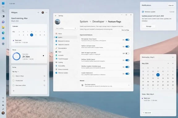
The new Feature flags page may be the most revealing Insider change because it changes the relationship between testers and Microsoft. For years, Windows enthusiasts have used tools such as ViVeTool to enable hidden or gradually rolled-out features before Microsoft made them broadly available. That culture exists because Microsoft’s controlled rollouts often leave Insiders reading about features they cannot actually test.A built-in Feature flags page acknowledges the absurdity. If the point of an Insider channel is feedback, the tester should not need unofficial tools and feature IDs to reach the experiment. Microsoft still needs staged deployment for safety, but an explicit feature switch is a cleaner contract.
It also makes the Insider Program more legible. Today, being “on an Insider build” does not necessarily mean seeing every announced feature for that channel. Features may be gated by region, hardware, A/B bucket, server-side enablement, account type, or rollout percentage. That is rational from an engineering perspective, but maddening from a user perspective.
Feature flags can reduce that mismatch. They let Microsoft say, in effect, “This exists, it is experimental, and you can choose to test it.” That is a healthier relationship than pretending a build number tells the whole story.
For WindowsForum readers, this may also change how early features are discussed. Instead of long threads about whether a feature is missing, blocked, hidden, or region-locked, users may be able to verify flags directly. That does not eliminate bugs, but it does make testing feel less like spelunking.
The 26H2 Assumption Needs Caution
PCMag frames many of these changes as likely candidates for stable Windows 11 builds later in the year, perhaps as part of a fall update referred to as 26H2. That is plausible as a broad seasonal expectation, but Windows version naming has become slippery enough that caution is warranted.Microsoft’s Insider channels no longer map neatly onto old assumptions about one big annual feature release. Features can arrive through cumulative updates, enablement packages, controlled rollouts, Microsoft Store app updates, server-side switches, or full OS version updates. A feature can be “in Windows 11” long before most users see it, and it can be announced for a channel without being guaranteed for the next stable release.
That is not just pedantry. It affects how businesses plan. An IT admin does not deploy a rumor. A developer does not redesign support documentation around a feature that might be pulled. A hardware vendor does not assume an Insider experiment becomes a shipping requirement.
The better way to read these changes is as a roadmap of intent, not a release manifest. Microsoft is clearly testing a less rigid, less noisy Windows 11. It is not yet promising that every PC will get every feature in exactly the form PCMag saw.
This uncertainty is part of the modern Windows experience. Microsoft wants flexibility to ship improvements continuously, but users and admins still want predictable milestones. The tension between those goals will not disappear just because the taskbar can move again.
The Real Feature Is Microsoft Listening Late
There is an obvious cynical reading of all this: Microsoft removed or degraded things users liked, ignored complaints for years, and now expects applause for giving some of them back. That reading is not wrong. The movable taskbar in particular is a self-inflicted wound.But it is also too simple. Large platform companies rarely reverse course quickly, especially when the original decision was wrapped in a broader design strategy. Windows 11’s simplified shell was not an accident. It was part of an attempt to modernize the PC experience, align touch and desktop metaphors, and make Windows feel less like decades of layered control panels and legacy affordances.
The problem is that Microsoft overcorrected. It treated customization as clutter, local intent as a search opportunity, widgets as a content surface, and AI branding as a universal accelerant. Users pushed back because those decisions changed the daily feel of the PC.
Now Microsoft appears to be discovering that trust is won in the places a keynote does not dwell on. The taskbar. The update button. The search box. The widget panel. The tiny icon in Notepad that makes a user wonder whether an app is still an app or another portal into a strategy deck.
The encouraging sign is not that Microsoft has achieved the right balance. It has not. The encouraging sign is that the company is testing changes that would have seemed ideologically unlikely in early Windows 11.
The Enterprise Stakes Are Bigger Than a Movable Bar
For enterprise IT, the most important question is not whether users can put the taskbar on the left. It is whether Microsoft is rebuilding Windows 11 around predictability and control. The Insider features are encouraging because they lean in that direction, but they also raise governance questions.A built-in feature flags page is useful for testers, but enterprises will want policy controls. Longer update pauses may help administrators in some contexts, but security teams will want guardrails. AI features with less Copilot branding may reduce visual clutter, but they do not eliminate questions about data handling and compliance. A quieter Widgets board is welcome, but organizations will still ask whether consumer content surfaces belong on managed machines at all.
This is the split personality of Windows in 2026. It is both a consumer product and the substrate of global business. Microsoft cannot tune it only for enthusiasts who want knobs, nor only for enterprises that want lockdown. It has to make the same OS feel personal on a home ultrawide and governable across a hospital, school district, or financial firm.
The best version of this reset would give both groups more explicit control. Let home users move the taskbar, shrink the chrome, silence feeds, and choose whether Bing belongs in Start. Let administrators enforce update rings, disable unapproved AI features, manage Widgets, and decide which experiments are visible. The underlying principle is the same: Windows should not surprise the person responsible for the machine.
That principle has been missing too often. Windows 11 has sometimes behaved as though Microsoft’s desired user journey matters more than the user’s actual job. These Insider features are promising because they move the center of gravity back toward the job.
The Nine Fixes Point to One Larger Apology
The individual features PCMag highlights are worth tracking, but their combined message is clearer than any one toggle. Microsoft is testing a Windows 11 that gives up some of its worst habits without abandoning its modern foundation. That is the version users have been asking for since launch.- The movable taskbar is the clearest sign that Microsoft now accepts customization as a core desktop expectation rather than a legacy indulgence.
- The smaller taskbar option matters because it returns usable screen space to applications instead of treating interface chrome as untouchable.
- The expanded update controls suggest Microsoft is at least experimenting with a more respectful balance between security urgency and user timing.
- The quieter Widgets board and reduced Copilot branding show that Microsoft understands attention is a finite resource, not a surface to be harvested.
- The Start menu search changes are welcome, but they will remain incomplete until disabling web results is a normal setting rather than a registry workaround.
- The Feature flags page could make Insider testing more honest by giving users direct access to experiments that were previously hidden behind rollout machinery.
If Microsoft carries this direction through to stable Windows 11 releases, the future of Windows will not be defined by a single AI button, annual update codename, or redesigned panel. It will be defined by whether the PC once again feels like a machine the user commands rather than a surface Microsoft continually negotiates for influence. The future PCMag saw in Insider builds is not revolutionary; it is more important than that. It is Windows remembering that usefulness often begins with getting out of the way.
References
- Primary source: PCMag Australia
Published: Sat, 30 May 2026 16:00:00 GMT
The Future of Windows 11 Is Already Here: 9 Insider Features You Need to See
You don't have to wait for the next big update—these Windows 11 changes are already being tested in Insider builds right now.au.pcmag.com - Official source: blogs.windows.com
Improving Windows quality: Making Taskbar and Start more personal
In our commitment to Windows quality, we outlined our plans to deliver improvements in performance, reliability, and craft. We are also committed toblogs.windows.com - Related coverage: windowscentral.com
Microsoft just revealed how it's fixing Windows 11 this year | Windows Central
After feeling the heat from macOS and Linux, Microsoft is getting its act together and making significant changes to Windows 11 that will bring it up to par with the competition.www.windowscentral.com - Related coverage: pcgamer.com
Microsoft says it's going to 'fundamentally raise the bar' on driver quality, reliability and security across Windows | PC Gamer
Start your engines.www.pcgamer.com - Related coverage: tomshardware.com
Microsoft is reportedly working to fix Windows 11's most annoying flaws — wants to restore the operating system's reputation | Tom's Hardware
Apparently, complaints from the Windows Insider community have reached a tipping point for Microsoft higher-ups.www.tomshardware.com - Related coverage: techradar.com
It's actually happening — Microsoft promises to fix the biggest issues in Windows 11, from AI slop to pushy Windows Updates | TechRadar
Taskbar positioning too!www.techradar.com
- Related coverage: tomsguide.com
Microsoft promises Windows 11 reset: new focus on performance, reliability and 'reducing unnecessary Copilot' AI | Tom's Guide
Microsoft is promising to fix Windows 11, here's how.www.tomsguide.com
