
 Overview: A Better Default for a Small Screen
The Apple Watch has offered two familiar ways to open apps: the original Grid View, with a movable field of circular icons, and List View, an alphabetical directory. Both remain available in watchOS 27. What changes is the default experience when the Digital Crown is pressed.
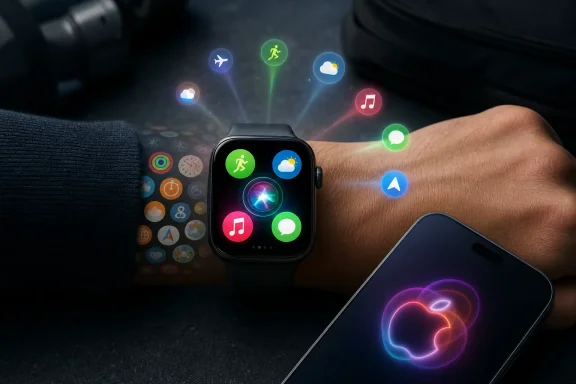
Instead of launching a full application library, watchOS 27 opens the Dynamic App Grid. The interface presents five large suggested app icons around a permanent central Siri app icon. A smaller control at the bottom leads to the complete app library, preserving either Grid View or List View according to the user’s existing preference.
That hierarchy matters. Apple is no longer treating the whole app collection as the Apple Watch’s primary home screen. It is treating the watch as a device where the next likely action matters more than comprehensive navigation.
For a wearable, that is the right instinct.
The Watch is not typically used like an iPhone, where a user might browse a folder, compare several applications, or spend ten minutes working in a single interface. Most watch interactions are short, focused, and contextual:
- Starting a workout
- Replying to a message
- Checking the weather
- Opening a boarding pass
- Controlling music or a podcast
- Finding directions
- Reviewing an upcoming appointment
- Checking a transit card or payment card
The old Grid View could accommodate all of those apps, but it did not prioritize them intelligently. It gave equal visual weight to frequently used tools and forgotten downloads. The watchOS 27 Dynamic App Grid is Apple’s attempt to correct that imbalance.
The Dynamic App Grid Explained
Six large icons, but only five are flexible
The new launcher is built around a simple six-item layout. Five positions are dynamic, while the center belongs to Siri. Apple says the surrounding app suggestions can reflect popular apps, recently used apps, and Siri recommendations.
In practical terms, that means the app grid should adapt to routines rather than force users to adapt to a static layout.
A typical day could look something like this:
- Morning: Weather, Calendar, Messages, and a coffee or transit app may be prominent.
- Commute: Maps, music, payment tools, and transit information may become more relevant.
- Workout: Workout, Now Playing, Podcasts, Fitness, and recovery-related apps may appear.
- Evening: Home controls, Messages, Sleep, and charging-related utilities may take priority.
Apple has long used suggestions in places such as the iPhone Lock Screen, Smart Stack, Siri Suggestions, and Spotlight. The Dynamic App Grid applies that same philosophy to the Apple Watch’s most visible navigation screen.
The key difference is that this is not merely a widget or a recommendation surface. It is the new default app launcher.
The old app views are still present
This is not a forced retirement for Grid View or List View. Anyone who needs a less predictive, more exhaustive layout can still reach the full app collection through the bottom icon in the Dynamic App Grid.
That fallback is important for several reasons:
- Users with many installed apps still have a complete launcher.
- People who prefer alphabetical browsing can retain List View.
- Longtime Apple Watch owners do not lose their existing app organization overnight.
- The Dynamic App Grid can be useful without becoming a single point of failure.
Apple’s design is best understood as a layered system. The Dynamic App Grid is for quick action. The older app views are for complete access.
That is a much healthier approach than pretending every installed app deserves a front-row seat on a screen measured in inches.
Why the Honeycomb Grid Needed Replacing
The original Apple Watch app grid was visually distinctive. It also quickly became one of the platform’s weakest usability choices.
On an iPhone, a dense grid of icons is manageable because the display is large enough to support labels, folders, spatial memory, and direct touch targets. On the Apple Watch, the same concept became a field of tiny circles that could be moved and resized but were often difficult to recognize at a glance.
The problem grew worse as Apple Watch apps became more capable. Owners began installing more tools for fitness, payments, smart homes, navigation, work communication, travel, and health. The launcher gained more icons while the display did not gain more space.
List View solved some of the discoverability problem, but it introduced a different kind of friction: scrolling. If the needed app begins with “W,” an alphabetical list is not necessarily faster than navigating a grid.
The Dynamic App Grid sidesteps both problems.
It reduces the initial choice set, enlarges touch targets, and places likely actions closer to the user. The goal is not to make every app easy to find. It is to make the right app easy to find most of the time.
That is a more realistic objective for a smartwatch.
A shift from application library to action launcher
The most notable aspect of this change is philosophical. Apple is moving away from an app-centric interface toward an intent-centric one.
The old view effectively asked:
Which app do you want to open?
The Dynamic App Grid attempts to answer:
What are you probably trying to do right now?
That distinction may sound subtle, but it changes how the Apple Watch feels in daily use. A traditional app launcher assumes the user knows the application route to an outcome. An AI-curated launcher attempts to surface the outcome’s most likely route first.
For example, a person preparing for a run may not mentally frame the task as “open the Workout app.” They may simply want to begin exercising. If Workout is already surfaced in a large icon, the watch gets out of the way.
That is the standard Apple should be aiming for on a device designed for seconds-long interactions.
Siri Moves From Feature to Interface Layer
The central placement of the new Siri app is not just a branding decision. It signals Apple’s intention to make Siri a core navigation layer across watchOS 27.
For years, Siri on Apple Watch was useful for basic, structured requests:
- Set a timer
- Send a message
- Start a workout
- Turn on a light
- Add a reminder
- Check the weather
It was much less reliable when a request required context, reasoning, multi-step actions, or information buried across personal apps and services. In those cases, the Watch often became the least convenient place to ask.
watchOS 27 promises a broader role for Siri AI. Apple describes the assistant as capable of handling more natural conversation, accessing relevant personal context, performing actions in apps, and responding to broader questions. The new dedicated app can also retain conversations, allowing a user to start a request on one Apple device and continue it on another.
That continuity is particularly relevant to the Apple Watch. A watch screen is not a natural place for a lengthy exchange, but it can be a highly convenient place to begin one.
What Siri AI could make easier
If the new system performs consistently, it could reduce the number of times users need to manually locate individual apps. Rather than opening Messages, Calendar, Maps, Music, or Fitness separately, users may be able to state a goal and let Siri find the right path.
Examples include:
- Sharing flight information with a family member
- Setting a new Activity ring goal
- Resuming a podcast
- Playing a song recommended in a message
- Pulling an upcoming reservation detail from a note
- Looking up a saved address or door code
- Finding information from recent emails or messages
This is where the Dynamic App Grid and Siri app complement each other. The grid serves the actions the system can predict with reasonable confidence. Siri becomes the escape hatch for the actions it cannot.
The central Siri position has advantages—and baggage
Making Siri permanent in the center has a clear usability benefit. The user always knows where to find the assistant, even as the surrounding apps change. Consistency is valuable when everything else on the page is deliberately dynamic.
But it also creates a risk. The Siri app occupies one-sixth of the main launcher regardless of whether the user wants it there. For people who rarely use voice commands, rely on a cellular Watch without an iPhone nearby, or remain skeptical of generative AI features, that fixed placement could feel like wasted space.
Apple has earned some skepticism here. Siri’s historical inconsistency means that a prominent placement must be justified by dependable results, not just by strategic importance.
The company is betting that watchOS 27’s new Siri capabilities will finally make the assistant worth a permanent home on the wrist.
The Nearby iPhone Requirement Is a Meaningful Limitation
One of the most important practical details is that Siri AI on Apple Watch relies on a nearby Apple Intelligence-compatible iPhone for processing. The Watch may be the interface, but the paired phone remains essential for the more capable assistant experience.
That means the feature is not equivalent to a fully self-contained AI assistant running independently on the wrist.
For many owners, this will not be a major issue. Apple Watch is frequently used within Bluetooth range of an iPhone, especially at home, at work, or during everyday travel. But it matters for the Watch’s most independent use cases:
- Outdoor runs without a phone
- Gym sessions where the iPhone stays in a locker
- Walks using a cellular Apple Watch
- Travel situations where the phone is low on battery or unavailable
- Emergency or low-connectivity scenarios
Apple Watch has gradually become more independent through cellular connectivity, offline music, Wallet, fitness tracking, and safety features. A flagship AI feature that retreats when the iPhone is absent introduces a notable boundary.
The limitation does not invalidate Siri AI. It simply means buyers should understand what they are getting: a wrist-based extension of Apple Intelligence, not a fully local AI computer.
Apple’s AI messaging requires careful reading
There is also a distinction between what Apple has publicly described and what outside reporting has suggested about the models behind the service. Apple presents Siri AI as being powered by Apple Intelligence. Reports have discussed Apple’s broader use of Google Gemini technology in its AI strategy, but that should not be confused with a confirmed technical description of the processing path for every Apple Watch request.
For users, the operational questions matter more than the model label:
- Does it understand the request?
- Does it access the right personal context?
- Does it perform the requested action accurately?
- Does it explain when it cannot act?
- Does it remain available when the iPhone is not nearby?
- Does it handle sensitive personal data appropriately?
Those are the measures by which Siri AI on Apple Watch should be judged.
The Customization Problem: Smart Suggestions Need User Control
The most obvious weakness of the Dynamic App Grid is its limited customization.
The system chooses the five surrounding apps. Based on current beta behavior and available details, users cannot fully pin favorite apps, block unwanted suggestions, or lock a preferred arrangement. Siri remains fixed at the center, while the rest of the launcher can shift according to usage and context.
That can be liberating for casual users. It can also be deeply frustrating for power users.
Predictability still matters on a watch
A dynamic launcher is useful when its predictions are accurate. It becomes distracting when it changes too frequently or elevates an app at the wrong moment.
The risks are straightforward:
- A user may lose muscle memory for a commonly used app.
- A critical app may disappear from the first screen at an inconvenient time.
- Recency may outweigh importance, surfacing a temporary app over a daily essential.
- Suggested apps may reveal personal patterns to anyone glancing at the Watch.
- The interface may feel less like a personal device and more like a system-controlled recommendation feed.
Apple should add a middle ground before the final release or in an early watchOS 27 update.
A sensible customization model would include:
- Pinning one or two essential apps
- Hiding apps from recommendations
- Selecting preferred categories, such as Fitness, Travel, Communication, or Home
- Locking the layout temporarily
- Viewing a brief explanation for why an app was suggested
- Allowing Siri’s center position to be optional for users who prefer another app
The strongest AI interfaces do not simply predict. They let people correct the prediction quickly and permanently.
Without that control, the Dynamic App Grid could become excellent for first-time Apple Watch buyers while irritating the long-term owners who know exactly how they want their device to behave.
One-Handed Use Is the Bigger watchOS 27 Theme
The Dynamic App Grid does not exist in isolation. It arrives alongside a new single-tap gesture for interacting with Smart Stack widgets, additional context-aware Smart Stack suggestions, refinements to Wallet, improved Find My experiences, and other usability changes.
Together, these updates point to a clear watchOS 27 theme: reduce the amount of screen manipulation required to get something done.
The new gesture allows users to tap their index finger and thumb together once to select a Smart Stack widget. The action is designed for moments when the other hand is occupied—carrying groceries, holding a leash, gripping exercise equipment, or simply walking.
This focus is more significant than it may initially appear. A smartwatch should not require the posture of a smartphone. The best Watch interactions happen with a glance, a short voice command, a crown turn, or a simple gesture.
The Dynamic App Grid is therefore part of a wider usability strategy:
- Let the system anticipate the next task.
- Make the next task large and easy to tap.
- Allow voice to handle complex or unexpected requests.
- Reduce the need to navigate through layers of menus.
- Support interaction when only one hand is available.
That is a mature direction for the platform.
Compatibility Will Be the Hardest Part for Many Owners
watchOS 27 has a surprisingly narrow supported-device list. The update requires an iPhone 11 or later, or an iPhone SE (2nd generation) or later, running iOS 27, plus one of the following Apple Watch models:
- Apple Watch Series 9
- Apple Watch Series 10
- Apple Watch Series 11
- Apple Watch Ultra 2
- Apple Watch Ultra 3
- Apple Watch SE 3
That leaves behind the Apple Watch Series 8, the original Apple Watch Ultra, and every older model.
The decision will be difficult for owners of recently purchased hardware, especially those using an original Ultra or Series 8. Both remain capable watches for notifications, fitness tracking, payments, navigation, and health monitoring. The absence of watchOS 27 may make them feel prematurely sidelined.
Apple’s likely argument is that the company wants a consistent baseline for new intelligence features, gestures, and performance expectations. That is understandable from a product-development standpoint. Yet the Dynamic App Grid itself does not appear, on its face, to require extreme computing power.
The broader concern is precedent. If a new app launcher and companion-assisted AI experience can sharply reduce compatibility, Apple Watch owners may reasonably wonder how long future software support will last for otherwise functional hardware.
Do not buy hardware for unconfirmed features
There is also no need to make an upgrade decision based on unannounced Apple Watch hardware or speculative health capabilities. Reports about future models, thinner cases, redesigned sensors, or blood-pressure features remain subject to change until Apple formally confirms them.
The immediate purchasing decision is simpler:
- Keep a compatible Watch if watchOS 27’s AI and launcher improvements appeal.
- Keep an older Watch if its current features still meet daily needs.
- Upgrade only when the combined value of hardware, battery health, support lifespan, and new software justifies the cost.
The Dynamic App Grid is a strong software feature. It is not, by itself, a reason to discard a working smartwatch.
Walkie-Talkie’s Disappearance Adds an Unwelcome Footnote
watchOS 27 beta versions have also drawn attention for the apparent removal of the Walkie-Talkie app. The push-to-talk feature has disappeared from the app list and Control Center in current beta builds, though Apple has not provided a detailed public explanation.
Because watchOS 27 is still in beta, software features can change before release. However, the continued absence of Walkie-Talkie makes it increasingly difficult to dismiss as a simple temporary omission.
The app was never among the Apple Watch’s most polished or universally used capabilities, but it represented something distinctive: low-friction, voice-first communication that felt naturally suited to the wrist.
Its disappearance serves as a useful reminder that a smarter, more AI-focused interface should not come at the expense of simple, direct features. Not every interaction needs intelligence, context, or prediction. Sometimes the best wearable experience is still pressing a button and talking to someone.
Dynamic App Grid Versus Wear OS 7
Apple is not alone in treating the smartwatch as an AI surface rather than merely a miniature phone. Google’s Wear OS 7 is also moving toward more personalized and agent-like behavior through Gemini Intelligence, live updates, connected-device controls, customizable widgets, and multi-step app automation.
The competitive direction is clear. Both Apple and Google are attempting to make wearable software feel more proactive.
But their approaches differ.
Apple’s Dynamic App Grid is a focused intervention in navigation. It changes the first screen users see after pressing the Digital Crown and tries to make app launching more context-aware.
Wear OS 7 places more emphasis on live information, user-created dashboards, service integration, and assistant-led automation. It is a broader platform approach, while Apple’s change is more tightly framed around reducing friction in the Watch’s existing interface.
Apple’s advantage is restraint. A six-icon launcher is easy to understand. Google’s advantage may be flexibility, particularly for users who want to build more customized watch experiences.
The winner will not be the company with the most ambitious AI claims. It will be the one that produces recommendations that are accurate, timely, private, and easy to override.
The Bottom Line
The Apple Watch Dynamic App Grid is watchOS 27’s most promising feature because it finally acknowledges how people actually use a smartwatch. Most owners do not want to browse an app library on their wrist. They want to start the workout, answer the message, find the route, control the music, or check the next event with as little effort as possible.
Replacing the old honeycomb-first approach with a focused, context-aware launcher is a long overdue correction. The new design makes touch targets larger, reduces visual clutter, preserves the older app views for complete access, and creates a clearer role for Siri as a command and continuity layer.
There are meaningful caveats. Siri AI’s dependence on a nearby compatible iPhone limits the Watch’s independence. The lack of pinning and layout controls could frustrate experienced users. The restricted watchOS 27 compatibility list will leave many recent Apple Watch owners behind. And the apparent removal of Walkie-Talkie shows that a software update can simplify one part of the experience while taking away another.
Even so, the direction is sound. The Apple Watch does not need a more elaborate app screen. It needs fewer decisions, better suggestions, and faster access to the actions that matter in the moment. The Dynamic App Grid delivers exactly that vision—provided Apple gives users enough control to make its intelligence feel helpful rather than presumptuous.
