
Microsoft’s own retrospective confirms the basic record. Windows 95 launched on August 24, 1995, with the Start button, taskbar, Recycle Bin, desktop shortcuts, longer file names, and Plug and Play hardware support. The company says it sold 7 million copies in its first five weeks. The midnight launches, Rolling Stones campaign, and Jay Leno appearance made Windows 95 a cultural event, but the interface changes are what outlived the advertising.
For PC users and IT administrators, the anniversary is a useful reminder that the Start menu was never merely an app launcher. It was the visible entrance to a standardized way of operating Windows: one persistent location for applications, documents, configuration, and shutdown; one persistent strip showing what is already running.
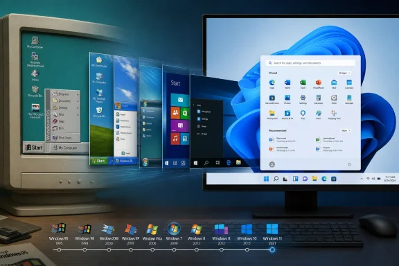 Windows 95 replaced a collection of windows with a control model
Windows 3.1 did have Program Manager, menus, icons, and program groups. It was not a command-line operating system. But Program Manager made the organization of the machine feel like the organization of a filing cabinet: users opened a group window, found an icon, launched an application, then managed the resulting windows separately.
Windows 95 changed the hierarchy. The desktop became the work surface, while the Start button became the named first action. Clicking it exposed Programs, Documents, Settings, Find, Help, Run, and Shut Down. The new taskbar then gave open applications a permanent representation at the bottom of the display.
That combination lowered the cost of basic desktop navigation. A user did not need to know which program group contained an application, remember a keyboard shortcut, or hunt through overlapping windows to return to something already open. The taskbar made state visible; Start supplied a consistent route to actions that were otherwise scattered across the system.
Microsoft’s 1995 documentation called the taskbar the “TV Guide” of Windows 95. The phrase sounds quaint now, but the design idea remains sound: a desktop needs an always-available summary of active work. In 2026, users may switch with Alt+Tab, Task View, virtual desktops, touch gestures, or a taskbar click, but the taskbar is still the visual fallback when they need to answer a simple question: what is open, and where did it go?
Microsoft did not invent the ingredients
Windows Central correctly notes that Microsoft did not originate every idea assembled in Windows 95. Graphical user interfaces, application launchers, contextual menus, desktop icons, and task-switching mechanisms all existed before August 1995. Apple’s Macintosh had a menu bar and Finder; Unix desktop environments had panels and menus; other systems had explored different models for organizing programs and documents.
The Windows 95 achievement was integration and scale. Microsoft put a task switcher, a launcher, a file-management gateway, system controls, and an explicit power command into a coherent layout that shipped on an enormous number of consumer PCs. It also tied the new shell to a major platform transition, bringing a more capable 32-bit Windows environment to machines whose owners were still accustomed to DOS and Windows 3.x.
That distinction is important when judging the legacy. Windows 95 was not the birth of the graphical interface. It was the point at which one interface pattern became the default mental model for a mass-market PC: launch from a menu, work in windows, switch from a strip, manage files in Explorer, and use the desktop as a stable home base.
The fact that rival desktop environments adopted similar panels, app menus, notification areas, and window lists is evidence that the model solved recurring usability problems. It gave mouse-and-keyboard users reliable targets that did not disappear when an application crashed, froze, or covered the screen.
The Start menu survived because its job is broader than search
The Start menu has endured repeated efforts to redefine it. Windows XP expanded it into a two-column hub. Windows Vista and Windows 7 put search at the center of the experience. Windows 10 mixed application lists with live tiles. Windows 11 shifted toward a centered panel of pins, recommendations, search, and account controls.
Each redesign changed the presentation, but not the role. Microsoft’s current Windows support documentation still describes Start as a key location for apps, settings, and files. Windows 11 lets users pin applications, choose which folders appear near the power button, change the app-list view, and move Start from the center back to the left side of the taskbar.
Those options reveal the enduring contract. The Start interface must provide an obvious place to begin, a way to recall installed software, access to important personal and system locations, and a safe path to sign out or shut down. Search improves that model, particularly for users who know the name of what they want. It does not replace the model for users browsing unfamiliar software, looking for an administrative tool, or trying to recover a task after a support call says, “Open Settings from Start.”
For managed Windows fleets, Start has become more than a personal launcher. Microsoft’s current Windows configuration guidance supports policy-based Start layouts and taskbar pins through Group Policy and mobile-device-management tooling. Organizations can establish a predictable set of approved tools for shared PCs, frontline devices, kiosks, and role-specific machines; newer policy options can apply a Start layout once, allowing users to customize later.
That is a direct descendant of the Windows 95 promise, even if the technology is vastly different. A standardized entry point reduces discovery time. The practical issue for admins is no longer whether users can find the Start button; it is whether the organization’s policies leave enough room for users to organize the tools they need.
Windows 8 demonstrated how much muscle memory matters
The clearest measure of Windows 95’s design durability came when Microsoft departed from it. Windows 8 replaced the familiar Start menu with a full-screen Start screen and removed the visible Start button from the desktop taskbar. The new interface was designed around touch-first tiles and the idea that the desktop was one environment among several, rather than the default command center.
The break was meaningful enough that Microsoft restored a visible Start button in Windows 8.1 in 2013, less than a year after Windows 8 shipped. Microsoft described Windows 8.1 at the time as a set of customer-driven refinements, including the return of that button, tutorials, desktop booting, and multitasking changes.
Windows 8.1 did not immediately restore the old Start menu; its button still led to the Start screen. But the reversal conceded a core usability point: desktop users expect a persistent, recognizable anchor at the edge of the screen. The button was a “warm blanket,” as a Microsoft manager described it at the time, because people had learned where to begin.
The episode is often flattened into a story about users disliking tiles. The deeper issue was continuity of control. A full-screen launcher can work well on tablets and touch devices. On a keyboard-and-mouse PC, it interrupts the visual relationship between the current work and the route to the next task. The Windows 95 layout kept that route on-screen.
Windows 11 preserves the structure while weakening some of its clarity
Windows 11 retains the Start-and-taskbar model almost intact at the structural level. Its default taskbar is centered, but Microsoft still allows left alignment. Start includes pinned apps, an All section, search, account controls, power options, and recommended items. The system tray remains the background-status area that Windows 95 made familiar, even though it now carries connectivity, accessibility, audio, battery, security, and notification functions that did not exist in the same form in 1995.
Yet the modern interface also exposes a tension Windows 95 largely avoided. The original Start menu was principally a user-controlled directory of programs and system tasks. Windows 11 Start is partly a curated surface, with recommendations and content suggestions competing for room with the things users explicitly chose to place there.
Microsoft’s support pages say users can disable recommendation providers so the section collapses, and enterprise administrators can define Start layouts. But the need for those controls underlines the practical design question: should the Start menu prioritize what the PC thinks is timely, or what the person operating it knows they need?
For most professional Windows deployments, the answer should be the latter. A support technician, finance worker, developer, or shared-device user benefits from recognizable, stable pins and clear access to system functions more than from a rotating recommendation layer. Administrators using Start layout policies should treat the menu as an operational interface, not promotional real estate: pin the required apps, avoid locking down every choice unless the device’s role demands it, and test the experience at ordinary display scaling.
The lasting design is a workflow, not a visual style
Windows 95’s gray bevels, teal desktop, and labeled Start button are artifacts of a particular era. The workflow is not. Modern Windows has touch input, high-DPI displays, cloud accounts, search indexing, virtual desktops, notification management, and AI-assisted features. But when a user needs to open an application, return to an open document, find a setting, or restart a machine, the interaction still follows the pattern Microsoft made standard in 1995.
Thirty-one years later, the Start menu and taskbar are less a tribute to Windows 95 than a constraint on every Windows redesign that followed. Microsoft can center them, simplify them, fill them with search, or manage them through policy. It can even try to replace them. But the next version of Windows will still need to answer the same questions Windows 95 answered unusually well: where do I begin, what is running, and how do I get back to work?
