

That distinction matters beyond retro-computing trivia. It explains why the original taskbar was not a row of pinned launch icons, why the Start menu was central to Windows 95’s mental model, and why debates over where Windows 11’s taskbar should sit remain arguments about workflow rather than mere nostalgia.
The claim that the NeXT Dock directly led to the taskbar
Joe Belfiore, a former Microsoft executive, has publicly rejected the idea that the NeXT Dock directly produced the Windows taskbar. In his account, two inputs mattered: an always-visible, bottom-of-screen Cairo “tray” and a realization about the burden of minimized windows. That is valuable first-hand testimony from someone familiar with the product’s development history.
But it should be read as a participant’s account of causation, not as a complete independently verified map of every graphical interface influence on Windows. The available evidence does not reconstruct every possible indirect relationship involving NeXTSTEP, Xerox PARC, RISC OS or other systems. Similar interface ideas can also arise as designers tackle similar problems: limited screen space, too many open windows and users who need a reliable route back to their programs.
The narrower conclusion is well supported: the record does not justify saying the NeXT Dock was the direct origin of the Windows 95 taskbar. Yet replacing that oversimplification with “it came from Cairo’s tray” would simply introduce a different oversimplification.
Cairo was an input, not a complete blueprint
Cairo was a Microsoft project exploring a more ambitious approach to information and interface organization. It mattered to early Chicago work. Daniel Oran, who says he worked on Chicago’s user interface, has described the team initially trying to integrate Cairo UI elements.
His account is important because it puts user testing at the center of the story. According to Oran, the functional Cairo model was too difficult for test participants to understand, and much of that attempted integration did not work out. He says that watching users struggle became the primary source for the ideas behind his Start menu and taskbar work, much of which he says he did in June 1993.
This does not erase Cairo from the history. A project can influence another even if its design is rejected, revised or used as a negative lesson. In fact, that is often how product design advances: a promising theoretical system meets ordinary users, the mismatch becomes clear, and the eventual design changes direction.
The meaningful lesson is not that Cairo “failed” and therefore had no influence. It is that Chicago’s interface did not merely transplant Cairo. Oran’s recollection describes a redesign prompted by usability evidence. The Start menu and taskbar should consequently be understood as an answer to specific observed difficulties, not just as visual remnants of an earlier project.
Why “tray” causes historical confusion
The word “tray” has acquired several meanings in Windows vocabulary, and that can blur the taskbar’s history. Users often use it informally for the notification area—the cluster that traditionally contains status and background-app icons near the clock. That is not the early Chicago “tray” described in the development record.
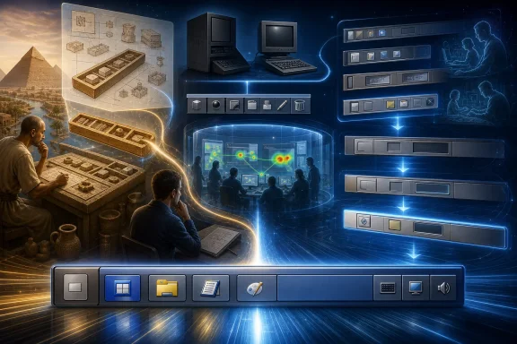
Raymond Chen, a long-time Microsoft engineer who has documented Windows history, explained that early Windows 95 builds used a bottom-docked folder window. Users could drag items into and out of it. This was called the tray. It was a working interface element, but it was not simply the final taskbar under an earlier name.
The crucial development change is concise: the tray was discarded and replaced with the taskbar.
That sequence supports two points at once. First, an always-visible bottom-area concept was present in early design work. Second, the final taskbar was a replacement rather than a direct preservation of that docked folder window. Calling the taskbar a “Cairo leftover tray” misses the discontinuity between the two designs and understates the role of testing and iteration.
It also helps explain why old terminology sometimes lingered. Interface language often outlives a product’s exact implementation. But historical nicknames are not proof that two components had the same purpose or structure.
The original taskbar solved the active-window problem
The Windows 95 taskbar and Start menu were designed as a system, but their roles were distinct.
The taskbar’s foundational job was task and window management. Its always-visible area represented active tasks, supplying a button for each active task. A user could use a single click to display a task window or switch to it. In an era when desktop users could easily accumulate minimized windows, this made the current state of the computer visible and recoverable.
The Start menu played the complementary role of centralized access. It was the route to programs, documents and system controls. Instead of requiring users to remember where shortcuts were scattered or which windows had been minimized, Windows could offer an obvious starting point and a consistent way to reach ongoing work.
This division is vital when judging the interface through a modern lens. Windows 95 task buttons primarily represented applications or documents that were already active. They were not conceived as permanent application launchers in the way today’s icons are commonly used. A program launcher and a task switcher may look alike in a horizontal strip, but they address different moments in a user’s workflow:
- Launching begins work by opening something not currently running.
- Switching resumes work already underway.
- Managing helps the user recognize, restore or organize active windows.
Windows 95 put the first of those actions chiefly in Start and the latter two in the taskbar. The apparent simplicity of the design came from keeping those jobs legible, even while presenting them next to each other at the bottom of the screen.
Windows 7 deliberately merged launching and switching
The widespread modern habit of treating taskbar icons as both launchers and active-app indicators is a later development. Before Windows 7, Windows included Quick Launch, a separate area containing application shortcuts. Those shortcuts could open programs that were not running.
Windows 7 folded that Quick Launch behavior into the taskbar buttons themselves. Users could pin an app that was not open, then launch it by selecting its icon; when the app was running, that same location also represented it on the taskbar. Microsoft described this as unifying the Quick Launch concept with the standard Windows taskbar.
This change was elegant for many people because it reduced visual duplication and gave frequently used applications a fixed home. But it also changed the taskbar’s meaning. The bar no longer solely answered, “What am I working on right now?” It also answered, “What might I want to open next?”
That merger has consequences for interface debates today. A user who mainly switches among numerous windows may value clear active-state representation, grouping behavior and labels. A user who mostly launches a small set of apps may value pinned icons and muscle memory. Both are using the taskbar, but they are emphasizing different layers of a control whose responsibilities expanded over time.
What this history says about Windows 11 taskbar placement
The return of taskbar-positioning discussion in Windows 11 has encouraged claims that Microsoft has simply restored an old capability for everybody. The evidence available as of August 31, 2026 does not support that conclusion.
Microsoft documentation dated August 14 placed four-edge taskbar positioning in Windows Insider Release Preview builds. Independent reporting shortly afterward likewise described the feature as nearing a general release and noted that Microsoft had not announced when it would be broadly available. Release Preview is a late testing and validation channel, but it is not the same thing as confirmed general availability to all Windows 11 users.
For practical users, that difference is more than terminology. A feature visible in release notes or on a test build may still be unavailable on a managed work PC, absent from a stable installation, or subject to change before wider rollout. Readers assessing whether they can move their own taskbar should check the specific Windows version and update channel on the machine rather than assume that a reported capability has reached every device.
There is also a useful historical irony. The Windows 95 taskbar’s bottom position was part of a broader effort to make navigation predictable and visible. Allowing it on all screen edges gives people greater control over desktop geometry—especially on ultrawide displays, portrait monitors or multi-monitor setups—but it does not replace the taskbar’s core challenge. The interface still has to make open work, launching choices and system status understandable at a glance.
A better way to describe the Windows 95 breakthrough
The strongest version of the history is neither a mythology of a single borrowed idea nor a claim that Windows invented every relevant concept from scratch. Windows 95 introduced the Start button and taskbar as a highly consequential mainstream implementation. The surviving accounts show an iterative path: Cairo influenced early Chicago work; attempts to incorporate Cairo’s functional model ran into usability trouble; designers responded to what people found difficult; an early docked tray was abandoned; and the shipping taskbar paired active-window controls with a centralized Start menu.
Belfiore’s denial of a direct NeXT Dock lineage belongs in that account. So does Oran’s emphasis on testing. So does the distinction between the early tray and the eventual taskbar. Together, they offer a more persuasive explanation than any one-origin story.
For Windows users, the practical takeaway is straightforward. The taskbar has never been just decoration at the screen edge. Its original purpose was to reduce the cost of losing track of work. Later Windows versions added pinned launching and other responsibilities, which made it more flexible but also more contested. Whether Microsoft places it at the bottom, lets users move it, centers icons or changes grouping behavior, the durable test should be the same one that shaped Chicago: can ordinary people quickly understand where their programs are, what is open, and how to get back to what they were doing?