

Microsoft is developing a Copilot Design System for Microsoft 365 that defines how its AI assistant appears, moves, and hands off work across Word, Excel, PowerPoint, and related productivity surfaces in 2026. The project is not a retreat from Copilot so much as a re-architecture of its visibility. After months of user complaints about AI buttons, prompts, and branding spreading through Windows and Office, Microsoft’s answer is not to remove the assistant; it is to make the assistant feel less like an add-on and more like the operating grammar of work.
That is the tension at the center of Microsoft’s AI strategy now. The company has heard the anger over Copilot sprawl, but it still believes the prize is an interface where Copilot is not a destination, sidebar, or chatbot, but a persistent layer that understands where the user is and what they are trying to do. The Copilot Design System is Microsoft’s attempt to turn that ambition into UX policy before backlash turns it into another Windows-era cautionary tale.
The phrase “Copilot Design System” sounds like the kind of internal naming that escapes into public view only because Microsoft employs enough designers, program managers, and executives to make language itself a platform. But beneath the corporate varnish is a serious shift. Microsoft is trying to define not merely what Copilot looks like, but when it should appear, how assertive it should be, and how much work it can do before the user feels interrupted.
That matters because Copilot has spent much of its young life as a branding exercise with an interface attached. In Windows, Edge, Office, Teams, Bing, and Microsoft 365, the name has been used for everything from a chat window to rewrite tools to contextual suggestions. For users, especially those who did not ask for AI in every corner of their workflow, the result has often felt less like assistance than saturation.
A design system is Microsoft’s way of admitting that saturation is not the same thing as integration. The company has spent the past two years proving that it can put Copilot almost anywhere. The harder problem is proving that it should.
John Friedman, now Microsoft 365 Chief Design Officer, has described the effort as an “AI-forward design system” meant to feel intentional and humane. Strip away the boardroom phrasing and the mission is plain enough: Microsoft wants Copilot to behave consistently across apps without turning every app into a shrine to Copilot. That is a much higher bar than adding a sparkle icon to the ribbon.
The challenge is that AI assistants violate many old assumptions of software design. A button launches a command. A menu reveals options. A sidebar contains a tool. Copilot is supposed to do all of those things, but also infer intent, suggest next steps, move across contexts, and sometimes act before the user has fully articulated a request. That is why Microsoft is no longer just designing affordances; it is designing behavior.
That is not a small distinction. In productivity software, screen real estate is not decorative. A floating object that covers a spreadsheet cell, a slide element, or a line of text is not “ambient” to the person trying to finish a real task under deadline. It is a trespass.
Microsoft’s response has been to soften the deployment. Users are being given more control over where the Dynamic Action Button lives, including the ability to move it back toward the ribbon rather than leaving it floating over content. That change is modest, but it reveals something important about the broader Copilot Design System: the company is learning that AI visibility is not automatically good visibility.
The irony is that the Dynamic Action Button appears to be one of the very patterns born from the design thinking Microsoft now wants to elevate. It was supposed to be contextual, visible, and helpful. It was supposed to reduce the need to hunt for Copilot features. But visibility becomes intrusion when the user cannot easily dismiss it, relocate it, or understand why it is appearing.
This is the oldest Microsoft problem in a new costume. The company has always been tempted to confuse discoverability with insistence. Office assistants, ribbons, task panes, notification badges, Start menu promotions, Edge nudges, and OneDrive prompts have all emerged from the same organizational instinct: if a feature matters strategically, users must be shown it. Copilot intensifies that instinct because Microsoft has placed enormous product, cloud, and investor expectations behind it.
The lesson from the floating button is not that Copilot should be hidden. It is that AI controls need the humility of good interface furniture. They should be nearby, legible, and predictable — but they should not sit in the chair before the user does.
The company’s central claim is that Microsoft 365 already shapes organizational behavior for enormous numbers of people. That is true in the mundane but powerful sense that Word defines documents, Outlook defines email habits, Excel defines business analysis, and Teams defines meetings for much of the modern workplace. If Copilot is embedded into those surfaces coherently, Microsoft argues, it can become a productivity layer rather than a novelty feature.
This is the generous reading of the Copilot Design System. A unified AI interaction model could reduce confusion. It could make the assistant less random, less visually noisy, and less dependent on users memorizing which app has which Copilot feature this month. For IT departments, consistency also matters: training, support documentation, accessibility review, compliance evaluation, and user adoption all become easier when the interface behaves predictably.
But “humane” design requires restraint, and restraint is not historically Microsoft’s strongest muscle when a strategic platform is at stake. The company is not merely trying to help users polish a paragraph or summarize a meeting. It is trying to normalize AI-mediated work across the Microsoft 365 estate. That means every decision about where Copilot appears is also a decision about how aggressively Microsoft can change user habits.
This is where the backlash becomes useful. Users complaining about a button are not merely being cranky about pixels. They are objecting to a perceived shift in control. When software begins suggesting, hovering, anticipating, and reappearing across contexts, users start to ask whether the interface is serving their intent or steering it.
Microsoft’s design system will succeed only if it treats that suspicion as legitimate. The future of Copilot in Office depends less on whether the AI can produce a decent summary and more on whether users believe they remain the authors of the workflow.
That sounds sensible in the abstract. The worst version of AI integration is a swarm of disconnected icons, each shouting for attention without knowing what the others are doing. If Copilot is going to live in multiple places inside the same app, those places need choreography. Otherwise the user experiences not intelligence, but clutter with machine-learning ambitions.
The phrase “Throw & Catch,” however, also exposes the difficulty of the project. Traditional software interfaces do not usually require users to track a tool as it moves through the environment. A command is either available or unavailable. A pane is open or closed. A button is in the ribbon or it is not. Copilot’s design challenge is that it wants to be fluid without becoming slippery.
Microsoft says this work is informed by mouse-tracking studies and prototyping experiments. That sort of research can reveal where users pause, where they hesitate, and when a suggestion might be noticed. But telemetry can only say so much about annoyance. A user may hover over Copilot because they are curious, because they are confused, because it is blocking something, or because they are trying to make it go away.
The company’s framing suggests that the system will lower cognitive friction by signaling which Copilot surface is active and letting other surfaces recede. That is the correct design goal. But Microsoft will need to be careful not to confuse choreography with consent. Smooth handoffs are still unwelcome if the user never asked to enter the dance.
There is a better version of this future. In that version, Copilot becomes like spellcheck, autocomplete, or paste options: present when relevant, quiet when ignored, and configurable when the user’s work style differs from Microsoft’s model. In the worse version, Copilot becomes Clippy at cloud scale, always convinced the next gesture is an invitation.
That is why Copilot cannot be treated as just another Office feature. A feature has scope. Context has gravity. Once a system begins to reason across documents, email, chat, calendar, and app state, it becomes part of the user’s working environment rather than a tool inside it.
For enterprise customers, that promise is exactly why Copilot is attractive. A chatbot that knows nothing about your tenant is a novelty. An assistant that can summarize a project history from Teams chats, Word documents, Outlook threads, and SharePoint files is something else entirely. It is also something that forces administrators to think hard about permissions, data boundaries, retention, and employee expectations.
Microsoft’s design challenge therefore overlaps with its trust challenge. If Copilot appears contextually, users need to understand what context it is using. If it suggests an action, users need to know whether the suggestion is based on selected text, the whole file, recent activity, or broader organizational data. If it hands off from an on-canvas prompt to a chat pane, the handoff needs to preserve not only workflow state but user confidence.
This is where Microsoft has an advantage and a burden. No competitor has the same depth of integration into Office work at comparable scale. But no competitor can provoke the same level of anxiety by changing how work appears inside Word and Excel. People tolerate experimentation in a new AI app; they are less forgiving when experimentation lands inside the spreadsheet that closes the quarter.
The term “thought partner” appears often in Microsoft’s Copilot messaging, and it is revealing. A partner implies agency, memory, judgment, and initiative. Those are precisely the traits that make AI useful — and precisely the traits that make users wary when the interface feels imposed.
Copilot arrived in Windows with similar ambition. It was placed on the taskbar, mapped to new keyboard hardware, tied into system experiences, and presented as a defining element of the Windows 11 era. More recently, Microsoft has signaled a more careful approach, including reducing unnecessary Copilot entry points and rethinking how AI features are branded in built-in apps.
That retreat should not be mistaken for surrender. Microsoft is not abandoning AI in Windows any more than it is abandoning AI in Office. It is recalibrating the visible layer while preserving the strategic layer underneath. In some cases, that means Copilot branding may fade while AI functionality remains under more generic labels such as writing tools or contextual actions.
For users who dislike Copilot, this can feel like a shell game. The logo disappears, but the underlying experience remains. For Microsoft, it is a rational product move: users may reject a brand shoved into every corner, while still accepting features that solve immediate problems. The company’s task is to determine whether resistance is to AI itself, to the Copilot name, to bad placement, or to lack of control.
The answer is probably all four, depending on the user. Some people do not want generative AI in their workflow at all. Some are open to it but resent mandatory UI changes. Some will use it if it is clearly useful and easy to ignore. Some will adopt it only when their employer mandates it. A design system that treats those groups as one audience will fail.
This is why Microsoft’s language about being intentional matters. Intentionality is not achieved by making Copilot more aesthetically consistent. It is achieved by deciding where Copilot does not belong.
Enterprise software lives or dies on governance. Administrators need to know which users see Copilot, which apps expose it, which data sources ground it, how feedback is collected, what audit trails exist, and how changes roll out across channels. A design system that improves consistency for end users may still create headaches if it arrives faster than policy controls, training material, and support readiness.
The Dynamic Action Button episode is a reminder that UX changes in Microsoft 365 are not just design decisions; they are help desk events. A button that appears in Excel can trigger tickets, internal guidance, accessibility reviews, screenshots in regulated workflows, and executive complaints. Multiply that across tenants, update channels, and licensing states, and a small visual change becomes an operational issue.
Microsoft has been trying to make Copilot more discoverable because usage matters. The company needs customers who bought Microsoft 365 Copilot licenses to actually use them, and it needs unlicensed users to understand what the paid product can do. But discoverability in a managed workplace is not the same as discoverability in a consumer app. IT departments do not want surprise campaigns inside productivity tools.
The best enterprise version of the Copilot Design System would make AI surfaces predictable, documented, and policy-aware. It would give administrators clear controls before new entry points appear. It would respect accessibility and screen-capture workflows. It would distinguish between users with paid Copilot licenses, users with limited Copilot Chat access, and users whose organizations have intentionally disabled AI features.
The worst version would be a rolling series of experiments justified by engagement metrics. If Microsoft learns only that a floating button increases Copilot clicks, it will repeat the mistake. If it learns that clicks purchased with irritation create distrust, the design system may become a stabilizing force.
A user may click Copilot because they want to try it. They may click because the icon is unfamiliar. They may click because it is in the way. They may click because they are trying to remove it. All of those events can look like engagement until someone reads the feedback.
Microsoft knows this, at least in theory. The company has repeatedly said it is listening to user feedback and adjusting Copilot experiences accordingly. But the economic pressure around AI makes this a difficult promise to keep. Microsoft has invested heavily in AI infrastructure, repositioned much of its product strategy around Copilot, and asked customers to accept a new pricing and licensing layer for features whose value is still being proven in many workplaces.
That pressure encourages aggressive distribution. The more surfaces Copilot occupies, the more chances users have to discover a valuable workflow. It also increases the chance that users conclude Microsoft is forcing a product rather than earning adoption. The Copilot Design System sits precisely at that fork in the road.
Good design can help here, but it cannot solve a business-model problem by itself. If users feel that Copilot is present because Microsoft needs return on AI investment, they will interpret even polished interactions cynically. If Copilot repeatedly saves time without demanding attention, the same users may stop caring whether it is part of a strategic platform.
The difference will be measured in moments: whether the suggestion appears at the right time, whether dismissal is respected, whether the feature works as promised, whether the UI stays out of the content, and whether the user can predict what will happen next. Trust in AI does not arrive in a keynote. It accrues through small, boring acts of interface reliability.
Copilot is nowhere near that stage yet. It is still surrounded by branding, novelty, anxiety, and inflated expectations. It is both a feature and a campaign. It is both a tool and a symbol of Microsoft’s AI turn. That makes every UI decision feel heavier than it would otherwise.
A design system could be the mechanism that helps Copilot mature. By defining consistent patterns across Word, Excel, PowerPoint, and other Microsoft 365 surfaces, Microsoft can reduce the sense that every app team is improvising its own AI land grab. It can teach users that Copilot behaves according to rules rather than whims. It can make the assistant feel less like a pop-up and more like a layer of the application.
But becoming boring also means accepting invisibility when appropriate. The system should not demand that Copilot be seen at all times. It should allow the AI to wait behind selection gestures, keyboard shortcuts, contextual menus, and user-invoked panes. It should treat quietness as a feature, not a failure of activation.
This is especially true for Excel, where precision and density define the experience. A floating assistant in a word processor may be annoying; in a spreadsheet, it can feel like something is physically blocking the work. Microsoft’s design patterns must respect the culture of each app, not merely apply one Copilot theory across them all.
The company says it wants a unified experience that accounts for local context. That is the correct formulation. Unified should not mean identical. Copilot in PowerPoint, where users manipulate objects visually, should not behave exactly like Copilot in Word, where selected text is often the primary object, or Excel, where a single obscured cell can matter.
Copilot is a bigger fight because it is not merely rearranging commands. It is changing the relationship between user and application. Instead of asking users to choose commands from a known set, Microsoft is asking them to accept a probabilistic assistant that may suggest, summarize, draft, transform, and route work across contexts.
That shift can be genuinely useful. Many Office workflows are tedious because users know what they want but not which command, formula, template, or menu path will get them there. Natural language and contextual suggestions can lower that barrier. For less technical users, Copilot may make complex features accessible in ways decades of ribbon refinements never did.
But the same shift can also flatten expertise. Power users often do not want the interface to infer intent; they want it to execute instructions. They may view proactive suggestions as latency, clutter, or patronizing automation. In Excel especially, the gap between “help me analyze this” and “do not touch my model” is wide.
The Copilot Design System has to serve both audiences. That requires a layered approach: visible entry points for new or occasional users, efficient shortcuts for frequent users, and suppression controls for those who prefer a cleaner canvas. If Microsoft treats all users as beginners in need of AI guidance, it will alienate the very professionals who have kept Office entrenched for decades.
This is the paradox of Copilot in Microsoft 365. The more powerful it becomes, the more carefully it must be governed by interface restraint. A weak assistant can be annoying. A capable assistant in the wrong place can be dangerous, or at least professionally disruptive.
These questions sound soft, but they are hard product requirements. Enterprise trust is built from control surfaces, documentation, rollout discipline, and predictable behavior. Consumer trust is built from usefulness and respect. Copilot needs both.
The design system’s language about being embedded, discoverable, and consistent points in the right direction. Embedded means Copilot should live where work happens. Discoverable means users should not need a training course to find it. Consistent means moving between apps should not feel like learning a new assistant each time.
Yet the missing word is optional. Not optional in the sense that Microsoft must stop selling or integrating Copilot, but optional in the daily interaction sense: easy to ignore, easy to move, easy to invoke, easy to dismiss. Optionality is what separates assistance from coercion.
Microsoft’s recent adjustments to the Dynamic Action Button suggest the company understands at least part of the problem. The question is whether that lesson becomes a principle or just a patch. If every Copilot surface has to be publicly disliked before it gains user control, the design system will arrive as damage control rather than leadership.
Microsoft therefore has less room for experimentation than it sometimes behaves as though it has. The company can test aggressively in Insider builds, limited rollouts, and opt-in experiences. But when AI UI changes arrive broadly in production apps, they carry the weight of Microsoft’s reputation for stewardship.
That reputation has been strained by years of prompts, upsells, defaults, and cloud nudges. Copilot inherits that baggage whether or not the Copilot team deserves it. Users who already feel Windows pushes Edge too hard, OneDrive too insistently, or Microsoft accounts too persistently are primed to interpret Copilot as another attempt to bend the desktop toward corporate priorities.
This is why the design system must do more than make Copilot beautiful. It must make Copilot trustworthy. Trustworthy means the assistant does not appear merely because Microsoft wants engagement. It appears because the user’s current task plausibly benefits from it. It recedes when the user continues without it. It does not punish those who prefer old workflows.
If Microsoft gets this right, Copilot could become a meaningful evolution of Office: less a chatbot pasted onto productivity apps than a contextual command layer that helps users bridge intent and execution. If Microsoft gets it wrong, Copilot will become the new symbol of everything users dislike about modern software: subscription pressure, cloud dependency, interface churn, and features that will not take a hint.
That is the tension at the center of Microsoft’s AI strategy now. The company has heard the anger over Copilot sprawl, but it still believes the prize is an interface where Copilot is not a destination, sidebar, or chatbot, but a persistent layer that understands where the user is and what they are trying to do. The Copilot Design System is Microsoft’s attempt to turn that ambition into UX policy before backlash turns it into another Windows-era cautionary tale.
 Microsoft Is No Longer Selling a Button — It Is Selling a Behavior
The phrase “Copilot Design System” sounds like the kind of internal naming that escapes into public view only because Microsoft employs enough designers, program managers, and executives to make language itself a platform. But beneath the corporate varnish is a serious shift. Microsoft is trying to define not merely what Copilot looks like, but when it should appear, how assertive it should be, and how much work it can do before the user feels interrupted.That matters because Copilot has spent much of its young life as a branding exercise with an interface attached. In Windows, Edge, Office, Teams, Bing, and Microsoft 365, the name has been used for everything from a chat window to rewrite tools to contextual suggestions. For users, especially those who did not ask for AI in every corner of their workflow, the result has often felt less like assistance than saturation.
A design system is Microsoft’s way of admitting that saturation is not the same thing as integration. The company has spent the past two years proving that it can put Copilot almost anywhere. The harder problem is proving that it should.
John Friedman, now Microsoft 365 Chief Design Officer, has described the effort as an “AI-forward design system” meant to feel intentional and humane. Strip away the boardroom phrasing and the mission is plain enough: Microsoft wants Copilot to behave consistently across apps without turning every app into a shrine to Copilot. That is a much higher bar than adding a sparkle icon to the ribbon.
The challenge is that AI assistants violate many old assumptions of software design. A button launches a command. A menu reveals options. A sidebar contains a tool. Copilot is supposed to do all of those things, but also infer intent, suggest next steps, move across contexts, and sometimes act before the user has fully articulated a request. That is why Microsoft is no longer just designing affordances; it is designing behavior.
The Floating Button Became the Warning Label
The controversy around the Dynamic Action Button in Office is the practical case study Microsoft did not need but probably deserved. The button, placed at the lower-right corner of Word, Excel, and PowerPoint, was intended to make Copilot more discoverable and context-aware. In practice, many users saw a floating AI badge sitting on top of the document they were trying to work on.That is not a small distinction. In productivity software, screen real estate is not decorative. A floating object that covers a spreadsheet cell, a slide element, or a line of text is not “ambient” to the person trying to finish a real task under deadline. It is a trespass.
Microsoft’s response has been to soften the deployment. Users are being given more control over where the Dynamic Action Button lives, including the ability to move it back toward the ribbon rather than leaving it floating over content. That change is modest, but it reveals something important about the broader Copilot Design System: the company is learning that AI visibility is not automatically good visibility.
The irony is that the Dynamic Action Button appears to be one of the very patterns born from the design thinking Microsoft now wants to elevate. It was supposed to be contextual, visible, and helpful. It was supposed to reduce the need to hunt for Copilot features. But visibility becomes intrusion when the user cannot easily dismiss it, relocate it, or understand why it is appearing.
This is the oldest Microsoft problem in a new costume. The company has always been tempted to confuse discoverability with insistence. Office assistants, ribbons, task panes, notification badges, Start menu promotions, Edge nudges, and OneDrive prompts have all emerged from the same organizational instinct: if a feature matters strategically, users must be shown it. Copilot intensifies that instinct because Microsoft has placed enormous product, cloud, and investor expectations behind it.
The lesson from the floating button is not that Copilot should be hidden. It is that AI controls need the humility of good interface furniture. They should be nearby, legible, and predictable — but they should not sit in the chair before the user does.
“Intentional and Humane” Is Doing a Lot of Work
Microsoft’s design language around Copilot leans heavily on words like intentional, humane, ambient, contextual, and intelligent. These are not meaningless terms, but they are aspirational ones. They describe the feeling Microsoft wants users to have, not necessarily the feeling users currently report.The company’s central claim is that Microsoft 365 already shapes organizational behavior for enormous numbers of people. That is true in the mundane but powerful sense that Word defines documents, Outlook defines email habits, Excel defines business analysis, and Teams defines meetings for much of the modern workplace. If Copilot is embedded into those surfaces coherently, Microsoft argues, it can become a productivity layer rather than a novelty feature.
This is the generous reading of the Copilot Design System. A unified AI interaction model could reduce confusion. It could make the assistant less random, less visually noisy, and less dependent on users memorizing which app has which Copilot feature this month. For IT departments, consistency also matters: training, support documentation, accessibility review, compliance evaluation, and user adoption all become easier when the interface behaves predictably.
But “humane” design requires restraint, and restraint is not historically Microsoft’s strongest muscle when a strategic platform is at stake. The company is not merely trying to help users polish a paragraph or summarize a meeting. It is trying to normalize AI-mediated work across the Microsoft 365 estate. That means every decision about where Copilot appears is also a decision about how aggressively Microsoft can change user habits.
This is where the backlash becomes useful. Users complaining about a button are not merely being cranky about pixels. They are objecting to a perceived shift in control. When software begins suggesting, hovering, anticipating, and reappearing across contexts, users start to ask whether the interface is serving their intent or steering it.
Microsoft’s design system will succeed only if it treats that suspicion as legitimate. The future of Copilot in Office depends less on whether the AI can produce a decent summary and more on whether users believe they remain the authors of the workflow.
Throw and Catch Turns Copilot Into a Moving Target
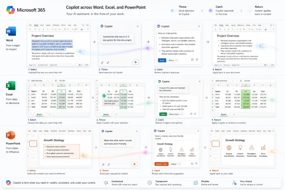
One of the more revealing ideas in Microsoft’s design work is a pattern called “Throw & Catch.” The concept is that Copilot entry points should communicate with each other, handing off attention and interaction as the user moves between surfaces. A highlighted passage might trigger an on-canvas suggestion. A floating button might recede as a chat pane becomes active. A contextual prompt might direct the user to the place where Copilot is currently focused.That sounds sensible in the abstract. The worst version of AI integration is a swarm of disconnected icons, each shouting for attention without knowing what the others are doing. If Copilot is going to live in multiple places inside the same app, those places need choreography. Otherwise the user experiences not intelligence, but clutter with machine-learning ambitions.
The phrase “Throw & Catch,” however, also exposes the difficulty of the project. Traditional software interfaces do not usually require users to track a tool as it moves through the environment. A command is either available or unavailable. A pane is open or closed. A button is in the ribbon or it is not. Copilot’s design challenge is that it wants to be fluid without becoming slippery.
Microsoft says this work is informed by mouse-tracking studies and prototyping experiments. That sort of research can reveal where users pause, where they hesitate, and when a suggestion might be noticed. But telemetry can only say so much about annoyance. A user may hover over Copilot because they are curious, because they are confused, because it is blocking something, or because they are trying to make it go away.
The company’s framing suggests that the system will lower cognitive friction by signaling which Copilot surface is active and letting other surfaces recede. That is the correct design goal. But Microsoft will need to be careful not to confuse choreography with consent. Smooth handoffs are still unwelcome if the user never asked to enter the dance.
There is a better version of this future. In that version, Copilot becomes like spellcheck, autocomplete, or paste options: present when relevant, quiet when ignored, and configurable when the user’s work style differs from Microsoft’s model. In the worse version, Copilot becomes Clippy at cloud scale, always convinced the next gesture is an invitation.
The Real Product Is Context
The most important part of the Copilot Design System is not the button, the pane, or the prompt. It is context. Microsoft wants Copilot to know what document is open, what text is selected, what meeting just happened, what files matter, what organizational permissions apply, and what the user is likely trying to accomplish next.That is why Copilot cannot be treated as just another Office feature. A feature has scope. Context has gravity. Once a system begins to reason across documents, email, chat, calendar, and app state, it becomes part of the user’s working environment rather than a tool inside it.
For enterprise customers, that promise is exactly why Copilot is attractive. A chatbot that knows nothing about your tenant is a novelty. An assistant that can summarize a project history from Teams chats, Word documents, Outlook threads, and SharePoint files is something else entirely. It is also something that forces administrators to think hard about permissions, data boundaries, retention, and employee expectations.
Microsoft’s design challenge therefore overlaps with its trust challenge. If Copilot appears contextually, users need to understand what context it is using. If it suggests an action, users need to know whether the suggestion is based on selected text, the whole file, recent activity, or broader organizational data. If it hands off from an on-canvas prompt to a chat pane, the handoff needs to preserve not only workflow state but user confidence.
This is where Microsoft has an advantage and a burden. No competitor has the same depth of integration into Office work at comparable scale. But no competitor can provoke the same level of anxiety by changing how work appears inside Word and Excel. People tolerate experimentation in a new AI app; they are less forgiving when experimentation lands inside the spreadsheet that closes the quarter.
The term “thought partner” appears often in Microsoft’s Copilot messaging, and it is revealing. A partner implies agency, memory, judgment, and initiative. Those are precisely the traits that make AI useful — and precisely the traits that make users wary when the interface feels imposed.
Windows Users Have Already Seen This Movie
The Copilot Design System is focused on Microsoft 365, but Windows users will see it through a broader lens. Microsoft has spent years using Windows as both a product and a distribution channel for its strategic priorities. Sometimes that has produced useful integration. Other times it has produced the familiar feeling that the PC is being rented back to its owner with promotional overlays attached.Copilot arrived in Windows with similar ambition. It was placed on the taskbar, mapped to new keyboard hardware, tied into system experiences, and presented as a defining element of the Windows 11 era. More recently, Microsoft has signaled a more careful approach, including reducing unnecessary Copilot entry points and rethinking how AI features are branded in built-in apps.
That retreat should not be mistaken for surrender. Microsoft is not abandoning AI in Windows any more than it is abandoning AI in Office. It is recalibrating the visible layer while preserving the strategic layer underneath. In some cases, that means Copilot branding may fade while AI functionality remains under more generic labels such as writing tools or contextual actions.
For users who dislike Copilot, this can feel like a shell game. The logo disappears, but the underlying experience remains. For Microsoft, it is a rational product move: users may reject a brand shoved into every corner, while still accepting features that solve immediate problems. The company’s task is to determine whether resistance is to AI itself, to the Copilot name, to bad placement, or to lack of control.
The answer is probably all four, depending on the user. Some people do not want generative AI in their workflow at all. Some are open to it but resent mandatory UI changes. Some will use it if it is clearly useful and easy to ignore. Some will adopt it only when their employer mandates it. A design system that treats those groups as one audience will fail.
This is why Microsoft’s language about being intentional matters. Intentionality is not achieved by making Copilot more aesthetically consistent. It is achieved by deciding where Copilot does not belong.
Administrators Will Judge the System by the Off Switch
For IT professionals, the Copilot Design System is interesting but secondary. The first question is not whether a floating button animates gracefully into a chat pane. The first question is whether the organization can control it.Enterprise software lives or dies on governance. Administrators need to know which users see Copilot, which apps expose it, which data sources ground it, how feedback is collected, what audit trails exist, and how changes roll out across channels. A design system that improves consistency for end users may still create headaches if it arrives faster than policy controls, training material, and support readiness.
The Dynamic Action Button episode is a reminder that UX changes in Microsoft 365 are not just design decisions; they are help desk events. A button that appears in Excel can trigger tickets, internal guidance, accessibility reviews, screenshots in regulated workflows, and executive complaints. Multiply that across tenants, update channels, and licensing states, and a small visual change becomes an operational issue.
Microsoft has been trying to make Copilot more discoverable because usage matters. The company needs customers who bought Microsoft 365 Copilot licenses to actually use them, and it needs unlicensed users to understand what the paid product can do. But discoverability in a managed workplace is not the same as discoverability in a consumer app. IT departments do not want surprise campaigns inside productivity tools.
The best enterprise version of the Copilot Design System would make AI surfaces predictable, documented, and policy-aware. It would give administrators clear controls before new entry points appear. It would respect accessibility and screen-capture workflows. It would distinguish between users with paid Copilot licenses, users with limited Copilot Chat access, and users whose organizations have intentionally disabled AI features.
The worst version would be a rolling series of experiments justified by engagement metrics. If Microsoft learns only that a floating button increases Copilot clicks, it will repeat the mistake. If it learns that clicks purchased with irritation create distrust, the design system may become a stabilizing force.
Engagement Is Not the Same as Acceptance
One of the quiet traps in AI product development is the worship of engagement. If a new Copilot surface increases usage, the dashboard looks better. But enterprise productivity software is not social media, and a click is not always a vote of confidence.A user may click Copilot because they want to try it. They may click because the icon is unfamiliar. They may click because it is in the way. They may click because they are trying to remove it. All of those events can look like engagement until someone reads the feedback.
Microsoft knows this, at least in theory. The company has repeatedly said it is listening to user feedback and adjusting Copilot experiences accordingly. But the economic pressure around AI makes this a difficult promise to keep. Microsoft has invested heavily in AI infrastructure, repositioned much of its product strategy around Copilot, and asked customers to accept a new pricing and licensing layer for features whose value is still being proven in many workplaces.
That pressure encourages aggressive distribution. The more surfaces Copilot occupies, the more chances users have to discover a valuable workflow. It also increases the chance that users conclude Microsoft is forcing a product rather than earning adoption. The Copilot Design System sits precisely at that fork in the road.
Good design can help here, but it cannot solve a business-model problem by itself. If users feel that Copilot is present because Microsoft needs return on AI investment, they will interpret even polished interactions cynically. If Copilot repeatedly saves time without demanding attention, the same users may stop caring whether it is part of a strategic platform.
The difference will be measured in moments: whether the suggestion appears at the right time, whether dismissal is respected, whether the feature works as promised, whether the UI stays out of the content, and whether the user can predict what will happen next. Trust in AI does not arrive in a keynote. It accrues through small, boring acts of interface reliability.
Copilot Has to Become Boring Before It Can Become Essential
The most successful productivity features eventually disappear into habit. Nobody marvels at undo, search, autosave, spellcheck, or track changes every time they use them. They are powerful because they are dependable, legible, and boring.Copilot is nowhere near that stage yet. It is still surrounded by branding, novelty, anxiety, and inflated expectations. It is both a feature and a campaign. It is both a tool and a symbol of Microsoft’s AI turn. That makes every UI decision feel heavier than it would otherwise.
A design system could be the mechanism that helps Copilot mature. By defining consistent patterns across Word, Excel, PowerPoint, and other Microsoft 365 surfaces, Microsoft can reduce the sense that every app team is improvising its own AI land grab. It can teach users that Copilot behaves according to rules rather than whims. It can make the assistant feel less like a pop-up and more like a layer of the application.
But becoming boring also means accepting invisibility when appropriate. The system should not demand that Copilot be seen at all times. It should allow the AI to wait behind selection gestures, keyboard shortcuts, contextual menus, and user-invoked panes. It should treat quietness as a feature, not a failure of activation.
This is especially true for Excel, where precision and density define the experience. A floating assistant in a word processor may be annoying; in a spreadsheet, it can feel like something is physically blocking the work. Microsoft’s design patterns must respect the culture of each app, not merely apply one Copilot theory across them all.
The company says it wants a unified experience that accounts for local context. That is the correct formulation. Unified should not mean identical. Copilot in PowerPoint, where users manipulate objects visually, should not behave exactly like Copilot in Word, where selected text is often the primary object, or Excel, where a single obscured cell can matter.
The Copilot Layer Is the New Ribbon Fight
Microsoft has been through interface wars before. The Office ribbon was controversial because it reorganized familiar commands and forced users to relearn muscle memory. Over time, many adapted, but the initial fight was real because Office users are not casual visitors. They live inside these tools.Copilot is a bigger fight because it is not merely rearranging commands. It is changing the relationship between user and application. Instead of asking users to choose commands from a known set, Microsoft is asking them to accept a probabilistic assistant that may suggest, summarize, draft, transform, and route work across contexts.
That shift can be genuinely useful. Many Office workflows are tedious because users know what they want but not which command, formula, template, or menu path will get them there. Natural language and contextual suggestions can lower that barrier. For less technical users, Copilot may make complex features accessible in ways decades of ribbon refinements never did.
But the same shift can also flatten expertise. Power users often do not want the interface to infer intent; they want it to execute instructions. They may view proactive suggestions as latency, clutter, or patronizing automation. In Excel especially, the gap between “help me analyze this” and “do not touch my model” is wide.
The Copilot Design System has to serve both audiences. That requires a layered approach: visible entry points for new or occasional users, efficient shortcuts for frequent users, and suppression controls for those who prefer a cleaner canvas. If Microsoft treats all users as beginners in need of AI guidance, it will alienate the very professionals who have kept Office entrenched for decades.
This is the paradox of Copilot in Microsoft 365. The more powerful it becomes, the more carefully it must be governed by interface restraint. A weak assistant can be annoying. A capable assistant in the wrong place can be dangerous, or at least professionally disruptive.
The Near-Term Test Is Not Intelligence, but Manners
The AI industry loves capability benchmarks. Microsoft’s users will judge Copilot by manners. Does it interrupt? Does it block content? Does it remember dismissal? Does it explain what it is doing? Does it show up differently after an update without warning? Does it make the user feel faster, or merely observed?These questions sound soft, but they are hard product requirements. Enterprise trust is built from control surfaces, documentation, rollout discipline, and predictable behavior. Consumer trust is built from usefulness and respect. Copilot needs both.
The design system’s language about being embedded, discoverable, and consistent points in the right direction. Embedded means Copilot should live where work happens. Discoverable means users should not need a training course to find it. Consistent means moving between apps should not feel like learning a new assistant each time.
Yet the missing word is optional. Not optional in the sense that Microsoft must stop selling or integrating Copilot, but optional in the daily interaction sense: easy to ignore, easy to move, easy to invoke, easy to dismiss. Optionality is what separates assistance from coercion.
Microsoft’s recent adjustments to the Dynamic Action Button suggest the company understands at least part of the problem. The question is whether that lesson becomes a principle or just a patch. If every Copilot surface has to be publicly disliked before it gains user control, the design system will arrive as damage control rather than leadership.
The Office Canvas Now Carries Microsoft’s AI Reputation
The stakes are high because Office is not a playground. Windows enthusiasts may debate taskbar changes, Start menu ads, or Copilot key mappings with justified intensity, but Office sits even deeper in the daily machinery of business. A bad AI interaction in Word or Excel is not merely irritating; it can interrupt paid work.Microsoft therefore has less room for experimentation than it sometimes behaves as though it has. The company can test aggressively in Insider builds, limited rollouts, and opt-in experiences. But when AI UI changes arrive broadly in production apps, they carry the weight of Microsoft’s reputation for stewardship.
That reputation has been strained by years of prompts, upsells, defaults, and cloud nudges. Copilot inherits that baggage whether or not the Copilot team deserves it. Users who already feel Windows pushes Edge too hard, OneDrive too insistently, or Microsoft accounts too persistently are primed to interpret Copilot as another attempt to bend the desktop toward corporate priorities.
This is why the design system must do more than make Copilot beautiful. It must make Copilot trustworthy. Trustworthy means the assistant does not appear merely because Microsoft wants engagement. It appears because the user’s current task plausibly benefits from it. It recedes when the user continues without it. It does not punish those who prefer old workflows.
If Microsoft gets this right, Copilot could become a meaningful evolution of Office: less a chatbot pasted onto productivity apps than a contextual command layer that helps users bridge intent and execution. If Microsoft gets it wrong, Copilot will become the new symbol of everything users dislike about modern software: subscription pressure, cloud dependency, interface churn, and features that will not take a hint.
The Copilot Design System’s First Draft Is Written in User Irritation
The clearest lesson from Microsoft’s current Copilot moment is that the company’s AI future will be negotiated through the interface, not just through model quality. Users do not experience “AI strategy.” They experience a button covering a cell, a pane opening at the wrong time, or a suggestion that either saves five minutes or steals attention.- Microsoft is building the Copilot Design System to make AI interactions across Microsoft 365 feel coherent rather than scattered across unrelated buttons and panes.
- The Dynamic Action Button backlash shows that discoverability can become intrusion when users cannot easily move, dismiss, or predict an AI entry point.
- The “Throw & Catch” pattern is Microsoft’s attempt to coordinate Copilot surfaces so that the assistant’s focus moves visibly across the interface.
- Administrators will care less about the elegance of the design language than about controls, rollout timing, licensing clarity, and support impact.
- Copilot’s long-term acceptance depends on whether Microsoft treats quietness, configurability, and restraint as core design features rather than concessions after complaints.
- The most important test for Copilot in Office is whether it can become useful enough to fade into habit instead of remaining a permanent branding campaign.
References
- Primary source: Neowin
Published: Tue, 26 May 2026 08:28:00 GMT
Microsoft is working on a "Copilot Design System" - Neowin
Microsoft says its new Copilot Design System will make AI feel "humane", and it also reveals how deeply Copilot is embedding itself into Office workflows. www.neowin.net
- Related coverage: windowscentral.com
Microsoft admits forcing the floating Copilot button on Office users was a mistake—but engagement went up anyway | Windows Central
After a wave of user backlash over "intrusive" design, Microsoft is rolling out a fix that allows Word and Excel users to move the AI assistant back to the ribbon.www.windowscentral.com - Official source: support.microsoft.com
Providing feedback about Microsoft Copilot with Microsoft 365 apps | Microsoft Support
Providing feedback about Microsoft Copilot with Microsoft 365 appssupport.microsoft.com - Official source: learn.microsoft.com
Known Issues in Microsoft 365 Copilot Extensibility | Microsoft Learn
Find information about current known issues related to Microsoft 365 Copilot extensibility and the recommended workarounds.learn.microsoft.com - Related coverage: theregister.com
Microsoft lets users exile floating Copilot button after interface rage
Listening to your customers? Who are you, and what have you done with Microsoft?www.theregister.com - Related coverage: windowsreport.com

Microsoft Rolls Back Floating Copilot Button in Word, Excel, and PowerPoint
Microsoft is rolling back part of its floating Copilot button changes in Word, Excel, and PowerPoint after user complaints.
windowsreport.com
- Related coverage: windowsnews.ai
Microsoft Moves Copilot Button to Ribbon by Default in Office After May 2026 Update Following User Complaints - Windows News
Microsoft finally lets you move the Copilot button in Word, Excel, and PowerPoint to the ribbon, ending the floating orb’s reign of distraction. Here’s how...windowsnews.ai - Official source: techcommunity.microsoft.com
Shaping Copilot across Word, Excel, and PowerPoint for the flow of work
Learn about updates we're making based on your feedback to give you more control over how Copilot appears in your favorite apps. techcommunity.microsoft.com
- Official source: design.learn.microsoft.com

Button | Atlas Design | Microsoft
design.learn.microsoft.com
- Related coverage: windowsforum.com
Microsoft Brings Copilot Button Back to Office Ribbon After User Backlash | Windows Forum
Microsoft is preparing to let Word, Excel, and PowerPoint users move the new floating Copilot button back into the ribbon after complaints that the...windowsforum.com - Official source: microsoft.com
</rdf:Alt> </dc:title> <dc:description> <rdf:Alt> <rdf:li xml:lang="x-default"/> </rdf:Alt> </dc:description> <dc:creator> <rdf:Seq> <rdf:li>Lukas V
</rdf:Alt> </dc:description> <dc:creator> <rdf:Seq> <rdf:li>Lukas Velushwww.microsoft.com
- Official source: cdn-dynmedia-1.microsoft.com
- Official source: marketingassets.microsoft.com
