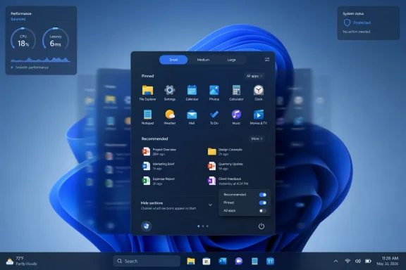
Microsoft is rolling out its 2025 Windows 11 Start menu redesign to version 24H2 and 25H2 users as of July 2026, bringing a single scrollable layout, category-based app browsing, and more control over the long-criticized Recommended area. The change is not the grand restoration of Windows 10-era freedom that some users still want, but it is the clearest admission yet that the original Windows 11 Start menu was too rigid for too many people. More important, the work now reaching mainstream PCs looks less like a one-off visual tweak and more like the foundation for a modular Start menu that Microsoft plans to expand in Windows 11 26H2 later this year. The Start menu is becoming configurable again — slowly, unevenly, and in Microsoft’s preferred staged-release fashion — but the direction of travel is unmistakable.
When Windows 11 launched in 2021, the Start menu was framed as part of a cleaner, calmer desktop. Centered icons, rounded corners, and a simplified launcher were meant to signal a break from the tile-heavy compromise of Windows 10. But the price of that calm was control.
For years, the Windows Start menu had been less a pristine design object than a working surface. Users pinned, grouped, resized, ignored, and customized it in idiosyncratic ways. Windows 11 replaced that history with a narrow grid of pinned apps and a Recommended section that often felt more like an obligation than a convenience.
That is why this rollout matters. The new design does not merely shuffle pixels. It changes the logic of the Start menu from a fixed panel into something closer to a shell component made of separable parts.
The immediate gains are modest but meaningful. Users get a single scrollable page instead of the older two-step split between pinned items and the app list. The All Apps experience gains category-style organization. The Recommended section can be reduced or hidden more cleanly than before, depending on configuration and rollout state.
The larger story is that Microsoft appears to have accepted the core criticism: a launcher used by hundreds of millions of people cannot behave like a static mockup. It has to accommodate different devices, different habits, and different administrative realities.
Microsoft’s new scrollable design is an attempt to make the menu feel less cramped without forcing users into the old “click All apps, then go somewhere else” rhythm. It puts more of the Start experience into a continuous surface. That sounds minor until you remember how often Start is opened for a task that lasts only a few seconds.
The category view for All Apps is also more than cosmetic. Alphabetical lists are predictable, but they are poor at discovery and tedious on machines with large software inventories. Category grouping gives Windows another way to make sense of an increasingly crowded app environment, especially on consumer PCs loaded with Store apps, web apps, system components, and vendor utilities.
Still, this is not yet the fully modular Start menu described in the newer preview builds. Users should not expect the currently shipping version to offer every switch, size preset, and privacy toggle Microsoft has been testing. The mainstream rollout is the first half of the story: fewer clicks, less clutter, and a layout that finally feels as if it can evolve.
That distinction matters because Windows users have learned to distrust vague promises of personalization. Microsoft has often used that word to mean “choose between a few approved arrangements.” The current Start menu is better, but the real test is whether Microsoft follows through on the deeper controls already visible in 26H2 development.
That tension runs through Windows 11. Search can reach the web. Widgets blend personal utility with feed-driven content. The Settings app increasingly advertises Microsoft account services and ecosystem features. The Start menu, sitting at the emotional center of the desktop, absorbed all of that frustration.
To Microsoft, Recommended was presumably a productivity surface. In theory, it could surface files, apps, and recent activity at the moment a user needed them. In practice, many users saw blank space, irrelevant entries, or a section that could not be removed without leaving the menu feeling awkwardly incomplete.
The new controls are therefore a concession to lived experience. A useful recommendation engine has to earn its space. If it does not, hiding it should not require registry edits, third-party tools, or resignation.
This is where Microsoft’s slow reversal is most interesting. The company has not abandoned recommendations, nor will it. But it is increasingly willing to let users say no, which is the minimum condition for any recommendation feature to be trusted.
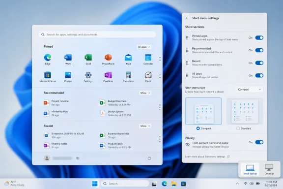
The size presets are especially important because the fixed Start panel has always been a strange fit for the diversity of Windows hardware. A 13-inch laptop, a 49-inch ultrawide monitor, a classroom desktop, and a handheld gaming PC do not need the same launcher footprint. A Small and Large Start menu may sound basic, but basic is exactly what Windows 11 often withheld.
Section-level toggles are the bigger philosophical shift. If Pinned, All Apps, and Recent or Recommended can be independently shown or hidden, then Start becomes less of a predetermined experience and more of a user-composed one. That is closer to the old Windows spirit, even if it arrives through modern Settings toggles rather than drag-and-drop chaos.
The account privacy controls are similarly overdue. A Start menu that displays a user’s name and profile photo may be harmless on a personal laptop, but it is less welcome in meetings, classrooms, livestreams, remote support sessions, or shared workspaces. Hiding identity in the launcher is a small feature with an outsized practical benefit.
None of this should be treated as guaranteed until it leaves the Insider pipeline. Microsoft tests many shell ideas that change, stall, or arrive in fragments. But the pattern is now coherent enough to read: the Start menu is being broken into pieces Microsoft can expose, hide, resize, and manage separately.
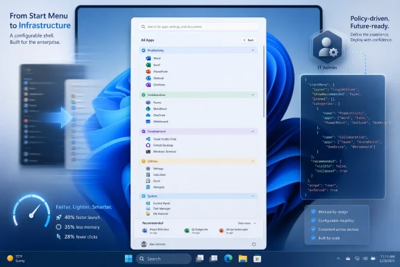
Microsoft’s move toward JSON-based Start layout configuration is one of the most consequential parts of the redesign. Windows 11 already supported Start customization through LayoutModification.json, and Microsoft’s current documentation emphasizes JSON for pinned layouts, deployment through Intune, Configuration Service Providers, provisioning packages, and Group Policy in supported versions. That puts Start customization into the same policy-driven world as the rest of managed Windows.
The distinction between applying a layout once and enforcing it repeatedly is crucial. A locked-down kiosk, lab machine, or frontline-worker PC may need a Start menu that resets at sign-in and never drifts. A knowledge worker’s laptop may need only a sensible initial layout, after which the user should be free to rearrange it.
This is where Microsoft’s evolving Start policy model is more mature than the consumer UI suggests. Admins can define pinned applications, deploy the layout through management tools, and in newer supported configurations decide whether user changes should persist. That is the difference between personalization and governance.
The risk, as ever, is fragmentation. Policy behavior can depend on Windows version, cumulative update level, edition, management path, and rollout state. In the real world, a “Windows 11 fleet” often contains multiple builds at different patch levels, and Start menu behavior may not be identical across them.
But this is not a return to the old days when administrators could assume one shell layout mechanism would behave uniformly across all supported Windows clients. Windows 11’s Start menu has changed repeatedly, and some controls require specific version and update baselines. That makes documentation discipline more important than ever.
Administrators testing the new Start menu should validate three things before declaring victory. They need to know whether the target PCs have the right Windows version and cumulative update. They need to confirm whether the policy path applies at the user or computer level in their deployment model. They need to test whether the layout is enforced every sign-in or applied once and left to the user.
The most common failure mode will not be dramatic. It will be the quiet reappearance of defaults: category view returning unexpectedly, pins not appearing because an app is missing, or a user’s changes being overwritten after policy refresh. Those are the kinds of problems that generate help desk tickets rather than headlines.
Microsoft’s direction is still welcome. Start layout management is moving toward a cleaner, more declarative model. But any admin who has lived through Windows shell policy changes knows the rule: trust the JSON only after the pilot group survives a reboot, a sign-out, a policy refresh, and a cumulative update.
Microsoft’s recent performance work, including the Low Latency Profile changes reported around the May 2026 optional update and the subsequent broader rollout, is aimed at that perception. The idea is straightforward: prioritize core shell experiences such as Start, Search, and quick system surfaces so they respond with less visible delay. For users on high-end desktops, that may be hard to notice. For cheaper laptops, older machines, or battery-constrained devices, it could matter.
The deeper fix is the reported rebuild of Start using native WinUI components rather than web-based pieces. That shift, if it arrives as described, would be more significant than any toggle. Windows users are remarkably forgiving of interface changes when the result feels fast; they are far less forgiving when a basic shell surface behaves like a sluggish embedded webpage.
There is a credibility issue here, too. Windows 11 has often looked modern before it felt modern. Animation, translucency, and rounded design language can make a demo sing, but daily use exposes latency. If Microsoft wants users to believe Windows is becoming more responsive, Start is one of the first places it has to prove it.
A faster Start menu also changes the meaning of the redesign. More controls are welcome, but controls layered on top of lag simply create a more customizable annoyance. Performance is what turns the new Start menu from a negotiated compromise into a genuine upgrade.
That overcorrection was understandable but costly. Microsoft wanted a cleaner Windows, one less burdened by decades of UI archaeology. But the company underestimated how much of Windows’ value lies in its tolerance for different workflows.
Power users did not object to the centered Start button because it was centered. They objected because the broader redesign removed escape routes. No movable taskbar at launch, fewer Start options, less density, fewer visible affordances — each change could be defended individually, but together they made Windows feel less like a platform and more like an appliance.
The new Start menu work suggests Microsoft has absorbed at least part of that lesson. The answer is not to resurrect every Windows 10 behavior wholesale. Some old behaviors were messy, inconsistent, or built for a different era. The answer is to make modern Windows configurable enough that users do not have to fight the defaults.
That is a subtle but important distinction. A good default should exist. It should not become a cage.
That is frustrating, but it is also the way Windows now evolves. The annual feature update is still a branding event, yet the real operating system changes arrive continuously. The Start menu redesign is a perfect example: parts of the 2025 work are reaching 24H2 and 25H2 users now, while the more advanced 2026 controls are already visible in experimental builds tied to the next wave.
For enthusiasts, this makes the Insider Program more important than ever. It is not merely a preview of next year’s Windows; it is the public staging area for features that may be switched on across supported releases in unexpected combinations. For administrators, that same reality complicates planning.
The practical response is to stop treating version numbers as the whole story. Build numbers, cumulative update levels, feature flags, and policy availability now matter. So does Microsoft’s habit of rolling features out gradually even after the relevant update is installed.
This is not unique to Windows, but it collides with Windows’ enterprise role. Consumer platforms can shift under users and call it iteration. Managed Windows environments need predictability, rollback paths, and clear documentation. The Start menu’s staged rollout is a reminder that Microsoft is still trying to serve both worlds with one update model.
Every time a user installs a Start replacement, Microsoft loses a little control over the first interaction with Windows. That matters technically, aesthetically, and strategically. The Start menu is where Microsoft can surface apps, files, search, account state, cloud services, and increasingly AI-adjacent experiences.
Giving users more built-in flexibility is therefore defensive as well as responsive. If the default shell can be resized, decluttered, and made less intrusive, fewer users need to replace it. Microsoft keeps the user inside the supported experience while reducing the resentment that drove them elsewhere.
This does not mean third-party tools are going away. Some users will always prefer classic menus, dense hierarchies, left-aligned taskbars, or specialized launchers. But the broader audience may be satisfied by official controls if those controls are reliable and visible.
That is the real opportunity for Microsoft. The company does not need to make every power user love the Windows 11 Start menu. It needs to make the default good enough, the customization obvious enough, and the performance fast enough that replacing Start becomes a preference rather than a survival tactic.
The new documentation reportedly covers both traditional Group Policy and MDM deployment through the Start Policy CSP. Admins can enforce JSON-based pinned app layouts, prevent users from modifying the Start menu, hide Recommended, disable category view, manage recently added and most-used apps, configure account-related options, and control pinned folders and power options.
One notable enterprise addition is the ability to force a specific Start menu size across managed devices. That matters for organizations trying to keep classroom PCs, kiosks, shared workstations, frontline devices, or department-standard builds visually predictable.
For IT pros, this moves the redesign from “new shell experience to watch” into “policy surface to test.” Admins should validate the controls on pilot devices before broad deployment, especially where Windows 11 version, cumulative update level, Intune profile scope, or Group Policy refresh behavior may affect whether the Start menu is merely initialized or actively enforced.
 Microsoft Finally Treats the Start Menu as Infrastructure, Not Ornament
When Windows 11 launched in 2021, the Start menu was framed as part of a cleaner, calmer desktop. Centered icons, rounded corners, and a simplified launcher were meant to signal a break from the tile-heavy compromise of Windows 10. But the price of that calm was control.For years, the Windows Start menu had been less a pristine design object than a working surface. Users pinned, grouped, resized, ignored, and customized it in idiosyncratic ways. Windows 11 replaced that history with a narrow grid of pinned apps and a Recommended section that often felt more like an obligation than a convenience.
That is why this rollout matters. The new design does not merely shuffle pixels. It changes the logic of the Start menu from a fixed panel into something closer to a shell component made of separable parts.
The immediate gains are modest but meaningful. Users get a single scrollable page instead of the older two-step split between pinned items and the app list. The All Apps experience gains category-style organization. The Recommended section can be reduced or hidden more cleanly than before, depending on configuration and rollout state.
The larger story is that Microsoft appears to have accepted the core criticism: a launcher used by hundreds of millions of people cannot behave like a static mockup. It has to accommodate different devices, different habits, and different administrative realities.
The First Wave Fixes the Daily Annoyance, Not the Whole Argument
The Start menu now rolling out to Windows 11 24H2 and 25H2 addresses the grievance most ordinary users could explain in one sentence: too much of the menu was wasted on things they did not ask for. The old layout’s Pinned section was useful enough, but the Recommended area was a lightning rod because it occupied prime space while often failing to justify its presence.Microsoft’s new scrollable design is an attempt to make the menu feel less cramped without forcing users into the old “click All apps, then go somewhere else” rhythm. It puts more of the Start experience into a continuous surface. That sounds minor until you remember how often Start is opened for a task that lasts only a few seconds.
The category view for All Apps is also more than cosmetic. Alphabetical lists are predictable, but they are poor at discovery and tedious on machines with large software inventories. Category grouping gives Windows another way to make sense of an increasingly crowded app environment, especially on consumer PCs loaded with Store apps, web apps, system components, and vendor utilities.
Still, this is not yet the fully modular Start menu described in the newer preview builds. Users should not expect the currently shipping version to offer every switch, size preset, and privacy toggle Microsoft has been testing. The mainstream rollout is the first half of the story: fewer clicks, less clutter, and a layout that finally feels as if it can evolve.
That distinction matters because Windows users have learned to distrust vague promises of personalization. Microsoft has often used that word to mean “choose between a few approved arrangements.” The current Start menu is better, but the real test is whether Microsoft follows through on the deeper controls already visible in 26H2 development.
The Recommended Section Became a Proxy War Over Windows Itself
The argument over Recommended was never only about recently opened files or suggested apps. It became a symbol of the modern Windows bargain: Microsoft wants the shell to be helpful, promotional, cloud-aware, and adaptive, while many users want it to stay quiet and get out of the way.That tension runs through Windows 11. Search can reach the web. Widgets blend personal utility with feed-driven content. The Settings app increasingly advertises Microsoft account services and ecosystem features. The Start menu, sitting at the emotional center of the desktop, absorbed all of that frustration.
To Microsoft, Recommended was presumably a productivity surface. In theory, it could surface files, apps, and recent activity at the moment a user needed them. In practice, many users saw blank space, irrelevant entries, or a section that could not be removed without leaving the menu feeling awkwardly incomplete.
The new controls are therefore a concession to lived experience. A useful recommendation engine has to earn its space. If it does not, hiding it should not require registry edits, third-party tools, or resignation.
This is where Microsoft’s slow reversal is most interesting. The company has not abandoned recommendations, nor will it. But it is increasingly willing to let users say no, which is the minimum condition for any recommendation feature to be trusted.
The 26H2 Work Suggests a More Radical Start Menu Is Coming
The preview work tied to Windows 11 26H2 goes beyond the version now reaching general users. Experimental builds have shown size presets, section-level visibility controls, and privacy options that allow users to hide account identity from the Start menu. That is a more substantial change than a prettier All Apps list.The size presets are especially important because the fixed Start panel has always been a strange fit for the diversity of Windows hardware. A 13-inch laptop, a 49-inch ultrawide monitor, a classroom desktop, and a handheld gaming PC do not need the same launcher footprint. A Small and Large Start menu may sound basic, but basic is exactly what Windows 11 often withheld.
Section-level toggles are the bigger philosophical shift. If Pinned, All Apps, and Recent or Recommended can be independently shown or hidden, then Start becomes less of a predetermined experience and more of a user-composed one. That is closer to the old Windows spirit, even if it arrives through modern Settings toggles rather than drag-and-drop chaos.
The account privacy controls are similarly overdue. A Start menu that displays a user’s name and profile photo may be harmless on a personal laptop, but it is less welcome in meetings, classrooms, livestreams, remote support sessions, or shared workspaces. Hiding identity in the launcher is a small feature with an outsized practical benefit.
None of this should be treated as guaranteed until it leaves the Insider pipeline. Microsoft tests many shell ideas that change, stall, or arrive in fragments. But the pattern is now coherent enough to read: the Start menu is being broken into pieces Microsoft can expose, hide, resize, and manage separately.
IT Administrators Get the Less Glamorous but More Important Upgrade
For home users, the Start menu story is about convenience. For administrators, it is about repeatability. A Start layout that looks tidy on one reference machine is not useful if it cannot be reliably deployed, preserved, or reset across a fleet.Microsoft’s move toward JSON-based Start layout configuration is one of the most consequential parts of the redesign. Windows 11 already supported Start customization through LayoutModification.json, and Microsoft’s current documentation emphasizes JSON for pinned layouts, deployment through Intune, Configuration Service Providers, provisioning packages, and Group Policy in supported versions. That puts Start customization into the same policy-driven world as the rest of managed Windows.
The distinction between applying a layout once and enforcing it repeatedly is crucial. A locked-down kiosk, lab machine, or frontline-worker PC may need a Start menu that resets at sign-in and never drifts. A knowledge worker’s laptop may need only a sensible initial layout, after which the user should be free to rearrange it.
This is where Microsoft’s evolving Start policy model is more mature than the consumer UI suggests. Admins can define pinned applications, deploy the layout through management tools, and in newer supported configurations decide whether user changes should persist. That is the difference between personalization and governance.
The risk, as ever, is fragmentation. Policy behavior can depend on Windows version, cumulative update level, edition, management path, and rollout state. In the real world, a “Windows 11 fleet” often contains multiple builds at different patch levels, and Start menu behavior may not be identical across them.
The Group Policy Story Is Better, but Not Magically Simple
Group Policy support for Start layout configuration matters because not every environment is fully Intune-managed. Plenty of organizations still rely on Active Directory, hybrid identity, local GPOs, imaging workflows, and the accumulated muscle memory of Windows administration. For them, a JSON file that can be referenced by policy is much easier to operationalize than a consumer-only Settings toggle.But this is not a return to the old days when administrators could assume one shell layout mechanism would behave uniformly across all supported Windows clients. Windows 11’s Start menu has changed repeatedly, and some controls require specific version and update baselines. That makes documentation discipline more important than ever.
Administrators testing the new Start menu should validate three things before declaring victory. They need to know whether the target PCs have the right Windows version and cumulative update. They need to confirm whether the policy path applies at the user or computer level in their deployment model. They need to test whether the layout is enforced every sign-in or applied once and left to the user.
The most common failure mode will not be dramatic. It will be the quiet reappearance of defaults: category view returning unexpectedly, pins not appearing because an app is missing, or a user’s changes being overwritten after policy refresh. Those are the kinds of problems that generate help desk tickets rather than headlines.
Microsoft’s direction is still welcome. Start layout management is moving toward a cleaner, more declarative model. But any admin who has lived through Windows shell policy changes knows the rule: trust the JSON only after the pilot group survives a reboot, a sign-out, a policy refresh, and a cumulative update.
Performance May Matter More Than Personalization
The Start menu’s design has taken most of the criticism, but performance has been the quieter source of irritation. A launcher can be ugly and still acceptable if it opens instantly. A launcher that hesitates turns every interaction into a reminder that the shell is heavier than it should be.Microsoft’s recent performance work, including the Low Latency Profile changes reported around the May 2026 optional update and the subsequent broader rollout, is aimed at that perception. The idea is straightforward: prioritize core shell experiences such as Start, Search, and quick system surfaces so they respond with less visible delay. For users on high-end desktops, that may be hard to notice. For cheaper laptops, older machines, or battery-constrained devices, it could matter.
The deeper fix is the reported rebuild of Start using native WinUI components rather than web-based pieces. That shift, if it arrives as described, would be more significant than any toggle. Windows users are remarkably forgiving of interface changes when the result feels fast; they are far less forgiving when a basic shell surface behaves like a sluggish embedded webpage.
There is a credibility issue here, too. Windows 11 has often looked modern before it felt modern. Animation, translucency, and rounded design language can make a demo sing, but daily use exposes latency. If Microsoft wants users to believe Windows is becoming more responsive, Start is one of the first places it has to prove it.
A faster Start menu also changes the meaning of the redesign. More controls are welcome, but controls layered on top of lag simply create a more customizable annoyance. Performance is what turns the new Start menu from a negotiated compromise into a genuine upgrade.
Microsoft Is Relearning a Lesson Windows Once Knew by Instinct
The Start menu became iconic because it balanced discoverability with user agency. It gave beginners somewhere obvious to click, while letting experienced users build habits around pins, folders, search, and muscle memory. Windows 11 initially overcorrected toward simplicity.That overcorrection was understandable but costly. Microsoft wanted a cleaner Windows, one less burdened by decades of UI archaeology. But the company underestimated how much of Windows’ value lies in its tolerance for different workflows.
Power users did not object to the centered Start button because it was centered. They objected because the broader redesign removed escape routes. No movable taskbar at launch, fewer Start options, less density, fewer visible affordances — each change could be defended individually, but together they made Windows feel less like a platform and more like an appliance.
The new Start menu work suggests Microsoft has absorbed at least part of that lesson. The answer is not to resurrect every Windows 10 behavior wholesale. Some old behaviors were messy, inconsistent, or built for a different era. The answer is to make modern Windows configurable enough that users do not have to fight the defaults.
That is a subtle but important distinction. A good default should exist. It should not become a cage.
The Insider Pipeline Is Now the Real Windows Roadmap
One reason the Start menu story is hard to follow is that “Windows 11” no longer means one thing at one moment. Features appear in Insider channels, roll out through controlled feature releases, arrive in optional previews, and then surface broadly through Patch Tuesday or enablement packages. Two users on the same nominal Windows version may not see the same shell on the same day.That is frustrating, but it is also the way Windows now evolves. The annual feature update is still a branding event, yet the real operating system changes arrive continuously. The Start menu redesign is a perfect example: parts of the 2025 work are reaching 24H2 and 25H2 users now, while the more advanced 2026 controls are already visible in experimental builds tied to the next wave.
For enthusiasts, this makes the Insider Program more important than ever. It is not merely a preview of next year’s Windows; it is the public staging area for features that may be switched on across supported releases in unexpected combinations. For administrators, that same reality complicates planning.
The practical response is to stop treating version numbers as the whole story. Build numbers, cumulative update levels, feature flags, and policy availability now matter. So does Microsoft’s habit of rolling features out gradually even after the relevant update is installed.
This is not unique to Windows, but it collides with Windows’ enterprise role. Consumer platforms can shift under users and call it iteration. Managed Windows environments need predictability, rollback paths, and clear documentation. The Start menu’s staged rollout is a reminder that Microsoft is still trying to serve both worlds with one update model.
The New Start Menu Is Also a Defensive Move Against Third-Party Shells
Windows customization tools have thrived because Microsoft left demand unmet. Utilities that restore classic Start behavior, tweak the taskbar, or bypass Windows 11’s defaults are not just nostalgia products. They are market signals.Every time a user installs a Start replacement, Microsoft loses a little control over the first interaction with Windows. That matters technically, aesthetically, and strategically. The Start menu is where Microsoft can surface apps, files, search, account state, cloud services, and increasingly AI-adjacent experiences.
Giving users more built-in flexibility is therefore defensive as well as responsive. If the default shell can be resized, decluttered, and made less intrusive, fewer users need to replace it. Microsoft keeps the user inside the supported experience while reducing the resentment that drove them elsewhere.
This does not mean third-party tools are going away. Some users will always prefer classic menus, dense hierarchies, left-aligned taskbars, or specialized launchers. But the broader audience may be satisfied by official controls if those controls are reliable and visible.
That is the real opportunity for Microsoft. The company does not need to make every power user love the Windows 11 Start menu. It needs to make the default good enough, the customization obvious enough, and the performance fast enough that replacing Start becomes a preference rather than a survival tactic.
The Start Menu’s 2026 Deal Is Control in Exchange for Patience
The practical message for Windows users and administrators is not that the Start menu saga is over. It is that the next phase is finally moving in the right direction. The current rollout improves the mainstream experience, while the 26H2 work points to a more flexible shell later in the year.- Windows 11 24H2 and 25H2 users should watch for the new scrollable Start menu, category-based All Apps view, and improved controls around Recommended content as Microsoft completes the rollout.
- The most powerful customization options, including Start menu size presets and independent section visibility controls, remain part of the 26H2-era preview work rather than a universal mainstream feature today.
- IT administrators should treat JSON-based Start layout configuration as the path forward, but they should test behavior carefully across update levels, management tools, and user sign-in cycles.
- The ability to hide or reduce identity and recommendation surfaces is not just cosmetic, because it affects privacy, screen sharing, classroom use, and shared-device scenarios.
- Performance improvements may ultimately matter more than layout changes, because the Start menu has to feel instant before users will care how elegantly it is arranged.
Update: Microsoft Publishes Enterprise Controls for Redesigned Start Menu (July 4, 2026)
Windows Report says Microsoft has now started rolling out the redesigned Windows 11 Start menu to organizations, not just consumer and general-release PCs. The practical change is that IT departments now have published administrative controls for managing the updated interface across managed Windows 11 devices.The new documentation reportedly covers both traditional Group Policy and MDM deployment through the Start Policy CSP. Admins can enforce JSON-based pinned app layouts, prevent users from modifying the Start menu, hide Recommended, disable category view, manage recently added and most-used apps, configure account-related options, and control pinned folders and power options.
One notable enterprise addition is the ability to force a specific Start menu size across managed devices. That matters for organizations trying to keep classroom PCs, kiosks, shared workstations, frontline devices, or department-standard builds visually predictable.
For IT pros, this moves the redesign from “new shell experience to watch” into “policy surface to test.” Admins should validate the controls on pilot devices before broad deployment, especially where Windows 11 version, cumulative update level, Intune profile scope, or Group Policy refresh behavior may affect whether the Start menu is merely initialized or actively enforced.
References
- Primary source: Windows Latest
Published: Wed, 01 Jul 2026 16:59:47 GMT
Windows 11's new Start menu released to all ahead of next big update
Windows 11's 2025 Start menu is rolling out to all users, as Microsoft prepares a resizable, more customizable version for later in 2026. www.windowslatest.com
- Related coverage: windowscentral.com
Windows 11 is finally rethinking the Start menu and Taskbar, and it might win back people who gave up on it | Windows Central
Microsoft rebalances Windows 11, adding more flexibility to the Taskbar and Start menu.www.windowscentral.com - Related coverage: notebookcheck.net
Windows 11 Insider Build 26300.8553 finally lets you customize the Start menu - Notebookcheck News
Windows 11 Insider Preview Build 26300.8553 brings a modular Start menu with Small, Large, and Automatic size presets and new privacy tools to the Experimental channel. www.notebookcheck.net
- Related coverage: allthings.how
Windows 11 Build 26300.8553 brings a resizable, modular Start menu
The Experimental build adds Small, Large, and Automatic Start layouts, section toggles, account-hiding privacy options, and substring search.allthings.how - Official source: learn.microsoft.com
Customize the Windows 11 Start menu | Microsoft Learn
How to pin OEM apps in the Windows 11 start menulearn.microsoft.com - Official source: support.microsoft.com
Customize the Windows Start Menu | Microsoft Support
Learn how to customize the Windows Start menu, pin or unpin apps, adjust the layout, and personalize its appearance to enhance your productivity and user experience.support.microsoft.com
- Related coverage: fdaytalk.com
Windows 11 Finally Lets You Resize the Start Menu
Windows 11 build 26300.8553 adds a modular Start menu with section toggles, resize options, and profile hiding. See every change in the May 2026 Insider builds.www.fdaytalk.com - Related coverage: windowsforum.com
Windows 11 Insider 26300.8553: Modular Start Menu, More Privacy, Better Search | Windows Forum
Microsoft released Windows 11 Insider Preview Build 26300.8553 to the Experimental Channel on May 29, 2026, adding a more modular Start menu that can hide...windowsforum.com - Related coverage: pureinfotech.com
Build 26300.8553 for Windows 11 26H2 adds resizable Start menu and system tweaks - Pureinfotech
Builds 26300.8554 and 26220.8544 for Windows 11 add Start menu resizing, smarter Search, taskbar fixes, and new loading animations. pureinfotech.com
- Related coverage: gamehazards.com
Windows 11 Start Menu Customization Returns in Build 26300.8553 | GameHazards
So Windows 11 is getting Start menu customization. You can hide the Recommended section, resize the menu, turn off sections independently. This is in an...gamehazards.com - Related coverage: techradar.com
Windows 11 is finally getting the Start menu changes we all wanted — and a surprise bonus | TechRadar
The new Start menu looks excellent, and Microsoft is tackling issues with rusty old parts of the Windows 11 interfacewww.techradar.com - Related coverage: scscc.club
Last edited: