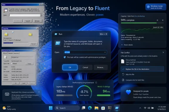
Microsoft is working through Windows 11’s older dialog boxes and rewriting them in WinUI 3, with the file copy dialog already completed internally and the common file dialog next on the list, according to remarks from Microsoft design executive March Rogers this week. That matters because Windows 11’s biggest visual contradiction has never been the Start menu or the taskbar; it has been the moment a modern-looking shell suddenly drops users into a gray, decades-old utility. The promise is not merely dark mode. It is a slow, risky attempt to make Windows feel like one operating system again.
Windows 11 has always had two faces. One is the polished marketing face: rounded corners, Mica materials, centered icons, Fluent Design, redesigned Settings pages, and a desktop that looks modern enough in screenshots. The other is the working face: file pickers, copy dialogs, Run, properties sheets, Control Panel remnants, credential prompts, printer panes, network boxes, and all the little windows that appear when the operating system has to do something practical.
Those seams are not cosmetic trivia. They are the places where Windows reveals its age, its backward-compatibility obligations, and its internal politics. Microsoft can redesign the taskbar every few years, but if a user still sees a Windows 95-adjacent dialog when opening a file, changing permissions, or browsing a path, the illusion of a coherent modern platform collapses.
The reported WinUI 3 rewrite plan is therefore bigger than another coat of paint. It is Microsoft acknowledging that the Windows 11 experience is not defined by its most photographed surfaces. It is defined by the tools people hit in the middle of real work.
The file copy dialog being “already done” internally is a telling place to start. File operations are ordinary, high-frequency, and emotionally loaded. Users notice when a copy window is ugly, inaccurate, slow, or inconsistent, because it appears when they are already waiting for something else.
The common file dialog is the classic example. It looks like a simple window for opening or saving a file, but it sits at the junction of the shell namespace, network paths, removable storage, OneDrive integration, search, permissions, recent locations, libraries, third-party shell extensions, and application compatibility. When that dialog changes, thousands of applications feel the change.
That is why the phrase “rewriting them in WinUI 3” deserves careful reading. A modern wrapper around an old behavior is one thing; a true rewrite is another. If Microsoft changes the look while preserving the underlying contracts, users may get a more consistent interface with fewer compatibility shocks. If Microsoft changes too much at once, the company risks breaking workflows that administrators and developers barely remember are dependent on old shell behavior.
Windows is not macOS, where Apple can more aggressively drag developers across platform transitions. Windows is the operating system of industrial software, medical hardware, accounting tools, utilities, game launchers, enterprise agents, and forgotten internal apps. Every ancient dialog box is ancient partly because someone, somewhere, still depends on it behaving exactly as it did.
That is the tension behind this modernization push. Microsoft is trying to make Windows 11 look less like an archaeological dig without disturbing the buried infrastructure that keeps it useful.
That opt-in approach is not cowardice. It is probably the only sane way to modernize the Windows shell at this depth. Run is small, beloved, and weirdly versatile. Some people use it to launch commands, some use it to open paths, some use it as a scratchpad, and some use it simply because muscle memory from Windows NT, Windows 2000, or Windows XP never died.
The important lesson is that Microsoft appears to understand that “modern” cannot mean “surprising.” A redesigned dialog must preserve keyboard behavior, timing, focus, tab order, command history, accessibility semantics, and edge-case compatibility. If Win+R opens something prettier but steals the first keystroke, delays input, changes paste behavior, or hides a trusted affordance, power users will not call it progress.
This is why the Run dialog matters more than its size suggests. It is a test case for whether Microsoft can modernize without condescending to its most experienced users. Windows enthusiasts are not opposed to change; they are opposed to change that treats established workflows as accidental.
If the file copy dialog and common file dialog follow the same pattern, the transition may be gradual, reversible, and telemetry-driven. That would be less dramatic than a single sweeping Windows release, but far more credible.
But WinUI 3 also carries baggage. For years, many Windows users have associated modern Windows interfaces with sluggishness: delayed context menus, heavier memory use, slower launch times, odd visual flashes, and UI elements that feel less immediate than their Win32 predecessors. Whether that reputation is always fair is less important than the fact that it exists.
Microsoft seems aware of this. Recent reporting and developer discussion around WinUI 3 performance has focused on launch time, allocation reductions, and responsiveness in components such as File Explorer and Notepad. That is a tacit admission that visual consistency alone will not win the argument.
The old dialogs may be ugly, but they are often fast. They open instantly, accept keyboard input reliably, and behave predictably on modest hardware. A modern replacement that looks better but feels heavier will fail the Windows test, especially among the sysadmins and power users most likely to notice.
That is the real benchmark for this rewrite effort. Not whether the new file copy dialog has rounded corners. Not whether the common file picker finally respects dark mode. The benchmark is whether it appears immediately, handles network paths gracefully, survives shell extensions, supports accessibility correctly, and does not make administrators regret every deployment ring they approved.
That distinction matters because Microsoft has often blurred cosmetic modernization with architectural progress. Users have seen icons changed while old control surfaces remained. They have seen Settings pages added while Control Panel applets persisted. They have seen Fluent Design arrive in one corner of the OS while a legacy dialog popped up two clicks later.
The promise of rewriting dialogs in WinUI 3 is more ambitious. It suggests Microsoft is not simply tinting old windows but replacing them with modern implementations. If true, that could make Windows 11 more consistent at the interaction layer, not just at the screenshot layer.
Still, there is danger in overreading one executive comment. Microsoft’s Windows roadmap is full of partial migrations, staged rollouts, A/B tests, regional differences, Insider-only experiments, and features that appear in preview before vanishing for months. The file copy dialog being done internally does not mean every user will see it next month.
The safest interpretation is that Microsoft has moved from acknowledging the problem to building replacements. That is progress. It is not yet a guarantee.
Modernizing it could pay enormous dividends. The current file open and save experience is one of the most visible places where Windows 11 still feels internally inconsistent. It also touches nearly every user, from someone attaching a photo in a browser to an administrator importing a certificate, selecting a driver, or browsing a network share.
But the risks scale with the reach. A new common file dialog must handle ancient Win32 apps and modern packaged apps. It must deal with UNC paths, mapped drives, redirected folders, cloud placeholders, file type filters, preview handlers, custom places, permissions prompts, and high-DPI scaling. It must work when Explorer is healthy and when Explorer is misbehaving.
Enterprise IT will watch this one closely. File dialogs are embedded in workflows that are rarely documented because they are assumed to be part of the operating system’s natural order. A slight behavior change can become a help-desk ticket factory if it affects save locations, default folders, network authentication, or file visibility.
That does not mean Microsoft should avoid the rewrite. It means the company has to treat the common file dialog less like a visual component and more like infrastructure. The prettier it gets, the more invisible its compatibility work must be.
Windows 11 has spent much of its life under a particular criticism: that Microsoft was more interested in adding services, prompts, ads, recommendations, and AI surfaces than in fixing the parts of Windows people touch all day. Whether one thinks that criticism is fully fair or not, it has shaped the user mood. A faster file manager and modern dialogs are not just engineering improvements; they are reputation repair.
The dialog rewrite, then, is symbolic in the best and worst sense. It shows Microsoft paying attention to small, old, embarrassing details. It also risks becoming another visible promise that users can measure every day.
If Microsoft ships one modern dialog that looks good and works well, enthusiasm will build. If it ships a half-modern replacement that drops features, opens slowly, or breaks niche workflows, the backlash will be immediate. Windows users have long memories because Windows itself has a long memory.
This is why the company’s recent emphasis on native experiences matters. The Windows community has grown wary of web-wrapped interfaces masquerading as system components. A WinUI 3 rewrite, if truly native and performant, is a better answer than another Chromium-backed panel with a Windows logo on it.
That requires restraint. Microsoft’s designers should not use every dialog rewrite as an excuse to add discovery surfaces, cloud nudges, account prompts, AI suggestions, or “recommended” locations that slow the user down. The job of a file dialog is to let users find and save files. The job of a copy dialog is to tell the truth about a file operation and let the user control it.
Windows 11 is at its best when it modernizes the frame without disturbing the work. The redesigned Notepad, Terminal, and Settings app have all shown versions of that trade-off, with mixed reception depending on performance and feature completeness. The lesson is not that old always wins. The lesson is that Windows users tolerate visual change when the tool remains trustworthy.
For administrators, the boring details matter most. Can the new dialogs be controlled by policy if needed? Will there be rollout staging? Will accessibility tools see the right names, roles, and states? Will automation that relies on window titles or controls break? Will Server-adjacent admin workflows inherit the same UI changes? These are not glamorous questions, but they determine whether modernization becomes a deployment success or another reason to delay feature updates.
Microsoft does not need to make every dialog exciting. It needs to make them consistent, fast, legible, accessible, and hard to break.
But compatibility is also Windows’ core product. The same backward-looking discipline that keeps ugly dialogs alive is what lets organizations run software stacks that would be financially impossible to rewrite on a vendor’s schedule. Microsoft cannot modernize Windows by pretending that history is a bug.
The better framing is that compatibility should no longer be an excuse for incoherence. Microsoft has had years to build bridges between legacy behavior and modern presentation. If WinUI 3 is now mature enough, and if the Windows App SDK can support truly native, responsive shell experiences, then the company has fewer reasons to leave users staring at visual fossils.
The challenge is sequencing. Microsoft should start with contained, high-visibility dialogs such as file operations and Run, then move carefully into shared platform surfaces such as the common file dialog. Each successful replacement builds confidence. Each botched one strengthens the argument that the old UI should have been left alone.
This is not just a design project. It is a migration of trust from old code to new code.
Windows has improved file operations over the years, but the experience still carries old assumptions. Copy speed estimates can fluctuate wildly. Error handling can be opaque. Conflict dialogs can become tedious when many files are involved. A modern rewrite gives Microsoft a chance to improve the whole interaction, not just the skin.
The risk is that Microsoft focuses on visual alignment and leaves the underlying frustrations intact. A modern file copy window that still gives poor estimates and confusing errors will look better in screenshots but not in daily use. The most meaningful modernization would pair WinUI 3 presentation with better state reporting, clearer choices, and more resilient behavior under messy real-world conditions.
That includes removable drives, network shares, OneDrive folders, developer directories with huge numbers of small files, and enterprise paths with long names or unusual permissions. File copy is easy only in demos. In the wild, it is where storage, networking, shell integration, security, and user patience collide.
If Microsoft gets this dialog right, it earns permission to go after harder targets.
That may frustrate users who want Windows 11 to feel finished. But it is also how Windows tends to survive change. The operating system evolves in layers because its user base lives in layers: consumers, gamers, developers, schools, regulated industries, small businesses, managed enterprises, and people running software no one has touched since 2008.
A staged rewrite also gives Microsoft room to backtrack. Optional toggles, controlled feature rollouts, and Insider telemetry can reveal where assumptions fail. The company should use that machinery aggressively, not as a way to hide changes but as a way to avoid forcing immature replacements onto production machines.
The danger is inconsistency during the transition. For a while, Windows 11 may have three kinds of dialogs: old light-themed relics, old dialogs with dark-mode paint, and fully modern WinUI 3 replacements. That middle period could be awkward.
But the current state is already awkward. The difference is whether the awkwardness is static or moving toward a coherent end.
A modern common file dialog could reduce confusion for users who live mostly in Windows 11’s newer surfaces. It could also create confusion if save paths, network locations, recent files, or cloud-backed folders are presented differently. Small visual shifts become operational issues when repeated across thousands of endpoints.
Microsoft should assume that organizations will want control. If new dialogs ship behind feature flags at first, enterprises need policy visibility. If the rollout is gradual, release notes need to say which dialogs changed and what behavior changed with them. If compatibility issues are discovered, rollback paths should be clear.
This is where Windows servicing discipline matters. A beautiful dialog that arrives mysteriously in a cumulative update will annoy the very customers Microsoft most needs to reassure. A documented, staged rollout will still generate complaints, but it will give IT departments something to plan around.
The most successful version of this project is not just modern. It is manageable.
Legacy dialogs are useful partly because they are not ambitious. They do not try to monetize attention. They do not recommend a workflow. They do not explain a Microsoft ecosystem. They just ask what file to open, what command to run, what folder to choose, or whether to replace an existing file.
If Microsoft brings that same restraint to the WinUI 3 rewrites, the project can be a genuine quality win. If it uses modernization as a pretext to add OneDrive upsells, Copilot suggestions, or account nudges to low-level dialogs, it will poison the effort.
The file picker is not the place to promote cloud storage. The copy dialog is not the place to suggest AI organization. The Run box is not the place to teach users about Bing. Windows already has enough surfaces fighting for attention.
The old dialogs may be ugly, but they understand their job. The new ones must understand it too.
That coherence will not arrive just because a Microsoft designer says the list is being worked through. It will arrive only if the new dialogs are fast, compatible, accessible, policy-aware, and boring in the right ways. The Windows community has seen too many partial redesigns to award trust in advance.
Still, this is the kind of work users have been asking Microsoft to prioritize. Not another content panel. Not another AI button. Not another settings migration that leaves the old applet lurking behind a link. The request has been simpler: make the operating system feel cared for at the points where people actually use it.
For once, Microsoft appears to be aiming at exactly those points.
 Microsoft Is Finally Attacking the Seams Everyone Can See
Windows 11 has always had two faces. One is the polished marketing face: rounded corners, Mica materials, centered icons, Fluent Design, redesigned Settings pages, and a desktop that looks modern enough in screenshots. The other is the working face: file pickers, copy dialogs, Run, properties sheets, Control Panel remnants, credential prompts, printer panes, network boxes, and all the little windows that appear when the operating system has to do something practical.Those seams are not cosmetic trivia. They are the places where Windows reveals its age, its backward-compatibility obligations, and its internal politics. Microsoft can redesign the taskbar every few years, but if a user still sees a Windows 95-adjacent dialog when opening a file, changing permissions, or browsing a path, the illusion of a coherent modern platform collapses.
The reported WinUI 3 rewrite plan is therefore bigger than another coat of paint. It is Microsoft acknowledging that the Windows 11 experience is not defined by its most photographed surfaces. It is defined by the tools people hit in the middle of real work.
The file copy dialog being “already done” internally is a telling place to start. File operations are ordinary, high-frequency, and emotionally loaded. Users notice when a copy window is ugly, inaccurate, slow, or inconsistent, because it appears when they are already waiting for something else.
The Old Dialogs Survived Because Windows Could Not Afford to Break Them
There is a reason Microsoft has not simply swept these interfaces away before now. Legacy Windows dialogs are not museum pieces accidentally left in the codebase. They are load-bearing components in an operating system that still has to run business software, installer routines, shell extensions, automation scripts, accessibility tools, management consoles, and line-of-business applications written across multiple decades.The common file dialog is the classic example. It looks like a simple window for opening or saving a file, but it sits at the junction of the shell namespace, network paths, removable storage, OneDrive integration, search, permissions, recent locations, libraries, third-party shell extensions, and application compatibility. When that dialog changes, thousands of applications feel the change.
That is why the phrase “rewriting them in WinUI 3” deserves careful reading. A modern wrapper around an old behavior is one thing; a true rewrite is another. If Microsoft changes the look while preserving the underlying contracts, users may get a more consistent interface with fewer compatibility shocks. If Microsoft changes too much at once, the company risks breaking workflows that administrators and developers barely remember are dependent on old shell behavior.
Windows is not macOS, where Apple can more aggressively drag developers across platform transitions. Windows is the operating system of industrial software, medical hardware, accounting tools, utilities, game launchers, enterprise agents, and forgotten internal apps. Every ancient dialog box is ancient partly because someone, somewhere, still depends on it behaving exactly as it did.
That is the tension behind this modernization push. Microsoft is trying to make Windows 11 look less like an archaeological dig without disturbing the buried infrastructure that keeps it useful.
The Run Dialog Shows Microsoft Has Learned to Move Carefully
The modern Run dialog is a useful preview of the strategy. Microsoft did not rip out the old Run box and force everyone into a new experience overnight. The redesigned version has appeared as an optional feature, surfaced through Advanced settings, with the old behavior still available.That opt-in approach is not cowardice. It is probably the only sane way to modernize the Windows shell at this depth. Run is small, beloved, and weirdly versatile. Some people use it to launch commands, some use it to open paths, some use it as a scratchpad, and some use it simply because muscle memory from Windows NT, Windows 2000, or Windows XP never died.
The important lesson is that Microsoft appears to understand that “modern” cannot mean “surprising.” A redesigned dialog must preserve keyboard behavior, timing, focus, tab order, command history, accessibility semantics, and edge-case compatibility. If Win+R opens something prettier but steals the first keystroke, delays input, changes paste behavior, or hides a trusted affordance, power users will not call it progress.
This is why the Run dialog matters more than its size suggests. It is a test case for whether Microsoft can modernize without condescending to its most experienced users. Windows enthusiasts are not opposed to change; they are opposed to change that treats established workflows as accidental.
If the file copy dialog and common file dialog follow the same pattern, the transition may be gradual, reversible, and telemetry-driven. That would be less dramatic than a single sweeping Windows release, but far more credible.
WinUI 3 Is Both the Cure and the Suspect
WinUI 3 is the obvious tool for this job. It is Microsoft’s modern native UI framework for Windows app experiences, tied to the Windows App SDK rather than the old UWP model, and it gives developers access to the design language Windows 11 is supposed to embody. If Microsoft wants consistency across Settings, File Explorer surfaces, Notepad, Run, and system dialogs, WinUI 3 is the platform it would naturally reach for.But WinUI 3 also carries baggage. For years, many Windows users have associated modern Windows interfaces with sluggishness: delayed context menus, heavier memory use, slower launch times, odd visual flashes, and UI elements that feel less immediate than their Win32 predecessors. Whether that reputation is always fair is less important than the fact that it exists.
Microsoft seems aware of this. Recent reporting and developer discussion around WinUI 3 performance has focused on launch time, allocation reductions, and responsiveness in components such as File Explorer and Notepad. That is a tacit admission that visual consistency alone will not win the argument.
The old dialogs may be ugly, but they are often fast. They open instantly, accept keyboard input reliably, and behave predictably on modest hardware. A modern replacement that looks better but feels heavier will fail the Windows test, especially among the sysadmins and power users most likely to notice.
That is the real benchmark for this rewrite effort. Not whether the new file copy dialog has rounded corners. Not whether the common file picker finally respects dark mode. The benchmark is whether it appears immediately, handles network paths gracefully, survives shell extensions, supports accessibility correctly, and does not make administrators regret every deployment ring they approved.
Dark Mode Was the Easy Part
The recent dark-mode work in file operation dialogs was useful, but it was also the minimum viable concession to Windows 11’s visual identity. A dark file copy window is less jarring than a bright legacy one on a dark desktop, but it does not solve the deeper split between old and new Windows.That distinction matters because Microsoft has often blurred cosmetic modernization with architectural progress. Users have seen icons changed while old control surfaces remained. They have seen Settings pages added while Control Panel applets persisted. They have seen Fluent Design arrive in one corner of the OS while a legacy dialog popped up two clicks later.
The promise of rewriting dialogs in WinUI 3 is more ambitious. It suggests Microsoft is not simply tinting old windows but replacing them with modern implementations. If true, that could make Windows 11 more consistent at the interaction layer, not just at the screenshot layer.
Still, there is danger in overreading one executive comment. Microsoft’s Windows roadmap is full of partial migrations, staged rollouts, A/B tests, regional differences, Insider-only experiments, and features that appear in preview before vanishing for months. The file copy dialog being done internally does not mean every user will see it next month.
The safest interpretation is that Microsoft has moved from acknowledging the problem to building replacements. That is progress. It is not yet a guarantee.
The Common File Dialog Is Where the Real Battle Starts
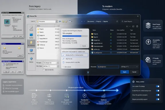
The common file dialog is a much harder target than file copy. File copy is central, but it is bounded: source, destination, progress, conflict resolution, error handling, speed estimation, and cancellation. The file picker is a platform interface that countless applications depend on.Modernizing it could pay enormous dividends. The current file open and save experience is one of the most visible places where Windows 11 still feels internally inconsistent. It also touches nearly every user, from someone attaching a photo in a browser to an administrator importing a certificate, selecting a driver, or browsing a network share.
But the risks scale with the reach. A new common file dialog must handle ancient Win32 apps and modern packaged apps. It must deal with UNC paths, mapped drives, redirected folders, cloud placeholders, file type filters, preview handlers, custom places, permissions prompts, and high-DPI scaling. It must work when Explorer is healthy and when Explorer is misbehaving.
Enterprise IT will watch this one closely. File dialogs are embedded in workflows that are rarely documented because they are assumed to be part of the operating system’s natural order. A slight behavior change can become a help-desk ticket factory if it affects save locations, default folders, network authentication, or file visibility.
That does not mean Microsoft should avoid the rewrite. It means the company has to treat the common file dialog less like a visual component and more like infrastructure. The prettier it gets, the more invisible its compatibility work must be.
Windows 11’s Quality Push Has Become a Trust Exercise
This modernization effort lands in a broader moment for Windows 11. Microsoft has been talking more openly about performance, reliability, File Explorer responsiveness, memory behavior, update quality, and the need to reduce friction in the daily experience. That shift is not happening in a vacuum.Windows 11 has spent much of its life under a particular criticism: that Microsoft was more interested in adding services, prompts, ads, recommendations, and AI surfaces than in fixing the parts of Windows people touch all day. Whether one thinks that criticism is fully fair or not, it has shaped the user mood. A faster file manager and modern dialogs are not just engineering improvements; they are reputation repair.
The dialog rewrite, then, is symbolic in the best and worst sense. It shows Microsoft paying attention to small, old, embarrassing details. It also risks becoming another visible promise that users can measure every day.
If Microsoft ships one modern dialog that looks good and works well, enthusiasm will build. If it ships a half-modern replacement that drops features, opens slowly, or breaks niche workflows, the backlash will be immediate. Windows users have long memories because Windows itself has a long memory.
This is why the company’s recent emphasis on native experiences matters. The Windows community has grown wary of web-wrapped interfaces masquerading as system components. A WinUI 3 rewrite, if truly native and performant, is a better answer than another Chromium-backed panel with a Windows logo on it.
The Best Modern Windows Will Still Be Boring
The paradox of system UI modernization is that success should feel uneventful. The best version of a new file copy dialog is one users barely discuss after the first week because it looks right, behaves correctly, and disappears when the job is done. The best common file dialog is not a showcase; it is a piece of infrastructure that stops making Windows feel divided against itself.That requires restraint. Microsoft’s designers should not use every dialog rewrite as an excuse to add discovery surfaces, cloud nudges, account prompts, AI suggestions, or “recommended” locations that slow the user down. The job of a file dialog is to let users find and save files. The job of a copy dialog is to tell the truth about a file operation and let the user control it.
Windows 11 is at its best when it modernizes the frame without disturbing the work. The redesigned Notepad, Terminal, and Settings app have all shown versions of that trade-off, with mixed reception depending on performance and feature completeness. The lesson is not that old always wins. The lesson is that Windows users tolerate visual change when the tool remains trustworthy.
For administrators, the boring details matter most. Can the new dialogs be controlled by policy if needed? Will there be rollout staging? Will accessibility tools see the right names, roles, and states? Will automation that relies on window titles or controls break? Will Server-adjacent admin workflows inherit the same UI changes? These are not glamorous questions, but they determine whether modernization becomes a deployment success or another reason to delay feature updates.
Microsoft does not need to make every dialog exciting. It needs to make them consistent, fast, legible, accessible, and hard to break.
Compatibility Is the Product, Not the Excuse
It is tempting to mock Windows for carrying so much old interface baggage. Some of that mockery is earned. No modern operating system should routinely send users from a polished settings pane into a relic that looks like it was discovered in a corporate image from 2003.But compatibility is also Windows’ core product. The same backward-looking discipline that keeps ugly dialogs alive is what lets organizations run software stacks that would be financially impossible to rewrite on a vendor’s schedule. Microsoft cannot modernize Windows by pretending that history is a bug.
The better framing is that compatibility should no longer be an excuse for incoherence. Microsoft has had years to build bridges between legacy behavior and modern presentation. If WinUI 3 is now mature enough, and if the Windows App SDK can support truly native, responsive shell experiences, then the company has fewer reasons to leave users staring at visual fossils.
The challenge is sequencing. Microsoft should start with contained, high-visibility dialogs such as file operations and Run, then move carefully into shared platform surfaces such as the common file dialog. Each successful replacement builds confidence. Each botched one strengthens the argument that the old UI should have been left alone.
This is not just a design project. It is a migration of trust from old code to new code.
The File Copy Rewrite Is the First Serious Receipt
The file copy dialog is a particularly useful proof point because it sits at the intersection of performance perception and user anxiety. When users move large folders, overwrite files, or copy data across drives, they want clarity. They want accurate progress, understandable conflict handling, reliable cancellation, and error messages that do not require a forensic investigation.Windows has improved file operations over the years, but the experience still carries old assumptions. Copy speed estimates can fluctuate wildly. Error handling can be opaque. Conflict dialogs can become tedious when many files are involved. A modern rewrite gives Microsoft a chance to improve the whole interaction, not just the skin.
The risk is that Microsoft focuses on visual alignment and leaves the underlying frustrations intact. A modern file copy window that still gives poor estimates and confusing errors will look better in screenshots but not in daily use. The most meaningful modernization would pair WinUI 3 presentation with better state reporting, clearer choices, and more resilient behavior under messy real-world conditions.
That includes removable drives, network shares, OneDrive folders, developer directories with huge numbers of small files, and enterprise paths with long names or unusual permissions. File copy is easy only in demos. In the wild, it is where storage, networking, shell integration, security, and user patience collide.
If Microsoft gets this dialog right, it earns permission to go after harder targets.
The Windows Shell Is Becoming a Long Renovation, Not a Big Reveal
There probably will not be one magical Windows release where every old dialog disappears. The more plausible future is a long renovation: a modern Run dialog here, a rewritten file copy window there, dark-mode stopgaps in between, and a common file dialog that spends time in Insider builds before reaching broad deployment.That may frustrate users who want Windows 11 to feel finished. But it is also how Windows tends to survive change. The operating system evolves in layers because its user base lives in layers: consumers, gamers, developers, schools, regulated industries, small businesses, managed enterprises, and people running software no one has touched since 2008.
A staged rewrite also gives Microsoft room to backtrack. Optional toggles, controlled feature rollouts, and Insider telemetry can reveal where assumptions fail. The company should use that machinery aggressively, not as a way to hide changes but as a way to avoid forcing immature replacements onto production machines.
The danger is inconsistency during the transition. For a while, Windows 11 may have three kinds of dialogs: old light-themed relics, old dialogs with dark-mode paint, and fully modern WinUI 3 replacements. That middle period could be awkward.
But the current state is already awkward. The difference is whether the awkwardness is static or moving toward a coherent end.
The Admin View Is Cautious Optimism With a Rollback Plan
For enthusiasts, this story is about whether Windows 11 will finally stop looking half-finished. For administrators, it is about change management. System dialogs are not decorative in managed environments; they are part of workflows, training materials, support scripts, screenshots, documentation, and user expectations.A modern common file dialog could reduce confusion for users who live mostly in Windows 11’s newer surfaces. It could also create confusion if save paths, network locations, recent files, or cloud-backed folders are presented differently. Small visual shifts become operational issues when repeated across thousands of endpoints.
Microsoft should assume that organizations will want control. If new dialogs ship behind feature flags at first, enterprises need policy visibility. If the rollout is gradual, release notes need to say which dialogs changed and what behavior changed with them. If compatibility issues are discovered, rollback paths should be clear.
This is where Windows servicing discipline matters. A beautiful dialog that arrives mysteriously in a cumulative update will annoy the very customers Microsoft most needs to reassure. A documented, staged rollout will still generate complaints, but it will give IT departments something to plan around.
The most successful version of this project is not just modern. It is manageable.
The Real Test Is Whether Microsoft Can Resist Adding More
There is one more concern worth stating plainly: Microsoft has a habit of turning simple Windows surfaces into strategic real estate. Search became web search. The Start menu became a recommendation surface. Widgets became a content feed. Settings pages increasingly became places where Microsoft could steer users toward accounts, subscriptions, backup, cloud storage, or AI features.Legacy dialogs are useful partly because they are not ambitious. They do not try to monetize attention. They do not recommend a workflow. They do not explain a Microsoft ecosystem. They just ask what file to open, what command to run, what folder to choose, or whether to replace an existing file.
If Microsoft brings that same restraint to the WinUI 3 rewrites, the project can be a genuine quality win. If it uses modernization as a pretext to add OneDrive upsells, Copilot suggestions, or account nudges to low-level dialogs, it will poison the effort.
The file picker is not the place to promote cloud storage. The copy dialog is not the place to suggest AI organization. The Run box is not the place to teach users about Bing. Windows already has enough surfaces fighting for attention.
The old dialogs may be ugly, but they understand their job. The new ones must understand it too.
The Dialog Rewrite Gives Windows 11 a Chance to Feel Whole
The concrete news is narrow: Microsoft is reportedly rewriting older Windows dialogs in WinUI 3, the file copy dialog is already done internally, and the common file dialog is on the list. The implication is broad: Windows 11 may finally be moving from selective beautification toward deeper interface coherence.That coherence will not arrive just because a Microsoft designer says the list is being worked through. It will arrive only if the new dialogs are fast, compatible, accessible, policy-aware, and boring in the right ways. The Windows community has seen too many partial redesigns to award trust in advance.
Still, this is the kind of work users have been asking Microsoft to prioritize. Not another content panel. Not another AI button. Not another settings migration that leaves the old applet lurking behind a link. The request has been simpler: make the operating system feel cared for at the points where people actually use it.
For once, Microsoft appears to be aiming at exactly those points.
The Receipts Windows Users Should Watch For
The next phase of this story will not be judged by executive posts or preview screenshots. It will be judged by whether the new dialogs show up in real builds, preserve old workflows, and make Windows 11 feel less like a negotiation between eras.- The file copy dialog is the first meaningful proof point because it is frequent, visible, and unforgiving when progress reporting or error handling goes wrong.
- The common file dialog will be the harder test because it touches countless applications, network paths, shell extensions, and enterprise workflows.
- Optional rollout would be the safest path because it gives Microsoft telemetry and gives power users time to find broken assumptions before broad deployment.
- WinUI 3 must prove that modern Windows interfaces can be as responsive as the old Win32 surfaces they replace.
- Administrators should watch for policy controls, release-note clarity, accessibility behavior, and rollback options before treating the redesign as harmless.
- Microsoft should keep these dialogs focused on the task at hand and resist turning low-level system UI into another surface for cloud, account, or AI promotion.
References
- Primary source: Windows Latest
Published: Sat, 30 May 2026 22:56:44 GMT
Microsoft is killing every ancient Windows 11 dialog box with a modern rewrite, and file copy is already done
Microsoft is working on a major redesign of all existing legacy dialog boxes in Windows 11, and it's going to be more than just a dark theme. www.windowslatest.com
- Related coverage: windowscentral.com
Windows 11's new Run box is what happens when Microsoft actually cares: Replaces legacy Windows 95-era dialog with something new and better | Windows Central
The new Windows Run box has been officially unveiled, and it's a genuine improvement over the legacy interface with faster launch times and more features. This is what happens when the people working on Windows actually care.www.windowscentral.com - Related coverage: windowsforum.com
Microsoft Tests Modern WinUI 3 Run Dialog in Windows 11 Opt-In | Windows Forum
Microsoft is quietly experimenting with a redesigned, modern Windows Run (Win+R) experience built on WinUI 3 — an optional, toggleable overlay that brings...windowsforum.com - Related coverage: techspot.com
Windows is finally killing off the Control Panel | TechSpot
Speaking to Windows users on X this week, Microsoft's Director of Design, March Rogers, said the company is working to address several UI issues across Windows 11....www.techspot.com - Related coverage: techradar.com
Microsoft reveals another way it's making Windows 11 faster, with more performance boosts promised for the likes of File Explorer | TechRadar
Microsoft is falling over itself to make Windows 11 more performantwww.techradar.com - Official source: learn.microsoft.com
Advanced Windows Settings | Microsoft Learn
Learn about the settings provided in the Advanced page of Windows settings.learn.microsoft.com
- Related coverage: techjuice.pk
Is Microsoft Redesigning Windows 11 Run Menu After 31 Years?
Microsoft is testing a redesigned Run menu in Windows 11 with a modern interface, improved speed, and new features.www.techjuice.pk
- Related coverage: windowsreport.com

Microsoft Targets Sluggish Windows 11 UI With New WinUI 3 Improvement
Microsoft is continuing its Windows 11 K2 initiative with major WinUI 3 optimizations focused on faster UI responsiveness and performance.
windowsreport.com
- Official source: microsofters.com
WinUI 3 mejora su rendimiento en Windows 11 | Microsofters
Microsoft detalla mejoras de rendimiento en WinUI 3 con menos asignaciones, llamadas y tiempo de carga en el Explorador de archivos. microsofters.com
- Related coverage: theregister.com
Microsoft aims to speed Windows with 'leap forward' in WinUI 3 perf
Bittersweet post tells devs what they already knew: The framework is too slowwww.theregister.com - Related coverage: tomshardware.com
Microsoft promises major improvements to Windows 11 performance, reliability, and updates — lower RAM usage, fewer Copilot interactions, and enhanced File Explorer incoming | Tom's Hardware
It only took four years to get the taskbar working properly.www.tomshardware.com - Related coverage: pcworld.com
Microsoft says Windows 11 will get faster as it scales back Copilot | PCWorld
Microsoft is trying to cut down on the resources Windows 11 uses, including the RAM requirement and even Copilot AI, in various Windows experiences. The goal: a leaner, more responsive Windows.www.pcworld.com - Related coverage: tweaktown.com
Microsoft is improving the responsiveness of Windows 11 with WinUI 3
A recent engineering update from the WinUI team has outlined a number of under-the-hood improvements coming to WinUI 3, showing promise. www.tweaktown.com
- Related coverage: windows.gadgethacks.com

Windows 11 Performance Improvements: K2 Overhaul Speeds File Explorer << Windows Tips :: Gadget Hacks
Windows 11 Performance Improvements: K2 Overhaul Speeds File Explorer Microsoft has disclosed internal engineering data showing File Explorer launches...
windows.gadgethacks.com