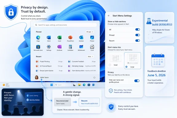
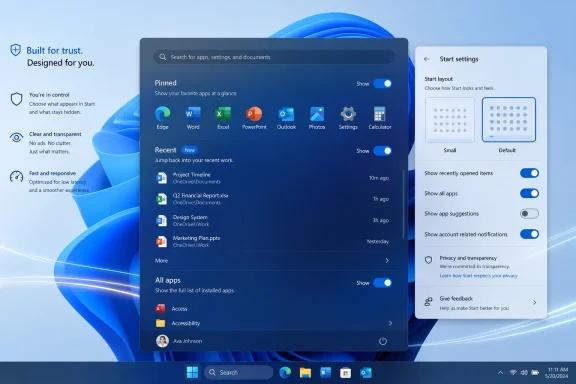
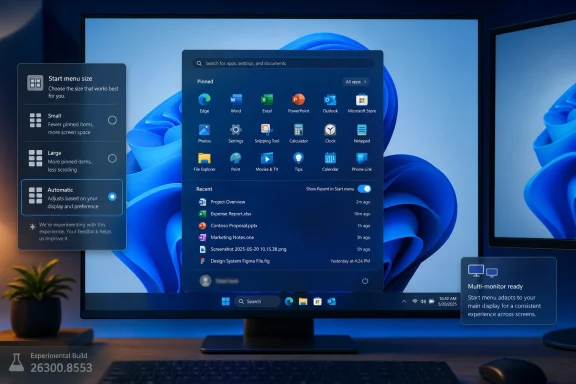
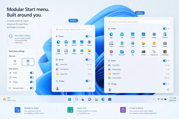
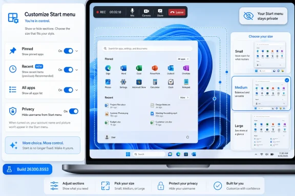
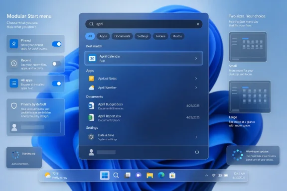
Microsoft released Windows 11 Insider Preview Build 26300.8553 to the Experimental Channel on May 29, 2026, adding a more modular Start menu that can hide or show individual sections, switch between small and large layouts, and remove the visible account name and profile image. The update is not a revolution, but it is a meaningful retreat from one of Windows 11’s most stubborn design bets. After years of treating the Start menu as a fixed expression of Microsoft’s priorities, the company is finally admitting that the most personal surface in Windows has to become personal again. For users and administrators, the signal matters as much as the pixels: Windows 11 is slowly trading enforced coherence for controlled choice.
The Windows 11 Start menu has always carried a contradiction. Microsoft pitched it as cleaner, calmer, and more modern than the Windows 10 tile grid, but the result often felt less like a user launcher and more like a company-curated panel: pinned apps above, recommendations below, and relatively little room for disagreement.
Build 26300.8553 changes that posture. The headline is not merely that the Start menu can be resized, though that will be the part many users notice first. The more important change is that Microsoft is separating pieces of the Start experience that were previously welded together.
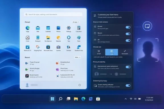
Users can now independently show or hide Pinned, Recent, and All sections. The “Recommended” label has been renamed “Recent,” a small linguistic change that gives away a larger product correction. “Recommended” sounded like Microsoft choosing what mattered; “Recent” sounds like Windows reflecting what the user actually did.
That distinction is not cosmetic. Windows users have spent decades building habits around Start as a launch surface, not a feed. When the lower half of the menu became a recommendation area, even a benign one, it invited suspicion that Microsoft was once again looking for engagement real estate inside the shell.
The new modular design does not abolish that tension. But it gives users more ways to opt out without breaking the rest of the menu, and that is exactly the sort of compromise Windows 11 should have offered from the beginning.
The example Microsoft is surfacing is particularly telling: users can remove recommendations while continuing to use jump lists. That is the kind of granular control power users expect and casual users benefit from without knowing the vocabulary. Jump lists are useful because they are contextual and action-oriented; recommendations have often felt fuzzier, especially when they occupy limited space in a menu people open to get somewhere quickly.
This is where the Start menu update becomes more than a design tweak. It recognizes that different parts of the Start menu serve different jobs. Pinned apps are deliberate. Recent files are memory. All apps is inventory. Jump lists are shortcuts into specific tasks. Treating those as independent modules makes the menu more honest about what users are trying to do.
It also gives Microsoft room to experiment without making every experiment feel compulsory. A modular Start menu can evolve section by section. If Microsoft wants to test richer Recent behavior, better app grouping, or new enterprise controls later, users are less likely to revolt if they can turn off the piece they dislike.
For administrators, this is a familiar lesson from the enterprise side of Windows: policy matters because defaults are never neutral. A consumer-facing toggle is not the same as Group Policy or MDM control, but it flows from the same principle. The more Microsoft separates shell behaviors into discrete switches, the easier it becomes for organizations to decide what belongs on managed desktops.
Windows 11 arrived with a striking confidence in centered minimalism. The centered taskbar, simplified Start layout, and absence of long-standing taskbar options all seemed to say that Microsoft knew which defaults would carry Windows forward. The backlash was not just nostalgia. It was the predictable response of a user base whose workflows had been compressed into a narrower design language.
Resizable Start is part of the slow unwind of that overconfidence. The same broader wave has brought renewed attention to taskbar position, taskbar size, and other shell behaviors that Windows 10 users regarded as ordinary flexibility. Windows 11’s original sin was not that it looked different; it was that it removed familiar forms of agency while insisting that simplicity was enough compensation.
There is a reason these changes are landing in Insider builds rather than being dumped straight into production. Shell changes are high-risk because they touch muscle memory. A Start menu that misbehaves is not like a bad widget or a glitchy inbox feature; it is a problem at the front door of the operating system.
Still, the direction is clear. Microsoft is no longer merely polishing the Windows 11 shell. It is restoring pressure valves.
This is the kind of feature that rarely drives an upgrade decision but improves trust in the product. Users increasingly expect operating systems to offer more control over what is shown by default. That expectation is not limited to telemetry dialogs or privacy dashboards; it extends to visible identity cues across the shell.
Microsoft’s account strategy complicates this. Windows has spent years nudging users toward Microsoft accounts, cloud sync, OneDrive integration, and identity-aware experiences. The account badge in Start is part of that ecosystem. It gives the OS a face, but it also turns a local interaction into another reminder that Windows is tied to a cloud identity.
Letting users hide it is a modest but welcome concession. It does not dismantle Microsoft’s account-centric design, and it probably is not intended to. But it acknowledges that not every surface needs to advertise identity all the time.
For IT departments, the value is less about aesthetics than reducing friction. Employees share screens. Help desks remote into devices. Kiosks and lab machines often operate in contexts where visual identity should be minimized. A cleaner Start menu can be a security-adjacent improvement even if it is not marketed as one.
“Recommended” is one of the most overused words in modern software. It can mean relevant, sponsored, algorithmic, recently used, cloud-derived, organizationally assigned, or simply something a vendor wants you to click. In a Windows Start menu, that ambiguity was always dangerous.
“Recent” is narrower and more defensible. It implies chronology rather than persuasion. If a file or app appears there, the user can understand why. That matters because system UI depends on predictability. Users tolerate automation when it feels accountable; they resist it when it feels like a black box.
The change also fits a broader retreat from engagement-scented language in core OS surfaces. Windows users are not opening Start because they want a discovery feed. They are opening it because they want to launch Excel, find Settings, open a recent document, or shut down the machine. The more the menu speaks that language, the less it feels like a contested space.
This is a small win for product humility. Microsoft can still use recommendations elsewhere, and it almost certainly will. But in Start, the company appears to be moving toward a vocabulary that better matches user intent.
This is the kind of improvement that makes Windows feel less broken rather than more advanced. Users do not think in tokenization rules. They remember fragments. They remember that a file had “budget” somewhere in the name, or that a document mentioned “status,” or that a meeting note happened in April. Search that fails those mental models trains users not to trust the system.
Windows search has had a complicated reputation for years. It is fast in some contexts, surprisingly weak in others, and often overshadowed by third-party launchers, indexing tools, and cloud search experiences. Substring matching will not solve all of that, but it addresses a highly visible class of annoyance.
It also pairs naturally with the Start menu changes. If Start is becoming more modular and more task-focused, search must become more forgiving. A launcher that cannot find what users half-remember is not a launcher; it is a form with strict validation.
For administrators, better local discovery has a productivity angle. The more users can find files and apps through built-in search, the fewer workarounds they need. That does not remove the need for disciplined file management, but it reduces the daily tax imposed by imperfect naming conventions.
Windows 11’s renewed taskbar flexibility is arriving with the awkwardness of a renovation performed while the house is occupied. Moving the taskbar to the top or sides is a long-requested restoration, but every restored option creates edge cases. Animation, hit testing, touch gestures, overflow behavior, system tray placement, and app assumptions all have to be revisited.
That is why the visual polish line in the changelog is more meaningful than it looks. It suggests Microsoft is still sanding down the interaction model around alternate positions, not simply checking a box marked “movable taskbar.” Windows users have been burned before by features that technically return without feeling complete.
Touch support is especially important. A side or top taskbar may be a power-user feature on a desktop monitor, but Windows still has to account for tablets, convertibles, and touch-first devices. If taskbar repositioning breaks touch ergonomics, it becomes a nostalgia feature rather than a modern one.
The Start and taskbar work should be understood together. Microsoft is revisiting the foundations of the Windows 11 desktop experience, and the theme is customization after years of consolidation.
But housekeeping matters in an operating system. Windows has long carried visual fossils from multiple eras, and those fossils become especially visible during transitions: boot screens, update messages, shutdown flows, and sign-in moments. When those surfaces do not match, users may not articulate the inconsistency, but they feel it as roughness.
The spinner change is therefore not about the spinner. It is about perceived reliability. A consistent animation with consistent status text can make an update feel less like a mysterious hang and more like a managed process. That does not make updates faster, but it can make them less alarming.
There is a risk, of course, in polishing around pain points instead of fixing them. Users frustrated by long updates will not be mollified forever by a prettier wheel. But visual coherence is not worthless. In enterprise environments, where users often assume every unfamiliar system screen is either broken or malicious, consistency is a security and support asset.
The Beta build also includes the same substring search improvement, suggesting that better discovery is not confined to the more experimental branch. That is a good sign. Search improvements belong in the mainstream Windows pipeline, not only in the playground.
This fits Microsoft’s broader move away from traditional third-party printer drivers and toward a more standardized print stack. Anyone who has administered Windows fleets knows why Microsoft wants this. Printer drivers have been a compatibility swamp, a deployment nuisance, and a security concern for decades.
The new branding, Windows Ready Print, is doing a lot of work. Microsoft is trying to frame the transition as simplification rather than subtraction. That is understandable, because printing is one of those domains where “modernization” often reads to users as “the thing that used to work now fails differently.”
The toggle is therefore politically smart. It gives Microsoft a path to make IPP the default without making every printer installation feel like a forced migration. Users and administrators can see the direction of travel while retaining an escape hatch.
The success of this effort will depend less on the wording in Settings than on hardware reality. If supported printers install cleanly, the new path will feel inevitable. If edge cases pile up, Windows Ready Print will become another name administrators say with a sigh.
That tension runs through the entire release. The Start menu becomes modular, but within a designed settings page. The taskbar becomes more flexible, but the team is still shaping gestures and polish. Printing moves toward a standardized driver model, but with a toggle. Even the spinner update is about making different system phases feel like one coherent product.
This is Microsoft’s Windows problem in miniature. The company serves consumers, gamers, enterprise administrators, developers, schools, kiosks, governments, and hardware partners with one desktop OS family. Every simplification angers someone with a workflow. Every restored option increases testing complexity. Every cloud-connected feature raises suspicion that the shell is being monetized or managed for someone else’s benefit.
Windows 11 initially leaned hard toward design control. These builds suggest the pendulum is moving back toward configurability. The move is not dramatic enough to satisfy every critic, but it is real.
The Experimental Channel label also matters. Microsoft’s renamed channel structure gives the company more room to float ideas without promising that every change will arrive exactly as shown. That is healthy, provided Microsoft remains clear about what is experimental and what is on a production track.
For administrators, the story is more complicated. New options are good, but each option raises a policy question. Should organizations standardize the Start layout? Should Recent be visible on shared devices? Should account identity be hidden by default in conference-room environments? Should Windows Ready Print be enabled across the fleet, piloted, or delayed?
The best Windows features are often the ones that let organizations answer those questions deliberately. The worst are the ones that arrive as consumer defaults and leave IT to reverse-engineer control after users notice the change. Microsoft has improved on this over the years, but Windows 11 still has a habit of introducing shell changes faster than some enterprises can digest them.
That is why administrators should watch these builds even if they do not deploy Insider builds broadly. The release notes are advance weather. They show which surfaces Microsoft is preparing to change, and they give IT teams time to think about communications, policy baselines, documentation, and help desk scripts.
The Start menu, in particular, is not just a cosmetic surface in enterprise Windows. It is part of onboarding, app discovery, support, and compliance. A modular Start menu could be a gift if it comes with the right management hooks. Without them, it is another set of screenshots that differ from one user to the next.
The updated Start menu is still recognizably Windows 11. It is not a Windows 10 resurrection, and it is not a concession to every demand from the taskbar nostalgia crowd. But it is less rigid, less presumptive, and more willing to let users decide which parts of the menu deserve space.
That is the right direction for a mature operating system. Windows does not win by pretending all users behave alike. It wins by making the common path simple while letting serious users, edge-case users, and organizational users bend the system without breaking it.
The risk is that Microsoft will stop halfway. A few toggles can relieve pressure, but they do not replace a coherent customization philosophy. If Start is modular, users will expect other shell surfaces to become modular too. If taskbar position is back, users will expect the experience to be polished in every position. If Windows Ready Print has a toggle, administrators will expect policy-grade control.
 Microsoft Finally Lets the Start Menu Stop Being a Billboard
The Windows 11 Start menu has always carried a contradiction. Microsoft pitched it as cleaner, calmer, and more modern than the Windows 10 tile grid, but the result often felt less like a user launcher and more like a company-curated panel: pinned apps above, recommendations below, and relatively little room for disagreement.Build 26300.8553 changes that posture. The headline is not merely that the Start menu can be resized, though that will be the part many users notice first. The more important change is that Microsoft is separating pieces of the Start experience that were previously welded together.
Users can now independently show or hide Pinned, Recent, and All sections. The “Recommended” label has been renamed “Recent,” a small linguistic change that gives away a larger product correction. “Recommended” sounded like Microsoft choosing what mattered; “Recent” sounds like Windows reflecting what the user actually did.
That distinction is not cosmetic. Windows users have spent decades building habits around Start as a launch surface, not a feed. When the lower half of the menu became a recommendation area, even a benign one, it invited suspicion that Microsoft was once again looking for engagement real estate inside the shell.
The new modular design does not abolish that tension. But it gives users more ways to opt out without breaking the rest of the menu, and that is exactly the sort of compromise Windows 11 should have offered from the beginning.
The Real Upgrade Is Independence Between Features
The most practical improvement in this build is the ability to remove one part of Start without sacrificing another. That sounds obvious until you remember how often modern Windows settings bundle related-but-distinct choices together, leaving users to accept a package instead of selecting a preference.The example Microsoft is surfacing is particularly telling: users can remove recommendations while continuing to use jump lists. That is the kind of granular control power users expect and casual users benefit from without knowing the vocabulary. Jump lists are useful because they are contextual and action-oriented; recommendations have often felt fuzzier, especially when they occupy limited space in a menu people open to get somewhere quickly.
This is where the Start menu update becomes more than a design tweak. It recognizes that different parts of the Start menu serve different jobs. Pinned apps are deliberate. Recent files are memory. All apps is inventory. Jump lists are shortcuts into specific tasks. Treating those as independent modules makes the menu more honest about what users are trying to do.
It also gives Microsoft room to experiment without making every experiment feel compulsory. A modular Start menu can evolve section by section. If Microsoft wants to test richer Recent behavior, better app grouping, or new enterprise controls later, users are less likely to revolt if they can turn off the piece they dislike.
For administrators, this is a familiar lesson from the enterprise side of Windows: policy matters because defaults are never neutral. A consumer-facing toggle is not the same as Group Policy or MDM control, but it flows from the same principle. The more Microsoft separates shell behaviors into discrete switches, the easier it becomes for organizations to decide what belongs on managed desktops.
Resizing Start Is a Small Concession With a Long Memory
The option to choose a small or large Start menu, alongside an automatic default mode, is the sort of change that looks minor in release notes and large in daily use. Start is a repetitive interface. A few extra rows, a less cramped layout, or a smaller footprint can change the feel of the desktop because users encounter it dozens of times a day.Windows 11 arrived with a striking confidence in centered minimalism. The centered taskbar, simplified Start layout, and absence of long-standing taskbar options all seemed to say that Microsoft knew which defaults would carry Windows forward. The backlash was not just nostalgia. It was the predictable response of a user base whose workflows had been compressed into a narrower design language.
Resizable Start is part of the slow unwind of that overconfidence. The same broader wave has brought renewed attention to taskbar position, taskbar size, and other shell behaviors that Windows 10 users regarded as ordinary flexibility. Windows 11’s original sin was not that it looked different; it was that it removed familiar forms of agency while insisting that simplicity was enough compensation.
There is a reason these changes are landing in Insider builds rather than being dumped straight into production. Shell changes are high-risk because they touch muscle memory. A Start menu that misbehaves is not like a bad widget or a glitchy inbox feature; it is a problem at the front door of the operating system.
Still, the direction is clear. Microsoft is no longer merely polishing the Windows 11 shell. It is restoring pressure valves.
Hiding the Account Identity Is a Privacy Feature Wearing a Cosmetic Jacket
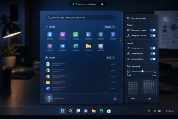
The option to hide the user name and profile picture in Start may sound like a vanity preference, but it has practical value in shared, public, and recorded environments. Screen sharing has turned many minor UI details into accidental disclosures. A name and profile photo in a prominent system menu can be harmless at home and awkward in a classroom, conference room, support session, or livestream.This is the kind of feature that rarely drives an upgrade decision but improves trust in the product. Users increasingly expect operating systems to offer more control over what is shown by default. That expectation is not limited to telemetry dialogs or privacy dashboards; it extends to visible identity cues across the shell.
Microsoft’s account strategy complicates this. Windows has spent years nudging users toward Microsoft accounts, cloud sync, OneDrive integration, and identity-aware experiences. The account badge in Start is part of that ecosystem. It gives the OS a face, but it also turns a local interaction into another reminder that Windows is tied to a cloud identity.
Letting users hide it is a modest but welcome concession. It does not dismantle Microsoft’s account-centric design, and it probably is not intended to. But it acknowledges that not every surface needs to advertise identity all the time.
For IT departments, the value is less about aesthetics than reducing friction. Employees share screens. Help desks remote into devices. Kiosks and lab machines often operate in contexts where visual identity should be minimized. A cleaner Start menu can be a security-adjacent improvement even if it is not marketed as one.
“Recommended” Becomes “Recent” Because Words Shape Trust
The renaming of “Recommended” to “Recent” is easy to dismiss until you ask why it was necessary. Microsoft did not need a new rendering engine to change a label. It needed to concede that the old label carried baggage.“Recommended” is one of the most overused words in modern software. It can mean relevant, sponsored, algorithmic, recently used, cloud-derived, organizationally assigned, or simply something a vendor wants you to click. In a Windows Start menu, that ambiguity was always dangerous.
“Recent” is narrower and more defensible. It implies chronology rather than persuasion. If a file or app appears there, the user can understand why. That matters because system UI depends on predictability. Users tolerate automation when it feels accountable; they resist it when it feels like a black box.
The change also fits a broader retreat from engagement-scented language in core OS surfaces. Windows users are not opening Start because they want a discovery feed. They are opening it because they want to launch Excel, find Settings, open a recent document, or shut down the machine. The more the menu speaks that language, the less it feels like a contested space.
This is a small win for product humility. Microsoft can still use recommendations elsewhere, and it almost certainly will. But in Start, the company appears to be moving toward a vocabulary that better matches user intent.
Search by Substring Fixes a Problem Users Should Never Have Had
Build 26300.8553 also adds substring search improvements, allowing files with compound names or matching content to be found by partial terms. Microsoft’s example is straightforward: a file named MeetingNotesApril should surface when the user types “april,” and ProjectStatusReport should be discoverable through “status.”This is the kind of improvement that makes Windows feel less broken rather than more advanced. Users do not think in tokenization rules. They remember fragments. They remember that a file had “budget” somewhere in the name, or that a document mentioned “status,” or that a meeting note happened in April. Search that fails those mental models trains users not to trust the system.
Windows search has had a complicated reputation for years. It is fast in some contexts, surprisingly weak in others, and often overshadowed by third-party launchers, indexing tools, and cloud search experiences. Substring matching will not solve all of that, but it addresses a highly visible class of annoyance.
It also pairs naturally with the Start menu changes. If Start is becoming more modular and more task-focused, search must become more forgiving. A launcher that cannot find what users half-remember is not a launcher; it is a form with strict validation.
For administrators, better local discovery has a productivity angle. The more users can find files and apps through built-in search, the fewer workarounds they need. That does not remove the need for disciplined file management, but it reduces the daily tax imposed by imperfect naming conventions.
The Taskbar Fixes Show the Shell Is Still Under Renovation
The same Experimental build includes small visual polish fixes for alternate taskbar positions and adds support for using a touch swipe to invoke the taskbar when it is placed somewhere other than the default location. These are not marquee features, but they matter because taskbar mobility is only useful if the rest of the shell behaves as though Microsoft expected people to use it.Windows 11’s renewed taskbar flexibility is arriving with the awkwardness of a renovation performed while the house is occupied. Moving the taskbar to the top or sides is a long-requested restoration, but every restored option creates edge cases. Animation, hit testing, touch gestures, overflow behavior, system tray placement, and app assumptions all have to be revisited.
That is why the visual polish line in the changelog is more meaningful than it looks. It suggests Microsoft is still sanding down the interaction model around alternate positions, not simply checking a box marked “movable taskbar.” Windows users have been burned before by features that technically return without feeling complete.
Touch support is especially important. A side or top taskbar may be a power-user feature on a desktop monitor, but Windows still has to account for tablets, convertibles, and touch-first devices. If taskbar repositioning breaks touch ergonomics, it becomes a nostalgia feature rather than a modern one.
The Start and taskbar work should be understood together. Microsoft is revisiting the foundations of the Windows 11 desktop experience, and the theme is customization after years of consolidation.
The Beta Build Shows Microsoft Is Polishing the Boring Parts Too
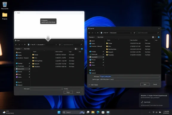
While the Experimental Channel gets the Start menu story, Beta Channel Build 26220.8544 tells a different but related story: Microsoft is working on the parts of Windows users notice only when they look old, inconsistent, or unreliable. The new solid “donut” spinners across boot, logon, restart, shutdown, and update flows are not transformative. They are housekeeping.But housekeeping matters in an operating system. Windows has long carried visual fossils from multiple eras, and those fossils become especially visible during transitions: boot screens, update messages, shutdown flows, and sign-in moments. When those surfaces do not match, users may not articulate the inconsistency, but they feel it as roughness.
The spinner change is therefore not about the spinner. It is about perceived reliability. A consistent animation with consistent status text can make an update feel less like a mysterious hang and more like a managed process. That does not make updates faster, but it can make them less alarming.
There is a risk, of course, in polishing around pain points instead of fixing them. Users frustrated by long updates will not be mollified forever by a prettier wheel. But visual coherence is not worthless. In enterprise environments, where users often assume every unfamiliar system screen is either broken or malicious, consistency is a security and support asset.
The Beta build also includes the same substring search improvement, suggesting that better discovery is not confined to the more experimental branch. That is a good sign. Search improvements belong in the mainstream Windows pipeline, not only in the playground.
Windows Ready Print Is the Enterprise Story Hiding in the Changelog
The Beta build’s Windows Ready Print toggle may be less flashy than the Start menu changes, but it could matter more in managed environments. Microsoft is adding a Settings control that lets users choose whether new supported printers install using IPP by default. When the toggle is enabled, Windows uses the modern IPP path where supported; when disabled, Windows may use other available installation methods.This fits Microsoft’s broader move away from traditional third-party printer drivers and toward a more standardized print stack. Anyone who has administered Windows fleets knows why Microsoft wants this. Printer drivers have been a compatibility swamp, a deployment nuisance, and a security concern for decades.
The new branding, Windows Ready Print, is doing a lot of work. Microsoft is trying to frame the transition as simplification rather than subtraction. That is understandable, because printing is one of those domains where “modernization” often reads to users as “the thing that used to work now fails differently.”
The toggle is therefore politically smart. It gives Microsoft a path to make IPP the default without making every printer installation feel like a forced migration. Users and administrators can see the direction of travel while retaining an escape hatch.
The success of this effort will depend less on the wording in Settings than on hardware reality. If supported printers install cleanly, the new path will feel inevitable. If edge cases pile up, Windows Ready Print will become another name administrators say with a sigh.
Insider Builds Are Product Strategy in Public
It is tempting to treat Insider builds as grab bags: one Start menu feature, one taskbar fix, one printer toggle, one spinner refresh. But the more useful reading is strategic. Microsoft is using the Insider Program to test how much choice it can reintroduce into Windows 11 without fragmenting the user experience it spent years simplifying.That tension runs through the entire release. The Start menu becomes modular, but within a designed settings page. The taskbar becomes more flexible, but the team is still shaping gestures and polish. Printing moves toward a standardized driver model, but with a toggle. Even the spinner update is about making different system phases feel like one coherent product.
This is Microsoft’s Windows problem in miniature. The company serves consumers, gamers, enterprise administrators, developers, schools, kiosks, governments, and hardware partners with one desktop OS family. Every simplification angers someone with a workflow. Every restored option increases testing complexity. Every cloud-connected feature raises suspicion that the shell is being monetized or managed for someone else’s benefit.
Windows 11 initially leaned hard toward design control. These builds suggest the pendulum is moving back toward configurability. The move is not dramatic enough to satisfy every critic, but it is real.
The Experimental Channel label also matters. Microsoft’s renamed channel structure gives the company more room to float ideas without promising that every change will arrive exactly as shown. That is healthy, provided Microsoft remains clear about what is experimental and what is on a production track.
Users Get Choice, Administrators Get Questions
For everyday users, the Start menu changes are likely to be welcomed because they address visible friction. People who dislike recommendations can hide them. People who want a denser or roomier Start menu can resize it. People who do not want their name and face on the menu can remove them.For administrators, the story is more complicated. New options are good, but each option raises a policy question. Should organizations standardize the Start layout? Should Recent be visible on shared devices? Should account identity be hidden by default in conference-room environments? Should Windows Ready Print be enabled across the fleet, piloted, or delayed?
The best Windows features are often the ones that let organizations answer those questions deliberately. The worst are the ones that arrive as consumer defaults and leave IT to reverse-engineer control after users notice the change. Microsoft has improved on this over the years, but Windows 11 still has a habit of introducing shell changes faster than some enterprises can digest them.
That is why administrators should watch these builds even if they do not deploy Insider builds broadly. The release notes are advance weather. They show which surfaces Microsoft is preparing to change, and they give IT teams time to think about communications, policy baselines, documentation, and help desk scripts.
The Start menu, in particular, is not just a cosmetic surface in enterprise Windows. It is part of onboarding, app discovery, support, and compliance. A modular Start menu could be a gift if it comes with the right management hooks. Without them, it is another set of screenshots that differ from one user to the next.
The New Start Menu Makes Windows 11 Feel Less Afraid of Its Users
The most concrete lesson from these builds is that Microsoft is beginning to trust users with the Windows 11 shell again. That does not mean the company is abandoning its design system or returning to the maximalism of older Windows releases. It means the clean default is being allowed to coexist with practical escape routes.The updated Start menu is still recognizably Windows 11. It is not a Windows 10 resurrection, and it is not a concession to every demand from the taskbar nostalgia crowd. But it is less rigid, less presumptive, and more willing to let users decide which parts of the menu deserve space.
That is the right direction for a mature operating system. Windows does not win by pretending all users behave alike. It wins by making the common path simple while letting serious users, edge-case users, and organizational users bend the system without breaking it.
The risk is that Microsoft will stop halfway. A few toggles can relieve pressure, but they do not replace a coherent customization philosophy. If Start is modular, users will expect other shell surfaces to become modular too. If taskbar position is back, users will expect the experience to be polished in every position. If Windows Ready Print has a toggle, administrators will expect policy-grade control.
The Build Notes Hide a Bigger Course Correction
This week’s Insider releases are easy to reduce to interface trivia, but they point to several practical consequences for Windows users and IT teams.- Windows 11 Experimental Build 26300.8553 gives the Start menu independent controls for Pinned, Recent, and All sections, making the menu less of an all-or-nothing design.
- Microsoft’s rename from “Recommended” to “Recent” narrows the feature’s promise and makes the Start menu feel less like a recommendation surface.
- The new small, large, and automatic Start menu sizing options continue the broader rollback of Windows 11’s early rigidity around the shell.
- Substring search should make Windows better at finding files from partial words inside compound names or content, which matches how users actually remember documents.
- Beta Build 26220.8544’s Windows Ready Print toggle shows Microsoft is modernizing printer installation while trying to avoid another forced-change backlash.
- The consistent donut spinners are a small visual update, but they reflect a larger push to make Windows system transitions feel less patched together.
References
- Primary source: Neowin
Published: Fri, 29 May 2026 17:26:15 GMT
Windows 11 gets big Start menu update with modular, resizable design in new build - Neowin
Windows 11 is getting more Start menu customization, with the latest build now allowing you to toggle on or off specific parts of it. www.neowin.net
- Official source: blogs.windows.com
Announcing Windows 11 Insider Preview Build 26220.6682 (Dev Channel)
Hello Windows Insiders, today we are releasing Windows 11 Insider Preview Build 26220.6682 (KB5065782) to the Dev Channel for Windows Insiders on Windows 11, version 25H2. Changes in Dev Channel buiblogs.windows.com - Related coverage: bleepingcomputer.com
Microsoft testing adjustable taskbar, Start menu in Windows 11
Microsoft has finally brought back the resizable taskbar and Start menu to Windows 11 in the latest preview version rolling out to Insiders in the Experimental channel.www.bleepingcomputer.com
- Related coverage: windowscentral.com
How to enable the new Start menu redesign in Windows 11 | Windows Central
On Windows 11, Microsoft is now allowing you to try the Start menu redesign. Here are the details and how to enable it manually using the ViveTool.www.windowscentral.com - Official source: learn.microsoft.com
Customize The Start Layout For Managed Windows Devices | Microsoft Learn
Learn how to customize the Windows Start layout, export its configuration, and deploy the customization to other devices.learn.microsoft.com - Related coverage: computerworld.com
Windows 11 Insider Previews: What’s in the latest build? – Computerworld
Get the latest info on new preview builds of Windows 11 as they roll out to Windows Insiders. Now updated for the June 26, 2026 releases for the Beta, Beta 26H1, Experimental, Experimental 26H1, and Experimental Future Platforms Channels. www.computerworld.com
- Related coverage: slashgear.com
Windows 11 Is Getting An All-New Start Menu – Here's How You Can Try It Out
While Windows 11 still doesn't let you manually resize the Start menu, this new iteration does automatically adjust based on the screen size.www.slashgear.com - Related coverage: moneycontrol.com
Microsoft finally brings movable taskbar and resizable Start menu: Here's how to do it
Microsoft has introduced movable taskbar support and a resizable Start menu in Windows 11 Experimental builds, giving users more customization options including taskbar positioning, layout changes, and improved Start menu controls.www.moneycontrol.com - Related coverage: windowsmode.com
Windows 11 Insider Preview Build 26220 Released - Windows Mode
Browse: Windows 11 Insider Preview Build 26220 Released on our web site & share it with your friends. www.windowsmode.com
- Related coverage: scscc.club
- Official source: download.microsoft.com
- Official source: news.microsoft.com