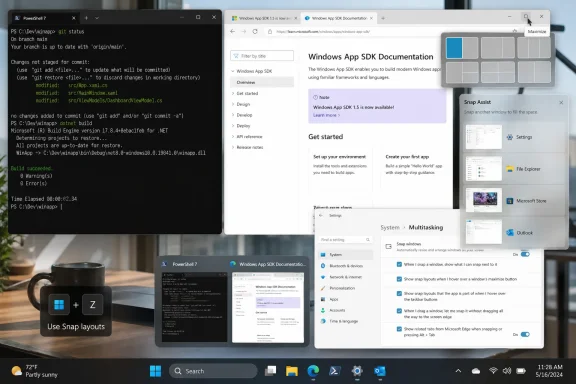
Paul Thurrott published the Thurrott.com attachment page “snap-max-guide” on July 8, 2026, under the Windows 11 Field Guide’s multitasking section, a small item that points to a larger Windows reality: Snap has become the operating system’s default answer to everyday desktop sprawl. The page itself is modest, carrying Thurrott’s byline, the “snap-max-guide” title, and a zero-share counter at publication. But the placement matters: in Windows 11, window management is no longer a power-user side quest. It is now one of the main places where Microsoft’s modern desktop either earns trust or burns it.
The old Windows ritual was muscle memory: drag left, drag right, maximize, minimize, Alt-Tab, repeat forever. Windows 11 did not invent snapping, but it turned snapping from an edge gesture into a visible system of layouts, suggestions, taskbar groups, and restore points. Microsoft’s own support material now treats Snap as a family of features rather than a single trick, while Microsoft Learn frames Snap layouts as something app developers may need to explicitly support when custom title bars or window chrome get in the way. Thurrott’s Field Guide update lands in that gap between “the feature exists” and “people actually know how to live with it.”
That gap is where Windows documentation matters. A screenshot attachment called “snap-max-guide” is not, by itself, breaking news. It is evidence of a broader editorial problem Microsoft has created for every serious Windows guide writer: the desktop is familiar enough that users think they understand it, but changed enough that old habits can now collide with new UI affordances.
Windows 11’s most visible identity is still Start, Taskbar, centered icons, rounded corners, Settings, Widgets, Copilot-era branding, and the constant churn of Windows Update. Yet the feature that many users touch dozens of times a day is far less glamorous: window placement. Every web browser, spreadsheet, chat client, remote desktop, terminal, document, ticket queue, and monitoring dashboard has to live somewhere.
That is why Snap matters more than its branding suggests. It is not merely a way to make two apps sit side by side. It is the desktop’s answer to the modern workload: too many windows, too many screens, too many interruptions, and too little patience for manual resizing.
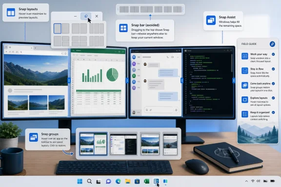
Microsoft Support describes Snap as a way to quickly resize and position windows using mouse, touch, or keyboard, with Snap Assist filling open layout spaces, Snap layouts offering predetermined arrangements, the Snap bar appearing when dragging toward the top of the screen, and Snap groups restoring collections of snapped apps. Microsoft’s public explanation is practical and user-facing: this is about keeping a workspace organized. The more interesting story is architectural. Microsoft has turned window placement into a stateful workflow, not just a one-off movement.
That distinction is important. Traditional snapping is transient: put this window here. Snap groups are persistent: return me to this arrangement. Snap layouts are predictive: here are the positions the system thinks make sense for this display. Snap Assist is opportunistic: you started placing one window, so here are the others you probably want beside it. Each layer reduces a tiny bit of friction, but each layer also introduces another place where the system can interrupt, misread intent, or behave differently across hardware.
Thurrott’s Field Guide context is useful because Windows 11’s multitasking story has become too layered for a casual tooltip. A user who only knows the old edge gestures will miss the maximize-button flyout. A user who only knows the flyout may never learn the keyboard path. A user annoyed by the top-screen Snap bar may disable too much and lose the useful parts. A developer with a custom title bar may accidentally ship an app that does not expose Snap layouts properly. A help desk technician may hear “snapping is broken” and have to determine whether the user means edge snapping, layout suggestions, Snap Assist thumbnails, taskbar Snap groups, or a third-party zone manager.
This is the strange achievement of Windows 11 multitasking: it made a basic desktop behavior powerful enough to require a guide.
But in the ecosystem of Windows coverage, attachments like this often reveal what the surrounding guide is trying to teach. “snap-max-guide” strongly suggests a visual explanation of maximizing or snapping behavior, and the path places it inside the Field Guide’s multitasking section. The story is not that Thurrott.com published a viral post. It is that Windows 11’s desktop behavior now requires visual, task-specific instruction even for operations that once felt self-evident.
That is not a criticism of Thurrott. It is an indictment of how complicated “simple” operating system features have become. A modern Windows guide has to serve several audiences at once: the home user upgrading from older habits, the IT professional building a standard desktop image, the developer whose app uses custom chrome, and the enthusiast who has already installed PowerToys because native Snap is not flexible enough.
Thurrott’s broader Windows 11 Field Guide work, as described on Thurrott.com, is being updated for the 2026 edition and positioned as coverage of currently supported Windows 11 experiences rather than a single static release. That is the correct editorial model for Windows now. The product is not a boxed operating system frozen at install time. It is a moving platform in which Start, Settings, Taskbar, Snap, Edge integration, backup flows, and AI-adjacent features may evolve independently of what many users still think of as “the version.”
Snap is a perfect example. The feature looks stable because dragging a window still feels like dragging a window. Underneath, Microsoft has layered layout menus, keyboard shortcuts, display-dependent arrangements, taskbar restoration, Task View integration, and app compatibility requirements. A static manual that says “drag to the side” is no longer enough.
The zero-share count is also quietly appropriate. This is not the kind of item that explodes across social media. It is the kind of low-glamour documentation that determines whether a user becomes faster or just more annoyed. Windows productivity is often won in increments: fewer wasted drags, fewer lost windows, fewer interruptions after a meeting, fewer help desk tickets that boil down to “where did my apps go?”
That official framing is clear enough for a basic how-to. What it does not fully capture is the behavioral trade-off Microsoft made. Windows 11’s Snap system is not just a command surface; it is an intervention surface. The OS now appears while you are moving a window and tries to turn a gesture into a layout choice.
For new users, that can be helpful. Drag a window upward, see layout options, pick one, and let Snap Assist fill the rest. For experienced users, the same behavior can feel like a roadblock placed in the middle of a familiar road. A user trying to maximize a window, throw it onto another monitor, or park it near the top edge may suddenly encounter a UI that assumes they want a layout decision.
Windows Central’s recent coverage captured that irritation from the enthusiast side, arguing that the top-of-screen Snap Assist tray can interrupt long-standing desktop muscle memory even if the maximize-button layout picker remains useful. That is the right distinction. The problem is not Snap itself. The problem is unsolicited Snap.
Microsoft partly acknowledges this by making Snap behaviors configurable. The fact that users can disable the top-screen Snap bar while keeping other parts of snapping is important. It means Windows 11’s multitasking model can be tuned rather than rejected. But discoverability remains the issue. The average user rarely explores expandable sub-options under a Settings toggle unless something has already become irritating.
That is why guides matter. The best Windows documentation today does not merely list what a feature does. It explains which part of the feature to keep, which part to turn off, and which part is meant for a different class of user. Native Snap is good enough for many people. The top-screen Snap bar is good for some people and noise for others. Snap groups are excellent when they work predictably, but less valuable if a user constantly changes tasks and monitors. FancyZones is powerful, but it is an enthusiast and admin tool, not a default household experience.
Microsoft’s official documentation tells users that the knobs exist. The better field-guide treatment tells them why they might touch those knobs at all.
The distinction matters because IT pros and advanced users often talk about “snapping” as if it were one category. It is not. Native Snap is for quick organization within Microsoft’s predefined model. FancyZones is for users who already know the model is insufficient.
This is not a simple “use FancyZones instead” recommendation. Native Snap has a crucial advantage: it is already there, supported as part of Windows, visible in the interface, and good enough for the majority of users. FancyZones has the opposite advantage: it lets a user define the desktop they actually have rather than the one Microsoft imagines.
The split becomes especially important on ultrawide monitors, portrait displays, docking stations, and multi-monitor setups. Microsoft Learn notes that Snap layouts are tailored to screen size and orientation, including different arrangements for large landscape screens and portrait screens. That is helpful, but it is not the same as letting a user define a recurring dashboard layout with exact zones.
For developers, the issue is even more concrete. Microsoft Learn says Snap layouts appear automatically for most apps when the maximize caption button is available, but custom caption buttons or title bars can prevent the menu from appearing. It advises Win32 developers to respond properly to window hit-testing for the maximize button and notes that minimum window size can also prevent an app from snapping properly into selected zones.
That is the part of the story most consumer how-tos miss. Snap is not only a user feature. It is a compatibility contract. If an app decides to draw its own title bar, customize its caption buttons, or enforce a large minimum width, it can degrade the Windows 11 multitasking experience. Users may blame Windows. Developers may blame the shell. Admins may blame the app. The real issue is that modern desktop integration is no longer just about launching and closing correctly.
Windows 11 made the maximize button into a feature gateway. Apps that mess with it inherit responsibility for the features behind it.
The administrative risk is not that Snap will break the company. The risk is that inconsistent Snap behavior becomes another small source of friction in an already overloaded desktop environment. One department has ultrawide monitors. Another works from laptops. Some users dock and undock repeatedly. Some line-of-business apps use custom title bars. Some employees install PowerToys if allowed. Others do not know Snap settings exist. Help desk scripts that say “drag the window to the left” no longer cover the real behavior users see.
There is also a training problem. Windows 11’s Snap feature set is visual, contextual, and stateful. That makes it hard to explain in a flat email. The maximize-button flyout appears only when hovering or using the keyboard shortcut. The top-screen Snap bar appears while dragging. Snap Assist appears after one window is placed. Snap groups are visible later through task switching surfaces. A user can encounter these features separately and never realize they belong to the same system.
For IT, the practical move is not to mandate one universal layout style. It is to standardize the explanation. Users should know how to invoke Snap layouts deliberately, how to use the keyboard path, how to resize snapped windows, how to restore a Snap group, and how to disable the most intrusive behavior without turning off the entire feature. That is a half-page internal guide, a short training clip, or a help desk macro — but it should exist.
The developer compatibility angle should also enter app certification checklists. If an internal Win32 app uses a custom title bar and does not show Snap layouts from the maximize area, that is now a usability defect. If a business app enforces a minimum width that prevents it from fitting into common snapped zones, that should be documented. A modern Windows app that cannot participate cleanly in window management is not merely old-fashioned. It is costly in all the tiny ways that never show up in a procurement spreadsheet.
The irony is that Snap is one of Microsoft’s friendlier Windows 11 features. It is not an ad surface. It is not a forced account flow. It is not a cloud upsell. It is a genuine productivity feature. That makes it worth managing properly.
This is where Microsoft’s design tension is most visible. The company wants Windows to be discoverable. It knows many users never learn keyboard shortcuts, never right-click the right thing, and never dig through Settings. A visual tray that appears while dragging teaches the feature at the moment of action. That is good onboarding design.
It is also a trap for skilled users. The same discoverability mechanism can feel like a pop-up in the one place where the user expected direct manipulation. When you drag a window, you are often not asking for advice. You are moving the window. If the operating system steps in too eagerly, the interface stops feeling like an extension of your hand and starts feeling like a negotiation.
Microsoft’s Settings design partly solves this by letting users turn off the top-screen Snap bar separately. The problem is that users must know the setting exists and know which checkbox corresponds to the annoyance. That is not obvious. Many will simply say “Snap is annoying” and disable more than they need to, or leave the irritation in place and resent the OS.
This is why Thurrott-style field guides retain value in an era when Microsoft publishes support pages for everything. Official documentation tends to describe features as designed. Good independent documentation describes features as experienced. The gap between those two viewpoints is where real usability lives.
It is also where Microsoft’s broader Windows 11 design language has struggled. The company often ships features with individually defensible logic that collectively make the desktop feel busier. Snap layouts are useful. Snap Assist is useful. Snap groups are useful. The Snap bar is useful for some users. But when every feature tries to reveal itself, the system can become noisy. Windows has to be both teachable and quiet, and Snap shows how difficult that balance has become.
The right answer is not nostalgia. Windows 10’s simpler snapping was easier to explain because it did less. Windows 11’s model is more capable. The task now is refinement: make the intentional paths obvious, make the interruptive paths easy to tame, and make the system predictable enough that users trust it.
This matters because Windows software has spent years moving away from standard chrome. Electron apps, custom frameworks, branded title bars, tabbed interfaces, and web-like shells have all eaten into the old assumptions about what a Windows window is. Users often do not care why an app looks different. They care that hovering over the maximize button works in one app and not another.
Snap layouts expose that inconsistency immediately. The maximize button is no longer just a maximize button. It is a contract with the shell. Break the contract, and a basic Windows 11 affordance disappears.
For enterprise developers, this should change acceptance testing. A custom line-of-business app that cannot expose Snap layouts may still pass functional QA, but it fails desktop integration QA. A trading application, case-management system, help desk console, or records viewer that cannot shrink into common Snap zones may force users back into manual resizing. That is lost time multiplied across the workforce.
For software vendors, Snap support is now part of looking native on Windows 11. Rounded corners and dark mode are superficial if the window cannot participate in the shell’s core layout model. Users may not describe the defect in those terms, but they will feel it. The app will seem clumsier than its peers.
This is also where FancyZones complicates the picture. Power users can route around weak app behavior with custom zones only up to a point. If an app enforces an oversized minimum window or resists normal window management, even custom layouts may not produce the intended result. Good Windows citizenship starts at the app window.
Microsoft has created a richer desktop model, but it cannot make every app honor it automatically. That burden now sits with developers, admins, and documentation writers as much as with the Windows shell team.
June 7, 2026 — Thurrott.com described the Windows 11 Field Guide’s 2026 edition as an evolving update to cover the current Windows 11 experience rather than a one-time snapshot of the OS.
July 8, 2026 — Paul Thurrott published the “snap-max-guide” attachment page under the Windows 11 Field Guide’s multitasking path, with the page showing his byline and a zero-share count near publication.
Microsoft often assumes discoverability will carry that burden. Put the feature in the UI, surface it contextually, add a support article, and let users adapt. That works for some people. It fails for users who experience the feature first as an interruption or inconsistency.
Snap demonstrates the better model. It is useful enough to justify learning. It has keyboard, mouse, and visual paths. It is configurable. It has a power-user upgrade path through FancyZones. It has developer guidance. The raw ingredients are strong.
What remains weak is the connective tissue. Windows does not always explain that Snap layouts, Snap Assist, Snap groups, and the Snap bar are parts of one system. It does not always distinguish between beginner-friendly discovery and expert-friendly control. It does not tell users, in plain language, that they can keep the useful maximize-button picker while disabling the top-edge behavior they hate. It does not tell developers, at the moment they customize a title bar, that they may be breaking a shell feature users expect.
That is why independent guides still matter in 2026. A Microsoft support page can define the feature. A field guide can explain how the feature fits into work. The difference is not academic. It is the difference between “Windows has this” and “here is how not to fight it.”
For most users, the best starting point is to leave Snap enabled, learn the keyboard shortcut for layouts, and use the maximize-button flyout deliberately. That path gives the benefit of modern Snap without relying on accidental top-edge discovery. If the top-screen Snap bar gets in the way, turn off that specific behavior rather than abandoning Snap entirely.
Users with large monitors should experiment with the layouts Windows offers before installing anything extra. Native Snap may already provide enough structure, especially when combined with Snap groups and divider resizing. Users with ultrawide displays, complicated dashboards, or recurring multi-app workspaces should look at PowerToys FancyZones, but only after understanding that it is a custom window manager, not merely “more Snap.”
Developers should test their windows like users actually use them: hover over maximize, press Windows key plus Z, snap into small zones, resize snapped pairs, move between monitors, and restore groups. If any of those actions feel broken, the app is not fully adapted to Windows 11’s desktop.
Admins should treat Snap as part of desktop readiness. That does not mean forcing everyone into the same layout. It means removing mystery. The best enterprise desktop is not the one with the most features enabled. It is the one where users understand why the system behaves the way it does.
The old Windows ritual was muscle memory: drag left, drag right, maximize, minimize, Alt-Tab, repeat forever. Windows 11 did not invent snapping, but it turned snapping from an edge gesture into a visible system of layouts, suggestions, taskbar groups, and restore points. Microsoft’s own support material now treats Snap as a family of features rather than a single trick, while Microsoft Learn frames Snap layouts as something app developers may need to explicitly support when custom title bars or window chrome get in the way. Thurrott’s Field Guide update lands in that gap between “the feature exists” and “people actually know how to live with it.”
That gap is where Windows documentation matters. A screenshot attachment called “snap-max-guide” is not, by itself, breaking news. It is evidence of a broader editorial problem Microsoft has created for every serious Windows guide writer: the desktop is familiar enough that users think they understand it, but changed enough that old habits can now collide with new UI affordances.
 Snap Has Quietly Become Windows 11’s Real Productivity Interface
Windows 11’s most visible identity is still Start, Taskbar, centered icons, rounded corners, Settings, Widgets, Copilot-era branding, and the constant churn of Windows Update. Yet the feature that many users touch dozens of times a day is far less glamorous: window placement. Every web browser, spreadsheet, chat client, remote desktop, terminal, document, ticket queue, and monitoring dashboard has to live somewhere.That is why Snap matters more than its branding suggests. It is not merely a way to make two apps sit side by side. It is the desktop’s answer to the modern workload: too many windows, too many screens, too many interruptions, and too little patience for manual resizing.
Microsoft Support describes Snap as a way to quickly resize and position windows using mouse, touch, or keyboard, with Snap Assist filling open layout spaces, Snap layouts offering predetermined arrangements, the Snap bar appearing when dragging toward the top of the screen, and Snap groups restoring collections of snapped apps. Microsoft’s public explanation is practical and user-facing: this is about keeping a workspace organized. The more interesting story is architectural. Microsoft has turned window placement into a stateful workflow, not just a one-off movement.
That distinction is important. Traditional snapping is transient: put this window here. Snap groups are persistent: return me to this arrangement. Snap layouts are predictive: here are the positions the system thinks make sense for this display. Snap Assist is opportunistic: you started placing one window, so here are the others you probably want beside it. Each layer reduces a tiny bit of friction, but each layer also introduces another place where the system can interrupt, misread intent, or behave differently across hardware.
Thurrott’s Field Guide context is useful because Windows 11’s multitasking story has become too layered for a casual tooltip. A user who only knows the old edge gestures will miss the maximize-button flyout. A user who only knows the flyout may never learn the keyboard path. A user annoyed by the top-screen Snap bar may disable too much and lose the useful parts. A developer with a custom title bar may accidentally ship an app that does not expose Snap layouts properly. A help desk technician may hear “snapping is broken” and have to determine whether the user means edge snapping, layout suggestions, Snap Assist thumbnails, taskbar Snap groups, or a third-party zone manager.
This is the strange achievement of Windows 11 multitasking: it made a basic desktop behavior powerful enough to require a guide.
Thurrott’s Tiny Attachment Page Is Really a Documentation Signal
The verified page is sparse: “snap-max-guide,” Paul Thurrott’s byline, the July 8, 2026 publication date, and a share count of zero near the byline. It appears as an attachment inside the Windows 11 Field Guide’s multitasking area rather than as a standalone essay. That makes it easy to dismiss as a content-management artifact.But in the ecosystem of Windows coverage, attachments like this often reveal what the surrounding guide is trying to teach. “snap-max-guide” strongly suggests a visual explanation of maximizing or snapping behavior, and the path places it inside the Field Guide’s multitasking section. The story is not that Thurrott.com published a viral post. It is that Windows 11’s desktop behavior now requires visual, task-specific instruction even for operations that once felt self-evident.
That is not a criticism of Thurrott. It is an indictment of how complicated “simple” operating system features have become. A modern Windows guide has to serve several audiences at once: the home user upgrading from older habits, the IT professional building a standard desktop image, the developer whose app uses custom chrome, and the enthusiast who has already installed PowerToys because native Snap is not flexible enough.
Thurrott’s broader Windows 11 Field Guide work, as described on Thurrott.com, is being updated for the 2026 edition and positioned as coverage of currently supported Windows 11 experiences rather than a single static release. That is the correct editorial model for Windows now. The product is not a boxed operating system frozen at install time. It is a moving platform in which Start, Settings, Taskbar, Snap, Edge integration, backup flows, and AI-adjacent features may evolve independently of what many users still think of as “the version.”
Snap is a perfect example. The feature looks stable because dragging a window still feels like dragging a window. Underneath, Microsoft has layered layout menus, keyboard shortcuts, display-dependent arrangements, taskbar restoration, Task View integration, and app compatibility requirements. A static manual that says “drag to the side” is no longer enough.
The zero-share count is also quietly appropriate. This is not the kind of item that explodes across social media. It is the kind of low-glamour documentation that determines whether a user becomes faster or just more annoyed. Windows productivity is often won in increments: fewer wasted drags, fewer lost windows, fewer interruptions after a meeting, fewer help desk tickets that boil down to “where did my apps go?”
Microsoft’s Official Story Is Useful, but It Hides the Trade-Off
Microsoft’s support language presents Snap as an efficiency feature, and that is mostly fair. It gives users mouse, keyboard, and layout-based ways to organize windows. It makes snapped windows resize together through divider bars. It lets users return to a snapped group from the taskbar, Task View, or Alt-Tab. It exposes controls in Settings under System > Multitasking, including toggles for Snap windows, Snap Assist, the maximize-button flyout, the top-screen Snap bar, Snap groups, and edge-distance behavior.That official framing is clear enough for a basic how-to. What it does not fully capture is the behavioral trade-off Microsoft made. Windows 11’s Snap system is not just a command surface; it is an intervention surface. The OS now appears while you are moving a window and tries to turn a gesture into a layout choice.
For new users, that can be helpful. Drag a window upward, see layout options, pick one, and let Snap Assist fill the rest. For experienced users, the same behavior can feel like a roadblock placed in the middle of a familiar road. A user trying to maximize a window, throw it onto another monitor, or park it near the top edge may suddenly encounter a UI that assumes they want a layout decision.
Windows Central’s recent coverage captured that irritation from the enthusiast side, arguing that the top-of-screen Snap Assist tray can interrupt long-standing desktop muscle memory even if the maximize-button layout picker remains useful. That is the right distinction. The problem is not Snap itself. The problem is unsolicited Snap.
Microsoft partly acknowledges this by making Snap behaviors configurable. The fact that users can disable the top-screen Snap bar while keeping other parts of snapping is important. It means Windows 11’s multitasking model can be tuned rather than rejected. But discoverability remains the issue. The average user rarely explores expandable sub-options under a Settings toggle unless something has already become irritating.
That is why guides matter. The best Windows documentation today does not merely list what a feature does. It explains which part of the feature to keep, which part to turn off, and which part is meant for a different class of user. Native Snap is good enough for many people. The top-screen Snap bar is good for some people and noise for others. Snap groups are excellent when they work predictably, but less valuable if a user constantly changes tasks and monitors. FancyZones is powerful, but it is an enthusiast and admin tool, not a default household experience.
Microsoft’s official documentation tells users that the knobs exist. The better field-guide treatment tells them why they might touch those knobs at all.
The Real Snap Divide Is Native Convenience Versus Custom Control
Windows 11’s built-in Snap system and Microsoft PowerToys FancyZones now occupy adjacent but different territory. Microsoft Support positions Snap as the mainstream system feature. Microsoft Learn describes FancyZones as a PowerToys window manager for custom layouts, zones, and workflows that go beyond the default arrangements.The distinction matters because IT pros and advanced users often talk about “snapping” as if it were one category. It is not. Native Snap is for quick organization within Microsoft’s predefined model. FancyZones is for users who already know the model is insufficient.
| Option | Best fit | Layout model | Keyboard behavior | Main limitation |
|---|---|---|---|---|
| Windows Snap | Most Windows 11 users | Predetermined layouts based on screen size and orientation | Windows key plus arrow keys, plus Windows key plus Z for layouts | Limited to Microsoft’s built-in layout choices |
| Snap groups | Users who return to the same app arrangement | Automatically created from snapped windows | Appears through taskbar, Task View, and Alt-Tab behavior | Depends on the user keeping a coherent app group alive |
| PowerToys FancyZones | Power users, developers, traders, admins, multi-monitor workers | User-defined zones and custom layouts | Can override Windows Snap shortcuts and add layout switching | Requires PowerToys deployment, configuration, and user training |
The split becomes especially important on ultrawide monitors, portrait displays, docking stations, and multi-monitor setups. Microsoft Learn notes that Snap layouts are tailored to screen size and orientation, including different arrangements for large landscape screens and portrait screens. That is helpful, but it is not the same as letting a user define a recurring dashboard layout with exact zones.
For developers, the issue is even more concrete. Microsoft Learn says Snap layouts appear automatically for most apps when the maximize caption button is available, but custom caption buttons or title bars can prevent the menu from appearing. It advises Win32 developers to respond properly to window hit-testing for the maximize button and notes that minimum window size can also prevent an app from snapping properly into selected zones.
That is the part of the story most consumer how-tos miss. Snap is not only a user feature. It is a compatibility contract. If an app decides to draw its own title bar, customize its caption buttons, or enforce a large minimum width, it can degrade the Windows 11 multitasking experience. Users may blame Windows. Developers may blame the shell. Admins may blame the app. The real issue is that modern desktop integration is no longer just about launching and closing correctly.
Windows 11 made the maximize button into a feature gateway. Apps that mess with it inherit responsibility for the features behind it.
Why Admins Should Care About a Consumer-Looking Feature
Enterprise IT has a habit of treating desktop ergonomics as soft tissue: nice to have, hard to measure, easy to ignore. Snap challenges that instinct because it sits directly in the path of daily work. If an employee spends all day in Teams, Outlook, browser tabs, dashboards, line-of-business apps, remote sessions, and documents, window management is not decoration. It is workflow infrastructure.The administrative risk is not that Snap will break the company. The risk is that inconsistent Snap behavior becomes another small source of friction in an already overloaded desktop environment. One department has ultrawide monitors. Another works from laptops. Some users dock and undock repeatedly. Some line-of-business apps use custom title bars. Some employees install PowerToys if allowed. Others do not know Snap settings exist. Help desk scripts that say “drag the window to the left” no longer cover the real behavior users see.
There is also a training problem. Windows 11’s Snap feature set is visual, contextual, and stateful. That makes it hard to explain in a flat email. The maximize-button flyout appears only when hovering or using the keyboard shortcut. The top-screen Snap bar appears while dragging. Snap Assist appears after one window is placed. Snap groups are visible later through task switching surfaces. A user can encounter these features separately and never realize they belong to the same system.
For IT, the practical move is not to mandate one universal layout style. It is to standardize the explanation. Users should know how to invoke Snap layouts deliberately, how to use the keyboard path, how to resize snapped windows, how to restore a Snap group, and how to disable the most intrusive behavior without turning off the entire feature. That is a half-page internal guide, a short training clip, or a help desk macro — but it should exist.
The developer compatibility angle should also enter app certification checklists. If an internal Win32 app uses a custom title bar and does not show Snap layouts from the maximize area, that is now a usability defect. If a business app enforces a minimum width that prevents it from fitting into common snapped zones, that should be documented. A modern Windows app that cannot participate cleanly in window management is not merely old-fashioned. It is costly in all the tiny ways that never show up in a procurement spreadsheet.
The irony is that Snap is one of Microsoft’s friendlier Windows 11 features. It is not an ad surface. It is not a forced account flow. It is not a cloud upsell. It is a genuine productivity feature. That makes it worth managing properly.
Action checklist for admins
- Confirm whether your standard Windows 11 image leaves Snap windows enabled under System > Multitasking.
- Document the difference between Snap layouts, Snap Assist, Snap groups, the Snap flyout, and the Snap bar in user-facing language.
- Teach Windows key plus arrow keys and Windows key plus Z as deliberate alternatives to mouse dragging.
- Test core business apps for maximize-button Snap layout support, especially apps with custom title bars.
- Identify teams that need PowerToys FancyZones rather than native Snap, such as multi-monitor operations, developers, analysts, and dashboard-heavy roles.
- Include Snap behavior in new-hire Windows 11 orientation instead of assuming older Windows muscle memory is enough.
The Top-Screen Snap Bar Is Where Helpfulness Becomes Interruption
Every operating system eventually reveals its philosophy through the features that appear uninvited. In Windows 11 Snap, that point is the top-screen Snap bar. The maximize-button flyout is intentional: hover over a button or press the keyboard shortcut, then choose a layout. Edge snapping is old muscle memory. But dragging toward the top of the screen and seeing a layout surface appear is more assertive.This is where Microsoft’s design tension is most visible. The company wants Windows to be discoverable. It knows many users never learn keyboard shortcuts, never right-click the right thing, and never dig through Settings. A visual tray that appears while dragging teaches the feature at the moment of action. That is good onboarding design.
It is also a trap for skilled users. The same discoverability mechanism can feel like a pop-up in the one place where the user expected direct manipulation. When you drag a window, you are often not asking for advice. You are moving the window. If the operating system steps in too eagerly, the interface stops feeling like an extension of your hand and starts feeling like a negotiation.
Microsoft’s Settings design partly solves this by letting users turn off the top-screen Snap bar separately. The problem is that users must know the setting exists and know which checkbox corresponds to the annoyance. That is not obvious. Many will simply say “Snap is annoying” and disable more than they need to, or leave the irritation in place and resent the OS.
This is why Thurrott-style field guides retain value in an era when Microsoft publishes support pages for everything. Official documentation tends to describe features as designed. Good independent documentation describes features as experienced. The gap between those two viewpoints is where real usability lives.
It is also where Microsoft’s broader Windows 11 design language has struggled. The company often ships features with individually defensible logic that collectively make the desktop feel busier. Snap layouts are useful. Snap Assist is useful. Snap groups are useful. The Snap bar is useful for some users. But when every feature tries to reveal itself, the system can become noisy. Windows has to be both teachable and quiet, and Snap shows how difficult that balance has become.
The right answer is not nostalgia. Windows 10’s simpler snapping was easier to explain because it did less. Windows 11’s model is more capable. The task now is refinement: make the intentional paths obvious, make the interruptive paths easy to tame, and make the system predictable enough that users trust it.
Developers Now Own Part of the Desktop Experience
Microsoft Learn’s developer guidance on Snap layouts is one of the most important pieces of the puzzle because it turns a user-facing feature into an app responsibility. If an app uses standard window behavior, Windows can generally show Snap layouts automatically. If the app customizes its title bar or caption buttons, the developer may need to implement the right behavior so Windows can recognize the maximize area. If the app’s minimum window size is too large, it may not fit into the zones a user selects.This matters because Windows software has spent years moving away from standard chrome. Electron apps, custom frameworks, branded title bars, tabbed interfaces, and web-like shells have all eaten into the old assumptions about what a Windows window is. Users often do not care why an app looks different. They care that hovering over the maximize button works in one app and not another.
Snap layouts expose that inconsistency immediately. The maximize button is no longer just a maximize button. It is a contract with the shell. Break the contract, and a basic Windows 11 affordance disappears.
For enterprise developers, this should change acceptance testing. A custom line-of-business app that cannot expose Snap layouts may still pass functional QA, but it fails desktop integration QA. A trading application, case-management system, help desk console, or records viewer that cannot shrink into common Snap zones may force users back into manual resizing. That is lost time multiplied across the workforce.
For software vendors, Snap support is now part of looking native on Windows 11. Rounded corners and dark mode are superficial if the window cannot participate in the shell’s core layout model. Users may not describe the defect in those terms, but they will feel it. The app will seem clumsier than its peers.
This is also where FancyZones complicates the picture. Power users can route around weak app behavior with custom zones only up to a point. If an app enforces an oversized minimum window or resists normal window management, even custom layouts may not produce the intended result. Good Windows citizenship starts at the app window.
Microsoft has created a richer desktop model, but it cannot make every app honor it automatically. That burden now sits with developers, admins, and documentation writers as much as with the Windows shell team.
Timeline
October 14, 2025 — Microsoft’s support messaging says Windows 10 support ended on this date, reinforcing Windows 11 as the mainstream destination for users who still rely on classic desktop behaviors.June 7, 2026 — Thurrott.com described the Windows 11 Field Guide’s 2026 edition as an evolving update to cover the current Windows 11 experience rather than a one-time snapshot of the OS.
July 8, 2026 — Paul Thurrott published the “snap-max-guide” attachment page under the Windows 11 Field Guide’s multitasking path, with the page showing his byline and a zero-share count near publication.
The User Education Problem Is Bigger Than Snap
The deeper Windows 11 issue is not that users cannot learn Snap. They can. The issue is that Windows now contains many features that are simple only after someone explains the mental model. Snap, Quick Settings, Widgets, Task View, Desktops, Start personalization, Edge tab integration in switching surfaces, OneDrive backup prompts, and Settings migrations all ask users to update habits formed over decades.Microsoft often assumes discoverability will carry that burden. Put the feature in the UI, surface it contextually, add a support article, and let users adapt. That works for some people. It fails for users who experience the feature first as an interruption or inconsistency.
Snap demonstrates the better model. It is useful enough to justify learning. It has keyboard, mouse, and visual paths. It is configurable. It has a power-user upgrade path through FancyZones. It has developer guidance. The raw ingredients are strong.
What remains weak is the connective tissue. Windows does not always explain that Snap layouts, Snap Assist, Snap groups, and the Snap bar are parts of one system. It does not always distinguish between beginner-friendly discovery and expert-friendly control. It does not tell users, in plain language, that they can keep the useful maximize-button picker while disabling the top-edge behavior they hate. It does not tell developers, at the moment they customize a title bar, that they may be breaking a shell feature users expect.
That is why independent guides still matter in 2026. A Microsoft support page can define the feature. A field guide can explain how the feature fits into work. The difference is not academic. It is the difference between “Windows has this” and “here is how not to fight it.”
What Windows Users Should Actually Change
The practical lesson from Thurrott’s “snap-max-guide” breadcrumb is that Windows 11 users should stop treating Snap as a single on-or-off feature. It is a toolkit, and the right setup depends on whether you value discoverability, speed, consistency, or custom layouts.For most users, the best starting point is to leave Snap enabled, learn the keyboard shortcut for layouts, and use the maximize-button flyout deliberately. That path gives the benefit of modern Snap without relying on accidental top-edge discovery. If the top-screen Snap bar gets in the way, turn off that specific behavior rather than abandoning Snap entirely.
Users with large monitors should experiment with the layouts Windows offers before installing anything extra. Native Snap may already provide enough structure, especially when combined with Snap groups and divider resizing. Users with ultrawide displays, complicated dashboards, or recurring multi-app workspaces should look at PowerToys FancyZones, but only after understanding that it is a custom window manager, not merely “more Snap.”
Developers should test their windows like users actually use them: hover over maximize, press Windows key plus Z, snap into small zones, resize snapped pairs, move between monitors, and restore groups. If any of those actions feel broken, the app is not fully adapted to Windows 11’s desktop.
Admins should treat Snap as part of desktop readiness. That does not mean forcing everyone into the same layout. It means removing mystery. The best enterprise desktop is not the one with the most features enabled. It is the one where users understand why the system behaves the way it does.
The Small Page Points to the Big Habit Shift
The concrete takeaways are less about one Thurrott.com attachment page than about the operating system behavior it documents. “snap-max-guide” is a small marker in a much larger Windows 11 transition: the desktop is still familiar, but the rules of arranging it have changed.- “snap-max-guide” was published on Thurrott.com on July 8, 2026, with Paul Thurrott listed as author.
- The page sits under the Windows 11 Field Guide’s multitasking path, making Snap part of the guide’s productivity coverage rather than a cosmetic sidebar.
- Microsoft’s own support material treats Snap as a set of related features: Snap layouts, Snap Assist, Snap groups, the Snap flyout, and the Snap bar.
- The most useful Snap path for many users is deliberate: use the maximize-button flyout or Windows key plus Z instead of relying on accidental drag triggers.
- PowerToys FancyZones remains the better fit for custom, repeatable, multi-monitor, and power-user layouts.
- Developers and admins now share responsibility for whether Snap feels consistent across real Windows 11 environments.
References
- Primary source: thurrott.com
Published: 2026-07-08T22:00:18.499939
snap-max-guide - Thurrott.com
 www.thurrott.com
- Official source: support.microsoft.com
Snap Your Windows | Microsoft Support
Discover the power of the Snap feature in Windows, designed to enhance your multitasking and productivity. The Snap feature allows you to quickly resize and position windows on your screen by dragging them to the edges or corners. With Snap, you can easily organize multiple windows, making it...support.microsoft.com - Related coverage: information-services.ed.ac.uk
- Official source: learn.microsoft.com
Support snap layouts for desktop apps on Windows 11 - Windows apps | Microsoft Learn
Support the snap layouts menu in your desktop application.learn.microsoft.com - Official source: microsoft.com
Snap for Organization | Microsoft Windows
Explore Windows 11 organization with Snap layouts. Use Snap layouts to place the windows and apps you need to see side-by-side on one screen.www.microsoft.com
- Related coverage: windowsdigitals.com
Windows 11: How to Use Snap Layouts to Snap Apps
Snap layouts in Windows 11 maximize the use of the screen space. Learn how to use snap layouts to split screen or snap multiple apps here.www.windowsdigitals.com
- Related coverage: windowscentral.com
How to master Snap Assist on Windows 11 | Windows Central
On Windows 11, you can use these instructions to get started with Snap Assist and its features like Snap Layouts, Groups, and Suggestions to better organize your open windows and boost productivity.www.windowscentral.com - Related coverage: windows.gadgethacks.com

Disable Snap Layouts When Dragging to Top of Screen in Windows 11 << Windows Tips :: Gadget Hacks
Disable Snap Layouts When Dragging to Top of Screen in Windows 11 One checkbox fixes this. Go to Settings &gt; System &gt; Multitasking, expand the Snap...
windows.gadgethacks.com
- Related coverage: scscc.club
- Related coverage: teachucomp.com
- Related coverage: customguide.com