

Windows 11 Beta build 26220.8925 gives Microsoft’s Start menu something it has conspicuously lacked since the operating system debuted: straightforward control over what appears, how much space it occupies, and how much personal information it exposes. The update lets testers choose a small or large Start layout, hide entire sections such as Pinned, Recent, and All, remove the account name and profile image, and navigate a redesigned personalization page. Alongside those headline changes, Microsoft is correcting smaller irritations elsewhere in Windows, including File Explorer’s habit of expressing every file size in kilobytes rather than switching naturally between KB, MB, and GB.
The redesign was visually cleaner and more consistent with Windows 11’s rounded, touch-friendly interface. However, simplification also removed agency, leaving users with fewer ways to adapt one of the operating system’s most frequently opened surfaces.
Windows 10 had allowed the Start menu to be resized by dragging its edges, expanded into a full-screen experience, divided into named tile groups, and populated with different tile sizes. Not everyone liked Live Tiles, but their removal did not require Microsoft to discard the broader principle that Start should bend to the user rather than force every user into the same layout.
Those changes improved organization without resolving the core complaints. Start remained constrained by Microsoft’s predetermined sections, and turning off individual recommendation providers did not always reclaim the corresponding space cleanly.
The result was a menu that could be adjusted but not truly reshaped. Beta build 26220.8925 represents a more meaningful change because it introduces section-level controls and explicit sizing choices, rather than merely changing what content appears inside a fixed framework.
Microsoft acknowledged this problem in May 2026 when it outlined a broader effort to make Start and the taskbar more personal. That program included movable taskbar positions, compact taskbar sizing, more predictable Start layouts, and clearer controls for recommendations.
Some of the Start improvements initially appeared in the Experimental channel. Their arrival in Beta build 26220.8925 indicates that Microsoft has gained enough confidence to expose them to a wider and generally more stability-conscious group of Windows Insiders.
That integration makes section-level controls especially important. A unified menu is convenient when every section is useful, but it becomes visually heavy when users rely primarily on search, pins, or a small collection of applications.
The new controls acknowledge that Windows users follow different navigation patterns. Some launch everything through search, some depend on an alphabetical list, and others treat Start as a curated dashboard of pinned tools.
Insiders who enable the option to receive the latest updates as soon as they become available typically have a better chance of receiving gradual feature rollouts early. Even then, enrollment in the Beta channel and installation of the correct build do not guarantee immediate access.
This distinction matters because Windows build numbers no longer provide a complete description of the enabled experience. Two PCs on the same build can temporarily expose different features because configuration packages and server-side rollout assignments also influence availability.
Small is intended for users who want Start to behave like a compact application launcher. Large favors people who maintain extensive pin collections, browse installed applications visually, or want more content visible without additional scrolling.
Explicit sizing is preferable to relying entirely on adaptive logic because screen dimensions do not tell Windows how a person works. A user with a 32-inch monitor may still want a tiny launcher, while a user on a 13-inch convertible may prefer a large, touch-friendly menu.
Those changes can make muscle memory less reliable. A pinned application that appears in one visible row on the laptop display may move elsewhere when Start recalculates its layout on a larger external monitor.
A persistent Small or Large preference should make Start feel more predictable. Microsoft will still need to account for physical constraints, but the operating system now has a clear expression of user intent rather than relying only on hardware-derived assumptions.
Power users may reasonably ask why Start cannot be resized continuously like an ordinary window. The answer likely involves the complexity of maintaining responsive grids, touch targets, animations, accessibility behavior, and consistent flyout positioning across a vast hardware ecosystem.
Microsoft’s compromise is understandable, although understandable is not the same as ideal. Small and Large are important additions, but they should be viewed as a practical restoration of control rather than the final word on Start menu sizing.
Hiding Pinned allows Start to operate more like an application directory or recent-work hub. It also avoids forcing users to maintain a collection of icons simply because Microsoft assumes pins are essential.
For shared or highly standardized systems, removing the pin surface could reduce clutter and discourage users from treating Start as an unmanaged collection of shortcuts. Conversely, organizations that deploy a carefully designed pin layout can retain it while hiding less relevant sections.
The new Recent toggle is much closer to that direct instruction. Users who dislike activity-based content can hide the section rather than chasing multiple settings and wondering why blank or partially populated space remains.
This is an important privacy and usability improvement. A setting should express the outcome a person wants, not require them to understand the internal categories Microsoft uses to generate that outcome.
However, an always-present application directory can add weight to a Start menu intended to be minimalist. Users with a carefully organized pin collection may prefer to hide All and treat Start as a focused dashboard.
Independent toggles allow several distinct layouts:
That ambiguity encouraged suspicion. Users could not always tell whether Windows was helping them resume work, promoting an application, or using behavioral data to decide what deserved attention.
Renaming the section to Recent narrows its stated purpose. A recent item has a clearer relationship to the user’s activity, whereas a recommendation implies that Windows is making a judgment about what the user should open.
Users should also be able to disable Start file suggestions without unintentionally disabling useful recent-item behavior in File Explorer or taskbar jump lists. Microsoft has previously tied some of these surfaces to shared controls, creating an all-or-nothing tradeoff that did not reflect how people use Windows.
The broader personalization initiative promises more separation between Start recommendations and recent content elsewhere. If implemented consistently, that change will be more consequential than the rename itself.
A useful Recent section should favor ongoing work over raw chronology. It should understand that a project document edited repeatedly is probably more important than an image briefly opened from a messaging application.
That balancing act introduces algorithmic judgment back into a section whose new name sounds purely chronological. Microsoft should therefore explain how recency, frequency, file location, cloud status, and user dismissal signals affect what appears.
A redesigned page gives Microsoft an opportunity to place controls according to visible outcomes. Instead of scattering related settings across vague recommendation categories, the page can present a direct representation of the menu’s sections and appearance.
This matters because personalization features are only effective when users can find and understand them. A hidden registry value technically offers choice, but it does not constitute a polished consumer feature.
Microsoft could strengthen the redesigned page with a live preview showing how Small and Large differ, which areas disappear when toggles are disabled, and where account information is displayed. Such a preview would also help users understand terminology that may change as Windows evolves.
Clear dependencies are equally important. If hiding a section affects another option, Settings should explain that relationship before the user makes the change.
A high-quality Start settings page should prioritize Start settings. Promotional or advisory content must not become a barrier between users and the controls they opened the page to change.
Microsoft’s stated emphasis on Windows quality will be judged by details like these. New options are valuable, but their placement, wording, accessibility, and resistance to future clutter determine whether they remain genuinely useful.
That information is not secret in every context, but it is unnecessary exposure. Content creators have often blurred the corner of Start, used a generic local account, or carefully avoided opening the menu while recording.
A native control removes that burden. It also reflects a more mature understanding of modern PC use, in which desktops are frequently broadcast beyond the person sitting directly in front of them.
However, Microsoft must preserve easy access to locking, signing out, switching accounts, and opening account settings. Privacy should remove identifying decoration, not make essential session controls difficult to find.
The ideal implementation retains a generic account button or another recognizable control. Completely removing the affordance could confuse users who depend on Start to switch profiles.
If Microsoft exposes the option through Group Policy, configuration service providers, or mobile device management, IT teams can deploy it consistently. Without policy support, administrators may need scripts, preference management, or manual configuration.
Microsoft should also document whether hiding the identity applies only to Start or affects other account surfaces. Predictable scope is essential for enterprise deployment and accessibility testing.
The number is not mathematically wrong. It is simply poorly matched to human comparison, particularly when users are deciding what to delete, upload, archive, or move to limited storage.
Build 26220.8925 begins showing file sizes in KB, MB, and GB as appropriate. This is a textbook quality-of-life improvement: small in engineering visibility, large in everyday legibility.
When every value uses KB, users must mentally count digits or perform rough conversions. That process is manageable for experts but still unnecessary, and it is particularly unfriendly to less technical users.
Adaptive units also align File Explorer with storage settings, download interfaces, browsers, cloud services, and most modern file managers. Consistency across those surfaces helps users develop an intuitive sense of scale.
The best design uses concise adaptive units in the list while preserving exact size information in Properties or a details surface. It should also distinguish between a file’s logical size and its size on disk where relevant.
There is also the perennial question of decimal versus binary measurement. Windows has historically used binary calculations while sometimes labeling them with decimal-looking abbreviations, an inconsistency that can create discrepancies between Explorer, drive manufacturers, and other operating systems. The new display behavior improves readability but does not automatically resolve that deeper convention.
For laptop users, however, the touchpad is a primary interface. A gesture that fails occasionally or behaves differently after an update can interrupt work more frequently than a missing headline feature.
Microsoft’s challenge is to improve precision without disrupting established muscle memory. Gesture changes should be clearly documented, reversible where practical, and validated across the wide range of precision touchpad hardware used by Windows manufacturers.
Start’s new controls also need complete accessibility support. Narrator should announce each section toggle, describe the selected menu size, identify account-visibility settings, and present dependencies or rollout limitations in a logical order.
Accessibility cannot be added after visual design is finished. Microsoft must test the redesigned Start settings page with keyboard navigation, high-contrast themes, text scaling, voice control, and multiple screen readers before broad release.
That perception has strategic value. Windows 11 has sometimes appeared to prioritize new services and promotional surfaces while long-standing interface complaints remained unresolved.
Build 26220.8925 does not erase that history, but it supports a more grounded development narrative: fix obvious friction, restore missing choices, and refine the tools people already use.
Users should therefore avoid treating build 26220.8925 as a fixed preview of the next public update. The controls may arrive through a cumulative update, a feature enablement package, a later annual release, or a staggered configuration rollout.
The exact combination may also vary between Windows branches. Microsoft has maintained different servicing paths for Windows 11 versions, including targeted platform releases and the mainstream branch used by most existing PCs.
A useful test sequence includes:
Anyone testing the build should maintain current backups, preserve recovery keys, and understand how to leave the Insider channel. Depending on the branch and timing, returning to a stable release may require more than flipping a switch.
Organizations should use dedicated validation devices or virtualized test environments where possible. Start and Explorer changes touch core workflows, so even a visually modest regression can affect support volume across a large deployment.
Privacy-conscious users can remove Recent and hide identity information. Laptop owners can select a compact layout, while touch users may favor a larger target-rich menu.
These choices reduce the pressure to install third-party Start replacements. Such utilities remain attractive to enthusiasts seeking classic layouts or deeper customization, but fewer users should need them merely to hide unwanted sections.
The value depends on manageability. Microsoft must provide stable policy names, documentation, configuration precedence, and behavior across feature updates.
Enterprises will also watch whether Microsoft separates productivity-oriented recency from consumer recommendations. Administrators need confidence that a carefully governed Start configuration will not later gain new promotional providers or cloud-connected content without explicit approval.
Support documentation will need to account for alternate configurations and encourage search-based navigation when appropriate. Remote-support tools may also need to capture personalization state before guiding a user through a procedure.
This is not an argument against customization. It is a reminder that flexibility transfers some complexity from product design to documentation, management, and troubleshooting.
Microsoft’s new toggles address mainstream complaints but do not eliminate demand for those tools. Enthusiasts may still want free resizing, classic cascading menus, custom skins, complete recommendation removal, or tighter control over search behavior.
The difference is that third-party software can return to serving users who genuinely want an alternative rather than those seeking basic controls Microsoft should provide itself.
As Microsoft modernizes Start, it should avoid unnecessary hostility toward legitimate customization tools. Stable extension points and clear documentation would reduce the temptation for developers to rely on fragile hooks.
Security still matters. Shell utilities can access significant user activity and launch behavior, so users should install them only from reputable developers and keep them updated.
A desktop operating system should be especially strong at adapting to different work styles. That has historically been one of Windows’ defining advantages.
Restoring Start customization therefore has symbolic importance beyond the individual toggles. It signals whether Microsoft still sees Windows as a user-owned workspace or primarily as a standardized delivery surface for Microsoft services.
Microsoft may ship the Start changes independently of a major annual feature update. Modern Windows servicing allows interface capabilities to arrive through cumulative updates and controlled feature enablement, sometimes long before every PC receives them.
Users should watch for explicit confirmation that the controls have entered Release Preview or stable retail builds. Appearance in Beta is a major milestone, but it is not the end of the deployment process.
Roaming can be convenient, but it should not override device-specific needs. A compact laptop and a large touch display may warrant different Start configurations even when they belong to the same person.
Enterprise administrators will also look for Group Policy and mobile device management settings. Policy documentation should specify whether enforced values prevent user changes, establish defaults, or behave as recommended preferences.
The key test will be integration. A top-mounted or vertical taskbar must open Start in a visually and ergonomically sensible position, while Small and Large layouts must adapt without clipping or awkward animation.
Microsoft also needs to decide whether to support different taskbar positions and Start behaviors on separate monitors. Multi-monitor users have long requested more per-display control, and a single global setting may not be sufficient.
The encouraging sign is the nature of the work. Start section toggles and readable file-size units are not designed primarily to sell subscriptions or showcase a new service. They solve recognizable user problems.
WindowsForum users should judge the initiative by consistency over the coming months: fewer regressions, clearer settings, better accessibility, stable Explorer behavior, and a willingness to restore sensible options even when they complicate Microsoft’s preferred design.
Windows 11 Beta build 26220.8925 does not return Start to the limitless customization of earlier Windows eras, nor does it make third-party alternatives obsolete. It does, however, mark a meaningful shift from cosmetic personalization toward structural control, giving users a say in which Start sections exist, how large the menu should be, and whether personal identity appears within it. If Microsoft carries the same philosophy into the taskbar, Explorer, search, and future stable releases, Windows 11 may finally become not only more polished, but more recognizably personal.
 Background
Windows 11 started with a deliberately simplified Start menu
When Windows 11 launched in October 2021, Microsoft replaced Windows 10’s highly configurable Start experience with a centered, fixed-size launcher. Live Tiles disappeared, the alphabetical application list moved behind an extra button, and a large Recommended area occupied substantial space even for users who did not find its contents useful.The redesign was visually cleaner and more consistent with Windows 11’s rounded, touch-friendly interface. However, simplification also removed agency, leaving users with fewer ways to adapt one of the operating system’s most frequently opened surfaces.
Windows 10 had allowed the Start menu to be resized by dragging its edges, expanded into a full-screen experience, divided into named tile groups, and populated with different tile sizes. Not everyone liked Live Tiles, but their removal did not require Microsoft to discard the broader principle that Start should bend to the user rather than force every user into the same layout.
Early personalization options were too narrow
Microsoft gradually restored some flexibility. Users gained the ability to create folders for pinned applications, change the balance between pinned and recommended content, select alternative views for the All apps section, and place common folders next to the power button.Those changes improved organization without resolving the core complaints. Start remained constrained by Microsoft’s predetermined sections, and turning off individual recommendation providers did not always reclaim the corresponding space cleanly.
The result was a menu that could be adjusted but not truly reshaped. Beta build 26220.8925 represents a more meaningful change because it introduces section-level controls and explicit sizing choices, rather than merely changing what content appears inside a fixed framework.
Microsoft is responding to a long-running trust problem
Start and the taskbar are not peripheral utilities. They are among the first interfaces users encounter after signing in, and small frustrations in either surface are repeated dozens of times per day.Microsoft acknowledged this problem in May 2026 when it outlined a broader effort to make Start and the taskbar more personal. That program included movable taskbar positions, compact taskbar sizing, more predictable Start layouts, and clearer controls for recommendations.
Some of the Start improvements initially appeared in the Experimental channel. Their arrival in Beta build 26220.8925 indicates that Microsoft has gained enough confidence to expose them to a wider and generally more stability-conscious group of Windows Insiders.
What Beta Build 26220.8925 Changes
The Start menu gains five major controls
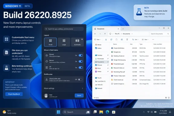
The Start changes in this build can be divided into five practical improvements:- Recommended is renamed Recent, making the label better match the mixture of recently opened files and newly installed applications shown there.
- Pinned, Recent, and All receive independent visibility toggles, allowing users to hide sections they do not want.
- Start can be set to Small, Large, or Automatic, reducing dependence on Microsoft’s display-based sizing logic.
- The account name and profile picture can be hidden, which is useful during presentations, screen recordings, livestreams, and shared-device sessions.
- The Start settings page has been redesigned, bringing the new controls into a clearer and more coherent arrangement.
The changes build on the newer unified Start design
Microsoft’s current Start menu has evolved beyond the original Windows 11 release. Pinned items, recent content, and installed applications increasingly function as integrated parts of one surface rather than entirely separate pages.That integration makes section-level controls especially important. A unified menu is convenient when every section is useful, but it becomes visually heavy when users rely primarily on search, pins, or a small collection of applications.
The new controls acknowledge that Windows users follow different navigation patterns. Some launch everything through search, some depend on an alphabetical list, and others treat Start as a curated dashboard of pinned tools.
Not every tester will see everything immediately
As with many Insider additions, the features may be delivered through a controlled rollout rather than appearing simultaneously on every PC running build 26220.8925. Microsoft uses staged deployment to compare reliability data, gather feedback, and stop a feature’s expansion if it causes unexpected problems.Insiders who enable the option to receive the latest updates as soon as they become available typically have a better chance of receiving gradual feature rollouts early. Even then, enrollment in the Beta channel and installation of the correct build do not guarantee immediate access.
This distinction matters because Windows build numbers no longer provide a complete description of the enabled experience. Two PCs on the same build can temporarily expose different features because configuration packages and server-side rollout assignments also influence availability.
Start Menu Sizing Becomes a Real Preference
Small, Large, and Automatic serve different workflows
The new size control offers three modes. Automatic remains the default and allows Windows to select an appropriate layout based on factors such as display size, resolution, and scaling.Small is intended for users who want Start to behave like a compact application launcher. Large favors people who maintain extensive pin collections, browse installed applications visually, or want more content visible without additional scrolling.
Explicit sizing is preferable to relying entirely on adaptive logic because screen dimensions do not tell Windows how a person works. A user with a 32-inch monitor may still want a tiny launcher, while a user on a 13-inch convertible may prefer a large, touch-friendly menu.
Consistency across displays is the bigger benefit
The most valuable aspect may not be the physical size itself, but the ability to preserve a preference across different display arrangements whenever practical. Automatic layouts can change when a laptop is docked, undocked, connected to a projector, or moved between monitors with different scaling levels.Those changes can make muscle memory less reliable. A pinned application that appears in one visible row on the laptop display may move elsewhere when Start recalculates its layout on a larger external monitor.
A persistent Small or Large preference should make Start feel more predictable. Microsoft will still need to account for physical constraints, but the operating system now has a clear expression of user intent rather than relying only on hardware-derived assumptions.
Fixed presets are useful but not as flexible as free resizing
The new options do not necessarily recreate Windows 10’s drag-to-resize behavior. Presets are easier to test, support, synchronize, and keep visually coherent, but they also define boundaries around personalization.Power users may reasonably ask why Start cannot be resized continuously like an ordinary window. The answer likely involves the complexity of maintaining responsive grids, touch targets, animations, accessibility behavior, and consistent flyout positioning across a vast hardware ecosystem.
Microsoft’s compromise is understandable, although understandable is not the same as ideal. Small and Large are important additions, but they should be viewed as a practical restoration of control rather than the final word on Start menu sizing.
Section Toggles Fix the Menu’s Most Obvious Limitation
Pinned can now be hidden
Pinned applications have traditionally formed the core of Windows 11’s Start menu. Yet users who launch software through Windows Search, PowerToys Run, keyboard shortcuts, desktop icons, or the taskbar may not need a pin grid at all.Hiding Pinned allows Start to operate more like an application directory or recent-work hub. It also avoids forcing users to maintain a collection of icons simply because Microsoft assumes pins are essential.
For shared or highly standardized systems, removing the pin surface could reduce clutter and discourage users from treating Start as an unmanaged collection of shortcuts. Conversely, organizations that deploy a carefully designed pin layout can retain it while hiding less relevant sections.
Recent can finally disappear as a complete section
Windows 11 has long provided switches governing recently opened items, frequently used applications, tips, shortcuts, and newly added software. Turning those providers off could reduce the content shown, but users were not always given a clean, intuitive way to say, “I do not want this entire section.”The new Recent toggle is much closer to that direct instruction. Users who dislike activity-based content can hide the section rather than chasing multiple settings and wondering why blank or partially populated space remains.
This is an important privacy and usability improvement. A setting should express the outcome a person wants, not require them to understand the internal categories Microsoft uses to generate that outcome.
All can be removed for a pins-first layout
The All section provides access to installed software and can support list, grid, or category-oriented browsing. It is valuable for discovering applications whose names users may not remember well enough to search for.However, an always-present application directory can add weight to a Start menu intended to be minimalist. Users with a carefully organized pin collection may prefer to hide All and treat Start as a focused dashboard.
Independent toggles allow several distinct layouts:
- A pins-only configuration can hide Recent and All.
- A traditional launcher configuration can emphasize All while hiding Pinned and Recent.
- A recent-work configuration can prioritize files and newly used applications.
- A full configuration can leave all three sections enabled.
- A minimal configuration can hide nearly everything unnecessary and rely on search.
Recommended Becomes Recent
The old name carried too much baggage
“Recommended” was one of the most controversial labels in Windows 11 because it could describe several very different things. A recommended item might be a document the user recently edited, an application that had just been installed, a frequently used program, or content surfaced through a Microsoft-controlled provider.That ambiguity encouraged suspicion. Users could not always tell whether Windows was helping them resume work, promoting an application, or using behavioral data to decide what deserved attention.
Renaming the section to Recent narrows its stated purpose. A recent item has a clearer relationship to the user’s activity, whereas a recommendation implies that Windows is making a judgment about what the user should open.
A better label does not settle the privacy question
Recent is more precise, but the underlying settings still matter more than the heading. Microsoft needs to ensure that people can distinguish local activity history from cloud-connected files, organizational content, newly installed applications, and promotional suggestions.Users should also be able to disable Start file suggestions without unintentionally disabling useful recent-item behavior in File Explorer or taskbar jump lists. Microsoft has previously tied some of these surfaces to shared controls, creating an all-or-nothing tradeoff that did not reflect how people use Windows.
The broader personalization initiative promises more separation between Start recommendations and recent content elsewhere. If implemented consistently, that change will be more consequential than the rename itself.
Relevance will determine whether users keep it enabled
Microsoft says it is working to improve the ordering and relevance of files shown in the section. That work is essential because a recent-content system fails quickly when it surfaces temporary downloads, old attachments, autosaved duplicates, or documents that were opened only once.A useful Recent section should favor ongoing work over raw chronology. It should understand that a project document edited repeatedly is probably more important than an image briefly opened from a messaging application.
That balancing act introduces algorithmic judgment back into a section whose new name sounds purely chronological. Microsoft should therefore explain how recency, frequency, file location, cloud status, and user dismissal signals affect what appears.
The Redesigned Start Settings Page Matters
Better organization lowers the cost of personalization
Windows has accumulated many Start-related switches over time. Some govern recommendations, others control recently opened content, and still others determine folders, account information, or layout behavior.A redesigned page gives Microsoft an opportunity to place controls according to visible outcomes. Instead of scattering related settings across vague recommendation categories, the page can present a direct representation of the menu’s sections and appearance.
This matters because personalization features are only effective when users can find and understand them. A hidden registry value technically offers choice, but it does not constitute a polished consumer feature.
Settings should preview the result
The strongest personalization interfaces provide immediate visual feedback. Users should not have to toggle an option, close Settings, open Start, inspect the result, and repeat the process several times.Microsoft could strengthen the redesigned page with a live preview showing how Small and Large differ, which areas disappear when toggles are disabled, and where account information is displayed. Such a preview would also help users understand terminology that may change as Windows evolves.
Clear dependencies are equally important. If hiding a section affects another option, Settings should explain that relationship before the user makes the change.
Microsoft must avoid adding promotional clutter
The Settings app itself has increasingly hosted account notices, cloud-storage reminders, Microsoft 365 prompts, and recommended configuration cards. That makes a cleaner Start page welcome, but it also raises the possibility that personalization controls could be pushed below account-oriented messaging.A high-quality Start settings page should prioritize Start settings. Promotional or advisory content must not become a barrier between users and the controls they opened the page to change.
Microsoft’s stated emphasis on Windows quality will be judged by details like these. New options are valuable, but their placement, wording, accessibility, and resistance to future clutter determine whether they remain genuinely useful.
Hiding the Account Name and Profile Picture
Presentation privacy gets a practical improvement
The ability to hide the account name and profile image addresses a small but persistent privacy risk. Opening Start during a screen share, recorded tutorial, classroom demonstration, or livestream can reveal a real name, corporate identity, or personal photograph.That information is not secret in every context, but it is unnecessary exposure. Content creators have often blurred the corner of Start, used a generic local account, or carefully avoided opening the menu while recording.
A native control removes that burden. It also reflects a more mature understanding of modern PC use, in which desktops are frequently broadcast beyond the person sitting directly in front of them.
Shared devices can look less personally identifiable
Family PCs, training systems, demonstration units, conference-room machines, and front-desk computers may all benefit from a less personalized account area. Hiding identity elements can make a shared interface feel more neutral without requiring the underlying account model to change.However, Microsoft must preserve easy access to locking, signing out, switching accounts, and opening account settings. Privacy should remove identifying decoration, not make essential session controls difficult to find.
The ideal implementation retains a generic account button or another recognizable control. Completely removing the affordance could confuse users who depend on Start to switch profiles.
Enterprises will want policy support
Organizations may wish to enforce this setting on devices used for presentations, kiosks, training, examinations, or customer demonstrations. That makes administrative policy support more important than the consumer-facing toggle alone.If Microsoft exposes the option through Group Policy, configuration service providers, or mobile device management, IT teams can deploy it consistently. Without policy support, administrators may need scripts, preference management, or manual configuration.
Microsoft should also document whether hiding the identity applies only to Start or affects other account surfaces. Predictable scope is essential for enterprise deployment and accessibility testing.
File Explorer Finally Uses Sensible Size Units
Everything in kilobytes was technically valid but practically awkward
File Explorer has historically displayed sizes in kilobytes in several views and properties-related contexts where adaptive units would be easier to read. A large file might therefore appear as hundreds of thousands or millions of KB rather than a concise value in MB or GB.The number is not mathematically wrong. It is simply poorly matched to human comparison, particularly when users are deciding what to delete, upload, archive, or move to limited storage.
Build 26220.8925 begins showing file sizes in KB, MB, and GB as appropriate. This is a textbook quality-of-life improvement: small in engineering visibility, large in everyday legibility.
Adaptive units reduce cognitive load
Consider a folder containing a 640 KB text document, a 48 MB presentation, and a 6.2 GB disk image. Expressing each item in the most natural unit makes their relative scale immediately apparent.When every value uses KB, users must mentally count digits or perform rough conversions. That process is manageable for experts but still unnecessary, and it is particularly unfriendly to less technical users.
Adaptive units also align File Explorer with storage settings, download interfaces, browsers, cloud services, and most modern file managers. Consistency across those surfaces helps users develop an intuitive sense of scale.
Precision and unit standards still need scrutiny
Microsoft will need to handle rounding carefully. A compact value such as 1.0 GB is readable, but users copying files to nearly full storage may need more precise byte counts than the main Explorer column can display.The best design uses concise adaptive units in the list while preserving exact size information in Properties or a details surface. It should also distinguish between a file’s logical size and its size on disk where relevant.
There is also the perennial question of decimal versus binary measurement. Windows has historically used binary calculations while sometimes labeling them with decimal-looking abbreviations, an inconsistency that can create discrepancies between Explorer, drive manufacturers, and other operating systems. The new display behavior improves readability but does not automatically resolve that deeper convention.
Touchpad and Narrator Refinements Reinforce the Quality Theme
Input reliability matters more than novelty
The build reportedly includes additional touchpad changes, although the Start menu naturally receives most of the attention. Input refinements often look minor in release notes because they affect edge cases, gesture recognition, configuration behavior, or consistency rather than introducing an entirely new capability.For laptop users, however, the touchpad is a primary interface. A gesture that fails occasionally or behaves differently after an update can interrupt work more frequently than a missing headline feature.
Microsoft’s challenge is to improve precision without disrupting established muscle memory. Gesture changes should be clearly documented, reversible where practical, and validated across the wide range of precision touchpad hardware used by Windows manufacturers.
Narrator improvements have an outsized accessibility impact
Narrator changes deserve similar attention. Screen-reader behavior affects whether blind and low-vision users can navigate dialogs, understand controls, interpret application content, and recover from unexpected interface states.Start’s new controls also need complete accessibility support. Narrator should announce each section toggle, describe the selected menu size, identify account-visibility settings, and present dependencies or rollout limitations in a logical order.
Accessibility cannot be added after visual design is finished. Microsoft must test the redesigned Start settings page with keyboard navigation, high-contrast themes, text scaling, voice control, and multiple screen readers before broad release.
Small fixes form the perceived quality of Windows
Windows users often judge an update by whether familiar tasks become smoother, not by the number of artificial intelligence features or new applications Microsoft announces. Correct size units, reliable gestures, and accessible settings are examples of improvements that make the operating system feel finished.That perception has strategic value. Windows 11 has sometimes appeared to prioritize new services and promotional surfaces while long-standing interface complaints remained unresolved.
Build 26220.8925 does not erase that history, but it supports a more grounded development narrative: fix obvious friction, restore missing choices, and refine the tools people already use.
How the Beta Rollout Works
Beta does not mean guaranteed retail release
The Beta channel is intended for features that are more mature than the earliest experimental work, but an Insider appearance is not a promise of general availability. Microsoft can modify, delay, or remove a feature based on reliability, engagement, compatibility, or feedback.Users should therefore avoid treating build 26220.8925 as a fixed preview of the next public update. The controls may arrive through a cumulative update, a feature enablement package, a later annual release, or a staggered configuration rollout.
The exact combination may also vary between Windows branches. Microsoft has maintained different servicing paths for Windows 11 versions, including targeted platform releases and the mainstream branch used by most existing PCs.
Testing should focus on transitions, not just screenshots
Insiders evaluating the new Start menu should test more than whether each toggle visibly works. Layout systems often fail during transitions between displays, scaling factors, languages, account types, and input modes.A useful test sequence includes:
- Select Small, restart Explorer, and confirm that the preference persists.
- Dock and undock a laptop while Start is configured to a fixed size.
- Move Start between monitors using different scaling levels.
- Toggle Pinned, Recent, and All in multiple combinations.
- Sign in with local, Microsoft, work, and school accounts where available.
- Enable large text, high contrast, and Narrator.
- Test keyboard, mouse, touch, and pen navigation.
- Verify that hiding account details does not block sign-out or account switching.
Backup and recovery precautions still apply
Insider builds can contain regressions that affect Explorer, Start, search, sleep, input, drivers, or application compatibility. They should not be installed casually on a sole production machine.Anyone testing the build should maintain current backups, preserve recovery keys, and understand how to leave the Insider channel. Depending on the branch and timing, returning to a stable release may require more than flipping a switch.
Organizations should use dedicated validation devices or virtualized test environments where possible. Start and Explorer changes touch core workflows, so even a visually modest regression can affect support volume across a large deployment.
Consumer and Enterprise Impact
Consumers gain a less opinionated desktop
For home users, the immediate benefit is freedom from unused space. A person who wants only pinned applications can create that layout, while another who prefers a complete application browser can emphasize All.Privacy-conscious users can remove Recent and hide identity information. Laptop owners can select a compact layout, while touch users may favor a larger target-rich menu.
These choices reduce the pressure to install third-party Start replacements. Such utilities remain attractive to enthusiasts seeking classic layouts or deeper customization, but fewer users should need them merely to hide unwanted sections.
Enterprises gain consistency if controls are manageable
Businesses care less about visual novelty than predictable deployment. A configurable Start menu can support different roles: streamlined pins for task workers, full application access for developers, and identity-hidden layouts for presentation systems.The value depends on manageability. Microsoft must provide stable policy names, documentation, configuration precedence, and behavior across feature updates.
Enterprises will also watch whether Microsoft separates productivity-oriented recency from consumer recommendations. Administrators need confidence that a carefully governed Start configuration will not later gain new promotional providers or cloud-connected content without explicit approval.
Support teams may initially face more variation
Greater customization creates more possible layouts, which can complicate remote support. Instructions such as “open Start and select All” become less reliable if the user has hidden that section.Support documentation will need to account for alternate configurations and encourage search-based navigation when appropriate. Remote-support tools may also need to capture personalization state before guiding a user through a procedure.
This is not an argument against customization. It is a reminder that flexibility transfers some complexity from product design to documentation, management, and troubleshooting.
Competitive and Ecosystem Implications
Third-party Start tools retain an advantage
Applications that replace or augment Start have flourished because Windows 11 left obvious gaps. They can provide Windows 7-style menus, Windows 10-inspired layouts, deeper theming, custom shortcuts, faster browsing, and extensive control over menu dimensions.Microsoft’s new toggles address mainstream complaints but do not eliminate demand for those tools. Enthusiasts may still want free resizing, classic cascading menus, custom skins, complete recommendation removal, or tighter control over search behavior.
The difference is that third-party software can return to serving users who genuinely want an alternative rather than those seeking basic controls Microsoft should provide itself.
Microsoft must keep extension boundaries stable
Start replacements and shell-customization utilities operate close to sensitive parts of the Windows interface. Major updates can break them when Microsoft changes Explorer, taskbar components, undocumented interfaces, or security boundaries.As Microsoft modernizes Start, it should avoid unnecessary hostility toward legitimate customization tools. Stable extension points and clear documentation would reduce the temptation for developers to rely on fragile hooks.
Security still matters. Shell utilities can access significant user activity and launch behavior, so users should install them only from reputable developers and keep them updated.
Personalization is now a competitive quality signal
Windows does not compete only on application compatibility. It also competes with macOS, ChromeOS, Linux desktops, mobile operating systems, and browser-centric workflows on coherence and user control.A desktop operating system should be especially strong at adapting to different work styles. That has historically been one of Windows’ defining advantages.
Restoring Start customization therefore has symbolic importance beyond the individual toggles. It signals whether Microsoft still sees Windows as a user-owned workspace or primarily as a standardized delivery surface for Microsoft services.
Strengths and Opportunities
The build’s strongest improvements are not radical, but they directly address recurring complaints and create a foundation for further refinement.- Section-level toggles provide clear outcomes. Users can hide Pinned, Recent, or All without reverse-engineering multiple content-provider settings.
- Explicit Start sizing improves predictability. Small and Large reduce unwanted layout changes across docking and multi-monitor scenarios.
- The Recent label is more transparent. It better describes activity-oriented content than the broader and more promotional-sounding Recommended name.
- Account hiding supports real privacy scenarios. Presenters, streamers, educators, and shared-device users can avoid exposing unnecessary identity information.
- The redesigned settings page can consolidate scattered controls. If executed well, it will make Start easier to configure and troubleshoot.
- Adaptive Explorer units improve everyday readability. File sizes become easier to scan without mental conversion.
- The changes may reduce reliance on shell modifications. Mainstream users can obtain cleaner layouts without installing deep system customization tools.
- Enterprise policy support could unlock role-based layouts. Microsoft has an opportunity to make the same controls manageable at organizational scale.
Risks and Concerns
The new flexibility also raises technical and policy questions that Microsoft should answer before a broad public rollout.- Controlled rollout may confuse testers. PCs on the same build can expose different settings, making troubleshooting and documentation more difficult.
- Presets remain less flexible than free resizing. Small and Large may not satisfy users who want precise dimensions.
- Recent could still mix unrelated content types. A clearer name will not help if local files, cloud items, new applications, and suggestions remain difficult to distinguish.
- Settings may become cluttered again. Account prompts or promotional cards could undermine the redesigned personalization page.
- More layouts mean more edge cases. Multi-monitor scaling, touch mode, right-to-left languages, accessibility settings, and account switching all require extensive validation.
- Enterprise value depends on policy support. Consumer toggles alone are insufficient for managed fleets.
- Third-party shell compatibility may suffer. Start and Explorer changes can destabilize customization utilities that depend on undocumented behavior.
- Insider status still carries reliability risk. The build should not be mistaken for a normal production update merely because its visible changes seem modest.
What to Watch Next
The path from Beta to stable Windows
The first question is how quickly Microsoft expands the rollout within the Beta channel. Reliability telemetry, Feedback Hub reports, accessibility findings, and engagement with the new controls will influence whether the features move toward broader availability.Microsoft may ship the Start changes independently of a major annual feature update. Modern Windows servicing allows interface capabilities to arrive through cumulative updates and controlled feature enablement, sometimes long before every PC receives them.
Users should watch for explicit confirmation that the controls have entered Release Preview or stable retail builds. Appearance in Beta is a major milestone, but it is not the end of the deployment process.
Policy, synchronization, and backup behavior
The next technical question concerns how preferences are stored. Microsoft should clarify whether Start size, section visibility, and identity hiding roam through a Microsoft account or Windows Backup.Roaming can be convenient, but it should not override device-specific needs. A compact laptop and a large touch display may warrant different Start configurations even when they belong to the same person.
Enterprise administrators will also look for Group Policy and mobile device management settings. Policy documentation should specify whether enforced values prevent user changes, establish defaults, or behave as recommended preferences.
The rest of the Start and taskbar roadmap
Microsoft’s wider personalization work extends beyond this build. Movable taskbar positions, smaller taskbar sizing, labels, alternate alignment behavior, and improved interactions with Start are all part of the same effort to restore flexibility.The key test will be integration. A top-mounted or vertical taskbar must open Start in a visually and ergonomically sensible position, while Small and Large layouts must adapt without clipping or awkward animation.
Microsoft also needs to decide whether to support different taskbar positions and Start behaviors on separate monitors. Multi-monitor users have long requested more per-display control, and a single global setting may not be sufficient.
Whether “quality” becomes a durable strategy
Build 26220.8925 arrives during a period in which Microsoft is publicly emphasizing performance, reliability, craft, and user choice. That language will mean little if obvious problems remain unresolved or if new promotional surfaces offset each restored control.The encouraging sign is the nature of the work. Start section toggles and readable file-size units are not designed primarily to sell subscriptions or showcase a new service. They solve recognizable user problems.
WindowsForum users should judge the initiative by consistency over the coming months: fewer regressions, clearer settings, better accessibility, stable Explorer behavior, and a willingness to restore sensible options even when they complicate Microsoft’s preferred design.
Windows 11 Beta build 26220.8925 does not return Start to the limitless customization of earlier Windows eras, nor does it make third-party alternatives obsolete. It does, however, mark a meaningful shift from cosmetic personalization toward structural control, giving users a say in which Start sections exist, how large the menu should be, and whether personal identity appears within it. If Microsoft carries the same philosophy into the taskbar, Explorer, search, and future stable releases, Windows 11 may finally become not only more polished, but more recognizably personal.
References
- Primary source: XDA
Published: 2026-07-20T23:02:51+00:00
Windows 11's new Beta build finally adds some much-desired Start customization options
It also contains nice tweaks to the touchpad and File Explorer. www.xda-developers.com
- Official source: blogs.windows.com
Improving Windows quality: Making Taskbar and Start more personal
In our commitment to Windows quality, we outlined our plans to deliver improvements in performance, reliability, and craft. We are also committed toblogs.windows.com - Official source: support.microsoft.com
Customize the Windows Start Menu | Microsoft Support
Learn how to customize the Windows Start menu, pin or unpin apps, adjust the layout, and personalize its appearance to enhance your productivity and user experience.support.microsoft.com
