

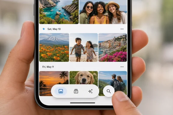
Google Photos on Android is now broadly receiving a redesigned bottom navigation layout that shrinks the old bottom bar into a compact persistent control cluster, grouping Photos, Collections, and Create in one pill while splitting Search into a separate round button near the bottom of the screen. The change, reported by Android Authority’s Taylor Kerns after 9to5Google spotted the rollout, brings Android into line with a design that Google Photos users on iOS have had since early 2026. It is a small interface update by release-note standards, but it says a great deal about how Google is reshaping its own apps for a more content-first, floating-controls era. The practical question is not whether the new bar is prettier; it is whether Google has finally made Photos easier to navigate without making it feel less stable under your thumb.
For years, the safe assumption with Google’s consumer apps was that Android would get the canonical Google experience first and iOS would receive the adapted version later. Google Photos has been a counterexample often enough to make that assumption risky. In this case, the floating bottom bar redesign arrived on iOS in February and only now is rolling out broadly on Android.
Android Authority describes the Android rollout as broadly available for many users, and says its own devices are already seeing the updated layout. Kerns specifically notes the new button layout appearing in version 7.82 of Google Photos on a Pixel 9 Pro. 9to5Google separately reported the Android rollout, making this less of an isolated server-side experiment and more of a real platform catch-up moment.
That order matters because Google Photos is not a side project. It is one of Google’s most important consumer apps, a default memory vault for millions of Android users, and increasingly a place where search, creation, editing, backup, sharing, and AI-assisted discovery converge. Navigation in Photos is not decoration; it is the map for one of the most emotionally and practically valuable datasets people carry on their phones.
The redesign also lands in a period where Google has been steadily sanding down the old Android app architecture of fixed bars, heavy surfaces, and full-width controls. The new Photos bar is smaller, separated from the screen edge, and more visually lightweight. It looks less like a permanent shelf bolted to the bottom of the app and more like a control island floating above the content.
That is the design thesis in miniature: show more of the user’s photos, make the controls feel present but not oppressive, and keep navigation visible even when the old bar would have disappeared. It is also a wager that users will accept a more stylized, less traditional Android control surface if the app feels more modern and easier to parse.
The new version takes a different bargain. It uses a single large pill shape for Photos, Collections, and Create, then places Search in its own separate round button. Android Authority says the whole cluster takes up maybe a third of the space of the previous iteration, while remaining persistent near the bottom of the display regardless of which tab the user is viewing.
That is the key trade: less surface area, more permanence. Google is not simply making the old bar smaller. It is changing the interface from a full-width fixed navigation region into a compact floating control system that stays visible across views.
For some users, persistence will feel like an obvious improvement. A navigation bar that disappears can be elegant when you are passively browsing, but it can be irritating when you are trying to switch tasks quickly. Photos is not just a gallery; it is also a backup viewer, album manager, search engine, editor, sharing hub, and creation tool. A persistent map helps when the product has accumulated that many jobs.
For other users, the old behavior may have felt cleaner. A disappearing bar gave the timeline maximum room and reinforced the idea that the photos themselves were the primary object. The new bar may be smaller, but because it persists, it is always part of the composition. A floating button cluster is less bulky than a ribbon, but it is also harder to ignore.
That tension is why the redesign is more consequential than its size suggests. Google is trying to solve two opposite problems at once: reduce interface bulk and reduce navigational uncertainty. The new bar wins the first fight by shrinking the controls, and wins the second by keeping them visible. Whether it wins the third fight — not getting in the way — will depend on how users browse, search, and tap through their libraries.
On paper, Photos, Collections, Create, and Search are peer destinations. In practice, Search is different. Photos is the main chronological feed. Collections is the organizational layer. Create is the generative and project-oriented entry point. Search is the retrieval engine — the feature that turns a decade of images into something navigable.
By placing Photos, Collections, and Create together while giving Search its own round control, Google is implicitly acknowledging that search is both navigation and action. It is how you move through the library, but it is also how you ask the app to understand what is in that library. In the modern Google Photos product, search is not a passive tab; it is the front door to the app’s intelligence.
That distinction becomes more important as Google continues pushing AI-assisted photo retrieval and creation. Even without over-reading this particular UI change, the layout reflects a larger product reality: users increasingly do not browse massive libraries by scrolling alone. They search for people, places, events, screenshots, documents, pets, receipts, outfits, school projects, and half-remembered moments.
A separate Search button makes that behavior visually prominent without forcing it into the same group as static destinations. It also lets Google preserve the three-item pill as a clean hub for the app’s main modes. The result is a layout that says: browse here, organize here, make things here — and ask the archive over there.
That is good interface storytelling. It reduces ambiguity by giving the app’s most powerful retrieval function a different shape. But it also creates a new hierarchy that users will absorb whether they notice it or not. Search is no longer just another label at the bottom; it is a freestanding control.
For IT writers and product designers, this is the part worth watching. Google Photos has often served as a test bed for how Google thinks ordinary people should interact with personal AI. When Search becomes a distinct object floating above the grid, it is not hard to see the path toward more assistant-like photo queries, contextual actions, and memory mining. The button is small, but the product direction behind it is not.
There are benign explanations for that. Google may have used iOS as the initial proving ground because its interface constraints, device matrix, or app architecture made the rollout cleaner. The company may also have been aligning the Android version with broader internal design work before turning it on widely. Server-side rollouts can make UI availability seem arbitrary even when there is a carefully staged deployment behind the scenes.
But from the user’s point of view, the optics are still strange. Google’s own flagship photo app looked more modern on Apple’s platform than on Google’s platform for months. That does not mean Android was neglected in any strategic sense, but it does show how Google’s app ecosystem no longer moves in a simple Android-first rhythm.
This is the new cross-platform Google: iOS is not merely a secondary port, and Android is not always the first beneficiary of Google’s latest consumer design language. Google competes for user attention on Apple hardware, and it often has strong incentives to make its apps look excellent there. The result is that Android loyalists sometimes watch new Google app interfaces appear across the fence before they appear at home.
That is not unprecedented. Google has regularly shipped features, design experiments, and interaction changes in uneven waves across platforms. What makes Photos stand out is that the app feels so native to Android’s identity. For many Pixel buyers, Google Photos is not just an installed app; it is part of the phone’s core value proposition.
When a major visual refresh appears on iOS first, it invites a predictable complaint: why did Android have to wait? The better answer is that Google’s apps are now products first and platform showcases second. That may be rational for Google, but it complicates the story Android users tell themselves about getting the best Google experience.
In this case, at least, the gap is closing. Android Authority says the redesign is rolling out broadly on Android and is visible on its own phones. If a user still has the old ribbon-style layout, the expectation is that the new version should arrive soon.
A full-width bottom bar has the advantage of clarity. It gives each destination a predictable location and a large touch area. It also gives the app a strong structural base, which can be helpful in a complex product. The downside is that it consumes exactly the area where modern phone screens are already crowded by gesture navigation, safe areas, image captions, scrubbers, and bottom sheets.
The new Photos bar is a compromise shaped by that geometry. By collapsing the main destinations into a pill and moving Search into a round button, Google frees up more of the lower screen for the photo grid while preserving a visible navigation anchor. Android Authority’s description that the new bar takes up maybe a third of the previous iteration’s space captures the visual ambition: reduce chrome without going fully invisible.
That matters because Google Photos is an app where users often skim rather than read. They swipe, scroll, pinch, tap faces, open memories, jump into albums, and backtrack through years. In that context, every persistent interface element competes with the images themselves.
A smaller bar changes the density of the experience. It makes the app feel less like a database viewer and more like a canvas with controls hovering nearby. That is a better match for modern mobile design, but it is not automatically better for every user. Floating controls can create new edge cases around accidental taps, overlapping content, reachability, and visual distraction.
The decision to keep the bar persistent is especially important. Google could have simply made the old disappearing bar more compact. Instead, it appears to have prioritized constant orientation. The app now gives back screen real estate through size rather than through disappearance.
That is a subtle but meaningful choice. It suggests Google believes the old vanishing navigation model imposed too much cognitive cost. Users may have gained a cleaner timeline, but they had to rediscover navigation when they wanted to move elsewhere. The new model says: the controls are always there, but they will try to stay out of the way.
The old Google Photos ribbon-style layout gave users a familiar structure. Even if it occupied more space, it made the app’s destinations explicit. For less technical users, that kind of boring stability is valuable. Google Photos is often used by people who do not think of themselves as managing files or navigating software; they are simply trying to find a picture from a trip, show a grandparent a video, or free up storage.
The redesign asks those users to accept a more modern visual metaphor. The destinations still exist, but they are packaged differently. Photos, Collections, and Create now live together in a pill, while Search sits apart. For most people, the change will be easy to learn. But “easy” is not the same as “invisible.”
This is where UI updates in mature apps become tricky. A new user may find the floating bar cleaner from day one. A longtime user may first notice that muscle memory no longer maps exactly to the old interface. Even when every function remains available, the perceived disruption can be real.
The persistence of the new bar may soften that transition. Android Authority argues that keeping the buttons visible should make the app’s layout easier to understand at a glance with less trial and error. That is plausible. A persistent compact control cluster gives users a constant reference point, which can be especially helpful after a visual redesign.
Still, Google should expect the normal backlash cycle. Some users will praise the extra image space. Others will complain that the floating buttons look too much like iOS, that they cover content, or that the separate Search button breaks the symmetry of the old bar. Those objections are not necessarily evidence that the redesign is bad; they are evidence that Photos has become a daily utility, and daily utilities are judged by habit as much as by aesthetics.
The best interface updates in mature apps are the ones that feel obvious after a week. The worst feel like a designer’s screenshot escaped into production. The Photos redesign has a decent chance of landing in the first category because it preserves the core destinations and does not appear to remove functionality. But its success will depend on whether users stop noticing the bar quickly.
Google frequently rolls out interface changes gradually. A user can have the right app version and still wait for a server-side flag, account-level enablement, device targeting, or staged rollout wave. Conversely, another user may receive the new UI without doing anything more dramatic than opening the app after the backend switch flips.
That is why the most practical advice for ordinary users is modest: update Google Photos, restart the app if necessary, and wait. There is no evidence in the supplied reporting that sideloading, clearing data, or forcing configuration changes is required or wise. For a cloud-backed photo app, aggressive troubleshooting can create more anxiety than benefit.
For enterprise and support environments, the staggered rollout creates a different problem. If employees use Google Photos on managed Android devices — especially in education, field work, media, real estate, insurance, construction, or any role where phone photos become work artifacts — support desks may see two interface versions at the same time. One user’s Search button may be inside the old bottom layout; another’s may be floating separately.
That kind of mismatch is minor until someone is trying to follow a help article, a training document, or a screen-sharing walkthrough. Then it becomes friction. The new layout does not appear to change core capabilities, but it does change where people look first.
That distinction matters because Android update culture trains users to look for magic numbers. A build number, app version, or device model becomes a talisman. People compare screenshots and assume they can reproduce the UI if they match the version.
With Google apps, that is often only partly true. The Play Store version is one layer. Server-side configuration is another. Account eligibility, region, rollout cohort, and platform experiments may also influence what appears. Android Authority’s “landing on your device soon” language is the right level of certainty: the rollout is real and broad, but not necessarily simultaneous.
The Pixel 9 Pro detail also tells us something about where Google’s design work is most visible first. Pixel devices often serve as the cleanest expression of Google’s Android software assumptions. If the Photos redesign is showing there, it is reasonable to treat it as part of Google’s intended Android experience rather than a vendor-specific skin or third-party overlay.
Still, users on Samsung, Motorola, OnePlus, and other Android devices should not assume something is wrong if the bar has not appeared yet. Google Photos is distributed through the Play Store and heavily controlled by Google’s own app logic, but Android’s device diversity still makes staged rollout behavior messy. The lack of the new pill today is not evidence of an unsupported phone.
The safest reading is simple: version 7.82 is associated with the visible redesign in Android Authority’s testing, the rollout is broad, and many Android users are seeing it now. Anything more precise would exceed what the reporting establishes.
The supplied reporting does not claim accessibility regressions, and there is no basis to assert them. But the redesign does create design questions that Google will have to get right in practice. Are the grouped pill controls large enough for comfortable tapping? Does the separate Search button remain obvious in light and dark photo contexts? Does the floating surface maintain enough contrast over busy images? Does persistence interfere with users who scan the bottom of the frame for dates, thumbnails, or timeline context?
The answer may well be that Google has solved these issues through spacing, contrast, and Material component behavior. The visual description from Android Authority suggests a modern, compact bar rather than a minimalist hidden control. But users with motor or visual accessibility needs often experience “compact” differently from designers with flagship phones and perfect lighting.
There is also the question of gesture navigation. Modern Android phones already reserve the bottom edge for system gestures. A floating bar that sits near the bottom must coexist with the home gesture area, back gestures, keyboard transitions, bottom sheets, and media controls. Done well, it feels natural. Done poorly, it becomes the place where app controls and system controls fight for the same thumb movement.
Google has an advantage here because it controls Android design guidance and the Photos app itself. But that also raises expectations. If any company should understand how a floating bottom navigation surface behaves on Android hardware, it is Google. The Android rollout is therefore a test not just of Photos, but of whether Google’s current design language can make content-first controls feel practical rather than ornamental.
This is where Android’s diversity again complicates the story. A floating bar that looks elegant on a Pixel 9 Pro may feel different on smaller screens, budget devices, foldables, or phones with aggressive display scaling. A broad rollout will reveal the real edge cases.
That product expansion makes navigation more important and more difficult. Every new capability competes for a place in the interface. If Google exposes too much, Photos becomes cluttered. If it hides too much, users miss features or assume they do not exist. A compact persistent bottom bar is one answer to that pressure.
The grouping of Photos, Collections, and Create is especially revealing. Those are not random tabs. They represent three modes of using the archive: looking, organizing, and making. Search, separated into its own button, becomes the fourth mode: asking.
That structure is cleaner than the app’s actual complexity. Google Photos contains many surfaces beneath those labels, and users still need to understand albums, shared libraries, device folders, backup state, memories, editing, utilities, and storage management. But the new bar gives the top level a stronger conceptual shape.
In that sense, the redesign is not merely cosmetic. It is information architecture expressed as visual design. Google is telling users what the app is for: your timeline, your collections, your creations, and your search.
The risk is that Photos keeps adding weight behind those doors. A cleaner bottom bar can make the top level feel calmer, but it cannot solve deeper complexity if the underlying product continues to sprawl. This is the recurring challenge for successful consumer apps. The more useful they become, the more they need navigation restraint. The more restrained the navigation becomes, the harder it is to reveal the full power of the product.
Google’s answer, increasingly, is to let search and AI absorb some of that complexity. If users can ask for what they want, fewer features need to be surfaced as explicit menu items. The separate Search button makes sense in that future. It is not just a place to type; it is the escape hatch from hierarchy.
On screenshots, the new Google Photos bottom bar likely wins. It looks more modern, leaves more images visible, and aligns Android with the iOS experience that arrived earlier in the year. It also gives Photos a more polished, floating-control aesthetic that fits current Google design trends.
In daily use, the verdict will be more complicated. A persistent bar is helpful when switching tabs, but it can be annoying if it visually floats over content a user wants to inspect. A smaller bar is elegant, but only if the touch targets remain comfortable. A separate Search button is logical, but only if users understand why it has been visually separated from the other destinations.
The old bar’s disappearance on timeline scroll was both a feature and a flaw. It maximized content when browsing, but reduced orientation when navigating. Google has now chosen orientation. That is a defensible choice for a product as complex as Photos.
The deeper question is whether Google can keep the interface calm as Photos becomes more powerful. A smaller bottom bar helps, but it is not a substitute for disciplined product design. If Collections becomes a dumping ground, Create becomes a rotating carousel of experiments, and Search becomes an AI prompt box with inconsistent behavior, no pill shape will save the experience.
For now, the update appears restrained. It does not rename the app’s basic destinations. It does not remove the central Photos timeline. It does not bury Search. It simply rebalances the bottom of the screen around a more compact, persistent control model.
That restraint is why the change is worth taking seriously. The best redesigns in mature apps often look modest because the hard work is deciding what not to disturb.
Google Photos’ new Android bottom bar is the kind of update that will seem obvious if it works and irritating if it does not. The design gives Android users the compact, persistent Photos navigation that iOS users received first, and it nudges one of Google’s most important apps toward a future where controls float, content dominates, and Search stands apart as the real power tool. If Google can keep that balance as Photos becomes more AI-heavy and feature-dense, this small pill-shaped bar may be remembered less as a redesign than as a course correction.
 Google Finally Lets Android Catch Up to Its Own iOS App
For years, the safe assumption with Google’s consumer apps was that Android would get the canonical Google experience first and iOS would receive the adapted version later. Google Photos has been a counterexample often enough to make that assumption risky. In this case, the floating bottom bar redesign arrived on iOS in February and only now is rolling out broadly on Android.Android Authority describes the Android rollout as broadly available for many users, and says its own devices are already seeing the updated layout. Kerns specifically notes the new button layout appearing in version 7.82 of Google Photos on a Pixel 9 Pro. 9to5Google separately reported the Android rollout, making this less of an isolated server-side experiment and more of a real platform catch-up moment.
That order matters because Google Photos is not a side project. It is one of Google’s most important consumer apps, a default memory vault for millions of Android users, and increasingly a place where search, creation, editing, backup, sharing, and AI-assisted discovery converge. Navigation in Photos is not decoration; it is the map for one of the most emotionally and practically valuable datasets people carry on their phones.
The redesign also lands in a period where Google has been steadily sanding down the old Android app architecture of fixed bars, heavy surfaces, and full-width controls. The new Photos bar is smaller, separated from the screen edge, and more visually lightweight. It looks less like a permanent shelf bolted to the bottom of the app and more like a control island floating above the content.
That is the design thesis in miniature: show more of the user’s photos, make the controls feel present but not oppressive, and keep navigation visible even when the old bar would have disappeared. It is also a wager that users will accept a more stylized, less traditional Android control surface if the app feels more modern and easier to parse.
The New Bar Shrinks the Chrome, But It Also Changes the Contract
The old Google Photos bottom bar behaved like a conventional bottom navigation strip. It occupied the full width of the lower interface area and, according to Android Authority, disappeared entirely when users scrolled back through the Photos timeline. That disappearing act created more room for images, but it also meant the app’s primary navigation could vanish at the very moment a user was deep in the library.The new version takes a different bargain. It uses a single large pill shape for Photos, Collections, and Create, then places Search in its own separate round button. Android Authority says the whole cluster takes up maybe a third of the space of the previous iteration, while remaining persistent near the bottom of the display regardless of which tab the user is viewing.
That is the key trade: less surface area, more permanence. Google is not simply making the old bar smaller. It is changing the interface from a full-width fixed navigation region into a compact floating control system that stays visible across views.
| Element | Previous Android layout | Redesigned Android layout | Practical effect |
|---|---|---|---|
| Main navigation surface | Larger ribbon-style bottom bar | Compact pill-shaped control cluster | More photo content remains visible |
| Primary views | Photos, Collections, Create, Search in the bottom navigation area | Photos, Collections, and Create grouped together | Core browsing and creation views feel visually connected |
| Search | Part of the old bottom layout | Separate round Search button | Search is emphasized as its own action |
| Scroll behavior | Could disappear when scrolling back through the Photos timeline | Persistent near the bottom across views | Navigation remains easier to find at a glance |
| Screen real estate | Occupied significantly more vertical space | Roughly a third of the previous iteration’s space | Less app chrome competes with the photo grid |
For other users, the old behavior may have felt cleaner. A disappearing bar gave the timeline maximum room and reinforced the idea that the photos themselves were the primary object. The new bar may be smaller, but because it persists, it is always part of the composition. A floating button cluster is less bulky than a ribbon, but it is also harder to ignore.
That tension is why the redesign is more consequential than its size suggests. Google is trying to solve two opposite problems at once: reduce interface bulk and reduce navigational uncertainty. The new bar wins the first fight by shrinking the controls, and wins the second by keeping them visible. Whether it wins the third fight — not getting in the way — will depend on how users browse, search, and tap through their libraries.
Search Gets Its Own Island Because Photos Is No Longer Just a Gallery
The most telling choice in the redesign is not the pill shape. It is the decision to split Search into a separate round button.On paper, Photos, Collections, Create, and Search are peer destinations. In practice, Search is different. Photos is the main chronological feed. Collections is the organizational layer. Create is the generative and project-oriented entry point. Search is the retrieval engine — the feature that turns a decade of images into something navigable.
By placing Photos, Collections, and Create together while giving Search its own round control, Google is implicitly acknowledging that search is both navigation and action. It is how you move through the library, but it is also how you ask the app to understand what is in that library. In the modern Google Photos product, search is not a passive tab; it is the front door to the app’s intelligence.
That distinction becomes more important as Google continues pushing AI-assisted photo retrieval and creation. Even without over-reading this particular UI change, the layout reflects a larger product reality: users increasingly do not browse massive libraries by scrolling alone. They search for people, places, events, screenshots, documents, pets, receipts, outfits, school projects, and half-remembered moments.
A separate Search button makes that behavior visually prominent without forcing it into the same group as static destinations. It also lets Google preserve the three-item pill as a clean hub for the app’s main modes. The result is a layout that says: browse here, organize here, make things here — and ask the archive over there.
That is good interface storytelling. It reduces ambiguity by giving the app’s most powerful retrieval function a different shape. But it also creates a new hierarchy that users will absorb whether they notice it or not. Search is no longer just another label at the bottom; it is a freestanding control.
For IT writers and product designers, this is the part worth watching. Google Photos has often served as a test bed for how Google thinks ordinary people should interact with personal AI. When Search becomes a distinct object floating above the grid, it is not hard to see the path toward more assistant-like photo queries, contextual actions, and memory mining. The button is small, but the product direction behind it is not.
The iOS-First Rollout Exposes Google’s Cross-Platform Reality
The awkward detail in Android Authority’s report is that iOS users had this redesign first. The February update made the bottom navigation more compact and allowed more photos to show through, but at the time it only hit the iOS version of Google Photos. Android users are only now getting the same concept broadly.There are benign explanations for that. Google may have used iOS as the initial proving ground because its interface constraints, device matrix, or app architecture made the rollout cleaner. The company may also have been aligning the Android version with broader internal design work before turning it on widely. Server-side rollouts can make UI availability seem arbitrary even when there is a carefully staged deployment behind the scenes.
But from the user’s point of view, the optics are still strange. Google’s own flagship photo app looked more modern on Apple’s platform than on Google’s platform for months. That does not mean Android was neglected in any strategic sense, but it does show how Google’s app ecosystem no longer moves in a simple Android-first rhythm.
This is the new cross-platform Google: iOS is not merely a secondary port, and Android is not always the first beneficiary of Google’s latest consumer design language. Google competes for user attention on Apple hardware, and it often has strong incentives to make its apps look excellent there. The result is that Android loyalists sometimes watch new Google app interfaces appear across the fence before they appear at home.
That is not unprecedented. Google has regularly shipped features, design experiments, and interaction changes in uneven waves across platforms. What makes Photos stand out is that the app feels so native to Android’s identity. For many Pixel buyers, Google Photos is not just an installed app; it is part of the phone’s core value proposition.
When a major visual refresh appears on iOS first, it invites a predictable complaint: why did Android have to wait? The better answer is that Google’s apps are now products first and platform showcases second. That may be rational for Google, but it complicates the story Android users tell themselves about getting the best Google experience.
In this case, at least, the gap is closing. Android Authority says the redesign is rolling out broadly on Android and is visible on its own phones. If a user still has the old ribbon-style layout, the expectation is that the new version should arrive soon.
A Smaller Bottom Bar Is Really a Larger Design Argument
The redesign fits neatly into the broader trend toward floating, compact, content-aware controls in mobile apps. Google’s Material design direction has increasingly favored rounded shapes, layered surfaces, and controls that feel like objects placed over content rather than heavy application scaffolding. Photos is an obvious candidate for that treatment because the content is visual and emotionally central.A full-width bottom bar has the advantage of clarity. It gives each destination a predictable location and a large touch area. It also gives the app a strong structural base, which can be helpful in a complex product. The downside is that it consumes exactly the area where modern phone screens are already crowded by gesture navigation, safe areas, image captions, scrubbers, and bottom sheets.
The new Photos bar is a compromise shaped by that geometry. By collapsing the main destinations into a pill and moving Search into a round button, Google frees up more of the lower screen for the photo grid while preserving a visible navigation anchor. Android Authority’s description that the new bar takes up maybe a third of the previous iteration’s space captures the visual ambition: reduce chrome without going fully invisible.
That matters because Google Photos is an app where users often skim rather than read. They swipe, scroll, pinch, tap faces, open memories, jump into albums, and backtrack through years. In that context, every persistent interface element competes with the images themselves.
A smaller bar changes the density of the experience. It makes the app feel less like a database viewer and more like a canvas with controls hovering nearby. That is a better match for modern mobile design, but it is not automatically better for every user. Floating controls can create new edge cases around accidental taps, overlapping content, reachability, and visual distraction.
The decision to keep the bar persistent is especially important. Google could have simply made the old disappearing bar more compact. Instead, it appears to have prioritized constant orientation. The app now gives back screen real estate through size rather than through disappearance.
That is a subtle but meaningful choice. It suggests Google believes the old vanishing navigation model imposed too much cognitive cost. Users may have gained a cleaner timeline, but they had to rediscover navigation when they wanted to move elsewhere. The new model says: the controls are always there, but they will try to stay out of the way.
The Old Ribbon Was Boring, But Boring Has Advantages
It is easy to mock traditional bottom bars as dated. They are wide, flat, and visually conservative. They also work.The old Google Photos ribbon-style layout gave users a familiar structure. Even if it occupied more space, it made the app’s destinations explicit. For less technical users, that kind of boring stability is valuable. Google Photos is often used by people who do not think of themselves as managing files or navigating software; they are simply trying to find a picture from a trip, show a grandparent a video, or free up storage.
The redesign asks those users to accept a more modern visual metaphor. The destinations still exist, but they are packaged differently. Photos, Collections, and Create now live together in a pill, while Search sits apart. For most people, the change will be easy to learn. But “easy” is not the same as “invisible.”
This is where UI updates in mature apps become tricky. A new user may find the floating bar cleaner from day one. A longtime user may first notice that muscle memory no longer maps exactly to the old interface. Even when every function remains available, the perceived disruption can be real.
The persistence of the new bar may soften that transition. Android Authority argues that keeping the buttons visible should make the app’s layout easier to understand at a glance with less trial and error. That is plausible. A persistent compact control cluster gives users a constant reference point, which can be especially helpful after a visual redesign.
Still, Google should expect the normal backlash cycle. Some users will praise the extra image space. Others will complain that the floating buttons look too much like iOS, that they cover content, or that the separate Search button breaks the symmetry of the old bar. Those objections are not necessarily evidence that the redesign is bad; they are evidence that Photos has become a daily utility, and daily utilities are judged by habit as much as by aesthetics.
The best interface updates in mature apps are the ones that feel obvious after a week. The worst feel like a designer’s screenshot escaped into production. The Photos redesign has a decent chance of landing in the first category because it preserves the core destinations and does not appear to remove functionality. But its success will depend on whether users stop noticing the bar quickly.
Why Android Users May See It at Different Times
Android Authority’s report points to the updated button layout appearing in version 7.82 of Google Photos on a Pixel 9 Pro, while also noting that the redesign is rolling out broadly and is available for many users on Android. Those two details should be read together. App version matters, but it may not be the only switch.Google frequently rolls out interface changes gradually. A user can have the right app version and still wait for a server-side flag, account-level enablement, device targeting, or staged rollout wave. Conversely, another user may receive the new UI without doing anything more dramatic than opening the app after the backend switch flips.
That is why the most practical advice for ordinary users is modest: update Google Photos, restart the app if necessary, and wait. There is no evidence in the supplied reporting that sideloading, clearing data, or forcing configuration changes is required or wise. For a cloud-backed photo app, aggressive troubleshooting can create more anxiety than benefit.
For enterprise and support environments, the staggered rollout creates a different problem. If employees use Google Photos on managed Android devices — especially in education, field work, media, real estate, insurance, construction, or any role where phone photos become work artifacts — support desks may see two interface versions at the same time. One user’s Search button may be inside the old bottom layout; another’s may be floating separately.
That kind of mismatch is minor until someone is trying to follow a help article, a training document, or a screen-sharing walkthrough. Then it becomes friction. The new layout does not appear to change core capabilities, but it does change where people look first.
Action checklist for admins
- Update internal screenshots or job aids that refer to the old ribbon-style Google Photos bottom bar.
- Expect mixed UI states during the rollout, even among users who believe their app is up to date.
- Ask users to confirm the Google Photos app version before troubleshooting missing navigation changes.
- Avoid telling users to clear app data unless there is a separate sync or corruption issue; this UI change is a rollout, not a repair task.
- For managed Android fleets, test the new layout on at least one current Pixel-class device before updating support scripts.
The Pixel 9 Pro Detail Is Useful, But Not a Compatibility Matrix
Android Authority’s device detail is deliberately narrow: the updated button layout is visible in Google Photos version 7.82 running on a Pixel 9 Pro. That is useful because it proves the redesign is not confined to iOS and is live on at least one modern Android device in the wild. It is not enough to conclude that only Pixel 9 Pro devices are receiving it, or that version 7.82 guarantees it for everyone.That distinction matters because Android update culture trains users to look for magic numbers. A build number, app version, or device model becomes a talisman. People compare screenshots and assume they can reproduce the UI if they match the version.
With Google apps, that is often only partly true. The Play Store version is one layer. Server-side configuration is another. Account eligibility, region, rollout cohort, and platform experiments may also influence what appears. Android Authority’s “landing on your device soon” language is the right level of certainty: the rollout is real and broad, but not necessarily simultaneous.
The Pixel 9 Pro detail also tells us something about where Google’s design work is most visible first. Pixel devices often serve as the cleanest expression of Google’s Android software assumptions. If the Photos redesign is showing there, it is reasonable to treat it as part of Google’s intended Android experience rather than a vendor-specific skin or third-party overlay.
Still, users on Samsung, Motorola, OnePlus, and other Android devices should not assume something is wrong if the bar has not appeared yet. Google Photos is distributed through the Play Store and heavily controlled by Google’s own app logic, but Android’s device diversity still makes staged rollout behavior messy. The lack of the new pill today is not evidence of an unsupported phone.
The safest reading is simple: version 7.82 is associated with the visible redesign in Android Authority’s testing, the rollout is broad, and many Android users are seeing it now. Anything more precise would exceed what the reporting establishes.
A Cleaner Photos UI Also Raises the Stakes for Accessibility
Any persistent bottom control in a photo-heavy app has to satisfy more than aesthetic taste. It has to be reachable, legible, and forgiving. Shrinking a navigation bar can improve screen density, but it can also reduce the visual and motor margin for users who rely on larger targets or clearer separation.The supplied reporting does not claim accessibility regressions, and there is no basis to assert them. But the redesign does create design questions that Google will have to get right in practice. Are the grouped pill controls large enough for comfortable tapping? Does the separate Search button remain obvious in light and dark photo contexts? Does the floating surface maintain enough contrast over busy images? Does persistence interfere with users who scan the bottom of the frame for dates, thumbnails, or timeline context?
The answer may well be that Google has solved these issues through spacing, contrast, and Material component behavior. The visual description from Android Authority suggests a modern, compact bar rather than a minimalist hidden control. But users with motor or visual accessibility needs often experience “compact” differently from designers with flagship phones and perfect lighting.
There is also the question of gesture navigation. Modern Android phones already reserve the bottom edge for system gestures. A floating bar that sits near the bottom must coexist with the home gesture area, back gestures, keyboard transitions, bottom sheets, and media controls. Done well, it feels natural. Done poorly, it becomes the place where app controls and system controls fight for the same thumb movement.
Google has an advantage here because it controls Android design guidance and the Photos app itself. But that also raises expectations. If any company should understand how a floating bottom navigation surface behaves on Android hardware, it is Google. The Android rollout is therefore a test not just of Photos, but of whether Google’s current design language can make content-first controls feel practical rather than ornamental.
This is where Android’s diversity again complicates the story. A floating bar that looks elegant on a Pixel 9 Pro may feel different on smaller screens, budget devices, foldables, or phones with aggressive display scaling. A broad rollout will reveal the real edge cases.
The Redesign Is Part of Photos’ Slow Transformation From Archive to Operating System
Google Photos began as a smarter camera roll and backup service. It is now something closer to a personal media operating system. It stores images, recognizes contents, clusters people and pets, builds creations, offers editing tools, surfaces memories, manages sharing, and increasingly mediates how users search their own visual history.That product expansion makes navigation more important and more difficult. Every new capability competes for a place in the interface. If Google exposes too much, Photos becomes cluttered. If it hides too much, users miss features or assume they do not exist. A compact persistent bottom bar is one answer to that pressure.
The grouping of Photos, Collections, and Create is especially revealing. Those are not random tabs. They represent three modes of using the archive: looking, organizing, and making. Search, separated into its own button, becomes the fourth mode: asking.
That structure is cleaner than the app’s actual complexity. Google Photos contains many surfaces beneath those labels, and users still need to understand albums, shared libraries, device folders, backup state, memories, editing, utilities, and storage management. But the new bar gives the top level a stronger conceptual shape.
In that sense, the redesign is not merely cosmetic. It is information architecture expressed as visual design. Google is telling users what the app is for: your timeline, your collections, your creations, and your search.
The risk is that Photos keeps adding weight behind those doors. A cleaner bottom bar can make the top level feel calmer, but it cannot solve deeper complexity if the underlying product continues to sprawl. This is the recurring challenge for successful consumer apps. The more useful they become, the more they need navigation restraint. The more restrained the navigation becomes, the harder it is to reveal the full power of the product.
Google’s answer, increasingly, is to let search and AI absorb some of that complexity. If users can ask for what they want, fewer features need to be surfaced as explicit menu items. The separate Search button makes sense in that future. It is not just a place to type; it is the escape hatch from hierarchy.
The Real Test Is Whether Users Stop Thinking About It
Interface redesigns are usually judged twice. The first judgment happens on screenshots, where novelty dominates. The second happens after days of use, where muscle memory and friction decide the verdict.On screenshots, the new Google Photos bottom bar likely wins. It looks more modern, leaves more images visible, and aligns Android with the iOS experience that arrived earlier in the year. It also gives Photos a more polished, floating-control aesthetic that fits current Google design trends.
In daily use, the verdict will be more complicated. A persistent bar is helpful when switching tabs, but it can be annoying if it visually floats over content a user wants to inspect. A smaller bar is elegant, but only if the touch targets remain comfortable. A separate Search button is logical, but only if users understand why it has been visually separated from the other destinations.
The old bar’s disappearance on timeline scroll was both a feature and a flaw. It maximized content when browsing, but reduced orientation when navigating. Google has now chosen orientation. That is a defensible choice for a product as complex as Photos.
The deeper question is whether Google can keep the interface calm as Photos becomes more powerful. A smaller bottom bar helps, but it is not a substitute for disciplined product design. If Collections becomes a dumping ground, Create becomes a rotating carousel of experiments, and Search becomes an AI prompt box with inconsistent behavior, no pill shape will save the experience.
For now, the update appears restrained. It does not rename the app’s basic destinations. It does not remove the central Photos timeline. It does not bury Search. It simply rebalances the bottom of the screen around a more compact, persistent control model.
That restraint is why the change is worth taking seriously. The best redesigns in mature apps often look modest because the hard work is deciding what not to disturb.
What Changes When the Bottom Bar Floats
This rollout is not a crisis, a breakthrough, or a reason to reinstall your photo workflow. It is a design correction with practical consequences, especially for users who live inside Google Photos every day.- Android users are now broadly getting the compact bottom bar redesign that appeared on iOS earlier in 2026.
- The new layout groups Photos, Collections, and Create into one pill-shaped control, while Search becomes a separate round button.
- The bar occupies significantly less screen space than the older ribbon-style layout, but remains persistent near the bottom of the display.
- The old Android layout could disappear while scrolling through the Photos timeline; the new one favors constant orientation.
- Android Authority observed the design in Google Photos version 7.82 on a Pixel 9 Pro, but staged rollout behavior means not everyone will see it at the same moment.
- Support teams should expect temporary screenshot mismatch as some users keep the old layout while others receive the new one.
Google Photos’ new Android bottom bar is the kind of update that will seem obvious if it works and irritating if it does not. The design gives Android users the compact, persistent Photos navigation that iOS users received first, and it nudges one of Google’s most important apps toward a future where controls float, content dominates, and Search stands apart as the real power tool. If Google can keep that balance as Photos becomes more AI-heavy and feature-dense, this small pill-shaped bar may be remembered less as a redesign than as a course correction.
References
- Primary source: Android Authority
Published: Wed, 08 Jul 2026 17:54:00 GMT
Google Photos is finally getting its bottom bar redesign on Android
The row of navigation controls at the bottom of Google Photos has been updated to be a bit more compact and consistent.www.androidauthority.com - Official source: play.google.com
- Official source: 9to5google.com
Google Photos widely rolling floating bottom bar on Android
Google Photos is finally rolling out a floating bottom bar redesign on Android that updates how you navigate the app.9to5google.com - Related coverage: phonearena.com
Floating toolbar surfaces on Google Photos app - PhoneArena
One of Google's most popular apps has upgraded the toolbar on the app and is now more than just a gallery of photos.www.phonearena.com - Related coverage: findarticles.com
- Official source: support.google.com
- Related coverage: techtiper.com
Google Photos Unveils Major UI Redesign with Floating Navigation Bar
Google Photos is rolling out a significant visual update, introducing a modern, "floating" bottom navigation bar to enhance user experience. Learn about the new minimalist design, improved AI search access, and what's next for the popular photo management app on iOS and Android. www.techtiper.com
- Related coverage: frandroid.com
Google Photos s'offre un nouveau look, mais uniquement sur iPhone et iPad — Frandroid
Google Photos abandonne sa barre de navigation historique au profit d'un design flottant plus moderne. Déjà disponible sur iOS, cette mise à jour se faitwww.frandroid.com - Related coverage: droid-life.com
Google Photos Gets a Fresh New Design
iOS vs. Android Google seems to have mostly limited the changes for this new navigation bar to the main tabs, as entering a photo or some other areas of the app switch back to that old style pinned bar with options or lack one entirely. This all appears to be the beginning of this transition to...www.droid-life.com - Related coverage: androidheadlines.com
Google Photos UI Update: New Persistent Floating Toolbar Arrives
Google Photos is rolling out a fresh UI redesign featuring a persistent floating toolbar to improve navigation and photo management. www.androidheadlines.com
- Related coverage: androidcentral.com
Google Photos is making it easier to find pictures of the people you care about | Android Central
Google Photos is adding face group shortcuts to make finding photos of people faster and easier.www.androidcentral.com - Related coverage: gadgets360.com
- Related coverage: m2.material.io
Material Design
Build beautiful, usable products faster. Material Design is an adaptable system—backed by open-source code—that helps teams build high quality digital experiences.m2.material.io
