tedrecommends
New Member
- Joined
- Feb 26, 2010
- Messages
- 12
- Thread Author
- #1
I've had Windows 95, 98, 2000, ME, XP, Vista (32 & later 64bit) and now just installed Windows 7 (64bit). I've also tried Macs, which are overpiced trash.
So far, 7 seems to start up and load various items a bit faster than Vista and I also think the transparent or "glass" visual feature looks better on 7 than Vista. Having said that and the fact that I've only had it for about a week, I have found some preferences and features that I am really angry about in Windows 7 and might even switch back to Vista for.
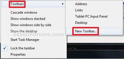
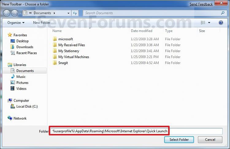
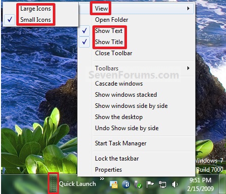
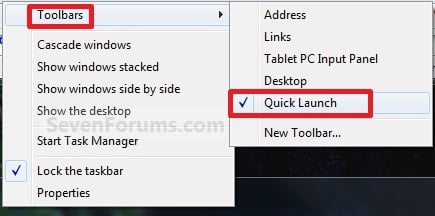
The quick tabs (now called "pinned" items) are a HUGE problem now. On XP and Vista, I hardly ever went into the start menu or any other menu because I had all of the programs I used on a daily basis right there on the taskbar.
#1) They are spaced WAAAAAAAAAAAAYYYYYY too far apart from eachother now. All of my quick tabs on Vista were lined up close to eachother and 6 or 7 of them barely took up an inch and a half on my taskbar. Nice and tidy. NOW on Windows 7, three "pinned" items take up the same amount of space that 6 or 7 used to on Vista. If I had 6 or 7 pinned items on Windows 7, they would take up almost half my taskbar! Seriously, WTF Microsoft????!!!!
#2) You can't place certain items as "pinned" on the taskbar. I used to have games, Adobe software and even internet pages as quick tabs. For example, I listen to the Howard Stern Show online. On Vista, I dragged the Stern Show's site from my favorites bar right onto my taskbar. WINDOWS 7 DOESN'T LET YOU DO THIS. You have to click on the internet icon, then move over to the pinned website. Again, the taskbar is no longer tidy and efficient in Windows 7 for me.

#3) Why can't I switch to the "classic" start menu? In the classic start menu, everything opens up and expands so you can find what you are looking for FAST. In the new start menu, you are confined to a tiny programs list where you have to scroll through it. Why did they get rid of the option to switch to the "classic" start menu?
#4) In Vista, you could click a button to scroll through all of the windows you currently have open. They would pop up in the middle of the screen sideways like book pages and you could use your scroll button to cycle through them. This option is GONE on Windows 7.
#5) If you download a new Windows 7 theme, why can't you delete it? I downloaded one from the Windows site to see what it looks like (you can't even preview it on the website. good job, guys.) and when I didn't like it and decided to delete it, I couldn't. WTF?
Everything else has been fine so far, I just really dislike the things I mentioned above and if they get annoying enough, I might switch back to Vista. Can anyone help me troubleshoot these issues? I really really really want my tidy and efficient quick tabs or the now called "pinned" items bar back. I can't stand the fact that (1) I can't have my internet links on there and (2) I hate how far apart they are spaced. HELP!
So far, 7 seems to start up and load various items a bit faster than Vista and I also think the transparent or "glass" visual feature looks better on 7 than Vista. Having said that and the fact that I've only had it for about a week, I have found some preferences and features that I am really angry about in Windows 7 and might even switch back to Vista for.
The quick tabs (now called "pinned" items) are a HUGE problem now. On XP and Vista, I hardly ever went into the start menu or any other menu because I had all of the programs I used on a daily basis right there on the taskbar.
#1) They are spaced WAAAAAAAAAAAAYYYYYY too far apart from eachother now. All of my quick tabs on Vista were lined up close to eachother and 6 or 7 of them barely took up an inch and a half on my taskbar. Nice and tidy. NOW on Windows 7, three "pinned" items take up the same amount of space that 6 or 7 used to on Vista. If I had 6 or 7 pinned items on Windows 7, they would take up almost half my taskbar! Seriously, WTF Microsoft????!!!!
#2) You can't place certain items as "pinned" on the taskbar. I used to have games, Adobe software and even internet pages as quick tabs. For example, I listen to the Howard Stern Show online. On Vista, I dragged the Stern Show's site from my favorites bar right onto my taskbar. WINDOWS 7 DOESN'T LET YOU DO THIS. You have to click on the internet icon, then move over to the pinned website. Again, the taskbar is no longer tidy and efficient in Windows 7 for me.
#3) Why can't I switch to the "classic" start menu? In the classic start menu, everything opens up and expands so you can find what you are looking for FAST. In the new start menu, you are confined to a tiny programs list where you have to scroll through it. Why did they get rid of the option to switch to the "classic" start menu?
#4) In Vista, you could click a button to scroll through all of the windows you currently have open. They would pop up in the middle of the screen sideways like book pages and you could use your scroll button to cycle through them. This option is GONE on Windows 7.
#5) If you download a new Windows 7 theme, why can't you delete it? I downloaded one from the Windows site to see what it looks like (you can't even preview it on the website. good job, guys.) and when I didn't like it and decided to delete it, I couldn't. WTF?
Everything else has been fine so far, I just really dislike the things I mentioned above and if they get annoying enough, I might switch back to Vista. Can anyone help me troubleshoot these issues? I really really really want my tidy and efficient quick tabs or the now called "pinned" items bar back. I can't stand the fact that (1) I can't have my internet links on there and (2) I hate how far apart they are spaced. HELP!


